My previous posts from The World Top Incomes Database have presented the relative share of income received by the various top brackets. This article concerns the actual incomes needed to make it into a bracket, or the thresholds for the top brackets. We also compare the bracket average incomes to the average household income in the US. The graphs below were generated by me on the database. The official credit for the cite is contained in the citation: Alvaredo, Facundo, Anthony B. Atkinson, Thomas Piketty and Emmanuel Saez, The World Top Incomes Database, http://topincomes.g-mond.parisschoolofeconomics.eu/ .
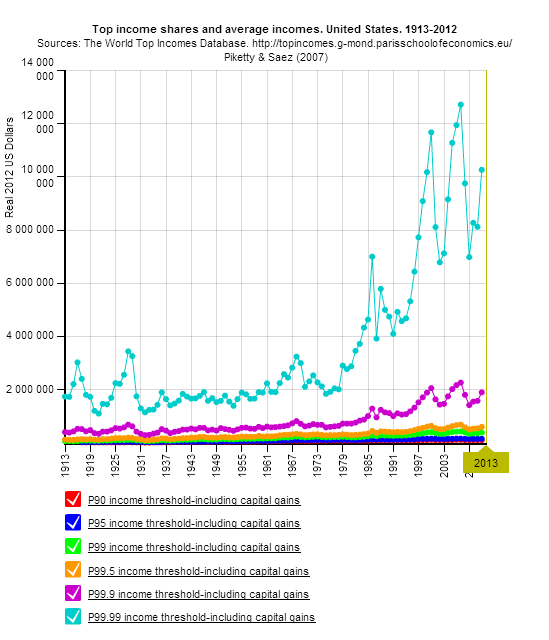
The graph below shows the starting incomes of the various top income brackets. It is of course dominated by the lines for the top 0.01% in light blue, and the top 0.1% in purple. The top 0.01% threshold was about $2 million per year in the 30’s, and has increased to $10 million today, an increase by a factor of 5. The top 0.1% threshold has increased to about $2 million a year today.
To make the income bracket averages clearer, we have left out the top 0.01% in the graph below, and just show income averages for the top 0.1% (green), top 0.5% (blue), and top 1% brackets (red). Comparing averages in 1970 to 2012, the top 0.1% rose from $0.84 million in 1970 to $4.66 million, a factor of 5.5. The top 0.5% rose from $0.45 million to $1.60 million, a factor of 3.6. The top 1% rose from $0.34 million to $1.02 million, a factor of 3.0. 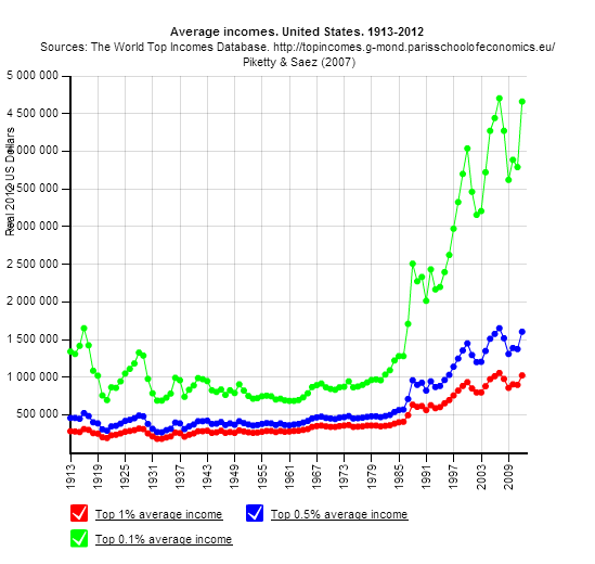
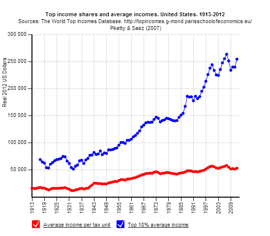
The graph below shows the average income per tax unit or household at slightly above $50,000 per year in 2012. That number has been fairly steady since 1970. The average income of the top 10%, however, has increased steadily since 1933, when coincidentally it was $50,000. It is now over $250,000. (Who said FDR was bad for the wealthy?) That increase was a factor of 5 for the top 10%. The average income for all increased from about $20,000, or a factor of 2.5 over the same period.