
Exercise 3.2 – Personas – Katherine Cheng
Project 3 – Experiences – Katherine Cheng
Exercise 2.3 – Geographies – Katherine Cheng

For my whole adult life, I’ve lived in major cities. First New York City, then San Francisco, and now Los Angeles. In NYC and SF, I had strong walking habits. During my free time, when the weather was nice or when I just felt an urge to explore and a restlessness in my legs, I’d head out on foot, sometimes walking up to 12 miles a day.
I intentionally walked because for me, the practice was one of seeing, rather than of getting to a destination. So standing at 5′ 3″, walking at a slow to moderate pace, I would look up, left, right, and down to the limits of my ability and attention. Some days, I’d notice the particular shape of a leaf on a tree. Other days, I’d sense changes in air texture, moisture and heaviness. Rain was coming.
In LA, my geographic ramblings are much more car-oriented. It’s partially to do with the sprawl of the city and its crisscrossing freeways. And, the other part is cultural. It is simply strange to see people walking when most people are car-bound.
I felt this acutely on this mapping project, which I did in a combination of foot and car. On foot entirely, I would have been constrained to a very small area, or I would have walked all day to cover the spread I desired. What I wanted was to find a balance of breadth and detail.
Something that occurred to me while on foot was how clean the streets are in my area. I’ve been in LA only about half a year, but long enough to take for granted streets uncluttered by litter, feces and bodies and unadorned with the scent of body fluids. In San Francisco, every left and right turn was an assault on the senses, with most scents carrying a medley of eucalyptus, stale alcohol and urine notes.
In this particular part of LA, where my nose lacked stimulation, my ears made up for it. The white noise! Almost everywhere, there’s a background hum of freeway traffic. Rarely honking, but occasionally tire squealing and sirens.
In my descriptions here and in the notes I jotted on the sketch, my observations are grounded in the framework of comparison. How does this environment I’m here in now compare to other environments from my past? What about my past experiences bias my attention to the very things I am calling out? To the question of “Can our observational faculties be trusted to objectively describe a familiar environment?”, my answer is a resounding no.
Exercise 3.1-Narratives – Katherine Cheng

Heat, fire, flame, burn. Humankind harnessed heat and manipulated fire to cook. The result? Increased longevity, geographical expansion, cultural development.

Present day. Sous vide. Means “under vacuum” in French. 1 pound, 1 inch grass fed steak, cooked at low heat in water, submerged in plastic. Hours later, the perfect steak. No flame, no fire. The result? Convenience and the optimization of the present human experience. What’s next?

Project 2, Part 2 – Mappings – Katherine Cheng
This map deals with a section of Santa Monica where I spend anywhere from 50 – 85 hours a week. The map covers my office, adjoining video production studio spaces and a parking garage.
FINAL MAP

Design Notes:
- Redid map using non-satellite view to address Shreya’s feedback about blurriness
- Zoomed in on map/reduced scope of geographic coverage in order to call out more detail
- Clarified placement of corridors and partitions to more accurately convey real life layout of space
Part 2 – See below
Force 1: Vegetation

Force 2: Parking

Force 3: Road Blocks

Force 4: Partitions

Force 5: Corridors

Exercise 2.2 – Architectures – Katherine Cheng
Work: Studio and Outdoor Space

Work: Office/Desks

Work: Parking

Project 2, Part 1 – Mappings – Katherine Cheng
When I moved from San Francisco to Los Angeles late last year, I did so for a lifestyle and career change. I traded in the intense grind of the software/tech world for the intense grind of the digital video world. More than an industry-switch, I feel like I completely switched cultures, and as such, have been fascinated to observe the human, power, and design-dynamics of my new company, city and industry. Below, I share a sampling of five forces that affect the space I occupy almost daily – the roughly 2 block radius extending from the center of my office to the outside space.
Vegetation: Planters filled with succulents and cushioned seats line the exterior walk ways, adding elements of beauty, comfort and relaxation to an an otherwise industrial-looking area.

Parking: Parking spaces close to the office/studio are highly limited, with there only being about 20 spots for workers that number over 100. This forces the immediate environment around the office to be pedestrian-friendly, while also highlighting in a visual way a certain power structure within the company. Through some unknown equation and/or negotiation, a relatively small number of people are granted this convenience.

Road Blocks: Road blocks stand at corners of the street leading to my office’s entrance. This slows down traffic and extends the “pedestrian-zone,” again contributing to a feeling of relative calm in the area outside of the hustle and bustle of the studio.

Partitions: Much of the office – the actual desk area and the production studio – is laid out in an open style. However, there are times where temporary separations must be created to control light sources, and that’s when large black cloths are hung from metal frames, partitioning off certain sight lines and reshaping the paths someone can take through and around the activity in the studio.


Corridors: There are interior and exterior corridors that connect different spaces. Indoors, there is a hallway that connects two suites in the office. It runs probably 100 meters, and is visually striking in it’s color (green-ish), lighting (fluorescent), and occupancy (none). It’s a strange no man’s land that people avoid walking through, opting instead to exit the building to re-enter through a side door to get to the other suite. Outdoors (pictured), the entry corridor leads to different studio spaces.

Exercises 2.1 Informations: Katherine Cheng
The city of Copenhagen recently issued its first official map for Mandarin speakers.

Strategies
Iconic Representation. Rather than using text labels, this map conveys the presence of recreational boating activities, scenic elements and transportation via simple images.


Legibility. The text on the map is reasonably easy to read. The sans serif typeface, negative space around words and even spacing between the letters contributes to this.
Proportion. This map is designed for use for visiting tourists. As such, destinations of potential tourist interest are visualized at much larger scale in relation to their surroundings.

Forgiveness. Copenhagen’s cityscape is dotted with several large waterways and lakes. in this map, the boundaries of the water areas are lined in two progressively darker shades of blue to clearly separate the water from the surrounding land. Particularly for color-blind users, this additional differentiating detail can help minimize confusion around the meaning of the blue/water areas.
Harmony. The map is designed in tonally similar shades of green, blue and brown. This creates a feeling of visual harmony between the elements of green space (signified by green), water (signified by blue) and humanity/architecture (signified by brown).
Katherine + Michelle – Exercise 1.3 Graphics
Chairs in Katherine’s Life

This photo is an unabashedly transparent capture of my work space on any given day. I choose to share it as is for two reasons:
1) it shows the relationship between the office chair and the standing desk to its right. The laptop, my main work tool, is positioned in front of the chair, revealing that though I have both standing and sitting options, at the particular moment of the photo capture, I chose to sit. This could indicate a transitional state – I have not yet plugged my laptop into the monitor; I am in between meetings. But the absence of a floor cushion to ease the stress on my legs and the prominent placement of the chair in my work space reveals that sitting at the desk is a regular choice, at least this week.
2) it shows the chair in relation to the rest of the work space. The work space is obviously cluttered. It is more a staging ground for packages and products than a place of devoted work. Thus, the chair here acts as a station for brief rest and moments of seated work. It reflects the reality of my day, which is that I am often on my feet and on the go, from meeting to meeting or working a video production shoot outside of the office area.
As such, the chair is something I treat transactionally – it is cushioned enough, sized reasonably appropriately, and most importantly, is available and present whenever I need it in my desk area. It could be interchanged with another chair, and I’d nary notice a difference as long as it met the rough criteria I described above. It gets the job done.

These are apple boxes, an essential and multi-purpose fixture in all production studios. They can be used to support any number of things – furniture, light stands, and often, weary bodies. When I am producing a video shoot for work, which I do in 12-hour blocks, often several times a week, I will occasionally grab an apple box to get off my feet for a few minutes.
I appreciate their lightness/transportability, ubiquity and multi-purpose use. I even like that they provide the function of support without any extra bit of comfort because in a production setting, you have to be alert and able to move quickly. If a seat were too comfortable, I could become distracted. They give me a sense of satisfaction because their portability and multi-functionality mean that they “earn their keep” in a fast-paced and often-gear-filled environment. Every thing must have a job!

Like most people in LA, I drive every day – to and from home, work, yoga, the grocery store, the beach, and other adventures. I specifically chose an upholstered car seat over leather because the car itself is a prius, and the leather felt aesthetically and socially-economically misaligned with the car!
For the most part, I’m happy with the choice because in very hot weather, the upholstery stays cool to the touch against my bare skin. The “brightness” of the grey feels good to me as well – it feels accessible, reliable and no-nonsense.

I occasionally sit in this arm chair by my screen door overlooking the bougainvillea-lush patio at my house, but why do I do this to myself? The cushion is lumpy with old-fashioned metal springs, and the fabric itself is tearing. I like the wide hand rests for resting pens or cups of tea, but the chair is rigid in the back, jarring in the cushion, and too deep for me (a petite 5′ 3″) to sit comfortably while I read. It’s also quite heavy. Truthfully, this chair is still in my life because the burden to wriggle it out of my room and down a flight of wooden stairs outweighs the discomfort of sitting in it occasionally.
Objects: Love + Hate
Strongly Dislike/Hate

The top and bottom parts of the Badger Balm hand moisturizer container affords twisting for removal of the top lid from the base. This method of removal is mapped from the convention of how to open jars – twist to open. Like jars, physical constraints, specifically axes, in the form of the grooves along the side of the container afford turning left to loosen the top and right to tighten it.
This is all fine until the container is dropped, which happens often when the balm is placed on a bed side table or handled with balm-greased hands.
As a result of these small, commonplace impacts, the walls of the container can form unintentional physical constraints, i.e. dents, that prohibit the lid from moving as intended by the axes of the grooves. Often, the dents are not obviously visible, so frustration is created in the user when they attempt to twist open the container and receive feedback in the form of resistance to the opening. The lack of consistency in performance, here defined as being “openable” when needed, creates negative emotion, especially when compared to the availability of other moisturizing creams in different containers. A workaround is to lightly tap the end of the container. This seems to realign the parts.
Love

This simple key ring is durable, consistent, and obvious in its affordances – apply pressure to the top or bottom wire to slip a key into the ring. Here, the physical constraints of the design – the sturdiness of the circular wire, the tight seal that’s created from the coil of wire, and the slight angle of the opening – support the purpose of the key ring – it keeps keys secure. Feedback is experienced when the wires are lifted – they will lift when pressure is applied to slide in the ring, but ring reciprocates the pressure in the form of resistance. The size, material and shape of the coil are such that it would take inordinate pressure and focus to twist or pull it apart a greater width that required for a standard key.
Strategy: Cognitive Dissonance
“Cognitive dissonance” is a psychological term that describes the discomfort a person might feel when they are holding opposing thoughts. It further describes a human tendency to create or find consistency in beliefs, thoughts and attitudes. It’s built on the idea that people do this because conflicting beliefs, attitudes and thoughts create mental discomfort. Source.
Original:

Online:

Real Life:

Strategy: Exposure Effect
“Exposure effect” refers to a phenomenon in which repeated exposure to something can increase a person’s positive attitudes towards it. Source.
Original:

Online:

Real Life:

Strategy: Highlighting
“Highlighting” refers to taking action to direct attention to a specific thing, word, or image. Source
Original:

Online:

Real Life:

Strategy: Propositional Density
“Propositional density” refers to the relationship between design elements and the meanings they convey, with high propositional density corresponding to more pleasurable and interesting designs. Source.
In a non-visual-design context, one can understand “propositional density” as being like a double entendre, a word or phrase with multiple meanings. Designs, words or phrases with multiple layers of meaning are believed to be more interesting.
Original:

Online:

Real Life:

Strategy: Savanna Preference
“Savanna preference” describes a human preference for environments that are open, have depth, are uniformly grassy though with scattered trees. This is in comparison to environments like mountains, deserts and jungles. The underlying theory – recently disputed – is that over the course of evolution, humans had a better chance of survival in savannah settings and therefore developed a disposition for such environments.
Original:

Online:

Real Life:

Strategy: von Restorff Effect
The “von Restorff Effect” describes how people are often more likely to remember details and things that are noticeably different, rather than common things. This phenomenon is also referred to as the “isolation effect” and “novelty effect.” Source.
Original:

Online:

Real Life:

Strategy: Contour Bias
“Contour Bias” describes the preference for things that are rounded (have contours) vs things that have sharp angles. Source.
Original:

Online:

Real Life:

Histories: Katherine Cheng
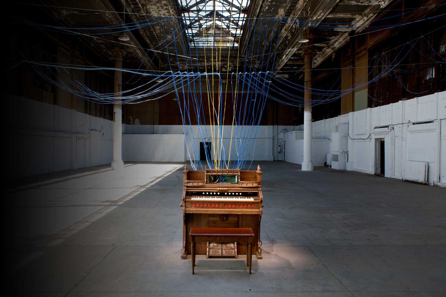
Playing the Building – David Byrne
Versailles Waterfall – Olafur Eliasson

The Hills, Governors Island, NYC

More Info | Profile of the Landscape Architect in the New Yorker