2.3 Geographies by Saine, Jonatan

I decided to follow the directions of this assignment using the front of my house as the starting point. It was pretty late at night, it was dark and cold, I had my two dogs with me as I was prepared to go on a long walk around my neighborhood, I knew that every left and every right will mean a street since I wouldn’t take a left or a right and land into a neighbors lawn, especially being late at night that would have been very suspicious! The duration of my walk took around 30 mins to complete from start to finish, however, since I ended up on the other side of my community, took me another 10/15 mins to walk back to my home.

I hope through my sketch I was able to illustrate the distance I walked, the path I took, and what I’ve seen along the way. One thing that I found challenging was “reversing” because it meant nothing for this exercise, or at the very least walking the distance I did and dealing with streets and major intersections like I have, so I took slightly modified “reverse” depending on the street I was in. Things didn’t get interesting until halfway of this exercise since the first half of this exercise was in my community or neighborhood I knew the area, it wasn’t anything different, lots of houses and trees around me, however, as soon as I left my area I started feeling anxious in a way that it wasn’t very comfortable, it could have been the surrounding that I wasn’t very familiarized with, or maybe how dark it was, or perhaps crossing a major intersection for the sake of this assignment and keep following directions.

An interesting observation was when I was on the other side of the intersection and was walking around this neighborhood were how nice the homes were, they looked new, big, and everything around me was clean, yet another and very interesting observation were the street names in that neighborhood were all about coffee related, some of the street names were; doubleshot, house blend, coffee bean, freshly brewed, smooth blend, french roast, etc. It made me smile, I felt silly by finding myself giggling and smiling about the different street names. Once I got the end of this assignment it was at the end of this neighborhood with funny names, however, on the way back to my house I think it is important to notate that I did not feel safe, I took this narrow back street that led me back to an area that I knew and was familiar, so I knew how to get home from there.

All in all I had a great experience doing this exercise and following directions, something I wouldn’t have done otherwise.


Looking Forwards: Map – Saine, Jonatan

New York Statues & Walking Map Brochure

Context and background: This is a map brochure that I created for my company with the intention to create a healthier environment for our patients. Because we just opened our first clinic in New York, and every single one of our rooms has a dedicated name to them (Room Plaques, you can view them here) with Central Park Statues as part of our theme for our decorations, we decided to create a brochure that not only emphasised and expanded on each of these statues and what they are, but also you could walk them to create a better engagement with the patient, not only that, but we’re promoting health and wellness by having you go out there and walk all of these. In the map itself, we illustrate how many steps (ish) it takes to go from one statue to the other, with some infographic information on the back of this map. I’ve included the original source file that I created in the footer of this post for reference.

Uniform Connectedness: 

By connecting the dots (footprints) throughout all of these landmarks/statues it promotes a visually appealing and easy to understand map as these are all connected from start to finish.

Readability: 

There’s not a lot of writing as this has been kept to a very minimum in purpose so that the illustration becomes the primary point of focus with the text to add support to the overall message. The statue names listed in a well-organized way on the bottom of the map suggest for easy to read and easy to find the status names with the statue number (photo).

Affordances: 

The perception of the environment of this map inevitably leads to some course of action, it provides cues that indicate the different possibilities for action. In this case is to ‘walk’ around the park following the park, counting the steps (or already counted for you) and visit the different statues.

Standardization: 

In this map I try to illustrate how standardized design can be important for better accessibility and understanding the artifacts illustrated in this brochure.

Repetition of color and line: 

Repetition of color, line and even patterns  is a technique that I thought it was important to illustrate how easy it is to navigate through the map, by connecting the circles to statues, footprints to steps, and lines that connect the different roads and streets throughout the park to make this a more intuitive and easy to navigate map.

You can view the original file here.

Strategy: Gradation

Gradation can be measured in several ways/formats depending on the field that is applied, for instance, in Art which varies how’s done in Photography, but they all refer to the same idea, or accomplishes the same result. Gradation in the old days mostly applied in Art was accomplish by adding different layers of different shades of color to transition to another color, this is the Gradation phase: gradually transitioning from one hue to another. But as many of us use it now, from photography to computer design software we use Gradation, or “halftone” which was developed in the late 19th century, which is a method of applying tiny little dots into an image through a film and this accomplished the Gradation process.

Visual Description: Source


(source: wikipedia.org/gradation. URL)

Visual Description: Online

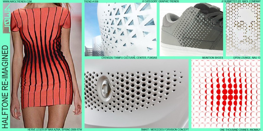
(source: awoltrends.com. URL)

Visual Description: Real Life


Photoshop: using the gradient tool to transition from one hue to another.

Strategy: Unity

Unity refers to the need to tie various elements together, whether that’s typography, illustration, etc to make it work together, as a group. Unity can be defined as the elements of a page that seem to fit together, that belongs together, a representation of a unified work.

There are a few ways to achieve Unity and that is through Proximity, Repetition, Continuation. Proximity refers to the objects appearing together, grouped together, or relatively close that make up this proximity area. The other is Repetition, which can be made up of colors, shapes, textures, etc, things that make this work together as a group. Lastly, we can Continuation, which is a subtle method of unifying a work that involves the continuation of lines, edge or direction from one area to another.

Visual Description: Source


(source: etad.usask.ca. URL)

Visual Description: Online

(source: pamelaplatt.com. URL)

Visual Description: Real Life

Strategy: Mapping

Mapping is the relationship between controls and their movement or effects. Mapping is about having a real relationship between the two they have in the world. That’s more of a technical way to describe mapping, but another way is to provide a personal experience. I can think of two: one) is the house switch control panel that controls all the lighting/power of the house, if these didn’t have a name next to these switches, oh boy, would we be in big trouble. 2) the lumbar control switches of my car. The photo below is not my car, but my car does have the same buttons as this image below. At least, when I first got into this car it took me a full minute probably to figure out the switches for the sear wherein the door. I thought to myself, why would a seat control be on a door? it makes no sense! Until I didn’t have to reach my hand down to the side of the seat to move my seat, or when I only had a barely lift my hand to completely rearrange the way that I was sitting. Without realizing and after several complaints (used to the old way), I’ve gotten used to the seat buttons in the door. They were easy to reach, easy to move, and everything made sense, even have one button designated for the lumbar, bottom, and height adjustment. Genious!

Visual Description: Source

Visual Description: Online


(source: designerliness.blogspot.com. URL)

Visual Description: Real Life


Strategy: Dominance

By definition, Dominance refers to the object or shape that is more dominant than the opponent shape. There are a few things that would make this a more dominant shape, starting with the overall visual weight, the greater its visual weight, the more an element will attract the eye and exhibit dominance, as well as creating dominance through contrast.

Visual Description: Source


(source: smashingmagazine.com. URL)

Visual Description: Online

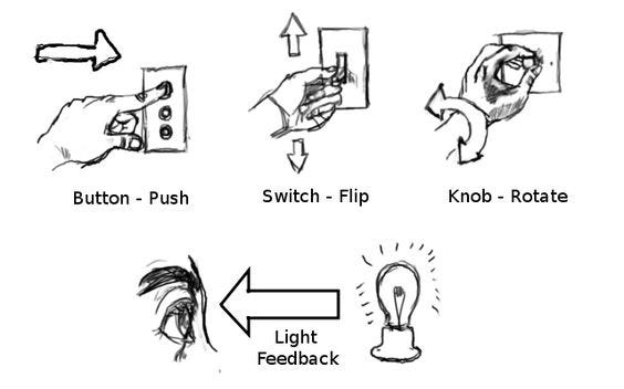
(source: techinfographics.com. URL)

Visual Description: Real Life

Strategy: Balance

Balance refers tot he idea of a design having an equal appearance or at least weighted equally, which can be very different from the latter. There are two world known ways of describing balance: symmetrical and asymmetrical. Symmetrical refers being weighted evenly on both sides, versus asymmetrical refers to being ‘different’ on one side (X or Y) from the opposite side.

Visual Description: Source

(source: graf1x.com. URL)

Visual Description: Online

(source: interaction-design.org. URL)

Visual Description: Real Life

Strategy: Errors

An action producing an unintended result. There are many Error taxonomies but two we’ll refer here are Slips and Mistakes. Slips refer to an action that was not what it was intended, and mistakes are purely intentional.

Visual Description: Source


(Universal Principles of Design, pg. 83)

Visual Description: Online

(uxplanet.org website: URL)

Visual Description: Real Life

Strategy: Archetypes

Archetype is the characteristics of a person. Because Archetype is believed to be mythical and through various channels of communications like movies, shows, brands, etc. we experience an Archetype, we just don’t know it because this type of experience is ‘hardwire’ in our brains.

Archetypes are found in the themes of myths (e.g., death and rebirth), characters in literature (e.b., hero and villain). (Universal Principles of Design, pg. 28)

Archetypes are believed to be unconscious patterns that have been hardwired into our brains over the course of human evolution. (“Doctordisruption, URL”). 

Visual Description: Source

Visual Description: Online

Visual Description: Real Life

The Chairs of Jonatan’s Life.

Kitchen Bar Stool: From time to time whenever time permits we get to sit down in these bar stools when hanging out around the kitchen area. Although, for me these a too tall, which then leads to being super tall (already 6.5ft as is), we frequently use these as a way to engage in a conversation, more relax, eye to eye, somewhat standing position which makes for a great quick conversational seating. However, the ones who use these bar stools the most are my kids: 3 and 6, they find these very fun to sit on as they have breakfast every morning in these stools, which makes them very functional for them.

Kitchen Banquette Bench: Although I won’t argue that this bench looks great in the kitchen but we find ourselves utilizing this bench to place items like, backpacks, lunch boxes, other random items because it makes it a perfectly convenient place to set items while going in and out of the kitchen, but it has a flat surface which makes it even more intriguing to set items in there. As for the seating, we rarely sit in here, not because we find it uncomfortable because of its wooden surface, but rather because it is not functional. You can sit to chat which someone is in the kitchen working away, or perhaps to put on your shoes, or something along those lines, but because behind the curtain is the window and a molding of the window/frame isn’t very comfortable to support your back on it, therefore we barely use this area as a seating area.

Couch; Entertainment Seating: in a way this couch is the main divider between the living room and the kitchen. With its soft pillows and padded seats, this makes it a very comfortable sitting area. This makes me feel relaxed, almost too relaxed, and it is very functional as more than one person can seat in this couch, whether to converse, or do some work on your laptop, this makes it an ideal place to seat. Sometimes the bottom cushions keep sliding down (away from the couch) and this makes it a frustrating moment where you have to keep pushing those in, so this type of couch even makes you feel an emotion, so you think about how to seat, and what the consequences might be if you’re there for a long time or if you move around. Very comfortable nonetheless.

Living Room Chairs:  These chairs remind me of the bucket seats of a racing car due to its side-backrest and armrest pieces that secure you in place, almost like you can’t move. It is fair to say that I’m 6.5ft tall, so to me this isn’t the first choice of seating if I want something comfortable, but rather it makes you feel some sense of power if you may, like you’re the host of the party, or maybe because of the very tall backrest it resembles the chair from Game of Thrones, which suggests a high power, or something. For me, I find myself using these chairs when I’m wanting to seat upright/straight, and want to be focused, although the cushion is very comfortable, the backrest doesn’t have much padding, which leads to my point above, to sit up-right.

Patio Chair: This patio chair is located in the back part of my house, I have two of these chairs are make for great seating, these are very comfortable, big, but not too heavy, easy to move around, and good overall chairs. The bottom part though, is very deep (from the front of the chair to the backrest of the chair), so if you’re a bit short, then you will have to sit all the way back, which would probably lead to hanging feet, if that’s your thing, then go for it! I use these types as much as possible, whenever outside with my kids or socializing. This chair is functional for what is meant to do, it has metal armrests, and the cushions are very padded. One thing is that the backrest isn’t very tall, so if you want to rest your head…well, good luck with that.

Vehicle Seat:  the driver and passenger seat of one of my cars. I purposely chose this car vs the other one because this is my wife’s main car, its main purpose is to take you to and from work, is not very big compared to our other SUV vehicle, but it is functional indeed.

Things that I love: It offers a high headrest for a smaller vehicle, it is leather and is very easy to clean, the lumbar controls are located in the door which is very easy to access the controls rather than being next to the seat.

The thing that I hate (though that’s a harsh word): I don’t like that this seat doesn’t go lower than proposed, and me being tall it is easy to reach the top with my head.

Dining Table Chair: I find this chair to be practical, it serves most of the functions of seating, any purpose, any relationships you may have with a chair, you can do with this one. This chair is very functional because I use it to eat with the family, I use it to work from time to time, I use it to do my school work,  use it to engage in a conversation, or simply to visit with someone. It is comfortable, offers nice padding, nice padded backrest, and is tall enough where you can either keep your feet on the ground or even big enough where you can put your feet up.

Home Office Chair: This is where I spend most of the time/day, seating in this chair, but I don’t mind it because it is by far the most comfortable chair I have. But is it a ball? Well, its a ball inside a frame with a back support, all you need to do is sit and relax and the ball does the rest. As we read in the book 1000 chairs, it mentions “The timeless problem associated with this physical relationship is that however much a chair seat may be softened, the pressure of the bone will eventually be felt on the flesh of the buttocks as uncomfortable”. This is exactly why I have this chair because the ball takes the pressure away from my bone/flesh/body. This is a very comfortable chair, it makes me feel awake, it makes me feel alert, it makes me feel like I’m contributing to my body’s health.


An Object Jonatan Loves, An Object Jonatan Hates

I find this to be a difficult thing to find artifacts that we ‘love’, I’m not sure whether its love, affection, passion or being obsessed about something. I think I find myself surrounded by things that I enjoy, things that I like to have, or perhaps I find myself surrounded by artifacts that have cool affordances, and this one is not the exception. Our Fridge has an affordance that I find myself geeking every time I play with it, but is it really playing?

This LG fridge has a door that offers almost an entire glass door, so it suggests that is there for a reason, it serves a function, it mapped the user to lead to wanting to do an action, perhaps touch it? which I find it very interacting and fascinating at the same time; I get to see what’s inside just with a tap? Not to mentioned that growing up I had a fridge that I had to pull with both hands and kick it on the side so that it would open the door, this has taken it to a new level. The affordance of this fridge is that it offers a simplistic and interacting way of peeking what’s inside the fridge. Not only does it provide a clue about what to do, in this case just touch/tap the glass door, but it offers a physical characteristic that influences its function.

This, I love very much, more like border like affection.

An object that I hate is my dishwand holder. This ceramic looking artifact contains a visual feedback of three different openings where one supposedly places the dishwand after use.

Because this is a frequently repeated stimulus, or habitation,  one doesn’t think about the physical contrains this artifact lacks of. As you can visualize from the photo (sorry not the best photo) the dishwand leans to the side of the holder, or outside of the holder, what that means is when one is done washing dishes you immediately respond to setting it in there while one is doing other things, or perhaps it is left there once dishes are done, the problem with this is the dripping and mess that it leaves after a few minutes. Which, I appreciate how modern, clean and elegant it looks, but it lacks from the very fundamental functionality that this is supposed to achieve, which is ensure whether the dishwand is upright so it drips into the holder, or only make one opening so the dishwand drips inside the sync and not onto the counter with the other two openings to the side.