
- 3-Step Rule: Creating quick navigation paths across an interaction. (Shilpa Tripathi)
- 80/20 Rule: concept that in a complex system, a large percentage of the effects are caused by a small percentage of the variables. (Francis Rodrigues)
- Accessibility: The measure to which a design is created to be used by the most users who represent the widest variety of abilities. (Maria Haynie)
- Add Value, Not features: Design that posses quality wins over design that provides entertainment or excessive options. (Shilpa Tripathi)
- Advance Organizer: Instructional strategy in design that is used for users’ to understand and learn new concepts. (Shreya Gupta)
- Aesthetic-Usability Effect Good aesthetics promote the perception and thus actualization of fluid user interaction. (Sarah Murray)
- Affordance: The design of an object or space directly informing how it will be used. (Michelle Chin)
- Alignment: Elements in a design should line up for cohesiveness – rows, columns, or angles. (Jennifer Du)
- Anthropomorphic Form: Humans have tendency to perceive certain forms that areas humanlike, – typically as such resembling ae faces and or body. (Miyuki Takazono)
- Anti-Affordance: Design that prevent of an action or interaction. (Davidson)
- Area Alignment: Aligning the objects based on the area, shape, and visual-weight, instead of aligning to the edges of the objects, such as center-based or edge-based align. (Jeff Chen)
- Archetype: An innate, subconscious bias that informs a person’s opinion or perception of something based on the accepted stereotype and elicits a specific, set emotional reaction (Mia Itri)
- Archetypes: Archetype is the characteristics of a person. We experience an Archetype frequently, but we just don’t know it because this type of experience is ‘hardwire’ in our brains (we don’t think about it). (Jonatan Saine)
- Assume that the user is as smart as you and cares as much about the task.Users deeply understand their needs in the task, and the system should respect that understanding by providing a balance of simplicity of use without restricting information or adding unnecessary constraints. (Sarah Murray)
- Attractiveness Bias: Attractive people are perceived to be more socially desirable than unattracted unattractive people. (Miyuki Takazono)
- Axis: An imaginary line used to organize a group of elements in a design, about which forms and spaces can be arranged in a balanced or symmetrical manner. (Cindy Lee)
- A Uniform Story: Keeping the narrative of design consistent. (Shilpa Tripathi)
- Baby-Face Bias: Humans perceive people and things that are have baby-like features have baby-like traits – , such as naïvenaivety, helplessness, and honesty. (Miyuki Takazono)
- Balance: Balance refers to the idea of a design having an equal appearance or at least weighted equally. (Jonatan Saine)
- Balance of Color: Balance of color is a technique utilizing color theory with the color wheel in order to adjust the intensities of the colors for photography, paintings, interior design, industrial design, etc. (Manuel)
- Be Lazy Like the Fox: Don’t start from scratch, see what is out there and use it for your design. (Juan Flugelman)
- Beauty is due more to harmonious relationships among the elements of a composition than to the elements themselves: The beauty of a design is related to the harmony of its components. (Shirin Davoudpour)
- Biophilia Effect: Environments that evoke rich sensory experiences related to nature help improve concentration, reduce stress and improve healing and recovery. (Michelle Chin)
- Brevity: Being concise and exact on how you communicate to your user (Amin Rashidifar).
- Cathedral Effect: The use of ceiling height to influence how people think. (Calvin Lin)
- Chunking: Impart a lot of information in a digestible format. (Paul Tutty)
- Clarity: Design that communicates clearly, without encumbering the viewer with too many, too few or convoluted options. (Shilpa Tripathi)
- Classical Conditioning: the repeated use of certain images or stimuli in order to stimulate a habitual unconscious response. (Calvin Lin)
- Clear: To properly address the user, you have to present the content in a way that makes a logical connection between users’ expectations and your content. (Juan Flugelman)
- Closure: Deriving from Gestalt principles of perception, elements in proximity are perceived subconsciously as the whole. (Jennifer Du)
- Cognitive Dissonance: The discomfort a person might feel when they are holding opposing thoughts. (Katherine Cheng)
- Color: The use of color to reinforce the impact of a design/meaning with consideration to number, combinations, saturation and cultural symbolism of color.(Mia Itri)
- Color theory provides a framework for understanding the behavior and meaning of colors: Color theory means to combine and mix different colors to provoke specific thoughts, feelings and emotions. (Shirin Davoudpour)
- Common Fate: The principle of common fate—one of the Gestalt principles of perception—recognizes elements moving in the same direction. (Youngri Kim)
- Comparison: A method of illustrating relationships and patterns in or between systems or objects. (Joyce Xu)
- Conceptual Modeling: A Conceptual Model is a simplified explanation of how something works. by applying a familiar analogy(s) or system to a new system. (John Delshadi)
- Confirmation: A technique that is used to verify a user’s actions, to ensure the input is intentional and correct (Shreya Gupta)
- Constancy: Tendency to see objects as constant and unchanging, even though there are changes in the lighting, color,sizeand perspective. (Shreya Gupta)
- Contrast: Creating space and difference between components in your design (Amin Rashidifar).
- Control: A design principle which states the importance of customization,user friendliness, and control for both new users’, as well as experienced users’. (Shreya Gupta)
- ConsistencyConsistencyallows a user to learn the function or meaning of a feature and navigate future instances intuitively. (Sarah Murray)
- Constraint: This design strategy limits the actions that a user takes, either through physical constraint or psychological constraints. (Maria Haynie)
- Contour Bias: Describes the preference for things that are rounded (have contours) vs things that have sharp angles. (Katherine Cheng)
- Convergence: the process when similar characteristics or strategies evolve together in a system or environment. (Calvin Lin)
- Cost-Benefit Users will choose to use a tool based on whether the effort to learn andand effectivelyuse a tool is proportional to the value it brings to their task. (Sarah Murray)
- Cost Benefit: From a financial or operational perspective, this strategy refers to the ROI (return on investment). What will we gain by spending on this feature or function? (Juan Flugelman)
- Curiosity: Designers’ ability to embrace unknowns and serendipity in the process of creating a design, and a design technique used to drive user behaviors, generateexcitement,and provide motivations. (Jeff Chen)
- Defensible Space– Defined space to convey ownership and sense of safety in order to deter crime in the form of territoriality, surveillance and symbolic barriers. (Mia Itri)
- Denial and Reward– Creating an experience through a journey by guiding a user and briefly hiding and exposing end goals. (Gilberto Cardenas)
- Depth of Processing– Using memory techniques to learn deeply and more efficiently recall at a later time. (Gilberto Cardenas)
- Design by Committee: A process where design is taken into consideration by a group and decisions are made by the group. (Amit Barot)
- Design with models: Using 3D models can help a designer to understanding his/her design better in new ways and angles. (Shirin Davoudpour)
- Desire Line: A path worn by the natural walking pattern preference of people in a certain area off of the designated path or sidewalk, most often in order to form a shortcut between one point to another. (Mia Itri)
- Development Lifecycle: Development Cycle describes the four stages involved insoftwareproduct (Requirements, Design, Development, and Test). (Amit Barot)
- Discoverability: The human ability to determine what actions are possible to achieve with the object and where and how to perform them. (Cindy Lee)
- Dominance: Focal point of the design. The area of the design your eye get’s drawn to. (Amin Rashidifar).
- Dominance: By definition, Dominance refers to the object or shape that is more dominant than the opponent shape. (Jonatan Saine)
- Dunning-Kruger Effect: A tendency for unskilled people to overestimate their competence and performance. (Gary De La Cruz)
- Efficiency: The ability to intelligently help users accomplish their goals while minimizing the waste in time, energy, cost. (Jeff Chen)
- Emphasis: A strategy that aims to draw the viewer’s attention to a specific design element through visual reinforcement. (Cindy Lee)
- Entry Point: The initial impression of a design upon it’s physical or virtual entrance. (Amit Barot)
- Errors: An action producing an unintended result. There are many Error taxonomies but two we’ll refer here are Slips and Mistakes. Slips refer to an action that was not what it was intended, and mistakes are purely intentional. (Jonatan Saine)
- Expectation Effect:Psychologicalphenomenon which states that behavior and perception change based on personal expectations, and/or expectations from others. (Shreya Gupta)
- Exposure Effect: A phenomenon in which repeated exposure to something can increase a person’s positive attitudes towards it. (Katherine Cheng)
- Face-ism: The ratio between the amount of the subject’s head and the amount of a subject’s body that is showing in a particular image. (Maria Haynie)
- Factor of Safety: The factor of safety principle is about a system’s degree of flexibility during regarding the preparation for structural uncertainty in error conditions. (Youngri Kim)
- Fail Fast: There is something to be learned from every failure. Each iteration can yield useful idea that can be used in future iteration of design or inspire future innovations
- Feedback: A signal that something has occurred after an interaction with an object, and sends information back to the user about what action has been done and what result was accomplished. (Cindy Lee)
- Feedback Loop : Feedback is defined as the information gained about a reaction to a product, which will allow the modification of the product. (Anuja Upadhye)
- Five Whys: The five ways method attempts to understand underlying causes. Analysis often stops at the first explanation, by asking five whys we continue exploring and understanding new layers of our design challenge. (John Delshadi)
- Figure-Ground Relationship: states that humans perceptually separate stimuli into figure or ground, wherein elements are perceived as eitherfigures(distinct elements of focus) or ground (the background or landscape on which the figures rest). (Anuja Upadhye)
- Fitt’s Law: As the distance increases,movementtakes longer and as the size decreases selection again takes longer, more errors will occur reaching the target due to speed-accuracytrade off.(Anuja Upadhye)
- Flexibility Usability Tradeoff: As flexibility increases, usability decreases. (Davidson)
- Fibonacci Sequence: The Fibonacci sequence principle refers to a special number sequence in which the sum of the preceding two numbers becomes the next number. (Youngri Kim)
- Findability: Content should be easy to locate with little effort. (Juan Flugelman)
- First Impressions: In this digital world where you can download and delete an app in a matter of seconds first impressions are everything (Amin Rashidifar).
- Five Hat Racks: Organizing information is easy when you apply these 5 different methods, popularly coined as “LATCH” (Location, Alphabet, Time, Category, Hierarchy) (Jennifer Du)
- Five Whys : Analysis often stops at the first explanation, by asking five whys we continue exploring and understanding new layers of our design challenge. (John Delshadi)
- Forgiveness: Helping people prevent errors, minimize consequences, or correct their mistakes with warnings, confirmations, help/assistance, or safety nets. (Davidson)
- Form Follows Function: There are 2 interpretations of this, descriptive and prescriptive. (Shreya Gupta)
- Descriptive: A good design results from the simplicity/intuitiveness of the function.
- Prescriptive: The design should come second to the actual function of the system.
- Frame a view, don’t merely exhibit it: A designer can achieve more dramatic and rich experiment by carefully farming a view rather than simply providing the view. (Shirin Davoudpour)
- Framing: Change or enhance people’s viewpoints by manipulating the information in a negative context. (Davidson)
- Freeze-Flight-Fight-Forfeit: The principle of Freeze-Flight-Fight-Forfeit is about the sequential responses expressed when people confront danger. (Youngri Kim)
- Gamification: Taking elements ofgame playand applying it to designing other systems, typically used to encourage engagement and motivation of product or service. (Shreya Gupta)
- Garbage In – Garbage Out: the quality of the outputs will depend on the quality of the inputs. Good data going in, good data coming out. (Francis Rodrigues)
- Good Continuation: Elements aligned in lines or curves are perceived as a group, and are considered more related than unaligned elements. (Miyuki Takazono)
- Golden Ratio: If you draw a line of a certain length a, and divide it into two parts b and c where b is bigger than c, so that a / b = b / c, then that ratio is the golden ratio. (Anuja Upadhye)
- Gradation: Gradually transitioning from one hue to another. (Jonatan Saine)
- Gutenberg Diagram:The Gutenberg diagram describes a general pattern the eyes move through when looking at evenly distributed content stimuli. (Anuja Upadhye)
- Harmony: You can achieve harmony in your design when you effectively combine unity and variety in one design (Amin Rashidifar).
- Hick’s Law: The amount of timeis takesto makea decision increasesas the options available also increase. (Michelle Chin)
- Hierarchy Hierarchycreates an intuitive order of information thatreflectits importance and relative utility to the user and organizes complexity into an accessible system. (Sarah Murray)
- Hierarchy of Needs: Good design needs to meet prioritized standards thatincludesfunctionality, reliability, usability, proficiency, and creativity. (Jennifer Du)
- Highlighting: Refers to taking action to direct attention to a specific thing, word, or image. (Katherine Cheng)
- Horror Vacui: The fear of white or negative space. (Michelle Chin)
- Hunter-Nurturer Fixations: This design principle references the biological behaviors of boys and girls to have interests that align with hunter and nurturer characteristics, respectively, during early childhood. (Maria Haynie)
- Iconic Representation: A way to impart information through simple imagery and symbols. (Paul Tutty)
- IKEA Effect: a cognitive bias that increases the perceived value of something because the user has a hand in making it. (Paul Tutty)
- Immersion: a state of being in which mental focus is so intense that losing the individual loses a sense of reality (Miyuki Takazono)
- Inattentional Blindness: The inattentional blindness principle refers to the phenomenon or situation in which the location of the object a person’s eyes are set on cannot be perceived due to lack of attention. (Youngri Kim)
- Inclusivity and Accessibility: This strategysuggestthat everything we do must be able to reach and accommodate as large a group as possible (Juan Flugelman)
- Interference Effect: A phenomenon that occurs when mental processing is made slower due to two or more contradicting things. (Joyce Xu)
- Inverted Pyramid: The inverted pyramid is a method of sharing information where the most important information is presented first and the rest is presented in descending order of importance. (Amit Barot)
- Iteration: Iteration is the concept of repeating a set of actions or procedures to achieve a preferred result. (Amit Barot)
- Latency Reduction: Optimize a design to reduce the response time between the system and a user interaction, whendelayis inevitable don’t ignore it, handle it by keeping the user informed. (Gary De La Cruz)
- Law of Pragnanz: The tendency of humans to simplify convoluted, complex shapes by perceiving them as single, simplified and unified shape (by perceptually removing extraneous detail from these shapes). (Anuja Upadhye)
- Layering: the process of grouping together related information to manage complexity and to show relations between the information. (Calvin Lin)
- Leading Lines– Using lines to guide the viewer’s eyes. (Gilberto Cardenas)
- Legibility: The visual clarity of text in the following elements: size, typeface, contrast, text blocks and spacing. (Jennifer Du)
- Less is a bore: We can make a simple and boring design fascinating by adding more decoration, symbolism, color, and interesting patterns. (Shirin Davoudpour)
- Less is more: This Strategy imply and emphasis the beauty of simplicity. (Shirin Davoudpour)
- Life Cycle: stages of a product’s existence: introduction, growth, maturity, and decline. (Francis Rodrigues)
- Lighting: Lighting is used as a design strategy to addthree dimensionaldepth to a product, as well as to create a feeling for a theatrical scene, product showroom, architectural structures, etc.
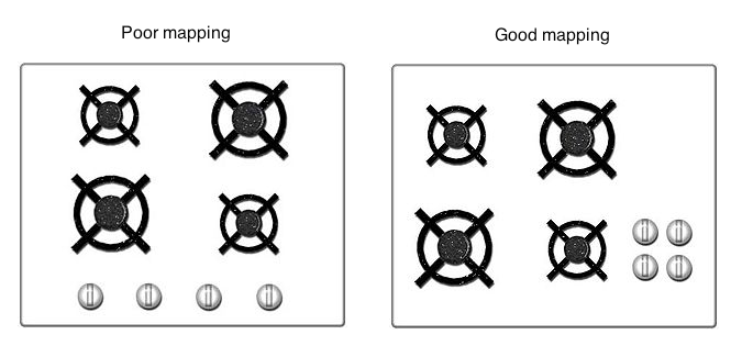
- Mapping: The way that controls and their movements or effects (what they do) are related to one another. (Mia Itri)
- Mapping: Mapping is the relationship between controls and their movement or effects. Mapping is about having a real relationship between the two they have in the world. (Jonatan Saine)
- Mental Model: People understand and interact with the world and their environment based on their previous experiences. (Shirin Davoudpour)
- Mimicry: The use of something that is familiar to other people, in order to reap the benefit of that recognition. (Paul Tutty)
- Mnemonic Device: Techniques to reorganize and/or group information to help make it easier to remember. (Michelle Chin)
- Modularity: Modularity is a system management method which that involves managing a large and complex system by dividing it into multiple and self-contained systems. (Miyuki Takazono)
- Moral Design: “Design affects society” as such, designers must consider the impacts of their design on society. (John Delshadi)
- Most Advanced Yet Acceptable: A design that is unique, desirable, obvious and yet has pragmatic appeal. (Amit Barot)
- Most Average Facial Appearance Effect: Study shows that most people are attracted to a face that looks average than a face that looks unique. (Amit Barot)
- Movement: A way of combining the art elements to produce the look of action, giving some elements the ability to be moved or move on their own, or to cause the viewerʼs eye to sweep in a certain manner or direction. (Cindy Lee)
- Negative Space: The empty space around the elements in your work, it deals with what you don’t add to your design (Amin Rashidifar).
- Normans Seven Stages of Action: Breaks downactioninto execution and evaluation in relation to goals of the user and the world in which actionsoccurs, this model to “provide a framework to understand “human action” and works to “guide design.” (John Delshadi)
- Normal Distribution-Bell shapedcurve representing average and extreme values of human characteristics, such as height, weight, and age. (Gilberto Cardenas)
- Not Invented Here: The idea that whatever our team does is better than anybody else. Refers to the fear of others being betterthe us, so just in case, all ideas are dismissed. (Juan Flugelman)
- Nudge: Encourages action or behavior with defaults, reminders, incentives, feedback, and visible goals. (Davidson)
- Ockham’s Razor: The idea that simplicity is preferred to complexity. (Joyce Xu)
- Operant Conditioning: A design principle used to motivate desired behaviors by rewarding or punishing the users based on their actions. (Jeff Chen)
- Orientation Sensitivity: visual processing phenomenon in which certain line orientations are more quickly and easily processed from other lines. (Francis Rodrigues)
- Performance Load: The amount of effort, both physically and mentally, required for someone to accomplish a specific task. (Jeff Chen)
- Performance Versus Preference: Designs created for optimal performance thatareoften not chosen because of personal preference based on a number of different, individual factors such as familiarity of aesthetic preference over the desire for improved performance. (Mia Itri)
- Personas: techniqueused to create user profiles of one or more archetype of users with the objective of learning and describing one’s interests and other relevant behaviors. (Francis Rodrigues)
- Picture Superiority Effect: Pictures are more recognizable and memorable than words. (Joyce Xu)
- Priming: Use of stimulus, image, sound, smell, touch, and words, to influence behavior. (Davidson)
- Principle of Least Astonishment A feature should function in a manner consistent with the user’s expectation. (Sarah Murray)
- Progressive Disclosure: strategyto manage complexity in user interfaces by showing only relevant information and allow users to explore further options as they become more advanced. (Francis Rodrigues)
- Proportion: The relationship of various elements in a design and the relative size and scale of how they compare with one another. (Cindy Lee)
- Propositional Density: Refers to the relationship between design elements and the meanings they convey, withhighpropositional density corresponding to more pleasurable and interesting designs. (Katherine Cheng)
- Prospect-Refuge: An environmental preference that provides an open, visible environment with areas that provide a concealed space to retreat when wanted/needed. (Mia Itri)
- Prototyping: Prototyping is the idea of creating and using a low-fidelity, medium-fidelity or high-fidelity simulated and incomplete model of a design for the main purpose of testing functionality, verifying specifications and verifying requirements.
- Proximity: Elements that are closer together are perceived as related. (Joyce Xu)
- Readability: A measure of how easily understood the concepts are based on the words they’ve been presented in. (Maria Haynie)
- Recognition Over Recall: It is easier to recognize things that we have experienced earlier than having to recall those from memory. (Anuja Upadhye)
- Red Effect: setof triggers (cognitive and behavioral) evoked by the color red.The perception that the color red can be perceived as more attractive and/or dominant. (Francis Rodrigues)
- Redundancy: Redundancy is the use of excessive elements to prevent a system failure. (Calvin Lin)
- Reliability/ Building Trust: Using design experiences to foster trust by being reliable, having transparency and following-through with promises. (Shilpa Tripathi)
- Repetition of color and line Repetition of color and/or line in design is a technique that is often utilized indesign.
- Root-cause Analysis: Conducting a Root-cause Analysis involves working to find multiple sources of “err” instead of a single course of error, this strategy helps to build a holistic picture of the incident or design problem. (John Delshadi)
- Rosetta Stone: A method of communication by unlocking and decoding new information through the use Conducting a Root-cause Analysis involves working to find multiple sources of “err” instead of a single course of error. This strategy helps to build a holistic picture of the incident or design problem.of elements of common understanding. (Gary De La Cruz)
- Rule of Thirds:An aesthetictechnique that optimizes a composition by using a grid to divide into thirds. (Jennifer Du)
- Rhythm– Perceived movement or harmony created from repeated patterns or forms. (Gilberto Cardenas)
- Satisficing: Settling for a satisfactory result rather than laboring in pursuit of the ideal or ‘perfect’ solution. (Michelle Chin)
- Savanna Preference:Describes a theory of human preference for environments that are open, have depth, are uniformly grassy though with scattered trees. (Katherine Cheng)
- Scaling Fallacy: People believe, wrongly, that something at a certain size will automatically work at a different size (bigger or smaller). (Paul Tutty)
- Scarcity: Increase the desirability of an object by indicating supply is limited or has a time constraint. (Davidson)
- Self-Similarity: An object or thing that is exactly or approximately similar to a part of itself. (Joyce Xu)
- Serial Positions Effect: The first and last items in a list or group are more likely to be remembered. (Maria Haynie)
- Shaping: a technique in which a complex behavior is taught by reinforcing simpler sub-behaviors. (Calvin Lin)
- Signal-to-Noise Ratio: The amount of useful vs. non-useful information in design. (Jeff Chen)
- Signifiers: The properties of an artifact, device or system that communicate to the user specifically where interactions should take place within the design. (Gary De La Cruz)
- Simplicity: Creating designs that reduce complexity. (Shilpa Tripathi)
- Similarity: Things that are closer together, or with a similar look and feel, are often interpreted as similar in nature, such as functionality, shapes, colors. (Jeff Chen)
- Standardization: reatingstandards can be greatly beneficial, they can promote good, accessible design. In manycasesstandards can discourage silos of innovation and incentivize interoperability. (John Delshadi)
- Stickiness: Specific strategies used to make ideas or expressions especially memorable: simplicity, surprise, concreteness, credibility,emotionand story. (Jennifer Du)
- Storytelling: A story is a short exchange of information and ideas between a storyteller and an audience. (Manuel)
- Structural Forms: An arrangement of organized elements in an object or system. (Joyce Xu)
- Style: The sense of style is the appearance, sight, touch or smell that gravitates an individual to a physical or digital product.
- Sustainable Development: Design based on criticalenquiryand backed by conscience. (Shilpa Tripathi)
- Symmetry: Symmetry creates balance, harmony, and stability in design. It is considered the most basic aspect of beauty. (Miyuki Takazono)
- Threat Detection: Threatening things are detected more efficiently thannon threateningthings. (Gary De La Cruz)
- Three-Dimensional Projection: The principle of three-dimensional projection allows users to perceive as if the design is three-dimensional by utilizing a variety of visual cues. (Youngri Kim)
- Three Levels of Knowing– Clearly understanding simple and complex systems and seamlessly connecting them to create informed simplicity. (Gilberto Cardenas)
- Top Down Lighting Bias: Design things to appear as if lit from above, or even from the top left, to avoid looking unnaturally lit. (Maria Haynie)
- Uncanny Valley: The uncanny valley principle is about the emotions humans feel toward robots or other non-humans. (Youngri Kim)
- Uncertainty Principle: Measuring things can sometimes alter system behavior and performance enough to make the measurement invalid. (Gary De La Cruz)
- Uniform Connectedness: Things connected by lines or boxes are perceived as more related than things not connected. (Gary De La Cruz).
- Unity: Unity refers to the need to tie various elements together, whether that’s typography, illustration, etc to make it work together, as a group. (Jonatan Saine)
- Unity: Unity gives a sense of oneness to a visual image and gives the design a theme (Amin Rashidifar).
- Variety: A way of combining visual elements in involved ways to achieve intricate and complex relationships. (Cindy Lee)
- Veblen Effect: A product is attractive and valuable to consumers because of its high price. (Michelle Chin)
- VisibilityVisibilityprovides the user feedback that reveals what can happen, what has happened and what is happening. (Sarah Murray)
- Visuospatial Resonance: is when an image takes advantage of how people’s perception change due to their distance from the image. (Calvin Lin)
- von Restorff Effect: Describes how people are often more likely to remember details and things that are noticeably different, rather than remember common things. (Katherine Cheng)
- Wabi-Sabi: An aesthetic principle based on the amalgamation of two Japanese aesthetic concepts:wabi, meaning “things that are fresh and simple,” andsabi, meaning “things whose beauty steam from age. (Paul Tutty)
- Waist-to-Hip Ratio: Refers to the penchant to find a specific ratio of waist and hip attractive. (Paul Tutty)
- Wayfinding: Wayfinding is the process of a user getting from one place to another utilizing an understanding of his/her spatial area and environment.
- Weakest Link– Safety mechanism to minimize damage and protect more important elements. (Gilberto Cardenas)
Deleted Media, November 5
On November 5, I sorted the media by file size and deleted the files listed on the first five pages. Below are screenshots of the affected files.
Note that because these screenshots have been resized according to the instructions (ideally less than 100kb, and absolutely less than 200kb) they do not zoom well. If you want to include dense files like this in your posts—and there are many cases, such as your final Project 2 maps, where you will want to—please use a file sharing service. For example, click here to download the full resolution versions of these files.


Strategy: Gradation
Gradation can be measured in several ways/formats depending on the field that is applied, for instance, in Art which varies how’s done in Photography, but they all refer to the same idea, or accomplishes the same result. Gradation in the old days mostly applied in Art was accomplish by adding different layers of different shades of color to transition to another color, this is the Gradation phase: gradually transitioning from one hue to another. But as many of us use it now, from photography to computer design software we use Gradation, or “halftone” which was developed in the late 19th century, which is a method of applying tiny little dots into an image through a film and this accomplished the Gradation process.
Visual Description: Source

(source: wikipedia.org/gradation. URL)
Visual Description: Online
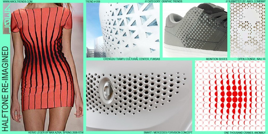 (source: awoltrends.com. URL)
Visual Description: Real Life

Photoshop: using the gradient tool to transition from one hue to another.
Strategy: Unity
Unity refers to the need to tie various elements together, whether that’s typography, illustration, etc to make it work together, as a group. Unity can be defined as the elements of a page that seem to fit together, that belongs together, a representation of a unified work.
There are a few ways to achieve Unity and that is through Proximity, Repetition, Continuation. Proximity refers to the objects appearing together, grouped together, or relatively close that make up this proximity area. The other is Repetition, which can be made up of colors, shapes, textures, etc, things that make this work together as a group. Lastly, we can Continuation, which is a subtle method of unifying a work that involves the continuation of lines, edge or direction from one area to another.
Visual Description: Source

(source: etad.usask.ca. URL)
Visual Description: Online
 (source: pamelaplatt.com. URL)
Visual Description: Real Life

Strategy: Mapping
Mapping is the relationship between controls and their movement or effects. Mapping is about having a real relationship between the two they have in the world. That’s more of a technical way to describe mapping, but another way is to provide a personal experience. I can think of two: one) is the house switch control panel that controls all the lighting/power of the house, if these didn’t have a name next to these switches, oh boy, would we be in big trouble. 2) the lumbar control switches of my car. The photo below is not my car, but my car does have the same buttons as this image below. At least, when I first got into this car it took me a full minute probably to figure out the switches for the sear wherein the door. I thought to myself, why would a seat control be on a door? it makes no sense! Until I didn’t have to reach my hand down to the side of the seat to move my seat, or when I only had a barely lift my hand to completely rearrange the way that I was sitting. Without realizing and after several complaints (used to the old way), I’ve gotten used to the seat buttons in the door. They were easy to reach, easy to move, and everything made sense, even have one button designated for the lumbar, bottom, and height adjustment. Genious!
Visual Description: Source
Visual Description: Online

(source: designerliness.blogspot.com. URL)
Visual Description: Real Life

Strategy: Dominance
By definition, Dominance refers to the object or shape that is more dominant than the opponent shape. There are a few things that would make this a more dominant shape, starting with the overall visual weight, the greater its visual weight, the more an element will attract the eye and exhibit dominance, as well as creating dominance through contrast.
Visual Description: Source

(source: smashingmagazine.com. URL)
Visual Description: Online
 (source: techinfographics.com. URL)
Visual Description: Real Life

Strategy: Balance
Balance refers tot he idea of a design having an equal appearance or at least weighted equally, which can be very different from the latter. There are two world known ways of describing balance: symmetrical and asymmetrical. Symmetrical refers being weighted evenly on both sides, versus asymmetrical refers to being ‘different’ on one side (X or Y) from the opposite side.
Visual Description: Source

(source: graf1x.com. URL)
Visual Description: Online

(source: interaction-design.org. URL)
Visual Description: Real Life

Strategy: Errors
An action producing an unintended result. There are many Error taxonomies but two we’ll refer here are Slips and Mistakes. Slips refer to an action that was not what it was intended, and mistakes are purely intentional.
Visual Description: Source
(Universal Principles of Design, pg. 83)
Visual Description: Online
(uxplanet.org website: URL)
Visual Description: Real Life

CC Tennis: Davidson and Jeff
Strategy: Archetypes
Archetype is the characteristics of a person. Because Archetype is believed to be mythical and through various channels of communications like movies, shows, brands, etc. we experience an Archetype, we just don’t know it because this type of experience is ‘hardwire’ in our brains.
Archetypes are found in the themes of myths (e.g., death and rebirth), characters in literature (e.b., hero and villain). (Universal Principles of Design, pg. 28)
Archetypes are believed to be unconscious patterns that have been hardwired into our brains over the course of human evolution. (“Doctordisruption, URL”).
Visual Description: Source

Visual Description: Online

Visual Description: Real Life

Strategy: First impressions
In this digital world where you can download and delete an app in a matter of seconds first impressions are everything. Designs should be engaging from the very first moment the user sees it. Most importantly for digital products don’t hide your most important/engaging feature behind a registration screen. A person interacting with your interface is not that different from them interacting with you for the first time. You want to make users feel comfortable when you first meet them, you want them to feel good, you want to be attractive and appealing. You want the users to image themselves with your product for a long time. Imagine the feeling you get when your opening up a new iPhone vs. opening up a home router. Source
First impressions: Source

First impressions: Online

First impressions: Real life

Strategy: Brevity
Most people don’t have time to read through your whole page of instructions of how to use your new app. You must be concise and exact on how you communicate to your user. You must streamline the message your communicating as much as possible without having negative ramifications in accomplishing the goal. A way to be direct when you have a lot to communicate is to give examples. A well-chosen example can often replace several paragraphs of explanation. Even more important places to use this principle is on mobile interfaces where space is limited and landing pages where you want to catch the users attention. Source
Brevity: Source

Brevity: Online

Brevity: Real life

Strategy: Dominance
When we talk about dominance in terms of design we’re speaking about the focal point of the design. The area of the design your eye get’s drawn to. Usually the first thing you see in a design is the dominant design feature. An effective designer can guide their user through their design by using the dominance principle. This an effective way to show the entry way to the design and also an effective way to show the user what you (the designer) deem as important. Dominance can be achieved through size, density, color and whitespace. Source
Dominance: Source

Dominance: Online

Dominance: Real life

Strategy: Contrast
Contrast creates space and difference between components in your design. A good design that wants to draw focus to a certain element has a background color considerably different from the element that seeks attention. This is significantly important when it comes to type and the ability for your type to be readable and pass accessibility. The element that pops from the screen is usually the element that has the highest contrast. Source
Contrast: Source

Contrast: Online

Contrast: Real life

Strategy: Confirmation
Confirmation is a technique for preventing unintended actions by requiring verification of the actions before they are performed. The use of confirmations help to minimize errors in the performance of critical or irreversible operations.
Example in Original Source:

Source: Universal Principles of Design
Example in Different Source:

Source: Dribbble.com
Real World Example:

Source: Screenshot from my iphone
Strategy: Proximity
Proximity refers to the understanding that elements that are closer together are perceived to be more related than elements that are farther apart. This understanding should be considered in designing.
Example from Original Source:

Source: Universal Principles of Design
Example from Different Source:

Source: https://blog.thepapermillstore.com/design-principles-proximity/
Real World Example:

Source: My Espresso Machine
Strategy: Lockouts
Lockouts are a strategy to keep someone in a space or prevents an action until the desired operations are done. Lockouts are usually used for safety reasons. Forcing functions can be a nuisance that people will deliberately disable, making the safety feature void. Good deign will minimize the nuisance while retaining the safety feature.
Example from Original Source:

Source: The Design of Every Day Things
Example from Different Source:

Source: iPhone Lockout Screen to protect content of phone
Real World Example:

Source: Waze Passenger Mode for usage while vehicle is moving
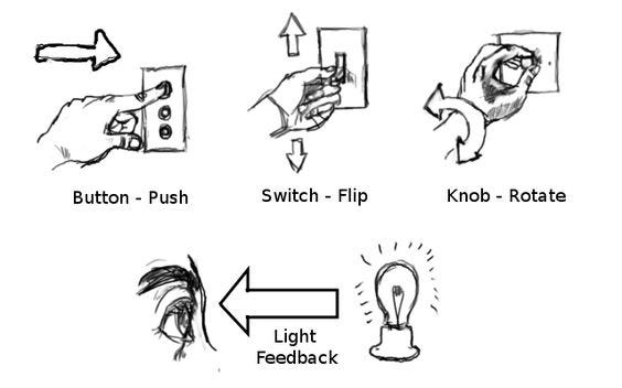
Strategy: Logical Constraints
Logical Constraints refer to the logical relationship between the spatial or functional layout of components and the things they affect or are affected by. This does not have anything to do with physical or cultural principles.
Example from Original Source:

Source: The Design of Every Day Things
Example from Different Source:

Real World Example:

Source: This is a light switch in my house. The order of these switches do not align with the natural mapping of the lights they control.
Strategy: Activity Centered Controls
Activity centered controls are when there is a mapping of controls to activities. This strategy anticipates the needs of the user and puts all the similarly related activity controls together.
Example in Original Source:
There was not a photo included for this strategy but the example described was related to auditorium controls for the lights, computer, video etc and how mapping out these controls around a particular activity like a lecture makes the experience far better.
Example in Different Source:

Source: http://www.jnd.org/dn.mss/activitycentere.html
Real World Example:

Source: Menu on television to control different components.
Strategy: Storytelling
Storytelling is a strategy or method of creating imagery, emotions and understanding of events through an interaction between a storyteller and an audience. This strategy is the original method of passing down information from one generation to the next. Storytelling can be done orally or digitally, but good experiences require certain elements: setting, characters, plot, invisibility, mood, and movement. Each of these elements contribute to the evoking of emotion from the audience.
Example from Original Source:

Source: Universal Principles of Design
Example from Different Source:

Source: Reuters News
Real World Example:

Source: The Alchemist from my bookshelf
Strategy: Advance Organizer
Advance Organizer, at times referred to as “onboarding,” is an instructional technique that helps the user understand the new information. The information can be spoken, written, or illustrated. There are two kinds of advance organizers: expository and comparative. Expository advance organizers are used when the user has little or no knowledge similar to the information being taught. Comparative advance organizers are used when the user has preexisting knowledge similar to the information being presented. The use of this strategy has been shown to have benefits when used in learning situations that are presented in a linear sequence.
Example in Original Source:

Source: Universal Principles of Design
Example from Different Source:

Source: Dribbble.com
Real World Example:

Source: My Kitchen Microwave
Strategy: Gamification
Gamification is a new trend where common game features are now cropping up in non-game apps and websites. For example, one design feature often found in games are tutorials, and now more and more apps have mini-tutorials to show how the app works. Additionally, its seen that in gaming, players go through the tutorial first, then are given basic tasks to ramp up and learn the game a bit more. Similarly, if you look at LinkedIn’s profile completion, you are handed out a progression bar to show how much you have completed, and are even rewarded an “All-Star” badge when your profile is a 75%+ done.
Example from original source:

https://uxplanet.org/gamification-in-2017-top-5-key-principles-cef948254dad
Example not from original source:

Example in real life:

My LinkedIn profile has an “All Star” badge because I’ve completed all the sections on it.
Strategy: Constancy
Constancy is the tendency to see objects as constant and unchanging, even though there are changes in the lighting, color, size and perspective. There are a few different type of constancy principles: size, brightness, shape, and loudness. When trying to maintain constancy, the visual processing system causes correction errors, which impacts how we see things.
Example from source:


Example not cited by original source:

Example from real life:

I remember this dress causing many discussions between my friends and I at the time. I only saw it as blue/black, while some were on camp gold and white. The reason for this is because the way the dress was presented – the brightness caused visual processing systems to show it as gold/white to some people, an example of brightness constancy.
Strategy: Structural Forms
Summary
Structures are an arrangement of organized elements in an object or system. There are three ways to organize or support and protect something: mass structures, frame structures, and shell structures.
Mass structures: materials that are put together to form a solid structure
Frame structures: consist of struts joined to form a framework
Shell structures: thing material that wraps around to contain a volume
Original Example

The Statue of Liberty demonstrates the flexibility and strength of frame structures.
Online Example

Dams – an example of mass structures
Real Example

My office building displays a frame structure.
Source
Lidwell, William, et al. Universal Principles of Design: 125 Ways to Enhance Usability, Influence Perception, Increase Appeal, Make Better Design Decisions, and Teach through Design. Rockport Publishers, 2003.
https://www.copper.org/education/liberty/liberty_design3.html
http://www.bbc.com/future/story/20151014-the-chinese-are-obsessed-with-building-giant-dams
Strategy: Form Follows Function
Form follows Function has two interpretations: the descriptive interpretation and the prescriptive interpretation. The descriptive interpretation is that a good design results from the simplicity/intuitiveness of the function. Therefore, they have a balance between them.
The prescriptive interpretation is that design should come second to the actual function of the system. This principle was popularized by architects, and since has been adopted by designers.
Example from the original source:


Example not cited in source:

Example from real life:

Clock which both has form and function (although leans more toward form).
Strategy: Confirmation
Confirmation is a technique that is used to verify a users’ actions, to ensure the input is intentional and correct. It is meant to prevent slips, but should be used sparingly as they slow task performance down. There are 2 different types of confirmation: dialog and two-step operation.
The dialog involves a verbal interaction from the system to the user (e.g. dialogue box that pops out, saying “Are you sure you want to send this message?”). These should be short, and give options of either “yes” or “no”. “Ok” and “cancel” should be avoided for confirmations.
The two step operation is when you have to do two steps to complete an operation , a preliminary step, and then the actual command. For example, in order to launch a nuclear weapon, two people might have to turn two unique keys. The purpose of this interaction is so that accidents don’t occur. Therefore, this type of interact is most common in aircrafts, nuclear power plants, and other dangerous environments.
Example from the original source:


Example not cited in source:

Example in real life:

Strategy: Control
Control is a design principle which states the importance of control for both new users’, as well as experienced users’. This means that a user who is new to the system will benefit from structure, and fewer options so as to understand how the system works without becoming overwhelmed by other functions. On the other hand, the system should also support experienced/veteran users’ and provide customizable, flexible interaction. An example of this is a bike with training wheels, to help young kids learn how to bike. As the child becomes more confident in his skills riding a bike, he will no longer need the training wheels, and can “upgrade” to bikes with more flexibility (gear, steering, tire changes, etc).
Example from the original source:


Example not cited by original source:

Example from real life:


Photoshop has different settings for beginners vs. those who are comfortable with the software.
Strategy: Visibility
Visibility is a technique generally applied to complex system to allow the user to see the several statuses of the system as it runs through it processes. The idea behind it that a user can understand what is the system doing, if needs user input and/or what is next in the process. When applied correctly, this concept structures the information so the user sees what is needed at the moment, and if required, s/he is allowed to dig deeper for more information. On the same line, this concepts hides what is not important for a user, showing just what matters.
Lidwell, Holden & Butler: Universal Principles of Design.
Example from original source

Example not cited by original source

Sourcehttps://i.ytimg.com/vi/xJ8BzNGaLVg/maxresdefault.jpg
Example from real life

Only the most important things is visible, nothing more, nothing less.
Strategy: Expectation Effect
Expectation Effect is a psychological phenomenon which states that behavior and perception change based on personal expectations, and/or expectations from others. There are many studies which have looked into the phenomenon, and have come up with several examples of these effects. The most common/familiar one is the placebo effect, where you are given something which you think will make you feel better, but actually has no scientific proof that it has medicinal properties. The fact that you believe/expect it will help, is actually what changes the perception and effect of it.
Example from the original source:

Example not cited by original source:

 placebo pills
Example in real life:


I’ve always considered this store to have really cheap groceries, even though I’ve never been inside. I think its a lot to do with how they advertise themselves as a bargain market, changing my expectations that this store would be cheaper than others, such as Vons or Albertson’s.
Strategy: Efficiency
In UX design, efficiency refers to the ability to intelligently help users accomplish their goals while minimizing the waste in time, energy, cost. The good thing is this can easily be measured and optimized, but it’s also worth noting that there are often other qualitative aspects of UX that is harder to measure and are equally critical, such as clarity, comprehension, and perceptions. i.e. faster is not always better.
Vogt, JD. “Defining Principles to Drive Design Decisions – Salesforce UX – Medium.” Medium. February 04, 2016. Accessed October 16, 2017. https://medium.com/salesforce-ux/defining-principles-to-drive-design-decisions-b647b68fb057.
Example from original source

Example not cited by original source

Google’s Answer Box tells you what you need to know without you having to click on the web pages. An example here.
Example from real life

It’s common in Japan to order your food through a machine before you sit down. This saves time for customers, waiters and overall make a quick eat-and-go experience very efficient.
Strategy: Operant Conditioning
Operant conditioning is a design principle used to motivate desired behaviors by rewarding or punishing the users based on their actions. This is a popular technique and can easily be seen in our daily life, e.g., marketing campaign, reward program, and company bonus scheme. There are similarities between operant conditioning and gamification, and these two principles are often used interchangeably. However, gamification is a broader discipline that covers other game mechanics such us badges, goals, level-up, competition, etc.
Lidwell, William, Kritina Holden, and Jill Butler. Universal principles of design. Gloucester, MA: Rockport, 2010.
Example from original source

Video game (https://en.wikipedia.org/wiki/Pac-Man#/media/File:Pac-man.png)
Example not cited by original source

Fred Perry Sale – FOMO is also a type of operant conditioning. (https://thestylishcity.com/fred-perry-black-friday-overstock-sale)
Example from real life

Point card from my favorite coffee shop. These cards make me want to go back!
Strategy: Signal-to-Noise Ratio
Signal-to-noise ratio refers to the amount of useful vs. non-useful information in design. Great designs often have a high signal-to-noise ratio. Although it’s sometimes impossible to remove all the noise due to constraints, limitation or compliance, a good general guideline is to downplay or eliminate anything that doesn’t support the core message.
Lidwell, William, Kritina Holden, and Jill Butler. Universal principles of design. Gloucester, MA: Rockport, 2010.
Example from original source

Left: low signal-to-noise, right: high signal-to-noise
Example not cited by original source


A series of controversial but fun design concepts by A2591 (http://www.a2591.com/) Do you think they work?
See more interesting variations here and here.
Example from real life


Comparing the two delivery cards conveying almost the same information, one from Royal Mail and one from Japan Post. Which is cleaner and easier to absorb?
Roal Mail image from http://www.dailymail.co.uk/news/article-2210583/Royal-Mail-start-leaving-parcels-door-ones-home.html
Strategy: Similarity
Things that are closer together, or with a similar look and feel, are often interpreted as similar in nature, such as functionality, shapes, colors. When used correctly, designers can help users to quickly recognize similar features, content, interactions, by applying similarity principle in the design.
Lidwell, William, Kritina Holden, and Jill Butler. Universal principles of design. Gloucester, MA: Rockport, 2010.
Example from original source

Example not cited by original source

When we see a setup like this in the market, we automatically assume that fruits that are together are the same kind. (https://unsplash.com/photos/vnNFWKY7Tj4)
Example from real life

Washing machine also group similar buttons together and has a standalone, prominent the start/stop button.
Strategy: Performance Load
Performance load is the amount of effort, both physically and mentally, required for someone to accomplish a specific task. Usually, the more effort that it takes for users to accomplish their goals, the less likely users will successfully accomplish their goals using the design. It’s worth mentioning high performance-load often leads to the need to seek for alternatives or workarounds.
Lidwell, William, Kritina Holden, and Jill Butler. Universal principles of design. Gloucester, MA: Rockport, 2010.
Example from original source

Slot Machine is simple to operate with a single press of a button. (https://www.walmart.com/ip/Crazy-Diamonds-Slot-Machine-Bank/29582770)
Example not cited by original source

An example of high performance load UI – Microsoft Word (https://www.magnani.com/ideas/ux1)
Example from real life

Apple TV remote is a lot easier to use compared to the old-fashioned remote because of its lower performance load.
Strategy: Curiosity
This design principle is both a quality that designers need to have but also a technique that designers can apply to their works. First, it describes the designers’ ability to embrace unknowns and serendipity in the process of creating a design. Second, curiosity principle is also a popular design technique used to drive user behaviors, generate excitement, and provide motivations.
“Applying Curiosity to Interaction Design: Tell Me Something I Don’t Know.” Johnny loves you. Accessed October 24, 2009. http://johnnyholland.org/2009/08/curiosity-and-interaction-design/.
Example from original source

Hot Wheels’s mystery car
Example not cited by original source

You never know the next profile you are going to see on Tinder!
Example from real life

I saw this mysterious coffee vending machine on a street. There’s only one completely black can in this machine, so you don’t even know what you are buying! As you see in the photo, there’s a pretty long queue and a big crowd surrounded the machine.
Strategy: Area Alignment
Area alignment means aligning the objects based on the area, shape, and visual-weight, instead of aligning to the edges of the objects, such as center-based or edge-based align. Most of the time, aligning based on the edges of the objects is sufficient to achieve visual balance, but there are also cases where objects are less uniform or symmetrical, and better visual harmony can be achieved by using area alignment. This is done manually and requires designer’s taste and judgment.
Lidwell, William, Kritina Holden, and Jill Butler. Universal principles of design. Gloucester, MA: Rockport, 2010.
Example from original source

The left column is center-aligned based on the edges, and the right column is center-aligned based on the areas of the objects.
Example not cited by original source

This cute Cat Breeds Poster by AmyHwangShop. Notice how the designer aligned the cats based on visual-weight and shape?
Example from real life

A poster I spotted in front of a store in Shibuya. The designer manually adjusted the space of the items to achieve visual harmony.
Strategy: Advance Organizer
Advance Organizer is a instructional strategy in design that is used to users’ understand and learn new concepts. There are two types of Advance Organizers: Expository and Comparative. Expository advance organizer strategy is used when the user is brand new to the concept, and needs the background knowledge first to illustrate the concept. On the other hand, comparative advance organizer is a strategy when the user is already familiar with the concept, so the way the new concept is presented is by comparing it to the familiar one. This comparison helps the user understand the differences between one vs. the other. Both of these are used to help users’ learn new information, as well as retain it.
2 of 365: Expository and Comparative Advance Organizers #design #principles. (2014, January 02). Retrieved October 16, 2017, from http://lemasney.com/consulting/2014/01/02/2-365-expository-comparative-advance-organizers-design-principles/
Example from original source:

Example not cited by original source:

Example from real life

Rosetta Stone, a language learning tool, uses an example of something that people are familiar with (black cat), to introduce a new concept (a new way to say black cat).
Strategy: Rhythm
Rhythm as described by the author is the “movement created by repeated pattern of form.” There are to two key component having a rhythm that works, the first being patterns, when we are able to recognize them we can expect certain elements to constantly show up. The author uses the Airbnb app as an example, every listing is formatted the same, and when scanning after some time one can recognize a pattern and know exactly where to find the price. The other component is having a break in rhythm, when it occurs it does not flow the normal pattern, and users can expect something else. For example in the twitter app, when the rhythm is broken, its usually to grab the attention of the user to look at something else, such as suggesting to follow people in the middle of your twitter feeds.
Mandelbaum, Melissa. “Design Principles.” Design Principles. Accessed October 13, 2017. http://learndesignprinciples.com/.
Example from original source


Airbnb app shows rhythm when patters are repeated. Twitter app is an example of a break in the rhythm.
Source: Learn Design Principles website
Example not cited by original source
Checkered floors are an example of patters that are repeated with some variation. One always knows where to expect the white or black tiles.

Source: Pinterest
Example from real life

All the resident mailboxes are the same size, however one quickly notices the large boxes at the bottom, a break in the rhythm signifies that they are communal mail boxes for large packages.
Strategy: Depth of Processing
The authors state that through a strong analysis, information can be recalled more efficiently at a later time compared to information that had a superficial analysis. Its a phenomenon in memory that is created from the two ways information is process. In Maintenance rehearsal one simple repeats information over, such as repeating a phone number to remember it. In elaborate rehearsal, a deeper understanding of the information is carried out, such as answering questions from something that was read. In design, when information is required to be learned, it is valuable to use various tools to assist the users in learning the information, such as mnemonic devices.
Source: Lindwell, WIlliam, Kritina Holden, and Jill Elam. Universal Principles of Design, Revised and Updated: 125 Ways to Enhance Usability, Influence Perception, Increase Appeal, Make Better Design Decisions, and Teach through Design. Beverly, MA: Rockport Publishers, 2012.
Example from original source
The author provides an example of a Fire Extinguisher class, where a Mnemonic device is used along with a quiz after the concepts are reviewed to learn the steps required to use the extinguisher effectively.

Source: Superior Fire
Example not cited by original source
Children’s songs are a good example of Depth of Processing as songs repeat and provide various definitions to make sure the concept is honed in.
Source: Color Song
Example from real life
By defining and providing examples to various design principles for this assignment, the class is using an elaborate rehearsal to process the terminology and obtain a deeper understanding of the design vocabulary.

Strategy: Three Levels of Knowing
Simplicity is being totally immersed in an experience not being aware of the surroundings. This view is often shared by children or adults that are not informed
Complexity is having an awareness of the complexities in the world but not being able to find patterns.
Informed Simplicity is the ability to understand clearly the complex world, find patterns and create designs with clarity. In other words connecting various design considerations and making them fit seamlessly.
Frederick, Matthew. 101 things I learned in architecture school. Cambridge, MA: MIT Press, 2007.
Example from original source

Source: 101 things I learned in architecture school
Example not cited by original source
In the past, one device performed one function and people had to take a whole set of items to perform various task. camera, take player, video recorder, phone, beeper, etc. This is an example of complexity

Source: reddit
Example from real life
Smart phone have multiple functions, designers have integrated various apps to create a simple to use device with many functions, replacing many of the apparatuses in the above example.

Strategy: Denial and Reward
This strategy will show the user their goal early on in a journey, it will guide them through various paths and intentionally hide the goal, then reveal it at different times in various perspectives. The journey itself creates an experience. An example, as seen below, would be walking through a winding path towards a building. The building will be blocked from view as the walker passes various trees, hills, and landmarks. As the walker gets closer, the building will come into view.
Frederick, Matthew. 101 things I learned in architecture school. Cambridge, MA: MIT Press, 2007.
Example from original source

Source: 101 things I learned in architecture school
Example not cited by original source
A rollercoaster provides a wild experience, at the beginning of the journey, riders will be full of anticipation.

Example from real life
An individual living in the third floor can clearly see the goal at the bottom, as they climb the stairs, they will loose sight of their goal at some moments and will be rewarded at the end with reaching the apartment and having a nice view.

Strategy: Leading Lines
Lines placed in a design will control where the viewers eyes will go. This is useful providing guidance or directing what a viewer should be looking at. Lines may be subtle such as a tree, or an arm, or they can be literal.
Stribley, Mary. “10 Rules of Composition All Designers Live By – Design School.” Design School. September 16, 2015. Accessed October 13, 2017. https://designschool.canva.com/blog/visual-design-composition/.
Example from original source
Flowcharts effectively use leading lines, as a viewer can follow the steps in a clear way.

Source: Design school canva
Example not cited by original source
The lines guide the viewer to the pig flying across the sun.
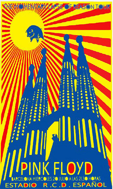
Source: PHS Visual Art Department
Example from real life
Leading lines exist in nature such as the blinds, visitors that come to the house always complement the plant, because the lines will lead them to it.

Strategy: Normal Distribution
Many various human characteristics such as people’s height, weight, age, shoe size, and hair color can be measured and averaged out. The Normal distribution curve is a bell shaped curve that represents the extreme and average values of those characteristics. At the very center of the curve is the the average of the variable being measured, about 68% of the populations falls within one standard deviation above and below that average. In design, one must consider the wide range in the variances of people, and its difficult to create a product for the average users as only 68% of the population would be considered average. Products should not be designed for the average person as there is a fallacy that the average person exist. If possible the goals should be to design for 98% of the population, and to have design specifications to accommodate the other groups outside the average.
Lindwell, William, Kritina Holden, and Jill Elam. Universal Principles of Design, Revised and Updated: 125 Ways to Enhance Usability, Influence Perception, Increase Appeal, Make Better Design Decisions, and Teach through Design. Beverly, MA: Rockport Publishers, 2012.
Example from original source

Source: Universal Principles of Design
Example not cited by original source
It is very difficult to design for the average person, as they do not exist. Designers should use various specification to target a larger population group.

Source: Cast a bigger Net
Example from real life
Chairs will fit a large population of the group. I have a chair for toddlers, which represent a very small group of the population, it is not as common for it to be more expensive. The larger chair will be able to sit a larger population group, and since its very common, its also very affordable.

Strategy: Weakest Link
The authors refer to the weakest link in design as having a safety mechanism in place to minimize damage and protecting more important elements, for this reason a weak link is viewed as very important. There are two ways a weak link can function, it can be a passive design, meaning that it can shut down a system such as a fuse blowing out and protecting electrical circuits. It can be an active design, triggering another system to do something, such as the liquid filled cells in fire sprinkles, when they expand and break, they trigger the sprinkler system.
Lindwell, William, Kritina Holden, and Jill Elam. Universal Principles of Design, Revised and Updated: 125 Ways to Enhance Usability, Influence Perception, Increase Appeal, Make Better Design Decisions, and Teach through Design. Beverly, MA: Rockport Publishers, 2012.
Example from original source

https://media.digikey.com/Photos/Bel%20Photos/3AG%203.5-R.JPG
Example not cited by original source
Saw Stop- an electrical signal runs through a saw blade, when the signal is broken due to skin contact, it triggers an aluminum break and stops the saw immediately.
Example from real life
Impact sensors in an automobile activate in a sudden stop due to a car crash, they deploy an airbag in an automobile.


Strategy: Fail-fast
There is something to be learned from every failure. Each iteration can yield useful idea that can be used in future iteration of design or inspire future innovations. Failure is an “essential part of exploration and creativity.” [1] By using “fail-fast” as a strategy we can begin to redefine “failure” as an opportunity to learn as opposed to just an endpoint.
https://www.youtube.com/watch?v=9NxWW4poljU&ab_channel=RaphaelD%27Amico
Example from Design of Everyday Things: IDEO on Failing fast – Ideo Founder David Kelley
” How quickly you get to the first crumby prototype and show it to people is directly related to how successful my product will be”
https://youtu.be/hQCI3zj3aIc?t=201
Example from The Web: Illustrator Kiri Leonard –
in this video from professional Illustrator Kiri Leonard talks about her journey toward becoming a professional artist. She points out how her craft really began to improve as she began to product lots and lots of sketches across many different notebooks.

Example from My life: Whiteboarding my next project
A low cost example of failing fast, I created prototypes of my next project and went through the drawing, erasing, adding and commenting with colleagues and designers.
[1] Norman, Don. The design of everyday things. New York: Basic Books, 2013.
Strategy: Root Cause Analysis
Root-cause Analysis is a strategy used to understand underlying issues before attempting to remedy them. Conducting a Root-cause Analysis involves working to find multiple sources of “err” instead of a single course of error. This strategy helps to build a holistic picture of the incident or design problem. To a successful use of “RCA” designers should not stop as soon the first error, human or system, is uncovered and should continue until any sources of “err” is uncovered. Norman tells us as soon as we learn “why the error occurred” then learn what we can do to prevent it.
 Example from Design of Everyday Things: Applying Root Cause Analysis to the Crash of an F-22 Jet in 2010, the Inspector General was able to determine that the pilot could not have been to blame to the crash as he was unconscious. This lead to change in the jet fighters design.

Example from the web: The UN in a series of articles addresses Relief aid but also links (literally and figuratively) to a series of reporting determining Global Conflict as the root cause of famine.

Example from my life: JIRA Issue Tracker – This tool I use for work on resolution encourages developers, product managers and others to log root cause if known when Issues are resolved.
Norman, Don. The design of everyday things. New York: Basic Books, 2013.
Strategy: Seven Stages of Action
Normans Seven Stages of Action breaks down action into execution and evaluation in relation to goals of the user and the world in which actions occurs. This model to “provide a framework to understand “human action” and works to “guide design.” Breaking down actions into discrete steps helps designer to capture actions they maybe consider “implicit” and design for them. The Goal – is what the user wants to do. Plan – Is the action, Specify and Perform – are sequences of action. Perceive – is the users viewed state. Interpret- is the users understand of what they have perceived. And lastly, Compare is equalization of between goal and the outcome.

Example for Design on Everyday Things: Don Norman applies his Seven stages of action to simple act of turning on a light. Here is Don doing a similar exercise in this video.
Example from the Web: In this video the designer illustrates how a simple google search can be broken into action steps to get a full picture of what “Drew” our user is doing.
Example from my Life: I made of video of me diagramming out a seven steps of action for a project I am currently doing for work. I have never done one, but this helped me understand how an end user might interpret a “submitted status” and what it means in my current workflow.
Norman, Don. The design of everyday things. New York: Basic Books, 2013.
Strategy: Conceptual Modeling
A Conceptual Model is a simplified explanation of how something works. by applying a familiar analogy(s) or system to a new system . Strong conceptual models aid users in forming a “coherent image” of how a system work, by allowing them to anticipate potential actions. By borrowing from system that users are already familiar with as a design strategy we promote learning as opposed to memorization. Norman (a professor Hayes) uses the conceptual model of files and folders that we see on most all computers.

Example from Design of Everyday Things: The File Folder system on Computers.

Example from the Web: Trello uses Conceptual model of a Kanban board with post-it notes. You can do just about everything one would do with a physical board.

Example from my Life: I’m going to recycle an item I shared in my histories post, this remote light switch looks and acts wall-mounted switches. Thought it is a different kind of switch, conceptually it is modeled after light switches I am familiar with.
Norman, Don. The design of everyday things. New York: Basic Books, 2013.
Strategy: Moral Design
“Design affects society” as such, designers must consider the impacts of their design on society. Often the goals of capitalism run contrary to moral design, businesses aim make and sell goods continuously to the largest number of people they can. This creates an environment of continuous consumption. Norman points out that “needless features, needless models” is in danger of making the design of everyday things into the design of “overloaded, unnecessary things.” Designers can employ Moral Design, by questioning the need for new features and iteration as well employing sustainable means of delivering new goods. He uses the video subscription services as a good example.

Example from Design of Everyday Things: A video subscription service eliminates the need for mailing DVDs or creating thousands of plastic discs.

Example from the web: This is more of anti-example, the iPhone maybe an example of immoral design, are all these iterations and models necessary? Are we delivering true usable value with each model and release? Some call this planned obsolesce.

Example from my life: In recent years I have seen an increase quality of design of reusable water bottles. These aesthetically pleasing designs make it desirable, fun to be sustainable.
Norman, Don. The design of everyday things. New York: Basic Books, 2013.
Strategy: Standardization
Standardization often requires the efforts of many people, organization and governments to create. Creating standards can be greatly beneficial, they can promote good, accessible design. In many cases standards can discourage silos of innovation and incentivize interoperability. While creating and following standards can beneficial, building a consensus takes time. Often by the time standards are created the technology is obsolete or the has progressed such that the standards are not helpful.

Example from Design of Everyday Things: Norman gives us this nonstandard clock to illustrate how standards are important and how ubiquitous they can be.

Example from the Web: Section 508 defined US Federal requirements and standards for creating broadly accessible websites and tools. It is a standard that many federal contractors must meet in order to win government contracts.

Example from my life: The Scale Agile Framework for Enterprise (SAFe) is an attempt to create a standardized framework for practicing Agile Development at scale. There are still many styles and versions of agile development, in time we may see a few emerge. That handbook is full of fun standards and strategies!
Strategy: Five Whys
The five-whys method is a method that can be a mean to conducting a root cause analysis, but can be employed in other scenarios to “dig deeper.” The five ways method attempts to understand underlying causes. Analysis often stops at the first explanation, by asking five whys we continue exploring and understanding new layers of our design challenge. Though “why” is broad question and this method can lead us to fixate on a single causes it is still an improve over traditional investigations by committees that stop as soon as the first human error is uncovered.

Example from Design of Everyday Things: The Toyota Production system employs the “Five Why” Strategy to understand and improve production line issues.
- “Why did the robot stop?”The circuit has overloaded, causing a fuse to blow.
- “Why is the circuit overloaded?”There was insufficient lubrication on the bearings, so they locked up.
- “Why was there insufficient lubrication on the bearings?”The oil pump on the robot is not circulating sufficient oil.
- “Why is the pump not circulating sufficient oil?”The pump intake is clogged with metal shavings.
- “Why is the intake clogged with metal shavings?”Because there is no filter on the pump.

Example from the Web: The Healthcare field utilizes Five Why method. In this example the Institute for Health Care Improvement illustrates how it can be applied to an incorrect intravenous run rate.

Example from My Life: It’s hard to illustrate Five Whys, so I sketched a design interview where the interviewer used “Five Whys” to get me to engage in design thinking.
Strategy: Variety
Variety refers to a way of combining visual elements in involved ways to achieve intricate and complex relationships. These contrasting elements within the composition add visual interest, guide the eye, and hold attention. This can be achieved by varying elements like line, shape, value, color, and texture. However, although varying the components of a design can create visual interest and avoid monotony, design elements must also convey a sense of cohesion. Visual design without any variation is monotonous, but without cohesion, the design will be unorganized and look unintentional, like a hodgepodge of mismatched elements. Good design is achieved through the balance of unity and variety; the elements need to be alike enough so we perceive them as belonging together and different enough to be interesting.
Source: J. Paul Getty Museum, “Understanding Formal Analysis – Principles of Design“; The Elements and Principles of Visual Design Wiki
Example from original source:

Example from different source:

Source: TechCrunch
Real life example:

Strategy: Proportion
Proportion is the relationship of various elements in a design and the relative size and scale of how they compare with one another. Proportion is said to be harmonious when a correct or desirable relationship exists between the elements with respect to size, color, quantity, degree, or setting. Good proportion adds harmony, symmetry, or balance among the parts of a design. When elements are out of proportion, they tend to look awkward or unbalanced. This relationship exists between objects, or parts, of a whole, so proportion needs to be discussed terms of the context or standard used to determine it.
Source: Cornell University, About Art, Design and Visual Thinking; The Elements and Principles of Visual Design Wiki
Example from original source:

Example from different source:

Source: The Netflix SmartTV App for Samsung
Real life example:

Source: The Broad Museum
Strategy: Emphasis
Emphasis is a strategy that aims to draw the viewer’s attention to a specific design element through visual reinforcement. That could be to an area of content, to an image, to a link, or to a button, etc. The aim is to create a focal point in the design: an eye-catching part that stands out, distinct from the rest of the design elements. Lines, shapes, colors, textures, size, as well as many other elements, may be used to create emphasis. Most often, we use emphasis to drive a call to action (e.g., a sign-up, purchase, or login button, etc.).
Source: Interaction Design Foundation; The Elements and Principles of Visual Design Wiki
Example from original source:

Example from different source:

Source: Viget
Real life example:

Strategy: Movement
Movement refers to a way of combining the art elements to produce the look of action or to cause the viewerʼs eye to sweep in a certain manner or direction. Such movements can be directed along lines, edges, shapes, and colors within the works, but moves the eye most easily on paths of equal value. Because the innate physiology of the eye forces the individual to focus in on specific elements within the visual field, it is used to carry or direct the eye of the viewer from one part of the design to the other, often to focus areas. Movement encompasses the use of art elements to direct a viewer’s eye along a path through the work, and/or to show movement, action and direction. Giving some elements the ability to be moved or move on their own is also the principle at work.
Source: J. Paul Getty Museum, “Understanding Formal Analysis – Principles of Design;” Cornell University, “About Art, Design and Visual Thinking;” The Principles of Design and Organization; Jeff B. Petz, “Eye Movement and Natural Tasks”
Example from original source:

Example from different source:

Source: Melissa Mandelbaum, “Design Principles”
Real life example:

For more info: Walt Disney Concert Hall
Strategy: Axis
Axis is an imaginary line used to organize a group of elements in a design, about which forms and spaces can be arranged in a balanced or symmetrical manner. The axis provides length and direction, induces movement, and promotes views along its path, as well as uphold a feeling of order. Although the axis is invisible to the eye, it can be made more apparent by defining the edges of surrounding elements. It is commonly conceptualized in architecture with defined endpoints but can be continuous in virtual spaces with infinite scroll. It is represented by a dashed line in diagrams and drawings.
Source: Architecture: Form, Space, and Order by Francis D. K. Ching; GharPedia, “Ordering Architecture Principles of Design”
Example from original source:

Example from different source:

Source: Melissa Mandelbaum, “Design Principles”
Real life example:

Strategy: Feedback
Feedback is a signal that something has occurred after an interaction with an object, and sends information back to the user about what action has been done and what result was accomplished. It communicates the effects of an action, and in order for it to be effective, it has to be immediate. Even a minuscule delay can be disorienting to the user and lead to incorrect interactions. It should also convey appropriate information so as not to cause confusion. Feedback is critical in directing behavior and communicating success or failure.
Source: Don Norman’s The Design of Everyday Things
Example from original source:

Example from different source:

Source: UX Planet, Dialog Design
Real life example:

Strategy: Discoverability
Discoverability, in the context of product and interface design, is the degree of ease with which the user can find all the elements and features of a new system and whether it’s possible to figure out how to use it by interacting with it. Good discoverability makes it easy to determine what actions are possible to achieve with the object and where and how to perform them. Essentially, it refers to the human ability to discover what operations one can do. In other words, discoverability is the ability of the person using the product to determine what is possible to be done with the object and how to do it. Most failures of design stem from the inability of the object to convey its intended usage and operations. All operations should be discovered by systematic exploration.
Source: Don Norman’s The Design of Everyday Things; Bruce Tognazzini “First Principles of Interaction Design”
Example from original source:

Example from different source:

Source: Shazam
Real life example:

Strategy: Three levels of knowing
Strategy: Rhythm
Strategy: Denial and reward
Strategy: Leading Lines
Strategy: Depth of Processing
Strategy: Normal Distribution
Strategy: Weakest Link
Strategy: Findability
Content should be easy to locate with little effort. Ideally, it will be presented in one place with minimal links and requests for other pages. This will help performance and loading time as we look into content online. As we browse more pages, these small savings accumulate making the experience faster and more rewarding.
http://www.designprinciplesftw.com/collections/building-blocks-of-sustainable-web-design
Example from original source

Example not cited by original source

Source: google search
Example from real life

Strategy: Not Invented Here
Whatever we do is better than anything else. This strategy refers to the false idea that ‘we’ should and must question whatever has been done by ‘others’ and modify the product as we see fit since ‘we’ know more. There are 4 social dynamics that push this strategy, but mostly, it is fear and the idea of superiority. This might sabotage innovation, so to circumvent this problem, one must think of cross-functional team to ensure a fresh perspective.
Lidwell, Holden & Butler: Universal Principles of Design.
Example from original source

Example not cited by original source

Source: http://www.madeintheusa.com/blog/2014/03/10-reasons-buy-american/
Example from real life

Strategy: Clear
Having a clear understanding of your users is the first step in providing the right information and layout needed for them to have a positive experience. Although the term is vague (clarity can mean very different things for different users), it sits on the premise of consistency and language.
To properly address the user, you have to present the content in a way that makes a logical connection between users’ expectations and your content. The better you know your user, the clearer such connection will be.
http://www.designprinciplesftw.com/collections/the-four-cs-of-form-design
Example from original source
![]()
Example not cited by original source
![]()
Probably the only good thing under this administration…the EPA’s spanish-version website does apply clarity quite well. It still mentions the same horrific policies, but in a clear way :-\
Example from real life
![]()
Sample ballot, both in English and spanish. It does look busy as it contains all the legally required information. However, they still manage to present the information in a clear way for both Spanish and English speakers
Strategy: Cost Benefit
From a financial or operational perspective, this strategy refers to the ROI (return on investment). What will we gain by spending on this feature or function? From a design perspective, we put ourselves on the shoes of the user. How much reading? How many steps? How many clicks? How much does the eye have to travel to find needed elements? All these questions will answer what is the benefit for the user to either wait, travel, read more etc. as s/he interacts with the product
Source: UPD
Example from original source

Example not cited by original source

Source: http://uxmag.com/sites/default/files/article-images/mobileexperience.png
Example from real life

Nothing says cost-saving like big-box retailers like Costco. This picture by Gursky exemplifies everything that is good and bad with the current mentality of reaping HUGE benefits for little cost.
Strategy: Be lazy like a fox
Don’t start from scratch, see what is out there and use it for your design. There is no need to reinvent the wheel. See what works and modify it as needed so it best applies to your need
Source: http://www.designprinciplesftw.com/collections/wikihouse-10-design-principles#549
Example from original source

Source: http://delta-associates.com/what-about-the-old-advice-dont-reinvent-the-wheel-is-it-stupid-or-smart/
Example not cited by original source

Boostrap offers a library of open-source codes for developers to use as they work on their own projects. Basically, a complete opposite to Not invented here.
Example from real life


The new remote for the Apple Tv 4k took the best from the old remote and improve most of its functions. Looking at what had been done, it moved the user experience forward.
Strategy: Inclusivity and Accessibility
As we design in today’s world, one must consider groups that might have been left outside the mainstream in the past. This strategy suggest that everything we do must be able to reach and accommodate as large a group as possible. From kids to people with disabilities, our end product must work on all platforms, comply with ADA regulation and ensure a best experience for all.
http://www.designprinciplesftw.com/collections/occs-design-principles#938
Example from original source

Example not cited by original source

Captcha allows for user to select an audio version of the words in case they are visually impaired
Example from real life

A paved path in the beach for those using wheelchairs or crutches.
Source: https://www.baytoday.ca/local-news/disabled-ramps-at-city-beaches-17745
Strategy: Frame a view, don’t merely exhibit it.
A designer can achieve more dramatic and rich experiment by carefully farming a view rather than simply providing the view. To achieve dramatic views an Architect will carefully develop the shape, size and determine the place of the window.
Source:

Source: Frederick, 101 Things I Learned in Architecture School.
Online:

Life:

Source: My Dining Room Window
Strategy: Design with models
Using 3D models can help a designer to understanding his/her design better in new ways and angles. 3D models are useful when they are not carefully crafted with details. The idea of 3D models is to help designers to evaluate their ideas in a concrete forms from different perspectives.
Source:

Source: Frederick, 101 Things I Learned in Architecture School.
Online:

Source: http://www.augment.com/sample-3d-models/
Life:

Source: Christopher Young Kim, 3D Model, Pasadena Art Center, College of Design
Strategy: Mental Model
People understand and interact with the world and their environment based on their previous experiences. We learn by comparing the outcomes of our mental models with feedback from the outside world. There are two types of mental model: system models and interaction models.
System models: mental models of how systems work.
Interaction models: mental models of how people interact with systems.
Source:

Source: Lidwell, William, Kritina Holden, and Jill Butler. Universal Principles of Design. Rockport Publishers, 2010.
Online:

Life:

Source: Entrance Door of Cal State Fullerton Irvine Campus
Strategy: Less is more
“Less is more” is a famous quote from Ludwig Miles Van Der. This quote imply and emphasis the beauty of simplicity. With limiting the extra elements of design, we can have a simple and clean product.
Source:

Source: Frederick, 101 Things I Learned in Architecture School.
Online:

Source: http://teche.ltc.mq.edu.au/less/
Life:

Source: https://www.google.com/
Strategy: Beauty is due more to harmonious relationships among the elements of a composition than to the elements themselves
The beauty of a design is related to the harmony of its components. Having harmony means that all parts of a design relate to, and complement one another. Individual pieces of a design are not as important as the final product itself. To develop harmony, we need to pay a close attention to the size, shape, color and function of each individual piece.
Source:

Source: Frederick, 101 Things I Learned in Architecture School.
Online:

Source: http://www.thinglink.com/scene/625371843003416577
Life:

Source: Coolsculpting Advertise
Strategy: Color theory provides a framework for understanding the behavior and meaning of colors
Color theory means to combine and mix different colors to provoke specific thoughts, feelings and emotions.
For example, gray, white, ice blue, and cooler colors can give us a feeling of Winter. Warm and muted colors can bring us a feeling of Autumn. Bright colors remind of the Summer and pastel tones will remind us of Spring. Colors also brings out specific emotions in humans. For example yellow, orange and red will increase a person’s appetite and make them feel hungry.
Source:

Source: Frederick, 101 Things I Learned in Architecture School.
Online:

Source: https://www.tes.com/lessons/cggtA89lBDVO5Q/color-theory-10th-grade-art
Life:

Source: Carolina’s Advertise
Strategy: Less is a bore
“Less is a bore” is a quote from Robert Venturi. This quote goes against minimalist design. A simple design can be too plain and too boring. We can make a design fascinating by adding more decoration, symbolism, color, and interesting patterns.
Source:

Source: Frederick, 101 Things I Learned in Architecture School.
Online:

Source: https://missvacation.wordpress.com/2012/05/24/paris-day-6/
Life:

Source: Korean Friendship bell, San pedro, CA
Strategy: Latency Reduction
Latency is the time it takes for a user to receive a response from a system after a user interaction. Latency affects how interactive user perceives the system to be. When the user is burdened with excessive latency he may think the system is broken and may either repeat the interaction putting unnecessary stress on the system, or he may just give up on the task. Loading screens and spinners should be removed where possible, network delays should be masked by preloading data and anticipating what website resources the user will need for subsequent webpages or tasks. When the technical abilities to limit latency have been exhausted, the designer must deal with the latency by keeping the user informed, don’t let the user think an interaction was not registered. If the user has to wait then manage their expectations by keeping them informed of how long the delay is or by distracting them to keep them engaged with the system.
Bruce Tognazzini, First Principles of Interaction Design, accessed October 13, 2017, http://asktog.com/atc/principles-of-interaction-design/#latencyReduction
Original source image

http://asktog.com/atc/principles-of-interaction-design/#latencyReduction
Online image

Robot assisted surgery
https://www.nuh.com.sg/news/media-articles_837.html
Real world image

Card chip reader typically take about 5-10 seconds to complete a transaction. The delay is a limitation imposed by the technology, therefore to prevent the user from removing the card prematurely and getting into an error state the terminal is forced to display a wait message. Target, The District, Tustin
Strategy: Visuospatial Resonance
Visuospatial resonance is when an image takes advantage of how people’s perception change due to their distance from the image. The hybrid image uses a mix of low spatial frequency (sharp outlines easily perceived up close) and high spatial frequency (blurry details easily perceived from a distance), creating two different images depending on the distance of the viewing.
SOURCE:
Lidwell, William. “Aesthetic-Usability Effect” Universal Principles of Design: 125 Ways to Enhance Usability, Influence Perception, Increase Appeal, Make Better Design Decisions, and Teach through Design, Rockport, 2010.
Source Example:

Non-Source Example:
Motorcycle Bicycle

PhotoSource: cvcl.mit.edu
Real Life Example:

Photo Source: fineartamerica.com
Strategy: Three-Dimensional Projection
The principle of three-dimensional projection allows users to perceive as if the design is three-dimensional by utilizing a variety of visual cues (e.g., interposition, size, elevation, linear perspective, texture gradient, shading, and atmospheric perspective). 3D is equal to the sum of 2D and projection. Through this design principle, the spatial and dimensional aspects of design are enhanced.
In addition to the areas of 3D-based VR and games, visual cues can be suitably combined with certain elements or effects in 2D-based environments to offer realistic experience.
#1 Original sources: Universal Principles of Design

An example which actively uses three-dimensional projection is video games. Three-dimensional screens are represented to provide a realistic experience. The game Black & White, for example, is a representation of a three-dimensional world, where depth cues can be observed.
#2 Online source: Link to Samsung VR Internet Application

Samsung’s VR internet application provides an in-depth gradation on the menus and background color. Meanwhile, the different sizes of the overall web page and menu panel are supplied by perspective and curves for an effective three-dimensional feel.
#3 Real life: My Samsung Galaxy S6 edge, Task manager

The three-dimensional perspective is effectively delivered by interpositioning the thumbnails of tasks in a two-dimensional space. Also, when the thumbnails are flicked up and down, size changing effects are provided.
Strategy: Fibonacci Sequence
The Fibonacci sequence principle refers to a special number sequence in which the sum of the preceding two numbers becomes the next number. This numbering system can be easily seen in nature, so designs based on the Fibonacci spiral offer people a sense of stability. The design can strongly appeal to users when applying this principle after deciding on the direction, rather than designing with the Fibonacci sequence in mind from the beginning. The principle is mainly used for architecture requiring harmony with nature or logo designs which need to be remembered for a long time and have diverse usages.
#1 Original source: Universal Principles of Design

The Modulor, created by Le Chobusier, incorporated two Fibonacci sequences which were derived from the main characteristics of the human body shape. It is said that the sequences are representations of “ideal measurements” designers can refer to for balanced design proportions. The calculation of “gold ratios” were done by dividing each sequence’s number by the number which comes before it.
#2 Online source: Mona Lisa

<Image source : Google>
Mona Lisa—long-cherished as a beautiful, harmonious painting—is also where the Fibonacci sequence has been applied.
#3 Real life: My PC’s logo

< Image’s source on the right side: Google >
Apple’s logo, which is remembered as natural and impressive, also applied the Fibonacci sequence.
Strategy: Uncanny Valley
The uncanny valley principle is about the emotions humans feel toward robots or other non-humans. According to Masahiro Mori’s theory, the more robots look similar to humans, the more positive feelings humans feel toward them. When the feelings reach a certain level, it suddenly turns into a strong repulsion. However, when the appearance and behaviors of robots become indistinguishable from humans, the positive feelings increase again to almost approach the level of human-human emotions. Here, the domain where the repulsion from robots similar to humans and near-human robots exists is called “uncanny valley.” This name does a good job in pointing out that the near-human robots fail to derive necessary emotions required in human-robot interaction because they exhibit excessively odd behaviors unlike actual humans. This design principle increases the strong appeal of design in certain areas.
The theory is primarily used on the fields of robotics and animation. This principle’s position in science is still under debate; there are some contradicting examples that avoid or deliberately exceed uncanny valley.
#1 Original sources: Universal Principles of Design
The classic graph of Masahiro More shows the degree of human-likeness or appeal against realism. The sharp “v” shaped curve on the right side of the graph is the uncanny valley. The beginning of the valley drops suddenly right before the point of the “healthy person.”

#2 Online sources: Robots

(1) An example of avoiding uncanny valley (Flower Robotics by Tatsuya Mastui)
A favorable feeling is maintained at a certain level while expression of human-likeness is reserved. It is made like a human but distance is kept from making it near-human.

(2) Examples of exceeding uncanny valley, intentionally(byDavid Hanson, robotics designer)
These images insist that the feeling of aversion is not just appearance but a result of various reasons. The electric circuits are made visible by taking off the rear side of the head.
#3 Real life: Security robot in my apartment complex

This is a security robot which moves around our complex. It is avoiding uncanny valley, my son and his friends like it and wants to touch.
Strategy: Freeze-Flight-Fight-Forfeit
The principle of Freeze-Flight-Fight-Forfeit is about the sequential responses expressed when people confront danger. Since this response is human nature, the designer’s in-depth understanding of each stage and sequence may help her make better design decisions as well as strengthen the aspect of usability. Also, each stage may be skipped through training. This design principle must be considered when designing contexts including the functions of life-critical control system, emergency response plans and systems, and emergency and self-defense training functions.
#1 Original sources: Universal Principles of Design

In January 2009, an airplane fell into the Hudson River due to the engine failure caused by birds. Although the , as the plane was expected to sink in less than 30 minutes, the crew managed it well and, as a result, all passengers (150 in total) and crew members landed safely on the ground.
#2 Online sources: Link to Vívosmart® 3

The wearable Vivosmart 3 Activity Tracker can measure heart rate variability (HRV) and converts it into a stress level. Each stage of stress is provided visually; continued self-monitoring helps the user predict and prepare for sudden dangers.
#3 Real life: (1) My iPhone, medical ID, (2) Weekly feedback in course

(1) Image on the left side – My iPhone, medical ID
When a user’s medical information such as certain allergies, illnesses, or blood type are saved in his/her phone, accurate information can be sent to medical staff without having to panic about what to do during emergencies.
(2) Image on the right side – Weekly feedback in course
The level of satisfaction for a course can be checked on a weekly basis and the feedback can be analyzed, allowing for continuous monitoring. This can help the users not to freeze or fight in the following classes.
Strategy: Factor of Safety
The factor of safety principle is about a system’s degree of flexibility during regarding the preparation for structural uncertainty in error conditions. The bigger this value, the greater risk-control is possible for the designed system’s emergency situations.
This principle should be considered in all context requiring error handling. In particular, it is often used in structural design, because structures are designed to endure heavier loads than those they are expected to hold.
#1 Original sources: Universal Principles of Design

The O-ring design of the rocket booster of the space shuttle Challenger was designed to have a “3” value of safety factor. It was found out that at low temperatures the O-rings were eroded, making the safety factor go below three. On the day of the launch, engineers objected to launching the rocket because the temperature of the launch pad was very low. The launch was proceeded as planned, believing that the safety factor would guarantee its success. Unfortunately, the launch failed, as the safety factor decreased due to the temperature condition.
#2 Online sources: (1) Link to Visual wall, (2) Crosswalk lighting

(1) A visual wall; a laser hologram traffic light concept by artist Hanyoung.

< Image source : Google >
(2) Crosswalk lighting in South Korea; reduces the danger of pedestrians by alerting drivers through the strong light rays projected when pedestrians cross.
#3 Real life: Playground slide

Children’s slide needs to bear a higher load than normally expected, since it needs to account for uses by larger children as well as misuse.
Strategy: Inattentional Blindness
The inattentional blindness principle refers to the phenomenon or situation in which the location of the object a person’s eyes are set on cannot be perceived due to lack of attention. As this principle affects users’ cognition, the core elements for each context should always be inspected. Inattentional blindness is especially utilized for security, advertising, and product design.
Designers use various methods, such as using point colors, adjusting component size, adding pop-ups, etc., to highlight the information which they want users to pay attention to. For example, the input field of the major information on membership applications or the file delete button are emphasized with point colors. Meanwhile, actions such as “delete” are accompanied by pop-ups which require another confirmation. In the case of the virtual reality (VR) area, the space within and outside the user’s sight needs to be designed effectively. Within the angle of vision, spaces should be adjusted as visual cues to prevent peripheral content from disturbing the focus on the main content.
#1 Original sources: Universal Principle of Design

Daniel Simons and Christopher Chabris, in their famous Inattentional blindness experiment, showed participants a short video of students tossing a basketball in two teams. Participants were asked to count how many times the students wearing white shirts passed the ball while observing the students’ quick movements. Halfway through the video, a person in a gorilla costume appears in the middle of the scene. Although the gorilla tried to catch attention by beating her chest before walking out, about half of the participants did not even notice her presence.
#2 Online sources: Link to Samsung VR Internet app
Design should prevent the surrounding menus from coming into the angle of vision to allow users to fully engage with the web page. However, a visual cue should be given so that users can expect to see menus when turning sideways.

#3 Real life: My Car – blind spot sensor

Drivers look at side mirrors to change lanes, but sometimes other automobiles or people may be not readily visible. As a supplement, there are lights near the side mirror which help with recognition. Audio feedback is provided to enhance the driver’s attention, informing there are objects and changing lanes is difficult when the left or right signals are on.
Strategy: Common Fate
The principle of common fate—one of the Gestalt principles of perception—recognizes elements moving in the same direction. Even if the shapes or colors are different, this principle perceives those elements which move in the same direction to be more relevant to one another than those moving in different directions. It is a basic principle used when inducing users’ perception according to the designer’s intention.
The principle is usually used when designing the navigation menu, since elements moving in the same direction are perceived to be related. It is particularly useful when designing the drop down menu with a hierarchical structure or the content browsing menu which has the same attribute.
#1 Original sources: Universal Principles of Design
When staying still, the Xs and Os are grouped according to their similarity (i.e., Xs with Xs, Os with Os). When Xs and Os are mixed and moving in a similar manner, the common fate principle is mainly applied to group them.

#2 Online source: Link to VR Interface Design Pre-Visualization Method
Horizontal movement takes place within the same document category; vertical movement refers to the movement such as “video,” “photo,” etc.

#3 Real life: My iPhone’s App store app
Scrolling up and down moves “each game group” (i.e., new games, new games we love, etc.), while scrolling left and right allows you to move each of the “new games.”

Strategy: Dunning-Kruger Effect
The Dunning-Kruger effect is a cognitive bias where a low skilled, incompetent person is unable to see their own inability and as a result overestimates his or her competence. The converse, (though seen less) is also true, where a highly skilled person underestimates his own abilities, and overestimates the skill in others. Mastering a complex skill requires practice and self assessment over time. Since people suffering from the Dunning-Kruger effect are unable to see how bad their performance is, they are never able to self asses, move up the skills ladder, and thus never improve their abilities.
William Lidwell, Kritina Holden and Jill Butler, The Pocket Universal Principles of Design (USA: Rockport publishers, 2015), 40.
The Dunning Kruger effect can be applied to design by offsetting the effect by helping the user to understand how they are performing. For example by creating opportunities in a design that allow a person engaged in a task to see how well they did, showing how their performance compares to others, providing prompt relevant feedback, and by keeping future tasks locked until lower level tasks have been mastered. A design can exploit the effect in a negative way also. For example a system could make it difficult for the user to see how well they are performing, or deceives them into believing they are doing well in order to keep them engaged with a task.
Original source image

William Lidwell, Kritina Holden and Jill Butler, The Pocket Universal Principles of Design (USA: Rockport publishers, 2015), 40.
Online image

Zepp Golf 3D swing analyzer
https://www.apple.com/shop/product/HJZ52ZM/A/zepp-golf-2-3d-swing-analyzer?fnode=4a&fs=fh%3D35f7%252B3493
Real world image

Realtime leaderboard display at K1 Speed, Go kart racing track, Irvine
Strategy: Signifiers
Signifiers are properties of an artifact, device or system that communicate to the user specifically where interactions should take place with the design. They are perceivable marks or sounds that tell the user what the appropriate interaction behavior should be. They are like useful signs, signals, drawings, or labels but don’t have to be as overt or intentional. For example an unintentional signifier can just be a perceived affordance that is unambiguous, like an on/off light switch.
Norman,Donald . The Design of Everyday Things (USA: Basic Books, 2013), 13-16.
To contrast the design principle of Affordances with Signifiers we can look at the example of paved roads and lots. Given a car, the relationship between the wheels and the road together demonstrate the affordance of driving across the pavement. But it is the property of painted lines on roads and in lots that indicate the possible actions a driver can take. The lines and markings are signifiers that indicate where the driving (or ceasing of driving) can take place. On paved roads they can indicate where one can turn left or right, where you need keep driving straight, where you should avoid driving over, or where to stop the vehicle to park.
Original source image

Signifier left/right arrows on a touchscreen
Norman,Donald . The Design of Everyday Things (USA: Basic Books, 2013), 21.
Online image

The swipe signifiers on the IOS shutdown screen
https://www.igeeksblog.com/how-to-use-lockscreen-in-ios-10/
Real world image

Stripes on the pavement indicate where one can park their car. The District Parking lot, Tustin
Strategy: Shaping
Shaping is a technique in which a complex behavior is taught by reinforcing simpler sub-behaviors. The complex behavior is broken down into simple sub-steps and is reinforced one by one until the complex behavior is learned. The how’s and why’s are not learned in shaping, and therefore are only used for rote procedures and motor skills.
SOURCE:
Lidwell, William. “Aesthetic-Usability Effect” Universal Principles of Design: 125 Ways to Enhance Usability, Influence Perception, Increase Appeal, Make Better Design Decisions, and Teach through Design, Rockport, 2010.
Source Example:
Project Pigeon
Project Pigeon was a program in which trained pigeons were used to guide bombs in World War II. Pigeons were first trained to peck at targets from images, then once a level of efficiency was attained, they were placed into tubes in a bomb. The bomb was designed so the pigeons were able to guide the trajectory of the bomb with their pecking on a window.
Non-Source Example:
Microsoft’s AI Chatbot
/cdn.vox-cdn.com/uploads/chorus_image/image/49155161/download.0.0.jpeg)
Tay, was an Artificial Intelligence that was shaped by the people it talked to, learning from each conversation. Because shaping does not incorporate an ideology or the hows and whys, the AI was shaped into a “racist asshole” by internet trolls.
Real Life Example:
Video Game Level Designs (Megaman X)

Video games use shaping in order to teach the players how to play the game. Levels are designed to slowly teach the players how the mechanics of the game works, slowly introducing new mechanics one by one until the player is able to play the full complex game and learn all the functions.
Here is a fun link to a breakdown of how a great game design can use shaping to teach the players how to play the game. (contains NSFW language). LINK
Strategy: Redundancy
Redundancy is the use of excessive elements to prevent a system failure. Multiple elements are used to maintain and increase the reliability of the system in case of a failure of an element within the system. There are 4 different types of redundancy: diverse, homogenous, active, and passive. Diverse redundancy is when different types of elements are used to prevent a single form of failure. Homogenous redundancy is the use of multiple elements of the same type, but is susceptible to single cause of failure. Active redundancy guards against both system and element failure with the use of redundant elements at all times. Passive redundancy is when an active element fails and is replaced, ideally used for noncritical elements.
SOURCE:
Lidwell, William. “Aesthetic-Usability Effect” Universal Principles of Design: 125 Ways to Enhance Usability, Influence Perception, Increase Appeal, Make Better Design Decisions, and Teach through Design, Rockport, 2010.
Source Example:
Super Cow

Many redundant elements were used to make sure the Super Cow would be able to withstand a Hurricane with no failure.
Non-Source Example:
Golden Gate Bridge

PhotoSource: sftravel.com
Suspension cables are a form of redundancy.
Real Life Example:
Pillars
Strategy: Cathedral Effect
The cathedral effect is the use of ceiling height to influence how people think. Higher ceilings promote a more creative way of thinking while lower ceilings promote a more concrete, detail oriented though process. The ceiling height does not have an effect if people do not notice a difference.
SOURCE:
Lidwell, William. “Aesthetic-Usability Effect” Universal Principles of Design: 125 Ways to Enhance Usability, Influence Perception, Increase Appeal, Make Better Design Decisions, and Teach through Design, Rockport, 2010.
Source Example:

Photo Source: Graphics.com
Non-Source Example:
Rogers Store

Lower ceiling when talking to agents to promote focus
Higher Ceiling for “customers to be in a more imaginative, inspirational and open mind, so that people can connect the dots and make associations”

PhotoSource: quininedesign.com
Real Life Example:
Living Room
Strategy: Classical Conditioning
Classical Conditioning is the repeated use of certain images or stimuli in order to stimulate a habitual unconscious response. It can also be used to learn a new behavior through the process of continual association. Two different stimuli are linked together in order to create a new unconscious response.
SOURCEs:
Lidwell, William. “Aesthetic-Usability Effect” Universal Principles of Design: 125 Ways to Enhance Usability, Influence Perception, Increase Appeal, Make Better Design Decisions, and Teach through Design, Rockport, 2010.
McLeod, S. A. (2014). Classical conditioning. Retrieved from www.simplypsychology.org/classical-conditioning.html
Source Example:

Non-Source Example:
Anti-Smoking Ad

PhotoSource: tobaccofacts.org
Real Life Example:
Anti-Abortion Display at UCI

Photo Source: UCI
Strategy: Convergence
Convergence is the process when similar characteristics or strategies evolve together in a system or environment. The amount of convergence occurring is indicated in the environment in which the system exists in; the more stable an environment is, the more convergent systems exist in that environment. In a very unstable environment, there exists few convergences, so it is more receptive to new innovations or an evolution of new convergences.
SOURCE:
Lidwell, William. “Aesthetic-Usability Effect” Universal Principles of Design: 125 Ways to Enhance Usability, Influence Perception, Increase Appeal, Make Better Design Decisions, and Teach through Design, Rockport, 2010.
Source Example:

Non-Source Example:
QWERTY Keyboard
PhotoSource: apple.com
The QWERTY keyboard has become the convergent system for all typing apparatuses. The environment for all typing layouts are very stable and are not very susceptible to change even though there are different layout which make more sense or are more efficient.
Real Life Example:
Touch Screens

Photo Source: setandbma.wordpress.com
Touch screens are now becoming the new standard of how we interact with technology. We are now converging towards a touch screen world and away from button inputs.
Strategy: Layering
Layering is the process of grouping together related information to manage complexity and to show relations between the information. There exist 2 different types of layering: Two-dimensional, and Three-dimensional. Two-dimensional layering is the process of grouping the information to be viewed one at a time; this can be done in a linear or non-linear fashion. Linear layers are really useful for displaying sequential information, something with a clear beginning and end. Non-linear layers are useful for grouping information and to relay how they are related. Three-dimensional layering is when multiple types of information can be viewed at once. Usually through the use of opaqueness, multiple types of information can be layer on top of each other.
SOURCE:
Lidwell, William. “Aesthetic-Usability Effect” Universal Principles of Design: 125 Ways to Enhance Usability, Influence Perception, Increase Appeal, Make Better Design Decisions, and Teach through Design, Rockport, 2010.
Source Example:

Non-Source Example:
The Evolution of the Web Infographic

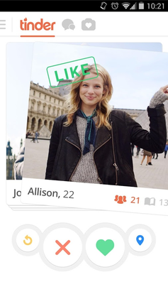
PhotoSource: http://www.evolutionoftheweb.com/?hl=en
Real Life Example:
Google Maps

Strategy: Garbage In – Garbage Out
Garbage in – garbage out (GIGO) refers to the concept that bad inputs will result in bad outputs no matter how accurate the logic behind the scenes is. This rule applies more generally to systems across different domains including business and education. The input errors can be related to incorrect type of data entered in a wrong field (e.g. zip code entered on state field), or wrong data entered on the right field (e.g. wrong email entered on email field). Affordances, previews and confirmations should be used to avoid problems of data quality or minimize errors in general. As per Lidwell, Holden and Butler in Universal Principals of Design, the best way to avoid garbage out is to prevent garbage in.
Lidwell, Holden & Butler: Universal Principles of Design.
Example 1: Universal Principals of Design – Forms


Example 2: Bad Data Costs the U.S. $3 Trillion per Year https://hbr.org/2016/09/bad-data-costs-the-u-s-3-trillion-per-year
Example 3: Operations and financial impacts for not having proper standards on system inputs. The domino effect. I worked on a project where we did not account for a proper field with a dropdown for time (hour) where a Customer Service Agent would enter the delivery time for a truck from Nestle to a big store (CostCo, Wal-Mart, Target). Since hours needed to be entered in military time, a new employee (although trained) entered hours in am/pm form. The results: trucks which were supposed to get to a store at 11 pm (23:00), got there at 11 am. For almost two days several trucks were getting to their destinations at the wrong time. The company was fined thousands of dollars and in some of the stores we weren’t able to supply products before the 4th of July weekend, resulting in loss of revenue.
Strategy: Orientation Sensitivity
Orientation Sensitivity is an experience of visual processing that certain line orientations are more easily processed from other lines. Visual information processing depends on different factors, with orientation sensitivity based specifically on oblique effects and pop-out effects.
Oblique Effects: easier to perceive horizontal and vertical lines than oblique. Implications for design: elements that are vertical and horizontal are considered more aesthetically pleasing to users.
Pop-out Effects: elements of an area ‘pop out’ and are quickly and easily detected. When we need to identify a line among other lines, it is easier when the target line differs from the others by 30 degrees or more. This effect is strongest when combined with the oblique effect.
Lidwell, Holden & Butler: Universal Principles of Design.
Example 1: Universal Principals of Design

Example 2: London Subway Map by Harry Beck
Replacing irregular lines with horizontal, vertical and 45-degree diagonal lines. Classic of information design -> First cases of a map designed from a user’s perspective.


Reference: https://www.theverge.com/2013/3/29/4160028/harry-beck-designer-of-iconic-london-underground-map
Example 3: I am still looking out there…
Strategy: Progressive Disclosure
Progressive Disclosure is a strategy to manage complexity in user interfaces, instructional materials and physical spaces. The purpose is to show only relevant information and allow users to explore further options as they become advanced in the system. Progressive Disclosure can be found in search options, pop-ups with the More button and in physical spaces to manage the perception of complexity and activity such as those in theme parks. The use of progressive disclosure reduce complexity and avoid users’ confusion and frustration with a given solution, product or service.
Lidwell, Holden & Butler: Universal Principles of Design.
Further reading: NN/g (https://www.nngroup.com/articles/progressive-disclosure/)
Example 1: Universal Principles of Design – Search boxes, modal screens.

Example 2: iOS Mail App -> Most frequent options visible as well as More for advanced functionality.

Example 3: Kayak.com – Most relevant menu options available with a More option at the top. E.g. Flights -> Round-Trip, One-Way, Multi-City or Explore for further options.

Strategy: Red Effect
Red effects are a set of triggers (cognitive and behavioral) evoked by the color red. Designers should use red whenever the intention is to increase general attractiveness of a given product or solution. According to studies, wearing red appropriately can make both genders more attractive to the opposite sex, can increase slightly competitive advantage in sports, and should be avoid at all on working and studying spaces as it impairs problem solving and creativity.
Lidwell, Holden & Butler: Universal Principles of Design.
Example 1: Universal Principles of Design – Same woman wearing red and blue. When wearing the red dress the woman increases her attractiveness.

Example 2: Why The Color Red Revs Your Desire (But Lowers Your IQ)
Andrew Tate, 2015: https://designschool.canva.com/blog/red-means/

Example 3: Here’s why all fast-food signs are red
http://www.businessinsider.com/why-are-fast-food-signs-red-2015-9

Strategy: Personas
Personas is a technique used to create user profiles of one or more archetype of users with the objective of learning and describing one’s interests, likes, dislikes, some demographics and other relevant behaviors. The number of personas should be kept small and the primary persona represents the target audience. Having a Personas defined can help in the process to define and prioritize requirements, as well as support the subsequent processes of design including ideation, prototyping and testing.
Lidwell, Holden & Butler: Universal Principles of Design.
Example 1: Universal Principles of Design

Example 2: NN/g – https://www.nngroup.com/articles/personas-jobs-be-done/
Example 3: Digital Mom Nestle Nutrition – This is the Personas resulted from the research we conducted in one of our projects a couple of years ago. We were researching how the millennial moms consult the different sources of information on how to feed their babies, as well as what influences the shopping decision-making.
