All products go through a life cycle that progress in stages during the existence of the product. Designers should consider a product’s life cycle while envisioning or creating something new. There are four stages of life for all products:
Introduction: launch of a product (it can coincide with final stage of development). Normally involves early adopters.
Growth: focus is to scale in supply and performance to meet product’s demand. Efforts to get requirements for next version of product should be underway.
Maturity: peak of life cycle. Sales decreases while competitors increase. Focus to enhance product features and maximize customer satisfaction.
Decline: sales decline, market share at risk. Focus to minimize maintenance and develop transition to new products. Testing of next generation products should begin at this point.
Lidwell, Holden & Butler: Universal Principles of Design.
The 80/20 refers to the concept that in a complex system, a large percentage of the effects are caused by a small percentage of the variables. Other examples provided in the Universal Principles of Design include:
80% of a town’s traffic in on 20% of its roads.
80% of a company’s profit come from 20% of its products.
80% of system failure are caused by 20% of the components.
Question that must be always asked: What is 20% of the design that drives 80% of the effects?
Lidwell, Holden & Butler: Universal Principles of Design.
Iteration is the concept of repeating a set of actions or procedures to achieve a preferred result. In UX, it would require a constant progression, testing, and tuning of the design.
Original Source:
Lidwell, William. “Aesthetic-Usability Effect” Universal Principles of Design: 125 Ways to Enhance Usability, Influence Perception, Increase Appeal, Make Better Design Decisions, and Teach through Design, Rockport, 2010.
Example from Original Source:
Example from Online Source:
Source: “Positive vs. Negative Iteration in Design” by Glenn Ballard, Proceedings of the Eighth Annual Conference of the International Group for Lean Construction, 2000
Personal Life Example:
Fans have been iterated over the years from the typical spoke version to the current version in the image above.
The inverted pyramid is a method of sharing information where the most important information is presented first and the rest is presented in descending order of importance.
Original Source:
Lidwell, William. “Aesthetic-Usability Effect” Universal Principles of Design: 125 Ways to Enhance Usability, Influence Perception, Increase Appeal, Make Better Design Decisions, and Teach through Design, Rockport, 2010.
Example from Original Source:
Source: Edwin Stanton, Abraham Lincoln’s Secretary of War (1865) – report of assassination
A process where design is taken into consideration by a group and decisions are made by the group. Of course, this assumes no bias, the correct influencers are present, and a general agreed upon collaborative decision is made.
Original Source:
Lidwell, William. “Aesthetic-Usability Effect” Universal Principles of Design: 125 Ways to Enhance Usability, Influence Perception, Increase Appeal, Make Better Design Decisions, and Teach through Design, Rockport, 2010.
Example from Original Source:
Example from Online Source:
Example from Personal Life:
The Apple Watch involves numerous parts from a variety of companies/makers. Design by Committee is paramount for its success.
Study shows that most people are attracted to a face that looks average than a face that looks unique. Research has shown that combining photos of several people’s faces to generate a composite, an “average” face was created. In trials, it showed that these highly average faces were consistently rated more attractive.
Original Source:
Lidwell, William. “Aesthetic-Usability Effect” Universal Principles of Design: 125 Ways to Enhance Usability, Influence Perception, Increase Appeal, Make Better Design Decisions, and Teach through Design, Rockport, 2010
Example from Original Source:
Example from Online Source:
The “Average Joe” as depicted in the British TV Show: The Office.
Rosetta stone is a technique of communicating new information that must first be unlocked (or decoded ) by a set of commonly understood elements, known as the ‘key’. The elements of the key act help bridge the users understanding the new information. The information that makes up the ‘key’ must be made obvious so that the user can interpret it and use it as a reference when examining the new information. The new information should be presented in stages with stages building on each other: The previous ‘key’ plus the newly unlocked information will act as the ‘key’ for the next stage.
William Lidwell, Kritina Holden and Jill Butler, Universal Principles of Design (USA: Rockport publishers, 2003) ,206.
The Rosetta stone technique is commonly used in educational learning platforms when introducing new concepts. The presentation of the material is structured so that the first principles taught are demonstrated in relatable terms. Once a lesson has been mastered, the next lesson is unlocked and builds on the concepts taught in the previous. The previous lessons become a new key for understanding new concepts.
Original image
The plaque for the Pioneer space probes with messages designed for potential extraterrestrial encounters, and the Rosetta disk; a human language archive designed to last thousands of years.
William Lidwell, Kritina Holden and Jill Butler, Universal Principles of Design (USA: Rockport publishers, 2003), 207.
The key signature at the beginning of a measure lets a pianist know how to interpret the notes that follow (which notes are sharpened or flattened; white or black keys on the piano), without the key signature a pianist would never be able to play the melody or harmonies correctly.
Kojo Kondo, The Legend of Zelda for Piano, The Wind Waker Movement II, Measure 56 in D flat major (USA: Alfred Music, 2015), 28
Designs created for optimal performance that are often not chosen because of personal preference based on a number of different, individual factors such as familiarity of aesthetic preference over the desire for improved performance.
Example from Universal Principles of Design: QWERTY versus Dvorak Keyboard (pg. 181)
Example from an Online Source: Kyocera Keitai Smart Flip Phones in Japan 2017, flip phones are still preferred by many users in Japan, though they incorporate all the same aspects as a smart phone like an iphone or android phone in the U.S. This model of phone runs android software for smart phone capability in the body of the familiar and sometimes preferable aesthetic of a flip phone, but lack the performance convenience of a touch screen and require use of t9 for typing instead of having a full keyboard.
Example from Real Life: Portable Cassette Player and few tapes in my collection in 2017. Though it takes up much space, is not convenient and tape players break often and must be replaced frequently, I prefer the sound quality and warmth of the lofi medium over digital music.
A path worn by the natural walking pattern preference of people in a certain area off of the designated path or sidewalk, most often in order to form a shortcut between one point to another.
Example from Universal Principles of Design: Worn Pathway off Sidewalk (pg. 77)
Example from an Online Source: Cycling Path Desire Line, a path worn down into the grass from cyclists and pedestrains cutting the corner and walking across the grassy area, wearing it away.
Example from Real Life: Golf Cart tracks through the grass rather than going the long way and staying on the designated path.
An environmental preference that provides an open, visible environment with areas that provide a concealed space to retreat when wanted/needed, thought to be a preference based on evolutionary developments from preferred natural spaces to preferred human-created spaces.
Example from Universal Principles of Design: Cafe Layout Design (pg. 193)
Example from Online Source: Study Alcove, the space allows its occupant to look out into their environment freely, but has recessed areas for the occupant to retreat back into for privacy.
Example from Real Life: Cat Cubbies, Cat Cafe, the cubbies allows privacy and a refuge space for the cats to seek privacy, especially in the bottom shelf or underneath the structure, while still allowing them to look out into their environment open space freely.
Horror vacui is the tendency to fill all white, or negative space. In Latin, it means “fear of emptiness,” and is the opposite of minimalism. In a commercial application, there is a perception of value depending on how full or empty a store display is. One that is packed with very little empty space is perceived to have a lower value than a store employing more space between objects.
Example 1 – Universal Principles of Design: Shop Window with Lower and Higher Perceived Value
This is a strategy of perceived value, meaning the product is attractive and valuable to consumers because it has a high price. Some may think that high price equates to higher quality, while others may find the scarcity of an expensive item to be the attraction.
Example 1 – Universal Principles of Design: Tesla Roadster
Example 2 – Kopi Luwak: The Most Expensive Coffee in the World
The amount of time is takes to make a decision increases as the options available also increase. This can result in decision paralysis. It’s our job as designers to identify and prioritize the needs of the user rather than give them a laundry list of potential options.
The Interaction Design Association defines it as, “he more stimuli to choose from, the longer it takes the user to make a decision on which one to interact with. Users bombarded with choices have to take time to interpret and decide, giving them work they don’t want.”
Example 1 – Universal Principles of Design: Road Signage
Settling for a satisfactory result rather than laboring in pursuit of the ideal or ‘perfect’ solution. Sometimes this is leveraged against the ROI or return on investment with budgets and timelines dictating how far you can pursuit the idealized state. In most projects, a level of severity of an outstanding issue has to be assigned. Certain issues may be ‘show stoppers’ while others are just ‘like to haves.”
Herbert Simon coined the term ‘satisficing’ by combining the words satisfy and suffice. He asserted that, “people, in many different situations, seek something that is “good enough”, something that is satisfactory.”
Example 1 – Universal Principles of Design: Apollo 13 Carbon Filter (with additional insights from Gizmodo)
Example 2 – Brand Society: Swatch Watches versus precision time pieces
Example 3 – Inside Disney: Launching without desired functionality, but still solves the needs of 80% of users
Techniques to reorganize and/or group information to help make it easier to remember. Some people make up songs or rhymes to help remember large volumes or complex information. It’s related to chunking.
PsychCentral describes it as, “a simple shortcut that helps us associate the information we want to remember with an image, a sentence, or a word.”
Example 1 – Universal Principles of Design: Treehouse Lofts
Environments that evoke rich sensory experiences related to nature help improve concentration, reduce stress and improve healing and recovery. The benefits are not constrained to actual views of nature through a window or door or even visual input, but can be simulated through posters, installation of plants, water features and natural materials.
There doesn’t seem to be much disagreement about this strategy, only degrees with which it is employed. Most sources mention only imagery (Universal Principles of Design and HOK), but others refer to multiple tactics that use biophilia effect in design.
Example 1 – Universal Principles of Design: Hospital Prototype
Commonly, we see an affordance as the design of an object or space directly informing how it will be used. That assumes that it is a good design that is intuitive to interact with. We have all seen faulty designs, where the affordance isn’t intuitive and the users develop their own workaround.
The way that controls and their movements or effects (what they do) are related to one another; good mapping results in an easier use experience for the user whereas poor mapping results in poor ease of use.
Example from Universal Principles of Design: Stove tops and Stove Controls; Window Controls in the Car, Segways (pg. 153).
Example from an Online Source: Power seat controls in a vehicle designed to be in the shape of the seat for ease of use and understanding as to which button controls which part of the seat.
Example from Real Life: Poor Mapping Design in my Old Car; the location of the radio display high on the dashboard and the location of the radio controls located below the center console near the center armrest of the car behind the car’s gearshift knob and parking brake. There is no mapped relation between the radio display itself and the radio controls.
Defined space to convey ownership and sense of safety in order to deter crime in the form of territoriality, surveillance and symbolic barriers, for example, fences, walls, exterior lighting, lawn furniture or hedges.
Example from Universal Principles of Design: Homes & Defensible Space (pg. 71)
Example from an Online Source: A Fenced House wherein the fence is exhibiting territoriality and is also somewhat of a symbolic barrier since it is relatively small and unimposing.
Example from Real Life: Townhome with a security gate, small wall and landscaping to show ownership, inhabitance and sense of heightened security with locking gate.
The use of color to reinforce the impact of a design of the meaning with consideration to number of colors, color combinations, saturation and symbolism with careful consideration for cultural significance of a color being used.
Example from Universal Principles of Design: Complimentary Colors (pg. 49)
Example from an Online Source: The Firefox Logo, Complimentary Colors
Example from Real Life: Photograph of an Oil Pastel Drawing of an Ocotillo Skeleton, Complimentary Colors
An innate, subconscious bias that informs a person’s opinion or perception of something based on the accepted stereotype and elicits a specific, set emotional reaction.
Example, from Universal Principles of Design: Danger Warnings to future humans to warn them of radioactive waste (pg. 29)
Example from an Online Source: Explorer Archetype; Jeep Advertisement depicting the Jeep in an extreme adventure scenario.
Example from real life: Tesla Store in Scottsdale Fashion Square Mall; portraying the alternative tech meets luxury persona established by the brand with the vehicles displayed in a sleek, modern environment within a luxury shopping mall.
Threat detection is a human evolved (and animal) ability that quickly allows us to identify threats. The visual system automatically detects things like snakes, spiders, and angry threatening faces. Because this is an ongoing subconscious process it triggers quickly, but it can be prone to mistakes when we react to everyday things that have features resembling threatening stimuli. For example water hoses, or wavy lines could be mistaken for snakes.
William Lidwell, Kritina Holden and Jill Butler, Universal Principles of Design (USA: Rockport publishers, 2003), 236.
This strategy can be applied to design by integrating threatening imagery to attract and hold the user’s attention to your design, especially in intense high stimulus environments where many elements are competing for the user’s attention. It can also be used in the opposite way by influencing human behavior to avoid certain actions. For example it can be used to keep people away from certain areas, or limit unwanted behaviors.
Original source image
William Lidwell, Kritina Holden and Jill Butler, Universal Principles of Design (USA: Rockport publishers, 2003), 237.
The Uncertainty Principle states that the act of measuring a variable can affect the nature of the system enough that it alters the measurement in a way that makes the measurement invalid. This depends on how expensive and invasive it is to get the measurement. Using computer event logging as an example we can understand the principle. Creating log files that periodically record details about a computer’s performance will consume computer resources, which can degrade computer performance just by the virtue of recording this information. The level of invasiveness required to measure the performance will dictate how the overall system performance is taxed, for example checking a performance variable multiple times a second and recording that information to a file immediately uses more computer resources than checking every minute or hour. A system doing frequent lookups and writes will appear busier than usual and will result in performance metrics that inflate or deflate whatever variable was being measured.
William Lidwell, Kritina Holden and Jill Butler, Universal Principles of Design (USA: Rockport publishers, 2003), 244.
This principle can be applied to design in multiple ways. Designers should be careful to use minimally invasive measures, not only with technology but in social and behavioral ways. For example when interviewing people about their impressions with a product or service they should be careful how the questions are formed so that the participants are not put on the spot or pressured which can result in dishonest answers. This principle can be used to promote positive behaviors too, for example a common weight loss technique is to keep a diary of all the food one eats throughout the week. This awareness alone can trigger a self analysis and reflection that can lead a person to adjust their diet make healthier choices.
Original source image
William Lidwell, Kritina Holden and Jill Butler, Universal Principles of Design (USA: Rockport publishers, 2003), 245.
Real world image
Monitoring my Prius’s mpg metrics while I’m driving makes me more aware of how I handle the car and sometimes causes me to ease up on the gas pedal to conserve more gas.
Uniform Connectedness is a Gestalt principle of perception that states that elements connected by lines or grouped by regions are perceived as more related than elements not connected by lines or grouped. One strategy of Uniform connectedness is to connect 2 or more elements directly by a line. The other strategy of Uniform connectedness is to group 2 or more elements by an enclosing region or a shaded area. This is the strongest Gestalt grouping principle, and overrides proximity and similarity. So for example 2 similar elements that are next to each other can appear related however this relation can be easily broken by simply drawing a line connecting each of these elements to foreign entities.
William Lidwell, Kritina Holden and Jill Butler, Universal Principles of Design (USA: Rockport publishers, 2003), 246.
Uniform connectedness can by applied in design by organizing control panels with many switches, buttons or functions. Connecting lines can be used to imply a sequences of steps. Region shading can be used to associate text with corresponding controls, or to group together common functions.
Original source image
William Lidwell, Kritina Holden and Jill Butler, Universal Principles of Design (USA: Rockport publishers, 2003), 247.
Online image
Dialog in comics is matched to the corresponding character by drawing the dialog bubble around the text and having the line connect to the character. http://www.wikiwand.com/en/Comics
Real world image
Whirlpool Microwave button panel, Tustin
In design, Ockham’s Razor is the idea that simplicity is preferred to complexity. Unnecessary design elements decrease a design’s efficiency and can lead to various issues. Other variations of this principle exist, and I’m reminded of the famous Apple ad “Simplicity is the ultimate sophistication.”
Original Example
The Yamaha Compact Silent Electric Cello is a minimalist cello with only those portions touched by the player represented. Musicians can hear concert-quality cello sound through headphones while creating a little eternal sound, or through an amplifier and speakers for public performances. The cello can also be collapsed for easy transport and storage.
Online Example
This Dyson V7 Cordless Vacuum Cleaner is the definition of simplicity as the ultimate sophistication. The vacuum is slim and light, yet powerful.
Real Example
My desk lamp from IKEA is just light bulb, neck, and base. Elegant design with minimalist qualities.
Source
Lidwell, William, et al. Universal Principles of Design: 125 Ways to Enhance Usability, Influence Perception, Increase Appeal, Make Better Design Decisions, and Teach through Design. Rockport Publishers, 2003.
Interference effect is a phenomenon that occurs when mental processing is made slower due to contradicting interpretations. The textbook recommends avoiding designs that create conflicting mental processes to lessen the burden on the user. A few examples of interference effects include:
Stroop Interference: an irrelevant aspect of a stimulus triggers a mental process that interferes with processes involving a relevant aspect of the stimulus.
Proactive Interference: existing memories interfere with learning
Retroactive Interference: learning interferes with existing memories
Original Example
Reading the words aloud is easier than naming their colors. The mental process for reading is more practiced and automatic and, therefore, interferes with the mental process of naming the colors.
Online Example
The conflicting message interferes with the mental process of driving.
Real Example
Naming the shapes out loud is easier than reading the titles
Source
Lidwell, William, et al. Universal Principles of Design: 125 Ways to Enhance Usability, Influence Perception, Increase Appeal, Make Better Design Decisions, and Teach through Design. Rockport Publishers, 2003.
Self-similarity is an object or thing that is exactly or approximately similar to a part of itself. In particular, the whole has the same shape or pattern as one or more of its parts. This phenomenon is widespread in nature and the arts.
Original Example
Robert Silvers’ photomosaic of The Mona Lisa The photomosaic comprises of 800 classic art images and demonstrates the power of self-similarity at two levels.
Online Example
Fractal Fern Each leaf of this fern plant contains an exact replica of more tiny leaves!
Real Example
Yayoi Kusama: Infinity Mirrors This art exhibit experience demonstrates the power of self-similarity. When you stand in front of the mirrors, you can create an infinite sequence of smaller reflections of yourself.
Source
Lidwell, William, et al. Universal Principles of Design: 125 Ways to Enhance Usability, Influence Perception, Increase Appeal, Make Better Design Decisions, and Teach through Design. Rockport Publishers, 2003.
The principle of proximity asserts that elements that are closer together or grouped are perceived as related. This principle is also referred to the Gestalt Principle of Perception. In design, a lack of proximity results in the perception that there are differences among the elements. It’s necessary to ensure labels and or text information is appropriately placed.
Original Example
Interior car controls are often placed in the center of the dashboard.
Online Example
Proximity between circles influences how they are grouped – as square groups or as a rectangular group.
Real Example
The photos app on iPhones does a great job grouping related photos together. It can be categorized down to the year.
Source
Lidwell, William, et al. Universal Principles of Design: 125 Ways to Enhance Usability, Influence Perception, Increase Appeal, Make Better Design Decisions, and Teach through Design. Rockport Publishers, 2003.
The picture superiority effect says that humans recognize and remember pictures more than words. This principle is widely used in advertisements, instructional design, and other contexts where easy and accurate information recall is required. The book also suggests using pictures and words together to reinforce the same idea/information for optimal effect.
Original Example
The Watch Shop Ad 5 advertisement for a clock repair shop that includes a picture of a clock will be better recalled than the same advertisement without the picture.
Online Example
This McDonald’s ad features a promo for 30 cent ice cream without much text.
Real Example
I picked up this Bear Republic Brewing Co. coaster from a bar. The image represents the brand well and allows beer fans to recall the “bear” beer brand.
Sources
Lidwell, William, et al. Universal Principles of Design: 125 Ways to Enhance Usability, Influence Perception, Increase Appeal, Make Better Design Decisions, and Teach through Design. Rockport Publishers, 2003.
When you visually perceive the whole, as opposed to the elements that make up a whole. Deriving from Gestalt principles of perception, elements in proximity are perceived subconsciously as the whole.
Source: Lidwell, William. Universal Principles of Design: 125 Ways to Enhance Usability, Influence Perception, Increase Appeal, Make Better Design Decisions, and Teach through Design. Rockport, 2010.
Comparison is a method of illustrating relationship and patterns in or between systems or objects. There are three key techniques for making valid comparisons:
Apples to Apples: using common measure and/or common units to present comparisons
Single Context: comparison data should be presented in a single context
Benchmarks: suggests comparing data or objects in relations to standards that have been already made in the past. Past performance data can include comparing one record to an older record.
Original Example
Florence Nightingale’s famous Coxcomb graphs. This graph makes apples to apples comparisons, representing the same variable (death rates) the same way (are of the wedge).
Online Example
A benchmark comparison of the inauguration of Barrack Obama (left) vs Donald Trump (right).
Real Example
Apples to apples comparison of two brands of sunscreens. The ingredients in these two sunscreens are exactly the same. The only difference is one is a pharmacy brand vs a name brand.
Source
Lidwell, William, et al. Universal Principles of Design: 125 Ways to Enhance Usability, Influence Perception, Increase Appeal, Make Better Design Decisions, and Teach through Design. Rockport Publishers, 2003.
An aesthetic technique that optimizes a composition by using a grid to divide into thirds. One would position the subject in a specific grid to create intrigue and interest.
Sources:
Lidwell, William. Universal Principles of Design: 125 Ways to Enhance Usability, Influence Perception, Increase Appeal, Make Better Design Decisions, and Teach through Design. Rockport, 2010.
The Rule of Thirds: Know your layout sweet spots, Interaction Design, Oct 2017. https://www.interaction-design.org/literature/article/the-rule-of-thirds-know-your-layout-sweet-spots
Symmetry creates balance, harmony, and stability in design. It is considered the most basic aspect of beauty. Symmetry is one of the Gestalt principles; there are three types of symmetry: Reflection, Rotation, and Translation. Reflection symmetry is the mirroring of elements around a central axis (i.e., butterfly). Rotation symmetry is the rotation of elements around a common center (i.e., sunflower). Translation symmetry is the location of elements in different areas of space (i.e., school of fish). Use simple symmetric form when recognition is important, and use a combination of different types of symmetric forms to emphasis interestingness.
Modularity is a system management method that involves managing a large and complex system by dividing it into multiple and self-contained systems (modules). A computer memory chip is a good example of modularity. The owner of the computer can add the memory chip without any requirements to increase the memory. If a computer chip were not modular, the only way to increase memory would be to buy a new computer. Because modular design reduces the complexity of the system architecture, it improves reliability, flexibility, maintainability, as well as promoting innovation.
Source: Universal Principles of Design: Modularity
Example 1 (original source) – Universal Principles of Design: Modularity
Attractive people are perceived to be more socially desirable than unattractive people. It has been studied and proven that they receive more positive attention and are more associated with intelligence and honesty. They are preferred in hiring decision, make better money doing the same work, and receive leniency in the courtroom. Human are shown to ascribe positive characteristics to attractive people subconsciously. Studies shows that biological factors of attraction are innate. For example, one study showed pictures of attractive and unattractive people to babies, and found that babies looked longer at attractive people. Attractive bias is often used in marketing and advertising where images of people are shown.
Source: Universal Principles of Design: Attractiveness Bias, Wikipedia
Example 1 (original source) – Universal Principles of Design: Attractiveness Bias
Immersion is a state of being in which mental focus is so intense that the individual loses a sense of reality; examples of immersive activities include playing games and reading. Working on tasks can also be immersive, resulting in feelings of joy or/and satisfaction. Immersion occurs when perceptual and cognitive systems are challenged just enough to align with capacity (people become bored when these systems are not challenged enough, but get frustrated when they are challenged too much). To incorporate immersion in activities and environment requires people’s participation over time. To achieve immersion, it is important to provide the right balance of control, stimuli, and distraction from the real world.
Source: Universal Principles of Design: Immersion
Example 1 (original source) – Universal Principles of Design: Immersion
Good continuation is one of the Gestalt principles of perception. Elements aligned in lines or curves are perceived as a group, and are considered more related than unaligned elements. For example, two V-shaped lines appearing side by side are perceived as two shapes. However, when those lines are inverted and connected at the bottom to form an X shape, we no longer see two V shapes but instead see one X shape. Good continuation is useful to indicate connectedness between or among elements.
Source: Universal Principles of Design: Good Continuation
Example 1 (original source) – Universal Principles of Design: Good Continuation
Humans perceive people and things that have baby-like features have baby-like traits – such as naivety, helplessness, and honesty – more than those that have mature features. Babies with stronger “baby-face” features receive more positive attention from adults and are considered more fun to be with than babies with weaker baby-face features. Baby-faced adults are effective when they play a role involving innocence and honesty; however, they are perceived as ineffective when the role involves assertiveness and authoritativeness. In addition, it is easier to believe that an innocent person would do wrong accidentally than intentionally. For example, in a courtroom, baby-faced adults tend to be found innocent in intentional acts but are likely to found guilty in negligent acts.
Source: Universal Principles of Design: Baby-Face Bias
Example 1 (original source) – Universal Principles of Design: Baby-Face Bias
Humans have tendency to perceive certain forms as humanlike – typically resembling a face or body. When this tendency is applied to design, it attracts more attention as well as establishes emotional connection. Feminine body proportion evokes sexuality and vitality. Round forms are used to evoke baby-like features. Angular forms evoke masculinity.
Source: Universal Principles of Design: Anthropomorphic Form
Example 1 (original source) – Universal Principles of Design: Anthropomorphic Form
Iconic representation is a way to impart information through simple imagery and symbols. This can be branding, so we can more easily recognize and recall [1]; icons that help us navigate systems while minimizing the space used, as with UI controls; and, can be used as a way of imparting information to a large group of people without the need for language, such as with signage [2] along roads and in airports.
Chunking was introduced by George A. Miller, in a 1956 paper: “The Magical Number Seven, Plus or Minus Two : Some Limits on our Capacity for Processing Information.”[1] In psychology, it means an organizational unit of memory.[2] Information science has rapidly learned to use it to distill ever increasing amounts of information down to bite-sized “chunks.” The design world uses this principle to impart a lot of information in a digestible format.
Waist-to-Hip ratio (WHR) refers to the penchant to find a specific ratio of waist and hip attractive. For men, studies show 0.7 is the “golden ratio,” while for women it is shown to be approximately 0.9 [1]. In design, this can be used to sway the viewer towards liking what they see in context to the WHR, as can be seen with the average fashion model’s WHR being 0.7. This concept is based on research by Dr. Devendra Singh of the University of Texas at Austin.[3]
[2] “Waists, Hips And The Sexy Hourglass Shape.” Psychology Today. N. p., 2017. Web. 15 Oct. 2017.
[3] Singh, D. (1991). An Evolutionary Theory of Female Physical Attractiveness. [ebook] Austin. Available at: http://people.fmarion.edu/tbarbeau/An%20Evolutionary%20Theory%20of%20Female%20Physical%20Attractiveness.pdf [Accessed 15 Oct. 2017].
Wabi-sabi is an aesthetic principle based on the amalgamation of two Japanese aesthetic concepts: wabi, meaning “things that are fresh and simple,” and sabi, meaning “things whose beauty steam from age.”[1] It is also known as the “art of imperfection.” [2] It is a humbling aesthetic choice that shows that art, architecture, design, or even life does not have to be shiny, new, expensive, or fancy to be perfect.
A scaling fallacy is one where people believe, wrongly, that something at a certain size will automatically work at a different size (bigger or smaller). This can be related to in many areas of design, production, economics, and engineering. An example: a car that can drive 100mph with a 2.0 liter engine should not be expected to be able to drive 200mph with a 4.0 liter engine.
A little known fact is that the largest tower in Tulsa was designed by Minoru Yamasaki, the Twin Towers’ architect. It was designed at almost exactly half the scale during the oil boom of the 1970s. Tulsa has lots of land. Going up was not necessary. This was a status symbol ordered by William’s corporation CEO John Williams. Unfortunately, it never garnered the same national attention that made the twin towers so iconic. Some argue that is due to the fact it lacks the twin and the size.[4]
[1] Hardman, Daniel. “The Scaling Fallacy.” Codecraft. N. p., 2012. Web. 14 Oct. 2017.
[2] Jones, Brandon. “The Scaling Fallacy And Web Design.” Web Design Envato Tuts+. N. p., 2011. Web. 15 Oct. 2017.
[3] “The Believer – The Lost Twin: The Lone, Shrunken World Trade Center Tower In Oklahoma.” The Believer. N. p., 2008. Web. 15 Oct. 2017.
[4] “1/4 World Trade Center: Tulsa’S Half-Sized, Untwinned Tower.” WebUrbanist. N. p., 2016. Web. 16 Oct. 2017.
Named after the Swedish retailer that sells items that require partial assembly by the customer., the IKEA effect was demonstrated by Norton, Mochon, and Ariely, who found that people show increased value to products they either made wholly or partially. Participants “saw their amateurish creations as similar in value to experts’ creations.”[1] It is a cognitive bias that increases the perceived value of something because they had a hand in making it. The research specifically shows the effect being related to the completion of the task, not the size of the task. This means that we can “create a stronger bond between user and product” by allowing them to have a hand in its creation. [2]
Example of a Home Garden
Apple Music Onboarding
Tulsa Community College, Center for Creativity
This example is a little obscure, so I’m adding an explanation. I got my first U.S. degree from this location, and because of the time, money, and effort I put into that I feel very attached to this building. I believe it is of more value than just a community college.
[1]Norton, M., Mochon, D. and Ariely, D. (2017). The IKEA effect: When labor leads to love. [online] Harvard Business School. Available at: http://www.people.hbs.edu/mnorton/norton%20mochon%20ariely.pdf [Accessed 14 Oct. 2017].
The use of something that is familiar to other people, in order to reap the benefit of that recognition. While there are negative connotations surrounding the use of mimicry in design, there is also the thought that “why [should we] resolve problems that nature has already solved over thousands of years?” [1] This can be extended to the UI design realm, taking into consideration copyright infringement, by reusing well-known or well-adopted interface elements and patterns. This makes sense from a user experience perspective, which is backed up by jakob Nielsen’s 10 Usability Heuristics for User Interface Design.[2]
The Flexibility Usability Tradeoff design principle is about the balance between having the many options or solutions and the functionality and simplicity of the design. Example of flexibility is the swiss army knife. It has scissors, bottle opener, knife, saw, file, and more. However, the flexibility comes at a cost of increased complexity and decreased usability. The small scissors aren’t usable for large cutting tasks.
Example: The Swiss army knife’s flexibility: it has scissors, bottle opener, knife, saw, file, and more. However, the flexibility comes at a cost of increased complexity and decreased usability. The small scissors aren’t usable for large cutting tasks.
“If an audience’s needs are clearly understood then designs should target those as efficiently as possible, whereas if they are less well understood then build greater flexibility and contingency into systems to ensure the widest possible set of applications.” From www.doctordisruption.com
Example found online: A Convertible Dressthat allows the user to have multiples styles based on the occasion.
Example found in the real world: An all-in-one screwdriver that provides several options for heads. However, the tradeoff is the heads are not tightly secured to the pipe because it uses magnets to attach the two pieces.
Framing is a technique typically used in advertising, marketing, and other forms of media to manipulate the way information is presented (Universal Design Principles). It’s a way to change or enhance people’s viewpoints. It’s often used in propaganda to sell or disparage an idea, belief, or system. For instance, prohibition campaigns in the early 1900s framed alcohol in negative terms in order to gain support for laws banning alcohol.
Example found online: Anti-Hillary Poster.Opponents promoted anti Hillary Clinton images and news to disparage her candidacy during the 2016 Presidential election. This poster frames Hillary Clinton with the star of David and money. The poster aims to rile up racist Americans against her.
Example found in the real world: Chilean resistance posters found in a restaurant and community center. These posters remind viewers of the bloody coup that threw Chile into chaos. Images of an explosion, barb wires, and broken glass frames the narrative as a struggle against the violence to its citizens and leaders.
Nudge is a technique to lead people to take action that will result in a positive outcome. It’s generally something that people don’t do even though it’s good for them.
Universal Design Principles and Nudge (Thaler and Sunstein)) provide the methods for effective nudges: Defaults, Feedback, Incentives, Structured Choices, and Visible Goals.
People generally need nudges when there are difficult choices between benefits now and benefits later. For instance, people struggle to save for their retirement like using a 401k plan because it takes away access to their money. Companies often use a default contribution percentage to get employees to add to their 401k plan.
The example from Universal Design Principles is a fly graphic on a urinal. The fly acts as a target, reducing splash.
Example found online: These stairs in Japan encouraging people to use the stairs because it burns calories.
Example found in the real world: A sign encouraging dinners to eat vegan to save the planet.
The Universal Design Principles states the following tactics that are applied to this principle: exclusive information, limited access, limited time, limited number, suddenness.
Example: Event at H&M has limited time to shop. Shoppers only have 15 minutes to grab what they want and can only pick two items per style.
Example found online:Pliney The Elder Beer is a craft beer that is available in limited quantity. The company doesn’t market the beer and doesn’t provide release dates. The scarcity causes consumers to hunt for the beer and make a purchase because they know that it will sell out quickly.
Example found in the real world: Safeway advertising items that are only on sale on a specific date. It was posted a couple of days before the sale to entice the customer to come back.
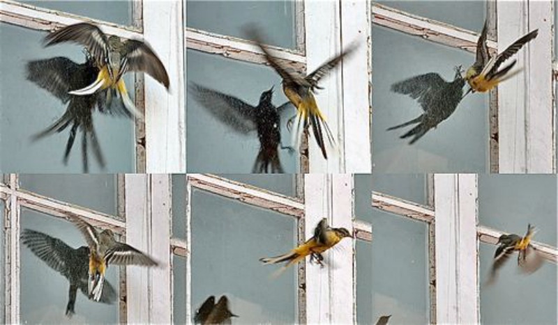
Anti-affordance is the prevention of an action or interaction. (Norman, Design of Everyday Things). A window affords visibility. However, it’s anti-affordance results in birds flying against it.
Example: Gore-tex primes the consumer with images of rain and cold. The images trigger the consumer’s emotions and memory of being wet and cold. Thus, influencing the consumer to purchase a jacket.
Example found online: Zzzquil images on their Twitter profile associates the product with relaxation, calm, and sleep.
Example in the real world: Cinnabon leverages smell to entice mall visitors to purchase their product. They place their ovens in the front of the store and bake new buns every 30 minutes. It’s also rumored that they have fans to blow the smell farther from their store.
Forgiveness is a design principle that helps people prevent errors, minimize consequences, or allows them to correct their mistakes. It may include warnings, confirmations, help or assistance, safety nets, and a way to reverse the error.
Example: Road sign warning drivers that there are pedestrians are not paying attention to traffic.
Example found online: Google Apps provide a safety net for users by autosaving their work. Users don’t have to think about saving.
Affordances and constraints help prevent errors. For instance, the size of gasoline nozzles are constrained and regulated to match the size of the afuel tank opening in cars. This prevents users from putting diesel gasoline into their car that only takes unleaded gasoline.
Example found in the real world: MacBook plug. The plug is attached to the laptop with magnets. It unplugs easily if the user trips on the cord.
Feedback loop is the response received from a stimuli, which is then fed back to alter the stimuli which in turn tweaks the consequent response or reaction. This process goes on till an equilibrium or desired response has been acquired.
There are two kinds of feedback loops : Positive and Negative. (Universal Principles of Design, pg. 92-93)
Positive Feedback Loop : amplifies system output, resulting in growth or decline. These are effective in creating change but generally result in negative consequence. Negative Feedback Loop : dampens output, stabilizing the system around an equilibrium point. These are effective for resisting change.
Fly-by-wire control systems use the Feedback loop strategy to perform tasks without pilot input.
Image from source
The Airbus A320, first airliner with digital fly-by-wire controls. (Wikipedia)
Feedback loop diagram : Fly-by-wire control systems allow aircraft computers to perform tasks without pilot input. Automatic stability systems operate in this way. Gyroscopes fitted with sensors are mounted in an aircraft to sense movement changes in the pitch, roll and yaw axes. Any movement (from straight and level flight for example) results in signals to the computer, which automatically moves control actuators to stabilize the aircraft.
Temperature regulation in humans occurs constantly. Normal human body temperature is approximately 98.6°F. When body temperature rises above this, two mechanisms kick in the body begins to sweat, and vasodilation occurs to allow more of the blood surface area to be exposed to the cooler external environment. As the sweat cools, it causes evaporative cooling, while the blood vessels cause convective cooling. Normal temperature is regained. Should these cooling mechanisms continue, the body will become cold. The mechanisms which then kick in are the formation of goose bumps, and vasoconstriction. Goosebumps in other mammals raise the hair or fur, allowing more heat to be retained. In humans, they tighten the surrounding skin, reducing (slightly) the surface area from which to lose heat. Vasoconstriction ensures that only a small surface area of the veins is exposed to the cooler outside temperature, retaining heat. Normal temperature is regained.
Images from real life
Feedback loop and Speed Radars.
Let’s say you are driving just a little too fast and you pass a digital radar sign that says, “Your Speed Is…” and displays the current speed of your car as you pass. Our first instinct is to press the brake pedal and slow down till we are close to the desired speed.
These signs are one example of a feedback loop. The output of your current behavior (driving too fast) becomes the input for your new behavior (slowing down).
The Gutenberg diagram describes a general pattern the eyes move through when looking at evenly distributed content stimuli. The pattern applies to text-heavy content. Think pages in a novel or a newspaper.
The Gutenberg diagram divides the layout into 4 quadrants.
Primary optical area located in the top-left
Strong fallow area located in the top-right
Weak fallow area located in the bottom-left
Terminal area located in the bottom-right
The pattern suggests that the eye will sweep across and down the page in a series of horizontal movements called axes of orientation. Each sweep starts a little further from the left edge and moves a little closer to the right edge. The overall movement is for the eye to travel from the primary area to the terminal area and this path is referred to as reading gravity. (Universal Principles of Design, p.118)
However, as people have started reading on websites, a new eye movement pattern has been identified as the F- shaped pattern, where the lower left corner is actually an area of focus. (Nielsen, 2006)
Another pattern that has been identified is the Z- shaped pattern. (Babich, 2017) A Z-pattern design traces the route the human eye travels when they scan the page— left to right, top to bottom:
First, people scan from the top left to the top right, forming a horizontal line
Next, down and to the left side of the page, creating a diagonal line
Last, back across to the right again, forming a second horizontal line
Resource Example
Gutenberg Diagram explained.
ONLINE EXAMPLE
The logo and value propositions are placed in the first quadrant. A phone number (Secondary means of conversion) is in the strong fallow area. We conclude with a call to action in the terminal area. Source : http://www.clicksandclients.com/
REAL LIFE EXAMPLE
Books often employ the Gutenberg Diagram for visualization. The copy lies predominantly in the upper-left corner, where the Western eye first enters the page (Gutenberg Diagram). The angle of the figure’s body and the robe pull the eye to its preferred exit at the lower-right corner. Though very small, the face manages to capture our attention. The outstretched arm and the direction of the gaze work as convergence tools that direct our eyes toward the title.
There are two types of memory retrieval : recognition and recall.
Recognition refers to our ability to “recognize” an event or piece of information as being familiar, while recall designates the retrieval of related details from memory. (Nielson, 2014).
It is easier to recognize things that we have experienced earlier than having to recall those from memory. For example, when you go to an Italian restaurant, an image or a description of the ingredients of a dish (that you have tasted before) will instantly provide you with cues of how it tasted than when the menu has only the name. Just the name of the dish will make you search your memory for when you had it and how it felt. You may or may not be successful in recalling this.
This concept can be employed to digital interfaces as well. I have experienced this especially when instructing my mother on how to use her smartphone. I have often observed that my mother fails to understand when I ask her to use the “search” function on the phone. I believe, this makes her recall what “search” looks like. But when I tell her to look for the magnifying glass on her screen, she is instantly able to associate and locate the search function. Here, recognition is being used.
Resource Image
Bing has a link to the user’s search history. The link helps users remember previous searches. (Nielson, 2014)
Online Image
Amazon Order History: Amazon provides a history of your order with description of the item and other related details. These lists help users to remember what they had ordered before or if they need to order it again, they can reach out to this instead of searching for the item again (recall).
Wordpress.com uses symbols plus text to label functional pages on the Dashboard. This aids in recognition
Showing users their options
and letting them choose among them, rather than force users to recall their options
and tell the computer what they want.
Real life example
The icons used for the buttons on the steering wheel of the car, activate recognition memory retrieval, they icons can be related to what real life actions.
The human eye likes to find simplicity and order in complex shapes – it prevents us from being overwhelmed by information overload. When we see convoluted shapes in a design, the eye simplifies these by transforming them into a single, unified shape (by removing extraneous detail from these shapes).
We humans like to make quick sense of things that would otherwise be upsettingly disordered. We dislike flux and need to find meaning quickly. Luckily, we don’t even have to think about doing this – our eyes have already got there!
The Law of Prägnanz can be described by a number of separate laws of grouping covering proximity, similarity, closure, symmetry, common fate and continuity. Source : http://www.psywww.com/
Images from original source:
In the first illustration, one can see a rider on a horse despite the fact that major portions of the figure are missing. This is called closure because the perceptual system closes the gaps needed to perceive a familiar form automatically. The second example–the triangle behind the ball–illustrates the effect of symmetry and also continuity. Symmetry is present because the left and right halves of the triangle are mirror images of each other, so we naturally assume they are part of the same object. Continuity is illustrated because we assume the bottom edge of the triangle continues behind the ball. The third example, the broken circle, illustrates continuity. The elements are seen as a circle rather than just line segments, because the segments are lined up in a continuous curve. The same figure illustrates closure because the continuity encourages us to fill in the gaps and see a circle. The fourth example shows similarity, because we group similar items together. If you can make out the X’s and O’s (not easy on a very small display) you will tend to see four columns rather than four rows. The fifth and last example shows the law of proximity or closeness. It is easier to see four rows rather than four columns, when the elements making up the rows are closer together.
Images from online source:
Iconography – Icon used on digital devices to represent “EDIT” function
This is an image I took of a rock covered in moss. The placement of the moss is almost random but due to the way we perceive (Law of Pragnanz) I see a smiling face in it.Different shapes used to create an icon for the bike lanes as seen in University of Southern California, Los Angeles.
If you draw a line of a certain length a, and divide it into two parts b and c where b is bigger than c, so that a / b = b / c, then that ratio is the golden ratio. If you draw a rectangle with sides in proportion to the golden ration, then this is called the golden rectangle.
In the golden ratio, a + b is to a as a is to b.
It is often symbolized using phi, after the 21st letter of the Greek alphabet. In an equation form, it looks like this:
The Pyramids of Giza, built between 2589 and 2504 BC. In the Great Pyramid of Giza, the length of each side of the base is 756 feet with a height of 481 feet. The ratio of the base to the height is roughly 1.5717, which is close to the Golden ratio.
Images from online Source
The design of musical instruments, such as a violin follows the golden number
Fitt’s law states that it’s faster to hit larger targets closer to you than it is to hit smaller targets further away from you. As the distance increases, movement takes longer and as the size decreases selection again takes longer, more errors will occur reaching the target due to speed-accuracy trade off.
Drop down menus – Selecting options within linear menus, whether vertical (e.g. dropdown menus) or horizontal (e.g. top-level navigation), takes longer than clicking options in pie menus – where choices are arranged in a circle. Traveling distance is the same for all options in pie menus, unlike linear menus where distance increases the further along or down the list of options the user goes. In addition, the size of target areas is large in the pie menu, with the wedge-shaped buttons affording a larger margin for error when moving the cursor.
Online Example
This page has a wonderful interactive exercise to understand what Fitts is talking about. Just take the test, don’t worry about the results.
What Apple does well : Mac does a good job employing Fitts law to the task bar/ dock. When you hover over the dock, the icons magnify, making it easier and faster for the user to make a selection.What Apple doesn’t do well: Here, Mac OS does not apply Fitt’s law in the close/minimize button for each window. The buttons are designed to be very small and round, making them very hard to click.
REAL life example
The brake pedal in cars is bigger than the accelerator pedal. It is also closer to you, which makes it faster and easier to hit in emergencies. Also note, the parking brake (extreme left) is the farthest and the smallest. The distance and the size of the pedal makes it difficult to reach out – hence if you do need to use it, you must make a conscious effort to do so. This is not what Fitts’ law proposes, but the converse of his law is helpful as well.
Figure Ground Relationship is one of the many principles of Gestalt principles of perception. According to Gestalt, the humans perceptually separate stimuli into figure or ground. In simple words, elements are perceived as either figures (distinct elements of focus) or ground (the background or landscape on which the figures rest).
The objects in focus are figure , also known as positive shape. These are easily discernible as a shape. The background or the areas and shapes created between figures are known as ground or negative shape. The ground is shapeless. (Landa, Robin 2011)
When the figure-ground of the composition is clear, relationship is balanced, the figure receives more attention from the viewer. When the relationship is unbalanced, the stimuli appears ambiguous and can be interpreted differently. The interpretation then alternates between figure and ground.
Images from the original resource (Universal Principles of design):
Initially, there is no stable relationship in this image. However, after a moment, the Dalmatian pops out and the figure-ground relationship stabilizes.Hope For Peace : Ronald J. Cala II
Hope For Peace by Ronald J. Cala II: The designer creates a figure/ground reversal, where the negative shapes are also identifiable as positive images – a dove between the two girls.
Images found online:
Romeo and Juliet
Romeo and Juliet: Lanny Somese : A heart and dagger are created in the negative spaces of the girl and the boy.
Instagram Feed – This webpage is a good example of figure-ground relationship. The figure (the feed) has a definite shape, it seems closer with clear location in space. Whereas, the background appears shapeless – it doesn’t have any boundaries. The only boundary is the screen within which it fits in. It also appears farther away. When we look at the page, the focus is on the logo, news feed- images, icons and the text.
The text on the blue bottle becomes the focus (figure), while the bottle surface (ground) sits in the background.The pattern on this dress successfully demonstrates figure-ground relationship. The white pattern (figure) is in focus and the black background (ground) appears further away and has no definite shape.
“Cognitive dissonance” is a psychological term that describes the discomfort a person might feel when they are holding opposing thoughts. It further describes a human tendency to create or find consistency in beliefs, thoughts and attitudes. It’s built on the idea that people do this because conflicting beliefs, attitudes and thoughts create mental discomfort. Source.
Despite well-documented comments disparaging and/or showing insensitivity to people of color and arguably stoking white supremacy, Trump received votes from people of color, even more than the much more politically and socially moderate former presidential candidate Mitt Romney. Source.
Real Life:
I’m allergic to cats – sneezing, hives, congestion – but because my boyfriend at the time adored them, I adjusted my attitude and grew to find them entertaining and cute.
I never would have thought I’d eat meat spread from a tube, but when you see racks like this filled with different options, all so brightly colored and cute, your initial resistance is worn down. Photographed in Stockholm, May 2016.
Lip balms I saw for sale at a store. I think this could actually be an example of highlighting and propensity density. The “offensively large” phrase is highlighted by the larger font, and then the joke about size being inappropriate is further hinted at by the “D” detail on the lip balms, perhaps conveying a double entendre about anatomy. I took this photo in San Francisco, in a neighborhood well-known for it’s cheeky and sexually provocative humor (the Castro).
“Propositional density” refers to the relationship between design elements and the meanings they convey, with high propositional density corresponding to more pleasurable and interesting designs. Source.
In a non-visual-design context, one can understand “propositional density” as being like a double entendre, a word or phrase with multiple meanings. Designs, words or phrases with multiple layers of meaning are believed to be more interesting.
Acclaimed Volkswagen ad likening the VW to gas savings and the cure to visceral problems. Source.
Real Life:
An advertisement that I spotted while driving in Los Angeles. The rounded shapes in the lower left corner resemble cartoon buttocks while the advertising copy is laid out in such a way as to emphasize “anal.” The advertisement is an Adult Swim comedy show.
“Savanna preference” describes a human preference for environments that are open, have depth, are uniformly grassy though with scattered trees. This is in comparison to environments like mountains, deserts and jungles. The underlying theory – recently disputed – is that over the course of evolution, humans had a better chance of survival in savannah settings and therefore developed a disposition for such environments.
Original:
Teletubbies, a globally popular children’s television show. Source.
Online:
Vincent van Gogh called “Wheat Field with Cypresses” one of his “best” summer landscapes. Source.
Real Life:
The outdoor area of Louisiana Museum of Modern Art in Denmark. I took this photo while in Denmark in May 2016.
The “von Restorff Effect” describes how people are often more likely to remember details and things that are noticeably different, rather than common things. This phenomenon is also referred to as the “isolation effect” and “novelty effect.” Source.
In Taiwan, my large extended often gets together for shared family meals. Party size can range from 5 to 26. All dishes are round, perhaps reinforcing the idea of unity and conviviality (no sharp edges). I took this photo at my Grandpa’s house in Taipei.
Informatics 282: Design and Prototyping integrates principles of design process with an introduction to time-based media and the methods used to design new interfaces, environments, services, and products that focus on the orchestration of user experience. You will be exposed to the characteristics of new design opportunities made feasible by digital technologies and the pivotal role of time and attention in contemporary design. Through lectures, analysis of a wide range of examples in communication, interaction, and experience design, and through studio-based assignments that provide opportunities for practical application and insight, you will be introduced to basic concepts, methods, tools and techniques used in the assessment, definition, and design of interactive experiences.


