
Part 1
The site I chose is my place of work PayPal corporate headquarters in San Jose, CA. This is the main campus that tens of thousands of PayPal employees visit from around the world yearly. The campus spans over a 40 acres. and was previously eBay headquarters.

Wild space (vegetation and water flow)
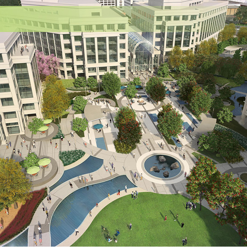
This is a man made pond near the center of campus. You can find turtles and fish swimming here. There are multiple water pumps helping water flow and the sound of water resonate the area. There are seats around the pond that people come and sit and have lunch on.

Vehicles (traffic and parking)
The amount of parking spaces almost match the area of land the main campus in on. The parking spots surround the outer area of the campus besides on the east side where the main road runs through. Because there is only one road traffic between 5-7 is at a standstill.

Employee space (Human habitation)
You’ll see the PayPal campus buzzing with people throughout the work day. The time where you’ll see the most people is during lunch time 12-2pm. During the warmer days you’ll see the outside benches full of people and the cafeterias packed inside.

Forgotten spaces
There are plenty of nooks and crannies lost in PayPal’s large campus. One of the spaces that you’ll rarely see people is the stair case in building 15. There was even some sayings placed there so people would be motivated in taking the stairs more often.

Venues
There is a showcase room at PayPal that is set up to display different types of business types that accept PayPal. This was built so that we can display different use cases of merchants and also to keep the customer at the forefront of everything we do on campus. There is also a town hall where PayPal host big events and conferences which take up almost two buildings.

Part 2
Wild space (vegetation and water flow)
I was delightfully surprised to see how much “wild space” we have on campus. It looks like the vegetation is would creates the boundaries of campus. I think this a eco-friendly campus that makes you feel like its not all man made.

Vehicles (traffic and parking)
Sadly the majority of space that makes up the campus looks like its dedicated parking spots for the employees. Whats crazy about this it looks like 3x more space is dedicated for parking than the actual employee space. Looking at this makes me think what if we made a parking garage and took back all the extra space for something better for the environment and for the employees. 
Employee space (Human habitation)
One of the most shocking aspects of this project is realizing how much space is actually dedicated to employee space. Looks like less that 30% of the campus is designed for places for employees to spend 99% of their time in. More space is dedicated for parking and vegetation than space for employees. This raises a question of do we need to leave this big of a footprint. 
Forgotten spaces
There are a lot of nooks and crannies that are forgotten in PayPal, especially in-between buildings. As mentioned in part 1, I listed staircases in forgotten spaces because you rarely see people there. You can see the red staircases overlapping with employees space. I also marked red a portion of the parking space as a forgotten space on the right hand side of the map because no one ever parks here. Which I never understood until I made this map, it’s because it’s the furthest distance to get inside campus. I think creating forgotten spaces is a useful tool to figure out how you can repurpose these spaces and take advantage of that lost space that people don’t use.
Venues
There are dedicated spaces at PayPal that you can host an event. There are two buildings dedicated for this on the east side of the campus. You can also host an event outside and inside certain buildings. You can see several places where the “Venue” color over laps with employee space and vegetation areas. 
Part 4
I had a really great feedback session that helped me understand how to format my map better. The feed back I received was that the white space on the map didn’t make much sense and that I should have dedicated areas where people could walk. To resolve that I added a trail area to the map where people can walk. Another great piece of feedback I received was that it looks like the all vegetation besides some trees are all grass. I felt like this was very great point especially because majority of all the greener is trees. I removed majority of the large green sections and replaced it with the original maps tree structure. The parking space seemed confusing to some also it was mentioned where does traffic flow and where is the orientation of how to get in and out of campus. I went back and included areas of traffic flow to get into parking lots. I included the names of the streets and major street people use to get in and out of campus. I also utilized the original map details so that there was more depiction of walking areas inside campus.
Title improvement
I included a “Trails” aspect to the map that guides the user of the map where they could walk on. This is mainly important to see within the campus itself. This also made the ‘campus loop’ a more predominate aspect of the map, this is a key part of visiting the PayPal campus where you can walk around the whole campus on this trail. I also included the name of street on the map so there is better orientation while looking at the map. This is key because the way the map is situated might be different then when your looking at it on google satellite.
Wild space improvement
After the feedback session I found it important to include the original tree structure so that people understand that this isn’t just grass surrounding campus. This gives a more accurate overview of the site.
Vehicle area improvement
This was a great improvement from the original map because it shows how traffic can flow in and out of campus. I also outlined the main street that employees use to get to campus. The grey was taken out for outlining parking spaces and replaced with white because there is more street parking that wasn’t shown on the first map. You can also park on the side street where you use to get into the main parking lots, this wasn’t clear on the map I originally made.
Legend improvement
I completely changed the legend to reflect information that would be relevant to the user. I didn’t think it would make sense to leave “Forgotten spaces” on the legend. I gave each building a different color so that the use can locate where they want to go quickly on the map. I included the address to each building because there could be a different route to each location. I added a compass to the map so they understand the orientation of the map. I flipped the map also because it wasn’t reflective of showing north. I also included a star to notate the main entrance for campus.


 Sketch of Watergarden showing common exit paths from the building I work in.


 Since there are a lot of stores and offices nearby, a lot of people are taking their lunch breaks here. These are the only restaurants that are within .5 mile radius. For more options, one needs to drive 10 miles to Santa Barbara ( 20 mins) drive one way.


 Community
 Defensible Space
 Transportation
 SJSU as a Public Space


