It’s 2029, and our “Full Bloom Experience” has turned into Warm Vanilla Sugar. It is a progressive society with a GROWTH outlook. The flowers now float, and have turned into vanilla flowers that impart a sweet vanilla scent as people sit underneath. The warm scent of vanilla, the green surroundings, and the calm lake work together to create a SERENE place to be. Scent is a strongly correlated to MEMORY, and the scent of the decadent vanilla bean cake to commemorate this birthday EVENT is a reminder of the ghosts of his younger self.
Client: Seattle Parks and Recreation
Where: Seattle Green Lake Park Intervention: “The Full Bloom Experience”
There’s something soothing about slowing down and listening to the patter of the rain, while being shielded from the rain. As you approach the installation, the immense flower or leaf gently unfurls, allowing you to sit at a covered bench.
1. Hi, meet Rachel, a fitness conscious park goer.
View high resolution pdf here.
Note: I pulled these joys and frustrations from an aggregate number of responses from Yelp here, and had to make an assumption on her biography.
2. Scenario
Rachel was able to park near by an entrance today because it is raining, so the struggle to park is a little less this morning. She’s glad she has her nasty rain tennis shoes on, because she already knows it’s going to be wet and muddy. She approaches one of the main entrances to the park and her eyes are immediately caught on the new… whatever that is near the entrance. She approaches it somewhat with curiosity, wondering who would be so audacious to install some sort of ginormous art installation at the beloved park.
She’s not totally impressed by the structure at first, but still gives credit where credit is due – it must’ve taken a while to build. When the person before her walks through, her eyes light up in surprise – the structures unfurls towards them, shielding them temporarily through the rain. The structures returns to their original structure when the person passes, and continues to unfurl towards them as they walk by. She picks up some speed, now very curious. When she passes near one, the installation unfurls with a pop and leans towards her. Her attitude changes 180 and she thinks it’s kind of fun, and sort of wishes the installation goes on for longer than a couple hundred feet. She starts to jog the beginning of her daily two miles, and looks forward to returning to the structure on the way back.
(I’m having trouble making this show up normally, so here’s the downloadable link).
Start: Home
End: Compton (lol.)
The house I currently live in is in a gated neighborhood on a golf course, kind of isolated a rough looking area on the outside. If you go one cardinal direction a few miles, it’s the wealthy Manhattan Beach area, and if you go the opposite direction it’s Compton. The exercise started kinda like how I normally behave, where I leave and come back before I leave the neighborhood x10 because I realize I forgot any or several of the following: my wallet, driver’s license, phone, purse, backpack, charger, lip balm.
The direction starts off towards Gardena, which I’m always excited about because I love the amazing Japanese and Korean restaurants in the area. But we quickly went the wrong way through a residential area. This area I’ve been in several times, and seems like neat and polished rows of houses with families. There’s a neighborhood watch sign, with lawn decor like flamingos, plastic cars, and palm trees/Californian shrubbery.
I pass by a park and pretty quickly get to an area with a church, a beauty salon, and a nail salon. Signs of a rougher neighborhood start appearing – no credit check businesses, cracked roads/pavements, lots of run-down auto shops, barred windows on both residential houses and business, a hemodialysis center, speedy cash, and a fried seafood place.
My initial reaction was being scared because of all the stories I’d heard about Compton over the years. Ironically, I started to feel at home and think fondly back to my time as a student. I hail from Atlanta, and at one point in time during school had to live on the corner of Ghetto and Crack (deep in Home Park in Atlanta, if you were curious). People were regularly robbed with guns (several times with AK47s), machetes, knives, whatever. At that time I had nightmares not being stabbed or shot but losing my laptop and not being able to turn in my homework, and when I was going to get my next paycheck so I could stay a few months ahead in rent. I fondly thought back to my pink pepper spray (the little flame on the bottom right represents that), and on the bottom left I say “I’ll be ok, I think”, the phrase that I’d repeat to myself every night I went home after dark in that neighborhood. As with these neighborhoods, keep your head down and be aware of your surroundings. You’ll be ok.
These are the signs that are near where I live, so I’ll be talking about the one for Maxine Waters, and Jason Gromski. I don’t love or hate most election signs, and still find myself indifferent to these two. I lowkey feel like most election signs have the same color scheme and use of their last name to take up most of the sign.
Let’s talk about Maxine Waters. It’s interesting to me that she uses a deeper, more navy blue and orange – neither the traditional shade or color that’s seen in Jason Gromski’s. What’s more important is the content strategy she chose – “Re-elect” in a small box separate from “Congresswoman”, and the phrase “She Fights For All of Us”. She is the most senior of the 12 African American women in Congress, so the choice in words reaffirm and establish her authority as an incumbent in the area. The area that she is running in is mostly made of minority ethnicities, so the phrase that “she fights for all of us” makes a lot of strategic sense, especially in this political climate where the President chooses to denigrate the very minorities she represents.
Visually, she uses a harsher, serif font, with the smaller font set against white. I find that there’s a lot going on here and it doesn’t look like she is using any gridded columns to figure out spacing and margins in the sign. In addition, “re-elect” is askew and quite small, making it difficult to read. Her name and her quote on the bottom is the most visible when driving past. Perhaps it doesn’t matter for her, since she is an incumbent with a long history or service.
Jason Grom is simply running for city council, but I find his sign to use the stereotypical blue/red colors that are bright (but not overly saturated). He doesn’t capitalize his name, and the font he uses is serif but has much more rounded/curvier edges, which speaks more relaxed, less formal, perhaps more relatable to voters. For the role he’s going for, it makes sense – it’s not a seat in Congress. His name is left-aligned, which helps for left-right reading, and the little quote beneath him is right-aligned. It was probably done to avoid the little bit of awkward empty space that would occur if placed right below the ‘G’ in his last name.
A hotspot of where most of the residents spend their time.
A map of the pathways that are most common that the residents take.
Map 2 – Street View of My House
The black and orange squiglies represent the neighborhood cats that wander everywhere. There is traffic on the main road, and not much pedestrian traffic.
Map 3 – Aerial View of the Entire Neighborhood
The reason why the line near the gas station is extra thick is because that station is ALWAYS busy, since it has the lowest gas rates for the entire area. The McDonald’s also always has traffic that spills onto the street, so that’s why I chose red for that particular street. The neighborhood borderlines against a golf course. The other major road that leads into the neighborhood is less frequently used.
I chose to visit a tiny, gentrifying area of Carson, with Greendoor Coffeeshop as the anchor location in the midst of it all. Nearby is the Carson City Hall, with the Carson Community Center not too far away. Just half a mile away is the exit/entrance for Highway 405, which is the major center north/south in Southern California. In the immediate area, there is an IHOP, a restaurant called DogHaus, a residential area called the Renaissance at City Center, an upscale apartment complex.
While exploring, the following five forces came to mind:
Traffic With the major 405 highway just half a mile away, and the anchor location at the corner of a four-way intersection at East Carson Street and South Avalon Boulevard, traffic is a major force here that adds to the energy and vibrance of the area.
Lush In the immediate area, there is a large water fountain, palm trees, vegetation, a Greendoor coffeeshop, vines, and shrubs. There is a lushness to the little area.
Growth The area is currently being gentrified – about ¼ a mile away is a strip mall with pawn shops, a few takeout, and lavanderia (laundry shop), and next to it seems like new apartment complexes across a mix of chain restaurants and a Ralph’s.
Residence
The area is considered “city center”, and there are apartments being built around the city hall and community center.
Newness
The city of Carson is the youngest municipality in the South Bay area of Los Angeles. The apartments, the little gentrified area with the Greendoor anchor, the city hall, and the community center are all relatively new. The businesses below the apartment complex have only existed for about a year or less.
Ok so explanation here – I was very unhappy with my Nov. 13th map – it felt uninspired, as Serena said I didn’t really have an audience, it barely shows forces. I also had to consolidate a few of my forces, which I felt like left me with nothing. So I decided to do a 3d version of a “map” with a bit of an artistic interpretation (I’m hoping that this is ok).
My attempt to illustrate my 5 forces:
1) residences are the little grey buildings with windows on them, surrounded by man-made trees.
2) the element of lushness are the foliage and trees.
3) traffic manifests itself with a ‘traffic-over-time’ illustration, showing what the car buildup looks like from the afternoon to end of the working day.
4) the 50% opacity buildings on the top left corner are growth & development, and the lowered opacity is meant to show that it’s not there yet, but that’s what it would look like on the map.
5) the last force is a little hard to see, but it depicts chillness. It’s the gradient circle at 50% opacity, fading into transparency. It’s over the Greendoor coffee shop, as well as the leisurely pool inside the residence. The reason why I chose to represent it this way is because chillness is an ambient force that’s pervasive over an area, and the soft gradient and fade is what comes to mind when I think about a relaxed ambience.
*I haven’t used Illustrator in a billion years and certainly have never done isometry before, so bear with me that it’s rough, but I learned a lot. I definitely had a hard time layering and re-sizing in 3D, it was honestly a nightmare. You can tell my learning curve through my trees – I started off with blocky trees, then got circle trees, then learned how to do oval-ish trees. I liked the diversity in foliage, so I left it there even though it’s not particularly accurate since the lushness I was referring to weren’t topiaries.
To give context of this map, the grey band is towards Moscow, the black band is Napoleon’s retreat. You can see the dwindling numbers (represented by skinnier bands) directly as the result of time and temperature.
Here it is next to a map of the path, along with my own Google maps route featuring a few of the cities:
The chart features many design principles, but the three I’ll be covering are:
Gutenberg diagram: this map reads best from left to right, signifying the start of Napoleon’s journey to Moscow with the thickest band (number of soldiers). Once the reader reaches Moscow, they can follow the black band on the bottom for the retreat and failure.
Layering: what this map does incredibly well is layering information. Actual map from Belarus to Russia (including major cities, rivers nearby, and route) with Napoleon’s soldiers in both onslaught and retreat, temperature (in Rankine, Celsius and Fahrenheit), time in dates, and elevation.
Proximity: this map uses proximity of cities across Belarus, Lithuania, and Russia in order to demonstrate the position and route taken by Napoleon’s dwindling number of soldiers.
A number sequence where the two previous numbers summed together form the next sequential number.
The Fibonacci sequence can be found in nature, such as seashells, flower petals, galaxy spirals, and the bones in our hands. The sequence is “naturally” pleasing, and can also be found as intentional designs in poetry, music, art, and architecture.
Closely related to the Fibonacci sequence is is the Golden Ratio, which is a 1 to 1.6 ratio of their sum to the larger of two quantities. Many items exhibiting the Golden Ratio also have the Fibonacci sequence.
Example 1: Modulor, by Le Corbusier
French-Swiss architect Le Corbusier used two Fibonacci sequences to create the Modulor, which is technically and theoretically biologically harmonious in design.
Example 2: Golden Ratio
The golden ratio is an example of the Fibonacci sequence, where a + b is to a as a is to b. The numbers have been added here for ease of parsing the numbers. Notice how this is also a nautilus shell.
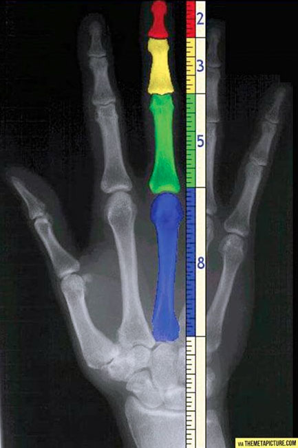
Example 3: Bones in my hand
The bones in our hands illustrate the Fibonacci sequence. It’s hard to tell, but this picture illustrates it better.
Resources
Lidwell, William, et al. Universal Principles of Design 125 Ways to Enhance Usability, Influence Perception, Increase Appeal, Make Better Design Decisions, and Teach through Design. Rockport, 2010.
Hom, Elaine J. “What Is the Golden Ratio?” LiveScience, Purch, 24 June 2013, www.livescience.com/37704-phi-golden-ratio.html.
A visual processing phenomenon in which some line orientations are more quickly or easily parsed than other line orientations.
Two factors affect orientation sensitivity: the oblique effect, and the pop-out effect. The oblique effect is a person’s ability to judge and percieve line orientations that are along the traditional vertical and horizontal orientations better than they do any sort of angled and horizontal orientation. This is caused by neurons having greater sensitivity to stimuli along the horizontal and vertical orientations.
The pop-out effect is a visual processing phenomenon in which elements tend to stand out when compared against a background of common orientation. This is caused by neurons that are able to detect visual stimuli that activate more neurons in order to discern pattern and orientation differences. The pop-out effect is most easily detected when the differing element differs by 30 degrees or more. It is also easier to detect element differences against vertical and horizontal lines than against slanted or oblique orientations.
Example 1: Analog Clocks
Our book uses two analog clocks with 30 and 15 degrees of separation to show that 30 degrees of separation is easier for the user to parse information.
Example 2: Compass
The compass makes use of our natural tendencies to process along the x and y axes in order to quickly parse information; in this case, navigation. What does make this hard to read is that there is less than a 30 degree of separation amongst the many degrees, so it isn’t a cursorarily distinguished as say, a 12-hour clock like above.
Example 3: Car meter
The car meter makes use of the pop-out effect so that drivers can easily distinguish what speeds. In my picture, even though the speedometer is fairly hazy, notice how the speeds pop out – it makes use of the pop out effect with stark black/white contrast so the user can quickly get the information they need.
Resources
Lidwell, William, et al. Universal Principles of Design 125 Ways to Enhance Usability, Influence Perception, Increase Appeal, Make Better Design Decisions, and Teach through Design. Rockport, 2010.
“Get Compass Rose Png Pictures #29390 – Free Icons and PNG Backgrounds.” Freeiconspng.com, www.freeiconspng.com/img/29390.
A mystery to me – some days I come in and it’s on the lowest setting, some days the arm rests are different heights, and there’s all these knobs and I never know what is going on because they usually don’t do anything. One day, I found out that one of the levers adjusted height, but I couldn’t be sitting on the chair while adjusting. What’s baffling is that another similar but newer model in the office can adjust chair height with you on it, so it was a hot commodity for a while. This chair blew my mind because it cost the company some $800+ each, and they’re everywhere in the offices. The budget for these chairs could have easily been several hundred thousand just for the DC offices. I don’t know if the value of these chairs are there. It’s nice and feels airy to sit on because of the mesh backing. I spend 40+ hours a week in these chairs and I’ve yet to experience back pain. However, I’m not entirely sure if it’s because I tend to not slouch at work as I do at home. I have noticed between this chair and the home chair (another, different industrial chair) that industrial chairs tend to be heavier, sturdier, and look/feel as if new even after several years of use.
Home Chair
Not much I can say about this chair because all I know was that it was poached from someone’s office and I thrifted it for $10. It certainly is an industrial office chair because it’s very heavy, sturdy, and has lived up to 3 years of use and abuse (by me and as a scratching post for my cat sometimes). The only indicator that it’s been used as a scratching post are some threads barely coming out of the chair. It still looks and feels like the day I got it three years, despite spending almost my entire time at home in it. I slouch and sit in all sorts of strange positions on this chair, and recently it’s given me some back pain.
Driver’s Seat Car Chair
I sit in this chair about an hour a day because of traffic, but I don’t notice it much because of habituation. I tend to focus on the driving and not the seating system inside so I don’t crash and die. I usually have the chair at default (as far away from reclining as possible) and recline only when I’m stuck at a light. To be honest, I never think about this chair, and it was evident even during this assignment because I totally forgot about it until I was getting my car picked up to be shipped across the country and luckily had snagged some pics earlier in the week. I do think that I sometimes think leather seats would be nice, but in the summer I am grateful that they’re fabric because the leather handles are so hot it’s sometimes hard to touch and drive. I also feel good about getting not-so valuable seats because cars only devalue through time.
Rowing Chair
At the gym I usually row for about 1000meters. The sessions are quick, not lasting for more than 15 minutes or so. The seat is minimal, usually a square shape with butt imprints. They’re usually plastic, hard, and textured. When I’m in the last stretch, I tend to buckle down into the seat and if I accidentally slouch, I’ll walk away from this machine sweaty, back hurting, and butt sore.
Yoga Mat
Another good chunk of my time at the gym sitting down is my yoga mat. It is a place to focus and breathe, and ironically is visually not a chair but functions as the ideal chair experience – my postures, the breathing, the poses, the relaxation – I not only feel great during, but better after my time on the yoga mat. The final pose in every yoga class is called the lotus pose, where you sit cross-legged on the mat. There is so much intention behind the act of sitting that makes it a meaningful experience, and this separates my experience sitting on a yoga mat compared to the chairs that I dread sitting on (Monday mornings in the office, rowing after a long day).
For about 15 years of my life, I always thought good baths at home were a myth because the tubs were too small and uncomfortable, and water levels never reached past my shoulders. I’d be freezing from shoulders up with hot water shoulders down, making a dichotic and wholly unsatisfying experience. Enter the bathtub overflow drain cover! As a Southerner living in cold DC weather, this changed my life in the winter. The cover is a physical restraint for water, and the affordance that’s immediately obvious are the little suction cups that place the cover onto the tub, and gives a bit of space for the person to lift the edges and peel off from the tub when they’re done. Suction cups tell me that they’re supposed to grip onto something, and my mental model of suction cups based on past experiences (sticking GPS or phone stand onto car window) tell me that the surface is more than likely going to be vertical.
The material of the drain cover is soft and flexible, giving the user a bit of room for forgiveness should the structure or shape of the bathtub or drain cover be slightly different (rectangular vs rounded rectangle of clawfoot tub). The drain cover reminds me of an analog version of Fitt’s law because the drain itself is huge, but the drain cover is even bigger, so it’s quick and easy placement over the drain.
The material is soft, clear, and takes the temperature of the water, so it’s unobtrusive visually and forgiving should the person touch or rest against it. For such a simple object, Dieter Rams said it best: “good design is unobtrusive”. Having a warm bath is usually a gratifying experience – it’s an easy, out of the box installation with very little cognitive load on the user.
Object I Hate: Petwell Pet Drinking Fountain
What you see is my cat doing everything but drinking from the fountain – she will wait patiently for me at my bathroom sink until I turn on the faucet and hand feed her water, or drink out of my cup on my desk. Like all cats apathetic to consumerism, my cat chose to drink everywhere BUT the $40 fountain. What I quickly discovered was really a product suffering from aesthetic-usability effect. The amount of money I spent made the fountain seem like a luxury by raising my perception of it’s value and the water coming out of a fake spout that streamed down looked very aesthetic. The visual feedback was immediate after pouring water inside – the water looked like my own Roman fountain for my beloved cat.
However, what made the fountain unusable it’s propensity for mold (made worse from the material it was constructed from) and the amount of effort required to clean the fountain. The fountain cover created a dark and moist well for mold to grow inside. The material of the fountain was porous and slightly rugged, perfect for mold to cling onto forever and thrive. At one point in my life, and for longer than I’d like to admit, I scrubbed this piece of garbage daily with scalding hot water, pipe cleaners, and various scrubbers. The various nooks, crannies, and impossible places to clean really made the fountain a terrible experience to clean, and it’s clear that many of them were unnecessary and were only hollowed out in that way to save material cost.
The only clear, explicitaffordance to me was that the cap should go on the top (but I later removed it because the top of it grew mold all the time) and where to place the ‘torso’ of the fountain. However, if I didn’t place the motor correctly the ‘torso’ wouldn’t fit in place, as evidenced by the middle picture. One feature that was an implicit affordance was that the water pump inside could be taken apart into two pieces. The first time I discovered the ability to do so, I was horrified by the gunk and hair inside and angry that I was not informed of my ability to take apart the motor for cleaning. The cleaning instructions in the manual did not have that step in it. If I had a journey map of my experience using this fountain, it dipped sharply when I called customer service when the fountain broke one day, and the very first thing he asked me was whether or not I had taken apart the motor and cleaned it, and that it’d been a known problem for several years.
For those of you wondering, this fountain solved most almost every problem above in both thoughtful design and material.
“Your game practically changed my life… It was the most fun I had with him since he had been diagnosed… My father passed in the spring of 2012, only a few months after his diagnosis.
Weeks after his death, I could finally return myself to playing video games. I tried to play Journey, and I could barely get past the title screen without breaking down in tears. In my dad’s and in my own experience with Journey, it was about him, and his journey to the ultimate end, and I believe we encountered your game at the most perfect time.
I want to thank you for the for the game that changed my life, the game whose beauty brings tears to my eyes. Journey is quite possibly the best game I have ever played. I continue to play it, always remembering what joy it brought, and the joy it continues to bring.
I am Sophia, I am 15, and your game changed my life for the better.”
Created by thatgamecompany, an indie studio with a handful of employees at the time, Journey is an indie game featuring no dialogue, direction, or goals. It’s easily completable in six hours, yet takes you on a vast trek starting from life to death. The game is simple; explore and unlock the next stage through runed temples.
Yet where the game excels is in emotional design, the three pillars of which are flow, movement, and choice. Katherine Isbister of How Games Move Us detailed that video games are a special medium that requires interaction and elicit strong emotional responses – sometimes negative, sometimes positive. Everything about Journey was designed with emotion in mind – from the color palettes, the smooth physics of movement, even the Grammy-award winning music from Austin Wintory, lent itself to creating an interaction that pushes users to have a “religious experience” by the end.
Jenova wanted to push the boundaries of emotional design in games and started by breaking down what social interaction meant to him, and isolating the interaction one by one – for example, why did social games like World of Warcraft make him feel even more lonely and isolated? He noticed a few key gaming interactions on how players build a connection, two of which are:
The gradual player empowerment, which lends itself to an easy toxic environment and “flaming”, the act of posting insults with profanity as skill and strength begins to divides its players
“Are you a boy or girl? How old are you? The answer is always a sad ending.”
One of Jenova’s design goals then was to eliminate age, gender, skill/strength, and other factors that create chasms between players and their interactions (universal design principle of accessibility here) in order to make make gaming a more healthy medium.
The players in Journey don’t interact until about the midway point where a second player (usually farther along or reached “enlightenment”) is suddenly introduced, and lends itself to the second player “guiding” the first unconditionally and uncommitally. At the very end, the players you played with, where you played together in the game, and where they are from in the world are displayed, and you are able to finally connect to these players.
Jenova’s vision was a game that could affect its players to be better people. Even though it’s been almost six years since I’ve played Journey, I still find myself thinking about the game on a near daily basis. Through careful design, Journey is an example of a product that empowers and enriches its users to be compassionate and empathetic to each other while reminding us what it means to be human.
Jenova Chen’s GDC talk is long, but worth it.
Journey artist Matt Nava is less of a speaker, but still interesting to see the visual design process and tech and product requirements changed the game here, and finally the incredible soundtrack here.


