Team 3 Principle #8: Propositional Density

When applied, propositional density is the notion that objects and environments with multiple meanings can be more interesting and memorable. The more deep meanings relative to the number of elements is what contributes to higher propositional density. We’ll use two examples below to illustrate. The equation used to calculate propositional density is as follows:

Propositional density (PD) = count of deep propositions / count of surface propositions

To calculate PD above requires understanding propositions. In this context proposition is an element that can’t be further broken down. As seen above there are two types. A surface proposition is often tenable and perceptible. A deep proposition is subtle or even hidden. For example in the US a stop sign has red, stop, and an octagon as surface propositions.1 These elements can no longer be broken down into meaningful parts. The stop sign’s only deeper proposition, however, is stop. It’s PD ratio of 1:3 implies a low propositional density which helps it achieve the goal of getting you to stop in your tracks. However, PD can also be applied to evaluate simply a sentence. Consider the following phrase highlighted by blogger Curtis Newbold in a blog post: “If gas pains persist, try Volkswagen.” The sentence as it is used in an old advertisement can be found here. The sentence cannot be broken down further into a logical element. There is merely one surface proposition which is Volkswagen suggesting it might be able to offer you better gas mileage. Digging deeper reveals its high propositional density as it has more than one deep propositions. These include alluding to the brand being a source of relief as well as using medical references to imply it can be a cure to one’s ailing gas problems.2

WV ad depicting the slogan


Example of the principle cited by one of my sources: Volkswagen slogan “If gas pains persist, try Volkswagen” as I have outlined above.3


Nike swoosh logo

Example of the principle not cited by one of my sources: Nike’s logo can be regarded as having high propositional density. On the surface it is two element: black in the color of a swoosh/checkmark. However it’s deep propositions include completing a task and marking it with a checkmark, wings on the shoes of the god Hermes who was swift and fast, victory, and progress which is generally regarded as up and to the right which is also the general direction pointed to by the Nike logo.4

Oakley store in San Francisco

Example of the principle not cited by one of my sources and not located online: To try and find a “real life” example I thought it would be good to walk along the tourist area of Market Street in San Francisco. As my eyes skimmed the numerous shops and restaurants, I found myself fixated on the simplicity of Oakley’s company logo. The distinctly flattened and stretched shape of the “O” makes it easily identifiable from other letter “Os.” Oakley, a well known brand in California, is of course in the business of making eyewear. It occurred to me that this shape was intentional and aligns with the fact human eyes are drawn as ovals that are wider than they are tall. Deep propositions of this logo include alluding to Oakley’s focus on eyes and a reference to the circular shape of one a primary courtyard and building at the Foothill Ranch headquarters in Southern California.5 Within the industry, Oakley is also known for eyewear innovations and generally align new product announcements and innovations together.6 I believe a third deep meaning for the “O” could be in reference to this iterative cycle of new innovations and subsequently bringing them to the consumer via eyewear.

Footnotes

1. Bradley, Steven. “Propositional Density: Adding Meaning To Your Designs.” Vanseodesign. Last modified Apr 19, 2010.
2. Newbold, Curtis. “Use Math to Make Better Logo Designs: The Propositional Density Principle.” Thevisualcommunicationguy. Last modified Oct 19, 2015.
3. Newbold, Curtis. “Use Math to Make Better Logo Designs: The Propositional Density Principle.” Thevisualcommunicationguy. Last modified Oct 19, 2015.
4. Google search. Accessed Oct 3, 2018.
5. Mantor, Cassidy. “Luxoticca mandates reorganization for Oakley.” fashionnetwork. Last modified Jul 27, 2016.
6. Oakley company site. Accessed Oct 7, 2018.
Team 3 Principle #7: Forgiveness

The principle requires us to recognize and to take into consideration that to be human is to be fallible. When applied by designers, the forgiveness principle can be expressed in two complementary ways. The first is that design should have good affordances to help users avoid making errors. The second is to help users minimize unintended consequences or better yet fully recover from errors when they occur.

An illustrative example of this comes from Bruce Tognazzini, editor of the first eight Apple Human Interface Guidelines. When designing new and exploratory interfaces, he argues strongly for incorporating forgiveness and highlights three of his own principles. These include providing users reversible actions, an escape hatch out of the current path, and a sufficient amount of guidance while remaining out of the way.1 His guidelines have been shown to withstand the test of time. The iPhone for examples demonstrates these qualities despite launching nearly three decades after Bruce’s departure from Apple. In the iPhone interface, even the most complex settings are simplified down to a toggle or menu selection that users can dynamically change anytime. One can always return to the home screen with a single button press or in the latest models a single swipe. And knowing it’s easy to “go home” fostered a  willingness to explore and learn the new design which included the new smartphone gesture of pinch-to-zoom.

Printer icon in bottom right

Example of the principle cited by one of my sources: Bruce highlights a funny story in retrospect about Xerox Star, a desktop GUI in the early 1980s. At the time dragging a document icon onto the printer would initiate printing out the document. However, once printed this single action also permanently erased the file from the computer. Engineers rationalized this by claiming the document was now in physical form and hence the electronic file no longer served a useful purpose. Designers ultimately advocated different and won the argument and today these two intents, printing and file deletion, have been separated into two distinct actions.2

Sample of Nike iD website

Example of the principle not cited by one of my sources: In a Medium article Anton Nikolov provides us with an example of the forgiveness principle applied to physical goods. He highlights NikeiD, an online shopping experience that lets you customize colors and graphics on shoes for preview before placing a direct order with Nike.3 While there are no returns on customized shoes and thus no ability to recover from an error, the online experience allows previewing to help minimize potential errors in the first place.

 Building call box

Example of the principle not cited by one of my sources and not located online. I found that my building’s telephone entry system incorporated the forgiveness principle in multiple ways. Known more commonly as a call box, it allows visitors to call residents who can remotely unlock the main building door. Upon approaching the box, visitors are immediately greeted with instructions to scroll and locate the intended callee. While it doesn’t explicitly mention the up and down arrows, there aren’t many other keypad buttons that suggest a scrolling action. Once scrolling is initiated, building residents are listed in alphabetical order by last name and first initial. This aids in identifying the correct individual. The “CLR” button can be used to immediately terminate a call should the wrong resident be dialed. Lastly, though not apparent residents can use the call box to let themselves in if set to ring their mobile number. The first two items, a welcome instruction message and listing residents by last name, serve as good affordances to help visitors perform a desired action: calling the right resident. The later two, a CLR button and dialing oneself, provide a safety net to help mitigate unintended consequences.

Footnotes

1. Tognazzini, Bruce. “First Principles of Interaction Design (Revised & Expanded).” asktog. Last modified Mar 5, 2014.
2. Tognazzini, Bruce. “First Principles of Interaction Design (Revised & Expanded).” asktog. Last modified Mar 5, 2014.
3. Nikolov, Anton. “Design principle: Error & Forgiveness.” medium. Last modified May 27, 2017.

Team 3 Principle #2: Inverted Pyramid

Inverted Pyramid  (Lidwell et al. 2010, 140-141) refers to a way information can be presented so that critical information can be presented first followed by additional information in “descending order of importance.” The inverted pyramid is composed of the critical, or lead, information and the elaborative, or body, information. News articles may only have the key paragraph showing on the first page with the body (the elaborative information) available if requested. Although important information may be presented first, since presentation of information is be descending order of importance, the lack of excitement build-up can allow the presentation to be “perceived as uninteresting.”


Example of Inverted Pyramid from Universal principles of design:

Online example of Inverted Pyramid:

Important headlines and critical information is shown first and people can click further into the links to read more details. This is a screenshot of the front page of https://www.nytimes.com/ taken on October 4th 2018.

Examples of Inverted Pyramid found in the wild:

The most critical information is presented first in this bathroom located at Hakata Station in Japan. We know here that it is a bathroom for females but we can also see that there are facilities for changing diapers etc.

This is a chart of the pickup dates for certain types of trashes located in Kumamoto, Japan. The most commonly thrown out garbage, landfill, is presented first followed by paper, recyclables, compost, etc. The smaller details post times of pickup.

References:

Lidwell, William, Kritina Holden, and Jill Butler. Universal principles of design, revised and updated: 125 ways to enhance usability, influence perception, increase appeal, make better design decisions, and teach through design. Rockport Pub, 2010.

Team 3 Principle #1: Five Hat Racks

Five Hat Racks (Lidwell et al. 2010, 100-101) refers to the five methods that can be used to organize information: categorically, through time, through location, alphabetically, and through a continuum.

  1. Categorical organization refers to organization by clustering similarity. For example, cameras and laptops can be categorized under electronic appliances but if all laptops are being organized by category, Macbooks can be categorized under Apple Laptops while Chromebooks can be categorized under Google Laptops.
  2. Organization by time refers to grouping by chronological order. Timelines or television schedules follow this method of organization, which can be used for comparing events or showcasing a sequence of step-by-step procedures.
  3. Location-based categorization is organization by “geographical or spatial reference” and is used for emergency exit maps or travel guides. This method can effectively convey organized information if the exact location or orientation is important for the information to be communicated clearly.
  4. Alphabetical organization refers to objects that follow an alphabetical sequence.  Dictionaries and encyclopedias are the most obvious examples.
  5. Organization by continuum refers to how things can be organized by magnitude such as highest to lowest or best to worst.


Example of Five Hat Racks from Universal principles of design:

Online examples of Five Hat Racks:

Since the iPhone XR is smaller than the iPhone XS Max but bigger than the iPhone XS, these devices were not organized by continuum but by category. The “XS” devices are clustered together. The link to this image can be found here: https://www.apple.com/lae/iphone/compare/

This image can be found here: https://bethdore.wordpress.com/evolution-of-nintendo-consoles/

This showcases the evolution of Nintendo consoles as well as the items need to save a game and follows the organization through time.

This brochure about Universal Studios’ Harry Potter World organizes the attractions through location. Theme Parks and malls often showcase a map on their directory.

This can be found online here: https://www.themeparkbrochures.net/maps/universal-studios-florida-harry-potter-diagon-alley/

Hollywood’s leading actors are displayed by shortest to tallest height using the categorization of continuum. This graphic can be found here: http://www.vulture.com/2014/06/hollywood-leading-men-height-graphic.html


An example of Five Hat Racks found in the wild:

This is a guidebook for a fancy train tour that my grandmother will attend in November. She will have to prepare outfits for “sightseeing,” “business-casual,” and “semi-formal.” The outfit examples are clustered and organized by category of the outfit type.  


References:

Lidwell, William, Kritina Holden, and Jill Butler. Universal principles of design, revised and updated: 125 ways to enhance usability, influence perception, increase appeal, make better design decisions, and teach through design. Rockport Pub, 2010.

Team 9 Principle #4: Self-Similarity

Self-Similarity is a property in which individual pieces are similar in composition to the sum of the pieces. Think of it as Russian matryoshka dolls where each piece is buried within one another (Agnati et al, 2009). Self-Similarity is a “meta” property and can be seen in nature as the result of recursion. Recursion is the process in which a system takes the input it receives, changes it a little and feeds it back out. Examples of this in nature are coastlines, Romanesco Broccoli and Peacock feathers.  Self-similarity in nature suggests an underlying tool that humans can use for structuring, modeling and improving man made pieces (Lidwell, 2010).

Example 1 (UPD Source): Valley of Seahorse, Smaller and Smaller, & Mona Lisa Mosaic

This is the example provided in Universal Principles of Design. They include images of the Valley of Seahorses, artwork by M.C. Escher and a photomosaic by Robert Silvers.The Valley of Seahorses are a region of the Mandelbrot Set that shows self-similarity on every level.The artwork titled Smaller and Smaller by M.C. Escher is comprised of reptilian forms pieced together to create a tunnel. The photomosaic by Robert Silvers uses 800 classic art  images to create a larger image of the Mona Lisa.

Example 2 (Internet Source): Internet Traffic

Internet or WWW traffic itself exhibits behaviors consistent with self-similarity (Crovella and Bestavros, 1996). This image represents internet traffic in a fractal model where hubs or websites are represented. The larger hubs represent the popular websites and the smaller ones represent the less tess traveled sites (Nucilli, www.ranker.com). Each large hub is made up of smaller hubs thus graphically, the traffic produced by internet traffic is an example of Self-similarity.

Example 3 (Non-Internet Source): Leaf from fern tree

This is a fern leaf I found in the backyard of my house. It is an example of self-similarity through the recursion process in nature. Each leaf is composed of smaller but similar leafs which in turns makes a larger leaf.


References

Agnati, Luigi F., et al. “Mosaic, Self-Similarity Logic and Biological Attraction Principles.” Communicative & Integrative Biology, vol. 2, no. 6, 2009, pp. 552–563., doi:10.4161/cib.2.6.9644.

Lidwell, William, et al. Universal Principles of Design 125 Ways to Enhance Usability, Influence Perception, Increase Appeal, Make Better Design Decisions, and Teach through Design. Rockport, 2010.

Crovella, Mark E., and Azer Bestavros. “Self-Similarity in World Wide Web Traffic.” Proceedings of the 1996 ACM SIGMETRICS International Conference on Measurement and Modeling of Computer Systems – SIGMETRICS 96, 1996, doi:10.1145/233013.233038.

“13 Natural Instances Of ‘Self-Similarity’ That Hint At The Math Behind The Cosmos.” Ranker, www.ranker.com/list/weird-cases-of-self-similarity/rylee_en. https://www.ranker.com/list/weird-cases-of-self-similarity/rylee_en

Team 9 Principle #3: Mnemonic Device

Mnemonic devices are used to make information more simple or meaningful so that they are more easily remembered. They beneficial because they serve as learning strategies that enhance and help with recall of information (Bellezza, 1981). This can be done through imagery or words to connect something unfamiliar to something that is familiar (Lidwell, 2010). Mnemonic learning uses the following three memory processes: symbolizing, organizing and associating (Bellezza and McDaniel, 2004). Examples of mnemonic devices include Keyword, Rhyme, Feature-Name and First Letter. Keyword is using similar words or phrases to associate with the original. Rhyme is when phrases are linked through rhyming schemes to help with recall. Feature-Name is a word that is related to one of the features linked to the original. First-Letter is when the first letter of the items form a meaningful phrase. (Lidwell, 2010)

Example 1 (UPD Source): Logos

In Universal Principles of Design, examples of Mnemonic Device were shown in form of clever logos that use different mnemonic devices to make them more memorable. This included logos from Hip Dance Studio, Ram Memory, Treehouse Lofts, Community Police and Vine Wines. Each logo used images to keywords or feature-names to help with memory recall.

Example 2 (Internet Source): The Onion

The Onion is a digital media company that publishes satire news based on current events and both international and national news. Their logo is a image of a onion next to their company name The Onion. Using imagery to leverage familiar concepts makes the logo more memorable.

Example 3 (Non-Internet Source): ROY G. BIV

ROY G. BIV is a mnemonic device taught and used by many to remember the color and order of the rainbow. Each letter of ROY G. BIV stands for a color: Red, Orange, Yellow, Green, Blue, Indigo and Violet. It is still used to this day to help children recall the order and colors of the rainbow.R


References

Bellezza, Francis S. “Mnemonic Devices: Classification, Characteristics, and Criteria.” Review of Educational Research, vol. 51, no. 2, 1981, p. 247., doi:10.2307/1170198.

Bellezza, Francis S., and Mark A. McDaniel. “Mnemonic Devices.” Learning and Memory, edited by John H. Byrne, 2nd ed., Macmillan Reference USA, 2004, pp. 393-395. Gale Virtual Reference Library, http://link.galegroup.com/apps/doc/CX3407100140/GVRL?u=univca20&sid=GVRL&xid=83c4068a. Accessed 12 Oct. 2018.

Lidwell, William, et al. Universal Principles of Design 125 Ways to Enhance Usability, Influence Perception, Increase Appeal, Make Better Design Decisions, and Teach through Design. Rockport, 2010.

“Mnemonic Device for the Order and the Colors of the Rainbow.” Mnemonic Devices Memory Tools, www.mnemonic-device.com/weather/roy-g-biv/.

Team 3 Principle #6: Hick’s Law

HICK’S LAW

Hick’s Law describes the relationship between response time and the number of choices available. This principle states that the more choices available the longer it will take the user to decide. It best relates to situations where there are a set of available responses to a specific event. An event happens, it takes the user (a) amount of time to decide what the event means and that they need or want to act. They are presented with (n) number of possible options to take in response to the event. This relationship only applies to simple decision making and not complex interactions, such as requiring analysis or extensive reading. In order to ensure that this principle is used correctly, avoid using it for situations where complex decision making processes are required (Lidwell).

Hick’s Law doesn’t speak to how complexity is hidden away. It looks at the relationship between the number of options available and the response time to make a decision. This is assuming that one of the options available is relevant to the current situation(Lidwell).

Hick’s Law can be represented as the following equation:

RT = a + b log2(n) (Lidwell)

Where:

RT = response time

a = time not related to decision making

b = constant (.155 seconds)

n = equally probable alternatives (Lidwell)


Example of the principle cited by original sources

“The time for a person to press the correct button (R,G, or B) depending on the color of the light (red, green, or blue) increases with the number of possible colors” (Lidwell).

Line drawings of a light and three RGB buttons
RGB Buttons (Lidwell)


Example of the principle not cited by original sources and located online

One application of Hick’s Law is in remote controls. Numerous buttons, many that were never used by users plague these remotes. Response times for these devices would be much slower than newer alternatives.  New remotes for Roku devices and Apple TVs have far fewer buttons, thus increasing response time.

Standard remote control with numerous buttons
TV Remote (Nikolov)


Example of the principle not cited by original sources and not located online

Consider two different household projectors, one with two controls (LG) and one with ten (Optima). The LG projector has a single power button and a control for focus. The Optima projector has eight buttons, and two different adjustment controls. The user decides they want to turn on the projector. The decision-making process does not require any deep analysis or heavy reading, so Hick’s Law is applicable. The black projector has simply more buttons, and thus increases user response time.

White and brown square mini projector
Home mini LG Projector (Image by Joe Davis)
Black full-size home projector
Optima Home Projector (Image by Joe Davis)

References:

Lidwell, William, et al. Universal Principles of Design. 2010. Accessed 2018.

Nikolov, Anton. Design principle: Hick’s Law — quick decision making. 2017, uxplanet.org/design-principles-hicks-law-quick-decision-making-3dcc1b1a0632. Accessed 14 Oct. 2018.


Team 3 Principle #5: Affordances

AFFORDANCES

Affordances describe the relationship between a person and an object. The properties of the object and the abilities of the person or agent acting on the object determine whether the object affords or “is for” a purpose (Norman). This means that the object has a property, the person can perceive this property, and the person has the ability to take an action as a result of perceiving it. Affordances help us understand how to use an object before we begin to interact with it.

It is important to consider the entire equation when examining affordances. If the person, or “agent” as Norman puts it, does not have the ability to act, then the object does not afford that purpose. Stairs afford climbing up and down for those who are agile and can walk. However, stairs do not afford climbing for individuals in wheelchairs or who do not have the strength or ability to climb. In this example, the relationship between the properties of the stairs and the capabilities of the individual determined whether the stairs afford (are for) climbing. Conversely, if the stairs did not actually have the property of steps, they also would not afford climbing (Norman).

Choosing to look at affordances as a relationship may help in a better understanding of the principle. This idea is presented in Don Norman’s Design of Everyday Things. Universal Principles of Design describes the principle as objects being able to afford better or worse than others or to even negatively afford some action (Lidwell). Understanding affordances as a property in this context may add confusion to the overarching idea behind their use and purpose, which is why Norman’s definition was used as a source for this exercise (Norman).


Example of the principle cited by original sources

The door on the left has a handle that appears to afford pulling, even though a sign indicates otherwise. This affordance breaks the design because it falsely suggests how to use the door. The handle affords grasping and pulling; however, the door does not have the physical property of swinging out that direction.  The flat plate on the second door, to the right, is an affordance that affords pushing. A property of the door to be pushed open matches, thus this door would allow us to understand how to use it with ease.

Two doors. One on left has a handle. One right has a plate.
Handles and plates as affordances (Lidwell)


Example of the principle not cited by original sources and located online

An affordance of these scissors are the holes in the handle. These holes afford inserting something into them such as your fingers. This affordance helps us understand how to use the product with out actually picking it up. Physical constraints and natural mappings make this an excellent design (Scissors).

Grey pair of full size scissors pointing left.
Scissors (Scissors)


Example of the principle not cited by original sources and not located online

The ball and chain on this lamp are affordances that allow us to understand how to use the lamp, even if this is our first interaction. The metal ball is easily grasped and the pair affords pulling.

Green Lampshade with a chain dropping down
Home office lamp (Image by Joe Davis)


References:

Lidwell, William, et al. Universal Principles of Design. 2010. Accessed 2018.

Norman, D.A. (1988) The Design of Everyday Things. New York: Basic Books

Scissors. 2017, medium.com/@eggsasperated/scissors-42698f16bf6c. Accessed 14 Oct. 2018.

Team 1 Principle #4: Feedback

Feedback, as defined by Don Norman in The Design of Everyday Things, is any means of “communicating the results of an action” to the user. Norman goes further by defining a set of standards that all feedback should meet; it should be immediate, proportionate, well-designed, planned, and prioritized. Feedback has grown much broader as our scope of technology has expanded, including haptic vibrations, vocal response, various interface states, and so on. In essence, Norman’s original definition still holds true, but has expanded beyond his original examples of simple flashing lights and beeps. In our current era of technology, interfacing might contain numerous forms of feedback to accommodate a slew of user needs for a single button press.

Example 1 – Dishwashers

Dishwasher controls

One of Norman’s key gripes about poor feedback was the beeping of his dishwasher in the early morning. He felt that, rather than meaningful interfaces, cost-cutting systems held precedence in the design of the device, thus resulting in an annoying, meaningless beep when the dishwasher’s cycle had finished. As his typical use of the machine occurred late at night, he was often woken up by this beeping. Unfortunately, this type of feedback still exists in current models, although some allow you to configure the beeping volume, or even turn it off. In other ways, however, dishwashers have gained new types of feedback. Newer models show clocks and timers which may be edited on the fly, and some even show timelines of the current cycle and the system as a whole. Pressing a button shines an indicator light, as well as changing the digital display accordingly. These changes have improved feedback on these machines, but there is still much left to be desired in that realm.

Example 2: Google Material Design

Google Material Design
Image courtesy of Google at material.io

Google’s ambitious Material Design for Android has become a standard in application and mobile development, and has easily branched out into the world of web and interface design. This is largely due to their focus on accessibility in design, much of which is echoed throughout the feedback of each component. Material Design standardizes innumerablew types of interactions and the states associated with them, as well as the feedback tied to each through multiple means – including haptic, visual, and auditory responses. One clear example of this is the button states laid out in this design system.

Google Material Design Button States
Image courtesy of Google at material.io

Each state of a button shows clear feedback to the user of when the button is held, pressed, or dragged, and this feedback has been carefully engineered to be shown around a finger press or mouse click. For example, the purple button on the bottom-right shows the beginning of a circle protruding around where the user has touched, giving a visual indication of interaction with that space. Similarly, the selected line item in the middle-top shows a clear color change and filled check box upon selection, giving the user an immediate notification that their action was input. These visual indicators are just one factor Google focuses on, and might be complimented with vibrations and sounds matching the direction and intensity of the action.

Example 3:  Instagram Photo Editing

Instagram does a fantastic job of giving immediate visual feedback to the user in multiple ways, including both a comprehensive “end-product” view of their photo, as well as clear selection states similar to my previous example.

Instagram - Photo Editor  Instagram - Photo Editor  Instagram - Photo Editor

In the above example, editing a photo of my dog allows me numerous options, including a choice of filter and the ability to fine-tune setting such as saturation and brightness. In the filter selection, I am given a small thumbnail previewing each effect, as well as a larger version of my current image with all edits being made. Not only is the selected filter popped out more than the others, but its title is much darker, showing me that I’ve clearly selected that option. Further, I am able to select each one and see it’s effect without finalizing anything. This feedback is immediate, changing the image right before my eyes. Once I go into more detailed editing of the photo, I am also able to manipulate a slider, which dynamically changes the image in front of me. I’m not given only a before/after, but rather I can see my image change in degrees as soon as I begin moving the slider with the finger. Small percentages of change are visible to the user on the fly, giving immediate feedback to every change I want to make. This is an excellent example of visual feedback at work.

Team 1 Principle #3: Iteration

Iteration is one of the key process throughout design and development with the goal of creating a holistic product that captures the true needs of your user through repeated testing and rebuilding when failure occurs. As Lidwell, Holden, and Butler define it in Universal Principles of Design, “In nature, iteration allows complex structures to form by progressively building on simpler structures. In design, iteration allows complex structures to be created by progressively exploring, testing, and tuning the design.” One might think of iteration as natural evolution as applied to design; this sort of positive, systematic reworking and tailoring of a system or product to work towards some more functional result.

Example 1: SnoWalkers Snow Shoes

Snowshoes

The example found in Universal Principles of Design explains the evolution of SnoWalkers snow shoes over the years, as product designers used high-fidelity prototypes of the shoes in their true environment to test out new models and improvements. This led to various iterations of the snowshoes, and new features meant to improve the shoes’ function and versatility in their harsh environment. Some might think of more handmade snowshoes when they think of the product, consisting of rope tied between thicker sticks. These have since evolved to include stronger materials like steel and fiberglass, and lock-in mechanisms for specialized shoes. All of these improvements have evolved through iteration after iteration of products and testing.

Example 2: Apple’s iPhone

Evolution of iPhones

When looking at iPhones since their original announcement in 2007, each new model is arguably both the result of iteration, and itself an iteration of the product as a whole. Not only has the hardware, materials, and design of the iOS gone through an incredible amount of testing and reworking, but the product structure and vision has also seen some dramatic changes. From it’s first ‘iteration’ in 2007, the iPhone has continued to push new features, eliminate old ones, and rework some into something more functional – though the latter is not always the case. Throughout Apple’s story, the product’s roadmap and vision are also huge inputs in the iterative process, and act as part of the evolutionary process. This could potentially leverage the user, which might clash with a more purist view of iteration. But, this still holds true to an iterative process, using the market as a force of testing and refinement in the building of a more advanced product.

Example 3: Letterpress Printmaking

Letterpress

Inherent to the art of printmaking is an extreme degree of iteration.One must test and print at every point in the process in order to achieve exactly what their project’s vision was. This is especially true for letterpress, as the art demands a high focus on things like roller pressure, ink type, registration, and paper choice. Because all these factors affect the outcome substantially, one is able to play with each to achieve a specific outcome for their prints.

LetterpressIn this example of my own prints, I needed to test the ink color and roller pressure to ensure that the outcome was both legible and wasn’t leaving a heavy impression (or deep embossing) on the back of the cards. This was so people would be able to write in those spaces without bumping over ridges or having the ink pool opposite the printed text. To achieve this, I had to constantly iterate on different levels of pressure, consistencies of the ink, and amounts of ink on the rollers. Print after print, I would take detailed notes on how each successive iteration turned out, and finely tune each new print to achieve a specific end goal. This process is highly representative of iteration as described by Lidwell, Holden, and Butler.

Team 7 Principle #3: Depth of Processing

“Depth of processing considers the richness and depth of exposure to material to support how someone retains information in long-term memory.” That’s how I summarized depth of processing to myself after reading the principle and doing my research.

From the Universal Principles of Design, an example of an online blog article and how deep processing may or may not be supported based upon. Blogs that use text, headings, images, video and survey questions engage the user from a processing perspective in a greater way than does a blog using only text or text with imagery. 

Two principles also seen are elaboration rehearsal and maintenance rehearsal. Elaboration rehearsal supports deep learning while maintenance rehearsal may be something you use to simply memorize information; possibly for a test. With elaboration rehearsal, there are three aspects that support deeper learning;

Distinctiveness – the uniqueness of the information, including how it is presented in its context and the experience level of the user.

Relevance – the degree to which information is considered to be important and if it is presented in a way that the user can make the relevant semantic connections.

Elaboration – how much thought and engagement is required to connect with the material and interpret and understand the information. How deeply can the user engage and is the material supporting deep processing.

Considerations for Design:

  • Identify targets for recall and retention
  • Use unique presentation and interesting activities to support deeper processing
  • Use rich media where it makes sense; video, audio, sound
  • Give users a choice to create engagement
  • Make information relevant to the audience
  • Use case studies, infographics, display information visually appropriately, use relevant imagery and data to create deeper learning opportunities.

An example would be the learning layout used by codecademy.com where the user rehearses how to write code from first instruction, but then by gradually thinking more and more on their own, eventually learning to write and build code from requirements. This is an example of elaboration rehearsal as the user is user deep processing to learn a concept into long-term memory.  

Here we can see the three panes that make up the user interface and provides the user with learning through elaboration rehearsal and feedback. In the left-hand pane the user is provided with details about how this type of code works, but not the answer to this specific example. The user, building on the knowledge of a previous lesson and the details and example provided, creates or completes the code example in the middle pane, and when the correct response has been coded,  the user will see the results if the right-hand pane. Codecademy.com provides the user with the ability to practice, building on the success of each lesson, getting feedback and tips and hints along the way.

A real world example of depth of processing is a map. With the depth of processing principle, seeing how it is supported should provide the user with multiple methods of processing. A map typically provides multiple modes of detail with the use of color, contrast, iconic representation and much more detail as we are learning as part of project 2 mapping.

Here we see the level of detail that is provided supports the users depth of processing. Information is provided though text, images and deeper information that is mapped to the other side of the map, providing the user with context.


The legend is used to drive meaning to the graphical elements used within the visual aspects of the map.


The final image shows where this map is providing detail for, providing deeper context for this map and the user.


Lidwell, W., Holden, K. and Butler, J. (2010). Universal principles of design. 2nd ed. Rockport Publishers, pp. 72

codecademy.com, screenshot taken 10/30/2018 from this URL


Team 7 Principle #4: Flexibility-Usability Tradeoff

The flexibility-usability tradeoff states as flexibility increases, usability decreases, generally to satisfy a higher number of requirements. The concept looks at specialization versus generalization and the affects on usability.

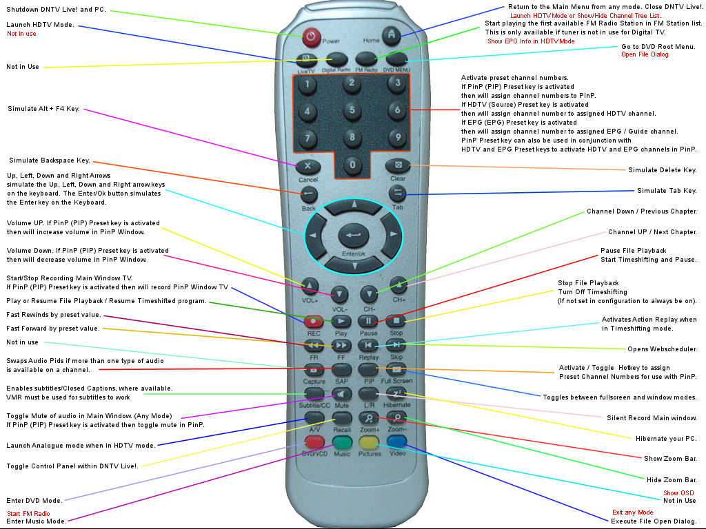
We know it is easier for the user to use an interface with less buttons versus more buttons, simply because the user has less choices. While specificity doesn’t always lead to greater usability, it is part of the premise within this concept that the more specific you are, the easier it is for someone to naturally understand what they are supposed to do and the less chances for the user to experience an error.

Illustrations and narrative as found on (3) Intel’s Developer Zone / Menu Documentation site. The Swiss Army Knife and a series of TV Remote Controls are used to illustrate this example within the Universal Principles of Design.

Images showing contrast of designFrom the book Universal Principles of Design, “The flexibility-usability tradeoff is related to the well known maxim, jack of all trades, master of none.” For some things this makes a lot of sense as specificity may be too expensive or too inconvenient. The lack of specialization may have to be applied from the users side to allow them to achieve their goal.

I think of how craftsman may use their tools, or how a power user applies software to meet their needs. They do with experience and knowledge, and so flexibility is rewarded but it comes at a cost of time to learn and acclimate to the tool. There are also examples where the approach becomes too flexible, accommodating too many needs at one time. For a consumer device targeted at wide-spread adoption (assumed to be the case for the example below), usability is key. It seems the attempt to integrate a keyboard with a TV for the non-specialized user market is out of reach.

“Sony’s recent… work with Google has resulted in this creation. It is a fine example of how when flexibility is pushed to the limit (in this case a QWERTY keyboard attached to a tv remote control) usability is so diminished that it potentially renders theobject useless. Ergonomically it appears to be uncomfortable, and by looking at the thumbs in the photo not unlike typing into a pocket calculator.” (2)

Within the description above, the object is referred to useless based upon its diminished usability. As you can see in the photo above, there is a lot this device can potentially do based upon its physical interface. You can only imagine the software interface and how Progressive Disclosure may be used to reduce some of the effects of complexity but a device such as this feels like it does and can do too much at once.

Ive thought of a few objects in the real world where the tradeoff between flexibility and usability are apparent and tools and kitchen utensils provided a few good options. An extreme example would the scissors compared to a multi-tool. I’m not sure why I keep this around to be honest, it is hard to use most of the functions without coming into contact with hats edges. In short this is a bottle opener, wire stripper, pliers, knife, scissors, can opener and I am sure I am missing other potential functionality. I don’t use it because it is difficult to use for any of its intended purposes. Part of this issue is with the design of its individual components such as with the handles, in contrast to the scissors which has a more specific grip, which is more comfortable and provides more control when using it, the multi-tool has handles that are able to be used with thick gloves on, but barehanded they are not comfortable and do not allow for a sense of control. The user has to insert their fingers in a way that feels unnatural to hold something.

Other issues come from using specific functionality such as the bottle opener, it is almost impossible not to come in contact with the serrated knife.

(1) Universal Principles of Design – 2010 Lidwell, Holden, Butler
(2) http://userpathways.com/2010/10/usability/ – Thursday, October 14th, 2010
(3) https://software.intel.com/en-us/articles/usability-tradeoff, October 23, 2013 – Diana B.

Team 6 Principle #8: Horror Vacui

Horror Vacui is Latin for ‘the fear of emptiness.’ It is the practice of filling a space with as many design elements as possible. As a design principle, it was a historically popular in the Victorian, Georgian, and Baroque eras, in times when having more meant you were more affluent.1 

Today, we are overwhelmed with options and choice, so minimalism and simplicity have become the trend. This means that there has been a shift in value perception. Now, the busier and more cluttered a design, the cheaper the product feels. Brands may choose to employ horror vacui based on their product positioning—for the Dollar Store, cheap is a good thing.

Example 1: Dollar Store vs. Jewelry Store

The more cluttered a store, the cheaper it looks.

Source: The Visual Communication Guy

The emptier a store, the more expensive it looks.

Source: The Visual Communication Guy

Example 2: The Cheesecake Factory vs. Ramen Hood

The Cheesecake Factory’s website design and menu are very cluttered, signifying low-quality, mass market food. (No one said it wasn’t delicious.)

Source: The Cheesecake Factory

Ramen Hood, a boutique vegan ramen shop in Los Angeles, has a much cleaner design and menu, signifying their quality of ingredients.

Source: Ramen Hood

Example 3: Attorneys/Abogados


This store window in downtown Los Angeles markets the attorneys inside to low-income clients with its use of horror vacui. It not only fills up most of the window space with information, but also advertises many different kinds of potential lawsuits that the lawyers could represent the clients on.

Footnotes

1“Horror Vacui: The Fear of Emptiness | Interaction Design Foundation.” 8 Aug. 2018, https://www.interaction-design.org/literature/article/horror-vacui-the-fear-of-emptiness.

Team 6 Principle #3: Desire Line

Desire lines, or desire paths, are traces of use or wear indicating a user’s preferred method of interaction with an object or environment.1 They are most often associated with walkways, in situations where pedestrians’ repeated traversals of shorter, more direct routes create alternative paths to paved ones. Landscape architects are now starting to embrace desire lines by allowing them to form and then paving over them, instead of predicting behavior and trying to force it with barriers and other constraints.

Desire paths as a metaphor for UX and design
Desire paths as a metaphor for user experience and design by Natalia Klishina | Image: 99% Invisible [3]
Desire lines can also be seen in other physical and digital objects, and should be taken into consideration in any user-centered design. A common motto calls for “paving the cowpath,” or supporting what users are already doing.2 For example, Twitter hashtags and @mentions grew out of community uses inspired by IRC (internet relay chat).3 Community forums with voting features like Digg and Reddit also indicate users’ preferred posts.1

The top 5 posts from reddit.com/r/all
The top 5 posts from reddit.com/r/all at time of writing

Physical examples include ergonomic keyboards that split in the middle and allow wrists to assume a more natural position, and the water fountain spigot designed for water bottles below. Prior to the installation of these faucets, the only way to fill up a water bottle was to tilt it sideways, a less efficient and more annoying method.

A water fountain spigot for bottles
A water fountain spigot for bottles in my office
Footnotes

1 Lidwell, William, Kritina Holden, Jill Butler, and Kimberly Elam. Universal Principles of Design: 125 Ways to Enhance Usability, Influence Perception, Increase Appeal, Make Better Design Decisions, and Teach Through Design. Beverly, Mass: Rockport Publishers, 2010. Print.

2 “Pave the Cowpaths – Social Patterns – Designing Social Interfaces.” 13 Aug. 2013, http://designingsocialinterfaces.com/patterns/Pave_the_Cowpaths.

3 “Least Resistance: How Desire Paths Can Lead to Better Design – 99 ….” 25 Jan. 2016, https://99percentinvisible.org/article/least-resistance-desire-paths-can-lead-better-design/.

Team 1 Principle #2: Prototyping

Prototyping is a design principle used to create quick and simple to more refined mockups in order to explore the design of the product being built, refine it, and test it. There are many different ways to go about doing this. It can be as simple as a sketch or be more complex as 3D printed models. The main purpose of prototyping is to walkthrough a similar experience and define points of failure or improvement in a way that is not costly. Prototyping in each design process is beneficial to exploring more of the focus of that process.

Example #1: Ojex Juicer

This image here depicts many examples of prototyping at each design phase.

Example #2: 3D Printed Custom Jewelry

This is a great example of prototyping in order to inspect something, in this case jewelry, prior to actually building out the final product.

Example #3: “Creeper Cam”

My friend and I were on a mission to create a sneaky way of taking photos of what’s around us (we’re normal, I swear).  We came up with an idea of an iPhone attachment and we decided to build it out. The red arrow focuses on the area where the attachment will slide into your iPhone. The black arrow is where we would add a reflective layer to bounce off the camera and into the opening. This allows users to have their phones parallel to the ground while at the same time taking pictures of what is right in front of them.

Resources:

Lidwell, William, Kritina Holden, Jill Butler, and Kimberly Elam. Universal Principles of Design: 125 Ways to Enhance Usability, Influence Perception, Increase Appeal, Make Better Design Decisions, and Teach Through Design. Beverly, Mass: Rockport Publishers, 2010. Print.

“Solus DLP 3D Printer – Australian Distributor – 25 Micron Resolution.” CAD Jewelry School, www.cadjewelryschool.com/solus-dlp-3d-printer.

Team 1 Principle #1: Garbage In-Garbage Out

Garbage In Garbage Out is a design principle based on the the notion of bad input producing bad output and vice versa. If the end user has the ability to input any type of value with any given quality into a space without ways of preventing “invalid” inputs, the outputs will probably be equivalent to the input’s caliber. In the Universal Principles of Design book, the authors bring up two types of input problems: input type and input quality. Input type is focused more on inserting the wrong information into a space. An example of this might be entering your username in the password field on a login form. On the other hand, input quality is centered around injecting a flawed value that is of the correct type. For example, missing one number from your credit card number will result in a faulty transaction. There are ways to prevent garbage ins broken out by each kind of problem. Using affordances and constraints for input type issues and previews and confirmations for input quality issues will help minimize the impact of the input has on the output. Prevention of input error is the key to a successful interaction resulting in the expected and desired outcome.

Example #1: Order Forms

The image displays the preventative measures added in the redesigned form to avoid any potential garbage input values.

Example #2: Remote Controls

This example shows the many possible inputs or sets of inputs for an end user of remote controls. One might keep hitting the “1” button numerous times with the result not having to do anything with the number “1”. It might take the user to the “On Demand” channel or “Guide”. The lack of constraints allows for bad inputs.

Example #3: Cuisinart Coffee Maker

This example I struggled with this morning while house sitting my friend’s house. I wanted to make a cup of coffee and I was confident I set everything up correctly. When it came to the moment of turning it on, I was puzzled by how it worked. I turned the distinct “Ready Tone” knob to “ON” and nothing was happening. No coffee. I realized later that I had missed the “ON/OFF” button at the top since the color blended in with the rest of the machine and did not stand out to me. The main issue is the counts of “ON” on that machine: “Auto ON”, “ON”, and “ON/OFF”. The probability that a user will interpret only one of these “ON” labels to be true decreases as the number of “ON” options  increases.

Resources:

Lidwell, William, Kritina Holden, Jill Butler, and Kimberly Elam. Universal Principles of Design: 125 Ways to Enhance Usability, Influence Perception, Increase Appeal, Make Better Design Decisions, and Teach Through Design. Beverly, Mass: Rockport Publishers, 2010. Print.

Wilkinson, Darryl, and Grant Clauser. “The Best Universal Remote Control.” Engadget, 24 Jan. 2017, www.engadget.com/2016/04/29/the-best-universal-remote-control/.

Team 5 Principle #6: Uncanny Valley

Summary:

Humans have a tendency to like anthropomorphic forms, or things that have similar characteristics to us. We are biased towards them, we feel a connection to them… That is, until they hit the “Uncanny Valley” where they become so similar to us that they become unappealing or even creepy. Though there is no concrete measurement of when an object enters the uncanny valley, characteristics that typically receive negative reactions include: abnormally portioned facial features, subtle eye movements, and unnatural skin complexions. An interesting observation to note is that this does not only affect humans; when macaque monkeys were shown computer generated images of monkeys they also fell into the valley effect.

Example #1 – Cited By Original Source:  Mannequins

As described in Universal Principles of Design, mannequins are a common example of “Uncanny Valley” because they typically have the basic shape and curves of a human body, but the plastic and uniform color, the eyes that are there but not there, and the motionless, dead aura of these figures give the uncanny feeling.

Example #2 – Found Online:  Avatar SDK

The Avatar SDK is a very effective example of “Uncanny Valley,” particularly when playing with the demo on their website. The SDK truly tries to create a computerized version of a person, and the similarities are just too much. Zooming in and out on the demo really gives the creepy feeling of “Uncanny Valley.”

Example #3 – Found in Real Life: Target

Walking through the isles at Target, you will find products such as the dolls and books above that exhibit the characteristics of something that could be identified as “Uncanny Valley.”

References and Citations:

  1. Bradley, Steven. “Contour Bias And The Uncanny Valley: Anthropomorphic Forms Part II.” Vanseo Design, 13 Sept. 2010, vanseodesign.com/web-design/anthropomorphic-forms-part-ii/.
  2. William Lidwell, Kritina Holden & Jill Butler. Universal Principles of Design, Revised and Updated: 125 Ways to Enhance Usability, Influence Perception, Increase Appeal, Make Better Design Decisions, and Teach through Design. Rockport, 2012.

Team 5 Principle #5: Scarcity

Summary:

Scarcity is the idea that an object’s level of desirability increases as its supply decreases. Our reading, Universal Principles of Design, describes five common tactics apply the principle of Scarcity: exclusive information, limited access, limited time, limited number, and suddenness. Each of these tactics move people to action because of a human cognitive bias known as “loss aversion.” Jen Cardello’s article, “Scarcity Principle in UI Design: Making Users Click RIGHT NOW or Lose Out,” highlights that the research conducted by Daniel Kahneman and Amos Tversky has shown that the human tendency is to avoid loss over acquiring gains. Both sources suggest that scarcity is largely effective in terms of not only quantity, but in time and information.

Example #1 – Cited By Original Source: Running Brides

As described in Universal Principles of Design, the running brides depicted in this picture show how scarcity can motivate people to act. Typically, I would imagine bridal shoppes to be mostly empty, quiet, calm – but this picture shows the complete opposite, all because of the short supply of cheap wedding dresses.

Example #2 – Found Online: Fancy food

This dinner plate depicts scarcity because seeing so little food on the plate, and especially in its artistic arrangement on the plate, suggests that this is a desirable and expensive meal.

Example #3 – Found in Real Life: Starbucks Pumpkin Spiced Latte

This was the first time I ever tried the PSL from Starbucks. It was pretty good, but I know people who count down the days before the Fall drinks come back to the coffee shop so they can order their beloved PSL. Of course, since this is the only time of the year they can drink this beverage, they enjoy it as much as possible before it disappears… the power of scarcity is Starbuck’s friend.

References and Citations:

  1. Cardello, Jen. “Scarcity Principle in UI Design: Making Users Click RIGHT NOW or Lose Out.” Nielsen Norman Group, 14 Sept. 2014, www.nngroup.com/articles/scarcity-principle-ux/.
  2. William Lidwell, Kritina Holden & Jill Butler. Universal Principles of Design, Revised and Updated: 125 Ways to Enhance Usability, Influence Perception, Increase Appeal, Make Better Design Decisions, and Teach through Design. Rockport, 2012.

Team 5 Principle #4: Red Effect

Two subtle biological indicators of female fertility are rosy cheeks and red lips. Humans subconsciously perceive women as more sexy and attractive if they’re wearing red (clothing, lipstick, and blush) compared to other colors for this reason. Iconic examples of this in history are Marilyn Monroe and Jane Russell’s bright red lips and sequin dresses in Gentlemen Prefer Blondes and Stevie Wonder’s soundtrack album, The Woman in Red. Men, on the other hand, are perceived as powerful, dominant, and aggressive if they’re wearing red. Some examples include, male politicians wearing red ties, Satan, and red sports cars.

Example #1 – Cited By Original Source:

Beyoncé is inarguably one of the most beautiful women in the world. Although the style of clothing, make-up, and art direction are very different in these two magazine covers, the color that Beyoncé is wearing is extremely influential to the overall vibe of each. In the blue dress, she’s a sweet and sophisticated beauty, while in the red dress, she’s a sexy, sultry, and confident vixen.

Cover sources: All Hail Queen B: Over 40 of Beyoncé’s Chicest Magazine Covers

Example #2 – Found Online:

Throughout history, Satan has been betrayed as an almighty, evil, fiery red beast from Hell. If you Google, “Male devil Halloween costume,” you’ll find a plethora of costumes that meet that criteria. However, if you Google, “Female devil Halloween costume,” all that comes up are sexy devil costumes that enhance the female form and highlight sensuality.

Costume sources: www.halloweencostumes.com

Example #3 – Found in Real Life:

Red roses are extremely feminine and reminiscent of the female form. They symbolize, love, passion, romance, fertility, and sensuality. Men often give a dozen red roses to women as gifts to show their love and appreciation on special occasions and Valentine’s Day. On the other hand, chili peppers appear as more masculine in nature. They are are hot, spicy, temperamental, and phallic.

Reference:

  1. William Lidwell, et al. Universal Principles of Design. 2nd ed., Rockport Publishers, Inc., 2010.

Team 5 Principle #3: Exposure Effect

The Exposure Effect, also known as The Mere Exposure Effect, occurs when people begin to like something (neutral or positive) after they’ve been exposed to it many times. For instance, turmeric, the exotic tasting spice that hails from India, is now a widely accepted anti-inflammatory flavor enhancer in Western cultures. Turmeric can now be found in practically everything — from smoothies, to lattes, to savory meals. K-Pop’s number one boy band, BTS, has become a worldwide sensation. Their songs, which are sung in Korean, are known by heart by women and men all across America. Conversely, when people are exposed to negative things, they’ll be more likely to dislike them even more. There are many examples of how over exposure to negative stimuli in the news is affecting our polarized nation… and what can be seen as negative to some, can be seen as positive to others.

Example #1 – Cited By Original Source:

Obama Hope Poster Politicians often use the Exposure Effect to help them gain popularity and likability. One of the most powerful examples of this is President Obama’s widely recognized “Hope” poster by American artist Shepard Fairey. Fairey’s poster helped define and encapsulate positive feelings of change, hope, and optimism. “That the image immediately went viral is proof of the emotional connection it had with potential voters, especially youth. Many believe this poster inspired enough voters to give Obama the edge that he needed to win.” (CNN) Since the original poster was created, the Fairey and other artists have created iterations of it that played on the theme of other important social and political issues.

Example #2 – Found Online:

The Exposure Effect can influence design trends and standards. Once certain layouts, symbols, and icons become popular, they begin to be widely used in design and accepted by users. The hamburger menu was originally designed three decades ago by Norm Cox while he was working at Xerox Star. Unfortunately for Cox, the icon was never “McDonaldized.” The icon was brought back to life during the advent of mobile devices and started trending after it was used for Twitter’s app, Tweetie, and Apple’s Voice Memos app for iPhone 3GS. (O’Neill) Although not everyone is a fan of the hamburger menu, it has become a very common standard for mobile friendly apps and websites.

In just sixty seconds, I found three examples of the hamburger menu (circled in red) on my phone:

Example #3 – Found in Real Life:

Remember a time when smoothies were just a healthy drink to aspire to making? Well… people got bored of just drinking their meals and taking photos of themselves holding a glass and decided to create a new trend: smoothie bowls. Instagram smoothie pics went from drab to fab seemingly overnight as people started creating fruit, nut, and seed mosaics on top of their smoothies. Currently, the #smoothiebowl hashtag has 1.7 million posts! Before grad school happened and I had more time on my hands, I used to painstakingly make smoothie bowls and take photos of them too…

Tropical Smoothie Bowl

#smoothiebowl hashtag on Instagram

References and Citations:

  1. CNN, Carol A. Wells. “Poster Politics: Can Art Influence Elections?” CNN Style, 1 Nov. 2016, https://www.cnn.com/style/article/political-posters-oped/
  2. O’Neill, Mark. “The 3 Line Menu Icon: What Is a Hamburger Menu?” Small Business Trends, 21 Jan. 2015, https://smallbiztrends.com/2015/01/3-line-menu-icon-hamburger-menu.html.
  3. Smith, Jeremy. “6 Conversion Principles You Can Learn From The Mere-Exposure Effect.” Marketing Land, 3 Sept. 2015, https://marketingland.com/6-conversion-principles-can-learn-mere-exposure-effect-140430.
  4. William Lidwell, et al. Universal Principles of Design. 2nd ed., Rockport Publishers, Inc., 2010.

Team 5 Principle #2: Chunking

Chunking refers to separating a large body of information into a smaller number of “chunks” so that information can be processed and memorized more easily. A chunk can refer to a string of letters, word, or series of numbers. The optimal number of chunks that can be most efficiently processed by our short-term memories is 4 plus or minus 1 (Lidwell, Holden and Butler, 2010). It is important to note that the limits brought up by this principle are specifically for tasks involving short-term memory. For references that may be scanned (such as a dictionary), chunking sections into 4 or so entries per page would be counterproductive and inefficient.

Example from original source:


Chunking examples

The example on the right is an e-learning course by Kaplan EduNeering, which utilizes chunking of the topics on the grey left sidebar as well as on the topics on the main page. The top left example shows how familiar words are more natural for us to chunk together and recall than unfamiliar words. The bottom left example shows how a large string of number (such as a phone number) can be made easier to recall by chunking them into small pieces.


Example from online:

Apple.com Human Interface Guidelines

On Apple’s Human Interface Guideline’s page in their developer portal, the content is divided into five digestible chunks. The first four boxes feature different Apple products while the bottom rectangle features additional technologies. Under Technologies, information is further divided into columns of four.  However, a critical observation is that the alphabetical ordering of their technologies seems a bit arbitrary; the way the rows are divided make the four items in each column seem like they might be related when in fact they aren’t. However, this may be due to the fact it is difficult to divide the content into four perfect groups of four technologies that are related.


Example from real life:

Chunking book example

In this example, I’ve divided the page on Chunking from “Universal Principles of Design” into four unironic chunks. This was to help me remember the key points of what I wanted to talk about in this very post.


Works Cited

Human Interface Guidelines. (2018) Retrieved from https://developer.apple.com/design/human-interface-guidelines/

Lidwell, W., Holden, K. and Butler, J. (2010). Universal principles of design. 2nd ed. Rockport Publishers, pp.27,40.

Team 5 Principle #1: Anthropomorphic Form

Anthropomorphic forms are forms that possess humanoid characteristics. People have a tendency to be drawn to human-like forms or patterns because we are predisposed to be drawn to forms that resemble us. Humanoid designs are often good at grabbing a person’s attention while exuding a positive emotional impression (Lidwell, Holden and Butler, 2010). However, it is important to note that abstract anthropomorphic forms lead to more positive reactions than more realistic anthropomorphic forms such as lifelike robots, which can sometimes result in a person feeling unsettled or even repulsed (AKA uncanny valley). Therefore, our positive bias towards anthropomorphic forms is more evident when the form appears only slightly human.

Example from original source:

method dish bottles
The Method Dish Soap bottle (left) designed by Karim Rashid vs. the modern day replacement


The Method Dish Soap bottle (left) was made to resemble a female breast and elicited a strong positive response in people because they have positive associations with breastfeeding. Moreover, this anthropomorphic bottle gave it personality, attracted attention, and even worked as an aesthetic art piece that livened up a space. In contrast, the replacement bottle (right) looks bland and uninteresting and fades into all the other soap bottle designs.


Example from online:

MUSIO AI
Musio AI Bot

This is Musio, an AI robot assistant that seemingly has emotions and can engage in fluid conversations with a user using machine learning. Musio’s design features two eyes, two ears, a head, two arms, two legs, and a heart too. However, its form looks far from realistic. In fact, it resembles more of a cat. On top of that, its short legs make it look almost cartoon-like which adds to the cute factor.


Real life example:

MammaChia’s Chia Squeeze

This right here is my main squeeze: MamaChia’s Chia Squeeze drink in strawberry banana. It took everything in me not to squeeze this package right then and there. Everything from the sensual feminine silhouette to the font that was chosen to the vibrant shade of fuschia of the packaging exudes vitality, femininity, and sweet chia goodness. The sides of the package curve inwards like the waist of a goddess, seducing me with her organic wholesomeness. In the Chia Squeeze’s case, its anthropomorphic form follows its function, as the curves gave me a solid and comfortable grip.  I also quite enjoy how the form of this package ties it in with the brand. MammaChia brings about associations with a mother figure who is nurturing and wants us to be well fed. The silhouette of an attractive female form further enhances that association and the curvy package ties it all together.


Works Cited

Musio: Your Curious New Friend. (2015) Retrieved from https://www.indiegogo.com/projects/musio-your-curious-new-friend

Lidwell, W., Holden, K. and Butler, J. (2010). Universal principles of design. 2nd ed. Rockport Publishers, pp.27,40.