LEFT! TO ADVENTURE!
: 
Started by Greg Puett,
Modified by Alex Q. Duong and John Molendyk.
PDF can be found here

UCI Informatics 282 | Fall 2018
LEFT! TO ADVENTURE!
:
Started by Greg Puett,
Modified by Alex Q. Duong and John Molendyk.
PDF can be found here
This masterpiece is called “Godzilla”!

It started off as a picture of cranes in Oakland that I thought looked like the AT-ATs from Star Wars and ended up as the King of Monsters.
You can follow our journey (Me, Joseph, and Kathlyn) here.
This piece of art is called:
“The Wanderers above the Land of HCI&D”
(The inspiration comes from Caspar David Friedrich’s The Wanderer above the Sea of Fog.)
Project 1’s team consisted of Kathy, Sahar, and me.
Here is the final product:

The link to the full narrative is here.
The Fibonacci Sequence
A number sequence where the two previous numbers summed together form the next sequential number.
The Fibonacci sequence can be found in nature, such as seashells, flower petals, galaxy spirals, and the bones in our hands. The sequence is “naturally” pleasing, and can also be found as intentional designs in poetry, music, art, and architecture.
Closely related to the Fibonacci sequence is is the Golden Ratio, which is a 1 to 1.6 ratio of their sum to the larger of two quantities. Many items exhibiting the Golden Ratio also have the Fibonacci sequence.
Example 1: Modulor, by Le Corbusier

French-Swiss architect Le Corbusier used two Fibonacci sequences to create the Modulor, which is technically and theoretically biologically harmonious in design.
Example 2: Golden Ratio

The golden ratio is an example of the Fibonacci sequence, where a + b is to a as a is to b. The numbers have been added here for ease of parsing the numbers. Notice how this is also a nautilus shell.
Example 3: Bones in my hand

The bones in our hands illustrate the Fibonacci sequence. It’s hard to tell, but this picture illustrates it better.
Resources
Orientation Sensitivity
A visual processing phenomenon in which some line orientations are more quickly or easily parsed than other line orientations.
Two factors affect orientation sensitivity: the oblique effect, and the pop-out effect. The oblique effect is a person’s ability to judge and percieve line orientations that are along the traditional vertical and horizontal orientations better than they do any sort of angled and horizontal orientation. This is caused by neurons having greater sensitivity to stimuli along the horizontal and vertical orientations.
The pop-out effect is a visual processing phenomenon in which elements tend to stand out when compared against a background of common orientation. This is caused by neurons that are able to detect visual stimuli that activate more neurons in order to discern pattern and orientation differences. The pop-out effect is most easily detected when the differing element differs by 30 degrees or more. It is also easier to detect element differences against vertical and horizontal lines than against slanted or oblique orientations.
Example 1: Analog Clocks

Our book uses two analog clocks with 30 and 15 degrees of separation to show that 30 degrees of separation is easier for the user to parse information.
Example 2: Compass

The compass makes use of our natural tendencies to process along the x and y axes in order to quickly parse information; in this case, navigation. What does make this hard to read is that there is less than a 30 degree of separation amongst the many degrees, so it isn’t a cursorarily distinguished as say, a 12-hour clock like above.
Example 3: Car meter

The car meter makes use of the pop-out effect so that drivers can easily distinguish what speeds. In my picture, even though the speedometer is fairly hazy, notice how the speeds pop out – it makes use of the pop out effect with stark black/white contrast so the user can quickly get the information they need.
Resources
Objects and things that cause a conflict in the thought process and increase cognitive load are known as the “interference effect.” When information is sending mix messages or different signals all at the same time, it is hard for the user to understand and comprehend. This inability to make decisions quickly is one of the many byproducts of interference within a user experience.
Example 1: The Pocket Universal Principles of Design
This depiction in the book of highway and traffic signs illustrates very clearly the Interference effects.  Example 2: Online Example of Interference Effects from The International Design Foundation

Example 3 : Parking signs near me in downtown San Jose, California

The idea of layering is organizing and grouping the related information together in order to manage complexity and strengthen relationships in information. There are two main types of layering: two-dimensional and three-dimensional layering.
Two-dimensional layering divides information into layers in such a way that only one layer can be seen at a time. There are two types of two-dimensional layers: linear and nonlinear layers. Linear layers are used for information that has a clear start, middle and end sequence. Nonlinear layers are used when one is reinforcing the relationships between layers. These are 3 types of nonlinear layers: hierarchical, parallel and web. An organizational chart is a good example of a hierarchical layer, which is useful when the information has a relationship between subordinates and superiors. Parallel layer is used when the information is based on the organization of other information, such as a thesaurus. Hypertext is a good reference for web layers that is useful when the information includes diverse relationships. The layers are revealed through linking to other layers.
Three-dimensional layering separates information into layers in such a way that multiple layers can be viewed at a time without switching context. The 3-dimensional layers can be revealed through opaque and transparent layers. Opaque layers are useful for presenting elaborate information or additional information to a particular item. A software pop-up window is a good reference for opaque layers. Transparent layers are used to combine overlaying information to illustrate concepts and highlight relationships in information.

This is example of two-dimensional layering. Linear layers are used when information has beginning, middle and end sequentially, while nonlinear layers are used for reinforcing the relationships between each layer. There are three different nonlinear layers: hierarchical, parallel, and web.

The map and navigation UI provide the aspect of three-dimensional layering. The layers of information, such as search box, direction information and location pin, overlay on top another and highlight information.

In these days, many Augmented Reality (AR) apps and products have been created. AR is a technology that layers virtual images and information onto the real world. With using both opaque and transparent layers, AR enhances the connections between digital information and real life and allows the user to have positive experiences.
Lidwell, William, et al. Universal Principles of Design 125 Ways to Enhance Usability, Influence Perception, Increase Appeal, Make Better Design Decisions, and Teach through Design. Rockport, 2010.
ThinkMobiles. What is Augmented Reality (AR) and How does it work, 2018, Retrieved from https://thinkmobiles.com/blog/what-is-augmented-reality/ .
The key point of Ockham’s razor is that simplicity is preferred over complexity. The idea is to avoid unnecessary information and elements that decrease the design’s efficiency and cause problems. There is a pleasing aesthetic with simpler, cleaner and purer results by removing the unnecessary elements from a design. If there are multiple possible selections with the same functionality, Ockham’s razor indicates that it would be better to choose the simplest one. Minimize the elements as much as possible and make the design as simple as possible; however, the design and function should still be clear and effective.
 Google keeps its design simple. This minimalist design helps it be the most popular search service, as it is efficient and easy to use and performs best among other search services.
 Example 2 (Found Online)
A strong and impactful message can be created by minimal elements. This Heinz ad is visually simple, but the main point is still clear and effective.
The Print Ad titled BOTTLE BOTTOM was done by McCann London advertising agency for product: Heinz Tomato Ketchup (brand: Heinz) in United Kingdom. (Apr 2007)

IKEA’s products and furniture have a minimal look compared to other furniture, but its functionality is still efficient and enjoyable.
Lidwell, William, Kritina Holden, and Jill Butler. Universal principles of design, revised and updated: 125 ways to enhance usability, influence perception, increase appeal, make better design decisions, and teach through design. Rockport Pub, 2010.
Coloribus. Heinz Print, Outdoor BOTTLE BOTTOM by McCann London, 2007, Retrieved from https://www.coloribus.com/adsarchive/prints-outdoor/heinz-tomato-ketchup-bottle-bottom-9628905/ .
The principle of gamification is the method of designing an experience that would not usually be experienced in a game like way. Applying a gaming experience to a non-game context is done to help “enhance the user experience and modify behavior”. Most importantly it helps with users overall engagement. Some examples of gamification are scorekeeping, showing progress, coaching along with a process, and motivating the user.
Example 1: The Pocket Universal Principles of Decision

In order to increase the number of people and motivate them to use the stairs instead of the escalator, a Swedish team created this “Stair Piano” in a busy transit area in Stockholm. They turned each stair into a piano key that would play once someone would step on it.
Watch the video of the experiment here.
Example 2: Online Careers Page: Ueno.com

One of my favorite examples of gamification is from the design agency, Ueno. They created a very engaging and fun applicant experience as part of their career’s page. Through playful animations, storytelling, sounds, and illustrations, the user is taking through an adventure, meeting characters who represent the people who are part of the team and hiring process. This experience is much different than most career pages and the gamification helps to tell a story about who the company is and helps to keep the user highly engaged.

Visit the website to experience the gamification career page here.
Example 3: My You Version Bible App


I have an app on my phone that allows me to read the bible daily. Some of the features include sending me push notifications with daily scriptures that take me to the full bible book and verse(s). One of the gamification elements of the app is a status notification that lets me know how many consecutive days have I read and engaged with the app. It’s a great way to remind me of how consistent I have been as well as it serves as an encouragement to not break the streak and also plays to my competitiveness.
References
William Lidwell, Kritina Holden, Jill Butler (2015), The Pocket Universal Principles of Design, Beverly, MA: Rockport, 2015
People often accidentally find themselves performing a different action than what they initially intended. Some events could have a severe negative impact if not done correctly. For example, deleting a software project that took a couple of months of a small team of developers will affect the bottom line of a company. Confirmation is not only an authorization message that is nice to have. Confirmation is a design principle that helps in preventing unintentional actions with potentially severe adverse results. In other words, the confirmation design principle uses verification to ensure that a performer of action has selected the intended action correctly before execution.
Example #1 cited by the original source:

The above examples are from the book. One example of a confirmation design is to ask users to re-enter a required input such as a password or an account number as a way to prevent slips. Another example is confirming that an email with a blank subject is intentional.
Example #2 found online:

This is a confirmation example that I saw while using the Venmo mobile app. The Venmo app is used to send money to someone using their cell phone number or a user ID. When I click the call to action button (Send), the app requires me to confirm the transaction information such as the amount to be transferred, the receiver of the money, and a description for the transaction before performing the command.
Example #3 found in real life:

I always get a confirmation to authorize the total amount of order when using my credit card to make a purchase. The credit card readers that are connected to a store’s point of sale solution show a message to customers to approve the amount that will be deducted from their accounts.
Citation:
1. Lidwell, William, et al. Universal Principles of Design 125 Ways to Enhance Usability, Influence Perception, Increase Appeal, Make Better Design Decisions, and Teach through Design. Rockport, 2010.
The principle of consistency enables people to learn new systems faster and efficiently deliver knowledge to new frameworks. The systems are more usable and learnable when they are presented in similar ways. Consistency helps people focus their attention on the task at hand. There are four categories of consistency: aesthetic, functional, internal, and external.
Aesthetic consistency means consistency in style. Aesthetic consistency helps things easily identifiable for people. As an example, a company logo is great identifier of who the company is and what the company does. When the logo is used consistently (same font, color, graphic, and tagline), then a brand is born. Aesthetic consistency enhances recognition and communicates emotional connection between brand and people.
Functional consistency improves usability by formulating existing knowledge of how designs functions. When similar controls function the same way, it is called functional consistency. The consistent use of symbols on a new device increases predictability of the product, which makes the new device easier to use and learn.
Internal consistency relates to correlation of elements in the system. This is a blend of both visual and functional consistency. As an example, if updating a webpage with new elements, you should also update other older webpages in the website with same elements.
External consistency refers to consistency across multiple independent systems. Adobe products are good examples of external consistency. Adobe Photoshop and Adobe Illustrator have similar tools and features that is recognizable to the users. Therefore, if you know Photoshop you can apply that knowledge to learn Adobe Illustrator.
Visual depiction from Universal Principles of Design

“Bob Evans uses the same logo, typefaces, color, schemes, menus, staff uniforms, interior design, and architecture across its restaurants. The consistency improves brand recognition, reduces costs, and establishes a relationship with customers that extends beyond any single restaurant.” (Lidwell, Holden, Butler 2010, p.57)
Online visual depiction

Elements of website designs to include Aesthetic consistency, Functional consistency, Internal consistency, (https://gofishdigital.com/guide-design-consistency/) and External consistency. (https://uxdesign.cc/design-principle-consistency-6b0cf7e7339f)
Real life visual depiction

Aesthetic consistency: Apple logo on MackBook Pro, iMac, Magic Mouse in Silver and in Space Gray

Functional consistency: Roku remote control, Samsung LED remote control, Samsung Blue-ray remote control (play, pause, fast-forward and rewind buttons)

Internal consistency: In the city of Irvine, street signs are brown with white letters

External consistency: Ubiquitous and recognizable restroom signs
References:
William Lidwell, Kritina Holden, Jill Butler (2010), Universal Principles of Design, Beverly, MA: Rockport, 2010
Matt Burt (2017) A Beginner’s Guide to Achieving Web Design Consistency, Go Fish Digital, https://gofishdigital.com/guide-design-consistency/
Anton Nikolov (2017) Design principle: Consistency, The most known and the most fragile design principle., UX Collective, https://uxdesign.cc/design-principle-consistency-6b0cf7e7339f
Comparison is a design method through which one can understand how a particular circumstance or situation can have different effects on two or more systems. This method reveals relationships and patterns among systems. Comparison is a useful method for measuring differences among systems which are similar or in the same context.
Example #1 Cited by the original source:

This is the Diagram of the Causes of Mortality in the Army in the East. Comparison is easier when diagrams are located next to each other on the same page. These diagrams compare the causes of army’s mortality in different years. The graph has 12 wedges representing each month, and three colors showing causes of death.
Example #2 found online:

This illustration is the comparison of countries population in the world. Each circle represents a country, and each continent is represented by different color. This data visualization has made the information appear simple.
https://www.businessinsider.com/heres-a-comparison-of-the-population-of-every-us-county-using-bubbles-2017-3
Example #3 found in real life:

Today was really windy. I was walking outside when I noticed a loud noise. I looked back and saw these outdoor chairs were blown away by the wind. I was wondering why only some of these chair has blown away and rest are set in their place. However, they are all the same regarding material and environment. This is an example of apple to apple comparison. The chairs are the same in the same situation. The only variable is their position to the wind.
Citation:
Lidwell, William, et al. Universal Principles of Design 125 Ways to Enhance Usability, Influence Perception, Increase Appeal, Make Better Design Decisions, and Teach through Design. Rockport, 2010.
The 80/20 rule also known as Pareto’s Principle state that 80% of output is produced by 20% of its inputs. The exact measurement in percentages are not crucial as it varies between 10 percent and 30 percent. The 80/20 rule has practical implications for interface design, engineering, and economics to name a few. The Pareto’s Principle is useful when assessing value of elements, target features, and concentrate resources for optimization. For example, when critical 20 percent of a product’s features are used by 80 percent of the time the focus should be applied to the critical 20 percent. When redesigning systems that make them more efficient, focusing on noncritical functions that are part of the less valuables 80 percent should be minimized or removed from the design.
Examples of 80/20 rule:
“80% of town’s traffic is on 20% of its road.
(Lidwell, Holden, Butler 2010, p.14)
“80% of a company’s revenue comes from 20% of its products.”
(Lidwell, Holden, Butler 2010, p.14)
“80% of errors are caused by 20% of code”
(Lidwell, Holden, Butler 2010, p.14)
Visual depiction from Universal Principles of Design

“Graphical user interfaces conceal most of their functions in drop-down menus (bottom image). Identifying the critical 20% of the functions and making them readily available in toolbar solves the problem (top image). ” (Lidwell, Holden, Butler 2010, p.15)
Online visual depiction


It is common that in certain areas of the website will fall under 20% of most–used functions. When designing a mobile version of the website, design focus is channeled on that very 20%. As an example, a mobile version of Petco.com shows us that 80% of functions that are least used in the full website is not included in the mobile version.
(https://www.webdesignerdepot.com/2011/02/the-8020-rule-applied-to-web-design/
Real life visual depiction

There are 10 players in my son’s soccer team. The 80% of the goals are scored by 20% of the players.
References:
William Lidwell, Kritina Holden, Jill Butler (2010), Universal Principles of Design, Beverly, MA: Rockport, 2010.
80/20 Rule Applied to Web Design (2011) Mobile Design Trends and the 80/20 Rule https://www.webdesignerdepot.com/2011/02/the-8020-rule-applied-to-web-design/
Alignment allows us to create order and organization among elements.
Alignment is one of the most basic principles in design, together with contrast, hierarchy, balance, proximity, repetition, simplicity and function. In general design, alignment helps connect all the visual element together, make the design more cohesive.
In graphic design and web design, there are many good and bad alignment examples. Good alignment brings proper visibility, guiding the user’s eyes to the information they are looking for. It also helps to balance the design and helps provide the overall structure of the entire object. Bad alignment makes the content more complex and difficult to read, and therefore provides bad feedback to the user.
Usually, alignment is defined by the rows and columns or along its center line. Alignment can be archived with a grid to help with more accurate alignment. The grid is an invisible line system, which helps organize elements from simple to complex content.

Below is an example of the different technique of alignment on Maddison Design website. Elements usually are aligned by rows and columns. However, designers have been experienced with different layouts, which aligns along diagonals, as above samples.

Alignment helps articles with complex contents easier to read. This is an example of using grid system to align various elements. With grid system, it is much easier for the user to read the article, although there is a lot of information on the page.

This photo of the stadium I took during my trip to Toronto is an example of how alignment connects elements together in architecture. All the seats were aligned to create a form of the stadium.
Citation and References:
Objects grouped together are seen as a whole
According to Gestalt psychology, our brain perceives forms and shapes as one whole object even though there are some parts missing. When looking at a visual design, our brain will automatically fill in the gaps of what is missing in what our eyes see. While using the Closure principle, we play with the negative and positive of the space to create the object. We can also apply the Closure Principle by grouping individual elements into a special arrangement or create patterns that trigger our brain into forming an object.
The principle of closure was used wisely in design and graphical elements. It helps simplify the details that are not needed to make it a stronger image. It also combines with other shapes to bring out deeper meaning or hidden messages of the design. This makes the design more appealing and interesting and invites the viewer to spend more time studying the design in more depth.

This is the sample from Universal Principle of Design book. The shape of the penguin was created by different shapes and colors. Although several parts of the penguin are missing and lacks enough details, our brain was still able to form and associate the various elements into the shape of a penguin.

Unilever created their logo by putting different smaller objects into a shape of the letter “U”. All of the elements are stand alone and have different meanings. But when they are formed into the shape of U, they are acting as a pattern, which is easily recognizable.

This is a set of wooden chopsticks I got in from Vietnam. If we glance through the object, we can see it has a shape of a fan. However, when we take out any part of the object, it can also act as a practical element.
Citation and References:
Wayfinding is the process in which people understand, orient and guide themselves through a physical environment by use of information and visual cues. Orientation, Route Decision, Route Monitoring and Destination Recognition are the four stages that are used in wayfinding.
First, orientation refers to establishing one’s location in relation to nearby landmarks and objects within the space. Signage and ‘you are here’ markers plays a major role in helping one determine their location and direction. After someone orients themselves in an environment, the second stage is determining which route to take to arrive at their destination, called route decision. The easiest way of visually deciding which route is fastest is by use of a map. While en route to the destination, the person will detect their route along the way to make sure they are going the right direction. This stage is called route monitoring. The last stage is called destination recognition, and refers to the person being able to determine that they have reached their final destination. The destinations should be made clear by identities and signage.

This map and map key are examples from the book. It shows the wayfinding system within the Pittsburgh Zoo, with landmarks, symbols and areas that are easily identifiable.

This example is wayfinding within the Seattle Children’s Hospital. It has clear zone identification by means of different themes and colors for each particular level. The graphics give the environment a playfulness directed towards furthering children’s imagination and helps make them feel at ease. The signage is clear and easy to understand, using small logos to help indicate areas (for those who can’t read English).


This is an example of wayfinding at the Third Street Promenade in Santa Monica, California. There is a plethora of restaurants and retail shops within just a few blocks, and the map located at the intersection of each main street shows where the person is in relation to the entire walkway. There is consistency in color, font, and shape of all signage, which helps with route monitoring and destination recognition. The map also shows the person in relation to the beach, public transit and parks that are within walking distance.
Wabi-sabi is a traditional Japanese philosophy that embraces the “impermanent, imperfect and incomplete.” Wabi is a concept that refers to beauty in the unique and unrepeated, while sabi refers to beauty that can be found after time has passed and worn an object. In design, it can be applied to singular objects as well as interior design and architecture. Wabi-sabi is seen as a ways to appreciate weathered materials, natural processes and simplicity. It opposes traditional Western ideals of symmetry and flawless durability, and values the organic forms and materials found in nature.

This example is from the book… it showcases unfinished wood materials and asymmetrical but modern forms on the exterior of the house. The interior shows the raw aesthetic of the rope alongside the staircase and organic, natural shapes of the decor.

This example shows the interior of The Musket Room, a New Zealand-inspired restaurant located in New York, New York. One of the walls features “lime-washed exposed brick” and wishbone dining chairs, each made to look unique and hand-carved. The details show weathered materials to enhance its beauty.
 This is an example of Tiffany’s bowl that reflects the ideas of wabi-sabi. It’s finished, decorative glaze is asymmetrical in design, and seems intentionally unintentional and natural in gesture. It features a muted dark brown often found outside. The table it’s sitting on could also be considered of the same aesthetic, as it is an unfinished, natural wood.
Contour Bias is a design principle that states people prefer objects with contoured surfaces over objects with sharp angles or pointed features (Lidwell, Holden, and Butler, Universal Principles of Design, p 62).
The empirical evidence supporting this principle comes from the primary work of Moshe Bar and Maital Neta in their article, “Humans Prefer Curved Visual Objects” published in Psychological Science, in 2006. It even appears the preference for rounded objects is exhibited by other primates.
From a design perspective, the general rule of contour bias calls for using angular features when the intent is to sharpen attention and using contoured features when attempting to create a positive first impression. (Lidwell, et. al.)
 This example from Universal Principles of Design recalls the Bar and Neta experiments, in which “emotionally neutral” objects were used to test for contour bias. These “emotion-free” shapes were used to mitigate confounding factors, such as using baby-shapes or knife-shapes. Which is to say, people prefer soft shapes to stabby features, in a setting free of other signals that tell you something is cuddly or dangerous.
 This second example looks at the discussion of font shapes, their personas, and the use of rounded ones to convey comfort, softness, and femininity. I wanted to use Comic Sans in this section, but decided not to, because of the confounding factors of its use being tied to a trend, and also the hatred of it also being tied to that trend.
 This is the exterior of the Museum of Pop Culture in Seattle, designed by Frank O. Gehry. It is one of several examples of museums designed by Gehry that feature extensive curving on surfaces where one might expect an angular, boxy building.
Was Gehry specifically considering the notion of contour bias, I suspect not. He likely was working within a larger context, but I was reminded of his work when researching contour bias, so I have presented it here.
 As internet research can do, including Gehry in this post reminds me of this cat scratcher as it seems to have been designed after Gehry’s Easy Edges furniture. Perhaps cats have contour bias too.
Biophilia effect is the name given to describe the emotional, cognitive and physical benefits conferred by exposure to natural environments (William James Holt, Psychology, The Briefer Course). On its own, the term biophilia was first coined to describe being attracted to life and vitality, in the sense of a psychological orientation (The Anatomy of Human Destructiveness by Erich Fromm, and Biophilia by E.O. Wilson). In the context of design, biophilia effect refers to the use of people’s attraction to nature as a means of increasing aesthetic value of environments (Lidwell, et. al, Universal Principles of Design, p 36).
 This example, cited in Universal Principles of Design, came from a redesign proposal for a hospital hallway. As an observer of just these images, I find this to be an example of the finding by Stephen Kaplan, that the biophilia effect does not require a real environment, rather, that imagery of such views – such as these digital renderings in a design proposal – can suffice. (“The Restorative Benefits of Nature: Toward an Integrative Framework”, Journal of Environmental Psychology, 1995, vol. 15, p. 169–182.) Imagine the thrill of this client to learn they would not have to rebuild their hospital to take advantage of these ideas!
Now look closely at the photos below. These photos depict the everyday office views at Microsoft Corporation in Redmond, WA.

 What’s astonishing to me is these are snapshots I took at work, and are 100% real world, 24/7 nature bonanza.
Further on the subject of nature views, Don Norman says of the notion of Zen View, “If there is a beautiful view, don’t spoil it by building huge windows that gape incessantly at it. Instead, put the windows which look onto the view at places of transition-along paths, in hallways, in entryways, on stairs, between rooms.” (Don Norman, Emotional Design, Why We Love or Hate Things, 2003, pp 110-113). But Norman seems to taken in by the biophilia effect himself instead describing what I’ll call biophilia payoff: gazing at the forever pleasure of nature’s ever-changing visage.
Biophilia in human creativity is broader than the biophilia effect in design. Here is a different interpretation of biophilia from the great musician and artist Bjork.

Bjork releases her ‘Biophilia’ album in 2011, along with a digital interactive experience. The New York Times reviewed the experience and described it as breaking new ground: “essentially turns an album into a sort of audiovisual game, delivering a miniature production studio into the world’s willing hands.”
Ever ambitious as an artist, the album and accompanying digital work centers on the idea that biophilia is “the love for nature in all her manifestations from the tiniest organism, to the greatest red giant floating in the farthest realm of the universe”, as introduced by David Attenborough. “With biophilia, comes the restless curiousity, an urge to investigate and discover the elusive places where we meet nature.”
The product I love:

This is a Christmas gift from my boyfriend’s company. It is a recreation of the “loot box” from Overwatch game. Loot boxes are often given to the user when they played, as rewards to level up. I am not a gamer, but when comparing the object to the game, it is very close in term of design. The material is plastic, with very nice color combinations and does not look cheap. I think for game fans, this is definitely something fun to relate to.

When he first introduced the gift for me, I looked at the box and thought: “It was a well-made toy. But that’s about it?” Initially, when looking at the product, from a design standpoint, it’s purpose was not clearly visible. I was unsure of its intended use and function. However, the way it was put together made me want to explore it further. It also made me want to know what was in the inside.

But then when we opened it, my perspective was different. It was very clear that the intended use was easily visible and discovered its use was of a mini picnic set. There are 4 pairs of coaster and glasses, which all contain details and illustrations from the game. When we removed all of these items from the box, we discovered that it could also be used as an ice box.
There are so many times I bought some functional object mostly for the look of it. I think this is a great design from both visual and functional standpoint. The object brings fun and entertainment to the user. It also gives us a surprise of affordance (we don’t know what it really is until we open it), but easy mapping (We can figure the coasters are there to be used with the glasses).
The product I love/hate:

Why do I have a love/hate relationship with this machine?
This machine saved me during the hot summer, but it also ruins the look of where ever I had to put it. This is a portable air conditioner so it convenient for me to move it to the location where I needed to use it.
While it provided me with cooling relief during the summer, the cost-benefit of the product was relatively high. This is due to the fact that this machine has only one main purpose which is providing cold air. However, this does not provide any benefit whatsoever for the cold winter months. So, therefore, I would need to purchase another product to keep me warm during this period.
While it provided benefits during summer, one of its major constraints is due to its physical size. When fully set up, the machine almost took ¼ of the available space. The product came with two big tubes, that needs to be connected to the outside of the window. To properly install these tubes, you have to open part of your window and attach them to a panel so the air can be circulated. When looking at the overall design, we can see it doesn’t provide good feedback. We don’t know if the two air tubes will fit in different windows if we have to move the machine to another location.
To use the air conditioner, I have to locate it in an open space, otherwise, it will block all the ways. It came with two big tubes, that will have to be linked to outside of the window. To install these tubes, you will have to open part of your window and insert it in. For me, it has so many physical constraints. When we look at the design, we can see it gives bad feedback. We don’t know if the two air tubes will fit in different window if we move the machine.
WORK
Comfy Office Desk Chair:
 My office chair at work is very comfortable. It has a lot of nice padding and lumbar support. Although it was adjusted and tested out for ergonomic usability by my office manager, I often have the worst posture in this chair. This is 100% my own doing. I find that having good posture all day keeps me alert… and sometimes I just want to slouch in my chair with a big warm blanket and mug of hot tea when I’m stressed out.
Focused Meeting Chair:
 The chairs we sit in during meetings are beautiful and modern. I love their clean lines and the way our organization’s logo is laser cut into the back. They don’t offer a lot of padding and aren’t as comfortable as my office desk chair. I usually sit at the edge of these chairs so that I can sit upright, focus, and listen/contribute to the meeting.
Too High (For This Shorty) Lounge Chair:
 I’m five feet tall and loathe any chair that is bar stool height. I look super awkward getting up and situated on high chairs… and getting down from them is even worse! This particular chair in my organization’s lounge area gives me so much social anxiety.
Fun and Unexpected Elevator Chair Ride:
My favorite work chair moment this week unfortunately wasn’t photographically recorded. However, I thought I’d share my experience, because it was a super cute office moment! When I went into the elevator on Thursday morning, a co-worker of mine and a security guy with two chairs were already in the elevator. As I eyed the chairs my coworker sighed and said, “Yeah, I was tempted to sit too.” I shrugged and decided to just go for it. After I plopped down, I begged him to join me. He luckily obliged. We said, “cheers,” clinked our coffee mugs together, and joyfully laughed the whole way down.
HOME
My Happy Place Couch:
 My family room couch is soooooo comfortable. It’s one of those all-purpose couches where I feel absolutely content and cozy, no matter what I’m doing (lounging, working, eating, or sleeping).
Modern Dining Room Chair:
My husband and I have been redecorating and we just got these chairs two weeks ago. I’m absolutely in love with them. Their Mid-Century vibe creates a nice juxtaposition to our new farmhouse table. They’re also very comfortable. My only worry about them is that they’re white…


EXPLORE
I sat in two chairs for fun while I was visiting the Wilshire Boulevard Temple for my field study. They were both located in a secluded lounge area in the temple and had completely different vibes.
The Regal Chair:
 I absolutely adore this chair. It feels fit for royalty or someone of high religious power. When I sat in it, I immediately felt more important and special. The bold red velvet seat cushion and ornate woodwork is absolutely breathtaking!
Laid Back Chair:
 These chairs were less than ten feet away from the regal chair above. Although they look like they were made in two different time periods, they oddly compliment each other. When I sat in this chair, I immediately felt at ease. I just wanted to recline, relax, or have an intimate conversation.
 Throughout the workday, while at my desk, I generally rotate the chairs I sit in. The first chair I used to sit in ( after standing up at my desk first) is the Herman Miller Aeron chair, which happens to be the same chair Professor Jackson showed in the lecture video. Very grateful to have a Herman Miller chair but over time it didn’t feel the same. So I switched to the high chair which provided better cushioning and padding for my rear, thighs, and hips. The high chair also provided a bit of social/work status and as Cranz calls out, a ] “status marker”. No one else sits in a high chair on my team or the office floor and so I am often referred to as ‘The Queen” and the high chair is my throne because I sit above everyone else. The high table/bar chair also allows me to have a bit of fun. I can swing my legs back and forth freely as if I am on a swing and occasionally I give myself a whirl and spin around in the chair for several rotations while letting out a “Wheeeee!” It helps to lighten up the mood and atmosphere. Finally, to ensure I am engaging my core and practicing good posture, by the end of the day I will switch and sit on my Swiss/Medicine Ball. I force myself not to slump by keeping both feet planted on the floor, engaging my core and rolling my shoulders back.

When not at my desk I am usually in the UX lab conducting member interviews. The chairs in the lab are very comfortable and allow for much a more relaxed posture. I often lean on the arms or back of the chair when conducting interviews. What I appreciate about these chairs is how they engulf the body. This ‘tulip’ style chair as Cranz noted helps to create a soothing atmosphere for the participants and researchers. The design accomplishes both style and comfort. The arms, back, and seat of the chair are one connected piece creating an experience where it feels like the chair is hugging the body.

This is a standard conference room armchair that I sit in daily for meetings. The mechanics of the chairs are not as detailed as the Aeron chair at my desk and I suppose that is on purpose. These types of chairs that were chosen for the conference room are not meant to provide full ergonomic support because people aren’t sitting in them all day, although sometimes I feel like I am especially on days when I am in back to back meetings. I find myself always adjusting the height of the chair so it is as high as possible. This is in part because I am used to the high chair at my desk and maybe also someone psychological because I can sometimes be the only female in the room especially when I have meetings with engineers.

The driver seat of my Camry provides a lot of comforts while I am driving. Although I only drive to work 1-2 days per week, it’s still always a pleasant and comfortable ride. After reading The Chair and realizing the number of armchairs I sit in during the day, it was interesting to look at my car seat and realize it is not an armchair but I am always using the middle console and the side of my door as armrests. The seat was definitely designed with some ergonomics as the shape of the high seat back helps to support the back including the lower back.

On most days I take the Caltrain into work where I am subjected to sit on basic L shape seats that may or may not be the standard blue pleather seats that are much more durable than the fabric seats pictured here. The lack of arms on the seats mean my private space is minimal. Furthermore, the design did nothing to incorporate erogonomics or style.
One of my favorite chairs to sit in while at home is my chair on my balcon y. This folding all weather armchair provides just the right amount of comfort to allow for relaxing while enjoying a beautiful day or evening outside. Sitting on the balcony allows me to be outside, observing nature and even people while not having to be seen. I sit perched like a bird looking down and around at everything while remaining inconspicuous. This chair also sits slightly lower to the ground, so I feel like I am lounging more as if on a beach. Being outside sitting on this chair helps me to relax after a long day and can transport me into deep thoughts. I have even fallen asleep in this chair.
 My reading chair can be classified as an “Easy Chair” made popular, as Cranz points, out during the Victorian time in England. This wide upholstered covered chair with short legs and no arms makes relaxing and lounging very easy. One of the reasons I really enjoy sitting in this chair is because it doesn’t have any arms. Its give me more freedom to curl up in it and I can turn and sit on it in multiple ways. Because of this freedom, this chair is placed by my balcony window/door so that I can read while looking out and turn which ever way I want all while enjoying the natural sunlight
Thought I would also share this full circle example of the power of chairs. My team is known as S.I.T because of the product areas we work on; Search, Infra and Trust. We decided to play off the acronym of our team name and come up with chairs that represent each of us. A couple of months ago one of our very talented designers illustrated the chairs and we all collaborated on the design. Our team slogan, “You can S.I.T. with us”. Bonus point’s if you know what movie the slogan is a spin-off of.
Below is the design & logo for our team shirts, stickers, and anything we can get it on. Can you guess which chair is mine?

IT’S ALL ABOUT CHAIRS!
1. The Asian wooden chair:

This chair belonged to the living room set at my parent’s house. It has been in the family house for more than two decades. I would consider this as one of the handmade types of chair. The chair was handcrafted by skillful craftsmen in Asia, in solid large pieces of wood. The design of the chair was inspired by Asian nobles house from the 18 century. During that time, your set of the chair really communicate your political view and power level, the more powerful they were, the bigger and more massive the chairs they had in their living room. The seating area is big, and could almost would fit two people. The chair is heavy with a mixture of oriented details. However since the set of chairs were designed in the modern time, the details was eliminated to fit with the current time.
2. The McDonald’s chair:

I took this photo at Mcdonald store. The chair was made in a lightweight plastic material. The color of the chair is in light cream, complimenting the interior of the store. We can see that it is mass-produced, very basic modern shape, easy to clean and maintain. Since it is the fast food place, the shop wants customers to mainly grab and go. I noticed the chair is not that comfortable. I guess the shop does not want customers to stay for so long.
3. The designer chair:

I found this photo through an upscale furniture Instagram’s store. The set of chairs built in wood, with geometrical cutting shapes. The chair itself is a piece of sculpture. Beyond the functionality, the design of the chairs enhanced the shape of the table. It is truly one of a kind chair. I am not sure how comfortable it is, but the look of the chair is already inviting people to come and have a seat on it.
4. The guest’s chair:

This chair was brought together with our solid grey sofa. The chair is wide and has a cushion, provides comfort for a guest to come and sit or just relax and unwind. With the print on the cushion cover, it also communicates as an accent piece of furniture to the rest of the furniture in the room, which are all in solid colors. I know it is comfortable and nice, but for some reason, the way the chair was designed, it unconsciously sent a message to me that it’s a chair for guests using only. I have not spent that much time with this chair.
I guess everyone has their own favorite chair in the house.
5. My office’s chair:

This was the first time I got furniture from Amazon, and it was a pleasant surprise. I was looking for something sleek, simple and not too pricey of a chair to go with my industrial looking desktop. Since I will spend a lot of time working on the chair, I was hoping that besides the look, the chair should be comfortable for me.
The chair is covered in faux leather and was inspired by the mid-century with organic shape that hugs the body of the person who sits on it. It is combined with three different materials: stainless steel for the leg; wooden material for the back of the chair; and faux leather for the seat – creating the modern look for the room. The chair is very comfortable for a person with my height (I am not that tall), easy to install, and has wheels at the legs so I can move around.
Object I Love: Vitamix
 My Vitamix is probably one of the most beloved appliances in my kitchen. I often use it once or twice a day. I whip up all sorts of delicious goodies – smoothies, sauces, soups, chia seed pudding, ice cream, pancake batter, hummus, and vegan cookie dough. Best of all, I can make nourishing meals for myself with very little time and effort. I simply throw in a bunch of roughly chopped ingredients, spices, and liquid… then flip a switch and turn a dial. Within less than a minute, voila! It’s done in a flash. It also takes minimal time to clean. You just have to rinse it, fill it halfway with water and a tiny bit of soap, and turn the blender back on for a minute until the water is nice and sudsy… then rinse it again and let it air dry.
The design of the machine is also practically idiot proof. The blender has several defined constraints. The start and stop switch on the right and the pulse switch on the left have easy to understand mappings. The dial in the middle conveys the speed of the blender from 1-10. This axes also provides feedback, because once you turn the dial, you can hear the level of the motor and see the speed of the food whirling around until it’s the desired consistency.
Although the blender is quite expensive, it has an amazing cost benefit. Considering that I’ve owned it for 5 ½ years and practically use it every day without any technical issues, it’s definitely an amazing investment. I’ve also saved oodles of money by cooking in instead of eating out! The blender has also kept my health in check, which has saved me money on medical bills.
Object I Hate: My Corner Cabinets


The corner cabinets in my kitchen are so badly designed. They’re situated on either side of my refrigerator. Although they look nice, I feel like they’re just an aesthetic necessity to create a clean wrap-around row of bottom cabinets for uniform connectedness. Due to the placement and hinge of the cabinet door, the affordance of the cabinet’s ability to open all the way is impeded by the physical constraints of the refrigerator.
Although both of the cabinet shelves are Lazy Susans, I find it very challenging and irritating to reach in and get anything out or put anything back in. I often have to contort my body in odd positions to get what I need. The awkward Pac Man-like shape of the Lazy Susans and the height of shelves also limits what I can put in there. I also discover that I end up buying things that I already have, because things are easily forgotten about if they’re stored in my cabinet vortex from designer hell.
Home seating

This is the couch in my living room. I love this couch. It is comfortable without being too plush and unsupportive. My cats enjoy sitting on the upper areas (hence the hair-covered blanket hung over the back of the couch) and observing my work from their vantage point. I sit here when relaxing and watching a TV show with my husband or occasionally when working on my laptop. Sometimes I put my feet up on the ottoman and work on my lap. Sometimes I have my computer sitting on the couch with me bent over my legs to type.

This is my desk chair at home. I have a gaming PC that I have built and upgraded over the years in my home office. I also occasionally work from home. I can hook up my laptop to my larger monitor and have a dual screen system to work with which is wonderful when I am working as a software engineer. I usually sit cross legged in my chairs (often with a cat in my lap) and having “floating” arms like these is hugely important for my comfort while sitting and working.
Over the years of vibrations in helicopters and pulling G’s in training aircraft, I have developed some lower back problems that make sitting for long periods uncomfortable. Because of this, my husband has turned my home desk into a sit/stand desk. He actually found a kit that would allow him to take my current desktop and add expanding legs with a motor. It has been a huge improvement in my ability to work (and play) from my home office.

I also sit on my floor a good amount in my office to read or to work on my laptop on the floor. If I want to sit but don’t feel comfortable in a chair because of my back, this is the best option for me. It allows me to stretch out my back and legs while I work. The downside is that cats like to attempt to attack the mouse pointer on the screen or lay on top of my keyboard while I work to demand attention.
Work seating

This is my chair in the office. I also have a sit/stand desk at my workplace so I only spend about half my time sitting. This chair has arms similar to my home office chair so I can sit cross legged or on one of my feet while I’m working through my most frustrating software problems.

This chair is one in the conference room we have at work. It is hard and uncomfortable with no cushion at all. An unfortunate side effect of this chair in this room is the volume of noise it makes when moved. We do a lot of conference calls with clients and remote team members. It is always painfully obvious if someone comes in late or has to move around the room at all. I think in some ways it is the perfect chair for a conference room because it encourages people to hold short meetings and also be on time for scheduled events.
Unfortunately…
Here are the other chairs in the conference room.

Surrounding the conference table of uncomfortable chairs is a series of extremely cushioned couches. Everything that those uncomfortable chairs did to shorten meetings is undone by the comfortable couches. While the microphones sit on the table with the wooden chairs, other members can sit back and extend meetings from their couch-perched peanut gallery if wanted.
Commuter seating

This is the driver’s seat of my 2007 Honda Fit. Kemosabe (my car’s name, don’t judge!) is my first and only car since I graduated college. He has transported my life and cats across the country multiple times over the past 11 years.
Unfortunately with my back problems now, the cushion and lumbar support offered by my base model car is no longer cutting it for my body. After any long stretch of time in the car, I have pretty excruciating back pain. My husband has a lumbar roll that I have to borrow for any car trip longer than about 2 hours.
I’m now in the market for a new car. On my list of amenities?
Better back support.

This bike was how I commuted to my development bootcamp for 4 months this summer. It has a great seat for a bike and helped me maintain daily activity while I spent a good amount of time staring at a computer screen for the rest of the day.
This is a standard weekday in the life of Greg Puett.
I wake up every morning, and get out of bed, do my morning routine and finally before leaving for work,  I sit down at my desk to catch up on emails and maybe read some news articles or something. I’m in this chair almost every morning, and definitely every night. This is probably my most favorite chair that I’ve ever owned. Its got a (mostly) fully mesh construction. Living in Phoenix Arizona, this is pretty much a requirement, it lets air flow through and keep you constantly cool and refreshed. Another thing I really like about this chair is that it lets me be comfortable, no matter the posture. If I want to sit fully leaning forward with my spine in a big C (very poor posture), I can do so in complete comfort. If I sit up straight, the backrest has perfectly placed lumbar support and encourages me to sit property. If I’m watching a movie or show on my computer, I can lean all the way back and have my head supported on the headrest. I love this chair.
After this, I head downstairs (I live in a 3rd  floor apartment) to my car, where this awaits me. I drive a high handling sports car, and sitting in this seat makes me feel secure. Its high sides hold you in place, and you feel like you can take corners at 50 miles an hour and not fall out. The car was designed to drift, so its seats need to be able to handle sideways pressure. I like it because it sits me low to the ground and that really connects you with the road. Sitting up higher just makes driving boring. Also the loop on the shoulder of the seat hangs onto the seat belt and makes it much easier to access every day. The seat has that red trim on the wings, and the stitching down the side matches. This looks particularly striking on the red models of this car. Mine is white, which also looks pretty nice. Interestingly, the model year of my vehicle only offers red trim, so even if your car is blue, it will have the red interior. It was an odd design choice by Scion and Subaru.
After getting to work, I walk in and get to my desk. I have a sit-stand desk, and I make an effort every night to leave my desk up in a standing position, so I start my morning standing. When I do finally sit down, it is in this chair. The Steelcase Amia. This is the chair that the majority of my office uses, and I’m not exactly sure why. The chair itself is fairly comfortable, but is fabric and foam rather than pure mesh like my desk chair at home. I already spoke of the benefits of pure mesh, but for some reason that is ignored at my office. It might be due to the willingness to keep the office at a constant 72 degrees, which prevents people from sweating and needing that consistent airflow. The chair has movable lumbar support to allow a much wider audience of users. My biggest issue with it is that the arm rests are TOO adjustable, so its very difficult to get them to be level without using a guide of some sort.
During the day, I regularly attend meetings, and while my office has several different chairs in the conference rooms, the one I encounter the most often (aside from the Amia) is this one: the Steelcase Think. This chair actually used to be my primary desk chair at work, but then my building underwent a remodel, and each desk got a new chair, and it seems that a lot of the older chairs got moved into conference rooms if there was a need. This is another pretty standard work chair, but thankfully it does have the mesh back. This is especially important in conference rooms where lots of people grouped together can quickly heat a room. Unlike the Amia, this chair has about 10 notches on its arm rests, so its fairly easy to line them up.
 As the workday ends, I head back home and generally sit right back down at my desk there, and use my home chair. But I have a couch and dining chairs which are very rarely used. Their primary purpose is horizontal space. I’m not the most organized person, and instead of putting things away, the end up on chairs or couches. Its usually stuff that’s easy enough to put away, I just don’t do it. I have my couch, which I’m glad I own, but regret getting because the faux leather and its lack of air movement and cooling. (Are you noticing a trend? It’s important). The dining chairs have a similar problem, but only the seat is like this, and that is usually bearable during the course of a meal. If I ate at my dining table more often, I would likely look for new chairs, but since they are mainly used as an
 art piece in my dining area, they can stay. The chair shown is currently not in my dining area since I’m using my table as a temporary workbench while I build my own custom workbench.

Behold, the Miele “Pure Suction” Compact Vacuum. I love things about it and hate things about it.
To say that I love this object (“Miele”) is wildly overstating my affection towards it, but I will say it is a fine sucker of dust, dirt, and hair. A lot of other vacuums have critical flaws, from poor suction to incredibly heavy, and frankly, they blow.
I moved in, and there it was. I don’t love carpet but I do like clean carpet, so I soon found myself looking for a lost user guide. It is a testament to Miele that I did not need one, for the 80/20 rule of operation was in effect.
Miele exhibits proper adherence to important design principles. To begin, the unit is unmistakably a vacuum cleaner. In terms of overall design, its ancestral lineage can be traced clearly to the very first vacuum cleaners which surged from the primordial froth, liberating Betty Friedan’s people. It has a head on a stick, and a body trailing behind. Unlike a Dyson product, which does not look like a snake pulling a space capsule, the Miele maintains design consistency with its forebears.
Overall, Miele works very well. It is very light, and it is very quiet. And wow, can it suck. Form follows function. On my first pass, I was able to vacuum the heck out of my room. This was after I wrestled it out of the supply closet, difficult because it is a two-piece unit. The vacuum body is separate from what is clearly, in terms of constraints, the business end, which I learned is the “telescoping suction wand”.

The power cord is stored within the compact vacuum unit, the plug clearly visible, which afforded grasping and pulling on it to extend the cord and plug it into a wall socket. I was pleased the plug did not require a hidden release switch to extend the cord, an unexpected constraint that could have resulted in a broken fingernail.
Miele exhibits visible features beyond its core identity. These would be to provide priority visibility to the key functions of turning it on/off, and extending/retracting its sinuous black power cord from its candy-colored shell. Thus, having never used it before, I was immediately able to grasp Miele by its head-end, plug it in, and turn it on.
The operations of power and the cord retractor are aided by a team of affordances. The two priority features flank the body of the vacuum, aided by large gray button surfaces. Sensibly, the retraction button is proximal to the side it lives on. No driving into the gas station on the wrong side with this vacuum. The big buttons are further afforded by icons meant to be universal in nature – the retractor button sports an illustration of a three-pronged plug and coiled cord, while the power button features the ever-universal straight line through a circle? In any event, I recognize the plug, so by my keen power of deduction, I know the other.
Miele is the top-of-the-line vacuum because it sucks the heck out of the aforementioned grime, and, it has a great mechanism for retracting the cord. One of the irrational fears I have is that the cord will retract with such speed the plug would whip around like the snake it resembles, and batter my hand as I depress the retraction button. That has never happened, and I suspect significant design resources went into constraining that possible effect.
 However, in the drive for more features and market share, it is as if a secondary design team was given the at-bat. Miele has a “system” for increasing and decreasing the suction of the unit and accounting for hard vs carpeted flooring. To change the function of one of these (I’m not sure which) there is a rotating dial with inscrutable icons for the levels. Ah, but if you look closely, someone has aided the odd mapping of the dial. The leftmost setting has been labeled with the word “min”, and the rightmost setting has “max”. I like the attempt to map the functions, but I’m still not sure what is being min’d and max’d.
Beyond the dial, the machine does not offer feedback to confirm the setting is what you want. I have a workaround, I listen to changes in the sound of the vacuum to determine its state. The lower the pitch, the less it sucks. That’s the mental model I have developed for it. I am pretty sure that model is wrong, because it still doesn’t work.
 But wait, there’s one more switch on the head of the snake. I think one way is for hard flooring and the other for carpet, but when it is depressed this particular way, it sucks for dear life to the carpet AND to the hard floor. So that’s what that does?
These last two functions, unhelpfully afforded by beautifully legible graphics of uncertain meaning, are actually quite problematic because of Miele’s excellent suction. When the settings are improperly adjusted, which is always, I have to vigorously push and pull the wand end and it is not easy to move it along the surface.
Finally, Miele continues to offer one of the worst design features in vacuums. In hiding it’s interior components, the dust bag for the unit is entirely enclosed and hidden from view, just as it is with many other vacuums. That means I have no idea when to change the bag, and lie awake at night wondering when the bag is going to tear open and blow me away in a vortex of dirt, dust, and hair. Sounds like modern art.
If I have not given adequate space to an object I hate, here is the HVAC controller in my little bedroom. I’m not sure if this controls just my room or if I’m torturing my roommate with my preference for an average room temperature of 24C. That is 75F to you, mate.
 I operate it solely by pushing the down and up arrows.
After that, I am lost. You can push the buttons to set the time, which would matter if the unit knowing the time meant something significant. But when you push “Pgm”, the ability to control a target temperature is lacking, even though you can choose a day of the week and time. Curious. This constitutes a hated object, in which hate is much too strong, but nevertheless, I disdain to learn it.
 This is my Bagatelle leather skirt in oxblood. It is perfect. It has pockets, and it is pull-on. It is high-waisted. It is warm. It is chic. It is everything.
I also got it for $15 on eBay. So it is cheap, which makes me feel smug.
So you can see, there is a lot of emotional resonance with this object.
Chair 1: My Bed
Arguably my favorite in this list, my bed is the primary spot for most of my life once I’m home. This ‘chair’ is easily transformed to fit whatever activity I’m engaging in; if I’m working, I can add some pillows behind me and use a laptop table, whereas video games allow me to lounge and shift my position as needed. This bed has a lot of emotional attachment tied to it as well, as it’s the main place my dog Rosie tends to hang out. She seems to hold this ‘chair’ in high esteem as well, as she spends all her time on it, and loves digging through the blankets to make that perfect puppy-cave. When sitting on the bed, my entire room is visible in front of me, whereas when sleeping, I may turn to one side and shut out everything by facing the wall. I love this spot!
 Chair 2: Burger Boss Booth
This chair was located at a fast-casual restaurant in which I met a friend. While the booths afforded sitting, their physical constraints were extremely limiting, especially to those of taller stature. My friend and I were constantly bumping knees with each other, and the table associated with the system was too small to hold two trays of food. The benefit of these booths were their high backs, however, as they seemed to create a much more intimate space for us to have a conversation. The seats were comfortable although small, and gave the illusion of privacy within a crowded restaurant.
 Chair 3: Waiting Room Couch
This comfortable leather couch was soft and seemed to encourage you to sink into it while waiting for the doctor to see you. The waiting room was strangely warm, working at odds with the leather material. This made it feel a bit sticky, but that was more than made up for by how soft and cushy the sofa felt. The context of the doctor’s office made this seat feel a bit strange, however, as one wouldn’t usually think of that type of place as a communal, social space, but this sofa seemed to suggest otherwise. It felt oddly dissonant with the area in which it was housed. That could have been done purposefully by the staff, in order to help patients feel “at home” and comfortable by associating the office with their living rooms, but that’s just conjecture.

Chair 4: Honda HR-V Driver’s Seat
Although I stated earlier that my bed was my favorite spot, this is easily trailing closely behind. The seats in my car are made of a very breathable material, which is a godsend for someone, such as myself, who tends to sweat. Further, the seat’s adjustable allowances let me customize my commute to the most comfortable extent! This seat allows me to adjust the pitch of the bottom, the angle of the back, the height of the head rest, as well as how close or far I am to the steering wheel. While most chairs seem small for me (as I’m somewhat tall), this chair allows me the most comfort due to its flexibility. This is one of the best seats in the house…or rather, on the road!
 Chair 5: Steelcase Series 1
This chair could have easily outshone the qualities of any chair on this list, if not for the kiss of death – its materials. While the body and netted material of this chair have a wonderful, contemporary look and feel, the choice of heavy, industrial-feeling woven fabric for the back completely destroys anything it touches. The material is so unforgiving and rigid that it actually physically degrades material which rubs against it! Pilling on shirts, sweaters, jackets, and coats has become expected thanks to this chair – it’s gotten so bad that many of my coworkers actually bought blankets specifically to act as a barrier between their apparel and the chair’s material. Apart from that glaring and unfortunate design failure, the ergonomics of this chair are amazing. Full, movable back support and a wide range for both height and the placement of the elbow panels make this chair extremely comfortable in any position!
At first, thinking of things in my house that I love and hate was a daunting task. I’m pretty good with my money, so I don’t tend to buy things that I hate. Additionally, I have a lot of things that I love, so picking just one was another challenge. As I started to think about it more and more though, one object in particular became completely clear. My trashcan’s lid.

I understand its general purpose, to keep my house looking nice and smelling nicer, but its not built well at all. It has physical constraints, but they are negative and unhelpful rather than useful or even necessary. If my trashcan is pushed up against the wall completely, the lid doesn’t open all the way, and when my hands are full and I need to throw something away, it just completely stops me from doing so. Additionally, as you throw things away, the lid gets dirty, and unless you clean it regularly, it just sits in your house or apartment showing the world (quite literally) your personal garbage. Its built to reduce visibility, but instead it increases it. I understand the need for it, but this thing causes too much irritation consistently to be something that I could not hate.
On the other hand, there is a lot of items that I love in my home, my computer, my desk, my bed. I decided on discussing one that most people are probably not totally familiar with. Its my Gyokucho Double Edge Pull Saw.  I absolutely love this thing. When I first started my woodworking hobby, getting straight saw cuts was nearly impossible. As you might know, when cutting some wood, even getting started is hard. Most beginning woodworkers pull the blade back towards themselves along their drawn line to start cutting, then once they get a small cut in the wood, they then begin to make full strokes using a forward and backward motion. What many people may not know however, is that traditional “western” saws, like this one from home depot only actually cut wood when pushed forward, so beginners don’t actually make any cuts on the wood when they’re trying to establish that line in the wood, they actually just mash the wood on the line. This is a physical constraint of western style saws. This constraint is part of this Japanese saw as well, since it cuts on the pull stroke, but those first few pulls to get lined up actually cut into the wood, and make progress much faster and easier for beginners. Second, as you cut the wood, your arm tends to twist to one side, and causes your cut to drift from a perfect straight line into something that is either wavy or just not where you want it.
  This pull saw has a handle that is long and straight, forcing the woodworker to hold it very particularly, which actually encourages straight cuts. Also when the saw is placed against the wood, the position of the handle affords pulling, which like I said, is the cutting half of the saw motion. Additionally, its easy to keep it vertical due to the shape of the wooden handle. Its an oval that when held naturally puts the blade perpendicular to the hand. Its very easy to establish and maintain proper form as a habit. Finally the thing I like most about this saw is that it has 2 separate edges, one for doing rip cuts, and the other for doing cross cuts. The difference between the two cuts is actually very important, and using the wrong side can possibly ruin a piece. Thankfully the teeth are fairly distinct, which increases the visibility of the saw’s operations. Its a little hard to see with the photo, but you can see how the teeth on the bottom are much closer together than the teeth on the top. What you can’t see due to the photo is the actual design of the saw teeth, and if you’re interested in learning more about the differences between the teeth, this website has a pretty good write up. Look at the first image to get the easiest understanding of the differences.

A. This is my bar stool. I use this stool a few times a day for eating and doing my work. Although it is not comfortable, I use it a lot. I usually keep things on the island out of the reach of my children, so I use this chair more often. One thing I like about this chair is that I can clean it quickly. It is also a fantastic space saver in my small kitchen.
B. This is my driver’s seat. I drive an average of 2 hours daily, so it is essential for me to be comfortable in my driver’s seat. The fabric is soft and anti-sweat. I feel in control because this seat is highly adjustable. I can also save my preferred adjustments so I can change the seat position with one click.
c. This is my work seat. I love to move around and fidget. The wheels provide smooth gliding, which is an amusing feature for my kids too. I also like the fabric on the seat and on its back. It prevents paint scratches.
D. This is my kids’ chair. I spend a lot of time sitting on this chair with my kids for drawing and eating. They want me to sit next to them on the chair while they’re eating or working. I don’t expect these chair to be comfortable for me, but I appreciate its stability. I feel safe when I sit on them.
E. This is my friend’s patio chair. I like its color and patterns. When I see them, it attracts my attention. Its simplicity provides flexibility for design and decoration. It can go with different quotients’ colors and patterns. With the addition of quotient, I can rest on them for hours. Its fabric does not hold water and rain. It helps the water dry out very fast. One thing I love about them is that they’re washable.
F. This is our community bench. The only good thing about it is that it has a cool design and style. The wood holds water, so I barely find it dry to sit on it. It is not comfortable at all. Besides form being rigid, it does not have any back support. Sitting on this bench is really tiring.

I fell in love with this bag the moment I saw it. I’ve been using this bag for 5 years now. It looks small, but the way it is designed can fit more than I could imagine. It has many pockets. 3 on the outside and 8 on the inside.
My favorite feature is the shoulder straps. The straps afford to wear the bag as a backpack which helps a lot with my shoulder and back pain. The shortening mechanism on the belt has visible signifiers that help understand how to change the length. When reached to the desirable length, the strap buckle gives feedback with a clicking noise which means the strap is locked in place.
The bag also has an over-the-shoulder strap option.
There are two round side pockets on the outside. These pockets are insulated and are designed for baby bottles. I like the circular shape which constrains putting anything other than a baby bottle in insulated pockets. Besides lots of storage pockets inside, this bag has storage on the front which is designed primarily for keys, sanitizers, cellphone, and credit cards. This provides the comfort of carrying only one sack.

I hate my Bissell vacuum cleaner and mop. When I first saw this product, I was thinking it is going to make my life easy since it both vacuums and cleans different surfaces. However, when I tried it, I realized it does not do any of the jobs well. Besides being heavy and its super loud noise, it leaves the floor wet which leaves stains on my wood flooring. First time I wanted to use this I was utterly clueless about how to use it. There is absolutely no visual cues of how to use it. There were no signifiers for how and where to add water and the detergent. How to clean and empty the trash storage tray. The storage tray seemed to affords pulling. Therefore, my conceptual model was that I need to grab the handle and pull it out. I almost broke the handle because I had first to push the handle to unlock the storage tray and then pull it out. Another problem I have with this product is that it does not provide a feedback on wether it is on carpet clean mode or wood flooring mode. My work around is that I push carpet clean button several times to make sure it is on that mode when I clean the carpet.

While visually stunning, the Sony PlayStation Gold Wireless Headset is a treasure trove of design on all counts. As soon as it is put on, one can see, hear, and feel the incredible amount of thought put into every aspect of the headset’s design. Similar to the magical regalia a player might don their character with, this headset provides a considerable boost to enjoyment and engagement when worn – you can definitely consider this loot to be god-tier.
 For starters, the visibility of controls and status is both simple and sleek, and just the right amount. A small light indicates whether you are live, muted, or connecting based on it’s color and whether it is solid or blinking. In terms of controls, they blend seamlessly into the material with just enough protrusion to be both visible and easily found by touch. Interacting with these controls is extremely easy, thanks to the system’s feedback mechanism and physical mapping. A press of the volume up or down button, for instance, not only follows our mental association of increase being up, and decrease being down, but you are given both haptic and on-screen indicators of what action has been taken. Similarly, pressing the mute button stops an ever-so-slight feedback of your own voice following a high-pitched beep, clearly indicating that something (in this case, your voice) is on hold. The last key feature of these headphones is their ability to weed-out unwanted background noise and mumbling. In this way, the habituation of a normal conversation is not put at odds with using this device, and we can converse with others as if we were there in person – no need to worry about possible distractions around you!

Ok, so maybe it’s not ugly…until you open up anything on your desktop. While this technology could still prove to be fairly useful, the first few iterations of it have been absolutely terrible. And not just subjectively – the inherent concept behind it is flawed. By trying to eliminate the physical constraints of a keyboard, Apple created a customizable space in which users could fine-tune macros and functions and essentially create their own, personal keyboard. If only that’s what they ended up with! This space is supposed to be dynamic as well as reactive, reading not only the behavior of the user, but the context in which they are present. For instance, switching into a photo app will place the thumbnails of every photo in your library into this tiny space, so you may, allegedly, quickly sort through them. But what if I wanted to use that space for editing tools? I have to now double down on my own work just to have a functional space, in which function once existed (the F-keys).
Beyond this dissonance between app context and user context, this touch bar makes an already poorly physically-mapped keyboard even smaller, thus causing innumerable typing and input errors. And now that it’s missing F-keys, the burden is placed on the user to re-configure something that existed for years before, or find those functions within the menus of every application. Semantic mapping also gets thrown out the window now, as common labels and functions are simplified to an extreme purely for the sake of this flashy tool. Apple has forced us into iconography that is repetitive, confusing, and innumerable at best, rather than allowing its users to rely on their experience with similar tools. Our habituation of not only a keyboard, but the advanced functions held within, is completely disregarded by this ‘purposeful’ design choice.
Objects, Part 2: Cindy Wang
Work Chair

A mystery to me – some days I come in and it’s on the lowest setting, some days the arm rests are different heights, and there’s all these knobs and I never know what is going on because they usually don’t do anything. One day, I found out that one of the levers adjusted height, but I couldn’t be sitting on the chair while adjusting. What’s baffling is that another similar but newer model in the office can adjust chair height with you on it, so it was a hot commodity for a while. This chair blew my mind because it cost the company some $800+ each, and they’re everywhere in the offices. The budget for these chairs could have easily been several hundred thousand just for the DC offices. I don’t know if the value of these chairs are there. It’s nice and feels airy to sit on because of the mesh backing. I spend 40+ hours a week in these chairs and I’ve yet to experience back pain. However, I’m not entirely sure if it’s because I tend to not slouch at work as I do at home. I have noticed between this chair and the home chair (another, different industrial chair) that industrial chairs tend to be heavier, sturdier, and look/feel as if new even after several years of use.
Home Chair

Not much I can say about this chair because all I know was that it was poached from someone’s office and I thrifted it for $10. It certainly is an industrial office chair because it’s very heavy, sturdy, and has lived up to 3 years of use and abuse (by me and as a scratching post for my cat sometimes). The only indicator that it’s been used as a scratching post are some threads barely coming out of the chair. It still looks and feels like the day I got it three years, despite spending almost my entire time at home in it. I slouch and sit in all sorts of strange positions on this chair, and recently it’s given me some back pain.
Driver’s Seat Car Chair

I sit in this chair about an hour a day because of traffic, but I don’t notice it much because of habituation. I tend to focus on the driving and not the seating system inside so I don’t crash and die. I usually have the chair at default (as far away from reclining as possible) and recline only when I’m stuck at a light. To be honest, I never think about this chair, and it was evident even during this assignment because I totally forgot about it until I was getting my car picked up to be shipped across the country and luckily had snagged some pics earlier in the week. I do think that I sometimes think leather seats would be nice, but in the summer I am grateful that they’re fabric because the leather handles are so hot it’s sometimes hard to touch and drive. I also feel good about getting not-so valuable seats because cars only devalue through time.
Rowing Chair

At the gym I usually row for about 1000meters. The sessions are quick, not lasting for more than 15 minutes or so. The seat is minimal, usually a square shape with butt imprints. They’re usually plastic, hard, and textured. When I’m in the last stretch, I tend to buckle down into the seat and if I accidentally slouch, I’ll walk away from this machine sweaty, back hurting, and butt sore.
Yoga Mat

Another good chunk of my time at the gym sitting down is my yoga mat. It is a place to focus and breathe, and ironically is visually not a chair but functions as the ideal chair experience – my postures, the breathing, the poses, the relaxation – I not only feel great during, but better after my time on the yoga mat. The final pose in every yoga class is called the lotus pose, where you sit cross-legged on the mat. There is so much intention behind the act of sitting that makes it a meaningful experience, and this separates my experience sitting on a yoga mat compared to the chairs that I dread sitting on (Monday mornings in the office, rowing after a long day).
An item I love…
This bracelet hair tie holder. As someone with longer hair who is perpetually living in a warm location, I have always been in the habit of wearing an extra hair tie around my wrist “just in case” I want to pull my hair back. Even when I’m dressed up to go to a nice event, I would often find myself still with a hair tie around my wrist because I never knew when hairstyle breakdown or sweat (or one because of the other) would occur. Often the best hair ties would be too tight on my wrist and cut into my skin slightly, leaving an uncomfortable line around whichever wrist was bearing the elastic that day.
Enter the bracelet… the solution to all of the hair tie problems!

The circular nature affords being wrapped around the wrist like any sort of cuff bracelet. The outwardly curved nature provides a constrained path for the elastic to sit and not slip off the curved surface as it wraps around your wrist.
It is such a simple and elegant solution to every issue stated above with keeping a hair tie always around your wrist. It maintains the easy accessibility by allowing the elastic to still be present around the wrist at all times. It slightly lifts the hair tie off the wrist, preventing the elastic from digging into the skin. Additionally, it appears as a simple bracelet in any attire, allowing wear in even to the most sophisticated events without drawing attention.

Some of you in the cohort may have seen me wearing this bracelet in our intensive and never even noticed it’s true purpose!
An item I hate…
The light switch in my laundry room. There is absolutely nothing intuitive about the light switch for controlling the overhead light in my laundry room.

Seems like an easy solution, right? But you notice the switch appears to the “off” despite the light being obviously on.

The initial thought since I live in an old house is that maybe the switch was installed backwards. Seems logical! This happens all the time. If you toggle the light switch to the “on” position, the outside light turns on.
Looking around the room, there is no other switch visible. If you go into the small bathroom just off the laundry room, there is only one switch which controls the over-sink light in that space. If you go into the kitchen, there is only a single switch controlling the overhead light in the kitchen. There is no visible way to turn on or off the laundry room light.
Let’s explore the space further….
There is nothing along the baseboards, no pull strings for the light overhead.
But there is a closet…

Opening the closet door yields no obvious ways to turn on the light switch.
You have to look deeper.

Yes, this is the switch to turn on the laundry room light. When we first moved into this house (we rent), the outdoor motion sensitive light was burnt out and therefore yielded no cue that the switch on the wall inside did not control the one light inside the space. After changing the lightbulb several times, we were convinced that the light was improperly wired and called the maintenance company.
The arrows in the above picture were added by the maintenance man… after he climbed into our attic crawlspace chasing wires because he also could not find the real switch.
They have been left there for posterity.

For about 15 years of my life, I always thought good baths at home were a myth because the tubs were too small and uncomfortable, and water levels never reached past my shoulders. I’d be freezing from shoulders up with hot water shoulders down, making a dichotic and wholly unsatisfying experience. Enter the bathtub overflow drain cover! As a Southerner living in cold DC weather, this changed my life in the winter. The cover is a physical restraint for water, and the affordance that’s immediately obvious are the little suction cups that place the cover onto the tub, and gives a bit of space for the person to lift the edges and peel off from the tub when they’re done. Suction cups tell me that they’re supposed to grip onto something, and my mental model of suction cups based on past experiences (sticking GPS or phone stand onto car window) tell me that the surface is more than likely going to be vertical.
The material of the drain cover is soft and flexible, giving the user a bit of room for forgiveness should the structure or shape of the bathtub or drain cover be slightly different (rectangular vs rounded rectangle of clawfoot tub). The drain cover reminds me of an analog version of Fitt’s law because the drain itself is huge, but the drain cover is even bigger, so it’s quick and easy placement over the drain.
The material is soft, clear, and takes the temperature of the water, so it’s unobtrusive visually and forgiving should the person touch or rest against it. For such a simple object, Dieter Rams said it best: “good design is unobtrusive”. Having a warm bath is usually a gratifying experience – it’s an easy, out of the box installation with very little cognitive load on the user.


What you see is my cat doing everything but drinking from the fountain – she will wait patiently for me at my bathroom sink until I turn on the faucet and hand feed her water, or drink out of my cup on my desk. Like all cats apathetic to consumerism, my cat chose to drink everywhere BUT the $40 fountain. What I quickly discovered was really a product suffering from aesthetic-usability effect. The amount of money I spent made the fountain seem like a luxury by raising my perception of it’s value and the water coming out of a fake spout that streamed down looked very aesthetic. The visual feedback was immediate after pouring water inside – the water looked like my own Roman fountain for my beloved cat.

However, what made the fountain unusable it’s propensity for mold (made worse from the material it was constructed from) and the amount of effort required to clean the fountain. The fountain cover created a dark and moist well for mold to grow inside. The material of the fountain was porous and slightly rugged, perfect for mold to cling onto forever and thrive. At one point in my life, and for longer than I’d like to admit, I scrubbed this piece of garbage daily with scalding hot water, pipe cleaners, and various scrubbers. The various nooks, crannies, and impossible places to clean really made the fountain a terrible experience to clean, and it’s clear that many of them were unnecessary and were only hollowed out in that way to save material cost.
The only clear, explicit affordance to me was that the cap should go on the top (but I later removed it because the top of it grew mold all the time) and where to place the ‘torso’ of the fountain. However, if I didn’t place the motor correctly the ‘torso’ wouldn’t fit in place, as evidenced by the middle picture. One feature that was an implicit affordance was that the water pump inside could be taken apart into two pieces. The first time I discovered the ability to do so, I was horrified by the gunk and hair inside and angry that I was not informed of my ability to take apart the motor for cleaning. The cleaning instructions in the manual did not have that step in it. If I had a journey map of my experience using this fountain, it dipped sharply when I called customer service when the fountain broke one day, and the very first thing he asked me was whether or not I had taken apart the motor and cleaned it, and that it’d been a known problem for several years.
For those of you wondering, this fountain solved most almost every problem above in both thoughtful design and material.
An Object I Hate
 Unfortunately, an object I hate is my MacBook Pro, the computer that I am writing this on currently. I don’t hate the whole thing, but I I’ll admit, I didn’t do my homework; I bought based upon reputation and past personal experience with 3 previous MacBook Pro computers in a row. I think I may have suffered from the Veblen Effect when making my purchase and with Apple in general, however I can say they are helping me seeing things with some of the questionable choices recently.
What I hate? The keyboard and the touch bar. Starting with the keyboard, they keys on the keyboard provide very little Feedback. In an attempt to get thinner I assume, they amount the key presses down while striking the key is reduced in a noticeable way. It’s hard to describe, but the keyboard just feels different and it isn’t something that I am getting used to. I understand some users do like this as it does seem to reduce the typing effort, however I just can’t seem to get used to it. It has to do with the Feedback expected when I strike the key.
Secondly, the touch bar is located at the top of the keyboard and is now content specific. That would be fine, except I find that my pinky touches the touch bar repeatedly while I am typing and as a result, the screen is changes; sometimes minimizing, getting brighter or maybe darker. In my eyes, this is unintended and an Error.
The problem only occurs when I use the computer as a laptop. When the computer is in its stand, then the keyboard and touch bar are inaccessible and I use the mini keyboard on my desktop for my work. I do believe I will find another laptop to replace this computer at some point as I do want to use a laptop the amount of Performance Load that comes from striking the wrong key or accidentally touching the touch bar is becoming more than a nuisance. Since the week I started using it, I kept asking myself did Apple test this device? How far did Prototyping go with this feature?
An Object I Love
 My SAMDI vertical laptop stand that I purchased on Amazon is something that I love. I bought it because I liked the curved, Symmetrical design and the fact that is made from wood. I want my laptops and devices to stand on end for better ventilation; or so I assume. When I bought this, I looked for something like this specifically to support limited space requirements to store multiple devices, 3 specifically; a MacBook Pro, iPad and PC based laptop or notebook.
 The design of the stand has 3 slots, following the Rule of Thirds and uses rubber inserts too allow for several different sized (width) devices to be stored. I have used the inserts that come with the stand successfully with the devices I own. However, if someone wanted have the exact insert for their device, they are available to be purchased individually. I think this feature makes it a very versatile design that can grow and change with the needs of the user over time. One regret, I wish I would have bough the dark walnut version, but the Birch version I bought is nice and matches the desk I have at the moment.
My Sonicare toothbrush represents a functional object in my home that I love because of several design principles that help to make using the electric toothbrush enjoyable and easy to use.

VISIBILITY: Several parts of the sonicare demonstrate great visibility. First is the easy access and clear indicator of the power button. The position of the power button is so convenient, easy to see and operate. The placement is right in line with the natural resting place of my thumb. I am able to quickly locate it (even without looking) while the brush is in my hand and press the button to turn it on. The button itself also has a power icon that is easily understood as it is a commonly used icon in electronics today. This ability to quickly identify the icon through recognition allows for better usability.
In addition to the power button, there are visual indicators which help to inform the different strength levels available for the brush. The different levels are indicated by a set of lines, from 1-3, representing the various strengths. Once selected there is also a green light that provides another visual cue letting me know which level the toothbrush is set to.

FEEDBACK: One of the best features of the Sonicare is the “Quadpacer & Smartimer”. I absolutely love this delightful touch to the brushing experience. The feature helps to ensure I am brushing at least 2 minutes and in each quadrant of my mouth. Once I start brushing, after 30 seconds, the Sonicare will pause indicating that it is time to move to a different quadrant of my mouth. It continues to do so every 30 seconds until 2 minutes are finished and the toothbrush automatically turns off. The pauses are unobtrusive and help to make sure I am brushing all of my teeth and for the right about of time that is recommended by dentists.
Which is Which? The common question someone asks when trying to turn on a light downstairs in my place. I have lived in my loft for almost 2 years and I still have trouble with this multi-switch light panel located downstairs in a hallway. It never fails that I usually end up pressing at least two switches before I actually find the one I want.

VISIBILITY: This is an object that definitely goes against the design principle of visibility. First, there isn’t a clear convention of which way is On or Off. Unlike a standard light switch that has a little nub that when placed up usually means “on” and when the nub is down, usually means “off”, with these flat panel switches, the degree of difference is much harder to tell. Also, the convention of “on” being up and “off” being down doesn’t fit entirely in this example. The switch all the way to the left can actually go either way. This dual switch actual controls a light that is located upstairs. So if the light has been turned on upstairs it can be turned off on this switch by merely pressing it in the opposite direction. The direction of the switch is predicated on what the other switch upstairs has done and vice versa. The other two switches, the middle and the one on the right, do follow the up is on and down is off conventions. But having these two different experiences within the same panel increases the cognitive load. All of this is in addition to not knowing what lights each of these switches turn on. There is no clear indication what lights each of the switches control.
MAPPING: Another problem with this light panel is understanding which lights each switch controls. The mapping convections of the panel can make it difficult to remember. I am often thinking about which control operates certain lights. I often just rely on if I see the lights come on to indicate that I have pressed the right button. This uncertainty causes me not to rely on the switch itself to signal the correct operation but the actual light to indicate the I have used the correct switch. I often mix up the switch on the right which controls the main hallway/foyer light and the middle light which is for the kitchen. I often end up pressing each before I actually turn on the one I want. The last switch on the left which is mapped to a light upstairs illustrates how the relationship of function and space are important in design. The light upstairs is often hard to see especially in the daytime so it is difficult to know whether the light is on or off because I cannot see it. I usually have to flip the switch a couple of times to determine if I see a difference in the shadows or light of the room. Sometimes I have to actually walk to an area and physically look up to see if the light is on/off. The control and its effects are so far apart that it makes it difficult to understand the functionality of the switch.
I understand why I have seen people put strips of tape with names of the rooms or where the switches control. Between the visibility and the mapping problems, the tape becomes the visual cues people need to use the switches in the most effective ways, despite how the tape with writing looks next to the more sleek light switch designs.

One of the chairs I spend the majority of my day in is the Herman Miller Aeron chair. This is the office chair that is currently used in the office I work in. Unfortunately, due to sensitive material, we are unable to photograph inside the office, so I got this picture from this website. This chair is nice in the fact that it does offer a good bit of adjustments to be made, but it is often unclear what knob or leaver to use to make the adjustment that is desired. One of the aspects I do greatly appreciate and enjoy is the mesh fabric material that comprises the seat and back of the chair. I find this material to be supportive enough for my lower back, but to have enough give so as not to be uncomfortable. In addition, it prevents the seat from getting too warm since the mesh allows for air circulation.

Recently, my office has gone through a renovation and one of the additions was this Brody Modular Lounge, the image for which was found here. I often switch between this and the Herman Miller Aeron chair throughout the workday. At first, when I saw these modular lounges, I thought that while they looked cool, they would not be that comfortable because they appear not to offer much support or customization. However, much to my surprise, these are actually quite comfortable and enjoyable. While they do not offer a space large enough for multiple screens, I find myself sitting in these when I have some important write-up or report to do because the semi-opaque plastic on top creates almost a little bubble around you that prevents you from the majority of the distractions of the outside world. In addition, there are some parts that can be customized, such as the desk surface which can be moved towards or away from the chair and also be set to different angles. I find this to allow me to sit comfortably and be able to reach my laptop with minimal effort. There is also a small footstool, which I did not anticipate liking or even using, but every time I sit in one of these pods, I find myself putting my feet up! It seems to put my body and back into a more suitable and comfortable position. All in all, this chair that seemed very much like a modern novelty to me is one of my favorites!

Ah, my favorite seat of all! This magnificent piece of leather is a County Sensation saddle, custom fitted for my horse and me. This is without a doubt the most comfortable of any saddle I have ever ridden in, due to the support and cushion in the rear of the seat, which can be read about here. Part of what makes me love this seat more is what it represents to me. In my eyes, it represents a true connection with my horse and the ability to communicate with him through subtle movements in my body. it also represents the freedom that riding allows me and the enjoyment I get from a good ride. Because the saddle is customized for both me and my horse, and based on his reactions to it, I know that he enjoys this “seat” as much as I do. The leather on this saddle is premium calf leather and very soft and supple, allowing it to mold to both me and my horse. It does still hold up well, since the barn is not always a place where objects are treated with the utmost care and accidents during riding do happen. This is one “chair” that I plan on being in my life for many years to come.

This is the chair that sits at the dining room table in my apartment, and is often where I sit when I am at home. This chair came as part of a table set from an old farmhouse in southern Virginia. While I do not care much for the faded pattern on the chair cushions, I do like the rest of the chair. It is made of solid wood and good construction, especially considering it is likely over 50 years old at this point and still in excellent shape and usable. In addition, I actually find the arm rests on the chair to be quite comfortable and find myself using them often. I suspect that one of the reasons I like this chair and find it comfortable is that it was likely made for people of a smaller stature than most chairs today are. I believe this because not only does it fit me (at a giant 5’3″), but also it was designed and created many decades ago, when people were generally smaller to begin with. However, this is just my speculation based off of the readings from this week (Cranz). I expect to use this chair for many years to come and continue to be a part of its rich history.

 At home, I have my couch and my kitchen table chair where I spend most of my time doing work or eating or living in the evenings and weekends. They are in the same area since of my apartment, so I am in the same space a lot when there. What I like about this combination is that they offer two different mindsets: usually, on my sofa I am more relax and less focused. While I am at my kitchen table sitting in that chair at the table, I typically am more focused and in a “let’s get down to business” sort of mood. It is interesting because you might be able to visualize those feelings just by looking at the material the seat is built from: hard wood versus comfy cushions.


The last three chairs are found around my place of work: one at my cubicle, one at my team’s typical meeting area, and one outside for my team’s informal afternoon break. The former two are very similar but do have differences in their general aura of importance, a fancier leather chair where execs invite business prospects to sit versus my chair that sits in the privacy of my cubicle for my own use. I fit well in my chair though, and it does allow me to fidget and reposition however many times a day I like so that works for me. The last seating area outside for my team’s usual afternoon break actually does not get very much sitting from us, as we tend to stand around for break since we sit all day at work anyway. Regardless of that detail, the seating area outside does not look very inviting to sit either as it is composed of hard concrete and does not offer back support. Nonetheless, it serves as a reminder of our light hearted, fun conversations we have during break time.
It may be odd to love a toaster oven, and yet here we are. After just a few weeks of having this toaster oven, I am more impressed than I ever have been with a kitchen appliance and find myself using it far more frequently than the rest of the gadgets in our kitchen.

The visibility on the toaster oven is both useful and minimal. The screen stays subtly back-lit when not in use which makes it unobtrusive but still visible to the user, even in the evening when the natural lighting is less. However, as soon as the large knob is turned or the toaster oven door is opened, the screen lights up fully and presents a list of options for use, such as “bake”, “reheat”, “toast”, et cetera. While the toaster oven is in use, such as preheating, baking, or toasting, the screen is still lit but not quite as brightly as when the user is selecting an option. This means that with a quick glance, the user can see what is happening with the toaster oven and its current temperature, but it is not so bright to be glaring and distracting while performing other tasks around the kitchen while the toaster oven is in use.

In concert with visibility, the feedback on this toaster oven is effective and simple. Described above, the user is presented with a list of options as soon as they move or click the large knob on the display. As soon as an option is selected by pressing the knob, the screen shows the option the user has selected and then any further details, such as the time it will take to be done in the instance of toasting or the current degree of heat and what the final level of heat will be in the instance of baking. I find this to be very useful feedback because it displays exactly the information I am looking for, specifically, what state it is in and what the end result of such state will be (such as the final temperature on the bake setting). I have used several toaster ovens with incredibly poor feedback that make the user struggle to figure out what the current and expected future status will be, resulting in burnt food and a few explicit phrases.
Also found in the kitchen, an object I have grown to hate is a small Keurig coffee machine. While at the time of purchase, nearly six years ago, I thought it was quite fun and functional, I no longer feel this way.

My biggest issue is with the physical constraints of the water loading mechanism. In order for the Keurig to work and produce coffee, it needs to be filled with water, nothing ground breaking here. However, when the lid is lifted to fill the tank with water, all that is show is three plastic circles slightly raised from the bottom of the tank, each displaying a different sized cup. The user is supposed to put enough water in the tank to reach the desired circle and therefore is able to choose between three sizes of coffee. The lack of physical constraint that frustrates me is that the user is able to pour in nearly twice as much water as needed by the largest sized cup of coffee the machine can possibly make.
 There is much more room in the top of the tank to fill with water than what is actually needed, leading to the common problem of over-filling the water tank. This may not sound like too great of an issue, but in this specific design of the Keurig, since it is small and compact, it does not have its own separate water tank that you can fill beyond the amount needed for a cup of coffee. Instead, when too much water is put in the tank, the excess water gets deposited out of the bottom into the little tray. This often results in overflowing from the tray since the tray is quite small as well. I think that if the tank itself offered more physical constraints to prevent the user from overfilling, it would be much more enjoyable to use and waste far less water.
A new Keurig coffee maker is my choice for a design I love. Not only does my new coffee maker provide a delicious beverage full of much needed caffeine, It also has well designed features for ease of use. There are numerous affordances that give the user clues on how to operate it, even if it is their first Keurig. There are both visual and auditory feedback, letting the user know that the machine is working and what stage of the coffee making process the user is in. There are also natural mappings and constraints that make for a pleasant experience.

Affordances such as the shape of the lever, on the front of the machine, and the protrusions on the water tank lid indicate to the user that these are movable parts. Each affords lifting. Once, you open the lid to the machine, there is spot for the K-pod.
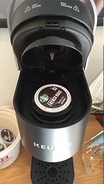
A physical constraint prevents the K-Cup (a plastic cup filled with coffee) from being placed in the machine the wrong way. When you lower the lid, tactile feedback indicates that the pod is being opened. A visual indicator gives feedback to let you know that you can now brew a cup of coffee.
The water tank has a direct natural mapping to the amount of coffee your machine will make for you. What you pour in, is how much coffee you get out. When you push the giant K button on the machine, it immediately gives you feedback that the process has begun. The water tank empties, and the indicator light pulses to let you know things are working as intended.
There is a platform that affords holding objects, and your mug fits perfectly on this spot. The brewing process ends with auditory feedback of the machine pouring hot delicious coffee into your cup.
A design I hate is my Creative E5 24 bit DAC (Digital to Analogue Converter). This little black device is loaded with top of the line features and specs that would satisfy the desires of most audiophiles. However, there is no way for me to enjoy these features because of two major flaws with how the designers built the hardware. The flaws are directly related to how it gives you feedback.

The device is battery powered and marketed as a way to take your audiophile needs on the go. This basically allows you to use high end headphones with your smartphone or laptop. You stream your music to the DAC via Bluetooth or plug it in directly via USB. The device converts the digital signal into an analogue signal that your headphones can understand. To control the E5, there are buttons as well as lights on the side. These lights are supposedly there to give you visual feedback and let you know when it is on, charging, and in Bluetooth pairing mode.
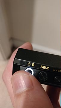
The power button toggles the E5 on and also serves as a way to activate the Bluetooth pairing mode. From the start there are problems. Push the power button for a couple of seconds, the E5 turns on. There is a small amount of tactile feedback as the button pushes in. Hold it for a few more seconds, you switch it into Bluetooth pairing mode. Hold the button even longer and it turns off again. This is a convoluted design as the mode that you are in depends on how long you hold the button. There is poor visual feedback, which fails to let you know what mode you have entered. This visual feedback, which is a different color of light, is insufficient because it is covered by your finger when you press the button. The buttons are smaller than even a child’s finger. Awkwardly, you will try to push the button without covering the light. What’s more, because there is only a small moment of time between switching modes, you will often have to try multiple times to get the device either to enter the correct mode, often overshooting into the one after. Additionally, I don’t understand having a timing element to switching between modes. I have many ideas on how to improve this design, but we need to move things along.
Once you have powered the E5 on and get it connected you will run into even more feedback problems. There is a volume knob on the front of the DAC to allow you to control the volume. However, there is no physical constraints on
the knob, allowing endless scrolling. There is also no feedback (visual or otherwise) to indicate what volume the device is currently set to. Pair this with the fact that you are intended to use this with multiple devices, means that the volume can easily be switched to different levels depending on the source of the audio. Initially, I would accidentally blast my ears with music on near maximum volume because of this problem. Not only could this potentially damage your ears or headphones, but is an overall unpleasant experience. This expensive little device now sits on my desk as a paper weight. Poor design inhibits its most basic functions and eliminates the possibility for a good experience.
 The Hario V60 is a drip coffee maker that I love because of how easy it is to use and understand how it works. The form of the coffee pot with the Hario Dripper affords the idea that the dripper fits on top of the coffee pot as shown in the image provided. Moreover, the handles let the user know that those are the areas from which you lift and can carry the distinct parts. This design also allows proper mapping and habituation because you can clearly see where the coffee is supposed to go and where it should end up after the brewing process, so a user does not have to think twice about it and all they are focused on is the coffee being made.
 I hate working window blinds because of the lack of visibility and regular breakdowns that occur when trying to use one. Opening the blinds can be very straightforward, you pull and the blinds go up. The reverse action is what gives me a headache every time; I was taught that to close the blinds, you had to pull a little, and then when you release, the blinds will fall to the window sill. Of course, what takes incredibly long is figuring out just how much you have to pull for the blinds to go down, and what way you have to wiggle the cord to make the blinds know they are supposed to go down. From the pictures I provided, you can clearly see there is no way to see how the release mechanism works, all you know is that the cord goes into the little dark rectangle at the top and at some point you either close the blinds or give up.
Object I love: Collapsible Laundry Basket
Collapsed:


Expanded:


This is the ideal basket for space saving purposes. It can expand up to 4 times its size and be able to hold a good amount of material. It can also collapse and be stored in a reasonably small space. I will never give this basket up. The rubber material and creases affords the ability to expand the middle body and collapsibility of the basket. Collapsed, I’ve used it as a tray to carry light stuff around the house, but it’s not designed to be tray, therefore it typically serves no purpose but to be stored in a small space. Expanded, I’ve primarily used it to hold my laundry to and from the washer and dryer. The rubber handles make the basket much more comfortable to carry on the palms of my hands. And the holes around the basket allow for air circulation that is needed when I load it with warm clothes fresh from the dryer. All in all, the design of this basket, especially focusing on its ability to be shrink in size, is a winner in my book.
Object I hate: New Macbook Charger

Don’t get me wrong, I am typically a huge fan of Apple and their designs. Their older magnetic charger ports and the feedback of the charging state by the light indication on the port is simply perfect. What I mainly have an issue with is their redesign of the port as well as the lack of update on the charging block. Switching the port to be a USB-C might have made it more universal, but it is lacking satisfaction and feedback. Going from the ports magnetically attaching to the laptop to having to look around and insert the charger is a step back in my opinion. Not to mention, there is no visual indication on whether or not the laptop was charging. I have heard it make a sound when it connects, but it’s not always consistent. I have had to open my laptop some days to make sure it actually is being charged since I did not receive any sort of feedback that it was indeed charging.

Moving onto the charging block, I have a major issue on its size seeing as it needs to sit perpendicular to the socket. The constraint of this design is not ideal if the wall outlet is behind the couch, for example, and one might need to move a couch in order to charge their laptop. I am aware that they have a cord attachment where the block will sit in between the cords and the size issue is no longer existent, however, it does make the product less compact and more cumbersome to carry around when on the go. If they can make an attachment where the prongs are placed on the side, allowing the block to be parallel to the socket, it would solve many space saving issues. I have depicted in the picture here how potentially simple this new proposed attachment might be.

One of my favorite products that I cannot live without (Ok, that’s an exaggeration, to only express my appreciation for the brilliant design.), Amazon’s voice-control system, Alexa. It lets you speak your wishes to an Echo smart speaker and see them fulfilled. Using nothing but the sound of your voice, you can play music, search the Web, create to-do and shopping lists, shop online, get instant weather reports, and control popular smart-home products—all while your smartphone stays in your pocket. The product well applied several great design principles and puts the users’ needs into a deeply thoughtful consideration.
Let’s go over some of the explicit design reflections in Alexa.
1. User Intuitive and harmonious
The Alexa app provides simple and easy steps for a user to set up the voice-control system with his/her phone. The design of the product provides 4 buttons and a succinct instruction to minimize any confusion for an average person to interact with the product without requiring the extensive learning. The natural setting of the interaction between the system and the users provides a seamless and pleasant user experience.

2. Consistency
The only requirement of saying the word “Alexa” before sending out voice demands creates a consistently interactive process.
3. Accessible to all users
With only one single requirement of speaking to the device, the system provides access to a variety of users including people with certain disabilities.
4. Reversible
It is ok to say the wrong thing or giving the wrong requests, just shout out “Alexa, stop,” the smart voice AI is capable receive any updated requests.
5. Many more
Above is only a list of a few general features of Amazon’s Voice AI, Alexa can provide to its users. In reality, Amazon has developed multiple versions of their echo products to serve their target users groups for their specific needs.

My first impression of Google’s Chromebook is simply great: its sharp sleek look. It is fast enough for tab-heavy browser work. It provides a full workday of battery life; it supports Android apps, and it has a small, light body, and a bright screen. Most importantly, its very affordable price provides people with the pleasure of owning a laptop.
Not until after using it I was extremely frustrated by its missing Cap lock. The Cap key was oddly replaced by another function, “Search” in all Google’s Chromebook keyboards. Instead of locking caps, this key calls up Chrome OS’s search window. You can still do cap lock by having to hit the Search key while holding down the Alt key. The fact of those two keys being far away from each other has disabled the handling of the keys by the user’s left hand without constantly repositioning. This missing function of locking Cap has violated so many areas in the principles of the basic design and user interactions. It takes away the consistency in the typing experience of the users and violates the fundamentals of the typing rules the users have adopted for years, which in my opinion makes the product unusable. This random update by Google is a violation of these two design principles: Design consistency, habituation.
Bright and Right

When I was shopping for chairs for my kids, I have found those bright colored great looking children’s study chairs. The design combines function and ergonomics with good appearances. The chairs provide the kids the sense of being in their study environment just like their parents sitting in their offices, meanwhile add a homey feel that would blend in with the other furnitures. Apparently, the designer put thoughts in simple, airy shape and additional qualities a good work chair needs. The choice of the colors is a good reflection on the designs for children.
Less is More

I found this couch from an online furniture store. What I like the most about this couch is its leather surface: a preference I have over fabric. Another unique feature of the sofa is that it is also a convertible futon, which adds a hint of style and comfort to any room. Its backrest easily reclines while the side armrests are removable to be converted into a sleeping bed for guests. This chair is also built with an additional fold-down middle armrest with two-cup holders, it allows friends or couples to kick back and relax with their favorite beverages. So far, I really like my silky black leather chair; it adds the multifunctional lounging essential to my small-spaced apartment.
More than just a chair

I saw this edgy looking chair while shopping chairs for Maggie and Meimei at IKEA. I didn’t end up buying it, however, the design of this swivel chair really caught my eyes. It brings the spun, hidden and cozy space for the children, which to me is beyond what a chair could offer. The inspiration for the swivel chair comes from the designer, Monika Mulder ’s own childhood. It was not allowed at home to spin around in her father’s large swivel armchair in leather – to Monika’s great disappointment, but also an inspiration from her creative mind to craft something that provides a fun imaginary world for the children.
Symmetry adds balance to a design. When elements are the same on both sides of an axis, the design feels harmonious. A perfect symmetry occurs when two mirrored sides are exactly the same. Symmetry is found everywhere in natural. A butterfly’s right and left sides are identical. Our left hand and right hand are highly similar (although never identical). “Symmetric faces are perceived more attractive than asymmetric faces [Universal Principles of Design].”.
Symmetry is categorized into three major types:
Rotational Symmetry – It requires a central point. The object is designed to be rotated around the center point and appears the same, which creates rotational symmetry.
Translational Symmetry – Translational symmetry occurs whenever we can move (translate) an element in a design without causing it to lose its symmetric properties.
Reflectional Symmetry – If one half of the image is a mirror image of the other, you’ll be looking at a case of reflectional symmetry. This is the strictest kind of symmetry.
From a design point of view symmetrical design does not depend on identical mirroring. It’s only important to get close to the effect; a designer can manipulate the user’s eye to have a symmetric effect in his or her design by utilizing the design rules of symmetry and balance.
A visual depiction from my cited source

Different types of symmetry effects
An example image was found online but Not from my cited source

This woman from a small town of UK was claimed by the scientists the most beautiful woman in the world. How did these scientists decide that she was the fairest in all the land? Symmetry is their answer. That was the science used to determine that she has an almost perfect face.
My realistic drawing in life is a symmetric reflection of what I see in the face of the real person

Citation and References
http://iggyjingles.com/design-principle-symmetry/
https://www.interaction-design.org/literature/article/symmetry-vs-asymmetry-recalling-basic-design-principles
The ratio of face to body in an image that influences the way the person in the image is perceived. When the person’s face taking up most of the image, the attention of the perceiver is drawn to the person’s intellectual attribute. This is what we call high Face-ism Ratio. When the Face-ism ratio is low, the message of the image intends to deliver physical and sensual affects from the image.
So what does this mean for you? Well, if you’re designing a flyer for a graduate school program, you probably don’t want to use full body shots of students (although this happens a lot). Intelligence and personality won’t shine through to your viewers; you’ll want a larger face-ism ratio. It isn’t that the full body shot will necessarily be anything sexual, but it won’t deliver a message about intellect and getting to know students. If, however, you are creating a flyer to advertise a gym, larger body shots, a small face-ism ratio, is probably your best bet.
Let’s take a look at the cover image from the Time Magazine and the cover photo from Vogue. When the cover photo is just a face, the photo editor is trying to tell you an insightful story that reflects the character’s personality, intelligence and ambitions. If the cover photo is mostly body, the story is about how cute the person looks in that dress. How physically attractive she or he is and how active that character is.
The example images from my cited source:

The example images not from my cited source but precisely applied the design principle of Face-ism Ratio:

LinkedIn is a business networking website where people offers their skills and knowledge in reflection on their intelligence to connect with others. Whereas, the VS site promotes the sales on lingerie and other intimacy wears which often connects to sensual effect.
The example of a kid’s drawing unintentionally applied Face-ism Ratio

The drawing on the left has a higher face-ism ratio which shows more innocence of the character.
Citation and References:
https://candacecrowe.com/blog/about-design/
 Corner Rocker. Pictured here is a little bamboo rocker chair in a corner of my bedroom. I use this more than any other chair in my apartment as I primarily work off a laptop placed on my knees. It’s generally difficult for me to sit or stand completely still hence the rocking affordance is a welcome addition. The striations in color and natural fiber material evoke a welcoming warmth feeling that most industrial office chairs can’t offer. A small throw pillow provides some needed lumbar support. The narrow chair back allows me to openly pull my shoulders back both to stretch and as a reminder to not slouch.
 All weather-er. This basic chair on the apartment patio is where I often take evening meetings, call friends and family, and have dinner. In these scenarios being in a relaxing place outdoors takes priority over comfort as each individual activity doesn’t span too long of a time period. As a result I associate downtime and meals with the patio space and its furniture. If it’s too cold outside I revert to the rocker chair previously mentioned. As a mass manufactured plastic and steel chair from Ikea, its simplicity gives it strength to hold up to outdoor conditions.
 Utility player. Despite being comfortable the couch is the least used seating item in my apartment. It was provided to the apartment by my roommate and because cultural norms of course dictate every home needs a couch. It is positioned in front of the living room TV. As someone who doesn’t even have his own Netflix account, the living room is a space I don’t spend much time in. As the biggest item, however, it does draw one’s eyes and thus greatly shapes the room and provides a sense of coziness. Its size combined with a few pillows allow you to fully stretch out. The size also provides some utility functions as it can be used as an extra bed in a pinch. On the occasion guests are over it provides lots of extra, comfortable seats and becomes a center of entertainment and discussion. Overall it contributes to a relaxing mood when one isn’t busy being a full time employee and student.
 The commuter. I forgot to take a photo so this one (source) is representative of my seat on the company shuttle used to commute to work. In the San Francisco (SF) area it is not unusual for companies to provide their own transportation shuttles – particularly between the strip that is SF and San Jose. The seat is pretty basic. It’s utilitarian in that it provides a place to sit on my 35 mile commute which on occasion takes up to two hours. A seat belt exists as required by law. However I can rarely get into a comfortable position and the seats are packed tightly together such that two tall individuals often rub elbows while typing away. The jolts from stop and go traffic and feeling of being in a big box certainly don’t help either. Overall it gets me between two places because few if any have ever said they like their commute.
 Tallboy. Despite constantly moving desks I have managed to hang onto this office chair for nearly three years. I keep it quite elevated from the ground for two reasons. The first is it’s a less drastic transition when switching the desk between standing and sitting modes. The second is even whilst sitting I can look across multiple aisles to see if a teammate is available. In the bottom right of the photo is a footstool where I rest my feet. The swivel makes it easy to turn around to chat with my team and the wheels allow me to quickly move it out of the way when I feel like standing. It’s more than satisfactory considering I rarely sit in it for more than two hours at a time. If you haven’t noticed, I’m generally a fan of armless chairs.
– by Q aka Alex Duong
 Home Office Chair

 Antique Chair
This is an antique chair that’s also in the front room. I love this chair because it used to be my grandmother’s chair and she did a lot of writing in it. I never met her, but the chair (and writing secretary it goes with) are important to my dad, who is 82, so they are important to me too.

Dining Chair
This is one of our dining room chairs and I don’t like it at all. My husband had the set before we met. Even though I’m not much of a decorator, I am not a fan of Craftsman revival. However, the chairs are very sturdy and comfortable. We only use them for holidays or when we have a bunch of people over and because I hate the fabric so much, I’m never stressed that someone will spill something on them. Spill away!
 Breakfast/Kitchen Area Chair
This is one of the chairs in our breakfast area. Unlike the dining room chairs, I am worried someone will spill something on them because we use these chairs on a daily basis. In retrospect, I should have chosen a darker color. Like I said, I’m not much of a decorator, so I chose a neutral color and style for the chairs in the hope they would blend into to other furniture in the future.
 Patio Chair
This chair is on our patio and I tried to capture the reflection so you can see what I see when I sit in this chair. Beyond our backyard is a big open area. It’s really pleasant place to sit and often I will bring my laptop or a book out to study. With the addition of the pillow, this chair has worked well for me and is comfortable even for a couple of hours. After I finish this post, I’m going to pour a glass of wine and go sit in that chair.
 Car Driver’s Seat
This is the seat in my car. I like this seat because it has perforations that allow it to be heated or cooled. It’s a black car in Texas. The air-conditioned seat is a life-saver. Also, the controls are really intuitive and easy to use.
 Office
This is a picture of my current office at Charles Schwab. As Cranz mentions, there is little variation in the modern office. Managing Directors and above at Schwab have offices while everyone else sits in an open area, but we all have the same chairs. The office does speak to status, but I don’t like it because I’m too far away from my team because there wasn’t an office available on the same floor. This will change soon. Our building is out of space and I’m currently working with corporate real estate to move all the UX people on Austin to a new location where we can all sit together.
 New Office Location
This is one of the potential new spaces for the UX team that we would sit in until a new building is finished at the end of 2019. You can see that all the chairs and desks are the same. Very democratic. My only fear is that there are no dividers between the desks, so some of the team members are going to be unhappy. Also, there is no office in this area for me. On one hand I like the democracy of having the same space as everyone else. On the other hand, I have a lot of calls with various leaders in San Francisco and I’m going to have find random team rooms to hold calls if we move into this location. It’s going to be very inconvenient for me. Of the three spots I’m looking at, this one is the nicest, so this is probably the one it will be.

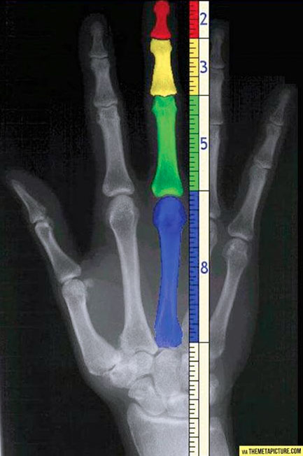