Objects, Part 2: Joe Davis

THEATER SEATING

Multiple red seats inside of a dark theater
K, Roger. Empty Theater. 2017, www.yelp.com/biz/amc-classic-blueridge-14-raleigh. Accessed 13 Oct. 2018.

I went to an older theater in Raleigh NC. The most striking feature of these seats is how they are different from modern cinema seating. Most modern theater seating tries to emulate your home recliner (e.g., La Z boy furniture). They are very plush, and the materials are supposed to ooze comfort. This seating arrangement was quite different, made of fabric with a small amount of padding. The seating were nostalgic of older theaters I went to growing up, but it was also kind of old and dirty. The seats didn’t squeak and were easy to access. They were not very comfortable, and I found that I had to readjust my position multiple times to prevent soreness and fatigue.

DRIVER’S SEAT

Black leather looking driver's seat with red stitching.I drive a Volkswagen Jetta for my daily commute. The most striking quality of the driver’s seat is the red stitching. The stitching is there to suggest a sense of sportiness. It doesn’t actually make my Jetta sportier or the seat more comfortable. This is my seat for my commute to and from work (approximately 19 minutes each way). I like my Jetta and find the seats more comfortable than any of my previous cars. I enjoy driving and look forward to sitting in these seats. One problem I have is with the black “leatherette/fake leather” material that these are made of. They become very hot during the very warm North Carolina summers and uncomfortably cold during the winters.

HOME OFFICE COUCH

Grey Tufted Loveseat
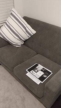
I bought my tufted loveseat for my home office. The most striking feature for me of this couch is the minimal amount of materials used to make it. I would assume this allows for it to be made rather cheaply in comparison to something like a recliner. The couch took up very little space when it arrived and I assembled it at home. I purchased this loveseat for reading, writing, and a place to comfortably perform general work. It functions very well for long periods of reading and working on my laptop. Overall this is a very comfortable seat; however, after about two hours, I start to feel fatigue from using it.

DESK CHAIR

Leather and wood executive style chair
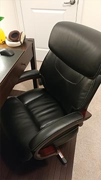
The most striking feature of this chair is the materials used. I didn’t need a chair with leather and wood, but when looking for office chairs the better materials both consciously/unconsciously took precedence over more ergonomic options. This is my home office desk chair. I bought this chair because my old college one was giving me extreme back pain. The chair functions well, I am able to sit in it for several hours before becoming uncomfortable. It is rated for 10 hours of sitting, but I would say it is able to get me through 5 comfortably.


LOFT CHAIR

Brown wood chair with brown fabric pad
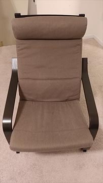
The most striking feature of this chair is the way it feels when you sit in it. There is no support, underneath the chair towards the back. This causes the chair to bounce when you sit down. This IKEA chair is made of wood and has a thin pad that goes over the top. It is in the loft of my house. I try to avoid sitting in this chair, but when there are guests over it provides backup seating. My cat uses it more than I do. This chair is frustrating. It is easy to get into, but rather difficult to get out of because of its odd shape and design. It is uncomfortable to sit in and has a weird bounce to it.

DINING CHAIR

Wood dining chair with white padded seat

Simple mass-produced dining chair purchased from IKEA. The most striking feature of this chair is that is light, easy to move and very simple in design. It is located in my dining room, though I rarely dine there. I don’t find this chair very relatable as I barely use it. It provides a place to sit but is not very comfortable for an extended period of time. I don’t have any strong feelings about this chair since I don’t use it that often. It performs a function of providing a seat at the table, but nothing beyond that function. It is not a particularly pleasant design. It is definitely not a work of art.

STARBUCKS

IDark wood chair in the corner of a Starbucks find the fact that this chair is made of wood to be its most striking feature. It is simple and easy to clean. It is light and easy to move. This is a wood chair at a local Starbucks. I go to this Starbucks frequently with friends and family and have sat in this chair several times. It performs its function as a place to sit but does not exceed that function. It is plain and boring. It is uncomfortable after a few minutes of sitting, but I don’t have any negative feeling towards this chair. It serves it’s purpose well and adds to the atmosphere of the Starbucks.


Objects, Part 1: Ken Mead

Front of Bose SoundLink Mini

AN OBJECT I LOVE is my Bose SoundLink Mini, a small, portable Bluetooth speaker that sits atop a charging cradle.

Apart from the great sound quality for its size, I love the care that went into the little design details.

top of Bose SoundLink MiniIts buttons afford being easily located even in the dark since the volume buttons are raised and the power button is flush to the left raised edge.

It uses a small signifier of a green battery icon to indicate it is fully charged, and a yellow pulsing icon to indicate it is charging.

Charging cradle of Bose SoundLink MiniI appreciate the audio feedback – when removed from the cradle, it emits two soft beeps in a falling tone. When reconnected to power, it emits the beeps in a rising tone.

The fact the charger can plug directly into the dock means it affords easy removal when I want to take the speaker with me. No need to unplug anything. Just lift and go.


samsung microwave

AN OBJECT I HATE is this Samsung microwave. It stings, because I picked it out of many, carefully reading reviews online.

There’s a habituation my housemates and I have about how a microwave works and the fact this one works very differently frequently causes a breakdown by needing to think hard about the system’s function.

close up of microwave start buttonMost of us are used to typing in the time we’d like to microwave something through a numerical keypad, then pressing the start button.  This microwave dispatches with the numerical keypad, requiring you first to press Start on the microwave (which begins microwaving with 30 seconds on the timer), and then have you rotate the dial to increase the time in 30-second increments.

Not only does this violate the cognitive model of the order we should take (we aren’t used to pressing Start before we enter a cook time), it also makes it challenging to figure out the total cook time.

Let’s say I’m trying to microwave something for 2 minutes. By the time I have pressed start and rotated the dial forward, the time reads 1:57. It puts a non-trivial amount cognitive load on me to do the math and realize I should stop rotating the dial. Worse, if I go too far, and take two seconds to get back, I now have to realize that 1:55 is the correct place for a 2 minute total cook time.

Objects, Part 2: Sofanah Alrobayan

Desk Chair

This is my everyday desk chair that I use for work. It makes me feel super productive when I work at my desk station versus the couches or bean bag chairs scattered all over the office and it makes me feel like whatever I’m doing at my desk must be super important. We have these chairs at every desk in the office regardless of your role. It functions like any other desk chair would. It is well cushioned which I appreciate. It’s a decent chair, but I find it’s not always super comfortable for my back (hence the pillow). Since our office space is very open, I find that the wheels play a huge part in my day to day. The ergonometric nature of this chair allows me to slide over to person behind me when I want to ask a question or simply move the chair to face the person next to me when we discuss something. I don’t necessarily have to get up and move around as much due to the proximity and physical placement of most of the people I work with. They are at most a glide away.

Bean Bag Chair

The bean bag chair is a ball of stuffing that your body just sinks into. The cushion is super comfortable and gives more off a more relaxed feel than a standard chair. This is my favorite spot to sit at when I feel I do not need to collaborate with anyone in the office which is around the same time as when my workload decreases and I have some time to “relax”. I find myself usually sitting there later in the workday when all that’s left for me to work on is busy work. It is my destress zone that allows me to still be productive.

Ottoman Chair/Table

These chairs are mainly used for when there aren’t enough seats in a meeting room. They are colorful and sturdy ottomans that are not very comfortable. It does its job during the ironically named daily “stand up” meeting. No one lasts more than one hour on that chair and if they had to, you’d usually see them standing. However, their flat surface allows it to be more versatile in a sense that it acts as both a chair and table. It comes with an optional metal top if you wish to transform the cushion top to a metal top and assure the safety of items stacked on top of it. These chairs are multi-functional but not the most comfortable.

Outdoor Chair

This is the chair I typically sit on when I take my lunch outside to the courtyard and want some fresh air. It’s a standard metal and wooden chair with legs and no arms. It’s not the most comfortable but it serves its purpose for the 30 minutes that I sit on it. It’s not the best chair, but it’s not the worst. It’s very much a standard chair and I have no feelings towards it whatsoever. It’s just okay.

Clothes Chair

Everyone’s favorite chair. It’s situated in the corner of my bedroom where This chair represents how I am doing in life and looking at affects my mood. If I look at this chair and it’s empty, I know I have my life together and makes me feel accomplished. However, if it has a pile of clothes and bags on top, I know I’m due for a reorganization of not only my stuff, but my priorities. The chair itself is fantastic. It bends in all the right places to make for the perfect chair in terms of structure and design. What it represents is what I love most about it. Its job is to silently tell me “good job” or “what are you doing with your life?”

Driver’s Car Seat


I sit on this chair pretty much everyday. It is a well-cushioned, adjustable, pleather chair that makes each car ride as comfortable as possible. The sides of the chair are designed to curve around your body to limit the undesirable body movements when turning. They are perfect for everyday commutes and can get uncomfortable on long car rides.

Toilet Seat

Ah, the porcelain throne. The seat itself is not meant to be super comfortable, but rather sturdy, durable, working, and easy to clean. I’m not sure what else to say except that it does its job and it’s not meant to be comfortable for a long period of time.

Objects, Part 2: Ken Mead

Chairs in my life

At Home

The funny thing about living in a shared house is how many chairs we accumulate. Housemates move in, bring chairs, and often leave some behind.

dining room chairsDining room chairs

Cranz noted the power dynamics at play with various chairs. This is definitely true of the dining room chairs. The white wooden ones are squeaky and falling apart—my roommates avoid them unless they are the last ones left. The ones with the carpeted seats are stout and solid. They are the preferred chair.

bar stool chairsBar stool chairs

Like our dining room table, there are two different chair styles at the counter. The placement is indicative of their use – the wicker chairs on the left hardly get any use. When I sit in them, I feel short and insignificant. The black chairs sit taller and place you at a near parity in height with a person standing upright in the kitchen. It makes you feel like peers when having a conversation.

a plush living room couchLiving room couch

Guests either love our hate these couches. They either think it is very comfortable, or they detest that it is swallowing them up. These couches afford being a couch-potato. Their deep cushions and copious amount of fabric feels as if you’re laying in a bed in the living room. Great for TV marathons and lazy Sundays.

couch sitting on outside porchOutdoor couch

Frequently dusty and in disrepair, but pleasant for sunny afternoon reading and late-night reminiscing under the stars. By virtue of its placement on our porch, this sofa acts more like seat in the public space. You will both observe and be observed by the people on the street and the houses across the way.

an office chairOffice chair

I have mixed feelings when I sit in this chair. It’s the most “professional” chair in the house and clearly communicates “office work” which is how I use it (I work from home). On the other hand, a few years ago, the corner was ripped while I was moving it, exposing the cheap yellow foam cushion underneath. When strangers see this chair I get self-conscious It looks like I’m a hard working professional from one angle, but if they see the rip will they think I’m too cheap to buy a proper office chair?

drummer chair sitting in front of pianoPiano chair (drummers seat)

This is the chair my parents bought me a few years into taking piano lessons as a kid. It is actually designed for a drummer – its design affords quickly swiveling around in a circular motion, not something you need to do when playing piano. This chair makes me feel good. It has a social aspect to it. When there are guests over, I find it easy to adjust where I am pointing myself to square up to whoever is speaking.

a toilet raised on multiple platforms“The Throne”

The amazing thing about our downstairs toilet is that it is actually raised on two separate platforms. Guests comment on this without fail when they see it for the first time—placing the lowest form of a chair on a pedestal.

Out

seat of honda civicHonda Civic chair

This “chair” is pure utility. There’s nothing luxurious about it but it gets the job done. The interesting thing about car seats as chairs is how often people use car seats as storage for their things (we don’t often stack stuff on chairs at home we use frequently). I tend to drive a lot of people around, so I like to keep the interior empty. People comment that for such an old car, I keep it clean. I think part of what they are noticing is that I’ve prioritized keeping the car seats able to be sat in.

seat cushions in a cafeCloth cushion at local café

This is a “chair” of the people. It’s best not to think about how many people have sat in it, or when it was last washed.

The Chairs of My Life – Christina

OFFICE CHAIR

This is my office chair, which in my opinion is really comfortable, but would probably be heavily criticized by Galen Cranz. Having actually taken Galen’s class at UC Berkeley, I have a sense of what she would consider to be variables of good chair design. As an believer in the Alexander Technique, she spent her life advocating for positions that encourage natural spine shaped postures. Key takeaway being the desire for an S-shaped spine, she would criticize this chair as being suboptimal, positioning my spine in a C-shape for 8 hours a day. She would say that “sitting is the new smoking.” And while I find this chair very comfortable for the first few hours, I do have to agree that my lower back is not very happy with me by the end of the day. Because I am rather petite, I fit comfortably and sink into the cushions. But on the downside, it gives me lots of room horizontally to lean onto the armrests and thus often assuming a bad slanted posture. But, humans don’t always want what is best for them. I see a chair with thick cushion depth, a head rest, and a bouncy leanback, and I think “I love it!” In hindsight, after the reading, I should probably be more aware of how I sit in it, or sit on a yoga ball instead.

HOME DESK CHAIR

This is my home desk chair from college. I rarely use it because I never work at proper desks or tables at home, but I don’t have the heart to throw it out because it looks very comfortable. As I’ve said, I judge chairs by the cover based on how soft and thick the cushion looks. This one is not only that, but has further softened to the contours of my body since college. Again, I sink into it very well, which is perceived as a good thing, but actually very bad for my spine. Also, the desire for a headrest leads me to lean sideways onto an armrests. And like almost all chairs for me, I have plenty of room sideways and find myself habitually not sitting upright.

COUCH

This is my couch which I bought on sale in college and use to brighten up my room. I spend most evenings on this couch because the width of the seat is exactly the length of my legs if I sit upright facing sideways. I have had this couch for many years and have fallen asleep in it many many nights after crawling home at before sunrise from the architecture studio in college. Not to sound like a broken record, but the cushion is very soft, and when paired with a pillow and blanket, feels very cozy. But I mostly use it to sink in and gradually enter a lying down position and never sit in it facing forward as one would with a normal couch. As a couch, it is probably not very comfortable and may feel way too small for 2 people despite being a loveseat. But being a small person, I love it as a couch/bed makeshift hybrid.

DRIVER’S SEAT

This is my seat in the car. Although it feels very comfortable in the first 5 minutes, this is the seat in my daily life that noticeably makes my lower back ache. Car seat designs are designed for the general population with very little range in the seat excluding the angle and height. From the manufacturer’s perspective, it is better to design and err on the bigger side so as to not exclude the population that is bigger, like a one-size-fits-all. And this makes total sense for them as manufacturers because it doesn’t alienate the smaller users. The smaller users will still buy the car and accept it as the norm across most brands. But, car seats leave my spine in a rounder C-shape than most other chairs and I should have a backrest or cushion to reverse the arch in my back.

TOILET

This is one of the toilets I use in my day, but most toilets I use look the same anyway. I generally find the seats comfortable, effective, and simple. The only ones that have ever blown my mind are high tech toilets with seat warmers, but considering how few minutes in a day is spent sitting on a toilet, it makes little difference to me. My usual desire for a cushion or a backrest does not apply here, because, well, it’s a strictly business-only seat that probably shouldn’t be too comfortable to prevent other people from lingering…

PHILZ COFFEE CHAIR

This is the Philz Coffee chair I sit in to do homework on the weekends. I actually find it very comfortable. Because it is so small, it does not encourage me to lean sideways or fidget like a swivel chair. The height of the backrest minimizes my back from arching into a “C” and I find my posture straighter in this chair than most others, second only to my toilet posture. I find it easier to focus and sit for longer periods in this chair. This chair is also designed for their bar tables, and since I am relatively short, I work quite effectively without hunching over my laptop.

Objects, Part 2: Lisa Grossi

Desk chairDesk Chair

This is my desk chair. It’s an inexpensive metal and cloth chair yet it is quite comfortable. The slight curve of the backrest and the stretchable mesh fabric supports my back while also forming to the natural curve of the spine. The armrests are nice to have, especially when leaning back and reading on the screen; they’re also a good height, not too low that they’re uncomfortable and not too high impeding the chair from being pushed into the desk. It would be nice if the chair was more adjustable, but for the inexpensive design, I can’t complain.

Bar height dining chairBar Height Dining Chair

This is my bar height dining table chair. It is made of wood and extremely uncomfortable. The lower supports between the chair legs are an awkward height for resting your feet; not resting your feet at a bar height table is very uncomfortable. The back is also too straight making it very uncomfortable to sit on for long periods. Because this chair is so uncomfortable I rarely sit at the dining table.


Blue Mid-Century Modern reading chairReading Chair

This is my reading chair, which I also bring out when we have guests over for additional seating. I originally chose it for its mid-century modern design. It is fairly comfortable with a good amount of seat cushion. The downside to the design is the low back, although alright for short periods, it becomes uncomfortable if I sit for a long time reading a book.


Grey and walnut foot stoolFootrest

This is actually a footrest but is very handy to move around as a short stool. I will sometimes craft on the coffee table and sit on the footrest which is a great height. It’s comfortable but of course, lacks back support. It’s perfect for moving around in a pinch but I wouldn’t want to sit for extended periods on it.


Far right side of a brown cloth couchCouch seat

This is my seat on the couch. I almost always sit on this side of the couch because I have two cats and a dog who are very particular about where on the couch they nap. We actually got this couch from a family that was moving and didn’t want to bring it along. We had low expectations because it’s an inexpensive, plain couch, but it’s extremely comfortable (as I said, we have pets, so dark colored inexpensive furniture is a must). It’s so cushioned it feels like it absorbs your body in a cushioned embrace. Never sit on this couch if you have work to do, it is a napping hazard.

Beige cloth driver's seat of a Toyota CamryDriver’s seat

This is my car’s driver’s seat. I drive a blue Toyota Camry also known as Blue Bell. I’ve had Blue Bell for almost 10 years so I definitely feel quite attached to her. I have made so many memories driving her around, including moving from New York to California with two unhappy cats in the backseat. This seat has adjustable back support and can be adjusted forward, backward, as well as up or down to make the right fit for a person’s height. Having sat in this seat for very long periods of driving at a time, I can say that it’s quite comfortable. If my back starts to feel fatigued while driving, I find that adjusting the back support can help alleviate the tension, at least temporarily. This photo can be found here.

Objects, Part 1: Lisa Grossi

DeWalt Cordless Drill

A design I Love: DeWalt Cordless Drill

A design I love is my DeWalt Cordless Drill. This cordless drill with rechargeable battery is easy to handle and understand. To be honest, power tools are not my strong point so being able to use the cordless drill like a pro is a great feeling. This design allows any beginner to just pick up the drill and use it without the need for online tutorials or lengthy instructions manuals (do people actually read those?).

DeWalt Cordless Drill with battery removed
Drill set in reverse mode
Drill set in the reverse mode
View of unselected forward drilling control


The DeWalt drill has great visibility. The affordances indicate settings and activation which are easily located and understood, making the drill easy to use even for beginners. The semantic mapping of the settings is clearly indicated, affording easy adjustment. The battery has clear tactile indicators of where to hold and press in order to release the battery. The battery’s physical design also creates a physical constraint, indicating the position the battery should be in when reattaching it to the drill. The iconic representation of the forward and backward arrow clearly maps the direction the drill will turn. The arrow can be pressed in only on one side at a time, physically constraining the possible outcomes.

A design I Hate: Samsung TV Remote

Samsung TV Remote

A design I hate is my Samsung TV remote. I have to give the designers props for simplifying the remote compared to the traditional button-loving style of remote, however, their design is not intuitive whatsoever.

While the semantic mapping of some buttons clearly affords each action, the design breakdown is in the circular control, and the volume and channel controls. Perhaps my (and most Americans) prior use of the Apple iPod’s original design utilizing a wheel to control the device influenced the way I perceived the remote. This circular control, however, is not a rotating wheel, it is simply a four directional button– up, down, left, right. This is incredibly confusing, especially without any semantic mapping.

The volume and channel buttons are semantically mapped; however, this is where the second breakdown occurs. The first time I used this remote I did not understand what to do. I first tried to push it as a button. Unfortunately, in regards to the volume control, this just mutes the TV. Albert Einstein famously said, “The definition of insanity is doing the same thing over and over again, but expecting different results.”. Well, I must be somewhat insane because what did I do over and over again but press the control like a button. After several minutes of this, I finally figured that you had to push these tiny devices up or down to change the volume and channel. After much time wasted over a remote, I was finally able to watch one TV episode on Netflix… OK, or maybe a bunch.

An Object I Love, An Object I Hate: Christina

Loved Object – Multicolored Pen

The multi-colored pen, invented nearly 60 years ago, is one of the most efficient and versatile writing tools that I’ve always taken for granted and recently had a newfound appreciation for. Nowadays, it even commonly includes a pencil amongst the writing options too!

To start, each option has a fin/tab of sorts at the end and a visible spring that serves as affordances telling you whether it is in a compressed state and can be extended or is in an extended state and can be compressed. When the designer chooses an opaque body, the colors of these tabs still map to the color of the ink you that will be selected. Then, when you push it down far enough, there is a tactile and audible feedback of it lock in place to be used. When one is locked and another is pushed down, there is similar feedback signaling the release of the locked one. This means that half of the motion of switching unlocks the previous color but does not yet necessarily lock the new one, thus eliminating the need for an separate unlocking mechanism. You can either push another halfway and release to an inactive mode or push it all the way to switch completely to another active mode. This automated release also serves as a physical constraint that avoids any simultaneous “selected” statuses and thus avoids confusion of which cartridge is activated. Often, at least some portion of the pen is transparent increasing visibility of the options or what cartridge is currently activated. The number of fins you see maps to the number of cartridges and is usually color-coded to the ink color. Otherwise, the general shape of the pen remains consistent and similar to most other pens for familiarity such as the clip at the end. Some brands even allow for switching out the components to refill or change colors. Coincidentally, the thicker body of the pen improves the accessibility aspect as those with less range of grip and hand closure often need thicker pens to hold properly.

This common tool seems undervalued, but especially useful for professions that require multiple colors frequently such as artists, designers, editors, teachers, etc.

On a somewhat related note / fun fact! :

Although I don’t see very many people use these pens anymore, the desire for multi-color pen is still very strong. A few years ago, someone even initiated a kickstarter project that claimed to make a smart-pen that could instantaneously produce ink matching a color of any object you “scan” with the tip of the pen.

The Scribble Pen, supposedly based in San Francisco, asked for 100k and raised 366k, only to cancel their campaign when kickstarter asked them to create a video that displayed the pen’s use more thoroughly. Their videos were analyzed and declared faked. They got away with $366,566 because people blindly supported the idea of a revolutionary multi-color pen. Tech blogs and news sites spread the enthusiasm like wildfire with more hope than skepticism. To this day, no real existing person can be found behind this fake company. Only 2 names were ever mentioned in association but nobody of such names can be found to match the profile. Imagine if Apple/Google/Microsoft actually came up with a pen that did this! There is definitely a market for it.

Hated Object – Apple iPhone/iPad

I apologize in advance because I do not know how to be concise when I feel this passionately about bad design I am forced to interact with.

My main frustration with iphones (my work phone) and ipads (my parents’ tablets that I have to set up and do maintenance for) comes from how the products over-constrain users in their actions and access. In their attempt to “idiot-proof” their products, they minimize visible actions, over-simplify affordances, and over-simplify mapping and functions. Even though Apple products are known as the most user-friendly products, these over-simplifications actually make it more difficult for me to navigate. I find myself often looking for a specific capability that is deeply nested and screaming at my phone, whereas the typical Apple approach intends for the user to choose from a list of visible capabilities revealed from the previous action/button. Then, when a basic capability isn’t allowed under certain conditions, the blue affordance is replaced by a visible grey “inactive” version, but they lack visible explanations as to why. Similarly, they persistently require authentication that you are the owner of the product to “thief-proof” while also preventing you from doing anything you might regret. Even for simple things like updating an app or turning on the phone, it feels as if I am asked to authenticate nonstop. Their overly strict security protocol also prevents a lot of app developers from publishing an app in their app store, making android’s PlayStore much more diverse and expansive.

Another issue with authentication is that they require a 2-step authentication which assumes that the owner is actively and presently holding either another or a previous product registered under the same email in order to authenticate with a code sent to it. This 2-step process used to be an option but is now mandatory. As someone who set up apple products under the same email for her elderly parents, I can imagine the same frustration for parents who hold accounts for products in their children’s possession. Now that the 2-step process is mandatory, I also cannot simply just go back and reset the older apple products under a new Apple ID to prevent linking the products. Apple products are constantly updating with new versions with an upper limit on the most updated version of iOS that it can handle after a few years, in which case these products subsequently cannot download new apps and can only grandfather old apps that were “purchased” under the original Apple ID. Even the last heard of workaround using itunes to re-sync the product with an older app is no longer viable since itunes eliminated its apps control component this past year. The updates to their software assumes that customers discard older products after a few years, despite their reputation for quality and longevity. These issues persist across all apple products and are internally consistent.

Other design aspects that I’ve strongly disliked include its tempered glass construction (I have seen many more smashed iphone screens than any other), the non-removable battery, and more recently, the specially designed headphone plug that replaced the universal 3.5mm jack, thus requiring a converter much like the macbook’s display port adaptor for the universally used HDMI cables. These are constraints, not nudges.

These newer iphone headphones then cannot be used directly with macbooks without the converter. Apple products are notoriously externally inconsistent and incompatible with the rest of the tech world. Many of Apple’s users become voluntarily consumed by Apple products saying it simply makes sense once you have one product. But that is one way of saying they have little choice otherwise. If they want to sync any of their products or even to set up products individually can become tedious and convoluted processes with any non-Apple product. This extends out to collaborating with users of other products. Classmates and professors/teachers work together less effectively as they have to consider that others are not also using macs/PCs. I personally see Apple products like VW’s TDI cars: pretty to look at, used by the cool kids, produced by remarkable people, and difficult to let go. But behind the smoke and mirrors, the insane inconvenience–disguised & marketed as “convenience”–is precisely what forces existing iphone users to upgrade often and motivates android users to avoid trying iphones. In my ideal world, I would only have to encounter android technology paired with Apple’s spectacular customer service.

Objects, Part 1: Kathy Emsoff

An Object I Love: My Apple Airpods

They are so convenient to use and are completely wireless. I use them multiple times a day for business and personal tasks. The have a case for storing them that keeps them from getting lost, but also charges them. The visibility, feedback, and affordances all make this product truly functional and the physical design makes it delightful.

Visibility is a basic principle of interaction design and indicates a system’s status, actions that can be performed and the potential results of those actions.1 Visibility is a fundamental feature for this product because people need to know how much battery life is left for their headphones. The AirPods provide multiple ways to have visibility to the battery life. If the case is opened near the phone, a window pops up that shows status, it’s available on the widget screen and the case itself has an led than can indicate the battery of the case or the headphones. The feedback works well too. When I put the AirPods in my ears and they connect to one of my devices, they play a sound that confirms they are connected. The case has a horizontal depression to indicate where to open it. When I pick up the case, I can just feel it with my thumb to know where to push to open it and I don’t recall ever really paying attention to this feature before, it seems like I just instinctively knew because the depression affords pushing.

The visibility, feedback, and affordances all work together to make this product very functional, but it goes beyond that because I really enjoy just interacting with this product. Norman2 holds that technology should bring more to our lives than just performance and the AirPods do this successfully. The anthropomorphic shape of the AirPods is smooth and feels well thought out. The shape of the case is just the right size and the rounded corners make it comfortable in my pocket. The lid of the case closes with a magnet, so there is no latch or button to mess with. The magnet causes the lid to close with a snap that’s not too hard, but hard enough to where you feel satisfied that it’s closed and your AirPods are safe and secure inside and getting charged. The pop up window that show the battery life shows an image of the AirPods and the case and they have a nice animation where they both rotate in a circle. This animation doesn’t add anything to the functionality of the product, but it’s nice to watch and add to the overall richness and enjoyment.

Objects I Hate: The Light Switches in My House


I hate the light switches in my kitchen, well my whole house really, but I’m going to focus mostly on the kitchen for this post. There are three sets of switches total that control two sets of overhead lights and various other things. Two of the sets include a control for the pendant lights above the island and a single switch controls the recessed lights in the ceiling. Unlike Melissa and Tara, I’m fine with overhead lighting, but I am constantly going to the wrong switch to turn a light on or off because the mapping doesn’t make any sense.

Mapping is the relationship between the controls and the outcomes they cause and should reduce the user’s need to think about what a control effects or what the outcome will be.2 The mapping of the switches in my kitchen are unnatural because the spatial relationship doesn’t indicate what switches control what lights. All of the lights are in the ceiling in basically the center of the room, but three different switches that control these central lights are spread out from each other. After I thought about why these switches are the way they are, I realized that the recessed lighting was added later and that’s why the switch is all by itself. There wasn’t enough room near then main set of switches to add another one. At least that’s my theory. So, sometimes when I’m in the kitchen and I want to turn on a certain set of lights, I fall back to this conceptual model that I’ve constructed and it works. The negative is that there’s a cognitive load associated with recalling that information since it’s in my head and not readily discoverable by looking around. The other annoying thing is that there are two controls on opposite sides of the room that control the pendant lights above the island. This means if someone goes to the far end of the kitchen and uses that switch to turn on the lights, then the switch at the more-trafficked end of the kitchen will be in the down position even when the light is on. If I want to turn on the recessed lights and I see this switch in the down position, I’ll walk over and switch it without even thinking about and then both sets of lights are off in the kitchen when I wanted them both on!

As if the functionality of these switches isn’t bad enough they are ugly and don’t match. Yes, I know this would something easy to fix, but we haven’t bothered to do it. The set by the back door is black and looks really old. The far right switch on that set turns off the outside light and we like to keep it on, so we’ve added a piece of scotch tape over it because it was inadvertently getting switched off, making it look even worse.

Around the house, some switches that are near doors have molding from the door around them, but some do not. Why? It’s inconsistent and weird. And, don’t even get me started on the bathroom light switches. There are two sets and we’ve had to add semantic mapping to even know what they control.


Objects, Part 2: Youngsun You

My chair in room
This is my desk chair where I usually sit when I study or work at home. It is thoughtfully designed with convenient armrests and a backrest. It features a five-wheel castered base with an adjustable height that is perfect for rolling, rotating and changing directions. The chair height can be adjusted no longer since the synchro tilt of adjusting height is broken, but fortunately it is stopped at the perfect height for me. This chair gives me a feeling of working hard. I feel like I have to do something when I sit in this chair. If I sit long in this chair for a long time, it means I have to do a lot of work and concentrate.


Sit on the floor
I usually sit on the floor leaning beside my bed. I created my own floor seat with a floor cushion and a big stuffed doll to make my posture comfortable. I sit here when I have a break, read a book, use my phone, or work without a monitor. I still have not found the right floor chair, so I made the floor space myself. I am familiar with the floor culture from the East. The floor is used in various ways in Korea, such as sitting, eating, hanging out, or even sleeping on heated floors.


Work chair
I recently switched to this height adjustable standing chair to pair with my standing desk in my office. I like this chair except that there are no armrests next to it. I usually sit in this chair for half a day and stand for another half-day. I sit on this chair when I am tired from standing for a long time.


Driver’s seat
This is the driver’s seat that I sit mostly when I commute. The comfort of the car seat is important in my daily life with long commutes. The seat is easily changed at any angle and adjusted to create a comfortable space. It is mainly used during driving, but this space is also used when taking a nap during the day. Sometimes when I am sitting here after work I feel comfortable like this place is almost home or my personal space.


Guest space chair and couch
There are two types of chairs in the guest area next to the front door of my home. One is a small-sized couch; the others are tub chairs. These are mostly used when visitors or guests come to home and have a short conversation. I believe that they are given more attention than the other chairs by being decorated with cushions and covers. I also relax on these chairs on the weekend, while there is a less chance of sitting on them during weekdays.


Spectrum rest chair
Irvine Spectrum recently remodeled the exterior and interior of the place and switched to new chairs to match with their new environment. In addition to providing comfort to people, their bright colors, unique shapes and design also make people feel positive, pleasing and wanting to spend time in the area. The design of these chairs fits well with the playful and lively outdoor experience.


Objects, Part 1: Youngsun You

Object I Love: Philips Sonicare toothbrush

This electric toothbrush represents a great combination of technology and user experience. It has a very simple design, but it includes all the functionality we need. The clear visibility of the on/off button and affordance provide me what to do just by looking at it. The toothbrush has a built in timer, so it briefly pauses and sounds a tone after 2 minutes. It responds and provides good feedbacks to the user when the time is up. The toothbrush also clearly visible when it needs to be charged as it blinks red with audible beeps. It is easily charged on the charge station and the light indicates that the toothbrush is charging. My toothbrush is not the latest design since I got this a few years ago, but I like mine better than the latest design, which has been updated with more buttons and functionality. I think that the current toothbrush with one button gives physical constraint that restricts other possible interactions and is only focused on limited necessary actions. This connects to the idea of Okham’s razor, minimizing the elements as much as possible and making the simplest and fewest assumptions.


Object I Hate: IKEA clock

This IKEA white alarm clock is neat and modern in its design with alarm and snooze functions. The clock is visually simple, but at the first glance, I could not find a clear visual hierarchy and call to action buttons. When I flip it, it has two tiny buttons for time, date, alarm and snooze functions, another button for background lighting, and a battery. The main features are supposed to be easy to understand since the label of each button is mapped to its functionality, but the way of using the buttons is complex. To change the number each time you set the time and alarm, you need to keep pressing the mode button; for instance, to display “50”, you need to click the mode button 50 times. It also doesn’t provide any clear response and feedback while I am doing tasks or after completing tasks, so I am always unsure if I accomplish tasks correctly or not. Unfortunately, there are no manuals for this clock, and I am still not sure if I am using the features correctly or not. Especially, the complicated methods and unclear visibility make me take a long time to figure out and complete the task. I currently left this clock for display only. This clock makes me realize that simplicity is not always the answer for a good experience of a product. The problem of this clock is that it doesn’t provide a good mapping and conceptual model, so it makes it hard for people to understand what it is about, what’s happening and how it should be done.

Objects, Part 2: Tara Suan

This is my chair in the first office I use at work. I used to conduct all my design research sessions here and decorated the shelf so it would not look so sad behind me. I have adjusted my desk height so that I can sit with my feet flat on the ground. I’ve also rotated the armrests 180 degrees so they point backward. I hate armrests, I think they are pointless on office chairs and just get in the way of the table when I’m trying to type.


This is the office chair in my second office space. I recently commandeered this office because I needed a quieter space to conduct my sessions. I am on a weekly cadence which means I conduct a study every week and it is killing me. Note that this chair (which I scavenged from a deserted office space)  also has armrests rotated 180 degrees backward and that for some reason its armrests are all scuffed like that. Why?


This is Big Boss’s office space. You can tell she is the Big Boss because of the number of chairs in her office.


This is a seat aboard Bus 245, which picks me up outside my condo and drops me off on campus – Microsoft and Bellevue are intertwined. Its a great bus except that the schedule doesn’t know when it is going to be late. It knows the bus is late when it doesn’t show up when its supposed to. That’s not helpful.


This is the counter height dining chair that is used as a bedstand in the room where I stay here in Bellevue. I wish it were the chair I use to study in, which is just below this one.


This is the chair I use to study. It’s the only chair I have here. I could buy a new chair but what would be the point since the table I use for a desk is a plastic utility table?  I rest my case.


This is one of the chairs for my dining table back in good old Brooklyn. The table and chairs are of a nice generic Danish modern design. I reupholstered these chairs with Knoll fabric. There is a Knoll store in NYC and I spent hours looking at fabric swatches. This fabric is gorgeous, and it can withstand 1 million Wyzenbeek rubs. What, you don’t think so?


This is a loveseat my mother bought 40 years ago from a store in crazy rich Atherton, CA. It is cushioned in down and is totally useless for sitting on. The Asiatic print of the fabric is very appealing. It connotes privilege and fancy and is beloved by my mother and me. It’s possible we love it because the other loves it too.

Objects, Part 2: Robin Kang

HOME OFFICE CHAIR
I’ve had this home office executive chair for a very long time. It survived five moves between Los Angeles to Orange County, and one year in public storage.  This chair has many scuff marks in its ripple body, the height adjustable seat and tilt mechanism no longer work. Nonetheless, I like the modern look and the simplicity of this chair. I only wish this chair had added cushion for extra comfort.

CHAIR IN MY ROOM
The most attractive part about this chair is its chrome plated frame constructed in one single piece that looks like an X. The tufted black leather seat is slick and modern, and I really enjoy sitting in it while I read or watch television.  The armless structure of the chair make it feel inviting without hesitation.  This is not the most comfortable chair I own but it is more comfortable than my first impression of seeing this chair.

DESK CHAIR
The desk chair I bought for my son is the cutest thing. This chair is mid-century modern style with blue molded seat, held up by wooden legs, and legs reinforced by iron stretchers. I appreciate the combination of wood, metal and vinyl materials used to construct this chair. It is lightweight which makes it perfect for my little guy with little hands. When my son spilled Elmer’s glue on the chair in his attempt to make slime, the clean-up was easy.

DINING CHAIR
This dining chair is one of four dining chairs I purchased from Restoration Hardware. I like this chair because of its clean lines and comfort. The seat cushion is filled with down feathers, single foam base, and covered in easy to clean white canvas fabric. The chrome legs match my coffee table and accent table in the great room. My dining chair is conducive to my home décor.

OFFICE CHAIR
I think I sit in my office chair for about six hours a day. There is nothing unique about my black office chair as it looks like every other office chair I had before. It is a standard swivel chair with arm rest and mesh back for airflow and support. It has height and reclining adjustment controls underneath the seat with several other levers I don’t understand how they function. I don’t find it fun or exciting about my office chair.

DRIVER’S SEAT
I find my driver’s seat very comfortable indeed. I can adjust the height of my driver’s seat, legroom, back support and headrest all from my side door. The semi-bucket sport style seat molds into my body, making me feel snug and safe when I drive. I’ve always had black or gray seats with black or gray interior. Either I’m boring or I love the way everything looks harmonious in my car. The best part about my driver’s seat is that it can be heated. This option is great for winter time in Southern California!

Objects, Part 2: Alexa Steinhauser

No. 1: My desk and extra living room chair

This is the generic version of the famous “DSW” Eames Chair, but much cheaper and from my local World Market. I liked the design so much that I have two of the same chair, originally bought for the living room to provide extra seats for friends. When I moved to my current apartment, I didn’t have a proper desk chair and borrowed the second from the other room. Besides the material being quite hard and cold, the plastic is actually molded well to a human form. Although it doesn’t have armrests, it is comfortable enough to sit in for an hour or so (to watch a movie or play board games on the coffee table). The height of the seat is perfect for me to rest my feet flat on the ground (being five feet tall), but I suppose it would be different for taller people. Aesthetically it is pleasing, and it gets the job done.

No. 2: The worst counter-height stool

I posted about this chair as the “object I hate” because I avoid sitting at the dining table because of it. It is a stool and provides a curved top for a more comfortable experience, but it’s other features prove otherwise. The foot rests are too high to rest on, as my knees are constantly in a weird, disjointed position. It also has no back rest, and promotes bad posture and pain if I sit here for over thirty minutes. The only time I find this stool of use is when I have to climb up high to reach something. I bought these in college because they were $12 each, but feel like I haven’t gotten my money’s worth because they are not ergonomically comfortable.

No. 3: The drum throne used to play the keyboard

My boyfriend’s roommate is a drummer, so we use this chair to play his keyboard. It is an ergonomically cushioned seat, and is the most comfortable “stool” I have ever sat on. The cushion is lined with leather, and the top is a nice, black velvet fabric that provides a pleasant smoothness. The height can be adjusted by the metal knob on the main stand, and the feet are made of rubber to help absorb shock when a drummer is going hard. So far on the list, this is my favorite chair. Although it doesn’t have a back rest, this probably gives a drummer the ability to move around better. I should also mention that it swivels to accommodate where the person has to pivot. It is a superb stool.

No. 4: The office chair

My boyfriend’s desk has an IKEA office chair. While he says it was fairly cheap, it is quite ergonomically fitting and comfortable. The fabric is made of vinyl which absorbs most of my body heat, the arm rests allow for me to be rested at the desk, and there is a lever below to adjust the height. I’ve noticed that changes in height make a big difference in terms of fitting a number of people, and this could market easily to a mass majority. Although it doesn’t have an extreme amount of cushion, it keeps the user from falling asleep to be more productive. It’s a mediocre chair that works better than a standard four-legged chair for someone sitting at a desk.

No. 5: The big, huge lawn chair (my mother and I for size reference)

Okay, I know this looks ridiculous… but it’s more of a placemaking technique for Lake Las Vegas. It is a white, wooden oversized picnic/lawn chair that isn’t really for function, but mostly fun and looks. Because of the size, it acted as more of a lounge chair because my feet were barely reaching the edge of the seat. The seat was slanted downwards, making it quite comfortable to rest against the backing, but that made it difficult to get up and out of it. The armrests served as a nice surface to put our coffee, and if it were normal-sized, it would probably be a properly functioning picnic chair. Overall, this felt like more of an art piece to experience something larger than life and provided a fun novelty.

No. 6: The Netherlandish bench

This is a picture I took of a bus bench in Amsterdam back in May. While I thought it was cute and aesthetically interesting because of the illustration on it, it was a decent bench. Made of wooden planks bolted to a metal frame, the form contoured to my body. This bench was intended for people waiting around for little amounts of time, and didn’t serve much past it’s function. The form also affords for people to lie down if needed!

No. 7: My cardboard chair

I made this chair out of one piece of cardboard for a Principles of Design class back in undergrad. I was aiming for a more unique formed chair, and didn’t pay much attention to comfort (and passing the assignment by having an 150-pound person sit on it without having it collapse). If I’m being honest, the back didn’t serve much of a function because it wasn’t secured during construction, so the comfort of the chair wasn’t prevalent. I enjoyed the process of making it, but probably should have focused more attention on the comfort and human ergonomics.


Objects, Part 1: Alexa Steinhauser


Gold-plated four sided cheese grater

An object I love… 

is this cheese grater!  I’m not going to lie; I may have bought it purely for aesthetic reasons, but was surprised when it actually worked well. Each of the four sides has different-sized openings used for a variety of grating styles. In this particular picture, the horizontal holes are used to slice things with an even thickness (which I have used for radishes and zucchinis).  It’s logical constraints limit this item to be used only as sharp items are used, but its form and slant signify the grater be set down on a flat surface (such as a cutting board) so the cheese or other delicacy be spread out easier than from a vertical surface. The handle on top affords itself to be held down while used… and while it may seem uncomfortable to hold, it’s actually quite fitting for a hand. For me, it goes beyond obvious need or expectation, and entices people with its unique shape and finish for a regular kitchen item.

———————————————————————————————–


An object I hate…

is this stool! Okay, I know this is a repeat picture and object from our chairs post… but I seriously despise having to sit on this for more than five minutes. Of course the affordance of the shape and size of this object is to sit down, but because it doesn’t provide any back rest, it is extremely uncomfortable. The pieces of wood towards the bottom also afford for the person sitting to rest their feet on it, but the height isn’t low enough for it to feel natural. I will say, however, that this stool lends itself to be used as a step-stool to reach things on the top shelf of the cabinet. Its seat slightly adheres to contour bias, which is probably the reason I bought it at the thrift store over the traditional, circular-topped stool.

Objects, Part 2: Omar Filippelli

These are the main chairs in my life. They tell a clear story about me.

This is my work chair:

It seats within the confines of my cubicle space. It has all the latest ergonomics aspects necessary to make my back feel relaxed and in posture. I can move it up or down with one lever on the right side of the chair. Another lever allows me to increase/decrease the tension of the back support with a simple axel rotation which I use and change several times during the week according to how my back feels. It is a light chair and the mesh material permits the constant dry feel with great body aeration. It provides me with a pleasant experience without making me go to sleep. I guess in a way it provides the right tension for me to be active and get up and down as many times as I need without hurting and/or promoting bad body postures. I don’t like the color, but I became accustomed to the latest technologies and design applied on this product and I will recommend to any business trying to provide a healthier experience to their employees. We spend many hours of our days seating, so having good technology support your body posture is imperative.

This is my recliner chair:

This is where I spend my leisure time, my place of Zen. This is where I relax and watch something on TV, read a book, article, or lecture. It makes me feel comfortable and cozy. It soothes me before I go to sleep is almost like a big panda bear that hugs me every night. Yea don’t get any weird ideas Jesse, is just a comfortable chair for me ?

One thing though is that during the summer it can feel a bet warm to the body. Other than that it’s great!

This is my cello chair:

Here is where I come when I need to escape to the world of music. Another place of Zen for me. This chair doesn’t have any adjustments or ergonomics but is the only chair in the house that allows me to be seating at the right Hight and leaning forward enough to embrace the cello correctly. All other chairs that can help me regulate the Hight and leaning angle have harms and prevent me from fitting the cello comfortably in order to play freely. It allows me to have the right body posture to play music without having to adjust while playing. Its interesting to me that depending on the application and specific use of the chair what the ergonomics require can be so different and opposite. I hacked into the ergonomics of this chair by adding a pillow to complement the comfortable leaning forward and prevent the metallic back from destroying my shirts as it has made a mess of new t-shirts that got tangle up in the metal imperfections causing small rips and deformations.

This is my study room chair:

Here is where I do my homework. Also, study, read, and take a lecture. This chair is very comfortable. It has the right amount of ergonomic levers to make any kind of adjustment. Is almost as good as the one I have in the office but less quality and ergonomics. One drawback ha to do with the leather, it doesn’t let the body breath as the mesh texture my work chair has. During long periods of work at home or study I get uncomfortable and humidity tends to accumulate where the body touches the leather. It is cool most of the time. It doesn’t get warm like the recliner, but is the only chair in the house that will make me break a sweat.

I love this beautiful leather seat!

It has taken me everywhere for the last 10 years. 150,000 miles of comfortable, ergonomics, and luxury, with a perfect fitting for my body and weight. It withstood the trial of time and friction. Visible is the only scar produced by frictions with my pants as I have entered and exit my car more than 20,000 times (my quick math showed). Aways delivering the same consistent luxurious feel and experience. It has the capacity to get warmed up for the cold winter nights with a fully electric set of controls that smoothly bring the seat up and forward as desired by the user. It also has a small lever that either fills or retracts a small section of the lower back providing more or less support for that area of the back, which happens to be one of my sources of stress and pain when I drive for long periods of time, so I really enjoy that little feature. Plus the only head support that truly does something positive for my neck and head.


Objects, Part 1: Omar Filippelli

An Object Omar Loves

This simple and symmetric object is a range hood. I just replaced an inset microwave for this hood because I always wanted to have something more effective at keeping the smoke and fumes of the kitchen from spreading all over the house. Specially, when I am cooking my favorite steaks, fish, and chicken dishes.

The hood aesthetic design is inviting and conducive to better usability combined with a limited set of actions grouped in a related sequence for good continuation practice. Plus, good application and use of constraints necessary to allow the user interaction with the artifact with a minimum set of variations for the better control of the unit.

It is clear what actions can be taken and nothing else clutters the interface. The accompanying iconic representation on each button provides affordances that clearly correlate and map the full set of functions available to the user.

As the expected and user basic needs are met with the main functionality the hood design moves into up in the hierarchy of needs pyramid by providing  two easy to remove and wash filters. Plus an added set of lights for better view of the range and cooking area. The design fits my kitchen perfectly and what is most important is that it works better than expected. The one thing I will consider less than perfect is the noise of the fan when turn on. It’s a bit laud which prevents me from listening the TV when I am cooking and watching something. Everything else works like a charm.

An Object Omar Hates

Item I hate is this electronic light switch. I bought it and installed it when I traveled to Europe. It was easy to install and somewhat easy to follow directions on a (microscopic font size) installation guide.

This devise allowed me to set time intervals for certain lights to be turned on and off when I am away from the house for long periods of time.

The idea is great, and it worked as designed for the first few times. But one day I lost the small user guide and now the lights do whatever they want they turn on a three in morning, 4 in the afternoon, and when I try turning them off it doesn’t obey the command. Its like I make things worse every time I press something. They’ve turned into a nightmare for me.

With a very minimalistic and aesthetic design this device show promise but the user interaction iconic representation on buttons, corresponding affordances, and UI Button mapping have done nothing to help me remember (Memorability) what to do to reset. Even though it has the known labels such as Mode, Prog, Time, etc. every time I try to do something with it the feedback I get is opposite to what I try to do provoking cognitive dissonance in my experience and expectations. I do manage more complex UIs during my every day experience with everything I do. But this little thing caused me to experience more frustration than I think is allowed due to the low cost of the artifact.

Objects 1.2.2 John Molendyk

Living Room Chair (past)

This is my old chair. Near the beginning of this exercise I decide, it was time for a new chair. This chair has gotten to the point where it causes me neck pain and headaches if I sat too long. There was no way to do things such as work with a computer, read a book or lay back comfortably. This chair used to sit in my living room where I could use it to watch TV, read and just sit. I relate poorly to this piece of furniture. I purchased it brand new from Ikea with a couch for under $1,000 and while it was inexpensive, it is not functional in the way I expect it to be as I’m unable to use it for more than a few hours at a time.

Living Room Chair (present)

This is my new chair. I don’t necessarily think it is very nice looking, but it is very comfortable. It is taller than the other furniture and doesn’t really fit the room. If I am not sitting in it, there is at least 1 cat in or on it, usually 2. The chair represents a place for me to be comfortable for long periods of time and to allow me to focus on school and learning. It is an electric recliner and is operated by a button on the side, and not a lever. It’s a microfiber type of material that has a suede type of texture. I don’t know the brand name of the chair it, but I bought it at a local store called Jerome’s that has multiple locations that sells furniture inexpensively.

Prius Front Seat

This is the front seat of my car. It’s a silver 2014 Toyota Prius 3 and it has grey cloth interior. I read another student with a Prius also mention that the interior is appropriate for what the car is and anything more, such as leather would feel odd and out of character for the car really stands for efficiency and simplicity. I agree and I like the interior, it is comfortable and considering I bought it to support driving long distances, comfort was a primary concern. The car has 68,416 miles and I would say I have been in the drivers seat for all but about 50 of those miles.

Lunch (Burger Boss)

This the seat I sat in when I had lunch earlier this week with Graham from class. It was comfortable for the time I was there, but wasn’t a place I would want to sit long-term. It was hard plastic and everything felt a bit compressed, spacing between the back of the seat and table and the size of the table. This seat was a place to allow me to focus on getting to know someone a bit better and have a good meal. The place was Burger Boss and I had the black bean burger with fries.

Office Chair

The chair in my office is pretty comfortable. I bought it about 6 months ago with the intention that I would be sitting in it a lot while doing school work as well as working. I use it at a sit / stand desk and so it isn’t always used when I am at my desk. Additionally, I use my chair in the living room to work in at times so I don’t always use my desk to do my school work. The chair is not leather but faux leather and was under $150. The chair means to me that I am able to provide myself with the appropriate chair for my needs.

Yoga Bolster

My yoga bolster is something that I sit as well as use in other ways on a regular basis. For its purpose, it could be a little more consistent, its become misshapen over the years I’ve had it. I believe I got it free from Yogaworks, it’s dark tan and has a canvas cover that comes off. I relate well to this yoga bolster as it is supportive of my needs and is flexible in my practice.


Meditation Pillow

I also have a meditation pillow that I also got from Yogaworks for free. The color is a light green and kind of reminds me to be calm when I go to sit on the pillow to meditate. It also has a canvas cover, however the contents inside are loose pellets and so to wash it I would have to empty them into another container. I also relate well to my meditation pillow. When I meditate regularly, life just seems to generally work better. The fact that I use a pillow or not doesn’t matter, but the pillow in some ways serves as a reminder to take the time to use it. I don’t tuck it away, rather leave it in the middle of my living space.

Objects 1.2.2: Saurabh Sharma

Chairs in my life

Furry fantasy in my living-room

Not very comfortable. Made me feel good when I bought it but haven’t felt the same since.

Bamboo bliss, not

Looks good in my living-room but can’t sit on this for too long either.

It’s a trap

This butterfly chair looks cool in the living room, fun to sink in, but is unstable when getting up. It’s less of a chair and more of a booby trap!

Workhorse

Boring-looking dining chair. Looks sad but delivers. I work from home and I’m usually sitting in this chair for most part of my work day. I love it/her. (Her?) It’s interesting that we give genders to objects that we like.

Isn’t it nice when things just work

This unassuming couch in my living room is the best. It is not the biggest, or the most expensive or the fanciest, but it is comfortable. I sit in it, lie down in it, sometimes get a short nap in it and love every bit of it. This is home.

Some other chairs that I sit in.

The unsung hero

Here’s a standardized public bench near my place. It lacks character, is generic and faceless in some ways. In fact, its face is somebody’s advertisement. So, it keeps changing with no identity of its own. These public benches are like the nobodies of our city and yet they play such an important role. They offer a comfortable resting place for strangers and neighbors alike.

Impulse cousins

Beautiful looking garden chairs being sold at the nearby nursery. They look nice but are not comfortable to sit. Their placement is designed to trigger impulse purchase. Somehow, people in a nursery always seem to be predisposed to buy things that go with their plants.

Uncomfortable by design

Outdoor seating in most busy restaurants seems to follow a trend. Most of the chairs are uncomfortable. Looks like the store owners do not want people to sit for longer.

Parrot greens

Saw these chairs at a Boba shop. The store had limited seating inside. And these chairs that they had laid outside were no better. Mat be the idea is to discourage people (esp. teenage clientele?) from sitting for too long.

Rejected twins

I saw these two by the road and felt bad for them. If they were in some developing country they’d still be in use. I felt sad for the chairs and the waste that has been created but did not have to be.

There are a few more, and unusual, chairs that I’d like to include in my list.

Keeps it cool

This earthy jute rug that I sometimes sit on,  and it’s  more comfortable than most of the chairs I have.

Think station

Toilet ‘seat’ that is more important than most of the chairs and rugs at home. It is a great place to relax and contemplate.

Chairs in our vocabulary

This assignment also made me think about chairs beyond my own little world. Chairs are a part of business and organizational vocabulary. Look at titles like ‘Chairperson’, ‘Chairman’, ‘Chairwoman’ etc.

There are other words created because of the roles that chairs play, like the Wheelchair.

Picture source: http://cdn.drivemedical.com/media/catalog/product/cache/image/9df78eab33525d08d6e5fb8d27136e95/S/T/STDS1074.jpg

Chairs can also create new words because of their unique feature, like the Revolving chair.

Picture Source:

https://n2.sdlcdn.com/imgs/a/q/r/Nice-Black-Metallic-Office-Chair-SDL770186739-1-95416.jpg

Chairs are also associated with games that children play like, the game of Musical chairs. The expression, musical chairs has gone further, it is also used to describe a situation characterized by uncertainty and frequent change.

Kids playing a game of musical chairs

Picture source:

https://duckduckgo.com/?q=musical+chairs&atb=v133-2&iax=images&ia=images&iai=http%3A%2F%2Fpartygames.guide%2Fwp-content%2Fuploads%2F2015%2F02%2Fmusical-chairs-1.jpg

Chairs as symbol of power

Like mentioned in Galen Cranz’s book, chairs have come to symbolize power and prosperity. In fact, the kind of chair being used says a lot about both the person using it. Chairs are an integral symbol of power in high ‘power distance societies’ (power distance societies are those where it is accepted that power is distributed unequally). In these societies the bigger or higher the chair the more important the person sitting in it. Traditionally, only kings and the royalty could sit in such chairs.

Emperor Akbar in his throne at the Delhi court (16th-17th century AD)

Picture Source:  https://upload.wikimedia.org/wikipedia/commons/thumb/a/af/Akbar_II_in_durbar.jpg/220px-Akbar_II_in_durbar.jpg

Fingerprints of a king’s court are still all around us. If you go to a traditional Indian wedding ceremony in India, you’ll see that the bride and the groom are usually seated in a big throne-like chair. The chairs are placed on a raised platform that rises above the guests and their seats, just like in a king’s court from an era gone by. It is often said in India that “every man gets to be a king on his wedding day.”

A groom at his wedding (North India, 2016)

No chairs = poor

Not having chairs or other furniture is associated with poverty. In this short clip, from a well-known Hindi movie. You’ll see the landlord and his assistant are visiting a poor farmer’s home to collect unpaid rent. The farmer has fallen on hard times and has no chair to offer to the guests. Guests have to sit on the floor.


Objects, Part 2: Serena

I feel like I need to preface this post with a disclaimer: I only use one chair daily, and it’s more like a swiveling stool with a backrest. I usually sit on it cross-legged, and ~80% of the time I’m standing at my desk or sitting on the couch with my feet up instead. But, in the spirit of “chairs are anywhere I sit for any reason”, here is each “chair” in my life, ranked from most to least frequently used.

(I’ve used the manufacturer’s photographs for all except #1, #6, and #13 because my house is an embarrassing mess.)

1. Window seat
This is, by far, my favorite place to work. When I’m not working at my desk, I’m usually on the window seat breathing in some fresh air. After living in cities for ten years, I’m enjoying the novel experience of having a backyard, complete with very chatty hummingbirds. It’s essentially a wooden bench with wide cushions below and several pillows that can be rearranged for any posture. Because I have a very clingy cat who follows me around wherever I go, he’s happiest when I decide to work from the window seat and keep him company while he chirps at birds.
red IKEA KIVIK sectional couch
2. Red IKEA KIVIK couch
When my laptop battery gets low, I move to the couch just a few feet away. (I could move my power cord from the couch to the window seat, but it somehow feels easier to just switch locations.) I grab my lap desk, put my feet up, and let the cat curl under my arm. Working from home has its perks! My only complaint is all the cat hair, which is not the couch’s fault. This couch is the one we use to watch shows and movies in the evening, and it’s situated opposite a projector screen.


3. Gray sectional couch
This couch is pretty much interchangeable with the red one, except it’s in a different room. If it gets too hot or bright in one room, I move to the other. Both couches have a chaise portion on one side that lets me stretch my legs out and change positions throughout the day. In case you haven’t noticed by now, I am all about having comfortable places to lounge around my house. We inherited this couch from the previous tenants and it fit the room so well that we kept it. Note: I never use either of our couches or the window seat with my feet on the ground. My legs are always either stretched out, crossed, or knees up.


photo of a black drafting stool
4. Drafting stool
Upon revisiting my Amazon order history, it seems that this chair is technically a drafting stool. I was going to call it “rolling desk stool”, but “drafting stool” sounds so much more professional, don’t you think? I try to do as much standing work as possible and my desk is elevated for this purpose, but when I get tired it’s easy to hop onto this stool, cross my legs, and continue. I love feeling tall, swiveling around, and adjusting my location by pulling myself along the desk. The seat and seat back are very cushioned, so my posture is pretty well supported in this chair. Something about the height and distance from the ground makes me feel more focused, like all my distractions are far away.


5. Toilet
I’m interpreting this assignment literally, so apologies in advance. Technically the toilet is a place I sit for a reason. We did not choose the toilets in our house, but they are satisfactory and function as expected, without any frills. They do not sing to us or perform fancy types of cleaning, but we did add a color changing LED to our bedroom toilet bowl so we can find it in the dark. I often spend longer on the toilet than expected because I get distracted by email or Instagram, and I can personally vouch that it’s ergonomic enough that my thighs only start to go to sleep after fifteen minutes or so.


photo of a shiny wood floor
6. Floor
When I’m not at my desk, on the window seat, or on the couch, I’m usually sitting on the floor. Our floor is a wood laminate, so it’s smooth and splinter-free. (Our previous apartment had late 19th century hardwood floors that splintered easily, as well as nails that occasionally needed to be hammered back in. Splinter-free still feels like a luxury.) Sometimes I will sit on the floor because I get too hot, sometimes I sit on the floor to take a break and think, and sometimes I sit on the floor to appease my demanding cat.


interior of the front seat in a Honda Fit
7. Honda Fit seat
I bought my first car last year, so the autonomy and comfort of car ownership still feel weird to me. I don’t really have much to compare it to. I’m short, so the seat is almost as far forward as it can go, and I’ve raised it enough that I can see over the dashboard, which seems to be a pretty important part of driving. I don’t usually notice the seat at all, which is a good thing, because it’s not distracting me while I drive. It’s soft, padded, and probably pretty standard-issue as far as fabric car seats go. Even though I’m positioned very far forward, I still can’t reach past the wheel to retrieve objects sliding across my dashboard, even with my seatbelt unbuckled. Maybe the solution is longer arms.
photo of a bamboo shoe bench
8. Shoe bench
I bought this for my wife, who likes to sit down while lacing up her shoes. It also has built in shelves, where we tuck our shoes away neatly when not in use. Because it’s positioned next to the cat’s food dish, my primary use for the bench is to sit and coax the cat into finishing his meal. Isn’t it cool how a single piece of furniture can serve multiple purposes? Shoe storage, shoe lacing, cat coaxing.


photo of a plain wooden chair
9. IVAR dining chair
Back when we were furnishing our previous apartment, my wife and I decided there was no point buying fancy dining chairs when we rarely eat at the table. (We usually sit on the couch and watch a movie or TV show while eating, like children do. Have you found the common theme across my furniture use?) So we bought the absolute cheapest dining chairs we could find that matched our table. They’re pretty much just unfinished wood chairs. We slapped some cushions on them and called it a day, and we probably use them once every couple of weeks or when we have more traditionally-minded guests.
photo of a multicolor hammock with stand
10. Hammock
When the weather is nice (and let’s be real, the weather is always nice in California) I sometimes take a mini break from work to lie in the hammock outside. The fabric is thin enough to allow some air flow on a hot day, and the shape of the stand promotes a relaxing posture and soothing swinging movement. If it’s really hot, I wrap myself up in it like a cocoon and enjoy the shade. It’s nice to have a change of scenery, air, texture, and motion when I’m stressed out or hyper-focused on a task, and I’ve found that the hammock is meditative and re-energizing for me. I usually spot some wildlife, or close my eyes and feel the sun on my face while the breeze blows over me.


photo of a blue wave-patterned picnic blanket
11. Picnic blanket
If I want to eat food in the backyard, chances are I’m too lazy to drag the outdoor table & chairs out of the shed. So I just spread out a picnic blanket instead. I also use it in place of the hammock when I have guests, so nobody feels like the other person has unfair hammock privilege. It’s great for eating, reading, sprawling, and examining nearby plants and animals. The grass underneath provides natural cushioning, and my bug-hating wife is safe from ants. This blanket folds up and velcros to itself, with a convenient carry handle, and the underside is waterproof to protect us from soggy grass.


photo of a dark wooden folding chair
12. IKEA ÄPPLARÖ chair
These chairs are pretty similar to our bare-bones dining chairs, except that they fold (and pinch my hands). I only bring them out when we have guests who want to sit in the backyard but prefer not to sit on the ground. They have cushions and they usually do not fall over. They match our folding table.


photo of a shelf filled with plants and turquoise egg-shaped chair beneath
13. Luca chair
This might be the only chair I’ve bought based on aesthetics rather than practicality. I got a little carried away covering our front porch in plants (see above) and decided the final touch should be a chair that made visitors feel like they were part of that little garden. The chair is a weird shape but–to my surprise–pretty comfortable and usable for people of all sizes. The individual “strings” conform to your shape when you sit in it. It’s fairly weather-proof and I added a pillow with a plant pattern for on-brand ergonomic customization. I sometimes sit in it for a few seconds while I wait for the mailman to come pick up my outgoing shipments.

Objects, Part 2: Grace Guo

Chairs at Work

Work Chair with Exercise Ball Seat Cushion

This is my work chair, where I sit 8 hours a day, 5 days a week. I haven’t had much time to go to the gym due to my busy schedule so I decided to invest in this exercise ball seat cushion for my work chair. This seat cushion is designed to work my core muscles by forcing me to sit in an upright posture and makes me feel like I’m getting a low-key workout at my desk. It makes me feel twice as productive while I work, since I like to convince myself I am simultaneously working out. The seat cushion is also 10x more comfortable than the original chair cushion, even when I’m sitting on it the wrong way. Admittedly this cushion looks a bit goofy but I feel like it’s really “me”, and it makes showing up to work that much more delightful. I also enjoy spinning around in this chair. I fidget a lot, so I always appreciate when a chair has wheels.

Chair in Boss’s Office

This is the chair I sit in when I’m talking to my boss in his office.  It’s a pretty mundane spectacle in a rather grotesque shade of lime green. After being used to sitting in my main work chair, this chair’s thin cushion pales in comparison. However, the more stiff structure of this chair causes me to feel more attentive and focused, which is helpful when interacting with my boss. I don’t typically utilize the back or armrests because I am usually leaning forward on my laptop when seated in this chair. While I do not like this shade of green, it does kind of brighten up the mood a tad (perhaps because it has hints of yellow in it). While this chair also has wheels, I do not spin around in it for obvious reasons.


Chairs at Home

Room Chair

This chair (if you can even see it) pretty much depicts the chaos that is my adult life. It is an office chair that faces a table in my room. I typically sit in this chair when I’m making jewelry for my online shop. This chair clearly has multiple functionalities as it doubles as a laundry basket. Sometimes I find myself in a haste and throw my clothes on this chair. The result is that I have slightly more than a couple inches of actual sitting space. To say that this chair causes anxiety would be an understatement. It seems that every time I remove my clothes from this chair, clothes find their way back. For what it’s worth, at least I can comfortably place my elbows on the armrests.

Kitchen stool

All I think of when I see this stool is my ravenous hunger being satiated. This is the stool I sit on when I am eating, whether it’s dinner or a midnight snack. While I wish this stool had a backrest, I’m usually far too hungry to care what I’m sitting on. In fact, I feel that since this chair does not have a backrest, it actually forces me to sit in a better posture which aids digestion. The cushion is a nice touch too, as it is quite comfortable. Overall, I have no qualms with this stool. It serves its purpose.


My bedchair

Perhaps my favorite “chair” of all isn’t even a chair, it’s my bed. When I am seated in my bed, it is usually the end of a long day. Whether I’m relaxing or working, sitting in my room on my bed always gives me an overall sense of peace. I lean back against two propped up pillows for added comfort while sitting. I like the fact that I can stretch out my legs on my bed. I also enjoy the fact that I feel very at home and safe when I am in bed. It feels like a space that is strictly mine.


Other Chairs

Driver Seat with Waterproof Seat Cover

While the driver’s seat of my car is physically comfortable, what makes me enjoy sitting in it the most is how it makes me feel mentally/emotionally. I love being in my car’s driver’s seat because it makes me feel in control, as well as introspective. Since I am a person who finds it hard to sit still, I enjoy driving because it feels productive, like I’m going somewhere, even if that means I’m just driving around aimlessly to good music. Often while driving, I self-reflect and come to meaningful realizations. Beyond driving, I’ve also taken numerous naps in my seat  (hence the hanging dreamcatcher) as it is a peaceful place where I can feel genuinely isolated. I think a large part of why I love sitting in my car so much has to do with the fact I still live with my parents and can often feel stifled at home. Sometimes I’ll just sit in my car when I want some time alone. Other times I’ll be sitting with a friend having a deep conversation. Since I spend so much time sitting in my car, my waterproof seat cover is a nice add-on because I don’t have to worry about spilling anything. I enjoy leaning back and pondering life. I look at my car as a vehicle to my outer world and inner world.

Objects, Part 1: Grace Guo

Object I Love

Delonghi Espresso/Cappuccino Machine

I love this espresso/cappuccino machine because it’s simple, easy-to-use, and sleek (just look at those smooth curves; hello contour bias). Even without reading the instructions, the affordances in this machine’s design make it clear to users what actions should be taken of each component. Some of the affordances employed by this machine are listed below:

  • The hinges of the metal lid reveal that this is a lid that swings open from the front.
  • The narrowing mouth of the dispenser indicates that below this is where the drink is dispensed.
  • The metal grills, which are a form of forgiveness in design, help to “minimize the negative consequences of error” (Lidwell, Holden and Butler, 2010) by acting as a security measure in the case that there is an accidental spillage.
  • The four buttons clearly look like buttons that can be pressed. Each button is then made distinguishable through iconic representation that allows the user to quickly differentiate between the size (either a shot or a cup) and type (either an espresso or cappuccino) of drink that will result from pressing the button.
  • The small rectangular toggle indicates that a user can drag the toggle to the right. This then results in the opening of the milk tray. While this feature may not be evident at first, a user will quickly understand its function given this machine’s purpose and through a simple process of elimination.

I thought it might be of interest to add that cognitive conditioning may also play a role in why I find this machine so delightful. Before using this espresso machine, I am usually in a groggy tired state. However, knowing that the espresso shots dispensed by this machine will increase my vitality and thereby my mood, my psycho-pleasure is enhanced while using this machine. After repeatedly using this machine, my body now associates it with the reward of feeling alive. So I guess that may be another reason why I love it.

Object I Strongly Dislike

Roper Dryer Controls

These are the controls of my new electric clothes dryer. I realize that a lot of dryer controls look like this, but just because a design is commonly used does not necessarily make it a good. From the crowded text to the duplicate labels to the awkwardly angled off positions to the ambiguous time measurements, this design is all but easy to use.

On the day that we got this dryer, my mom explained to me, “Make sure when you dry your clothes, don’t use ‘very dry’. You can just go with less dry and keep drying it if it isn’t dry enough.” I didn’t think I’d ever heard ‘dry’ repeated so many times in a sentence. The day inevitably arrived that I needed to use this dryer and my mother’s advice echoed in my brain. However, after arriving at this device, I was taken aback by the number of options. According to Hick’s Law, the number of alternatives increases the amount of time it takes to make a decision and I remember staring at these controls for a few minutes completely dumbfounded. Not only were there a lot of options, at first glance there seemed to be two sets of the same options.

I wasn’t sure which setting to use or which “Less dry” to twist the knob to face. It took me longer than it should have to process the controls and recognize that the disparity between the two “Automatic Dry” options was the level of heat — either low or high. This was because these labels are written in a tiny font that makes them hardly legible. I feel like a better way to design this would have been to show “Low Heat” and “High Heat” as the main headers with  “Automatic Dry” underneath (in a legible font size). This way, it would be easy to pinpoint the difference between the two options.

It was also strange that the high heat “Automatic Dry” seemed to denote a(n) (arbitrary) sense of hierarchy because it was written in a larger font size than for low heat. This made me subconsciously think that it was the default option, so after all that contemplation I finally decided to twist the knob to face the high heat “Less Dry”. Needless to say, my mom had actually been referring to low heat and my clothes shrunk.

Works Cited

Lidwell, W., Holden, K. and Butler, J. (2010). Universal principles of design. 2nd ed. Rockport Publishers, pp.22, 62, 104, 132.


Objects 1.2.1: An object Saurabh loves, and an object Saurabh hates

I love the Flippr Ironing Board

Ironing board was first patented in 1892 U.S. Patent #473,653 and since then, not much has changed in its design. I love Flippr for all the new ideas it brings to this age-old product. It’s strong, thoughtfully designed and practical to use.

Here’s why it stands out for me:

  1. 360 flip function

The good – It makes ironing easy and efficient.

The ‘could be better’ – no affordance to hint where’s to lift and flip the board from. No semantic mapping either.

2. Clamps to hold the trouser in place

The good – Trousers remain in place even when iron is moving across and over them with applied pressure.

The ‘could be better’  – The clamps are not very strong, but there’s no constraint in the design to prevent application of excessive force.

3. Easy to fold and unfold the board

The good – semantic mapping of various levels of height.

The ‘could be better’ – no physical constraint. The height adjuster is made of plastic and can easily break if the user applied excessive force.

4. Additional plank to iron the sleeves

The good – hassle free way to iron shirt sleeves.

The ‘could be better’  – poor feedback about how much pressure it can take.

Flippr is a great idea but it could have become even better if it had a build quality to match its practical design.


I hate these pullout drawers

Here’s why it hate them:

  1. Always gets stuck. There’s no constraint to prevent the user from exerting excessive force. There’s no affordance to lift the pullout from the bottom to prevent it from getting stuck or making excessive noise while being pulled or pushed. There is no way for the user to know how much force to apply and what to do if the drawer were to get stuck.

2. There’s no way to get habituated. Every time I open it, I feel like I’m doing it for the first time.


Objects, Part 1: Serena

Object I Love: Easy-Macro lens

If you’re thinking that this object just looks like a piece of plastic embedded in a rubber band, well, yeah. That’s essentially what it is. Unlike the fancier macro lenses for mobile phones (lenses that clip on and have interchangeable pieces), my Easy-Macro lens is a single piece with no moving parts and zero customization options. I’ve bought a few of the expensive clip-on lenses and they all ended up at the bottom of a drawer. So what makes this one special?

The simplicity of this macro lens is its greatest strength.

Since it stretches to fit, it’s adjustable to any phone size and any lens location, fits over most phone cases, and only takes a couple of seconds to position. It’s also really strong; pretty much as durable as a sturdy rubber band. And the most important aspect for me–it’s extremely portable. I put it on a business card and keep it in my wallet. It’s tiny, it weighs almost nothing, and fits inside an item I always have with me. It’s also inexpensive enough that if I lose it, it’s easy to replace.

Constraints are paramount in this design. There is only one way it can be put onto a phone. Users are already familiar with how rubber bands function, and that they wrap around objects. The item has two parts–rubber and plastic–and neither of them move. It’s also reversible, making it impossible to put on inside-out. Mapping is simple; you position the plastic lens directly on your phone’s camera lens. Finally, there is immediate visual feedback when it is correctly or incorrectly positioned; you can tell simply by looking through your phone’s camera.

I love my dumb rubber band lens so much, in fact, that I regularly recommend it to friends. There’s something really wonderful about being able to instantly capture these hidden secrets and beautiful details in the world around me.


Object I Hate: IKEA PS 2002 watering can

Sometimes you run across an object and you think, hey, didn’t we figure this out centuries ago? Watering cans are not exactly revolutionary items. This was my perspective when I bought a watering can from IKEA. In fact, I was so confident in its design that I bought two. I assumed that all watering cans were more or less the same, functionally speaking, so I felt empowered to opt for a very svelte looking one.

This watering can has a beautiful, sleek, and open design. The spout is a trough rather than a tube, and the body of the can is uncovered. Unfortunately, this means that it’s nearly impossible to control the flow of water. Water gushes out of this thing and all you can do is panic and slosh the can around as a puddle forms on your toes. It’s also got a cute handle, which means absolutely nothing when the can is full, since it’s completely off-balance as you carry it– even more water spilling on your feet. The handle is just a tricky affordance that lulls you into a false sense of security.

Many design principles are in use here, yet the execution is poor. Visibility is pretty clear; you can see where to fill the can and how the water pours out. The can has a lot of physical constraints. You can’t mistakenly fill it anywhere but into the body, and the spout is clearly designed to funnel water out, opposite the handle. It’s a design and action that most people are accustomed to, which makes it all the more jarring when it functions poorly.

Perhaps they should have thought less about constraining the user and more about constraining the water.

Objects, Part 2: Tiffany Tam

A. Wooden Dining Chair: This foldable wooden chair is found in the kitchen of my office. I always take notice to it because it is originally made and intended for the outdoors. It folds for easy storage but it folds from the back and not the front which makes it hard to operate. Although it doesn’t look like it, it is pretty comfy and is so easy to clean making it a perfect (although unintended) kitchen chair.

B. Industrial Stool: The silver metal stool is located in the storefront of where I work. It has a rustic vibe, I love the look and it is more than likely mass produced. It is too high for the counter where it’s located so I have to slouch over my computer when using that work station. It is not intended for long term use and serves its purpose as decor.

C. Office Chair: This rolling chair with a mesh back is the only one of its kind in our office. It is located in one of our meeting rooms and no one is sure how it got there. It is probably the most comfortable chair in the office and serves to be ergonomic and functional. You can lean back on it, move around with ease and adjustments can be made to fit the person sitting in it. It promotes good posture and makes me feel like I should sit up straight whenever I sit in it.

D. Starbucks Chair: This wooden chair is located at a Starbucks in Oakland. I like that the chair matches the design of the table. It is unique in that there are grooves in the seat for where your thighs rest. It is relatively comfortable and a good height for the table. One thing I did dislike about this chair is that it is very heavy. When you move it in and out it makes a really annoying loud noise disrupting everyone else in the cafe.

E. Airport Chairs: These chairs were located in the Las Vegas airport. They are made with (I assume) polyester and metal. There are arms between each seat to separate one seat from another, which also serves as a great barrier between you and the stranger next to you. It separates space but also prevents people from laying on multiple chairs to sleep. The way the back is positioned makes me feel like I can lay back and relax.

F. Bart Chairs: These are the chairs located on Bart (Bay Area Rapid Transit). They are made of water resistant material for easy cleaning. I use Bart every day for 2 hours a day and am constantly thinking about how dirty these seats are because of the amount of people that use them daily versus how often they actually clean them. What is striking is that there are no arm rests dividing the seats. People crowd around you during rush hour and there is no sense of privacy. They are cushioned but not that comfortable and very worn down.

G. Kaiju Couch: This couch is located in our retail store. It has a custom made print cover of a kaiju cage match scene. The couch itself was bought second hand and reupholstered by our in house pattern maker. It is a representation of our quirky company culture and a conversation starter. I can lounge on it and appreciate how unique it is. According to Cranz, “They (artists) used chairs as an opportunity to engage in social criticism and comment on social arrangements, including status, even to make visual puns,” and this chair is all about starting comments and social interaction.

H. Island Stool: This stool is located around the kitchen island at my parent’s house in Las Vegas. This is where the family sits to eat dinner. It doesn’t feel like a cozy family dinner chair, the striking metal back reads very unwelcoming to me; like metal gates blocking entry ways. It is not particularly comfortable, very heavy and is supposed to rotate in circles but doesn’t do so easily. My parents purchased this for aesthetics and not comfort, “If the shape of a chair communicates the right message, we don’t care how it feels physically. How it feels emotionally is what counts,” (Cranz, 67).

I. My Office Chair: This is my office chair and I despise it. We have standing desks and higher stools for us to sit in when we don’t want to stand. It is poorly designed, the foot stool is broken so my legs dangle; by the end of the day I have knee pain. The seat is curved, the back support is flimsy so when you lean back you feel like you’re going to fall off the chair. I don’t stand as much as I should and I’m starting to think that we got uncomfortable chairs to promote more standing.

J. Home Couch: This is the couch I lounge around on in my own home. It is “L” shaped, large and perfect for binge watching Netflix. It is made with durable poly linen and matches the decor in the rest of the house. I have had it for four years and it has survived 3 moves. My favorite thing to do is to take naps on it (which I don’t get to do anymore)! It is not too soft and not too hard and has maintained it’s firmness all this time. 

K. Blush Velvet Accent Chair: The blush and gold colored accent chair lives in my bedroom. It has been sat on a total of 5 times and was a splurge purchase from West Elm. It is beautiful, modern, decorative and very comfortable. I can lean back on it and lounge on it whenever I please. I love that it is large and as Cranz mentioned in the reading, I subconsciously feel like a queen in it, “the bigger the chair, the more power and status accrues to the sitter.”

L. Chair on Chair: The bone colored accent chair is located in the guest room of my parent’s house. The striking feature of this is the massage chair on top of the chair that is remote controlled. I took a picture of it because it didn’t seem like the best chair to use for this purpose but it seems to work. It is super comfortable and the massage pads works great on it. The chair is firm and gives enough support for your back during the massage. It is not particularly beautiful with the current set up, which is probably why it’s tucked away in a private room but it has great purpose.


Citation

Cranz, Galen. The Chair: Rethinking Culture, Body, and Design. W.W. Norton & Company, 2000.


Objects, Part 2: Clara Huang

Work desk chairThis is my desk chair at work. I don’t really care for it, but it’s tolerable. If I sit with my back against the backrest, the chair leans back, which is not conducive to typing on my keyboard. It takes a really conscious effort to sit up straight. The seat is pretty comfortable to sit on, which is good because I spend a lot of time in this chair.

I associate this chair with sitting in a cave because my office doesn’t have any windows. It really induces my biophilia.

 These are the seats on the Metrolink, the commuter train that I can take to Irvine. These are the best public transit seats I’ve encountered in Los Angeles County, besides maybe the commuter bus seats. I like them because they’re comfortable and have a high back.

They leave me with a bittersweet feeling, though. I like taking the Metrolink because it’s a nicer train experience and more reminiscent of European trains, but it runs so infrequently outside of normal commute times that I’m usually irritated or anxious about making the train.

These Metro seats are gross. They’re carpet, which means that they retain dirt and various liquids and bodily fluids much more easily. I don’t usually sit down on the metro, but if I’m on the train for longer than my usual commute it’s more comfortable to sit.

The seats invoke many mixed feelings because of the Metro. In LA, it serves mainly the low-income community, because those who can afford to have a car prefer to avoid dirty, uncomfortable, and sometimes unsafe public transportation. It comes back, in many ways, to the problem of homelessness that plagues LA. Which is not going to get solved anytime soon.

This is one of four Ikea chairs that I have at home, along with the matching kitchen table. The wood is hard and not very comfortable, so I don’t really enjoy sitting in them. Sometimes I actually eat standing up instead.

These chairs, along with others in my home, remind me of my current income bracket. They’re actually my roommates, and I can’t afford to buy new furniture, so I’m stuck with what’s there. I hope to one day not have to sit in them.


This is another Ikea chair that I inherited but don’t like. It feels cheap, but it’s ironically also heavy. The feet make an annoying noise when I move the chair, which means that I have to pick it up every time I want to adjust it slightly, or be subjected to a horrible grating noise.

Besides my financial state, I also associate this chair with my freedom and millennial flightiness. I’m not in a place where I want to own furniture because I don’t want to settle down in one city yet, which is why upon moving to LA, I scavenged the previous roommate’s furniture that she didn’t want.

This is the only chair in my home that I actually like—another piece of Ikea furniture that I do not own. I like that it allows for easy and comfortable lounging, with a high back and a headrest. The padding is actually removable and replaceable, which is very convenient. For about $30, you can have basically a new chair.

Unfortunately, I don’t actually sit in this chair very often. It’s the cat’s chair, and he likes to sleep on it.

1.2 Objects, Part 2: Alex Rosales

Office Chair

I spend the most time sitting on my office chair at Old Navy HQ. It is a standard black swivel chair with adjustable height, reclining settings, and arm rests. The black seat with silver base is fitting for a more professional setting; however, much of our building contains a colorfulness that exudes the fun and playfulness of Old Navy’s brand. From a comfort perspective, the seat is pleasant and the backrest provides good lumbar suport due to the flexible rods that keep you upright, while contouring to the shape of your back. The adjustable settings work just fine providing a preferred height for the seat and armrest as well as angle of recline for the backrest. Overall it’s a very functional piece that does not embody the playfulness of our workplace.

Home Desk Chair

The desk chair in my bedroom is an Armen Living Summer Modern Chair In Green Fabric and Walnut Wood, which I bought from Amazon.com. Its Mid-century Modern form is reminiscent of Eames and fits well with the rest of my modern furniture in my room. The green cushion also plays well with some of the colorful accents in my room (e.g. bright orange clock and color gradient-ordered books in my book case). From a comfort perspective, the curved seat and armrest works well for someone my height; however, it is not adjustable and could be different for someone shorter or taller. The base does not allow for movement, so in order to move the chair, I must stand up and pick it up.

One interesting thing about the chair is that my girlfriend and I often place belongings on it. This is due to the lack of space in my tiny room. Also, its spacious, bowl-like shape allows for clothes to be hung on multiple sides of the chair and for items to be placed in the seat. I realize this wasn’t it’s intended function, but it serves well to hold things.

Overall, this chair is a beautiful piece of furniture that I purchased solely for aesthetics, although it’s actually pretty comfortable despite it’s limited function. It also serves an unintended purpose in my household, making it extremely useful in other ways.

Dining Room Chair

As my room is quite cramped, I don’t often work at my desk. Instead, I sit at the living/dining room table and study. This standard dining room chair came with the apartment and boasts little in terms of additional features. The seat has a firm cushion, and the vertical slat backing keeps me upright but does not provide much comfort. There are no armrests and the base is also stationary. There isn’t much to say about this chair, and I only use it in lieu of having a better study area in my tiny apartment. In fact, writing this reflection makes me realize that a good solution to my lack of good seating is to move to a bigger place!

Bike seat

While not a chair per se, I do sit on this object every work day on my commute and also for leisure on the weekend. This is the standard seat that comes with my Public V7 commuter bike. The pleather seat fits well with the green and chrome frame of this exquisitely designed bike. The seat’s material does not absorb moisture and its cushion is very comfortable with a hint of firmness. You can tell that this seat and every detail of the bike was built for commuter comfort rather than performance.

In fact, Rob Forbes, the founder of Public Bikes, was also founder of furniture company Design Within Reach, which is owned by Herman Miller (manufacturer of modernist designs such as the original Eames Lounge Chair). In this video, you can see the care he takes to ensure Public Bikes are accessible to all types of riders, while also being uniquely beautiful pieces in their own right.

Objects, Part 1: Robin Kang

LOVE


I love my Louis Vuitton Zippy wallet in Damier Azur. I bought this wallet more than seven years ago and it still looks and feels great. My wallet is made out of coated canvas on the outside, cowhide leather lining on the inside with strong golden metal pieces. What I love most about this wallet is the affordance; its large capacity with 12 credit cards slots, zip coin pock, and large gusseted compartments to fit your daily essentials. I can put my Galaxy Note 8 in this wallet and still able to zip close to carry as clutch, so I don’t have to carry my big handbag. 

Furthermore, Damier Azur black and white checkered pattern is stylish, clean, and modern. I particularly appreciate brand’s logo not being all over the canvas.  The Zippy wallet was pricey, however, even after 7 years, my wallet is in great condition.  I think it’s worth every penny.

HATE


An object I hate in my house has to be the HP Pavilion dv6-3013cl Entertainment Notebook PC laptop that I purchased about a year ago from Costco. What I thought was a sweet deal of only $300, now I’m thinking I paid $300 too much. I wanted a simple computer with decent glossy display for online surfing, occasional light work and email exchange.

First, battery life on this laptop is terrible– 2 hours to 2.5 hours maximum. Second, the processing speed is super slow and makes waiting time unpleasant, especially when I’m in a rush. I often had to close my laptop before the content loaded steaming with frustrations! The trackpad on the HP Pavilion is not as responsive. It fails to act when I left click, only after several attempts it will register. The tactile and aural impressions are apparent, nevertheless, I often experience failure in its response.

Objects, Part 1: Alex Rosales

Object I Love: Topo Designs Backpack

An object that I love is my Topo Designs Klettersack. I have been using this backpack for over three years almost everyday– to work, to travel, and on-the-go during the weekends. I was initially drawn to it for its mountaineer-inspired look, but fell in love for how its form is a product of its functional design.

The backpack has three main storage areas and there is visibility to each, their function revealed simply by looking at the object:

  • A “dopp kit” sized compartment has the only exterior facing zipper. This compartment is for smaller objects, but is deceptively large.
  • Two side pockets afford themselves to holding more portable, easy to access items while you’re on the go such as water bottles, umbrellas, and even my bike lock.
  • A large compartment comprises the rest of the backpack and is accessible by unclipping the “dopp kit”, flipping it over, and expanding the opening using a drawstring mechanism.
Drawstring and cinch closure opening

Nice red-colored accents on the zipper and drawstring contrast the dark tones of the bag and signify a means to access the contents of the bag. The drawstring is particularly fun and novel, and while this mechanism isn’t a common feature of many backpacks, physical constraints outline how it can be opened. Once the dopp kit is released via clips and flipped over (a less fun interaction), the cinch closure opening to the main compartment is revealed. A toggle runs down the drawstring which serves as a track, and loosens the opening.

Yellow interior is accented with black to signify other storage.

The inside of the bag of the bag is also unique as it bright yellow. However, this color serves as a feature to make objects easier for people to see. Typically the insides of bags are dark and individuals have to fumble around in order to obtain the desired object. The yellow sharply contrasts with most objects contained within. Additionally, there is consistency between the interior of the main container and the Dopp kit, which again signals that the color decision is intentional. Black accents amongst the yellow interior serve as signifiers for further storage inside this compartment– a laptop sleeve and a smaller compartment for items such as papers or pencils.

The klettersack with some exterior cargo

Further, items such as blankets or jackets can be fastened to the klettersack by placing the item in between the dopp kit and the rest of the bag, clipping it together, and tightening the straps. This is most definitely another novel feature, that I like to use when hiking outdoors or even taking a blanket to a park picnic in the city.


Object I Hate: 1960s Pentax Spotmatic (At least certain parts of it…)

I must caveat that I actually love my 1960s Honeywell Pentax Spotmatic from an aesthetic perspective (its form and also the ability to create beautiful pictures). However, I absolutely hate its lack of learnability and the breakdown that often occurs with the “film advance” mechanism. This is largely a problem of another era and due to limitations in technology during this time, but my love for vintage cameras causes me to put up with the frustration.

Admittedly when I first started using film cameras, my conceptual model of how they worked was built upon the currently more common digital understanding. In order to build a new conceptual model, I observed the object. Unfortunately visibility to the entire system when film is loaded is not available as most of the “advance mechanism” must be hidden behind a closed camera door so as to not expose the roll. I had to really observe the inside of the system before loading any film to understand how it operates. Learnability is clearly not valued by the designers here, and unless you have been taught how to do this by someone, it’s really not easy to figure out on first use.

Here’s what the user is supposed to know about how it works, but can only figure out once the camera is open:

A lever is the only visible part of the film advance mechanism

A film canister is loaded into a chamber, and film is spooled through the “advance mechanism”. A lever on the outside of the camera is used to advance a frame  from the canister to be exposed to an image by the user pressing a button. The lever must be pulled again for the frame to be transported to a storage area. As pictures are taken, exposed frames sit in the storage area until the roll is respooled back into the canister to be developed.

Further frustration relates to the times when a breakdown in the system occurs– the advance mechanism sometimes gets misaligned with the film and does not advance the roll any further. In this case, two scenarios occur:

  • Feedback is provided signifying a breakdown through a physical constraint (the lever gets stuck). There is no way to fix this without opening the camera and exposing the film to light. This is directly in opposition to Don Norman’s attitude on errors, as it completely punishes the user for trying to fix the breakdown.
  • Faulty feedback is provided when the lever can be rotated but the film does not actually advance. In this way, the user doesn’t even know there was a breakdown.

In the end, it’s quite difficult to understand how to operate something when half the system is hidden to the user. Further, it’s a crapshoot whether the system works as intended or you end up exposing all your film. 


Team 6 Principle #6: Hierarchy

Hierarchy is a principle that organizes complex relationships into simple and visual structures. When information is grouped together and related, several ways to visualize these relationships is through tree, nest, and stair structures. This allows the user to understand the structure of a system by seeing the relationship between the parent element and children elements. Tree structures represent high-level views of relationships. Nest structures show information grouped by function and hierarchy. Stair structures reveal hierarchies in systems that are growing and unpredictable (Lidwell, Holden, & Butler, n.d., p. 122).

Example 1: Tree, Nest, and Stair Structures

The Universal Principles of Design illustrates the 3 structures of hierarchy. Source: Universal Principles of Design by William Lidwell, Kritina Holden, and Jill Butler


Example 2: Mac OS Nested File Structure

Mac OSX does nested file a different way. You can see the hierarchy between parent and child in a horizontal fashion. Source: Mac OS


Example 3: Hand drawn hierarchy

I drew another representation of how I organized different files for Project 1. I had little blurbs written as documents and I put them in a folder with the images I wanted to attach.


Resources:

Lidwell, W., Holden, K., & Butler, J. (n.d.). Universal Principles of Design. Rockport.

Team 6 Principle #5: Gutenberg Diagram

The Gutenberg Diagram is a principle that describes the Western reading orientation of homogenous and evenly distributed content. Content is separated into 4 different quadrants: primary optical area (top left), terminal area (bottom right), strong fallow area (top right), and weak fallow area (bottom left). The reading gravity begins at the top left and gravitates towards the bottom right (Lidwell, Holden, & Butler, n.d., p. 118). Research by Pernice (2017) shows that Western readers still read this way, even on mobile devices. Using eye tracking software, Pernice found that the pattern is shaped like an “F.”

Example 1: Wall Street Journal

The Wall Street Journal divides it’s content by sections. The sections allow for reading in from left to right, top to bottom. Source: Wall Street Journal


Example 2: Eye Tracking Heatmap

Pernice (2017) found that users read websites in an F-shaped pattern using eye tracking software. Source: F-Shaped Pattern Reading Web Content


Example 3: Textbook

This is a real world example of Gutenberg Diagram in a textbook given to us for our MHCID program at UC Irvine. Source: Contextual Design by Karen Holtzblatt and Hugh Beyer


Resources:

Lidwell, W., Holden, K., & Butler, J. (n.d.). Universal Principles of Design. Rockport.
Pernice, K. (2017, November 12). F-Shaped Pattern of Reading on the Web: Misunderstood, But Still Relevant (Even on Mobile). Retrieved from https://www.nngroup.com/articles/f-shaped-pattern-reading-web-content/

Objects, Part 1: Clara Huang

An Object I Love: Oster Rice Cooker

Oster 6-Cup Rice Cooker with Steam Tray, Black
Image: Amazon

While in general I am not the biggest fan of appliances with only one purpose, the ease-of-use and simplicity of this rice cooker make it worthwhile, especially if you make a lot of rice.

All of its parts and functions are easily visible, including the pot, steamer, lid, and button. The affordances of the pot easily indicate that the button is the only thing you can use to operate the rice cooker, which is also physically constrained to only move up or down.

The mapping is very clear too: when the button is in the down position, it’s cooking. When it’s in the up position after cooking, it’s keeping the contents of the pot warm.

When it’s done cooking, there is also unobtrusive feedback, as opposed to annoying beeps—you can hear the button click as it goes into the keep warm setting.

It’s very hard to mess up a pot of rice with this appliance, which is the most important thing.

An Object I Hate: Instant Pot Ultra (Interaction Design)

To be clear, I love my Instant Pot and will never stop loving it even though the interaction design on the Ultra, allegedly the most-advanced model, is awful. 

The dial is the worst for selecting which function you want to use and making changes to the settings. The mapping is very unclear—does turning the dial clockwise make it go up or down? I have yet to remember, and I’ve been using it for months. There are also no affordances on the dial to suggest that you push it to select or confirm.

Once you manage to select what you want, you can also adjust the time, pressure, temperature, and other settings. The mapping is improved because the options are displayed side-by-side, but feedback and constraints become more relevant. When you try to select a specific setting with the dial to change it, the text on the screen blinks but isn’t actually clear on what the blinking means. The real problem though, is that there are no physical constraints on the dial to force you to go through the selections slower, or one at a time. It turns too quickly.  This is useful to go through many options quickly when choosing the function, but not when there are only two options. On top of that, you’re forced to listen to very annoying and unnecessary beeping every time you turn the dial that means nothing at all.

Ironically, the older model actually has a more intuitive interaction design. It has buttons for each function and labeled buttons to control settings.

Objects, Part 2: Kathlyn Cabrera

My work office chair

Office chairThe office chair I use at work is horrible, for me at least. For reference I am less than average height at 4 ft. 10 in. and I often run into many problems with how chairs and tables are designed for the “average” height person. The desk I have at work does not go lower than pictured (it’s a standing desk so it does go higher), and the chair does not go higher than pictured which is not high enough for the desk and my torso length, therefore my arms are not at the ergonomically recommended downward angle when I type on my laptop and I have elbow/shoulder issues on my left side. I use a back pillow to push me forward a bit so I’m not slouched when sitting, and a footrest so that my feet are not dangling (as I mentioned the chair is at its highest setting and I’m small). With the help of the back pillow and foot rest I manage to get by for a few hours of sitting, then switch to an hour or so of standing, then sit again when I get tired. This is my most used chair since I spend more time sitting at work than anywhere else and I really wish it was better.

My home office chair

Home office chairI researched this chair before buying and it cost me a pretty penny at IKEA. The backrest is angled for good lumbar support. I don’t sit at my office chair at home as often as at work, therefore I have less complaints about this chair’s comfort level. Although I have a similar problem with my home office as my work office setup. I have to use a footrest since I raise the office chair to a high setting to have a better angle when typing on my desk. This is really more of a problem with desk height than the chair.

My cozy corner

Cozy cornerI designed my room for maximum comfort and created a “cozy corner” for myself with many pillows and a shag rug for times when I just want to cozy up on the floor. As you can tell from the office chairs, chairs are not made for me. As a kid, I used to sit on the floor often to do homework and play and I like sitting on the floor more than chairs so I knew this cozy corner was a good idea. The foot of my bed + the pillows act as the backrest for this sitting area. I positioned the TV across from the bed + pillows and I sit here when I want to watch a movie. I also sit here when I read or if I want to get in a more comfortable position with my laptop.

Objects, Part 1: Kathlyn Cabrera

Love: my quip toothbrush

Quip electric toothbrushOne artifact I love is my quip toothbrush. This electric toothbrush brings me joy because the vibrations that are used to clean my teeth more thoroughly than manual brushing are also used as a nudge and a constraint. Once I press the “q” button at the base of the brush head, the quip toothbrush is designed to vibrate in four 30-second increments with a short pause in between for a total of 2 minutes. The four 30-second increments are meant to brush each quadrant of my mouth (upper left, upper right, lower left and lower right) and the pauses between the 30-seconds nudge me to switch to another part of my mouth. After the total 2 minute run time, it uses 3 quick vibrations to signal its automatic shut off which is a constraint that gives me an accomplished feeling once I reach 2 minutes, as this is the recommended brush time for most people.

Since quip is a startup innovating tooth brushing, a few other cool quip features include a subscription to a replacement brush head refill sent automatically every 3 months, and the base/cover can be mounted to bathroom mirrors with an adhesive that doesn’t lose its stickiness which is perfect for traveling!

Hate: my box fan’s speed control knob

Fan speed control knobOne artifact I hate is my box fan’s speed control knob. I am often left confused by the knob on this particular box fan because when I turn it on, the fan immediately jumps to its highest speed setting because the numbers go from 0 then to 3. It then takes me 3 clicks to turn it to the lowest setting of 1, which is typically my preferred setting. My mental model for fan speed controls (and most controls) is that they should gradually increase in strength and number from their “off” setting, therefore 0-1-2-3 makes more sense to me than 0-3-2-1. I keep forgetting that the control knob is different for this particular box fan and keep getting surprised by the sudden strength of the wind it emits when I turn it on.

Objects, Part 2: Joseph Hornig

Couch

Couch Joseph HornigThis couch was my first big, adult furniture purchase—I got it right after moving to California, a year before moving in with my boyfriend. When I first sat in it at the store, I just melted into it and instantly knew it was the one. We pretty much sit on it every night to eat dinner, so I definitely spend more time sitting here than anywhere else in the apartment. It’s also the perfect size for both of us to lie down in, and every day I come home from work to find my boyfriend sprawled out on it, which makes the apartment feel like home.

Bar Stools

Bar Stools Joseph HornigEvery time we have guests over, they all immediately slide into the bar stools at our kitchen counter. Guests tend to gravitate toward the kitchen anyway, so having the stools there is perfect. They also have a very industrial, gastropub look to them, so I think that naturally encourages guests to sit down and have a beer. Though we rarely use them when it’s just the two of us (sometimes we’ll sit there and eat breakfast).

Dining Chairs

Dining Chairs Joseph HornigOur dining chairs were selected to match the white table. I like their beachy look and they help keep the apartment airy and casual. This has become my primary workstation at home and they are the perfect height for the table. However, without the red cushions that we added, they’re not very comfortable.

Balcony Stools

Main Balcony Stools Joseph HornigThese are a new acquisition from Craigslist. The stools are comfortable, but since they’re used, the cushions do sag a little. They also aren’t quite high enough to be ergonomically typing on a laptop, so when I want to do work outside, I usually bring out one of the bar stools from the kitchen and use these stools as a footrest. But their sturdiness and durability are nice for when we have guests.

Bed

Bed Joseph HornigI often sit up in our bed to read or do work. It’s a memory foam mattress and very comfortable. I feel calm and relaxed when I’m sitting in it, and it’s a nice indulgence when I need to de-stress or unwind (though I can still be quite productive). But as my first memory foam mattress, sitting up in it actually took some getting used to. I was used to a firmer mattress without as much give. After three years though, I’ve completely gotten used to it.

Bedroom Balcony Chairs

Bedroom Balcony Chairs Joseph HornigWe have a table and chairs on the porch off our bedroom that I hate. They are made of all weather wicker and the interwovenness of the material means it is impossible to fully wipe them clean of pollen. When I do sit there, I have to lay a towel over the chair so that my clothes don’t get covered in dust. They frustrate me so much that I’d prefer to just get rid of them.

Driver’s Seat

Driver's Seat Joseph HornigMy initial mindset when buying a car was that I simply needed a vehicle to get me from point A to point B. And since I had just moved to California, where I knew I would be doing a lot of driving, I wanted something practical with good gas mileage. But a sleek silver coupe caught my eye. It had an all-black leather interior, with a modern dashboard and stereo, and when I sat in the driver’s seat for the first time, I felt like James Bond. Despite being a coupe, it’s actually a mid-size car, so the seats are very spacious. I can spread out and stretch my legs, and the leather has a nice give to it so it’s extremely comfortable. There’s an undeniable cool-factor with my car, and it makes driving that much more enjoyable.

Office Chair

Office Chair Joseph HornigMy office chair is fine, it’s comfortable, I can appropriately lean back, and it has been tweaked and adjusted by the UCI ergonomics team. But because my desk is too low, that throws the whole equation out of balance. My chair should probably be a little higher, but as of now it occasionally scrapes the bottom of my desk whenever I pull it too far forward, so the height can’t be adjusted. It’s also the same kind of chair that we have in the conference room, so it doesn’t add any prestige or status to my office, despite being one of the corner suites.

Objects, Part 1: Joseph Hornig

Object that I HATE

iPhone 7 Joseph HornigHeadphone Jack-Less iPhone

Besides being a texting device or personal computer, my phone is most importantly a music player. Listening to music in the car helps get me energized in the morning and de-stressed in the evening. It helps keep me awake during long road trips or when I’m driving late at night. But when I upgraded my iPhone, a new constraint restricted my possibilities for playing music.

The iPhone no longer sports a headphone jack, effectively severing my ability to both play music and charge my phone at the same time in the car (my car doesn’t have a USB plug, so I need both an aux cord and a lightning port).

iPhone Adapters Joseph HornigIn order to do both, I had to buy a $50 adapter in addition to using Apple’s headphone jack adapter. This results in frequent breakdowns whenever I drive over bumps. I will lose audio connection and have to unplug the adapter (while driving) and plug it back in.

Unfortunately, there is neither feedback nor visibility on the interface as to whether or not plugging the adapter back in successfully reconnected the audio. The music doesn’t automatically start replaying, and nothing on the screen indicates a connection, so I have to manually press play and hope that music comes through the speakers. If it doesn’t, sometimes I have to unplug the adapter multiple times (again, while driving) before it finally reconnects.

There’s also no feedback or visibility of the system status regarding what’s causing the breakdowns. Sometimes the audio will disconnect from the tiniest bump, while other times it will be just fine going over huge ones.

What’s most frustrating is that the removal of the headphone jack wasn’t in response to some major design flaw. It was just a shameless ploy by Apple to force us all to buy their new #$@&%*! Airpods.

Object that I LOVE

Apple Airpods Joseph HornigApple Airpods

Unfortunately, I love their #$@&%*! Airpods. There is immediate habituation: once they’re in my ears, I totally forget they’re there—they fit perfectly, they don’t become loose or jostle around, and they don’t get in the way of my movements when I’m performing other tasks.

Apple Airpods Controls Joseph HornigThere is a visible indication of the system status (a green light in the carrying case indicates a full charge, whereas an orange light indicates that a charge is needed) and there is feedback to my actions (they make a noise or automatically start playing music when I put them in my ears, and they pause the music when I take them out).

The Airpods have very clear affordances (they’re the same shape as the previous Apple earbuds) and very clear constraints (each Airpod only fits in its corresponding charging slot).

The mapping between the controls and their effects is also very simple and straightforward. There is only one charging port on the carrying case and only one button (which is used to pair the Airpods with a Bluetooth device).

Overall, the Airpods are extremely intuitive, easy-to-use, and make my life a lot more convenient. I love them.

Objects, Part 1: Q

Behold!
Philips HF3520/60 Wake-Up Light

Love

Don’t let the name throw you off. The full product name itself already suggests this is no ordinary alarm clock. It has been a favorite object of mine used every weekday for nearly a decade. Its primary objective is to gradually wake you up with light that simulates a sunrise. If that fails a whimsical tone kicks in at the alarm “set” time just like a normal alarm clock. Mind blown ?.

Even at a remote distance the constant display of time is apparent. Two buttons along the edge map exactly to two small alarm icons on the display. Collectively these visual cues can reasonably help infer the device serves as an alarm clock. Pressing these alarm buttons provides immediate on-display feedback to indicate whether the alarms have been turned on or off. Across the bottom are four unobtrusive buttons that light up only upon approach else they remain subdued. They are semantically mapped to a single word or icon that each serve a specific function. Yet this mapping is sufficient to set the alarm, desired whimsical tone, clock time, and max brightness of the sunrise simulation.

Apple TV remote

Hate

Generally known for incorporating good usability principles, Apple perhaps didn’t get it quite right with the Apple TV remote. Its function as a remote is easily inferred with a quick glance. Button presses manipulate screen content in a timely manner. So where are the shortcomings? It lies in the lack of any physical constraints to help distinguish orientation and individual buttons which end up affecting a seamless experience. There are a set of users including myself who learn to navigate a remote by tactile feel in order to reach a few critical buttons. Over time looking at the remote becomes unnecessary. For such users the tapered physical shape helps communicate orientation and whether a remote is being held upside down. Differentiated button shapes further help identify the few critical ones that have been learned. The buttons on Apple’s remote are laid out symmetrical with each button being nearly indistinguishable by feel. The remote’s small, symmetrical rectangular shape with a nearly smooth surface across the entire top and bottom don’t provide orientation clues. The result is one must first look to see if orientation is correct and subsequently identify the proper button desired. Yes, this is without a doubt a hash-taggable “#firstworldproblem.”

– by Q aka Alex Duong

Objects, Part 2: Daniel Lau

Home Office Chair

This is my favorite chair even though I don’t get to sit in it often. This is the office chair that I have in my apartment and it’s been with me for years. The mesh allows great airflow and the backrest hits my lower back just right, providing great support for long hours of sitting. Although it’s not the infamous Herman Miller Aeron chair, this chair mimics Aeron’s ergonomics and came at only a fraction of the price. I can make several adjustments including the height, tilt angle, and arm height, which means I can make the chair as comfortable to my body as possible.

Caltrain Seat

Everyday for work, I hop onto a Caltrain and plop myself into one of these seats. This chair, despite it’s look, is the least comfortable chair I sit on everyday. The seat has very little padding, doesn’t adjust, and there’s very little leg room. I sit in this seat for nearly 2 hours every work day and it’s the most unpleasant sitting I do all week. I’m sure these seats are mass produced and try to help you to sit upright. However, getting comfortable in this seat is an impossible task.

Work Office Chair

We were given these work chairs in our office. Although it has meshing on the back, I’ve found that this chair is not as enjoyable to sit in compared to my apartment’s office chair. The cushion stores up heat and becomes uncomfortable to sit in after a while. As my company grows, cubicle space seems to be getting smaller. This chair, which twists 360 degrees, allows for easily getting in and out of my cubicle.

Corolla bucket seats

These are my Toyota Corolla’s seats. They are rather comfortable because of how they mold to my body. The seat’s edges act like a brace for sharp turns and also lock me in place pretty well. I can adjust the back’s pitch, how close or far I’m from my steering wheel, and how high my headrest is. This allows me to create an optimal seating arrangement for driving.

Team 7 Principle #6: Progressive Disclosure

Progressive disclosure is the act of showing a person only the most important, relevant, or user-requested information to accomplish their task, while leaving other information available but concealed. In interaction design, it is an attempt to balance the user’s competing desires for simplicity in use and robustness in features. Progressive disclosure can also be used in the physical world to have someone perceive a complex system or activity more simply such as labyrinthine attraction lines at Disneyland concealing the full length of the line.

Progressive disclosure is particularly useful for efficient learning, as less relevant information is concealed, while more relevant and timely information is revealed when needed.

Examples

sketching showing a line for an amusement park attraction
Example 1: Progressive disclosure is used in theme park attraction ride lines to minimize the perceived complexity and length of the line. Credit: Universal Principles of Design.
three iPhone screens showing how a user enables wifi
Example 2: Spreading information through multiple screens helps reduce information overload and guides the user to complete their task: here, turning on Wifi and selecting a network. Credit: John Duncan, Apple.

A Keynote presentation showing image styles

A Keynote presentation showing text styles
Example 3: I particularly like the way the presentation software Keynote uses progressive disclosure to show only the editing tools relevant to the object selected on screen. Rarely, if ever, do I need to go into the program’s menu bar. Credit: Apple.

Works Cited

  1. Duncan, J. (2017, May 2). Design technique: Progressive Disclosure. Retrieved October 17, 2018, from https://medium.muz.li/design-technique-progressive-disclosure-1980def8dc97
  2. Lidwell, W., Holden, K., & Butler, J. (2010). Universal principles of design: 125 ways to enhance usability, influence perception, increase appeal, make better design decisions, and teach through design ; [25 additional design principles ] (rev. and updated). Beverly, Mass: Rockport Publ.
  3. Progressive Disclosure. (n.d.). Retrieved October 17, 2018, from https://www.nngroup.com/articles/progressive-disclosure/

Team 7 Principle #5: Signifiers

Signifiers use marks, sounds and other indicators to communicate appropriate actions or behavior for a user to take. Signifiers can be intentional on the part of the designer (like highlighting an important button) or unintentional (like plates stacked the sink communicating that is a place people can leave them).  

Many people confuse affordances for signifiers. Whereas an affordance describes all possible actions a user may take based on his relationship to the object, a signifier communicates an appropriate behavior. As Norman sums it up,  “Affordances determine what actions are possible. Signifiers communicate where the action should take place.”

Examples

A push and a pull sign on a pair of doors
Example 1. In Norman’s example, both doors are perceived as affording pushing, but the door on the left uses the “Pull” sign to signify it should be pulled instead. Credit: Don Norman
footprints in the snow
Example 2. A trail of footsteps in the snow is an example of an unintentional signifier. The footsteps communicate the path someone has taken, even though they weren’t trying to communicate it. Credit: Kevin Higgins
a swimming pool showing the tiles and flag
Example 3. This photo of a pool I took in Seattle uses signifiers to keep swimmers oriented. The blue tile on the ground marks the center of the lane, and the cross marks where swimmers should take their flip turn. The flag hanging above lets swimmers facing upward in a backstroke know they are 5 meters from the end of the lane. Credit: Ken Mead

Works cited

  1. Norman, D. A. (2013). The design of everyday things (Revised and expanded edition). New York, New York: Basic Books.
  2. Signifiers, not affordances – jnd.org. (n.d.). Retrieved October 17, 2018, from https://www.jnd.org/dn.mss/signifiers_not_affordances.html

Objects, Part 1: Daniel Lau

An object I love is my Bowers & Wilkins PX Wireless Noise Cancelling Headphones. This love is due to the pure exhilaration and joy I get from listening to music with these headphones. The sound is incredibly crisp and well rounded, creating an immersive experience similar to a concert venue. My absolute favorite feature of these headphones are the ear pads.

Affordances for these headphones are subtle, to the point where signifiers would be helpful. The ear pads cup my ears perfectly, creating a comfortable gap between my ears and the headphone’s drivers. The drivers are angled so that they create a 3d sound effect within the ear pads. Another benefit from these drivers are that if you put these headphones on the wrong ears, the angled drivers dig into your ears. This physical constraint helps you put the headphones on correctly.

On the right ear pad, the controls are located on the back of the headphones. Volume up, pause, and volume down are grouped together and have unique ridges to differentiate from one another. The physical mapping allows me to control the headphones without having to take them off. The only confusion caused by the physical mapping is that there are hidden controls based on how many times you hit pause consecutively (double click is skip forward and triple click is to go backwards).

An object I hate and loathe is the Spigen® Car Mount Holder. At first, it seemed like an incredibly simple solution to attach my phone to my dashboard. After attaching the enclosed metal plate to my phone, the car mount magnetically attaches to the phone. Based on the way the car mount is designed, the affordance shows that it fits through the grates of your air conditioning vents.

The problem with this car mount holder is that as smart phones have grown larger, the more difficult it is to see where the car mount attaches to the metal plate. The phone becomes a barrier (physical constraint) to actually attach to the car mount holder.

The one thing I hated most about this car mount holder is also the breakdowns to this product. As I said before, smart phones keep getting larger and heavier. The prongs that I believed were a great affordance actually broke down from the weight of the phone. The prongs would no longer grip onto my air conditioning vent and broke shortly after a week of use. It was definitely the biggest waste of money in recent memory.

Objects, Part 1: Tiffany Tam

Power Pressure Cooker XL

A object that I love is my Electric Power Pressure Cooker XL. Why do I love it? Because it cooks me delicious food FAST. I have owned it for over two years and have used it almost every week to meal prep. It is so good, I would argue that if you owned this, you could survive without a kitchen. This pressure cooker is very easy to use and the visibility of all functions are not only indicated with words but with pictures too. There are 10 buttons: Delay time, Time Adjustment, Power/Cancel, Canning, Soup, Slow Cook, Rice/Risotto, Beans, Vegetables, Meat. To cook a meal, you add the required ingredients, press the button for the corresponding “type” of food and set the time. There is also appropriate feedback designed into the product. The buttons beep and light up when you press on it and a digital display lets you know the remaining cook time. The only complaint I have is that you aren’t given the option of cooking something longer than 20 minutes. Although most pressure cooker recipes don’t require more than 20 minutes, there are times I would like to be able to leave the pressure cooker on for a little bit longer. This constraint is probably built in for my own safety but I have found a workaround so it’s not really a big deal.


Misery Faucet

Although this product wasn’t in my house, I hated it so much I felt the need to write about it.  I came across this faucet at my parents house when I visited them over the weekend. The faucet has a handle that affords to be turned but when I turned it nothing happened. I proceeded to move the handle back and forth with no luck, I thought that I broke the faucet. I had to call my dad and ask him if the faucet was broken, and he chuckled and said “it’s sensor operated.” I waved my hand all around the faucet with no luck. It turned out that the sensor was behind the spout. There was no visible indicator of where the sensor would be located. To add more fuel to the fire, you have leave the faucet handle on the ON setting in order for water to actually come out. If you turn the handle to the OFF setting, then the sensor stops working. What is the point of that handle if running the water is operated by a sensor? There is also no feedback when you turn the faucet on (literally nothing happens). The faucet did not need the handle, it was an unnecessary constraint that made me believe the faucet was broken.

I would also like to note that my uncle (who happens to live next door to my parents) also has the same faucet but the sensor is located at the TOP of the faucet and not the back. So when I tried to use his faucet, I had to wave my hands around the object for 2 minutes before I figured out how to turn it on. I am not sure what brand designed these particular faucets but I know I am not buying them anytime soon. How can there be no indicators or visibility of where the sensor is!

OBJECTS 1.2.2: Rona Matsumoto Cabrera

The Chairs of My Life

Given that it may be a little inappropriate to take so many photos while with co-workers or friends, some of these photos are taken more casually and discretely. I may not have take several angles of a chair but I think one can get an idea from the following photos.

My Workplace: The Chairs at an English “Cafe”

One thing to note is that there are several English Language Cafes in Japan. People pay monthly fees to come in and talk to English speakers to practice their English in a more casual setting.

The main lobby of my workplace has several red chairs that contrast against the bold blue carpet floor. The red swivel chairs are different from the rest of the cafe as they are seats for potential new students signing up or other professional clients. Although the chair color does not differ from that of the chairs used by cafe guests, the rollers on the chairs at front desk make it much easier to move the chairs. On the other hand, chairs used by the cafe guests have 4 wooden legs and the arm rest is not very comfortable. Since lots of the table area are for students that wish to study and focus, a less mobile chair would seem fitting. It would be distracting for some students to see other students swiveling on the swivel chairs. The arm rests here are not necessary because I observed students placing their arms on the table more to write notes or use their laptops. The main lobby has the colors red, blue, white, and grey while the teaching areas have light green, orange, and white as the main colors. Because the colors are so different, the cafe/lobby area gives a more calming ” trendy cafe” ambience while the teaching area gives a more fun, enthusiastic atmosphere. I personally love this contrast.

My Home: There is no “Chair”

Although this could be because I just moved in last week to Japan from America, I currently do not have the traditional standing chair. However, considering my flat is small and I don’t want to clutter the place, I might be comfortable just sitting on my bed or working on the carpet.

Although recent modern houses in Japan do not have the old traditional tatami rooms, I still love the idea of sitting on the ground to eat and socialize.

One izakaya (drinking spots) near my workplace looked like an old home that was renovated into a drinking spot.

Here are some of my coworkers. Usually there are zabuton (cushions for seating) when sitting on ground. The great thing about tatamis in my opinion is the smell of the rice straws that it is made of. Some people think it smells like your grandma’s house and it can either bring out nostalgia and comfort or distaste by its archaicness. I think Japan still very much values sitting together on the group for social settings as, for me personally, I feel like I am more relaxed than if I were to be sitting in a traditional chair with legs.

My Commute: Bullet Trains

Although not common for a regular Japanese person, I frequently travel from Osaka to Kumamoto to see my grandmother once or twice a month. By bullet train, Osaka is around 2.5-3 hours south of Tokyo and Kumamoto is around 3 hours south of Osaka. Unfortunately, I was not able to take several photos of the bullet train chair but I was able to take a photo of the backside of the chairs. In my opinion, the chairs in front of your actual chair are more exciting and useful.

There is a tray that can be unfolded and the chair in front also has a knob on the top right to hang your belongings. Since lots of business men and women ride these bullet trains on the weekdays (although I see more men rather than women), one can comfortable work on these trays. Not included in this photo is the cup holder on the arm rest on the right-hand side. This is nice for when I want to sleep spaciously without the tray in front.

OBJECTS 1.2.1: Rona Matsumoto Cabrera

Object that I love: Dretec Stainless Kettle (~$52 on Amazon)

I had recently purchased this kettle as I thought I would need some sort of water boiler in Japan. Since I love brewing coffee, I searched for a coffee kettle on Amazon and saw that this was the most reasonably priced. I love this kettle as it controls the amount of water I’d like to pour out and the boiling time is very fast. The kettle also turns off automatically if the water has reached boiling point. This seemingly ordinary object has several design principles including feedback, affordances, and logical constraints.

After filling the kettle with water and plugging it into the outlet, I attempted to activate/start the kettle by pushing down on the black handle on the bottom right of the picture. As soon as I pushed this handle down, the orange-red light turned on as a feedback to my actions. Sizzling sounds emerged as I turned on the kettle so even if I did not see the light, the feedback of the sound indicates that the water is starting to boil.

Several affordances can be observed such as the handle to hold the kettle as well as the handle to open the lid of the kettle. The handle with a large opening allows holding where a hand can fully grasp it. The lid handle affords pulling as it looks like a knob. The curvature of the knob makes it easier to pinch or grasp the lid handle.

The kettle also displays logical constraints by separating the metal from the black matte material. Logically metal will be hot when heated and it doesn’t make sense for the handles of the kettle to be hot when water must be poured hot. It would be unfortunate if we had to burn our hands every time for hot coffee. Showing the different materials allows its constraints to be shown to make sure only the black areas are to be touched and the metal area to be untouched.

Object that I hate: Kate Spade Handbag (~$170 or $400 for people who are willing to buy retail price)

While seemingly a harmless bag, there are several reasons why I hate this artifact. The leather look and neutral color of it symbolizes some sort of corporate professionalism, an aspect that is jarring from my casual work environment. As I prefer comfortable backpack straps, I find carrying this sort of handbag cumbersome. The handles do indeed afford holding or putting on a hook and although the spaces on the handles are large enough to fit an arm, the straps do put a strain on my shoulders after using it for a while.

Another thing that frustrates me with this bag is that I must first open the handles widely to make sure I can open the zipper to take something out or put something in.The zipper strap affords pulling in a horizontal direction but not until the handles are out of the way! Reaching for something is really difficult with this bag. Even though this bag can easily fit a 13″ MacBook Pro, the inner zipper that “closes” the bag makes it difficult to fit a laptop. I compare it to one of those model ships in bottles where one cannot fit the whole object in one piece unless it is broken down.

Team 6 Principle #7: Highlighting

Highlighting is a way of calling attention to a specific area of content. Since users favor scanning over reading, highlighting can actually help guide users through the content.1 But to be effective, highlighting methods should be used sparingly (10% or less of the overall content), otherwise the content will become noisy and ineffective.2 Popular methods include using a different color, bold typeface, or all uppercase letters.

Highlighting Principle Baymard Institute

This article from the Baymard Institute uses bold typeface sparingly to add emphasis to important words and enable users to quickly scan the content and glean its main takeaways.1


Highlighting Principle Harvard Business Review

The homepage of the Harvard Business Review‘s website uses color sparingly to draw the user’s eye to the headline of the featured article.3


Highlighting Principle The Atlantic

This cover of The Atlantic uses color sparingly to draw the user’s eye to the focal point of the issue’s main story.


1Holst, Christian. “Scannability: How to Highlight Text on the Web.” Baymard Institute, Baymard Institute, 30 Nov. 2010, baymard.com/blog/highlighting-text-online.

2Whitenton, Kathryn. “Decision Frames: How Cognitive Biases Affect UX Practitioners.” Nielsen Norman Group, Nielsen Norman Group, 11 Dec. 2016, www.nngroup.com/articles/decision-framing-cognitive-bias-ux-pros/.

3Harvard Business Review, Harvard Business Publishing, 29 Sept. 2018, hbr.org/.

Team 6 Principle #4: Framing

Framing is a technique of using words, images, and context to present information in a way that influences the thoughts and decisions of users. Framing information in a positive light tends to get users to do something, while framing information in a negative light tends to prevent users from doing something.1 In fact, depending on the frame used, the exact same information can lead to opposite conclusions.2 To neutralize the effects of framing, both the positive and negative aspects should be mentioned so that users can use their own thought processes to make a decision.1


Framing Principle Prohibition

An example of negative framing. By associating alcohol with crime, poverty, and waste, this cartoon attempts to dissuade voters from opposing the prohibition of alcohol.1


Framing Principle Fox News

An example of negative framing. By referring to the Kavanaugh hearings as disgusting and a ‘travesty,’ the author hopes to persuade members of Congress to put an end to them.3


Framing Principle Doggie Bags

An example of positive framing. By showing smiling dogs and encouraging users to ‘be kind,’ the community hopes to convince residents to pick up after their dogs.


1Lidwell, William, et al. Universal Principles of Design. Rockport, 2010.

2Whitenton, Kathryn. “Decision Frames: How Cognitive Biases Affect UX Practitioners.” Nielsen Norman Group, Nielsen Norman Group, 11 Dec. 2016, www.nngroup.com/articles/decision-framing-cognitive-bias-ux-pros/.

3Gingrich, Newt. “Newt Gingrich: Is There Even One Democrat Decent Enough or Disgusted Enough to End This Kavanaugh Travesty?” Fox News, FOX News Network, LLC, 28 Sept. 2018, www.foxnews.com/opinion/newt-gingrich-is-there-even-one-democrat-decent-enough-or-disgusted-enough-to-end-this-kavanaugh-travesty.

Team 4 Principle #6: Golden Ratio

Two quantities are in the golden ratio if their ratio is the same as the ratio of their sum to the larger two quantities.

Formula for the golden ratio.
The formula for the golden ratio

This ratio can be found throughout history in art, architecture, and even nature. The Great Pyramid of Giza, The Parthenon, and Leonardo da Vinci’s famous Vitruvian Man all illustrate the golden ratio. Whether this ratio is a subconscious preference or a beloved design tradition has yet to be proven. There’s no question that the golden ratio still influences design today; however, designers should not design with the golden ratio as a priority. Instead, designers should only consider the golden ratio if it doesn’t compromise other, more critical, aspects of the design.

Examples of the Golden Ratio:

The Parthenon's architecture uses the golden ratio in many of its proportions.
The Parthenon’s architecture uses the golden ratio in many of its proportions.


The Whirlpool Galaxy (M51), one of many spiral galaxies that match the shape of the golden ratio.


Toyota logo
The Toyota logo is designed within the golden ratio.


Reference:

Lidwell, W., Holden, K., & Butler, J. (n.d.). Universal Principles of Design. Rockport.

Image Sources:

https://medium.com/i-math/what-is-the-golden-ratio-d3cc17c

https://www.topsimages.com/images/parthenon-golden-ratio-f6.html

http://cs.astronomy.com/asy/b/astronomy/archive/2018/03/12/go-figure-nature-39-s-numbers-are-the-keys-to-the-cosmos.aspx


Team 4 Principle #5: Color

Color can be used to improve the aesthetics of a design, create visual interest, and even assign meaning. Color may aid in creating a visual hierarchy, or in drawing attention; however, if used improperly color can detract, distract, and cause confusion within a design. When designing with color, consider using a limited color palette—using too many colors may detract from the design. Instead, a designer may consult a color wheel to find aesthetic color combinations. These color choices should not, however, communicate information, as a large portion of the population has limited color vision [1].

Color wheel and examples in nature
These color combinations correspond geometrically on the color wheel.

The saturation of chosen colors should also be considered. Saturated colors­—or pure hues­—can be used to attract attention and create visual excitement, whereas desaturated colors may create a more serious aesthetic. When choosing appropriate colors, consider that certain colors may have different connotations in different cultures; consider the audience and what significance each color may have for its members. For example, in Western cultures the color yellow is generally associated with warmth, summer, and hospitality; in Eastern and Asian cultures, members of the ruling class frequently wear yellow and it is considered sacred or imperial; in Latin America many times yellow is associated with death and mourning. Consider the implied meaning of the chosen color in relation to the audience [2].

Cultural Significance of Yellow:

Hanging scroll of Emperor Xuanzong of the Ming dynasty.
A Buddhist monk in traditional yellow robes.
Dia de Los Muertos display with yellow marigolds.


Color Used to Draw Attention:

"No parking" sign
This sign uses the color red to draw attention to the sign’s message.
Fire extinguisher
Fire extinguishers are red to draw attention in an emergency situation.


Color Combination in Nature:

Bird of paradise flower
The bird of paradise flower has a triadic color combination of orange, purple, and green.

References:

[1] Lidwell, W., Holden, K., & Butler, J. (n.d.). Universal Principles of Design. Rockport.

[2] Cousins, C. (2012). Color and cultural design considerations | Web Designer Depot. Retrieved October 12, 2018, from https://www.webdesignerdepot.com/2012/06/color-and-cultural-design-considerations/

Image Sources:

https://commons.wikimedia.org/wiki/File:Xuanzong_of_Ming.jpg

https://pixabay.com/en/buddhist-monk-sitting-meditation-1807526/

https://nowresortsblog.com/2012/10/19/now-resorts-spas-celebrates-dia-de-los-muertos/

Team 4 Principle #8: Constraint

Constraints are design restrictions, necessary for the focused and controlled performance of work in a system. Examples vary between two types of constraints: Psychological (e.g. warning sign) and Physical (e.g. train track). The main purpose of any constraint is to frame any force or work, preventing unnecessary actions and errors, and redirecting these in specific ways.

Physical Constraints:

This type of constraint physically limits the range of motion using the following elements: Paths, Axes, and Barriers

Online Images Courtesy of: Pixbabay

Paths: Such as a narrow walkway across a park, train tracks, or the grooves in a progressive light switch, providing a unique direction to a moving force.

Axes: Just like the spinning wheel on a computer mouse provides infinite scrolling mobility and control with minimum user effort and reduced space.

Barriers: Prevent undesired actions and stop, redirect, or slowdown forces from continuing in the wrong direction. The retaining wall in my garden

Psychological Constraints:

This form of constraint influences behavior by using intellectual, cultural, or learned perceptions such as symbols, conventions, and mappings.

Online Images Courtesy of: Pixbabay

Symbols: These are represented by contextual labels and icons with clear affordances to help guide desired behaviors.

Conventions: Are used to elicit behavior through the known commonalities and ways in which people interpret or do things. This adds a level of intuitiveness and system consistency.

 Mappings: Defined by the position, visibility, and grouping of elements and controls that are related in function and purpose.

References

Lidwell, W., Holden, K., & Butler, J. (2010). Universal principles of design,  Rockport Pub. PP. 60-61.


Team 4 Principle #7: Cognitive Dissonance

It refers to the state of intellectual/emotional discomfort. This happens when our thoughts and expectations about something are met by something different. Things that surprise, scared, or conflict us, where what we experience doesn’t match our values or believes. A clear example includes the use of rewards, salaries and benefits, commissions, and special gifts to move us to do things that require effort. The internal mental/emotional state, in most cases, move us to stay within the confines of comfort and leisure. It’s the greater need and reward that reduces dissonant cognition in our minds. Helping us rationalize and reduce tension by adding consonant cognition, and diminishing the relevance of dissonant cognition, such as our ability to delayed gratification.

This principle is also heavily used and observed in common pranks and skits. The cognitive discomfort can be used to enact our feelings of euphoria, flight and fight, and laughter.

Example From The Readings

AOL Gave customers a free 30 day trial. Customers had to endure a lengthy set up process, providing personal information such as email, passwords, etc.  The cognitive dissonance at the time of trial expiration made people rationalized it was better to paid for the service they had with AOL than having to redo the set up with another company.

Example From The Web

Dramatic use of cognitive dissonance in advertising campaign against tobacco. This is not a cognitive pleasant image. It defies our core values and believes. It is shocking. It contradicts human reasoning and expectations. Hence the powerful message delivered, by the proper use of Cognitive Dissonance.

Image courtesy of: Ads of the world


Example From The World

Choosing to do a Master at this stage in my life was a decision that required overcoming a level of Cognitive Dissonance. The expected reward helped me rationalize the discomfort of applying to the program. And it’s helping me right now push through the moments of sacrifice to succeed in the program.

References

Lidwell, W., Holden, K., & Butler, J. (2010). Universal principles of design,  Rockport Pub. PP. 46-47.