Thinking like a Bayesian is often different from thinking like an orthodox frequentist statistician. To be a frequentist is to think about long-run frequency distributions working with certain assumptions: What would the data X look like if T were true? Often, no attention is paid to the possibility that T might not be true and the focus is exclusively on false alarm rates: How often will I conclude that an effect exists when there really is none?
To be a Bayesian is completely different in this respect. Bayesians are rarely interested in such long-run behaviors, and will never condition their conclusions on the existence or nonexistence of an effect. While frequentists ask what is the probability of observing data X given truth T, Bayesians will instead ask what is the probability of truth T given that data X are observed? I contend that the latter is an interesting question for scientists in general, and the former is only of niche interest to a small minority — process engineers, perhaps.
This difference in focus shines through when we perform simulation studies of the behavior of statistical algorithms and procedures. While it is often more straightforward to assume a certain truth T (say, the null hypothesis) and generate data from that to study its long-run behavior, this leads inevitably to frequentist questions for which few researchers have any use at all. A more interesting simulation study is an attempt to emulate the situation real scientists are in: having the data as given and drawing conclusions from them.
The standard example
The distinction between conditioning on truth and conditioning on data is emphasized in nearly every first introduction to Bayesian methods, often through a medical example. Consider the scenario of a rare but serious illness, with an incidence of perhaps one in a million, and the development of a new test, with a sensitivity of 99% but a false alarm rate of 2%. What is the probability that a person with a positive diagnosis has the illness? We can study this issue with a simple simulation:
 n = 1e8;                            % the simulation sample size
 truth = rand(n, 1) < 1e-6;          % the true diagnosis is positive in 1/1,000,000 cases
 hit = truth & (rand(n, 1) < .99);   % 99% of positive cases are correctly identified
 FA = ~truth & (rand(n, 1) < .02);   % 2% of negative cases are incorrectly flagged
 diag = hit | FA;                    % the test reads positive if a hit or false alarm
We can summarize the outcome of this simulation study in a small two-by-two table:
| T = 1 | T = 0 | |
| D = 1 | 101 | 1999093 |
| D = 0 | 1 | 98000805 |
At this point, there are two ways of looking at this table. The frequentist view considers each column of the table separately: if the illness is present (T = 1, left column), then in approximately 99% of cases the diagnosis will be positive. If the illness is not present (T = 0, right column), then in approximately 2% of cases the diagnosis will be positive. Now that’s all good and well, but it does not address the interesting question: what is the probability that the illness is present given a positive diagnosis? For this, we need the Bayesian view that considers only one row of the table, namely where D = 1. In that row, only about 0.005% of cases are true, and this is the correct answer.
This answer is slightly counterintuitive because the probability is so low (after all, the test is supposedly 99% accurate); this impression comes from a cognitive fallacy known as base rate neglect. Consider that the probability of the illness being present is about 50 times larger after the diagnosis than before, but it remains small. The base rate is a necessary component to address the question of interest; we could not have answered the question without it.
Of course any Bayesian worth their salt would scoff at all the effort we just put in to demonstrate a basic result of probability theory. After all,

 .99 * 1e-6 / (.99 * 1e-6 + .02 * (1-1e-6))
 ans = 4.9498e-05
On to bigger things
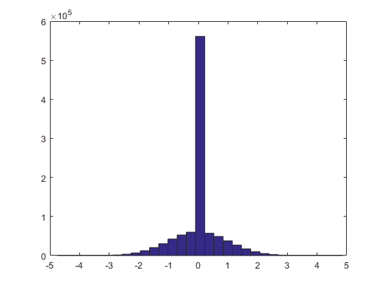
We can apply the same analysis to significance testing! Let’s generate some data for a one-sample t test with n = 15. Some proportion of the data are generated from the null hypothesis:
 clear
 nt = 1e6;
 nx = 15;
 prior_h0 = 0.50;
 truth = randn(1, nt) .* (rand(1, nt) > prior_h0);
 hist(truth, 31)
Now that we’ve generated “true” effect sizes, we can do t tests (feel free to check the math). Let’s do them one-sided for simplicity:
 e = randn(nx, nt);
 meanE = mean(e);
 stdE = std(e);
 observedX = meanE + truth;
 observedT = observedX .* sqrt(nx) ./ stdE;
 criticalT = 1.761;
 significant = observedT > criticalT;
 false_alarm_rate = 100*mean(significant(~truth));
The false alarm rate in the simulation is 4.9959%.
And now we can look at the outcomes with our Bayesian goggles; looking at the distribution of true effects conditional on the outcome measure (in this case, whether the test was significant). Let’s plot the two histograms together, with the “nonsignificant” one flipped upside-down. Because I saw this for the first time in one of Jeff’s talks, I think of this as a Rouder plot:
 xbins = linspace(-4, 4, 31);
 [ys, xs] = hist(truth(significant), xbins);
 [yn, xn] = hist(truth(~significant), xbins);
 set(bar(xs, ys/nt), 'facecolor', [.25 .25 1], 'edgecolor', 'none')
 hold on
 set(bar(xn, -yn/nt), 'facecolor', [1 .25 .25], 'edgecolor', 'none')
 xlabel 'true effect size'
 legend 'p < .05' 'p > .05' 'location' 'southwest'
 hold off
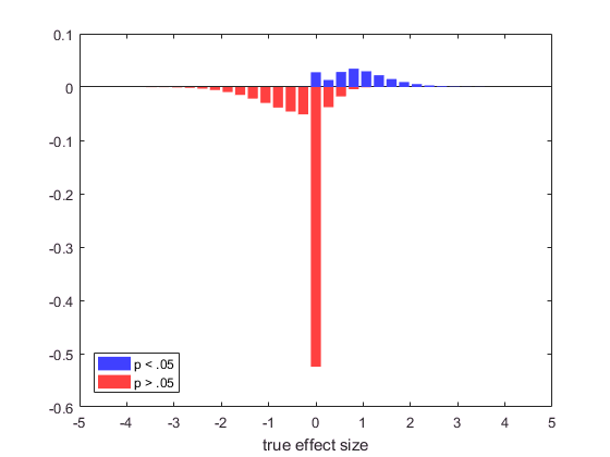
I like this graph because you can read off interesting conditional distributions: if p > .05, many more true effects are 0 than when p < .05, which is comforting. But how many more?
Well, we can make that same table as above (now with proportions):
| T = 1 | T = 0 | |
| D = 1 | 0.17 | 0.02 |
| D = 0 | 0.33 | 0.47 |
Note here that, looking at the right column only, we can see that the frequentist guarantee is maintained: if the null is true, we see a significant result only roughly 5% of the time. However, if we decide the null is false on the basis of a significant effect (i.e., looking only at the top row), we will be mistaken at a different rate seen by dividing the value in the upper right by the sum of the top row.
The continuous domain
So far, we’ve looked only at discrete events: the effect is either zero or it is not (T) and the effect is either significant or it is not (D). If we call x the sample means and t the true means, we can plot the joint distribution p(x, t) of their exact values:
 close all
 bwx = .25; bwy = .25; % plotting resolution
 [rho, xvec, yvec] = density(truth, observedT, bwx, bwy, [-4 4 -4 4]);
 title('joint {\itp}(data, truth)')

Here, too, we can inspect the results of our simulation in a frequentist fashion by inspecting only columns: we can condition on a particular model (e.g., t = 0) and study the behavior of the data x under this model. Alternatively, and more interestingly, we can be Bayesian and see what distribution of true values t is associated with a particular observation x.
In making figures, we can again make it explicit that you can condition on model (the frequentist idea; left) or on data (the Bayesian idea; right)
 idx = ceil(length(xvec)/2);
 idy = ceil(length(yvec)/2);
 normto = @(x, t) x ./ sum(x(:)) / t;
 subplot(1,2,1)
 bar(yvec, normto(rho(:,idx), bwy))
 title(sprintf('frequentist {\\itp}(data|truth = %g)', xvec(idx)))
 uistack(line(yvec, tpdf(yvec, 14), 'color', [1 .2 .2], 'linewidth', 3), 'bottom')
 subplot(1,2,2)
 bar(xvec, normto(rho(idy,:), bwx))
 title(sprintf('bayesian {\\itp}(truth|data = %g)', yvec(idy)))

The distribution on the left is a vertical slice from the joint distribution above — right out of the middle. It is the expected distribution of the observed data if the null hypothesis is true (t = 0). This is commonly known as the t distribution (here, with 14 degrees of freedom), which I’ve underlaid in red for emphasis. The distribution on the right is a horizontal slice: the distribution of true values that generated a particular observation (in this case, the ones that generated x values close to 0). This distribution is commonly called the posterior distribution.
I can think of no real-world use for the distribution on the left, but the distribution on the right tells you what you want to know: the distribution of the true effect size, given a possible data outcome. Obviously, you can make this figure for many possible outcomes, including the one from your experiment.
And that is how you simulate like a Bayesian.
(c) 2016 Joachim Vandekerckhove, all rights reserved