Informations, Part 2: Annie Luong

If you happen to be in the San Diego area and are looking for an activity to do, I recommend checking out the San Diego Zoo Safari Park. The park is separate from the San Diego Zoo and is located at a different location. I prefer the park over than the San Diego Zoo because it is more compact. It is also designed in a way that it is easier for visitors to browse around.

The San Diego Zoo Safari Park Map is one that I enjoyed reading. This is one of the examples of wayfinding. By showing Orientation, Route Decision, Route Monitoring and Destination Recognition, the map creates the 4 stages of how visitors can browse the zoo. After locating themselves in the environment and comparing to where they are at on the map, they can then make a route decision to where they want to get to. Visitors will follow the map trails, which is illustrated on the map by indicated routes, to monitor their progress to the destination.

The map also presents a very unique choice of colors. Since the theme of the park is Safari, the ground colors are also in a Safari-like color palette, which includes neutral, earthy tones combining with different shades of green. This use of color helps relate the reader to the safari and makes it more enjoyable to read.

With the complex information of the map, in order to separate necessary information with the different colors backgrounds, and busy illustrations, the different map routes, there is the use of highlighting technique. All the important activities of the zoo are highlighted in red color, in which make them stand out from the busy background. Usually, we have to be careful while playing with highlight. If we use highlight on busy content, it can give a negative effect. However, the use of red color with black stroke as highlight works in this case.  

Looking at the locator icons like the above photo, we can see how the figure-ground relationship principle which really makes the images stronger. The relationship between ground contrast with the figure in black/white color leaves the interpretation to the user without explaining. Hence it creates a smart and intuitive call to action icons.


The map is also pretty easy to discover, even for younger kids. On the map, we can see different areas that are illustrated with the drawing of the animals which are located in that specific area. A visitor does not need to look at the description to know what area it is. They can look at the drawings of the animals to decide if that is the destination they want to go.

 

Informations, Part 2: Graham Bachelder

TwitchCon 2018 Party at Avaya Stadium

This map details the available concessions and activities at TwitchCon’s 2018 party at Avaya Stadium in San Jose, California.\

Color
One of the most prominent features of this map is it’s strong use of a monochromatic palette. To match branding, most colors are tints, tones, or shades of Twitch’s iconic purple, and it uses contrasting yellows and reds to separate structures from nature. Color is also used to pop structures out, adding white to buildings and giving them a 3-dimensional effect with the use of flat design. This design style is employed liberally in this map, adding the slightest amount of dimensionality by giving each object a shadow from a global lightsource. These shadows are created by using shades of their parent color – an extremely simple effect. This is primarily for legibility and ease-of-use of the map, with white callouts clearly marking the function or name of each location.

Find out more about this principle here.

Biophilia
The addition of trees and textures to show grass and shrubs is an indicator of biophilia, which drastically alters the mood of the image. Although repetitive and not true-to-form, the trees lighten the tone of the information-heavy map, and give the viewer a more holistic scene (although slightly exaggerated) of the location. In this instance, these markers might truly refer to a field or patch of grass, and can actually be more of a subtle tool in that regard, but the trees in particular seem to be placed playfully and with more of a design-driven intent than functional. This skews the viewer’s understanding of the location to be more lush and natural, drastically changing its reception.

Find out more about this principle here.

Contour Bias
Contour Bias, or an inherent preference to rounded objects rather than ones with sharp edges, is seen throughout this map. Even the smallest details, like the tips of the flag, or the point in the top of the tent, all contain rounded edges. This is partially due to the flat-design aesthetic of the map, but also lends itself to ease-of-use principles. The softer edges are easier to glance over and don’t pull one’s focus easily.

Find out more about this principle here.

Informations 2.1.2: Renee Reid

Silicon Valley Office Wall Map

This wall map is in one of the campus buildings where I work and displays the specific cities and areas that are considered in Silicon Valley.  Several designs principles are used  in this depiction of the area 
Wayfinding 
One of the more apparent principles used in this map is Wayfinding which is also a universal principle used in maps in general.  In this example, location pins and illustrations of landmarks are used to assist with orientation. These symbols help to indicate, where you are.

Ockham’s Razor Another principle shown in the design of this map is its simplicity, following the  Ockham’s Razor principle. The minimalist approach in designing this wall map helped to make the map appealing to the eye, especially at this large scale.  Keeping the use of color at a minimal,  as well as only highlighting a few landmarks within each city still help to provide context and orientation without overwhelming people.

Proximity  The location pin, illustration of a landmark, the landmark names and written out locations used throughout the map help to group each of the areas on the map in an easy way that allows people to quickly comprehend.  This Gestalt principle of proximity is used throughout the map and is essential to the overall appearance and usefulness of the map.

Informations, Part 2: Liliana Hernandez

The San Francisco International Airport

The San Francisco International Airport has an oddly shaped structure, and coupled with the system of trains that arrive directly to the airport, it can be hard to navigate this intricate building. The use of maps is particularly important here because of this, and since people typically are in a hurry or may be unfamiliar with the space, they need to be able to quickly and efficiently make their way through the airport and make their flights. A number of design principles are employed to make this happen.

The first apparent principle is that of Ockham’s Razor, which essentially aims to avoid unnecessary information and elements that decrease the design’s efficiency. This map employs this design by simplifying all areas external to the airport. For example, the freeways are shown on the map as a means of getting to the airport, but they are grayed out and do not show all of the little twists and turns you have to take to get to the terminal you need. Another great example is that of the Rental Car Center, the blue box in the top left corner. This is just their to symbolize the location of the center, not necessarily the shape of the building or anything.

The second principle, as demonstrated by the image to the left, is that of Archetypes.

Archetypes are learned conventions from our cultures, this map shows the Caltrain and BART logos and therefore plays on the common knowledge of people local to the area who understand that these logos indicate the train routes that lead to and away from the SFO airport.

The third and final principle I will speak to is that of Color. The colors used in this map clearly define the distinct areas in the airport, the international versus the national terminals, the different train routes for getting around easily, and the parking areas.

Informations, Part 2: Sahar Abdizadeh


This the Newport Beach Public Library’s map. I believe this is a user friendly map. It helped me a lot in find different departments in the library when I visited this place for the first time. I can see the following design principals has been used in designing this map.

Layering: Different colors are used to organize different departments. If the plan was designed in one color it would look complex. Also the related areas are rendered in a same color.

Iconic Representation: Universal Icons such as men and women’s restrooms, information, and elevators are used in this map. These icons along with furniture icons increase learnability and recognition.

Way finding:  Use of door icons, stairs, and entrance helps user understand the flow of movements in this building. It clearly illustrates where people enter, and how they access different departments and upper floor.

2.1.2 Cindy Wang – INFORMATIONS

Charles Joseph Minard’s map of Napoleon’s March to Moscow in 1812.

To give context of this map, the grey band is towards Moscow, the black band is Napoleon’s retreat. You can see the dwindling numbers (represented by skinnier bands) directly as the result of time and temperature.

Here it is next to a map of the path, along with my own Google maps route featuring a few of the cities:

The chart features many design principles, but the three I’ll be covering are:

  1. Gutenberg diagram: this map reads best from left to right, signifying the start of Napoleon’s journey to Moscow with the thickest band (number of soldiers). Once the reader reaches Moscow, they can follow the black band on the bottom for the retreat and failure. 
  2. Layering: what this map does incredibly well is layering information. Actual map from Belarus to Russia (including major cities, rivers nearby, and route) with Napoleon’s soldiers in both onslaught and retreat, temperature (in Rankine, Celsius and Fahrenheit), time in dates, and elevation.
  3. Proximity: this map uses proximity of cities across Belarus, Lithuania, and Russia in order to demonstrate the position and route taken by Napoleon’s dwindling number of soldiers.

Informations, Part 2: Cassandra Hoo

Food Tube Map
Food Tube: The ultimate guide to a deliciously Instafamous summer in the city – By www.wrenskitchens.com

I was very hungry when I started this assignment, so I googled, “Ice cream maps.” I was surprised to find so many different maps dedicated to sweets! The map I chose immediately caught my eye. In addition to the fun aesthetics of this map, it highlights all of London’s most quirky treats — including desserts like unicorn poop, rainbow bagels, and ice cream nachos! Mmmm…. What’s not to love?

Food Tube: IconographyICONOGRAPHY:

The icons truly make this map unique. The dessert icons allow people to easily understand what each treat looks like and where it’s located on the map.  I absolutely love how each featured treat has its own adorable illustration. Although London isn’t really known for its cuisine, this map has inspired me to travel there!


OCKHAM’S RAZOR:

Food Tube Map
Food Tube
London's Tube Map
London’s Tube Map

The Food Tube map has been simplified to only show what’s truly important: the quirkiest treats in London and how to easily get them by metro.  I cropped the London Tube map to show the exact same area that the Food Tube map featured. By comparing the two maps, you can easily see how the Food Tube map only features the tube lines and stops where the featured treats are located.

WAYFINDING:

Food Tube Map Key
Food Tube Map Key

The Food Tube Map uses the same tube line color coding as the actual London Tube map, so people can easily recognize the lines and their geographic location. The Food Tube’s map key gives a lot of helpful information to guide people to their destination. The key has been alphabetized by tube stop, which can help people easily find the stop they’re looking for or happily discover that they’re already conveniently located by one of the featured treat locations.  The key also lists the names of each restaurant establishment where the featured treats are served in for destination recognition.  Finally, the Food Tube line key shows all of the tube lines that you can get on to reach the destination.

Informations, Part 2: Ken Mead

zoomed out version of Seattle map
A map of Seattle neighborhoods I found at the airport
zoom in of Seattle neighborhood map showing downtown
The map overlays sub-neighborhoods and uses numbers to refer to a key with the general neighborhood areas.

I picked up this map of Seattle neighborhoods in my local airport coming back from a trip. It layers various graphical elements like surface streets, and neighborhood borders, with textual elements like neighborhood names and numbers that refer to a key.  Color is a central organizing principle

One of the frustrations I find with this map is its poor use of proximity: the map overlays almost all of its information about neighborhoods directly on the geography of the map but isolates the general neighborhood areas in a key off to the side.


A key showing general Seattle neighborhood areas
One of the frustrations is that the map isolates the general neighborhood area names in a small key to the side

Choosing to place the “general neighborhood areas” (e.g. Downtown, Capitol Hill, University District)  disrupts hierarchy. These areas are at the highest level of organization on the map, but the small, out-of-the-way key does not communicate their importance.

Overall, I still enjoy viewing this map as it sparks my curiosity to learn more about the history behind the names of these neighborhoods in my city.

Informations Part 2: Greg Puett

My family’s map of Great Britain:

When I was younger, my family lived in England. While we were there, (basically) every single weekend we would go to a different castle or sight seeing location. While we were there, we would stop by a gift shop and get a pin for the attraction. Eventually we collected tons of pins, and we decided to make a map of the countries and pin them in their corresponding locations on the map.

What makes this map interesting from a design aspect, is the fact that most of its design decisions were made by my mother, an elementary school teacher with no design background whatsoever. So its fascinating that even on a map not built by a designer, design principles are present. They are so vital that even an untrained person uses them in order to present information.

The first, and definitely most obvious one is Color. The map itself represents a few countries, and you can see the land is clearly the green areas, the sea surrounding the islands is the blue background, and if you look closely, you can even see the borders between Scotland, Wales and Northern Ireland are done with yellow embroidery

.

Another pretty easy to spot example is Consistency. Each attraction location is represented by a single pin, all of which are about the same size. Whats interesting to note, is for attractions that did not have a pin for sale, my parents would use an image from the guide book, print it out onto Shrinky Dinks, and glue those onto pins in order to use for the map. You can see a few above on Ireland, and even more on the bottom of the next image.

:

Consistency also holds true for Scotland, where a large amount of their castles used almost identical designs for their pins, only adjusting the shape to represent the castle itself.

Finally, the most fun conversations about this map come from people who have also been to some of the locations on it, and that leads me to my third principle. Recognition-over-Recall. People are able to generally remember a general area where they saw an attraction, but cant necessarily point it out, with this map, they can recognize the actual site, and see exactly where it was in the country, rather than having to look specifically for where it is before finding it. It leads to all sorts of fun talks about how someone saw this one castle, and they think it was “somewhere around….. ah ha! Right here!”


What other principles can you see built into a map made by a school teacher?

Informations, Part 2: Lisa Grossi

ONE Westminster

This beautiful folded map was designed by Herb Lester Associates and was commissioned by ONE.org, an international advocacy organization fighting extreme poverty and preventable disease. This map was delivered in 2015 in Westminster for the election of the UK’s new parliament.

ONE Westminster folding map

Find this project on Behance here

Color:

This design uses a limited color palette of 3 colors: orange, navy blue, and white. This simple palette utilizes the complementary colors orange and blue, adding to the aesthetic of the design.

Ockham’s Razor:

The map exemplifies the principle of Ockham’s Razor by simplifying the map to avoid unnecessary information. Minor street names and buildings are removed to create a simpler and easier to read the map.

Wayfinding:

The wayfinding system in this map is clear. The designers use recognizable landmarks such as Westminster Abbey, 10 Downing Street, and the Westminster Clock Tower (Big Ben) to aid in a user’s wayfinding.  The map also keeps the River Thames central to the map as it is easily recognizable and a tool in wayfinding.

Informations, Part 2: John Molendyk

I think many maps use some common principles such as color, consistency and iconic representation that supports depth of processing through a deep exposure to rich details.

This is a map of Downtown Portland, OR and is interesting to me because of the caricature like iconic representation and bright colors to communicate points of interest and landmarks. There is s a lot of consistency across the iconic representations used here which is expected and lends to its overall readability.


Flexibility-Usability Tradeoff is at play here. While these icons are fun and the map has a lighthearted feel to it while providing basic information, there is a bit of tradeoff occurring as some points of interest are too dense based upon this maps point of view. This leaves some streets unidentified for a short period while more important details override. This leaves the user to determine and track the street. Because of the nature of this map, this may or may not be acceptable.


Highlighting is seen where information such as street names are presented, but other items such as building names, landmarks and points of interest are all in bold or even in a color with a graphic.


Horror Vacui seems to be at play here and I think it is one of things that makes the map interesting. When thinking about the type of map I wanted to use for this exercise, this is much like what I envisioned. Typically, I would say Horror Vacui has its place, with this design and the lighthearted feel you get from it, and considering it is a map, I think more can be better to a point and so the principle is useful. I think the best way to see this principle at play is by looking at the entire image.

Informations, Part 2: Sofanah Alrobayan

Halloween Horror Nights is a spooktacular annual event hosted at Universal Studios, and this map comes from the Hollywood location. Once I arrived, I was handed this static paper map in order to locate and navigate through different rides, mazes, scare zones, restaurants, etc.


One notices right away how color is used here to distinguish between the different attractions and highlight the locations. Rides are depicted in green, mazes in blue, scare zones in orange, live shows in violet, terror tram in light purple, and closed attractions in grey. Breaking it up by category makes specific types of attraction much more discoverable. Another use of color is through the color choice of text on the map itself. Notice how all the attractions are in yellow whereas other points of interest (entrance, exit, escalator, lot level) are in orange. One interesting thing to note is that these colors were not difficult to distinguish by my color blind friend.


Another design principle that is used in this map is layering. One thing to note is that there are two lots in this map; an upper lot and lower lot. The first example of layering that came to mind is the way those two lots were depicted in the map. There is an escalator depicted that leads to the lower lot and one way to notice which parts belonged to the lower lot versus the upper lot is how the trees were drawn on the map. The tree images surrounding the ledge looking over the lower lot only displayed their top halves, meaning everything that is past that point is considered in the lower lot. Another example of layering is all the different labels on the map, from attraction names, ride images, arrows to entrances, and various labels explained further on the legend depicted at the bottom of the map.


Consistency is another key design principle depicted on this map. The font chosen for major attractions and points of interest are the same, bolded, and capitalized, whether it is actual words or abbreviations (“UNIVERSAL MONSTERS” or “M3”). When it comes to labels on the map, legend descriptions use a different font, unbolded, and uncapitalized. All similar labels on the map are the same size. “M#” and “S#” have the same circle size. All the dining and shopping circles are the same size. Every other label with the exception of “Phones, Restrooms, and Water Fountains” are consistent in size. I believe the reason for grouping the “Phones, Restrooms, and Water Fountains” are because they are always in the same location and breaking them out might cause more clutter. Also notice the consistent use of borders on the labels and attractions and points of interest names. Labels have a white border whereas the words have a black label. Around the map are different legends and they are all consistent in detailing the “ripped paper” aesthetic.

Informations, Part 2: Kathy Emsoff

I think this map, How Birds Migrate, from National Geographic is both beautiful and fascinating. It shows the migration patterns of birds from North to South America and maps out their flight patterns along with other interesting information. The map successfully employs a number of design principles including continuity, layering, and color.

Map of North and South America with birds and migration routes
You can view the giant version of the map in my Google Drive

Circles connected with curvy lines versus circles connected with straight lines.Continuity
The success of the map relies on being able to follow a specific migration journey and the map uses smooth contours to achieve this principle of continuity. Ware (2012) referenced this as a Gestalt principle that states were are more likely to “construct visual entities out of visual elements that are smooth and continues, rather than ones that contain abrupt changes in direction”. The diagram with the circles and lines from the Ware article really helps illustrate the effect.

Layering
The map also uses layering to so that you can see the geographic map underneath the route illustrations. This is done through three-dimensional layering by making the migration route stripe slightly transparent so the land underneath is still visible.

Color
The map also uses color to help delineate the different types of migration patterns from each other. For example, the transparent blue line on the left shows the route for seabirds while the green one kind of in the middle shows waterfowl. I also think they tried to use color to associate the type of bird. Seas are usually depicted in blue so it makes sense the seabirds route would be blue. Freshwater is more likely to be green than blue and the waterfowl route is shown in green.

Hummingbird illustration with smaller outline belowBonus: Relative Sizing
In this poster, it looks like the designer has sized all the birds relative to each other except the hummingbird, which was blown up, and the actual size was shown as an outline.

This principle of relative sizing is something I’ve had to use a lot in my career. When showing a group of products, it’s always important to make sure their relative sizing is correct. For example, if you’re showing a Dell laptop next to a monitor, the laptop should be smaller than the monitor. Depending on the use case, sometimes it has to be exact and sometimes you can fudge it a bit. In the Dell example below, I fudged it and the monitor is actually too small, but the phone, tablet, and laptop are all relatively sized. This was for my personal website, so it didn’t matter, but if this was on the commerce site, it would need to be corrected. In the BlackBerry example (from when I worked at Razorfish) the products are all relatively sized. At one point, I made a giant file that contained all of the retouched BlackBerry phones relatively sized to each other and saved out as smart objects so any designer could just grab them, and if they scaled them together, they would retain their relative sizing.

Dell laptop, tablet, and monitor with Samsung phone.
This image was for my own personal website, so I took the liberty to shrink the monitor a bit compared to the other products.
A BlackBerry tablet and mobile phone picture next to a computer monitor.
This was an image that lived on the BlackBerry website, so all the products had to be relatively sized correctly.

Informations, Part 2: Christina Bui – BART Map

BART MAP

Color
In this map, color is distinctly used to assign meaning. The use of color is controlled in saturation and brightness to create contrast and group data, while color choice in the color wheel is used to distinguish data within the groups. In the BART map, you can see lighter colors were used for the land and ocean while much more vibrant and saturated colors are used to highlight the metro lines. But to distinguish the lines easily, they first used primary colors and then evenly spread out the shades along the color wheel to accommodate the 5 different lines.

Figure-Ground Relationship
Using color saturation as mentioned, it creates a figure-ground relationship that helps the viewer instantaneously recognize and prioritize data and attention. The lighter land and ocean is meant to indicate their insignificance and role as the “ground.” The attention is drawn to the rail lines as the “figure.”

Ockham’s Razor
This principle points to the minimization of irrelevant elements and optimizing simplicity. This is particularly useful in designing maps as there can be countless data and ways to inform about a space, but the simplicity is key to efficiently informing the viewer of what they need to know. In this case, all the rider needs to know are the stops, the connection of stops by each train, and their orientation in the bay area. This allowed the designer to narrow down the elements to: the outline of the bay to distinguish land versus water, the colored rail lines to show range of each train, and the names of the stations. This clear and simple map tells riders exactly what they need to know and only what they need to no, without superfluous data or distractions. The only necessary information is minimally noted for time restrictions.


Informations, Part 2: Kathlyn Cabrera

A Song of Ice and Fire Speculative World Map

A Song of Ice and Fire Speculative World MapThis interactive map represents the known world in A Song of Ice and Fire, a series of fictional novels by George R.R. Martin that was adapted into the HBO television series, Game of Thrones. The map is speculative, meaning it is based on what the novels and television shows have revealed about their fictional world so far, a.k.a. the known world. Much of the known world is in Westeros, as most of the story arc happen in cities in this region. We see a concentration of city/location labels in the western landmass (Westeros), while other landmasses are mostly unexplored with eastern and southern lands (Essos and Sothoryos) cut off from the map view because the storyline has not revealed where or if these landmasses end.

The map is hosted on Google Maps API which allows for interactive features such as zooming in and out (though the text does not auto-resize based on zoom in/out so you have to zoom in to read the font). We can also follow characters’ journeys, complete with timelines that can be adjusted or limited to avoid spoilers.

Principles in Action:

Surface Mimicry

Forest represented by dark green color and shrub textureDifferent types of terrain and physical features of the land are represented on the map using colors and textures. For example, the forest areas are a dark green color with a shrub-like texture that imitates the color and texture of trees seen from above. This imitation of visual appearance is surface mimicry and is a design principle used in many physical maps.

Hierarchy

Legend shows hierarchy of symbolsHierarchy using font and symbol sizesThere is a hierarchy in the font and symbols used to represent cities and towns. For example, the font and symbol used for King’s Landing, the capital and largest city in Westeros, are much larger than the surrounding towns.

Layering

Map showing Tyrion Lannister's character journey

The drawn map involves layers of information including physical features of the land, labels denoting cities, regions, and bodies of water, a compass for orientation, etc. There is also the interactive feature I mentioned earlier where we can follow characters’ journeys. The red line layered on the map appears when we check the box to track Tyrion Lannister’s journey, a character whose travels has taken him from Castle Black at the North Wall in Westeros to the city of Meereen in Essos in the east.

References:

theMountainGoat. A Song of Ice and Fire Speculative World Map, Version 1.0. Feb. 2012. http://quartermaester.info/

“The Known World.” Game of Thrones Wiki. https://gameofthrones.fandom.com/wiki/The_Known_World

Maps, Gestalt, and space + dimension challenges (Good maps are not good enough)

Note for the reader:

  1. I have taken example of a map that does the job but can be improved.
  2. The problem highlighted in this post is not isolated. Beijing’s subway map is not alone in surrendering to complexity. Wherever we have a big subway system, we’ll find a bad map trying to explain it.

This is Beijing city’s subway map, from 1965. Beijing had a total of three subway lines then.

Source: https://ia.net/topics/web-trend-map-2018

Accessed on October 26, 2018

This is Beijing city’s subway map from 2017, with fifteen lines in all.

Source: https://ia.net/topics/web-trend-map-2018

Accessed on October 26, 2018

And this will be Beijing’s subway map by 2021, with twenty-two lines.

Source: https://upload.wikimedia.org/wikipedia/commons/c/c5/Beijing-Subway-Plan_en.svg

Accessed on October 26, 2018

Beijing is populous and is growing rapidly, and a growing city needs a growing subway system. The pace of expansion of subway system in Beijing has been nothing short of stellar. However, the same can’t be said about its map design. In spite of the fact that the subway map has managed to retain its basic structure, while swimming within ‘Gestalt lanes.’ For example:

  1. Subway lines/ routes on top of a contrast white background (figure ground)
  2. Different subway lines are denoted by different colors (clustering/grouping)
  3. Subway stations are denoted by dots on the subway lines (similarity)

But in spite of all this, the subway map design leaves a lot to be desired. To start with, the map looks way more complex than before. This complexity is an outcome of the many more new subway lines and new subway stations that have been added since 1965. However, increasing volume of information shouldn’t necessarily mean increasing complexity. There has to be a better way of displaying this information, beyond this incremental design. Isn’t that the real job of design to making complex things simple?

A better design, in this case, needs to answer basic questions like:

  1. Who are the people using this subway map? (segments/personas)
  2. Are there challenges that users are facing with the current map design? (user problems)
  3. What do users want from their subway map?
  4. Do they need to see the whole map the same time? (user needs)
  5. Could only that part of a map, that’s relevant to their commuting needs, be activated at a given point in time? (personalization)

There could be many more such questions, and answers to these questions could define the problem we are addressing.

In my view, a redesign of this map should at least solve for:

  1. The limitations of physical space
  2. The constraints of a two-dimensional design

and do these while keeping the design solution practical in terms of usability and affordability. This calls for innovation.

When we think about simplifying complex maps and making them more useful, AR (Augmented Reality) applications come to mind. AR helps us in layering information and visualizing things in new ways. AR has been trying to simplify information display and augment productivity by layering information on top of physical spaces. However, it hasn’t come up with a reliable and cost-effective application for maps.

Google maps, a world leader in mobile maps, should be at the forefront of this. They should be helping us free ourselves from the tyranny of flat two-dimensional design limited by the screen sizes. But they have a long way to go. This is their leading edge right now: https://www.youtube.com/watch?v=4F0gFpzsYLM

Even if AR succeeded in addressing the information overload, would current crop of mobile devices be able to deliver the desired experience? Or would maps, like many other information intensive applications, need an entirely new kind of hardware that is tethered to our sense of sight and reduces friction? Are we talking about glasses (again?) and is that the best solution? Microsoft has been toying with HoloLens for over two years, and they still don’t have a working solution for work, gaming, or navigation. The prototype they displayed (a year back) was good only for indoor use and left a lot to be desired in terms of its practical utility. Watch this for a snapshot of where they are in this: https://www.youtube.com/watch?v=oMfNojNC0b0

Intel is trying too, but their glasses have a long way to go too https://www.youtube.com/watch?v=bnfwClgheF0

Who will come up with a solution? How will we make it affordable? And on top of all this, how will we make that map experience to all?

I have more questions than I can answer. But here’s one thing that I am sure of, the answer to “how can we make maps easier to use and more valuable to all kinds of people?” will come from design and not technology. Because whatever limited knowledge I have about technology, I believe we have enough and more of it. What we do not have is enough number of people who understand how to translate user needs to design solutions that harness these technologies smartly.

As designers, I wish, we imagined solutions that challenged technology to step up and solve for people.

Informations 2.1.2: Grace Guo


Irvine Spectrum Map
Irvine Spectrum Online Interactive Map

This is the online interactive map for the Irvine Spectrum, an outdoor shopping plaza. Immediately after arriving upon this page, it is plain to see that color is used to improve the aesthetic, draw attention, and assign meaning.

parking availability meter
Parking availability meter

The parking availability meter uses a spectrum of colors from green to yellow to red to represent how open or full the parking lot is. The more green, the more open. This choice of colors is a form of surface mimicry, mimicking the colors of the stop light. It, therefore, makes the information appear more familiar and recognizable. Even without reading the labels, users can quickly identify that green indicates the path of least resistance because of their familiarity with stoplights, where green represents “go”.

Moreover, the visual quality of the colors draws the immediate attention of the viewer. This is considered a form of hierarchy since the colors make this portion of the page stand out above the rest and are likely what the user will first focus on when landing on this map. This makes sense because finding parking is the first thing people must do when going anywhere.

Amenities iconography showing the hover-over effect for Bicycle Rack

Looking at the right side of the page, the iconography is likely the next object of focus for the user. Using commonly recognized symbols to convey amenities allows the user to recognize their meanings immediately. However, in case the user is confused, hovering over the icon shows what the icon represents.

Bathroom iconography on the map


Iconography saves the user the hassle of having to read things out and makes it easier to identify these amenities on the map itself.


Overall, this map does a great job at promoting visibility for all its features and making it clear what each portion of the map signifies. The design is clean, visually appealing, and easy to use.

Informations, Part 2.1.2: Robin Kang

This is a map of Los Angeles International Airport.  LAX is located 18 miles southwest of Downtown LA and is the 5th busiest airport in the world.  Looking at this 3D map, three principles immediately comes to mind: Ockham’s Razor, Wayfinding, and Color.

One can imagine how complex it is to design a map of LAX or alike.  The map depicted below shows application of Ockham’s Razor principle which emphasizes simplicity is always preferred over complex designs.  The absence of landscape, 3D rendering of structures, minimal color choices illustrates efficiency and simplicity of this map.


Next, wayfinding principle.  The map also successfully allows navigability in the space showing location of a theme building, terminals, control tower and parking structures.  The Arrival and Departure routes are specified with arrows to indicate orientation and destination recognition in the environment. The map further reveals diagram key for clear and consistent identities.


The third principle I noticed was color.  Primary colors of blue and red are used to direct importance of Arrival and Departure areas.  The more muted colors of terminals indicated they are all alike.  The limited palette of colors used in the map relieve the complexity of Los Angeles airport.

Informations, Part 2: Christine Benedict

San Diego VFR Terminal Area Chart (TAC)

Aviation charts are a great example of how much information you can pack into a map and have that map represents a three-dimensional space that one can navigate through.

The first principle I will touch on with this chart is the concept of progressive disclosure. This principle is more a part of the holistic design of aviation charts as opposed to within this one example. There is one chart that covers the entire area of southern California. Within this area there are also more in-depth detailed Terminal Area Charts (TACs) for San Diego and Los Angeles.

This is the same for most large cities throughout the US. It allows higher detail for more complicated and cluttered areas of airspace and rules. The mini-map in the legend of the chart depicts this layout of information and highlights the current chart in dark blue to alert the user to the area depicted.

Map of the US depicting how it is split into sections
Charts within charts. Chart-ception.

Obviously in a map or chart, the principle of wayfinding is paramount in both the design and functionality of the charts. The depiction of the runways is a way this type of chart aids in orientation as well as destination recognition within this concept. The illustration of the runways actually aligns with how the specific airfield is laid out. When you have multiple airfields that are close together, it can sometimes be difficult to tell grey strips of concrete apart when viewing at a distance and height. However, if you know how the runways are going to be oriented based on the direction from which you approach, it resolves ambiguity.

Close up of two airfields on the chart.
San Diego Intl. and North Island NAS lie just across the bay from one another. One is depicted with two crossing runways while one only has a single runway oriented approximately east to west.

The design principle of color also plays a huge role within the chart. There are three different type of color keys used to display information. One is specific to the lettering and line usage itself. Visibility of information is important when navigating complicated areas. With the volume of information displayed, having a new color for each new type of airspace or symbols would be overwhelming to the user. Therefore they have selected the shades, black, magenta, and blue, to display all of the information on the chart. They use shading and patterns more than color to differentiate areas and zones.

Portion of the key for color, shading and patterned airspace lines.

Another way the chart uses color is to highlight areas of dense population in yellow. This is a choice that easily maps to the brain as densely populated areas will be lit up in mostly yellow-toned lights when flying at night. The last color use is chosen with terrain. The scale for terrain coloring is in the chart on the left. This chart also easily maps with how we might see the color of terrain change from a low valley in green to a rocky mountain in red.

Key of colors going from dark green, to tan, to brown.
Scale for coloring terrain.
Zoom in of area with a mountain and a valley
While made more obvious by shading, the color allows one to take a quick look at the chart and easily pick out where mountain ranges are located.


These are all charts for flying visually around an area (VFR = Visual Flight Rules). Instrument charts look very different as a pilot no longer has to match the look of the ground up to what he or she sees on a chart.

Mostly white chart with text obviously the priority.
San Diego area instrument chart. Same area, very different priority of information.

Informations, Part 2: Young Sun You

I got this map when I visited the Palm Springs Aerial Tramway at Mount San Jacinto. I thought this map was more interesting and different from a typical simple and modern map. This hand-drawn illustration style of the map communicates many useful information in a unique and aesthetic design.

Aesthetic Usability Effect

People gravitate towards more aesthetic designs than less aesthetic designs. The map has great visual aesthetic designs that give people a more enjoyable and positive feeling. Just as people judge a book by its cover, this map gives an attractive first impression to people. At first, the map is not as simple as other maps, but its aesthetic designs foster a more generous and positive attitude toward design issues.

Wayfinding  

The wayfinding principle helps identify many details of the tramway and state park environment. Its clear and consistent labeling of the locations allows viewers to navigate around the place and understand each destination.


Less is a bore (by Robert Venturi, 101 Things I Learned in Architecture School)

This map shows the concept of “Less is a bore” by Robert Venturi. The map provides a lot of visual information such as the routes, directions, heights of the zone, tram details, and types of plants and animals living around the park. The map also shows the structure of floor plans of the main buildings and details of each section. It is opposite of simplicity and the concept of “less is more.” The style and way of displaying information in this map is different from other simple maps. The main points of this map are to share a variety of information and make it possible for people to focus on the details of the information in each section.


Informations, Part 2: Alexa Steinhauser

Coachella festival map with stages, food venues, and other important land markers

Coachella is a fairly popular, annual music/arts festival located in Indio, California. I was interested in seeing what kind of maps they provided to their guests (so that they could easily facilitate their way around the festival grounds), how the design of their map matches their brand, and if it’s as “ethereal” of an experience as it sounds. Let’s take a closer look…

The principle von Restorff Effect is used here to distinguish the large-scale art installations from the stages and food venues. You’ll notice that these icons aren’t labeled or outlined, but they are so different from anything else on the map that it would draw a user’s attention and increase their recognition… these large forms are typically used as visual cues for meeting up with friends at specific places on the grounds.

Consistency seem through use of font and color on a Coachella mapThe principle consistency can be seen throughout this map to efficiently detect where the stages are located. Each stage is clearly labeled with the same, all-caps font with a dark shadow behind it to increase visibilityThe landmarks also represent the size and shape of the physical architecture to compare with others. I will admit that the visibility of the map as a whole is limited by the background color in relation to specific icons that are also in the pastel color scheme. 

The principle wayfinding is very evident throughout the use of this map. There are clear icons that identify with basic needs such as food, water and restrooms, while there are clear indications of orientation as a user could recognize the size and shapes of each icon while they are navigating the environment. The signage they employ inside the festival is large and visible, so that the user can determine if they’ve reached their destination or not.

Sidenote: I couldn’t use the following map for this exercise because it doesn’t pertain to a specific place… but check out this really awesome foodie interactive map! Instagram Food Capitals


Informations, Part 2 Singapore’s Universal Studio Attractions Map

The first time I saw the attractions map of Universal Studios of Singapore was in one of Jared Spools’ UX conference talks. In his talk, Jared addressed what was done right in creating a great user experience, and this map was one of his examples.

The first impression people get from the map is its 3D display and the color-coded sections to highlight different attractions the theme park offers to visitors. Unlike most maps, this one relies heavily on visual elements, such as the vibrant colors and vivid graphics to highlight the theme park’s unique sections. By doing this, the designers have applied multiple design principles to draw the attention of the users. Below are some design patterns I have noticed in this map.

Three-Dimensional Projection

People have evolved to see things as three-dimensional whenever possible—even when the things are clearly not three-dimensional. The Universal Studio’s attractions map illustrates this principle by creating a 3D effect to provide people with realistic images.

Highlighting 

Highlighting is used in design to bring attention to particular elements or features. With this map, lively colors are used to highlight the most popular sections of the park . The first thing that caught my attention is the brightness and vibrancy of the colors that are used to highlight and call attention to the attractions.

Recognition over Recall

This Psychological rule shows that people can recognize things over needing to recall them. For example, the images of leading characters from a movie help people to remember the scenes in the movie, which brings back these memories. In the case of design, this translates to presenting a user with an interface that is immediately recognizable and intuitive for the viewer. 

Picture Superiority Effect

The picture superiority effect professes that viewers remember pictures better than text. Moreover, the effect is strongest when the pictures represent common, concrete things compared to more abstract ideas. By understanding this rule, the designers of the Universal Studios attractions map have created a large amount of graphics on the map. The image versus text ratio is extremely high in this map.

Many other design principles have been found in creating the Universal Studios attractions map of Singapore,  such as color for grouping similar elements, and iconic representations for finding important things that often are searched by visitors.

Informations, Part 2: Serena

The timing of this exercise is perfect, because this book recently arrived in the mail: The Wondrous Workings of Planet Earth by Rachel Ignotofsky. (I ordered it months ago, forgot about it, and it arrived just in time for this exercise– chock full of maps.)

open book featuring an ecosystem map of South America
Check out the use of color in this map! The author chose bright, high contrast colors to display ecosystems across the South American continent. Some color choices are a little unexpected (purple for rainforest and green for savanna, for instance) but the overall colors seem to map to expected colors for specific environments. (Red for desert, blue for wetlands.) I’d guess that she opted for purple rainforest to avoid too many shades of green that might result in contrast issues and reduce readability.


ecosystem map of South America
Looking closer at the map, we can see that layering is also employed here to convey additional information onto the map. The map key labels colors and textures used, and national borders and country labels are superimposed over the amorphous color areas. This map essentially has four layers: ecosystem (color and texture), borders (black lines), labels (black text), and interesting facts (mini images with text).


entire two-page spread containing an ecosystem map of South America and a page of text
Examining the entire spread, Ockham’s Razor is clearly used throughout. The author keeps everything as simple as possible, reducing all potential content that a map of South America might contain to only the most relevant information. Simple shapes and lines, clear labeling, lots of white space, and easy-to-read text labels all come together to create a clear map that is easily and immediately understood by the reader.

2.1.2 INFORMATIONS: Gillian Eiserman

DC Metro System Map
Source

When looking at the Washington D.C. metro map, I think the first design principle that stands out is color.  All of the different lines for the metro system are named after different colors, but instead of just labeling the lines, the map actually has those lines in the color that corresponds to the name.  This makes it much easier to identify the Orange Line from the Silver Line versus looking at all black lines with labels all over them. By using color in this way, the map also cuts down on the need for labels for each line, making the map look cleaner and easier for the user to navigate.

All the colors of the rainbow (or the DC metro line)

Another design principle that is seem in the D.C. metro map is Contour Bias  which is described as peoples’ preference for objects with contours versus sharp angles.  This can be seen in the lines that are drawn to represent the different metro lines. Instead of the drawn lines having sharp corners, all of the corners are curved and are more gradual than a sharp turn.  In addition, all of the symbols for the different stops along the lines are circles instead of squares, triangles, or another shape that has harsh angles and sharp lines. This makes the map overall more appealing to viewers and also makes it look less harsh and intimidating and like it is user-friendly.

cropped view of the D.C. metro map with curved lines and simple depictions of monuments and terrain
Displays use of Contour Bias and Ockham’s Razor

A third design principle that is shown in the D.C. metro map is Ockham’s Razor.  Ockham’s Razor states that simplicity is preferred to complexity and that whenever possible, unnecessary information and elements should be removed from the design and the most simple design should be used.  In the D.C. metro map, there is very little detail given to the parts of the map that deal with the external physical locations. There is green and blue used to symbolize water and park areas, but other than that, there are no distinctions as far as terrain or much geographic detail.  It is marked where the monuments are, but even these are done with simple line drawings versus pictures or more intricate illustrations. The utilization of Ockham’s Razor in this map allows for the important information to be clear and visible for the user and reduces non-essential information, such as terrain descriptions, to their simplest form.

INFORMATIONS, PART 2: Joe Davis

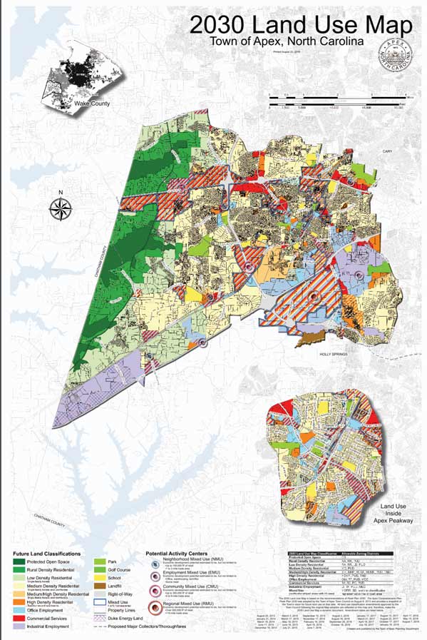
TOWN OF APEX – 2030 LAND USE

In searching for a map, I decided to see what was on the webpage of Apex, the town I’m living in. The small town is currently undergoing considerable growth, with major developments popping up over the last couple of years. The town currently has posted a map titled, “2030 Land Use Map – Town of Apex, North Carolina.” As you can imagine the map describes the uses of certain sections of land.

Map of the town of Apex. Shows Apex depicted in multiple colors that distinguish the different land uses.
Town of Apex Map

COLOR

The first principle that I noticed was color. This map uses color to distinguish not only the different types of land and their proposed uses on a map, but also to separate the Town of Apex from the surrounding towns and counties. The surrounding towns are mostly grey scale and do not distract from the focus. The legend at the bottom of the map uses color as its primary source of distinction among the variety of different land uses. This legend tells us how to read the color coded map above.

Picture of a map with bright colors distinguishing land uses
Town of Apex Map – Use of Color

ALIGNMENT

The data below the map consists of a legend and description of purpose. These texts and graphics are aligned to make it easier to read left to right. Most of the data is left justified with a few subsections being center justified. Overall the alignment of the data allows for a faster read and better understanding, than if it where all meshed together.

Map legend showing data left justified
Town of Apex Map – Use of Alignment

CHUNKING

The data on this map is separated into chunks, to allow for information to be more easily identified and digested. We can easily see what is important and how to read the map. There are three textual based chunks and three map/graphical chunks of data.

The textual data is split between the title, legend, and description/purpose of the map. In the top right corner is the title of the map, letting us know its general purpose. At the bottom left of the map is the legend that tells you how to read the color coding. To the bottom right is a description of the maps purpose and additional data.

The graphical data, the maps, are separated into three chunks. The first chunk shows a view of Wake county, where Apex resides. The second is the Town of Apex, and the breakdown of the different land uses. Finally, the third shows an expanded subsection of Apex that the map designers felt the need to call out.

One of the problems with this chunking, is that the three maps are layered over a larger map. This causes confusion as to whether the three maps are part of this background map or their own separate piece. To add to this confusion is the fact that two of the three maps are actually separate, while the Town of Apex map is part of the background. Wake County and Land Use inside Apex Peakway are a county perspective and a zoomed portion of the Town of Apex respectively. This layering could cause confusion to someone outside of Apex and Wake County.


Informations 2.1.2: Tara Suan

I am pleased to share the mapping work of my neighbor, Jonathan Levy, which he completed for the Museum of New York with The Pratt Institute and Local Projects. This is an interactive mapping environment that feature socio-economic, transportation and environmental data analysis.

Jonathan E. Levy’s interactive mapping, on permanent exhibit at the Museum Of The City Of New York: NY At Its Core
The full display at the Museum of New York. Notice the stunning wraparound that captures the sky-scraping height of the city.

In making visible what is otherwise hidden and inaccessible, maps … enable the accumulation, organization … of the … ever-emerging milieu.  — James Corner, Agency of Mapping

The purpose of the exhibit is to curate and make visible key aspects of New York life: making a living, living together, housing a growing population, living with nature, and getting around.

The universal design principles evident in use are Color, Comparison, and Layering. Note the different hues and complements of the colors within the “views” of the map – ethnicities, housing in the images above; the comparison afforded by the use of categorical data on neighborhood block-level Census tracts; and the visual layering that enables one to see the various information levels atop each other, albeit not at the same time. I assert the animation effect enables the layering to be transient and memorial at the same time.

Additional design principles operating include Immersion, Depth of Processing, and Five Hat Racks: location, category, continuum. (Tip o’ the hat to Rona for her selection of that one.

Immersion is the only way I can think of to describe the stunning display used for this exhibit. It takes horizontal information which is great for viewing the many layers of meaning, and extends it vertically up the wall where the imagery is used to frame the exhibit, and further immerse the viewer in an experience that is all around them.

Meanwhile, the map uses a lot of data to build this exhibit. In this way, I see this map as employing depth of processing to deepen the experience for viewers through the use of the physical display and the information presented.

[Fun fact: Jonathan also served as my practice interview for User Needs 281, wearing his Actor hat. I miss Brooklyn.]

[Updated: Watching Jesse’s lecture, I’m understanding the Gestalt principle of Figure-Ground and can see that at work in this map where NYC is the figure, and the water is the ground. A selection, ethnicities, becomes the figure, everything else the ground; and so on.

INFORMATIONS 2.1.2: Rona Matsumoto Cabrera

Here I present the map of rapid transit network in the Osaka Metropolitan Area of Japan: 

Here is a link to a higher resolution image.

Before I begin dissecting this map. one interesting fact is that while Tokyo is the most populated city in the world, Osaka comes in the ranking at #8.

(The legend shows the various lines and their associated colors.)

The first principle I notice is color where each line is associated with a color. If one actually goes to any of the stations, the signs which point to the certain lines are colored just like the map’s colors. The most popular Midosuji line is colored in red and this line connects some of the most popular stations such as Shin-Osaka, Umeda, and Namba. I take the purple Tanimachi line frequently and it is easy to navigate around the stations when following the colored signs. Unlike the bart or MUNI stations in SF, the individual train stations in Osaka and Tokyo can be massive and can connect directly to department stores, hotels, and more. Depending on the station, you could walk for 15 minutes to get out to a certain desired exit (Umeda station in Osaka and Shibuya station in Tokyo are literal mazes).

(The red line and the dark green line are perpendicular to each other and they lie right underneath Osaka’s main intersecting roads.)

The second principle presented in the map is Five Hat Racks, specifically categorization by location. If one could estimate and imagine the distance between each station as being a 8-11 minute walk, people can actually get off at any station and use this underground map to navigate to the next station while walking on the street above. The red Midosuji line and the dark green Chuo line are perpendicular to each other and they lie right underneath Osaka’s main intersecting roads.

(The thin light blue dotted and solid lines which are the Japan Railway lines are contrasted against the main Osaka transit lines.)

The third principle I notice is progressive disclosure where the user is only really given useful information on the Osaka rapid transit network rather than the Japan Railway network which connects lines across all of Japan. In the legend as well as the actual map, the Private Railways (i.e. Japan Railway) are minimized and less noticeable compared to the Osaka transit lines. This map was most likely created for people traveling within Osaka rather than traveling to or out of Osaka.

Informations, Part 2: Joseph Hornig

UCI Admissions Campus Map

This is a hand-drawn map of the UCI campus that we (the undergraduate admissions office) hand out to visitors who are looking to explore campus on their own. We also use it at college fairs to give students an idea of what campus looks like, where things are, and how green it is.

Biophilia Effect

People are attracted to nature, and images and depictions of nature tend to increase the aesthetic value of a design or environment. By using a green background and depicting an abundance of trees and bushes, the map is illustrating how lush and beautiful campus is, while also being aesthetically pleasing and vibrant itself.

Ockham’s Razor

Official UCI Campus Map

The admissions map favors simplicity over complexity. Compared with the official UCI campus map (pictured above), the admissions map eliminates unnecessary information and presents a simpler, cleaner design. Especially for visitors who are looking to take a walking tour of campus, the admissions map is a much more effective and usable design than the official campus map.

Depth of Processing

Anteater Illustrations

The map has so many fun little details scattered throughout that enhance the map’s richness and depth of exposure. The anteater illustrations are distinct and unique and allow users to deeply engage with the material. It’s almost like a Where’s Waldo picture, and the extra attention required to discover everything increases retention of the information.

Informations, Part 2: Alex Rosales

While I wrote about the Archie’s Press Portland map for the “Histories” assignment, I will use this post to expand on more design principles used to visually organize information on the map. I find this map extremely unique due to it’s extremely abstracted representation of the city. Despite this simplification, the design decisions are very deliberate in organizing the city by how native Portlanders view it and representing their conceptual model in a very unique and beautiful way.

Contour Bias

Portland Google Maps
Portland is not a circular city– the designer of the Archie’s Press map smoothed and rounded its borders to create a circle.

This first principle speaks to the designer’s decision to abstract the borders of Portland and turn the city and its neighborhoods into a perfect circular shapes. According to the principle of contour bias, “people prefer objects with contoured surfaces over objects with sharp angles or pointed features” (Tara Suan’s Post on Contour Bias). As this map is decorative, one may argue that its circular figure is more inviting and pleasing to view on the wall than one where Portland’s jagged borders are represented in detail. I personally find the the circular shape to be extremely unique– it was the first thing that caught my eye among the quirky gifts of a SE Portland gift shop.

Hierarchy

SE Portland
SE Portland as a “slice of the pie”. Portlanders use a quadrant system to organize neighborhoods and landmarks.

While the map’s circular form is visually pleasing and interesting, it also helps to organize the city into different “slices” like a pie. Each slice is representative of a directional quadrant– Northeast (NE), Southeast (SE), Northwest (NW), Southwest (SW). Native Portlanders actually use these directions when describing the locations of things in their city, and this hierarchy represented by slices helps organize their city into “simple and visual structures” (Daniel Lau’s Post on Hierarchy).

Highlighting

Downtown Portland
Downtown Portland is highlighted in teal-blue, but does not entirely distract from the sub-neighborhoods within it nor the details outside of it.

The Archie’s Press Portland map uses a bold, teal-blue circle to designate downtown and call attention to “this specific area of content” (Joseph Hornig’s Post on Highlighting). Downtown is typically the center of activity in cities, and maps often times provide expanded detail for these areas. This is done here uniquely with the simple and striking use of color– we’re drawn to this area immediately. However, it does not clash with the other elements as its color is consistent with the rest of the map.

Informations Part 2.1.2 – Omar Filippelli

This is a floor-plan representation of a 3000-rack Data Center. The mapping of this room is extracted from a CAD drawing. It is further simplified to keep the minimum affordances, necessary for software engineers to map all data from the actual room to its match in the software’s floor-plan.

For an untrained eye, this map could be an eye full, meaningless, and with an obvious high cognitive-load. This is the technical view of the map.  It is designed to help engineers place all necessary sensors, represented here by the strong use of basic colors such as red, yellow, magenta, and green. These colors combined with the use of Iconography makes it easier, for the intended audience, to know what goes where and how the floor layout is architected. A closer look (below) allows us to appreciate the use of symbols, design strategy, and other affordances.

Each icon, symbol, and design element contributes to a different level of information. For instance, the strong use of colors take prominence, almost as if these where in a top layer and more important than background elements establishing a hierarchy.  The most prominent set of design elements representing different sensors, strategically placed around the room floor. Each, responsible for capturing different types of data such as temperature, humidity, and air pressure. Also, the use of arrows every three racks showing airflow direction though the rack. Other affordances are in the background representing the actual design of the room floor. Including the alignment and grouping of the racks and rows. One can also observe the use of rack labels and a set of letters and numbers crisscrossed in a perpendicular way to provide clear coordinates; making it easier to find any rack within the room-floor (e.g. F, 3 = Rack G3-G02).

In a more visual and kinesthetic way the portion of the map below shows the user-friendly view of the floor plan. This is for those who work in the actual Data Center and are responsible for the consumption of resources, operation and ultimately room resiliency. The heat-map below is a powerful mapping resource for people managing data centers. It allows them to quickly gain a visual representation of temperature data and trends. This provides operators with a feel of how things are working inside the Data Center. It prevents users from having to walk the floor and estimate temperatures, humidity, and air pressure in a censorial way. The clever use of colors to represent the temperature mix helps users experience a visceral perception of what is happening. So, they can prevent areas of the floor from overheating and causing equipment failure and downtime, as well as preventing cold areas from becoming too cold. All this information aids in lowering operations’ risks while minimizing utility costs.

Informations, Part 2: Tiffany Tam

The Disneyland Park map is of one of the first “maps” I was exposed to and actually had to use. I love this map because it will probably be some of the few remaining maps that still need to get printed. I love using maps like this to navigate around theme parks and as a visual learner, it was pretty easy for me to figure out as a kid. Corner would probably categorize this map as more of a “tracing” than a “map” but I still think it has value. There was nothing more satisfying than being to tell your parents where to go and be correct.


Design Principles Used: 

Entry Point is used in this map of Disneyland by drawing your attention to the walkway that converges and meets at the center of the map. A bright red sign that reads “Main Street USA” also draws your attention to that part of the map. Entry Points are important for these types of maps because it allows visitors to get oriented with the park and helps with navigation of the park.

Iconic Representation is the use of pictures to help with recognition and recall. It is used in this map to help visitors locate rides, restrooms and restaurants faster than if it were to be written out. Similar Icons, Example Icons, Symbolic Icons and Arbitrary Icons are all used in this map and serves as both space efficient alternative as well as a means to draw attention to a specific part of the map.

Color is used in this map to group elements and enhance aesthetics. The map uses colors to separated out different parts of the park and to help organize the information for that specific area. The key is color coded to match back to the region of the map it is referencing.

Wayfinding is used in the design of the Disneyland map because it uses environmental navigation (like landmarks) to help visitors navigate through the park. I added this extra principle because I think it is a important one for maps in general. Wayfinding helps with orientation, route decision, route monitoring and destination recognition by featuring recognizable landmarks.


References:

Corner, James. “The Agency of Mapping: Speculation, Critique and Invention.” The Map Reader, 2011, pp. 89–101.

Lidwell, William, et al. Universal Principles of Design. Rockport, 2010.

Disneyland Map Here


Informations, Part 2: Q

Behold the California Cheese Trail Map – or at least so it claims to be. Below are a few example principles employed by the map.


Layering

In this map, the artist has specifically used three-dimensional layering to depict freeways and cheesemakers atop a map of the broader San Francisco “Bay Area.” Freeways are marked by white lines as well as the freeway number. Each cheesemaker location is represented by a pin bubble icon sitting atop the underlying geographic layer. This helps to highlight the relationship of each cheesemaker’s location relative to various freeways as well as distance amongst different cheesemakers. Link to principle’s project 1 post here.

Uniform Connectedness

This is one of the Gestalt principles of perception. It posits that elements with universal visual properties are perceived to be more related than elements that don’t share such a universal property. In this case, using the same graphic above, we see that each cheesemaker is graphically represented on the map by the same pin bubble icon. Each of these icons are of the same shape, size, and color. Note there was no project 1 post about this principle.


iconic representations used in the map

Iconic Representation

The map makes use of pictorial images to help users understand, amongst other things, capabilities and product offerings of each cheesemaker. In this case they specifically use a combination of arbitrary and symbolic icons. The arbitrary icons include those representing organic and farmstead cheese. For the former they decided to use the USDA Organic seal and for the later they icon is a historic jug of milk. The remaining icons are symbolic and somewhat represent the origin (e.g. type of animal from which the cheese is derived) or the concept (shopping basket for mail order and calendar for whether an appointment is needed). Note there was no project 1 post about this principle.

– By Q aka Alex Duong

Informations, Part 2: Daniel Lau

Soviet-era mapping of San Francisco Bay Area

I found this fascinating Soviet-era map of San Francisco online (Larger Version Here). The incredible detail the Soviets included in this map is astounding. They also used design principles to create well designed maps of the region. These maps were likely intended for a Communist takeover as the Soviets believed communism would win out over democracy (Robertson 2017).

Layering
Layering is utilized on this map to show landmarks such as secret military buildings, ports, parks, and neighborhoods. The map is detailed enough to even see underwater currents and elevation differences in the terrain. The Soviets included a lot of information on this two-dimensional map by adding icons and certain line patterns.

Consistency
The Soviets utilized consistency for this detailed map. There’s an aesthetic consistency in this map. It helps the user easily find things like military bases and major roadways. There’s also a functional consistency with way the Soviets used icons, landmarks, identifiers, and numbers. Users were probably well versed in reading this map.

Color
This map takes advantage of a lot of color. You could see that the Soviets had ideas of what they wanted to use the land for as well. The orange blocks were used to indicate neighborhoods. Blue was used to indicate the ocean and green was used for undeveloped wild terrain.


Resources:

Robertson, M. (2017, November 27). These ‘chilling’ Soviet maps of San Francisco, Bay Area likely intended for the Communist takeover. Retrieved from https://www.sfchronicle.com/living/article/russia-soviet-ussr-maps-communism-sf-bay-area-12384563.php

The Russians Are(n’t) Coming to С-Ф. (2012, October 27). Retrieved from https://burritojustice.com/2012/06/27/the-russians-arent-coming-to-с-ф/

Informations, Part 2: Clara Huang

Use-It Leuven

A map of Leuven, Belgium from Use-It
Click for a zoomable version on the Use-It website

Use-It offers a great collection of maps of European cities for travelers with tips from locals on “authentic” experiences and places to visit. The maps all have a different look and feel, but pack a huge amount of information into one visual. This map of Leuven, Belgium uses several design principles:

Gutenberg Diagram

Use-It Leuven map demonstrating Gutenberg Diagram principle

From a zoomed-out perspective, we can see that all of the text is placed into several evenly-spaced columns that are numbered from left to right, following the Gutenberg Diagram principle.

Framing

Use-It Leuven map demonstrating framing principle

The map’s entire shtick counts as framing, but especially this panel that gives tips on how to act like a local. The creators emphasize that for the most authentic experience, travelers should use their guide—perfect for young backpackers that prefer off-the-beaten and low-cost attractions.

Symmetry

Use-It Leuven map demonstrating symmetry

An example of classic reflectional symmetry, across the “longest bar in Europe.”

Highlighting and Face-ism Ratio

Use-It Leuven map demonstrating highlighting

It’s hard to pick out one thing in a huge block of text, which is why Use-It has highlighted several featured tips from locals. It also works as an example of the face-ism ratio. Because only heads are used in the design, it makes them look like authoritative experts.