
TOWN OF APEX – 2030 LAND USE
In searching for a map, I decided to see what was on the webpage of Apex, the town I’m living in. The small town is currently undergoing considerable growth, with major developments popping up over the last couple of years. The town currently has posted a map titled, “2030 Land Use Map – Town of Apex, North Carolina.” As you can imagine the map describes the uses of certain sections of land.
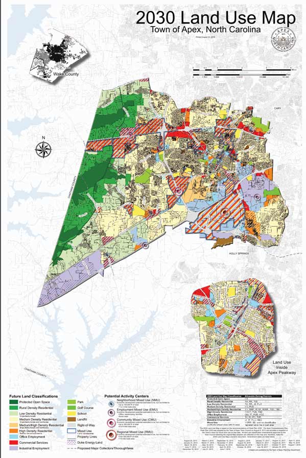
The first principle that I noticed was color. This map uses color to distinguish not only the different types of land and their proposed uses on a map, but also to separate the Town of Apex from the surrounding towns and counties. The surrounding towns are mostly grey scale and do not distract from the focus. The legend at the bottom of the map uses color as its primary source of distinction among the variety of different land uses. This legend tells us how to read the color coded map above.

The data below the map consists of a legend and description of purpose. These texts and graphics are aligned to make it easier to read left to right. Most of the data is left justified with a few subsections being center justified. Overall the alignment of the data allows for a faster read and better understanding, than if it where all meshed together.

The data on this map is separated into chunks, to allow for information to be more easily identified and digested. We can easily see what is important and how to read the map. There are three textual based chunks and three map/graphical chunks of data.
The textual data is split between the title, legend, and description/purpose of the map. In the top right corner is the title of the map, letting us know its general purpose. At the bottom left of the map is the legend that tells you how to read the color coding. To the bottom right is a description of the maps purpose and additional data.
The graphical data, the maps, are separated into three chunks. The first chunk shows a view of Wake county, where Apex resides. The second is the Town of Apex, and the breakdown of the different land uses. Finally, the third shows an expanded subsection of Apex that the map designers felt the need to call out.
One of the problems with this chunking, is that the three maps are layered over a larger map. This causes confusion as to whether the three maps are part of this background map or their own separate piece. To add to this confusion is the fact that two of the three maps are actually separate, while the Town of Apex map is part of the background. Wake County and Land Use inside Apex Peakway are a county perspective and a zoomed portion of the Town of Apex respectively. This layering could cause confusion to someone outside of Apex and Wake County.
Dear Joe thanks for sharing your hometown, glad to finally see it on a map. 🙂 You are correct with the overlay of multiple maps on a bigger presentation, and I wonder what would you do differently to solve this issue as a designer. One idea I can think of is progressive disclosure (which I also saw from other posts: https://sites.uci.edu/in4matx282f18/informations-part-2-christine-benedict/). I think the aviation maps are probably more complicated than the landscape architecture example. I would imagine using separate maps to capture the different counties and regions is probably a better idea.