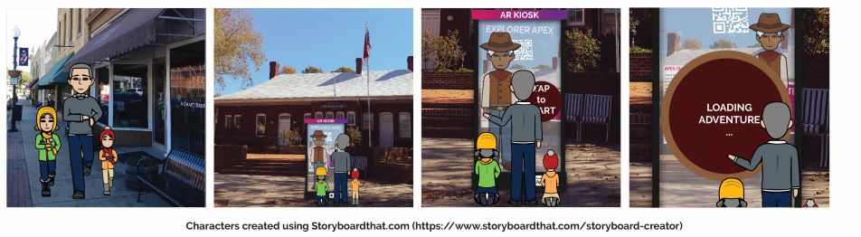
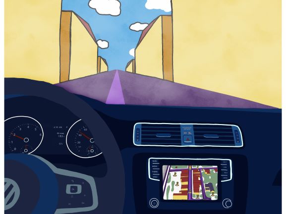
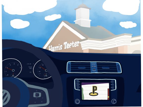
It’s a brisk Saturday afternoon and Mark has his two kids with him. He agreed with his wife, they needed some fresh air. Both kids had been restless today. They walked down the sidewalk of Salem street looking at the shops lining the historic district. He wanted to go to a coffee shop and perhaps get the kids some hot chocolate.
As they walked, Mark noticed a digital display in front of the chamber of commerce. A Cowboy avatar waved and smiled. “Let’s check this out,” he said to his kids. They walked over to the augmented reality kiosk. The kids instantly begin to touch the display and play with it. Mark was annoyed at first, he didn’t want them to break the display. But, almost immediately he realizes from the interaction that this was designed for kids to play with.
“Would you like to go on an adventure and explore history,” asked the friendly cowboy? “YES,” Screeched the four-year-old boy. Mark feels hesitant but decided to see what this is all about. He taps start adventure.
PROJECT: Augmented Reality (AR) experience, transporting users through the historic timeline of Downtown Apex, NC.
LOCATION: Historic Downtown Apex, NC
CLIENT: Apex Historic Society
OVERVIEW
An augmented reality app, allowing users to see historically relevant information about the site. Overlays will include both information about the town and photo-realistic historic models of past timelines. Users can take a walk downtown in the 1800s, to see the devastation of one of Apex’s most infamous and destructive fires. Additionally, the design should allow toggling between the present and various periods of the past. The timeline may also integrates plans of future developments, to allow residents to see what Apex may look like in the days to come.
OPTION TWO
PROJECT: Historic Scavenger Hunt & Graffiti tagging AR Experience
LOCATION: Historic Downtown Apex, NC
CLIENT: Apex Historic Society
OVERVIEW
An augmented reality app, allowing users to search and discover historic buildings. The design encourages users to take the time to explore the town through a scavenger hunt and appreciate the numerous historic structures. The town has seen tremendous growth in the last couple of years and has become a hot spot of urban development. We propose an augmented reality experience that will facilitate creativity for adults and kids of all ages. A highlight of this experience is marking/tagging sites discovered (Graffiti). A scavenger hunt game combined with 3D graffiti tagging allows users to express their creativity while bringing awareness to the past.
OPTION THREE
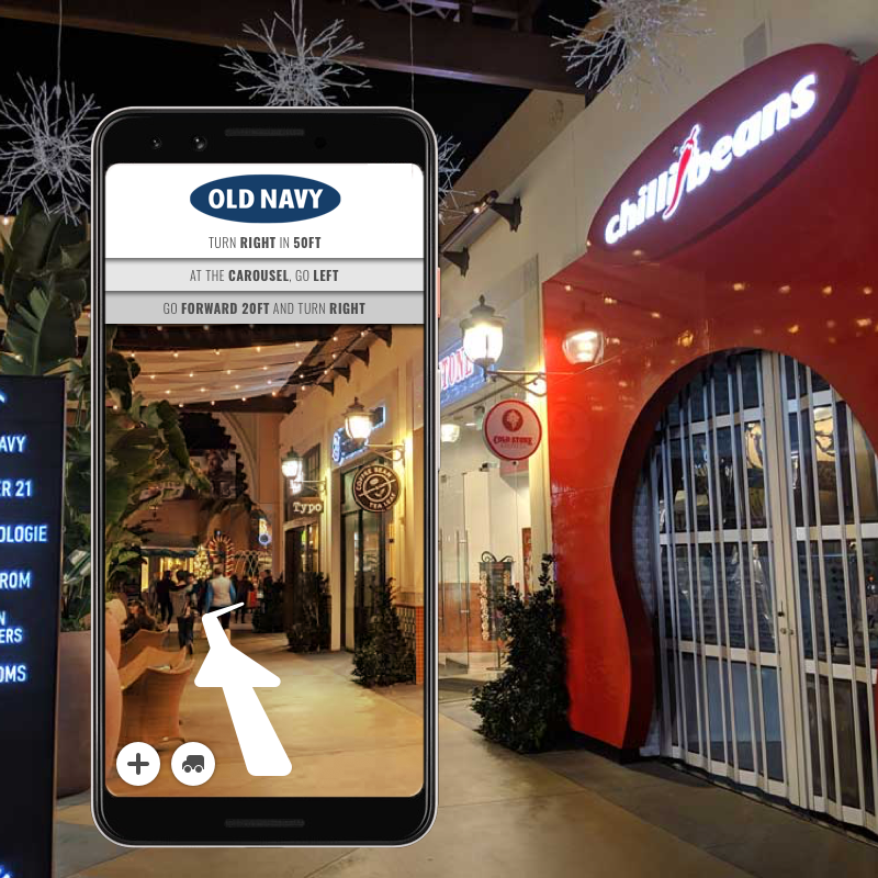
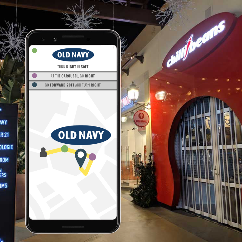
PROJECT: Augmented Reality (AR) navigation tool for a major retail and entertainment center.
LOCATION: Irvine Spectrum, Irvine, CA
CLIENT: The Irvine Company / City of Irvine
OVERVIEW
A multi-use navigation app, helping users maneuver through the massive center. Through the app, users are able to plan a trip and then navigate to the nearest parking, as well as find the fastest route through each location. Users may navigate via an augmented reality experience – using their phone’s camera – in which the navigation is overlaid onto reality with arrows and pathways leading the way. Users may also switch to a more traditional map, in which their live route is tracked via an on-screen map. The app has potential for discovering sales, new locations, hotspots, parking, advertising, etc.
I navigated my neighborhood in the process of creating my Psychogeographic Map. Fall has hit, and there was a cold and biting wind throughout the walk. Many of the elements of fall stood out to me as I wandered the neighborhood, following the arbitrary directions prescribed by the assignment. I found myself hearing more sounds than my standard walks. The rustling of the leaves, and the cool breeze blowing through the trees. I felt that the assignment helped me focus my senses. The sound of my neighbors mowing their lawns on a Saturday afternoon, or sanding down a wood project.
By following the directions, I discovered a new path that cut across the neighborhood. The experience definitely resulted in me learning more about my environment than a more passive walk might. I made it a point to not be interrupted by technology. I jotted notes down and made observations, that had gone unnoticed in the three years I had been living hear. It was nice to get out of a routine, and experience a familiar place in an alternate way.
A sign I hate and a sign that I don’t hate. I didn’t find a sign I loved, but I found one I don’t hate.
A SIGN I HATE
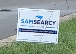
I decided to choose Sam Searcy’s campaign sign as the sign I hate for three reasons. First, the font size chosen for the majority of the sign is too small to read while driving, or even just walking by. Second, the propositional density of this sign is extremely low. He has redundant information that does not provide any substance. And third, the sign uses two hues of blue that seem clash.
I have included small versions of these pictures to give you the sense of what a viewer might see when driving by and plus “Keep your images small.”
Overall, my biggest problem with this sign is how many graphics and lines of text the sign employs, only to tell you Sam Searcy is running for NC Senate. Surely, a simpler sign could convey the same info with a bigger impact resulting in a higher PD.
A SIGN I DON’T HATE
One of the reasons I don’t hate the Harrison for Sheriff sign is their choice of colors. The dark brown background, the gold graphics, and clean white lettering help it stand out among the other political signage. This is good, because Harris is running for Sheriff, and this sign oozes Sheriff. Perhaps a little cliche in color scheme, but it gets the message across. Last name is in clean bold letters that are easy to read from a distance. There are contrasting colors that work well together, and the addition of the Sheriff’s badge makes the sign feel more official. It has one message, and it conveys that message with a minimal amount of fuss.
Welcome to Apex, originating from a railroad station chartered in 1854; Apex is aptly named for being the highest point on a 30 mile stretch of the Chatham Railroad. Since it’s incorporation in 1873, Apex has grown into one of the top places to live in the United States. Money Magazine ranked it #14 in 2007, #9 in 2013, and #1 in 2015. Despite these claims to fame, Historic Downtown Apex has been able to retain much of its character since 1912, after two fires caused the town to turn to fireproof brick designs. The town is listed, by the National Register of Historic Places, as a quintessential example of a “turn-of-the-century railroad town” (Apex).
tl;drMy site is the historical downtown region of a town called Apex, with its origins in the railroad industry.
Apex’s origins are in the railroad ( Which is still in use)
DOWNTOWN APEX WALK-THROUGH
HISTORIC ARCHITECTURE
Much of the charm of Historic Downtown stems from the site’s architecture. Many of the brick businesses were built around 1912, however, I suspect some of the wood houses to be older. My knowledge of architecture is limited, but I have tried to catalog some of the more unique buildings at the site. The history of these buildings helps sell Apex as a quaint town, despite the massive developments that are popping up in the surrounding area. There are two main occupants at the site, residents and businesses. I would argue that historic architecture, businesses, and residences are three separate forces.
tl;drHistoric downtown has some cool old buildings.
Historical Downtown is filled with thought provoking architecture
Influences of Apex’s railroad origins are present among the architecture
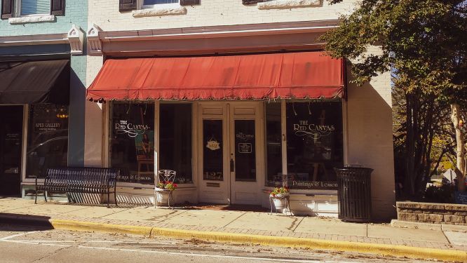
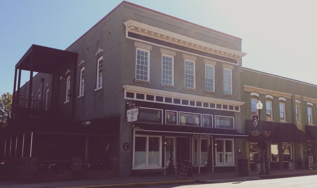
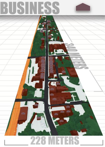
BUSINESSES
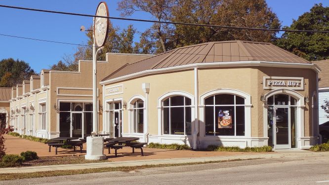
Many of the buildings along Salem Street, the road that runs through downtown Apex, are businesses. These businesses include coffee shops, clothing stores, and art studios. Not all businesses are in historic buildings, it is therefore necessary to be able to differentiate between which buildings are both a business and a historic site, and businesses that have no historical relevance in the context of Apex.
tl;dr There are many businesses in downtown, while the majority are inside of the historic buildings, there are exceptions.
Art Studio in Apex’s Historical Downtown region
Businesses nested between train tracks and Salem StreetNot all businesses are located in historically relevant buildings.
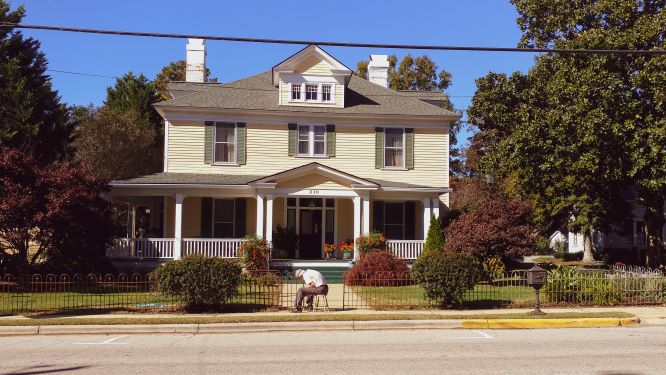
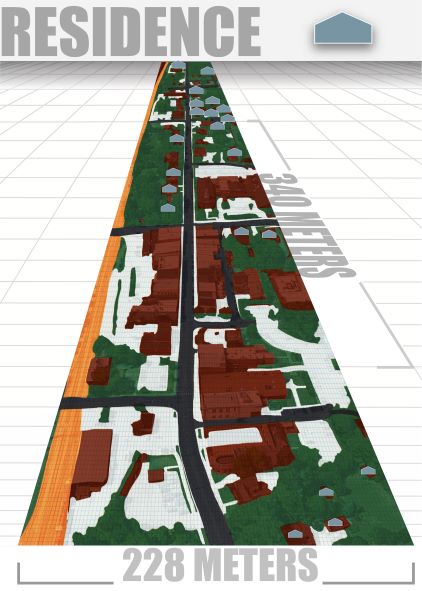
RESIDENCES
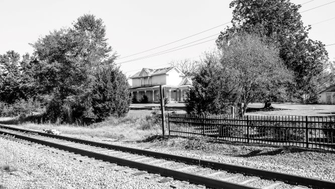
While many of the buildings at the heart of historic downtown are businesses, there are residences adjacent to Salem Street. As you get closer to a cluster of historic buildings, you start to see less residences and more businesses housed in historic buildings. This dichotomy is easier to understand in the maps below. Many of the residences appear to be currently in use. There was only one house that was obviously abandoned, featured as the first picture of this post. Additionally, I only noticed a single modern house in the vicinity of my site. Unfortunately, my lack of architectural knowledge prevented me from further distinguishing between the different eras, style, and design.
tl;dr Businesses are clustered at the center of historic downtown, with residences on either side.
Historic Residence OneHistoric Residence TwoHistoric Residence ThreeHistoric Residence Four
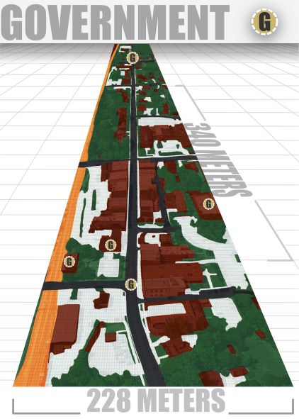
GOVERNMENT
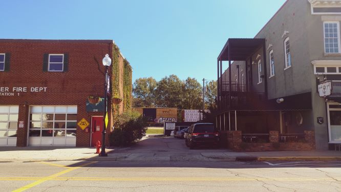
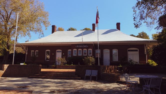
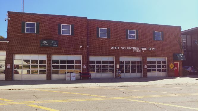
Government is quite prevalent in downtown Apex; the chamber of commerce, police station, and volunteer fire station all show signs of an organized community. There are additionally street signs, street lights, cross walks, utilities, a parks and recreation department indicating the presence of government. The preservation of the town and the historic buildings also further implies an outside influence protecting the site.
tl;dr Government buildings and signage are prevalent at the site.
Apex Chamber of CommerceApex Volunteer Fire DeptartmentWhite building (right) originally the town hall, transformed into a cultural center
TRANSPORTATION
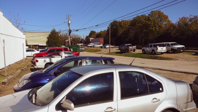
One of the first forces I noticed, while walking around my site, was transportation; numerous parking lots, parked cars, moving cars, speed cameras, sidewalks, railroad cars, railroad buildings, and train tracks all indicating that transportation was important to this site. The railroad has its roots in the founding of the town as mentioned above, and its current use can still be encountered on a daily basis. The vehicle traffic is impacted by Salem, the road that runs through downtown, being used to cut across Apex. Thus, the traffic is often a mix of those looking to visit the historic site and locals trying to get to their next destination across town.
tl;drDowntown Apex, like every town, is impacted by cars and parking; a railroad runs parallel to the site.
Train Tracks and Vehicles Parked
Train Caboose reflecting Apex’s Heritage
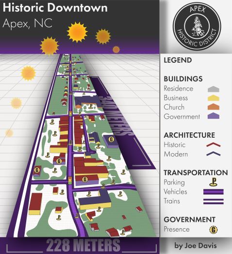
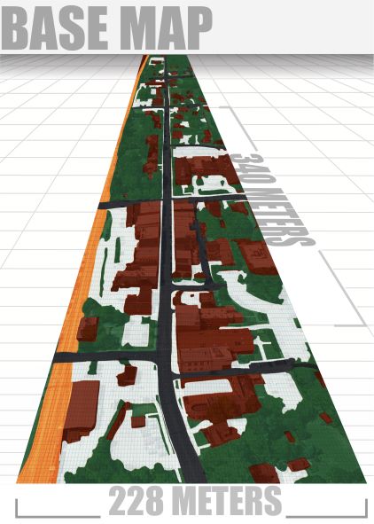
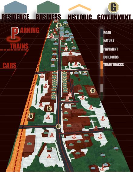
FINAL MAP & HISTORY OF REVISIONS
My major challenge with this project was in designing a perspective map that could show information in both a clear and aesthetically pleasing manner. I originally designed this with a detailed background base map. However, it became clear that this made it difficult to differentiate between the base map and my icons. Reducing the opacity of the base layer made the icons clearer, but eliminated the 3D appearance. Thus, I decided to make one final major edit. I also updated my mappings of residences and business, and made a few corrections.
I included my mapping of the sun, though this will soon be outdated, and I updated most of the graphics in the mapping to appear 3D. This update eliminated the need for the background map. It also allowed me to greatly reduce my use of icons, as the 3D buildings themselves now map their purpose. I’m still unsure on the aesthetics, but I am happier with the clarity of the map. I also made a fake logo, with a black and white vector version of my map in the center; it points to Apex, a play on both the word and the slogan “the peak of good living.”
tl;drI made a final major update to my map, it features 3D buildings and a mapping of the sun.
Base Map – Revision 3Transportation – Revision ThreeHistoric – Revision ThreeResidences – Revision Three
Business – Revision ThreeGovernment – Revision Three
REVISION TWO – OBSOLETE
All Forces – Revision Two
REVISION ONE – OBSOLETE
All Forces – Revision One
DATA
Information on the history of the Apex was pulled from Apex’s website. Proportions and dimensions of maps pulled from google maps. Earlier revisions, excluding the final, used stitched images of google maps, satellite view/perspective to provide additional context and depth to the project.
SOURCES
Apex North Carolina, www.apexnc.org/225/Our-History. Accessed 20 Nov. 2018.
Apex, NC Google Maps, 20 November 2018. https://www.google.com/maps
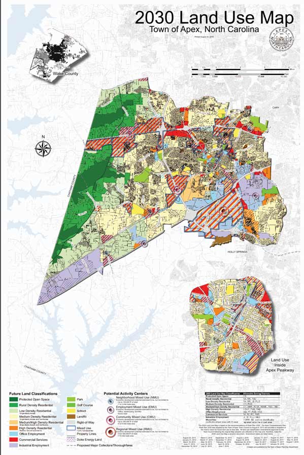
In searching for a map, I decided to see what was on the webpage of Apex, the town I’m living in. The small town is currently undergoing considerable growth, with major developments popping up over the last couple of years. The town currently has posted a map titled, “2030 Land Use Map – Town of Apex, North Carolina.” As you can imagine the map describes the uses of certain sections of land.
The first principle that I noticed was color. This map uses color to distinguish not only the different types of land and their proposed uses on a map, but also to separate the Town of Apex from the surrounding towns and counties. The surrounding towns are mostly grey scale and do not distract from the focus. The legend at the bottom of the map uses color as its primary source of distinction among the variety of different land uses. This legend tells us how to read the color coded map above.
The data below the map consists of a legend and description of purpose. These texts and graphics are aligned to make it easier to read left to right. Most of the data is left justified with a few subsections being center justified. Overall the alignment of the data allows for a faster read and better understanding, than if it where all meshed together.
The data on this map is separated into chunks, to allow for information to be more easily identified and digested. We can easily see what is important and how to read the map. There are three textual based chunks and three map/graphical chunks of data.
The textual data is split between the title, legend, and description/purpose of the map. In the top right corner is the title of the map, letting us know its general purpose. At the bottom left of the map is the legend that tells you how to read the color coding. To the bottom right is a description of the maps purpose and additional data.
The graphical data, the maps, are separated into three chunks. The first chunk shows a view of Wake county, where Apex resides. The second is the Town of Apex, and the breakdown of the different land uses. Finally, the third shows an expanded subsection of Apex that the map designers felt the need to call out.
One of the problems with this chunking, is that the three maps are layered over a larger map. This causes confusion as to whether the three maps are part of this background map or their own separate piece. To add to this confusion is the fact that two of the three maps are actually separate, while the Town of Apex map is part of the background. Wake County and Land Use inside Apex Peakway are a county perspective and a zoomed portion of the Town of Apex respectively. This layering could cause confusion to someone outside of Apex and Wake County.
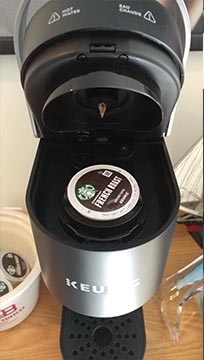
A new Keurig coffee maker is my choice for a design I love. Not only does my new coffee maker provide a delicious beverage full of much needed caffeine, It also has well designed features for ease of use. There are numerous affordances that give the user clues on how to operate it, even if it is their first Keurig. There are both visual and auditory feedback, letting the user know that the machine is working and what stage of the coffee making process the user is in. There are also naturalmappings and constraints that make for a pleasant experience.
Levers/lids afford lifting
Affordances such as the shape of the lever, on the front of the machine, and the protrusions on the water tank lid indicate to the user that these are movable parts. Each affords lifting. Once, you open the lid to the machine, there is spot for the K-pod.
Keurig K-Cups are physically constrained, preventing them from being inserted incorrectly
A physical constraint prevents the K-Cup (a plastic cup filled with coffee) from being placed in the machine the wrong way. When you lower the lid, tactile feedback indicates that the pod is being opened. A visual indicator gives feedback to let you know that you can now brew a cup of coffee.
The water tank has a direct naturalmapping to the amount of coffee your machine will make for you. What you pour in, is how much coffee you get out. When you push the giant K button on the machine, it immediately gives you feedback that the process has begun. The water tank empties, and the indicator light pulses to let you know things are working as intended.
There is a platform that affords holding objects, and your mug fits perfectly on this spot. The brewing process ends with auditory feedback of the machine pouring hot delicious coffee into your cup.
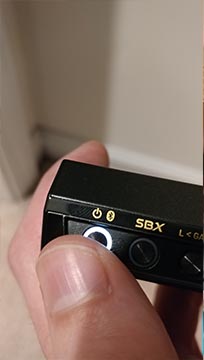
A DESIGN I HATE
A design I hate is my Creative E5 24 bit DAC (Digital to Analogue Converter). This little black device is loaded with top of the line features and specs that would satisfy the desires of most audiophiles. However, there is no way for me to enjoy these features because of two major flaws with how the designers built the hardware. The flaws are directly related to how it gives you feedback.
Creative DAC
The device is battery powered and marketed as a way to take your audiophile needs on the go. This basically allows you to use high end headphones with your smartphone or laptop. You stream your music to the DAC via Bluetooth or plug it in directly via USB. The device converts the digital signal into an analogue signal that your headphones can understand. To control the E5, there are buttons as well as lights on the side. These lights are supposedly there to give you visual feedback and let you know when it is on, charging, and in Bluetooth pairing mode.
The device has been powered on as indicated by the white light
The power button toggles the E5 on and also serves as a way to activate the Bluetooth pairing mode. From the start there are problems. Push the power button for a couple of seconds, the E5 turns on. There is a small amount of tactile feedback as the button pushes in. Hold it for a few more seconds, you switch it into Bluetooth pairing mode. Hold the button even longer and it turns off again. This is a convoluted design as the mode that you are in depends on how long you hold the button. There is poor visual feedback, which fails to let you know what mode you have entered. This visual feedback, which is a different color of light, is insufficient because it is covered by your finger when you press the button. The buttons are smaller than even a child’s finger. Awkwardly, you will try to push the button without covering the light. What’s more, because there is only a small moment of time between switching modes, you will often have to try multiple times to get the device either to enter the correct mode, often overshooting into the one after. Additionally, I don’t understand having a timing element to switching between modes. I have many ideas on how to improve this design, but we need to move things along.
Once you have powered the E5 on and get it connected you will run into even more feedback problems. There is a volume knob on the front of the DAC to allow you to control the volume. However, there is no physical constraints on
Volume knob has no constraints or visual feedback to indicate what level the volume is being set to
the knob, allowing endless scrolling. There is also no feedback (visual or otherwise) to indicate what volume the device is currently set to. Pair this with the fact that you are intended to use this with multiple devices, means that the volume can easily be switched to different levels depending on the source of the audio. Initially, I would accidentally blast my ears with music on near maximum volume because of this problem. Not only could this potentially damage your ears or headphones, but is an overall unpleasant experience. This expensive little device now sits on my desk as a paper weight. Poor design inhibits its most basic functions and eliminates the possibility for a good experience.
I went to an older theater in Raleigh NC. The most striking feature of these seats is how they are different from modern cinema seating. Most modern theater seating tries to emulate your home recliner (e.g., La Z boy furniture). They are very plush, and the materials are supposed to ooze comfort. This seating arrangement was quite different, made of fabric with a small amount of padding. The seating were nostalgic of older theaters I went to growing up, but it was also kind of old and dirty. The seats didn’t squeak and were easy to access. They were not very comfortable, and I found that I had to readjust my position multiple times to prevent soreness and fatigue.
DRIVER’S SEAT
I drive a Volkswagen Jetta for my daily commute. The most striking quality of the driver’s seat is the red stitching. The stitching is there to suggest a sense of sportiness. It doesn’t actually make my Jetta sportier or the seat more comfortable. This is my seat for my commute to and from work (approximately 19 minutes each way). I like my Jetta and find the seats more comfortable than any of my previous cars. I enjoy driving and look forward to sitting in these seats. One problem I have is with the black “leatherette/fake leather” material that these are made of. They become very hot during the very warm North Carolina summers and uncomfortably cold during the winters.
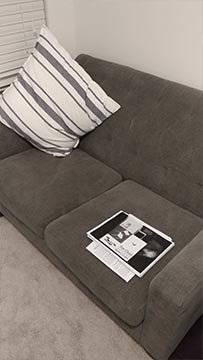
HOME OFFICE COUCH
I bought my tufted loveseat for my home office. The most striking feature for me of this couch is the minimal amount of materials used to make it. I would assume this allows for it to be made rather cheaply in comparison to something like a recliner. The couch took up very little space when it arrived and I assembled it at home. I purchased this loveseat for reading, writing, and a place to comfortably perform general work. It functions very well for long periods of reading and working on my laptop. Overall this is a very comfortable seat; however, after about two hours, I start to feel fatigue from using it.
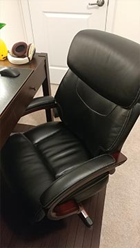
DESK CHAIR
The most striking feature of this chair is the materials used. I didn’t need a chair with leather and wood, but when looking for office chairs the better materials both consciously/unconsciously took precedence over more ergonomic options. This is my home office desk chair. I bought this chair because my old college one was giving me extreme back pain. The chair functions well, I am able to sit in it for several hours before becoming uncomfortable. It is rated for 10 hours of sitting, but I would say it is able to get me through 5 comfortably.
LOFT CHAIR
The most striking feature of this chair is the way it feels when you sit in it. There is no support, underneath the chair towards the back. This causes the chair to bounce when you sit down. This IKEA chair is made of wood and has a thin pad that goes over the top. It is in the loft of my house. I try to avoid sitting in this chair, but when there are guests over it provides backup seating. My cat uses it more than I do. This chair is frustrating. It is easy to get into, but rather difficult to get out of because of its odd shape and design. It is uncomfortable to sit in and has a weird bounce to it.
DINING CHAIR
Simple mass-produced dining chair purchased from IKEA. The most striking feature of this chair is that is light, easy to move and very simple in design. It is located in my dining room, though I rarely dine there. I don’t find this chair very relatable as I barely use it. It provides a place to sit but is not very comfortable for an extended period of time. I don’t have any strong feelings about this chair since I don’t use it that often. It performs a function of providing a seat at the table, but nothing beyond that function. It is not a particularly pleasant design. It is definitely not a work of art.
STARBUCKS
I find the fact that this chair is made of wood to be its most striking feature. It is simple and easy to clean. It is light and easy to move. This is a wood chair at a local Starbucks. I go to this Starbucks frequently with friends and family and have sat in this chair several times. It performs its function as a place to sit but does not exceed that function. It is plain and boring. It is uncomfortable after a few minutes of sitting, but I don’t have any negative feeling towards this chair. It serves it’s purpose well and adds to the atmosphere of the Starbucks.
Hick’s Law describes the relationship between response time and the number of choices available. This principle states that the more choices available the longer it will take the user to decide. It best relates to situations where there are a set of available responses to a specific event. An event happens, it takes the user (a) amount of time to decide what the event means and that they need or want to act. They are presented with (n) number of possible options to take in response to the event. This relationship only applies to simple decision making and not complex interactions, such as requiring analysis or extensive reading. In order to ensure that this principle is used correctly, avoid using it for situations where complex decision making processes are required (Lidwell).
Hick’s Law doesn’t speak to how complexity is hidden away. It looks at the relationship between the number of options available and the response time to make a decision. This is assuming that one of the options available is relevant to the current situation(Lidwell).
Hick’s Law can be represented as the following equation:
RT = a + b log2(n) (Lidwell)
Where:
RT = response time
a = time not related to decision making
b = constant (.155 seconds)
n = equally probable alternatives (Lidwell)
Example of the principle cited by original sources
“The time for a person to press the correct button (R,G, or B) depending on the color of the light (red, green, or blue) increases with the number of possible colors” (Lidwell).
RGB Buttons (Lidwell)
Example of the principle not cited by original sources and located online
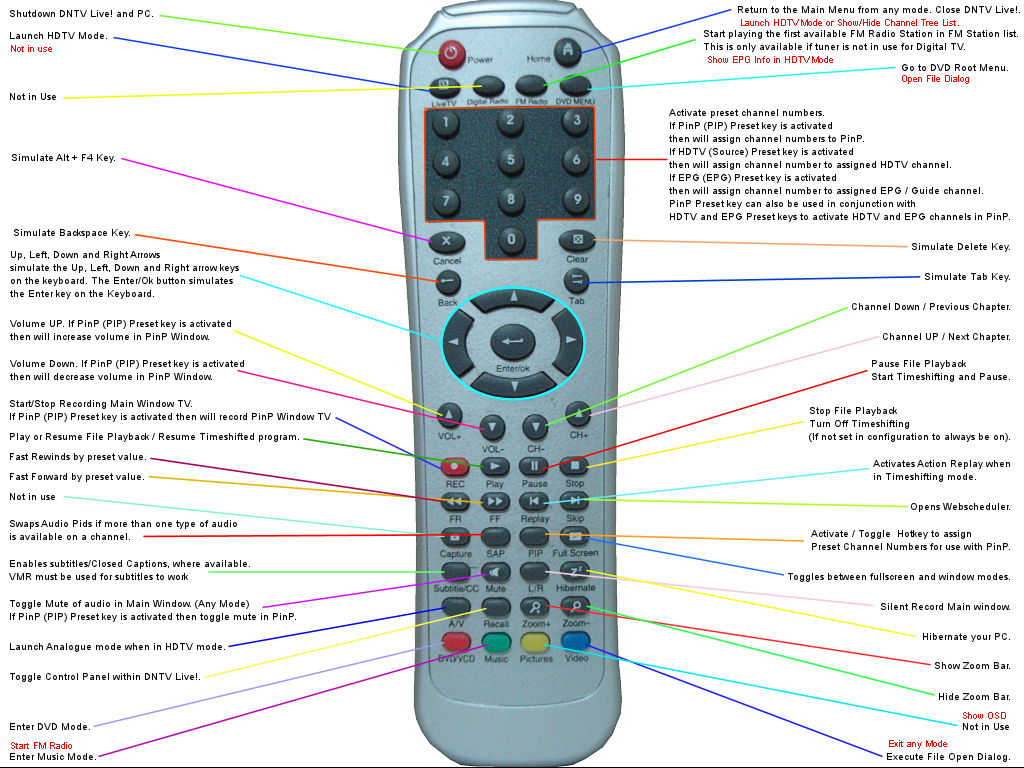
One application of Hick’s Law is in remote controls. Numerous buttons, many that were never used by users plague these remotes. Response times for these devices would be much slower than newer alternatives. New remotes for Roku devices and Apple TVs have far fewer buttons, thus increasing response time.
TV Remote (Nikolov)
Example of the principle not cited by original sources and not located online
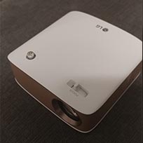
Consider two different household projectors, one with two controls (LG) and one with ten (Optima). The LG projector has a single power button and a control for focus. The Optima projector has eight buttons, and two different adjustment controls. The user decides they want to turn on the projector. The decision-making process does not require any deep analysis or heavy reading, so Hick’s Law is applicable. The black projector has simply more buttons, and thus increases user response time.
Home mini LG Projector (Image by Joe Davis)Optima Home Projector (Image by Joe Davis)
References:
Lidwell, William, et al. Universal Principles of Design. 2010. Accessed 2018.
Affordances describe the relationship between a person and an object. The properties of the object and the abilities of the person or agent acting on the object determine whether the object affords or “is for” a purpose (Norman). This means that the object has a property, the person can perceive this property, and the person has the ability to take an action as a result of perceiving it. Affordances help us understand how to use an object before we begin to interact with it.
It is important to consider the entire equation when examining affordances. If the person, or “agent” as Norman puts it, does not have the ability to act, then the object does not afford that purpose. Stairs afford climbing up and down for those who are agile and can walk. However, stairs do not afford climbing for individuals in wheelchairs or who do not have the strength or ability to climb. In this example, the relationship between the properties of the stairs and the capabilities of the individual determined whether the stairs afford (are for) climbing. Conversely, if the stairs did not actually have the property of steps, they also would not afford climbing (Norman).
Choosing to look at affordances as a relationship may help in a better understanding of the principle. This idea is presented in Don Norman’s Design of Everyday Things. Universal Principles of Design describes the principle as objects being able to afford better or worse than others or to even negatively afford some action (Lidwell). Understanding affordances as a property in this context may add confusion to the overarching idea behind their use and purpose, which is why Norman’s definition was used as a source for this exercise (Norman).
Example of the principle cited by original sources
The door on the left has a handle that appears to afford pulling, even though a sign indicates otherwise. This affordance breaks the design because it falsely suggests how to use the door. The handle affords grasping and pulling; however, the door does not have the physical property of swinging out that direction. The flat plate on the second door, to the right, is an affordance that affords pushing. A property of the door to be pushed open matches, thus this door would allow us to understand how to use it with ease.
Handles and plates as affordances (Lidwell)
Example of the principle not cited by original sources and located online
An affordance of these scissors are the holes in the handle. These holes afford inserting something into them such as your fingers. This affordance helps us understand how to use the product with out actually picking it up. Physical constraints and natural mappings make this an excellent design (Scissors).
Scissors (Scissors)
Example of the principle not cited by original sources and not located online
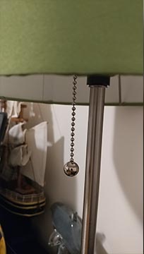
The ball and chain on this lamp are affordances that allow us to understand how to use the lamp, even if this is our first interaction. The metal ball is easily grasped and the pair affords pulling.
Home office lamp (Image by Joe Davis)
References:
Lidwell, William, et al. Universal Principles of Design. 2010. Accessed 2018.
Norman, D.A. (1988) The Design of Everyday Things. New York: Basic Books
You’re in a new car, and suddenly there is a torrential downpour. What do you do? Do you grab this shiny knob or push that red button. No. The answer is you do nothing. Automatic windshield wipers are a technology that seems to have snuck into new cars without a whole lot of fanfare. They have been designed to work when you need them and disappear altogether when you don’t. They magically find that sweet spot where the wipers whisk away the water but don’t screech across the windshield when the rain is all gone. You no longer are reaching for controls haphazardly, dramatically trying to figure out how to change the speed only to turn on the wiper in the back. It rains; they turn on. It stops raining; they turn off. It is a simple and elegant design.
Automatic Windshield Wipers
When the car in front of you hits a puddle and splashes water into your line of sight, the automation kicks in and calmly swipes away the hazard. It is a simple but luxurious design. Why this inspires me is because it shows that sometimes good design can be invisible. It takes action to help us in our daily lives and doesn’t add to our cognitive burden. Automated windshield wipers help us drive safely, while at the same time eliminating the difficulty of manually controlling their function.
Of course, the specific implementation of these wipers will be slightly different depending on the manufacturer, and in this particular case, I have only experienced them in Volkswagen cars. They designed the windshield wipers to be automated by default, but you can manually override them at any time. They are ultimately there to support you in your driving adventures.