
A sign I hate and a sign that I don’t hate. I didn’t find a sign I loved, but I found one I don’t hate.
A SIGN I HATE
I decided to choose Sam Searcy’s campaign sign as the sign I hate for three reasons. First, the font size chosen for the majority of the sign is too small to read while driving, or even just walking by. Second, the propositional density of this sign is extremely low. He has redundant information that does not provide any substance. And third, the sign uses two hues of blue that seem clash.
I have included small versions of these pictures to give you the sense of what a viewer might see when driving by and plus “Keep your images small.”
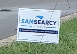
Overall, my biggest problem with this sign is how many graphics and lines of text the sign employs, only to tell you Sam Searcy is running for NC Senate. Surely, a simpler sign could convey the same info with a bigger impact resulting in a higher PD.
A SIGN I DON’T HATE
One of the reasons I don’t hate the Harrison for Sheriff sign is their choice of colors. The dark brown background, the gold graphics, and clean white lettering help it stand out among the other political signage. This is good, because Harris is running for Sheriff, and this sign oozes Sheriff. Perhaps a little cliche in color scheme, but it gets the message across. Last name is in clean bold letters that are easy to read from a distance. There are contrasting colors that work well together, and the addition of the Sheriff’s badge makes the sign feel more official. It has one message, and it conveys that message with a minimal amount of fuss.
