I have to preface this by noting that my neighborhood seems to only be interested in a small number of candidates which left few options. Of these scarce options, the following, which are not particularly strong or poor, are my choices.
Sign I Like:
Although I wouldn’t say I love this sign, I like it for a couple of reasons. First, the use of color. The designer uses red to highlight “Re-elect” and “State Assembly” which are both important for voters to know. Second, the letters of his name and background have a good figure-ground relationship, creating contrast and drawing attention to the name. A nice addition to the sign is the QR code to the campaign site. Although this would only be useful for someone on foot that could scan the code, it’s something not commonly seen on campaign signs.
Sign I Dislike:
So, this sign isn’t terrible. It has a nice hierarchy, identifying the name first, then the election, and third the three principles of his campaign. It chunks his campaign into three easy to remember groups; “Success”, “Safety”, and “Stability”. I don’t, however, believe that the typeface choices are suitable. They’re pretty “old school” and I would argue that more modern typefaces would be more appropriate. Possibly the biggest problem with this sign though is its poor visibility from the street, the subtext is too small to be legible unless you’re standing right in front of the sign.
So I put this off for two weeks because, to be honest, I can’t stand election signs. Before I tell you why, I’ll share one I dislike and one I think is probably okay.
This sign looks like someone just opened a Word doc, changed some font sizes and colors, and slapped in a “vote” clipart. Even though there’s not a lot of content, it feels crowded and all elements except for the candidate’s name are illegible when driving past. The use of an inverted pyramid doesn’t make a big difference because the sign itself is so boring. There are no decorative patterns or contrast elements in the background or around the edges, which makes it feel like a pretty low-effort, low-budget sign.
This one’s cute. There are some creative elements going on here, like the J that mimics the stars and stripes of the American flag, and the check mark in the “O” in vote. The website link and “VOTE” text are both calls to action that guide the viewer to the next step. This sign uses the same colors as the previous one, but employs them much more effectively, creating symmetrical areas of contrast for the text above and below. This highlights the secondary text while framing the primary text. My only concern with this sign was that I wasn’t sure whether the candidate’s last name was “Oropeza” or “Joropeza”. The placement would have been a clever touch if his last and first name both started with J.
Okay, so I have a confession. I found something that I like better than either of these signs. It’s an election flyer that was left on my doorstep. It’s not especially well-designed, but it contains the one thing I actually want from an election sign: context.
I know I’m being a bit curmudgeonly here. This is a really clear case of “you are not the user”, right? Who in their right mind would prefer a flyer with paragraphs of text over a simple, brightly colored sign?
Raise your hand if you’ve ever googled someone’s name based only on an election sign. I didn’t think so. I guess my biggest problem with election signs is that they don’t function alone. They really can’t, because–on their own–they’re just encouraging you to remember a name completely without context, which is kind of the opposite of informed voting. In some cases, they’re intended to supplement TV ads and other marketing materials, a reminder or memory trigger for those other pieces of media.
But in local elections, for instance, it’s unlikely that you’ll have seen the candidate mentioned anywhere outside of that one sign. So why is the sign so devoid of anything relevant to the job? You wouldn’t hire someone based on the way they write their name, and that’s essentially what most election signs are. Some signs contain a one-liner on a key issue. For instance: “increase STEM funding” on a school board sign. I’m still left with a lot of questions, but at least it’s a jumping off point.
I understand why election signs are so basic: they have a lot of constraints. With a limited amount of retail space, certain information has to be prioritized. But I see very few people thinking creatively in this space, and most signs feel like copies of the “generic election sign”, with no thought to why voters should remember and vote for a candidate. (Google image search “election sign design” if you want to stare into the void of mediocrity.)
I know I sound harsh. For local elections especially, I know that budgets and skill sets are limited and I don’t expect revolutionary design. However, everyone–from local candidates all the way to presidential candidates–seems to assume a static set of rules for election signs, in a way that we don’t see, for instance, with websites or apps, for which design standards and possibilities are constantly evolving. Why is it, then, that we take election sign rules for granted?
What do you think, are election signs good enough? Are they working? If you could do anything with this medium, what would you change?
This election sign is the perfect example of the Ockham’s razor design principle. It is simple, to the point, and includes basic details that are highlighted. Notice the “for” is just hiding on the “D” in “LUMBARD”. It is very clean and minimalistic. The consistency in font makes it super clear to read. The border frames the whole sign and the line around his name ads a nice touch to tie it all together. There’s great choice of colors with the white text and border, dark navy background, and orange for his last name. The contrast allows his name to stand out. Although this is the sign I chose to love, the one I hate is more effective in sending emotions than this one. This sign only gives the viewer his name and what he’s running for. There’s nothing that speaks to you in this sign in terms of emotions.
HATE
This sign is very bland. It’s black and white. There are no colors to make it more appealing. The text is inconsistent when it comes to font (WAGNER’s font is different than the rest) and the exclamation mark is much smaller than the text before it (NOT US). However, it is consistent in capitalizing every letter on the sign. One thing it managed to do is get emotion out with the dislike icon and the size of the words “NOT US”. It’s clearly anti-Wagner. This is why I think this sign is more effective in getting an emotion or “stance” out than the sign I chose in the “love” category.
BONUS (I thought this was fun)
Why do these two look exactly the same, but are actually for two different people? How does that even happen? Is that even possible (I’m actually asking)? The colors chosen, the checkboxes, the font… every. single. thing.
Note: The signs do not reflect my political stance, but are chosen simply by their design.
When I first saw this sign, my immediate reaction was that I liked it. A lot. I snapped the picture and then went about the rest of my day. Coming back and looking at it, I can start to dissect what it is exactly that makes me like it. I think one of the largest design principles at play here is contour bias. Even the mountains have curves to them instead of all sharp edges, or a flat line beneath them. I very much like the way that the curves of the bottom of the mountains is echoed by the curve of the white lines, it gives the design a sense of unity and continuity. With the mountains and the lines, I think that the design principle of closure is also at play in this sign, because the green shapes are interpreted as being a whole entity – a mountain in this case. I also appreciated that the text in this sign was large enough to read the names, but did not make the design feel cluttered.
A Sign I Hate
Matt de Ferranti’s Campaign Sign
This sign, on the other hand, was my least favorite of all of the ones that I saw this election season. What first strikes me about this sign is the fact that the “Educator Approved” piece appears to be covering up a pre-existing design, which gives the feeling that the “Educator Approved” text was slapped on last minute and that it was not really incorporated into the design. I think that this makes the design, and therefore the sign, feel cheap and rushed. This is the design principle of Horror Vacuiin the real world – the cluttered appearance of this sign, with multiple lines of text and a design partially covered up by more text makes the sign, and thus its candidate, seem cheap and poorly planned. Interestingly enough, the candidate was there when I took the photo, and when I explained I was using it as a real life example to discuss design principles, he immediately started telling me the things that he would change about the design, including making the text for his last name bigger so it was easier to see from farther away, and re-positioning the “Educator Approved” text. It was interesting to hear that many of his thoughts overlapped with my initial ideas on why I had a negative reaction to the sign.
This bonus assignment was extra challenging for me, because I literally saw ZERO political signs anywhere in Los Angeles. In the course of two weeks, I’ve been to Beverly Hills, Koreatown, Larchmont Village, West Hollywood, Miracle Mile, Westwood, and The Beverly Grove… and there wasn’t a single lawn, window, or gate decorated with political signs. I never really gave this lack of political engagement much thought until this assignment… but now I’m keenly aware of it. I believe this bizarre anomaly may be due to some strict laws… but I couldn’t find anything on the internet to back it up. If anyone knows the reason why, please let me know in the comments section.
In lieu of political signs, I have decided to analyze email header graphics instead and think outside the box with what’s in my inbox.
Email Header That I Love:
This email header came from one of my organization’s email campaigns. I personally liked some of our graphic designer’s other designs better (they were a little less on the nose and more symbolic), but this is ultimately what our internal partner chose to use. The graphic overall is clean, modern, and well-balanced. The illustration of the hand placing a ballot in the box easily conveys the action of voting. The copy, “Your Vote Counts: A Ballot Measure Forum,” is simple and to the point.
Email Header That I Dislike:
At first glance, the email header seems amateur. The top copy, “Vote 2018,” is very blurry. After I saw that, I had a hard time taking the rest of the email seriously. The sub-headline and italicized supporting copy below “Vote 2018” is also not very inspiring. It’s too text heavy without any visual aid. I don’t like that the section is aligned centered while the “Vote 2018” is aligned left — it makes the whole thing feel unbalanced. The the typeface, spacing, and kerning also seems like it was created in a Word document and wasn’t given much thought. Overall, this header is very forgettable amongst a sea of political emails.
This sign for mayor is one of my favorites of all time. It even highlights one of the principles that I personally worked on for our list, the von Restroff Effect. With Its diamond shape rather than square or rectangle, and the firefighter cap on the top, this sign will be remembered long after the campaign ends. This sign actually won my vote, mainly because all the Phoenix Mayor’s were saying pretty much the same thing, and didn’t speak on any of the issues I care about, but that’s a different class.
Hate
This sign for school board is awful. Not because of how its organized, but because of its Color. For some reason, this pair of candidates decided that in order to stand out, they were going to use the exact same color as all the “NO” proposition signs. Prop signs have always historically been yellow when telling you to vote NO (see examples below), and been a whole range of colors for yes. (You can see somewhat below that right next to a sign is a red “yes” sign. What were these two thinking, “People will see this, and will vote ‘NO’ for us too!”???
I chose this one because it is most memorable throughout the other campaign signs. This campaign offers a simple layout and color palette and bold text. It has minimal information and elements, but gives you the idea and reason immediately. The white text on dark blue background stands out well even at distances. The small star in orange, which is complementary to blue, is eye-catching. I can see the idea of Ockham’s razor principle from the fact that the sign minimizes the elements and avoids unnecessary information that decreases its efficiency, especially in the limited space of the campaign sign.
Dislike
At first I liked this campaign sign because of its visual elements and different look compared to the other signs, but I noticed an odd hierarchy and pattern in this sign. First, the name of the candidate is not sufficiently prominent compared to other elements. There is no clear hierarchy, and it doesn’t lead my eyes to the most important information. Also many designs follow the F-Pattern because most people’s eyes will always start on the top left corner of the space. I am not sure if the campaign has decided to place the water drop icon in the left corner because they think that is more important than the candidate name. Also at the distances, the lightweight and unbalanced name placement is not easily recognized and the only thing I can see is water drop.
These are the signs that are near where I live, so I’ll be talking about the one for Maxine Waters, and Jason Gromski. I don’t love or hate most election signs, and still find myself indifferent to these two. I lowkey feel like most election signs have the same color scheme and use of their last name to take up most of the sign.
Let’s talk about Maxine Waters. It’s interesting to me that she uses a deeper, more navy blue and orange – neither the traditional shade or color that’s seen in Jason Gromski’s. What’s more important is the content strategy she chose – “Re-elect” in a small box separate from “Congresswoman”, and the phrase “She Fights For All of Us”. She is the most senior of the 12 African American women in Congress, so the choice in words reaffirm and establish her authority as an incumbent in the area. The area that she is running in is mostly made of minority ethnicities, so the phrase that “she fights for all of us” makes a lot of strategic sense, especially in this political climate where the President chooses to denigrate the very minorities she represents.
Visually, she uses a harsher, serif font, with the smaller font set against white. I find that there’s a lot going on here and it doesn’t look like she is using any gridded columns to figure out spacing and margins in the sign. In addition, “re-elect” is askew and quite small, making it difficult to read. Her name and her quote on the bottom is the most visible when driving past. Perhaps it doesn’t matter for her, since she is an incumbent with a long history or service.
Jason Grom is simply running for city council, but I find his sign to use the stereotypical blue/red colors that are bright (but not overly saturated). He doesn’t capitalize his name, and the font he uses is serif but has much more rounded/curvier edges, which speaks more relaxed, less formal, perhaps more relatable to voters. For the role he’s going for, it makes sense – it’s not a seat in Congress. His name is left-aligned, which helps for left-right reading, and the little quote beneath him is right-aligned. It was probably done to avoid the little bit of awkward empty space that would occur if placed right below the ‘G’ in his last name.
The black and yellow color choice definitely helps this sign stand out. It breaks through the noise by contradicting the typical mental model that political signs should be blue or red. The color choice is also employing threat detection – in nature, black and yellow typically signifies danger or poisonousness, as the two are often seen on bees, spiders, and snakes.
Black and yellow is also a common color combination for warning signs. In this way, the color choice is being used as a framing device – voters should act cautiously before voting for Katie Porter. The association with higher taxes is another negative framing device.
The framing is so persuasive that Katie Porter’s supporters felt compelled to add a clarification, hoping to alter the negative frame to a positive one (although in Orange County, it’s uncertain that proclaiming higher taxes on the rich will be seen as a positive frame).
The sign’s simplicity, symmetry, and the iconic representation of the equal sign all contribute to increasing the design’s visibility as well.
A Sign I Find Ineffective
This sign is completely illegible. It’s using uppercase, title case, and mixed case words; multiple typefaces; bold and italics; and inconsistent spacing and alignment. This is a textbook example of why highlighting methods should be used sparingly – this sign is noisy, ineffective, and impossible to read.
These two signs are from a city 850 miles away from my home. I chose them purposely to avoid letting any personal political view bias my design critique. Also, I used a fast-view approach, as I drove through the streets. I wanted to see which sign had the fastest, bigger impact. Helping me decide as to who did the better, more effective sign campaign.
Tom Forese. campaign was clear and concise. The use of reversed type was simple and effective as well as the use of high contrasting colors. It contributed to my effective fast reading experience. it seems that without a picture this campaign is focusing more on people who already know Tom, or perhaps hoping that people will vote for the party or go to the website and do some research. This could be detrimental to the campaign as most people will be lazy to take such steps.
Justin Olson. This sign was impressive. This campaign managers are reaching to a wider audience than those who already know him. Hence, the use of the candidate’s face. This is a great implementation of Attractiveness Bias and Picture Superiority Effect, which won’t be necessary if he was reaching to the known crowd. These attributes plus others used by both campaigns, gives this sign the best chance of success. After spending a few days in Arizona this sign was the one I remembered the most.
A sign I hate and a sign that I don’t hate. I didn’t find a sign I loved, but I found one I don’t hate.
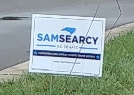
A SIGN I HATE
I decided to choose Sam Searcy’s campaign sign as the sign I hate for three reasons. First, the font size chosen for the majority of the sign is too small to read while driving, or even just walking by. Second, the propositional density of this sign is extremely low. He has redundant information that does not provide any substance. And third, the sign uses two hues of blue that seem clash.
I have included small versions of these pictures to give you the sense of what a viewer might see when driving by and plus “Keep your images small.”
Overall, my biggest problem with this sign is how many graphics and lines of text the sign employs, only to tell you Sam Searcy is running for NC Senate. Surely, a simpler sign could convey the same info with a bigger impact resulting in a higher PD.
A SIGN I DON’T HATE
One of the reasons I don’t hate the Harrison for Sheriff sign is their choice of colors. The dark brown background, the gold graphics, and clean white lettering help it stand out among the other political signage. This is good, because Harris is running for Sheriff, and this sign oozes Sheriff. Perhaps a little cliche in color scheme, but it gets the message across. Last name is in clean bold letters that are easy to read from a distance. There are contrasting colors that work well together, and the addition of the Sheriff’s badge makes the sign feel more official. It has one message, and it conveys that message with a minimal amount of fuss.
Both these signs pack a punch with their design. The No camp has got some fierce language on their side. Not only is it a no, its a NO. And it’s a STOP. This sign features strong primary colors, dominantly red, evocative of the Republicans, perhaps? Meanwhile in the yes camp its a cheerful, hopeful future in blue, green and yellow. I think both of these signs achieve a lot in the way of being “good” campaign signs.
However, what bothers me about them is they are both deceptive and meant to push people to opposite ends. That is how campaigns are won, but, it bugs me. 1631 is not just about sunshine and clean air. It’s a tax. And it’s also not unfair. Both these signs manipulate the public into voting and it’s super irritating. Of course, if I were voting in Washington I would pick a side and it would be the side that isn’t the fossil fuel companies spending millions to defeat this bill. So color me blue, green and yellow!
I tried to find a campaign sign that wasn’t good, but I didn’t see any. I also only walk and take the bus, so what I see is what I see. Have a look at this cute one. I don’t know that I agree with the bi-tonal “B-Right” but it’s a very memorable sign, with the subject’s winning name and the cute little lightbulb.
In my perspective, adding three names to an election signage this small is confusing and ineffective. This election sign is strategically posted near busiest intersections of Irvine; however, drivers have seconds to read the sign. This sign is ineffective because it lacks focus and creates noise. The designer should consider Signal-to-Noise Ratio in her/his design discipline.
Like
I cannot say I love this sign, but I can say that I like Don Barnes’s election sign. I like the usage of green, white and yellow colors. I can easily associate these colors with sheriff’s office. The sheriff’s star in the letter O is another way to drive the message- Don Barnes is running for Sheriff. I like this sign because it drives clear and concise message.
DISLIKE This campaign poster stood out for me as being really unfortunate. First, the pixelated stretched picture of the candidate is so distracting. Then the black lettering on the dark purple background made that part of the poster almost impossible to read. Finally, the call to action is to “Vote” by sheer dominance on the poster, which is great and all but the candidate’s name gets lost in the poster and doesn’t stand out amongst all the copy and picture. Someone driving by would probably miss her name entirely, which defeats the purpose of the poster.
The principle that is not being represented in this campaign poster is Consistency. The inadequate use of consistency in fonts, sizes, and colors makes this poster harsh on the eyes and brutal on the brain to comprehend.
LIKE
What I like about this poster is the ease of understanding the candidate’s name and the pleasant color combinations used on the poster. I enjoy not seeing the standard Red, White and Blue. The contrast used to emphasize the candidates last name is such a nice touch. And I appreciate the poster is using a darker blue on top of a lighter blue, it creates a subtle but distinctive poster. Finally, the call to action is the candidate’s name, nice and big so motorists can read and know the name of the candidate easily while driving by.
The principle of framing is being used in the poster with the candidates last name as a way to call attention to the most critical part a voter will see on the ballot. By using a darker color and making the last name larger the poster frames the name as being the important thing to remember.
I like this sign because it has a clear message. The massage is rendered in red, which attracts people attention. I can easily figure out what the designer wanted me to focus on. Scale and color contrasts are used to attract attention to the most important elements.
I hate this sign, because it does not provide me with any information. I can not understand what it is about. It requires me and extra step to figure out what the message is.
This sign cleverly applied a few design principles, such as colors, and highlighting that help the politician to deliver the right message he wants to send out. It has a good color contrast (the rule of highlighting) to expose the politician’s name and the role he is aiming for. The shape of State of California adds the politician’s commitment for what he is running for: the State Assembly.
Hate
I wonder why the politician chose to enlarge and expose his/her first name instead of his/her last name. This is a violation in naming convention in political campaigns. Secondly, I had a hard time figuring out what role this politician is going after as the tiny text of his/her target position is so easily missed in the very bottom of the sign (A lack of visibility) . All I can see is a pretty common first name with a blank blue background that has a lack of information.
I’m biased because I don’t support Ted Cruz, but I also don’t like his yard signs and branding. I think the image of the State of Texas is overused and the icon in the middle looks like fire, so I’m not really sure what that is supposed to represent. Also, his tag line “Tough as Texas” is good, but it occupies real estate that could be used to say what he is running for. On the plus side, the large, bold text in black and red on a white background is very eye-catching, contrast-y, and very readable. Also, I included the picture of this whole yard because it’s just funny to me. They have a Beto sign, who is Cruz’s opponent. Then, they have a sign for the Governor, but it’s facing a different way. Why?
LOVE
I love this sign for Mayor Adler. What’s his first name, anyway? Who cares. His last name is unique enough for ballot recognition and leaving it out leaves room to remind everyone that he IS the Mayor. This strategy takes advantage of the exposure effect. Mayor Adler is the Mayor and I think this will persist in peoples’ minds when they go to the polls. Visually, I love this sign as well. I like it that they used secondary colors that are complimentary. The diagonal banners create a sense of motion that support the tag line of “Forward”. (Full disclosure: I didn’t take this picture. The one I took didn’t come out and I’m currently traveling for work, so I grabbed this one off the internet here.)
I saw a few elections signs but none of them had a complete message to convey. All of them wanted me to do something but did not really make an effort to tell me why I should be doing it. Political candidates seem to be saying similar things. (Some are more unoriginal than others.)
Peter Choi wants us to vote for him, I’m not sure why.
Katherine Lee wants us to elect her. I’m not sure why should we be choosing her. The Smog Check sign, next to Katherine Lee’s, gives me a better reason to choose them, at least I know the price I’ll be paying.
And then there is Johnny Nalbadian, who seems to be unabashedly unoriginal.
As compared to politicians, interest groups seem to be a little better, at least they give some space to their cause/interest.
Stepping back and thinking about these election signs from the point of view of design principles that we’ve learnt, I’d say that all of them fail the “attractiveness bias” test. Even if a voter does not know anything about the candidate, a beautifully designed poster can never hurt.
But, it’s the ACLU posters that really stand out.Single minded headlines like “Dissent is patriotic,” “Fight ignorance not immigrants” and “There is no planet B,” use the principle of stickiness to their advantage. They are simple, carry an element of surprise, are specific and concrete, and trigger emotions among the passersby. These hand-made posters seem to communicate things more effectively than the printed sings from politicians.
To close this, I’d say the design of a poster, like any design, needs to view things from the audience point of view. Sure, politicians want us to remember their name, and choose them, but it’ll help them if they first thought about what voters want : )
PREFACE: I apologize for the terrible photos I am about to provide. Surprisingly there aren’t too many political signs posted where I am located but the few that I did see were while I was driving so the photo quality is not great.
Sign that I Like:
The sign for Esteves is great because it is legible and simple. I know what the person is running for and can read it quickly while I drive by. There is balance of elements and the choice of colors were intentional and legible. Color is used here to show patriotism (red, white and blue) and is a universal symbol in the United States. Highlighting is used here to show the important elements of the sign (name). Bold type faces and color is used here to bring attention to areas of the image.
Sign that I Hate:
This sign for David Cohen is not great. I saw the name “COHEN” but I could not read any of the other text on the sign. I had to do a google search to figure out what this individual was running for. The red text on blue background is very hard to read and the text for “Berryessa School Board” was too fine for it to be legible on a sign. Color is also used here to show patriotism but not as effectively as Esteves. This sign seems to try to follow the Gutenberg Diagram by showing the key information at the top left (The name), the weak fallow area (the books which represents education) and the actual position on the terminal area (position they candidate is running for). Highlighting is actually used well in this sign to show the last name and the position he is running for through the use of icons. This doesn’t negate the fact that the red against the blue is hard to see.
I was in San Diego this past weekend for fun and found no shortage of election signs.
Love
This sign farthest on the right emphasizes the name, role, and the familiar symbol of a fireman’s hat. All are easy to depict and this photo was in fact taken while riding by as a car passenger. The candidate chose to render a hat and thus is applying the von Restorff Effect to differentiate as most signs are pure text. With closer inspection once can see the remaining elements are the candidate’s firs name and a phrase stating this person has firefighter support. This later point alludes to the candidate having backing of a respected group of the community to further entrench credentials from an authoritative source.
Hate
The sign endorsing Brower uses similar elements to the sign I liked including emphasizing the name and role as well as having a community backer. It also uses the alignment principle more cleanly than my loved sign. However, the numerous font sizes detracted from understanding which was the most important. For example was it more important upon quick glance to read “for judge” or “JAG to judge?” This later phrase also provides what appears to be an acronym that perhaps some might not understand. What is JAG? Short for Jaguar? Judge approved gentleman? And yet this slogan is highlighted somewhat prominently and placed towards the top. In my opinion it applied Hick’s Law in a negative way by using too many font sizes and styles.
Hat tip to Liliana for the verbiage used in her post to clarify endorsement. I similarly do not advocate for or against any particular candidates and have evaluated these signs merely for class purposes.
As I drove down University Drive this morning, it was through a barrage of political signs, all essentially the same, boring, a few colors, a last name in bold without mush else.
The signs I don’t like are not just too basic, they are boring with nothing memorable about them aside from the last name, and in the barrage of signs, if you don’t have a reason to remember it, you wont. If you do, the sign isn’t necessary.
Signs I Don’t Like
The first one just seems to blend in. In a sea of signs, Len Herman does nothing to stand out and I think his name is also not memorable, so he needs to work harder from this perspective.
This sign doesn’t feel like they tried very hard to get your attention, when compared to the other signs it is found within, it somewhat disappears. The yellow doesn’t stand out, when combined with graphic stars, the whole sign has a cheap feeling to it.
Signs I Do Like
This sign I like, it is actually a little smaller than the others it is near and the name and all of the text are not as readable as it could be, but the graphic apple draws you in and makes you immediately think about education. It softens the normal political, strong stance that can come through. I think the white background brings a softness and trust worthiness as well.
I found this one on the ground. It is one of my favorites simply because of the graphic star and the use of the dark blue color. I think the blue brings a trusted, legitimacy and the star has motion in it, bringing a professional, up to date feeling where many of the other signs just seem to blend in.
This sign is very standard, what I imagine when thinking of the typical election sign you see when driving down the street or whatnot. I particularly enjoy the use of framing: not only the orange of the sign announcing the guy’s name but also the framing around the words “district attorney” makes it very clear to know what position Todd Spitzer is running for. Also, their consistency in the font used is appreciated.
Hate
Where is the COLOR? This sign gives me a little headache honestly becase it lacks even the most basic wow factor of having a bright and bold sign advertising the different candidates, not to mention the lack of symmetry with the black boarder around the edge of the sign. Even mixing the two font styles, this sign is not doing anyone justice.
Side Note: I am not advocating for or against either of these candidates, these are merely my impressions of their election signs.
This sign’s message is very clear. The perfect symmetry and inverted colors creates a rhythm that reinforces the sign’s thesis: X = Y. Simple but effective, and potentially sticky in a sea of design mediocrity.
A pretty sign, albeit busy, in legibly non-partisan colors. But unfortunately for Daelucian Ian (or is it Ian Daelucian?), you mess with the Gutenberg Diagram at your own risk. (In English speaking countries, of course.)


 The first one just seems to blend in. In a sea of signs, Len Herman does nothing to stand ou

 I found this one on the ground. It is one of my favorites simply because of the graphic star and the use of the dark blue color. I think the blue brings a trusted, legitimacy and the star has motion in it, bringing a professional, up to date feeling where many of the other signs just seem to blend in.


