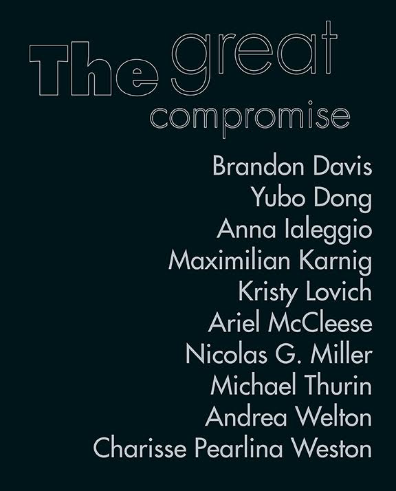
Each year the University Art Gallery presents the work of current UC Irvine MFA students in their second year of the program. The 2018 MFA 2nd Year Exhibition represents a cohort of 10 artists from varying disciplines and practices including performance, video, painting, photography, sculpture, and installation. The show will be exhibited in both the UAG and Room Gallery.
Select one of the art projects and critique it. You may also choose to critique the exhibition as a whole, or any relationships you perceive between the individual works.
Give the title or a quick description so that other students know which works you’re talking about. Be bold.
UAG and Room have the same hours as the Beall Center: Tuesday-Saturday, 12:00-6:00PM.
One of the other pieces that stood out to me was AWO by Nocolas G Miler. This piece captures the attention from the beginning since it had an audio component with a rather unusual visual presentation. The hand shown just as itself brings attention and the sleeve teaches a bit about the time period the piece is referring to as well. It looks like the electronic device is held by someone in a rain coat and the representation reminded me of old war movies. The voice over is talking about the product and the other pieces that are smaller parts of the entire seem very insignificant and small since they don’t contain the main piece. The main piece is the hand and the electronic device held by the hand and that makes the rest appear irrelevant.
The piece of work that captivated my attention is Mountain House by Kristy Lovich. I entered the gallery showroom and it just stands out to me it just looked like two simple walls and chains with bedsheets. Yet, after reading the title it all made sense to me. The work seems like some time was put into designing it yet creating or obtaining the tools that make up the work was not hard. The work with the title gives me the sense of helplessness and motivation to help others. I feel helpless in how many people are out there without homes and it motivates me with the title signaling how if and only if the work provided shelter. This work was definitely my favorite of the showcase because of the simplicity yet meaningful message it provides.
I also enjoyed the accompanying texts that were in the corner of this installation. I didn’t know if I was allowed to read them but my prolonged hesitance prompted the volunteer to nudge me towards it and look through it. There was a piece that was full of partially drawn homes and sentiments about a how a home acts upon its inhabitants printed on see-through paper. The use of a see-through material reflects why the artist chose to leave the foundations of the mountain home but no walls.
That piece also stood out to me the most. It was the most distinct piece and it grabbed my attention as soon as I entered the gallery. It’s placement at the front was also a great idea since the unusual ordering and placement of the individual pieces (The chair and hollow walls) make the viewer take a second look and try to understand the meaning of the piece. I personally wasn’t sure if this was a piece on display or if the back part was a simple brochure for the gallery but after taking a second look, it captures my attention.
Another piece that I think was really interesting to look at and figure out was Andrea Welton’s two paintings on the far left wall entering the UAG Gallery. They were instantly recognizable to me, though perhaps they were not supposed to be recognized. I saw them and thought about paint palettes covered in paints the artists used to create countless paintings all piled over each other in different directions depending on where the palette knife or paint brush last picked them up. That may not be what the piece was, but as someone who has painted a lot that is what I saw. I found it interesting to think that an artist would mimic a paint palette when the paint palette usually goes unnoticed part of the artwork. To put a palette in the spotlight was an idea that stuck with me- even though I might be totally wrong!
This exhibition was really fun to explore. While many of the pieces seemed to be unrelated, I thought a lot about how each piece made me feel, and I did seem to see a common theme. The “message” of each piece is unique and for the most part independent from works of other artists, I found that there seemed to be an underlying manifestation(?) of the distal and proximal, some presentation of each piece (per artist) that seemed to contrast the feeling of being within the piece and standing afar from it. Different perspectives of some pieces made me feel like I was participating in the setting just by viewing them. Other times I felt like there was an established distance between the pieces’ “setting” and the viewer, meant to be contrasted with that closeness of their counterparts.
Hi Kateri,
I agree. The exhibition is very fun to explore. However, you said that the art pieces seem to have a common theme caught my eyes. I am not exactly sure what common theme they have in common, but for the most pieces, I do see the “randomness” with their designs and that might be something these artists imply.
Hi Xiyun,
I too was a bit confused by the layout of the exhibit. My biggest confusion was the combination of two art pieces. The black hook and bag was hanging above the the painting. I orginal thought that they were part of the same art piece. But when I looked at the binder in the front I found that they did not belong to the same the piece. I see that the placement of the hook and bag was good because it was in a eye catching location. The hooks was one of the first things you looked at when looking down the exhibit. I spent some time wondering what the connection between the two pieces. I felt the location choose was purely cosmetic.
Hi Kateri,
The exhibition was fun to explore, with many different pieces resembling different ideas, I did not see the common theme but if i were to think about them is the different point of view from each piece and how it cultivated a random idea of how everyone sees their own life.
It’s interesting to see how you evaluated the gallery based on how you felt about the pieces which I believe is one of the main things artists are concerned about when they create their pieces. I certainly see the participation in the art piece you mentioned as well especially in the mountain house piece as well as the hanging pieces in the back where you get a different view if you are looking at the piece from a distance and when you look at the piece when you are very close and under the hanging pieces.
The artwork that caught my attention the most were the pictures Michael Thurin. They stood out the most to me because I really enjoyed the visual presentation of the pictures. They gave off a futuristic visual, kind of like Star Wars. I thought it was an interesting concept the way he chose to go to these car events and private events and photograph the people instead of the the event that people were there for.
Yubo Dong*
Hi Araceli
I saw that exact piece that you’re speaking of. I would like to know what the message the artist was trying to approach, also give more details on the piece.
After reading many classmates’ response, I notice that many students said the glass work is the most attracting work in the gallery. The reason why it is the most memorize artwork is that its special making process, deeply meaning and the position. This work is made up with glass, fragile material. It’s mot usual. The author must put more effort to make this piece. Secondly, the meaning of this work is fragile support. This meaning causes lots of us to think about the support around us. Finally, this work is located at the front door. When people walk in the gallery, it is the first artwork they met. People always impressed by the first work they met.
Hi Yadi,
I have visited other glass work factories like one in Seattle and another in Cabo, and it’s a little hard to believe how much work is put in creating art pieces like these. I like your interpretation of the glass work, how this resembles a fragile support. But I don’t necessarily agree with people always being impressed by the first work they see at art galleries because we don’t always see eye to eye. A lot of my friends who visit exhibits like these, they question how such art can hold so much value.
Hi Yadi, when it comes to the location of this glass art piece, I agree that others only see this one as the most attracting because it is so large and it is the first thing that meets the eye. On the other hand, I don’t think the curators placed it there because they think it should be the focal point of the exhibit. It’s just simply such a large piece that it only really fit right there. If the gallery was larger/ a different shape, this piece could have easily been placed in the back. I also believe it was placed in the middle of the room so 1) it can be easily monitored for protection and 2) it is meant to be seem from all angles. Not many know this but that glass piece doesn’t stand alone, the large mural on the dividing wall behind it is also paired with it. I believe the artist wanted viewers to be able to stand between this canvas and glass sculpture. One last note, I have seen many students refer to the broken glass as having some kind of meaning, but I asked the young woman watching over the exhibit if it was meant to be broken and she said no, it was actually accidentally broken during assembly.
Interesting analysis. What do yo think the purpose of separating the two piece of artworks were for?
Hi Tran
I really impressed by your thinking. Usually, when we walk in the exhibition, the first thing came to our mind is the meaning of artworks. It is hard for me to think about the making process. Making process is one of the important part of artworks. The glass piece is difficult to make. It is not like painting. Glass is a special material and it is fragile and hard to shape. During the making process, the author must be very careful about glass, otherwise it will hurt him or her.
Hi Morgan
I appreciate your understanding of the glass piece work. Every work’s meaning largely depends on the viewer’s own understanding. Glass means fragile. Your idea of furniture means support is great. The impression furniture gave us is comfortable but this work uses hard material to make fragile. Support is really fragile no matter it from family or sisal relations.
An artwork I enjoyed, even though I don’t remember the name or artist, was of the 3 artworks on a canvas that was in black and white and looked as if it were torn pieces from other objects. It almost looked like when all the parts were but together, it would make a human body or something like that. There is something enticing about the simplicity of monochrome works especially when it is a bunch of pieces unifying into a final image. It is like saying there are all these basic building blocks that come together to make a more complex work.
I agree Kevin! The idea behind this piece did show how a complex work is made by different blocks that unify together to make something meaningful.
I enjoyed that piece also. At first it seemed like the photographs were torn apart or taken with low quality on film and the the film wasn’t developed correctly but then I realized that the effect shown was what the artist was going for. I still don’t understand the image being depicted and I only remember pieces of the human body in a part of the first canvas on the left but it sure captures my interest.
The art piece that stood out to me most was the broken glass furniture. It seemed like one of the most unique art pieces because it’s purposefully a direct opposite of what conventional furniture is supposed to be. Rather than being comfortable and inviting, this furniture perpetuated an idea of how fragile support can be. Conventional furniture is supposed to be inviting and comfortable as it provides support and relief while we relax or do work. The furniture presented in this way seemed to almost represent the bones of the furniture, or the bones of support. It shows that support and comfort are taken for granted in our society and we must manage them much more carefully than we think.
That art piece was also the piece that immediately stood out to me. I really like your analysis of what the piece is trying to convey. Although I didn’t have the same thoughts as you when I was viewing the piece, I can see your perspective and why you had this type of analysis. I especially resonate with “bones of support” and how “support and comfort are taken for granted.”
Hi John,
Like you, I also really enjoyed the broken glass furniture. For me it stood out not only because it is one of the first pieces you walk into, but it has a unique feel to it that evokes feelings of curiosity yet also some feeling of sadness. Not that these are necessarily the best feelings but it was strong enough to pull me to look at this piece more closely and I also enjoyed the various poems around the furniture too!
Hi Brandon,
I also enjoyed the broken glass furniture. I think it’s the most special one in the gallery and evoke me a special feeling of sadness and fragility. The setting that poems written on the transparent glass is special and creative.
The broken glass furniture also stood out most to me for the same reason that you mentioned. Its apparent design is that of a furniture which is supposed to be of use but the way it was made makes it appear discouraging. It reminded me of Hennessy Youngman from our lecture when he said as long as the everyday object doesn’t serve a function it’s considered art.
The broken glass furniture was one of the art pieces that caught my attention too. It is maybe because of the set up that people will first see this when they walked into the gallery. I agree with you the point that furniture is supposed to be inviting and comfortable but this piece is not inviting or comfortable at all. At first I did not really understand what is the artist trying to tell us from this piece until reading some comments about this but it is very interesting that one art can describe different perspectives depending on the audience.
Crazy!, It looks like everyone pretty much likes the broken glass furniture. It was also a piece hat caught my attention , and I agree with you, i didn’t understand what the artist was trying to portray. The comments where somewhat clear, just a tad broad, but i think if it had more of a clear understanding, then it would be as far the best piece.
For me, the most interesting part in the gallery was the broken glass furniture as well. I spent lot of the time standing in front of this art, and I was thinking about what the artist wanted to tell us. I believe different people have different thought about this art. Furniture represent a family for me, and it is supposed to be comfortable and makes people feel relax. Therefore, I was really sad to see the broken glass furniture.
Hi Morgan, the scatter glass in the middle part of the art gallery also captures my attention . When I look it more carefully, I found many parts of this glasses are fragile and broken. it inspire: me the idea that something might looks differently when you see it more carefully. We should look some problems in different perspectives of views
When I first walk in to the gallery, the paint that caught my attention under that moment was the “Two Hats” painting. I thought that I might change my mind after seeing other works, but it turned out that I still like this one the most. I decided to take a look of the paint deeply and closely, so I could figure out the reason why it was attractive to me. I noticed that the author, Maximilion Kamig, used dark color as his main theme color. The whole picture presents a confusing and heavy mood. The whole paint used dark red as the sky color, and usually this presents something wrong is about to happen. Red makes people to associate it with blood. The men in the picture are wearing in blue, which associate it with policemen. The light that comes out from the house was orange. It meant something weird because normal light color are usually yellow or white. There were also something hiding behind the house. On the left side, there seems to have a man-like thing, and on the right side, there seems to have something. Therefore, in my opinion, I think the paint was showing two policemen were trying to investigate the house because they believe something was wrong inside there. However, there was something very dangerous that was waiting for them, and it might cause death.
Hi Ta,
I also really like the “two hats” painting. To me the painting seems like it is presenting an opposite side of the world the artist sees. The painting is telling the story. You may be right about the content the artist is trying to show, or may be the two police men are the two “bad” guys. Like you, I also really like the color usage in this painting.
I agree with your description of this work! It just shouts EXCITEMENT or THRILL. I felt truly anxious trying to find out what was happening. Personally, I enjoy more interesting and blood pumping artworks. This piece really entertained that part of my personality. A quick shot of adrenaline just keeps the blood pumping. I also enjoy reading mystery genre books. This art piece reminded me of the many books that I’ve read!
When first walking into the exhibit, the most memorable art piece that I saw was definitely the glass piece in the center. What really made this piece so memorable was how vulnerable it was, and how it really created a visual and made you think of what it was trying to say/represent. The art piece had obvious imperfections, but that’s what created this idea of vulnerability and fragility. It also appeared more broken when viewed at different angles. This piece was imperfect in so many ways, but you could tell that the artist had every little intention of making the piece look like this.
Hi Jacob,
I am pleasantly surprised that many people actually liked the broken glass structure in the center of the room; similarly I also chose that as my piece to talk about and really enjoyed how it evoked many feelings and it was also in the center so it drew my attention right away. I also enjoyed the poems all around the table, and I did not mind spending much time just walking around and observing the table.
Hi Jacob,
I thought it was cool how looking at this art piece from different angles allowed you to see different aspects of it. Other angles may portray the work of art as more vulnerable/fragile than its supposed to be. This piece definitely drew my attention as it seemed scary to leave such a delicate piece out there. However, the artists used this work to portray how different perspectives can portray the piece differently.
I agree with you when you say the piece was imperfect but was their any way to get what you imagined when your medium is through broken glass? The thing that impressed me was that the artist made the imperfection a key element of the piece. It shouldn’t take away another focus of the piece which was the poems scattered around the glass. The poems/stories was another element to elevate the artwork and give it more depth than just the glass in my opinion.
I was really attracted to this piece, mainly because of its placement. However, once I viewed it in more detail, it became my favorite of this exhibition. Like many of the comment, I want to mention the imperfections but personally I found that very appealing. I also enjoyed looking at it from different angles. It was very nice work and truly original.
Interesting how you mention that the piece was vulnerable. I completely agree with this and that is something I also realized too. At first I had to make sure I wouldn’t step on anything or break a piece and then I realized that the art piece was meant to be set that way. It certainly attracted my attention and made me take a second look and try to understand it. And the different sides of the piece did look broken. It seemed like the piece was made out of frustration at first but each broken piece was meant to be put together in that way to convey a message about art and its definition.
Hi, Jacob. I also reallly instered in the scatter part of glasses in the art gallery. I think this art works displays the value of fragility, because it composes many parts of broken glasses.When it settle together, it makes the whole things looks different when it displays as single part, This art works make me see the beatuty of artists that they want to portray.
One of my favorite art pieces from gallery was Mountain House by Kristy Lovich. At first it was a little bit confusing and hard to understand. After reading the description mentioning about shelter, I could understand this art has something to do with shelter. I think all the pieces in this picture could represent a shelter for some people. It may not be enough for us because it is basically house with no wall but for some people, they might feel some comfort such as from the blanket.
Hey Yuka, I didn’t think of it like that! When I looked at the artwork I just saw holes and an unfinished piece of shelter. I think that’s because I’ve been fortunate enough in my life to always have a roof over my head, so I tend to assume that everything else should be that way as well. Thanks for your take on the “Mountain House,” it helped me realize that not everyone needs four walls to feel safe and sheltered. After this, I looked back at a picture I took of the artwork and imagined rain coming down on the chair covered with a blanket while someone stands underneath it!
Hi Andy, thank you for your comment. After reading your comment, I totally agree with your point. We are lucky enough to live under the roof and we are too used to it to think that is normal. There are a lot of people in the world who are sleeping without four walls. It is interesting that how you imagined that situation! After reading this, I also imagined the same situation that you described.
Hi Andy,
I like what you point out of the roof thing. Yes, That is not always have roof as a shelter for everybody in their life. For the art work that have open space and hole for audience, and when people look at for first time without the distribution would not think it is a shelter. For me that the blanket is more like the sheltered for people. I like what you image.
I was confused at this piece at first too with all the furniture being hung up to the side of the wall. What it did do for me is to think about some of those shelters people make while rock climbing steep cliffs. I know that when you are on the side of a cliff you cant set up a shelter so people just sleep in a sleeping bag while dangling off a cliff. That is what the artwork reminded me of so I can see how this may be the mountain house in a way.
The artwork that I really enjoyed was Charisse Pearlina Weston’s “black notes for the thing left there.” The shattered glass immediately caught my attention. I believe that the art piece as a whole represents the fragile human soul, as emotions battle survival instincts for control of the body. In my opinion, the glass represents the human mind and the broken glass having been caused by human emotions. I intepreted the sturdy blocks holding the glass together to be human survival instincts, keeping the body alive despite constant stress put on the body by overwhelming emotions. I really enjoyed the contrast between the fragile glass and blocks of cement, which made me think of how strong the human mind is despite going through many hardships. As for the base, which is a mirror, I believe it represents wisdom. As we age and experience many things in life, we are able to reflect upon them and improve our state of mind.
Hi Felipe,
I really like your interpretation of Weston’s artwork. I just interpreted the artwork to represent the balance between fragility and destruction, but I think it’s interesting how you took it a step further to relate it to the human mind and mankind’s survival instincts. I thought the cement blocks were there to emphasize how fragile glass was and can easily be destroyed, but your ideas are much more optimistic by relating it to human resilience against hardships and obstacles in life.
Felipe, I find your interpretation of Charisse’’s piece very interesting. I wouldn’t have thought about the glass as the human mind and emotions and mirror as wisdom. I completely forgot about the cement blocks which I agree represents strength.
Your interpretation of the artwork is extremely intriguing. It is interesting that you thought of the broken glass as the fragility of the human mind throughout life. I did not see the blocks that held the glass together, but I agree with you that it represents strength and unity. My reasoning for the mirror being part of the setting was a reflection that even though life throws many curveballs that can break our soul, it is through this that individuals become stronger mentally and spiritually. Everyone faces various circumstances in life, and everyone needs each other to relate for ways to cope with stressful situations and times of trial in order for the betterment of society.
Hi, Felipe Sanchez
I also like Charisse Pearlina Weston’s “black notes for the thing left there”. I notice this glass art piece is not because it is in the middle of the exhibition room. What attracts me is that it’s the only “unfinished” art work”. Charisse Pearlina Weston provides a shattered glass to us. We can see different things from each piece of glass. It is a different way to present this world. The integrity is no more the most important thing and we will pay more attention to details.
The art work that I found most interesting was the glass table with glass shattered over it. It was on top of a large sheet of glass, so that it reflected different angles of the room at all times. For some reason, this art just felt surreal, cold, and vivid. This could be from the sharp edges of all the broken pieces that stir a sense of uncomfort. It also reminded me of being stuck in a carnival mirror fun house in which someone could get lost in because it made the person lose sense of direction. Overall, I found it the most unique of all the artworks in the exhibit.
Hi Chloe,
The glass piece was also the most interesting to and as I’ve been reading others comments it seems like many others have also claimed this piece to be the most memorable one of the gallery. I think this art piece, however, was interpreted in a different way but most definitely felt a certain kind of relatable feeling. I believe that what intrigued most about this piece were the scattered pieces of glass. The broken pieces gave artwork an interesting touch and in my opinion is the reason why most people interpret it differently.
Hello Chloe,
I found the glass table intriguing as well. I agree the glass project felt surreal. For some reason, I thought that the top glass pieces were plastic, but I all was glass.
I agree with you on this piece of artwork. The broken glass actually brought back the scene of Phantom of the Opera with me when he broke all the mirrors in the end.. and the glass was scattered over the floor. This brought tension for me because when I think of shattered glass, I always imagine someone being so mad or hurt that they feel the need to broke something.
As someone who edits their picture, I have a preference of choosing for my pictures to be in the cooler tones. However, when seeing the contrasts of these two pictures, I begin to admire the warmer tones. They have a perfect contrast to each other and make the different pieces stand out in their own ways. I personally like artworks that have contrasting tones, like warm vs cool, white vs. black, dark vs. light, etc. It is nice to see both sides of an artwork, how it can both be warming and chilling.
I thought the exhibit was really interesting. I normally don’t go to art exhibits but after going I would definitely want to go to more. I thought that the art work displayed was so diverse and wasn’t boring at all. Almost every piece caught my eye in someway. I enjoyed this one a lot more than the last because it was so different and I like the flow of the artwork a lot more. Now that I have experienced this gallery I want to explore more of them.
I agree that every piece was impressive and attractive. Different from the last exhibition, in this exhibition, the formation of the art pieces were more diverse and interesting. The woodwork, art piece of using glass, oil painted canvas, etc., there were diverse kinds of works. What did you like most from the exhibition? My favorite one was Karnig’s Two Hats which located at right side of the entrance. I loved his color choices and message that he tries to say via his artwork.
Hi Kandace,
Like you I actually do not usually go to art museums or galleries often or at all. But my time spent in the galleries for this class actually proved to be very beneficial and gave me a lot more insight to how much artwork we can appreciate and think more about, and how it can apply practically in our class. I actually enjoyed the broken glass structure in the center of the room as soon you walked in and it seemed to be the same for many other students too. Hopefully all of us are able to take what we have learned in class to appreciate more of what art is capable of and be willing to go out to different museums or galleries.
Hi Brandon, I can relate to your post. I rarely go to art galleries and usually when I do go, there is some sort of incentive. This exhibit was very different than what I was used to and it challenged my preconceived notion of what art is. I decided to take my time in this exhibit and I tried to understand what the artists’ messages are. I am starting to grow an appreciation for modern art and realize that art goes beyond what you see and it’s more about what you feel.
I agree with you, I definitely enjoyed this exhibit. It almost reminds me of museums I would go pay to see. I liked the bigger forms of art work such as the mountain house, shattered glass table, and skating bowl.
The horror film made by Ariel McCleese was very impactful to me. When I walked in, I was already immediately scared about what I was getting myself into. There were around 4 women dressed in blood red surgical costumes. They were in the process of wrapping a man in something like surgical bandages. As they were wrapping him up, I noticed and read the writings on the right side of the room. It talked about the cruel actions that happen during pupal mating of butterflies. It made me worried about what the video was going to show later. The actions of the women went gruesome pretty fast. It started with a cut on the chest and escalated to ripping the man’s jaw out. It took me a while to realize that the gender roles from the writing to the video are reversed. I really liked how HD and well made the film was for a student project. I was honestly distracted for a bit during the video thinking about how good this was filmed and how realistic they were about they make it.
I agree that I was distracted while watching the film because it drew attention to how it was made, so I lost my immersion and sense of realism. There were sections of the film that dragged on for too long like the surgical(?) preparations; I feel like quick cuts and multiple angles would have been more effective in preserving the horrific mood that was set during the chasing scene. Technical aspects aside, I highly appreciated the concept of switching the gender roles and the rejection of the male gaze.
It is interesting how you talk about the film combating the male gaze. I am just throwing this out there for discussions sake and hope to hear more opinions about the term “gaze”. I am coming to term with what the “gaze” really is. With my understanding the male gaze depicts women as objects. Not placing women in a state of power but in of more submissive and sexualized role.
This got me thinking about a “female gaze”. Is that when men are sexualized and objectified? My thinking is that the “female gaze” itself is a term that defines the exposure of the “male gaze.” Not necessarily placing males in a secondary position but, placing the public in a space where they can being to identify moments of the male gaze, themselves, in media.
Another question I have is whether or not there is a way to create visual media without a “gaze”. Would our visual experience change for better or for worse?
Hi Kelly
I agree with your analysis of the art. It was filmed extremely well which added to the impact it had. The part of this art that stood out to me the most though was how gruesome it was. I think it created a lot of shock value with draws a lot of the viewers attention. However the severity of the procedure performed by the women was almost sickeningly brutal and this reinforces the point the artist is trying to make about how cruel the pupal mating of butterflies is.
Hi Kelly,
Since I am not a fan of ‘groey’ films, I was most definitely uncomfortable with this film. By but the end of the film, I understand that the artist had to depict this image. Since it was hard for me to pay attention to the film, I wasn’t able to notice the emphasis of the gender roles. So it was nice to see your interpretation of this since I wasn’t able to focus on it.
After visiting the exhibition and seeing the work of many artists, one specifically stood out and that was Yubo Dong. After seeing his piece I decided to actually look into his work much further past what was just in the exhibit on show. Upon research I discovered more pieces that caught my eye and I believe the simplistic idea that connects all his pieces and in most of them you see this idea of commercialization. Many pieces have images of just an office building or a white board or even the lobby of a random office building. I believe what he is trying to do is get us to focus on the idea that is past what we or everyday working people see on a day to day basis. As humans we typically never stop to take in what’s around us and his pieces are there to capture something we don’t pay attention to and wants us to focus in on this idea of commercialization.
I get the impression that putting his work in a gallery context produces tension with his seemingly commercial style of event photography for advertisement. You would expect to see these style/genre of photos on architecture and events to be posted on Yelp, Google Maps, or Facebook event pages. The way he chose to install the work made a large difference in the tone; instead of glamour shots of the cars and sensational angles of people, the work allowed the viewer to be more observant.
While entering this art exhibit, I was immediately captivated by the pieces of broken glass laying on top of the concrete blocks. Usually, I would expect art pieces to be presentable in great condition and in “perfect” shape, but this art piece was different. The artist intentionally chose to portray the broken pieces of glass in this manner so it took me some time to try to decipher the meaning behind it. I was also intrigued by the underlying messages that were transparent throughout the centerpiece and it seemed as if this art piece was representing how vulnerable a person can be through the depiction of the broken glass. What I understood from this piece is that not everyone is perfect and it’s okay to express your feelings of hurt.
Hi David, I like what you pointed out here about this work not being presented in great condition or shape. Although I didn’t think this thought exactly while looking at this piece, thinking back to my visit that is a conclusion I agree with. I had difficulty reading the messages, and in a way I feel this could tie back to your interpretation. Sometimes it’s hard to understand what other people are saying or feeling. As your interpretation suggests, it is still okay to express those feelings.
This exhibition was a great destressor and a change to my everyday life. Being a bio major, I’m always stressed about bio and chem classes and labs. However, taking this art class has been a change in how I’m used to having classes. It is great to stroll through an art exhibition, and enjoy and appreciate the works of the different artists. This was my first art exhibition and I really enjoyed it. All the pieces have their own feeling and mood to it. It conveys a different message to everyone, depending on how they view this art. Having taken so many science classes, everything is set in stone for you to learn. However, for art, there is more room for creativity and for you to have different opinions and reactions to different art pieces. It was a great experience.
Hi To,
I definitely agree and can relate to your thoughts as I am a science major myself. Unlike my bio and chem classes, where there is lots of formulaic problems and memorization, art was much different by allowing you to interpret it using your own creativity and experience in life, and everyone has their own interpretations and there are no right or wrong answers. For example, there were so many different interpretations of the broken glass art, and it has amazed me how there can be so much depth and perception behind some shattered glass and words. This art exhibit has challenged me to look more deeply behind the artist’s meaning more than the intimacy exhibit as the pieces are more abstract and unique.
Hi To,
I completely agree with you. I feel the same way about art compared to my major. I also enjoyed walking through the art gallery and letting my imagination run wild about what the art pieces may mean. I rarely attend art galleries so I did not know what to expect. I was pleasantly surprised with the works of art I saw. This class has allowed me to view art in the digital era in a whole new perspective.
Of all the artworks displayed in the UAG, I spent the most time with Kristy Lovich’s “Mountain House”. Though the walls are just wooden foundations that others can see through, they provide a boundary that separate the space within them from the rest of the gallery. The corner helped to provide a feeling of privacy–the feeling of comfort in one’s own space. However, this comfort is also disrupted by the chairs and blanket installed on the wall. I believe Kristy’s piece talks about homelessness and how we cultivate feelings of home. Initially, when I walked into the corner, I began reading the packets on top of the desk. After reading a couple pages in attempts to understand the piece, I turned around to see the drawing of a toddler behind the desk chair and another drawing of scribbles near the floor left of the table. I was reminded of family and children’s tendency to draw on walls. Maybe these renders are elements familiar to Kristy and her own home. For her, these are the things that construct the idea of home. I am made to wonder how this idea and/or feeling is produced. In the case of homelessness, how do those without walls and a roof create a space–a home–for themselves?
I can see why the piece would evoke the impression of homelessness at first glance. However, important details make me think otherwise. The title “Mountain House” makes me think moreso of the spatial representation of isolation from industrialized society since the “cabin in the woods” trope tends to include a retreat of sorts or a preferred home for the modern Luddite. I was also taken aback by the graphite drawing of the child on the wall and how well rendered it is, which makes me think that the artist is an adult who longs for the simpler times of childhood.
During my visit to the Great Compromise exhibition, I found that Anna Ialeggio’s “Middle Place” was very captivating. I think there are many ways that one can interpret this work of Ialeggio. For me, I also have different interpretations of this piece. However, one interpretation that I want to discuss is the way how the wires are pulling these plastic pieces resemble and relate to an individual whose is struggling with mental health. If you’re not standing close enough to this piece, the wires that are being used are pretty much invisible. Therefore, we can only see the objects. And, the objects, in this case, symbolize the individuals. On a daily basis, we interact with people who we think are perfectly fine. They look happy and they act just like everybody else. However, a lot of us are not aware that the people that we interact with might actually battling with their own self. The wires, here, symbolizes the invisible pain that’s constantly pulling on the individuals.
I really enjoyed my experience at the University Art Gallery, as their were a wide variety of different art works ranging from oil paintings to broken furniture’s. Personally, my favorite of all the works was the broken glass furniture in the front of the gallery. I really enjoy how it challenges my perception of what art should really be. When I think of art I think of flawless masterpieces in which the artist’s dedicates hours and hours to make sure no imperfections are left. Instead the artist decides to purposefully leave the work as it is broken and flawed. I really think the main theme that she was trying to convey was the theme of fragility and how this is seen within our lives. My feelings about this were reinforced when I came closer to the work and i saw the notes beneath the glass each adding to the main idea of fragility.
Hi, I also agree that the broken glass furniture was a very interesting piece and caught my attention! You can tell that every part of the piece was carefully organized to convey sense of fragility. The overall composition of the piece was very stunning. I didn’t even think about how the notes contributed to the notion of fragility, so that’s a good point to mention!
Hi Lacey,
The most feeling I get from this art work is fragility. I don’t know what will happen and how things are going on in the future. Therefore, everything is gonna change and we should value and focus on the current .
This art gallery is very abstract. Kristy Lovich’s “Mountain House” is my favorite piece of art among the exhibition, and it is also the first art I see when I walk in. She puts a wood bed frame upward, two chairs face each other hanging on the wall covered with bedsheet, and a desk and a chair face the wall. When I pay more attention, I am able to tell this is a typical bedroom. No matter what your bedroom looks like, there must be a bed, desk, and at least a chair inside. This room is however very unorganized. In the binder she writes “If, somehow, my work provided shelter”, so I assume she implies this bedroom is actually a shelter. So many people have stopped by, so it remains unorganized.
Hi Xiyun, I really like your input on how she implies the bedroom is actually a shelter. When I first entered the gallery, this was the first piece of artwork that caught my attention. I initially thought that the artwork was not completed. However, I agree that this is bedroom is actually a shelter. I noticed on the desk, there were several packets, so I assume this represented her workspace. What I am unsure on, is the way the large wooden pieces were set up. I agree that it is quite unorganized, because I cannot really tell whether it is meant to represent a roof or is the “door” to her mountain house.
Perhaps she could also be saying that the bedroom doesn’t provide her shelter; however, the work she provided her shelter instead. Since the bedroom does not seen to be complete without any paint or coverage, it doesn’t provide the shelter that a wall should provide. Yet, she does have her work on a desk which can represent that she feels protected with her work.
Hi, Xiyun. I was also very interested in the art piece by Kristy Lovich. I also gave me a sense of unorganized home and it reminds me of my own house.
Although all of the art pieces from The Great Compromise were wonderful, I found Michael Thurin’s Recomposition (solo) to pique my interest the most. It was clear to me that there was a lot of thought put into the creation of this piece. It features the likeness of a body yet reconstituted into an entirely new mass. Because it is monochromatic, the contrast between the skin and dark background is highlighted; effectively making the subject stand out very well. Negative space in this work also serves to accentuate the subject by providing a stage for it. Finally, I believe that the piece drew me in because it is something that is so familiar yet completely foreign.
Hi Giovanni,
That art piece also got my attention. While it sort of maintained its original picture, it was obviously somehow distorted since it was taken from another picture. That made me feel like it represented the unseen hard toil that dancer’s body go through during daily strenuous practice. The monochrome black and white added to the melancholy mood.
It was mostly the paintings in the gallery because most of my artistic background is with illustration—not necessarily painting but I feel like I can be more educated in how I approach appreciating paintings. I already talked about my response to “Age of Cretaceous” in a reply to another post, but one other paintings I wanted to discuss was Maximilian Karnig’s piece “Two Hats” and “Façade”. Both had similar orange and reddish backgrounds which signals even to the most casual viewer, that the pieces are meant to be viewed together. Both pieces use perspective in a way that draw in a push away a viewer respectively. I know that Karnig painted three pieces, but “Façade” and “Two Hats” felt more related that “Hot Air.”
At first I entered into the art gallery not knowing what to expect, but then my attention was captured by the broken glass exhibit. The name of the piece is called “scattered pieces of glass”. My attention was captured from the many pieces of glass that composes the piece. I stared at the exhibit for a while trying to think what the meaning of this exhibit would be. Later on upon closer inspection, I noticed that each piece of glass was different and could have been a part of a whole and some pieces are cracked and broken. Perhaps the meaning of this is as a whole, we do not perceive ourselves as having flaws. But when you break down this whole image into tiny pieces, we can start seeing the cracks within ourselves.
Hi Daniel, I see your interpretation of the broken glass art piece and I agree with you! I, too, was pondering for awhile about what this art piece was meant to represent and I thought that since we are so used to seeing art pieces that are perfect and presented in great conditions, this art piece was meant to portray how not everyone is perfect and that it’s okay to be not okay. I like how you associated the broken pieces of glass to flaws and how it’s about one’s self-perception.
Hi Daniel!
I was also intrigued by the glass table because of its composition. The glass pieces were all bits and pieces of something else and Charisse compiled them into the table. I also like your interpretation of the piece and agree with you because everyone is compiled of different pieces and things that make them who they are. Our flaws are what makes us, us.
Hi Daniel, that an interesting interpretation of the scattered pieces of glass. I didn’t think of it that way at first but that provides me with a new and interesting perspective. This piece was interesting because when I first saw it I didn’t think much and I was a bit confused. I believed that this piece showed us that there is beauty in everything and we just have to slow down and look at the details. Even in broken things there is beauty.
Hi Daniel,
I was also interested in this artwork and felt the same way about what message it was trying to get across to the viewer. This image caught my because the differences in the pieces of glass that were shown.It was basically an piece that proved not everyone is perfect and , at the end of the day, everybody has something about themselves that may not like.
As the glasses are completely broken on the ground, the pieces could also represent that once we are broken, we can also be lost. The many pieces ff glass as a whole could represent what we used to be, but now since the glass is broken, it is difficult to find a certain piece of us and it is essentially lost within the pile. As the pieces are all scattered, we can notice that we are fragile and imperfect in our own ways.
Hi Daniel,
This piece also captured my eye when I walked in. At first I did not know what the piece resembled, but i can see why you think it resembles ourselves and our flaws. How you describe makes it comprehendible about how breaking things down really shows more of the image then when as whole.
Hey Lizette, I also thought that the “Mountain House” was interesting. I was very confused to see the chairs on the wall and was surprised to see the walls balanced on their own. I felt that it represents the different, but simple lifestyle in the mountains. I got this perspective from it’s title and how simple the furniture was.
The artwork that stood out to me was Kristy Lovich’s Mountain House. The artwork has two wooden pieces standing up somewhat crossed together with a desk in the corner and a chair and blanket on the wall. The description said “If, somehow, my work provided shelter. To me everything in this art piece is something that would be needed in order to provide a simple shelter for someone. We’re so caught up in our own lives and many of us have more than just wood and fleece for shelter that we don’t really think about the people who rely on items like this for their own shelter.
My one of the greatest an art piece was Façade by Maximilian Karnig because the color of oil paintings was intense red color caught my attention. I could see the time was at evening because I observed that the shadow of windows on the picture colored with yellow in mind of sunset. This painting was not sophisticated but abstract. You also found shoes on both sides of the picture, but there had no body or could not find any people. Moreover, I could see the structure was also wrong on the plane. In the middle of the painting, there was kind of blue carpet with a whirl shape which was not a texture so everything seemed to smooth in here. As using red bright color to show time changes morning to evening, it suggested that time is passing by.
Hi Na Yeon!
My favorite work was one of the art pieces of Maximillian Karnig too! I really liked the work called Two Hats. I think his use of color, red and yellow touched us in many ways. In the art piece, Two Hats, he used Red for the background and yellowish for the light. Those two works were abstract since I could not know why he drew these things. The objects that he drew such as hair dryer, people, curtains etc. were clear and recognizable, however, I could not figure it out his purpose of using all the objects altogether. I wanted to know the message that he tries to say via his works.
Hi Yoo!
My favorite art piece was Two Hats too. I was confused at first when I saw the paint, but it was really attractive to me for some reasons. Therefore I started to try to figure out the reason. In my personally conclusion, I believe that the paint was trying to show something bad was about to happen, like death. The reason was because the author used dark color, as his background. The sky was dark red, which makes people to associate it with blood. The two men seemed to be policemen. The things that were hiding behind the sides of the house were creepy too. Therefore, I believe the color was trying to imply a heavy mood, and the figures were the story.
When seeing artwork I usually like most of what I see, but what’s my favorite about different artwork, is trying to figure out the meaning behind it. Artwork can have so many meanings to it but the ones with the best meaning are my favorite.I like how out of all the pieces in the art gallery made me think something of that maybe someone else could be thinking as well. My favorite art piece was “If somehow, my work provided shelter” was my favorite one I saw. I liked it the most because it gave me a meaning that really brought out my emotions. It made me feel a lot of emotions that many people wouldn’t want to have, such as sad and lonely. I think it made me feel this way because of the way the piece looked, it was empty. It automatically gave me a bad feeling represented a bad shelter of where someone could live. I say this because the piece had a feeling of empty and I’m use to having couches and other types of furniture in my shelter or someone else’s. I like this artwork the most not because it makes me feel sad and lonely, but the picture itself has multiple meanings to it and mine happened to be sad and lonely. Not everyone may feel that way about this piece but that is the beauty of art.
Hi John,
I agree with you that painting is one of the most powerful tool to show emotion. I think it is much stronger than words because painting is direct. It is able to catch viewer’s eye in less than one second. Honestly I do not quite remember the piece you like the most, but after reading your post, I have strong interest and want to revisit to see this piece. You are right that feeling of a painting is personal, but a good painting is universal.
The art piece that caught my attention as “Mountain House” by Kristy Lovich. The structure was very open and the placement of the chairs was very intriguing, such as that they were upright on the wall which created an unsettling feeling. The description states “ If, somehow, my work provided shelter”, this gave more depth to the piece and made me think more about what the artist was trying to convey. The way that I interpret the piece is that sometimes people feel powerless so they seek comfort in places that are not the most ideal. I think the artist did a great job, such as that the piece is so ambiguous so everyone has a different interpretation on what it could mean.
When I entered the University Gallery, the first thing capture my eyes was the “scattered pieces of glass” at the center of the gallery. After that, I tried to see it carefully. I found that some part of the glass are broken, which looks fragile. This scattered piece of glass is not perfect and has defect. I am curious to think what it means for art. I realized that it alludes to say everyone is not perfect and have disadvantages. When we see ourselves carefully, we could gradually find our defects, but we do not need to worry to much about that, what we need to do is how to improve ourselves, and become a better person.
The art piece that really struck me the most was the film that was being played was “Heliconious Erato,” by Ariel McCleese. At first I wasn’t sure what to expect, but as the film played, I was really taken aback from what I saw. The content was gruesome because it showed someone being cut open in a surgical way. I really had no idea what to think of it, until I read the text that supported the film. The text was a description of how the Heliconious Butterfly mated. This text was what provided context to the film. Essentially, the film was a representation of that mating process. The difference, which i found really interesting, was how the one who was being wrapped was the male, while the butterfly who is wrapped is the female.
I really think this piece is really powerful, and despite that it was gruesome, I really enjoyed the video. There was no audio other than the score which was suspenseful and really kept you watching. I enjoyed it a lot.
Julio,
I watched the video too and honestly it had me kind of shook. I guess since these were pieces all done for the University by University students, I did not expect to see something so overtly gruesome (even though it is obviously fake). However, when I found out it was both a portrayal and a gender-role-reversal piece, I became a big fan. I feel like the message of this video was much more accessible than the messages of others in the gallery. The description really added so many layers to the video.
However, once I got past how gruesome the video was, I also really enjoyed it like you did! The no audio you mention at first seemed like a detriment to me but then the way it was filmed was actually very careful and skillful. I agree that it was powerful! I hope the artist continues to do more like this, it was really something to see.
I can’t really say I enjoyed the video, due to the extreme tension and ultimate gruesome content, but I wholeheartedly agree on the piece’s force of power and suspense. The scoring was definitely unnerving, since you didn’t get to hear the actors speak or make any noise. I think the painfully slow pacing of the main surgical scene also heavily contributed to the film’s suspense. The time it took just to prepare for the procedure was really compelling, even though overall I personally found the film rather disturbing.
Hi Julio,
I too was struck by this piece. I am usually weak-stomached when watching videos like this. It was very gruesome but, as you said, had a very beautiful undertone that was represented in the text that supported it. While it did confuse me at first this video turned out to be a favorite of mine. The power and suspense behind it backed with the no audio made it a very deep and meaningful piece.
I am curious. What does everyone think the exhibit’s name “The Great Compromise” mean in relation to the works that are being displayed? The name of an exhibit can be just as artistic as the pieces themselves.
My first thought was of the historical: The Great Compromise that took place during the Continental Congress when the US was still being formed. This event set forth how the Legislative branch was going to be organized.
However, my second thought went to the idea of the artists themselves. Were they required to work together and choose from their collection of works things that worked together well? Did they run out of time and end up making this exhibit instead of something they wanted to do instead?
Let me know what you think!
I believe that the “Great Compromise” is not a historical reference, but instead an artistic reference to the implicit collaboration between artists agreeing to exhibit their works in a shared space. Different works with differing symbolism might clash ideologically within the same space, similar to how two people compromising may give up some of their ideals in order to form a shared agreement.
When attending art galleries, I’m typically astounded and impressed by the work I typically see, however I often feel I don’t grasp the full meaning behind a lot of the work I view. When attending this gallery a lot confused me, per usual. One piece that caught my attention as well as outright confused me was the “Black Notes” piece. It had a hectic and unsettling feel to it because of the cracked/smudgy glass. My initial thoughts brought me to believe the artist was attempting to have a once beautiful item, turn broken and damaged. Upon a closer look I realized the depressing notes and the almost intentional placement of the glass shards. It seems the artist was attempting to maintain the original structure of a glass table while giving a sense of brokenness as well. Ultimately giving a “broken but beautiful” feel.
Hi CJ,
I completely agree with that feeling and had the same sentiments when I walked in myself and saw the piece. I think you summed it up nicely in saying that it’s “broken and beautiful” but I think we can tag a little more onto that in saying that it can represent the fragility of one’s person. Perhaps that meaning can be derived as well and I’m sure there’s more that we haven’t thought of!
I agree with you! The glass art piece was my favorite. At first, I did not notice the words/poems inside the glass pieces because the whole entire art was clear. However, when you look closer you can see the different poems. When I read them they were sad and figurative. Like you said, I thought of the glass as a representation of the shattered bits of their life when I was looking at it. Yet, it did not come across to me that the art piece is still kept together and is “broken, but beautiful”. I think the shattered bits in our lives is what makes us truly feel accomplishment, happiness and endurance which makes up our individuality.
Hi Cj, glad to know that I was not the only one feeling a bit confused when walking into the exhibition. I think your interpretation of the “Black Notes” fit perfectly with what the piece is depicting. When I came across this piece, my initial feeling was sad. I felt like this piece put me in a dark place. Almost as if I was isolated with negative feelings.
Hi Cj,
I also really like “Black Notes.” To me, it was like a combination of two completely unrelated things – broken glasses and poems! The artist was also creative to let these two things work like a perfect match. When i first read the poem, suddenly I understood the meaning of those glass pieces. They were like people’s most vulnerable parts that they wanted to hid.
At first, the first piece that caught my eye was the broken glass piece in the middle of the room. However, once I walked further into the room, what had me more speculative was Anna Ialeggio’s works, “Middle Place” and “No other horse will hold your hand”. At first glance, I had no idea what these suspended bits of plastic were. I was totally confused. Even the titles confused me. I also didn’t notice the second piece until my friend had pointed it out to me. I really liked the structure of “Middle Place” but I thought that “No other horse will hold your hand” seemed a little too far from the other piece, if they are meant to be seen together. Or share a narrative. However, I did find Anna’s work to be very intriguing and a bit confusing in a way that got me thinking, trying to figure out what was happening.
I had a similar reaction of confusion to these pieces. They were absurdist and surreal, and I think the titles furthered this feeling of strangeness, like being in a dream. I found it wonderful to be able to see the fingerprints of the artist in parts of the work, making it seem like it was left raw because the emphasis was not on making it look like it was made perfect like a machine. I felt uncomfortable with it because the pieces looked precarious, like they were not actually connected, but suspended from their own design and weight alone. Like, a reversal of the game Jenga, all balanced perfectly until someone takes a piece away.
One of the things that I think is really important to note, it just how affective Ariel McCleese’s piece is “Heliconius erato”. Not only was the video and its story impactful, I felt like it rubbed off on the piece by it. At first, I thought “Flying on my sweet angel” by Brandon Davis was just a skateboarding ring and after seeing the video I was only imagining a world dominated by males and made by males which this piece somewhat shows. I felt like Brandon was empathizing the exact thing that Ariel was trying to point out in her video and the expert, that males have a dominant stance in the world whether it’s good or violent. After all, it seems to represent a form that is more welcoming of males than females. After thinking it over, I understand that Brandon has a nice and sweet reason for making his piece look the way it did, but my judgment of it still lies with aftermaths of Ariels work. Overal, I think this just shows how impactful Ariel’ art can be since it created a new story of a piece by it and made me create judgment based on her work not the actual artists.
One of the pieces that caught most my attention was AWO by Nicolas Miller. I found beautiful the fact that the case that protects the arm for transportation and storage as well as the brochure that explains AWO become part of the art piece. The arm itself captures multiple parts of AWO success. Firstly, this includes the sleeve placket which was successful in the early 19th century. Then the chosen sleeve color reflects the fact that AWO initial success was marked by its contribution to yellow LED. Finally, the whole piece makes the viewer’s attention flow from the arm to the hand where the most important piece is placed: the AWO TR1. The flow from arm to hand that the art piece suggests not only emphasizes the AWO TR1 but it also acts as a timeline for the multiple successes AWO had during the 19th and 20th century.
Hi Luis,
I mainly wanted to reply, since your comment shed more light on that piece. Overall I thought that piece was bland and boring since It looked like an ordinary hand. I also thought it wasn’t completely unpacked since the case was still there, but your comment makes me appreciate the piece more. I had never considered the reason for the art work and I love just how much thought went into it.
Hi Luis,
The AWO piece was also a piece that stood out to me in the UAG because it was definitely different compared to the usual art pieces that I have seen in exhibits and it was also different from all the pieces displayed in the UAG. The audio that was playing from it was repeating in my head as I walked through the gallery so I had to go back and look at that piece another time to really indulge what it was and what it meant. It was definitely a unique, yet awkward piece in my opinion. I like how you described what each compartment of the piece represents. I was curious to know what this company (AWO) was and how they came up with this piece !
I agree with Lesley, your comment makes me understand the artwork a lot better. At first I was confused about whether the sleeve or the wooden device was the main focus, until realizing that there was more than one product being talked about. When I saw the product box/casing, I similarly enjoyed how it was put there to add more realism to the environment and artwork. I liked how well made everything was, from the wooden device to the brochure and even the women’s voice. Your reply makes me further appreciate the artwork by making me realize how well thought out the artwork is.
Hi Luis,
I was a little put off when viewing this piece. It was an awkward piece at my initial viewing and couldn’t conjure up the meaning or beauty behind it. The way you were able to break it down and describe it reinforces my inability to decipher the real beauty behind pieces of artwork and your depiction was spot on.
Walking into the exhibit, Kristy Lovich’s “Mountain House” immediately caught my attention. The piece took something that would have been the typical bedroom scene and managed to make it feel disordered, which left me a bit confused at first. Looking at the binder, I noticed that her description said “if, somehow, my work provided shelter.” After seeing this, I realized that the only part of the piece that wasn’t disordered was the desk at the very corner of the room. The fact that the only ordered part in the piece was at the corner reminded me of maybe a scared child sitting at the corner of a room, feeling small and hopeless. Everything else around it seemed like an attempt to build a shelter and feel safe, but the “shelter” clearly wasn’t enough. There are no walls, no form of protection, and essentially no one could not feel safe or at home here.
Hi Mary,
I really like your interpretation of the “Mountain House” piece. I personally did not understand this piece at first but after reading your interpretation, it really helped me understand the artwork. Everything that was on display was disoriented. Nothing seemed to be in the right place but the desk. The desk that was in the corner was organized and seemed to be put perfectly in place. Behind the desk was a picture of a child who seemed almost as terrified. This reflects a workaholic lifestyle because they are so focused on work that they neglect the life they have at home. Thus, why everything seems to be out of place and the only thing that was in its place was a desk (a workstation).
Hi Mary,
I also saw the “Mountain House” it caught my eye right away. I also like your interpretation of the piece even though I had a different interpretation of it. I agree that the desk was the only part that wasn’t disordered and that served as shelter.
Hi Mary,
The Mountain House artwork also caught my attention, as they had a table built to the side of the wall. I interpreted it as it being country/antique wooden furniture used back in pioneering days. By putting the table on the wall, it gave it a feeling that it was sort of awkwardly out of place and isolated, hence the name mountain house, assuming that the house and those who live there are also isolated.
Throughout this exhibition, I felt myself invited to observe the process of the artworks’ creation. Finger prints, raw lumber, layered chemicals, warped glass, and torn or worn canvas displayed the artists’ hand within the work. This gallery setup had quite a wide range of conveyance. Childish wonder and imagination came from the installed architecture in the first corner seen when entering the gallery. This was further boosted by the small table, childish scribbles, window frames painted blue, the bending of architecture, and the drawing that seems to vanish as it reaches the end of the parchment. It recreates the feelings and ideas present within the mind of youth and in the world of dreams. Meanwhile, the realistic yet absurdist clothing designs featured near the back of the gallery, complete with its own carrying case and specially shaped foam packaging, was humorous and invited the viewer to study the piece in depth. It was at once a capitalist critique and an upheaval of what we have become accustomed to as consumers. It felt like a more modern and satirical furthering of what The Museum of Jurassic Technology does to its viewers. The artwork in the middle of the space featuring glass and mirrors by Charisse created an ephemeral but serious space. It brought to mind ideas of self identity, transparency, censorship, and visibility. The viewer directly becomes a part of the artwork. The passages require the viewer to lean in to see them clearly, and in doing so, the person’s image is projected back through what is trying to be seen. In attempting to see clearer, it can become more difficult. Some of the words appeared redacted, and the messages written can be affected by these omissions. Overall, I am very impressed by this gallery exhibit. All works appeared professionally executed and displayed. The ones that stood out to me most, however, were the interactive pieces. They required me to spend more time with them, and so, created a more lasting memory.
When I walked into the art gallery, the first piece that caught my attention was Yubo Dong’s piece “Cars”. It captivated my attention because it was just pictures of particular aspects that make our present. It made me think about how dependent we are of such transportation devices. It makes me think of how as a species we’ve come a long way. We are always fascinated about the next big thing, the next revolutionary device. The images of cars and technological devices from this piece elicit a sense of hope for the future in my opinion. Personally, who knows what kind of vehicles or technology we will have. Only time will tell. I enjoyed this piece because it made me think about the future and how everyday we are creating things to get to it.
Michael, I agree. This piece was very interesting in how it was executed and displayed. The pictures seemed at first glance a collection of photo journalistic photographs documenting some single technology expo. However, upon further inspection, one finds artistic pieces which would not be fit for photo journalism. For example, finger prints on a painstakingly cleaned and waxed car door, all that work undone in less than a second. The shots themselves presented different types of modern and popular technologies. I couldn’t help but wonder if it was still the same expo or if it was a series done over a length of time. It brought into question the expected and practiced setup of expo displays and lighting, that in order to make an appealing look for the products being promoted there is a certain set of rules that are followed.
Now that I think of it, I would have to agree with you about the Cars piece. Cars are constantly changing and are always getting updated with new and improved features. 5 years may not seem long, but if you were to compare a car with the same make/model from 5 years we would see huge differences, because these cars are getting more advanced as society is getting more advanced in technology. I also agree that we are always fascinated about the next big thing, whether it is a next laptop, cell phone, or car..people are always wanting to get the newest and the most technological thing.
I agree with you. Looking through the pictures was like going back in a time machine. For us, it seems like something that has always existed. However, for the people during that time, these inventions can mean a whole new life and new possibilities. It is amazing to take a step back and see how far we have gone as a human race. It is nice to see certain devices and see how they have transformed to be what it is in the present.
Upon entering the exhibition, the center piece of broken glass by Charisse caught my attention. Being placed right in the center, it can attract many viewers just by its position. I learned that the glass piece was broken during set up yet the piece felt like it was in its original form. The shattered pieces represents fragility and the glass represents transparency. To me, when you’re being transparent to someone, you become fragile, and you can be broken if not handled with care. However, there is beauty in broken things and that is why I like the piece with its broken glass. It shows that art isn’t perfect but beauty can be seen even in the mistakes.
Totally agree with you! The first impression I got was that imperfections make art beautiful. To add to your comment, also when you read the translucent paper, you see multiple words that suggest fragility like relationship.
I agree that one of the artworks that caught my attention was the glass piece. Walking in I did not realize that it was glass and I just thought it was a table at first. Walking up closer, I realized that it was broken glass, real broken glass. In seeing this, I started to think about what it means for something to be art. When it comes to art, the thing that I personally think of is perfection. This is true for any other creative discipline. Unfortunately, it is hard or nearly impossible to be able to see a “draft” of a piece. It was nice to see that something that did not seem to be perfect on the outside could be represented and shown in an art gallery. Like you mentioned, art does not have to be perfect. Whether it is perfect or not, there is still beauty that can be found, even in the broken pieces.
I thought this was a really interesting centerpiece. Centerpieces are usually the centerpiece for a reason since they are the “main attraction” of a gallery. I found the centerpiece to be really thought-provoking and a great choice since it is open to so many interpretations.
Hi To,
I totally agree with you comment. It is true that art isnt perfect. In my opinion, art is meant to be an expression of oneself and of the heart. It should be open to interpretation, no matter in what shape of form it is. Personally, the broken glass caught my attention right away. It was one of those pieces that you have to take time to interpret it and just look at it.
I also had the same train of thought as well when I saw that piece. I too felt there was an important significance of the shattered glass in relation to how we are as people. Great interpretation.
Hi To. I like your interpretation of this exhibit. This exhibit does have us thinking about ourselves a lot and the interpretations of our classmates have been mainly about ourselves in different ways. Its like collectively we can say that as humans we our fragile and even flawed. However our flaws is what makes us unique and beautiful as we live our lives and strive.
Hi To! My thoughts resonate deeply with yours regarding the Charisse artwork. I view the work as one of many illustrations of what life actually is. Although things do not work out as planned, you learn to work with what you have and may often times see the turnout as a better alternative. You learn to make the best out of things and find beauty all around. Because the material of the piece consists of glass, it adds transparency to the overall work and adds to the clear insight to what life has to offer.
Hi To, the centerpiece of the broken glass by Charisse absolutely caught my attention instantly. My initial impression of the piece as I was observing was I thought it was beautiful. As I continue to observe the artwork, like what you stated, I began to think that it resembles someone who is very fragile. And the mirror that is used as the base of the artwork, to me, represented the individual’s awareness.
Hi To, I also agree with you on this piece! I also felt the sense of vulnerability through the glass yet also the beautiful destruction from being vulnerable. Though others may disagree, sometimes it is healthy to take back and look at how stronger we are from the initial vulnerable and just how much we’ve changed
My favorite out of all of was Charisse Pearling Weston’s art piece named “Black Notes for the Things Left There”. I personally enjoy looking at artworks that looks distressed. This piece was just a typical type of art that I would enjoy to have at home. The notes inscribed in the broken glass were so strong. It reminds of how easily good times may break. My life can be reflected upon the glass that stares back at me. I felt very accepted just looking this piece. It truly reflects real life situations where people may sometimes have a hard time accepting. I truly appreciate these heartfelt artworks that really dig deep emotionally. Simple, but meaningful. The best art are the ones that don’t require too much thought, but holds every single imagination the artist may have. Simply mind opening.
I thought your comment about having the piece in your home quite interesting. Although it would be similar to having a vase or a painting in my home, I thought that this was a different way of expressing appreciation for art. I too would really enjoy having the piece in my home and would even use it! To me, using such a piece as a common househeld tool is appreciating its beauty more than allowing it to sit untouched but that may be an unpopular opinion.
I definitely agree that the artwork was eye-catching. It wasn’t so much the fact that the piece went beyond the common paint-on-canvas structure, but it seemed unique in the sense that it would be difficult to reproduce the same exact art-piece a second time due to the randomness of the broken glass. This could add to your interpretation of “good times may break” because some moments in life could also be difficult to reproduce and should be cherished before they expire or shatter.
When I visited this art exhibit, the work that caught most of my attentions was Charisse Pearling Weston’s art piece named “Black Notes for the Things Left There”. At first, I thought it was a whole piece of glass table from far distance.However, when I stood directly in front of it, I noticed that this whole glass table was comprised of many pieces of cracked glasses. There were also some poems/notes written on transparent paper on each piece of glass. I read some of these poems with many depressed words. I watched this art work carefully because I felt it is easily to be broken. The cracked glasses made me be sensitive and felt everything was sensitive too- which means everything gonna change and we don’t know how things will go on so we should cherish everyone and every moment in our life.
Hi Zhiying, I’m not too sure, but I believe that this art has to do with depression. I believe that the cracked glass is from a car crash and the depressed poems show that the driver had symptoms of depression. There are other forms of suicide, but I believe that this one has a more dramatic impression on the audience. It was definitely the first thing I noticed when walking in the art exhibit.
Hi, Zhiying. I definitely agree with your opinion. The relationships between people are like glass. It is fragile and easily broken. After the damage, you can pick up the pieces and put them back together, but you rarely find every piece and the glass never looks the same again.
Upon entering the UAG, the first piece that caught my eye was the glass piece in the center on room. The piece intrigued me as it served as symbolism that there is beauty in bleak situations. The arrangement included broken glass on the ground and oddly shaped and rounded pieces of glass that surfaced very vague writing. The writing appeared to be what seemed like a poem. The shapes were versatile since we tend to view glass as always flat. However, the piece exhibited the shapes of flat, shattered, or curved.
Hello Koby! I also enjoyed the broken glass piece. The whole thing was beautifully placed and structured. When you enter the gallery, it’s positioned in a way that makes you start from the opposite side of the broken glass and then you walk your way around to it. You can read transparencies, read the poems and see a narrative told by broken words and broken glass, perhaps of a broken relationship.
Hi Koby,
The glass piece also caught my attention the most as I entered the the UAG. I really liked how this art piece was arranged and set up. The shattered glass pieces on the floor were interesting to see and I felt like it was the perfect touch to enhance the art piece even more. The uniqueness of this piece made the most impact in my overall experience at the UAG.
At the exhibit, one of the artworks that captured my attention was all the glass in the center of the room. It interested me because it got me thinking about how much effort it took to make that. Some of the elements of the piece was broken glass and knowing the properties of glass, I can only assume how difficult it is to make the piece. Glass is very unpredictable in the way it shatters so you have to appreciate the effort the artist takes in order to get it in a form they like. To think how difficult it is to work the large panes of glass along with broken glass in order to shape your art piece captured my interest and allowed me to appreciate it more.
When looking at the piece I did not think how hard it must have been to work with the material such as glass. You brought up a very interesting point in that it does add more meaning to the piece because of the complexity of the material used. I found that the aspect of broken glass was very beautiful and to me it represents that in difficult situations you gain a lot of insight and experiences that will lead to development.
I agree that it is a very captivating art piece. I think the broken glass was not the initial intention of the artist, but while setting it up, it broke giving a very unique art piece.
At first, I didn’t even notice about the writing under some glass pieces, but as I discovered it, I think this is the most interesting part of this art pieces. I thought that it was very creative to showcase the writing under pieces of glass but at the same time, it could be hidden.
Hi Huy! I also really enjoyed the piece. The broken glass makes it unique and stands out. I also thought it was very creative for the creator to have the writing beneath the glass.
Hi Huy! I also really enjoyed the piece. When I walked in the exhibit, the “Mountain House” first stood out to me. As I walk to the center of the room, i notice this piece, which the broken glass makes it stand out. I also thought it was very creative for the creator to have the writing beneath the glass.
The art piece that captured my attention was Michael Thurin’s project. Thurin created the Recomposition solo and Recomposition duet. He only used black and white with various shades. He also integrated with human body; It’s just not one body figure, but many different parts of body combined to an art piece. In my opinion, each parts of body are not stagnant, but rather in a dance movement. This art project is relevant to the previous lecture about dancing body and arts. Furthermore, it was interesting, because one of the Recomposition duet is not framed in rectangular shape, as many other projects. Although this art piece evoked interest in me, I couldn’t understand the author’s intention and message behind this work.
Hi Kyoung,
Great observations about the piece. I think that we can also look at the fact that these masses presented offer both human characteristics but are still uncanny. It really challenges the human form to be something more than what it has been created to be able to do. I think that the meaning behind the piece can change depending on what you focus on. Would you choose to focus on the human-like mass? The dark background?
Hi Giovanni,
I focused on the human-like mass, particularly the piece that had the leg compose a majority of the mass. Because of that focus and the implications of dance, I saw visual representation to be symbolizing the importance of the limb to someone in the practice. The leg is the supporting pillar and, without it, the movements may be limited. Taking in your question about the dark background, it complements my thought that the loss of such an important aspect of your body would be a dark experience.
Of the pieces in the UAG, I found Andrea Welton’s paintings particularly compelling. Usually I am not drawn to abstract works, but I feel that something about the unique textures added to their appeal. Learning from the gallery volunteer that the artist used unconventional materials mixed with paint only added to their allure, providing some reasoning behind the texture and, in some places, unique finishes, such as the sparkle I assume resulted from either the pumice or graphite powder. Welton’s method for creating these pieces reminds me of many drip/pour paintings, involving various acrylics placed in a cup before pouring onto the canvas. The resulting shapes seemed to convey movement, somehow more-so to me than when I have viewed other abstract works, and even to some degree appear to form figure-like shapes, particularly in “Age of the Cretaceous.” I think this effect works quite well with the piece’s title, given that ‘cretaceous’ is very evocative of dinosaurs and other ancient organisms that one might be able to make out in the poured paint mixtures.
Hi Eve. I also found Welton’s paintings fascinating. Abstract has always been a hit or miss for me, but the materials Welton used really grabbed my attention. “7,274 ft. Above Sea Level” had a texture and a color scheme that really resonated with how I pictured something above sea level, though perhaps not quite that high. Though abstract the color scheme really showed the different between what was above the sea and what was the actually sea. The top part of the painting was painted brown with bits of orange and yellow. The bottom part was blue. I could really picture huge waves crashing into a large cliff.
When visiting the exhibit, I was not expecting most of the art pieces to be abstract but I thoroughly enjoy abstract art hence, I was excited to see the whole exhibit. The art piece that intrigued me was the abstract painting with orange and yellow colors in the top two corners. Now one could think that the artist just put a bunch of colors on a palette and mixed it all together and then painted the canvas with it but others could see that there was definitely something strategic in the way he painted the piece. While the piece was mostly monochromatic, I liked that the artists included those two sections of orange and yellow in the top two corners. I interpreted it as the darkness encroaching on light since the monochromatic color doesn’t blend into the orange and yellow but contrasts right on top of it. I’m not sure whether the artist was trying to play on the contrast between light and dark but I think that is something to think about!
Walking into the gallery, I was confused at some of the art work. I couldn’t find who the artist or what the piece was called. I found the book in the front that talked about each piece. The piece I found was interesting was “Mountain House” by Kristy Lovich. Her description talked about her work providing shelter. I did not know how to convey her art. Her art did not show shelter but more like vulnerability. Not having a wall to protect you from the outside world. The only thing that could protect her in the art seemed like the blanket on the two chairs. The blanket felt like protection from when I was young and scared and thought that being under the covers would protect me from monsters. I don’t know what her art really wanted to represent but this is how it made me feel.
Hey Jose!
I also enjoyed Kristy Lovich’s piece of art, the “Mountain House”, but I did not see her work of art as vulnerable. When you pointed out that there was no wall for protection from the outside, I immediately was shocked. I did not sense emotion while viewing this artwork until you pointed it out to me another meaning to her work. The fact that the only things protecting an individual from the outside world are a couple of blankets, it definitely shows the helplessness & defenselessness of the person living in that “house”. Maybe this house was hit by a natural disaster since its from the mountain and these are the only parts of the house that are left.
Hi Jose,
I saw this piece and did not think of vulnerability at all. I thought of the two blankets bringing warmth and protection. As a child, you build forts out of furnitures and blankets in the house. I saw the blankets and chair as a fort-like shelter. However, looking back I can understand where you’re coming from with the vulnerability. A blanket and chair can easily be taken down; it is a temporary home.
While I was looking through the gallery, this art piece caught my attention. Reading your comment, I agree that this artwork does not provide a sense of shelter. When thinking about shelter, I personally think of feeling safe and protection. Thinking back at seeing the artwork for the first time and now reading your thoughts and comments about, I see how you believe that it shows more vulnerability rather than shelter. It makes more sense that it shows vulnerability rather than shelter. The chairs present on the wall makes me think of being open and exposed to the public, and this is unfortunately not symbolic of shelter to me personally.
Hi Jose,
I have same as your feeling at first time walking into the gallery. All the art work do not have name of the piece and artist next to them. I also like the “Mountain House” by Kristy Lovich. When I saw the piece for first time, I feel it is really interesting even I’m not sure what it is for. Two chairs hanging on the top of the wall, two big wood frames cross to each other and in the corner have a table. From her description about the shelter and your thinking of the art work are all reasonable. I like your feeling of the blanket. Yes! The blanket can symbolizes a kind of protection. I like to be cover when I feel scared or not be protected.
I agree, Jose. I also did not know how to interpret Kristy’s piece. I didn’t know what to make of it. It’s titled the “Mountain House”, yet I did not find that it could be a mountain house except for the wooden structures. I do like the idea of the blanket being protection, very much for a child. The piece did feature a picture or drawing (I don’t quite remember) of a child, so I do get a sense of the innocent child in their own imagination. The piece was a little bit on the whimsical side, and was definitely small enough that it could be sprouted from the mind of a child. There were texts on the desk that wouldn’t be meant for a child though. So perhaps we are actually in the mind of an adult, trying to come back to their childhood imagination.
I think one of my favorite art work for the exaction was “Age of Cretaceous” by Andrea Welton. it was very well designed in my opinion, the compositions of colors and the position of color, I can see the effort and thoughts put forth to create such an art work. The artist made it look very nature, if I were to create an art as such, would probably make it look uniform unconsciously. The colors complimented well with each other, there is contrast with dark colors and light colors. None of the colors were dominate colors and the contrast of the colors are of the same color but different shade. When saw this painting I felt in peace. A great creation of art work!!!! I really like it.
I agree that the color composition of the piece played a huge part in the experience. I particularly like the vague appearance of quadrants of colors but it was not pristine or concise enough to be clear quadrants. Your comment about nature made me realize that it could also be interpreted as an illustration of the 4 seasons – winter, fall, summer, and spring. Because of my interpretation, it caused me to following the piece in a clockwise direction starting from the top right. The blurring and vague borders between the 4 colors allows for free movement if you did not following the clockwise manner as I did. What I am particularly pondering is the reason behind the name “Age of the Cretaceous.” The first thing that comes to mind would be the prehistoric state of the world. Perhaps the piece employs a representation of nature and the lack of structure that technology would have provided if it existed at the time.
Hi Daphne and Phuc,
I really like both of your interpretations of this piece. The idea of it being the four seasons is something that would have never thought of. I actually thought that it was some sort of mosaic piece of art that contained a compilation a bunch of colors. I agree that the colors complimented each other, but that is all I ever thought it was, just a compilation of colors. I saw a mosaic/ abstract piece with colors, but I never really got an interpretation of it. I really enjoyed reading both of your interpretations and it is helping me shape my own interpretations! Perhaps it does represent nature and the dinosaur age, but that is the beauty in abstract art, it’s very subjective!
It’s quite interesting how having various unrelated art pieces in the same gallery can influence one’s analysis of a piece. After reading through a bunch of discussions about “Middle Place” and “No other horse will hold your hand” I was very surprised of people’s interpretation. Some of my peers have mentioned that they thought it was pollution related or even a depiction of social classes but to be honest my understanding of the artwork was nowhere close. The piece was very raw, and it engendered a feeling of disgust. But, my perception of this piece might have been distorted by the last 2 pieces I was looking at before I got to it. First, I was at the pasted photographs of some naked bodies bending in various directions and attached at weird angles. Next, I moved on to the yellow sleeve with the handheld radio. The recorded advertisement for that piece was very sexual making the inanimate object sound like something more…It made me uneasy. So, when I finally got to “Middle Place” and “No other horse will hold your hand” I perceived its content as something sexual as well. At first, I saw the hooks dangling and that immediately made me think of a slaughter house, but then one of the other hooks looked very primitive and hand-made out of scraps of material. Thinking of the primitive scene in front of me made me draw a connection to Freud’s theory that humans are driven by sexual and aggressive instincts. Finally, the dangling bags with the yellowish substances inside suddenly looked like large used contraception. The moment I reached that conclusion I was really disgusted and creeped out and just left the gallery.
The painting by Maximilian Karnig’s “Two Hats” was really interesting because it presents a variety of colors that creates a great painting. The painting itself does not worry about symmetry in any way, since it presents two persons but only showing one side of one of them. The other person is depicting as walking towards an uncompleted wall however the person legs seem to be elastic portraying an awkward walk. A red sky on the background makes the painting obscure while an orange bright light serves as the guiding road for the person walking. Is interesting to note that the wall does not cover everything but only the blue pathway, Karnig might be telling something about how society makes their own choices to deprive from freedom. Furthermore the curtains on both sides of the painting suggests that the inside of the painting is simply a theater stage.
Alberto Smith, I was definitely confused when I was looking at “Two Hats”. I definitely believe that the focus was meant to be on the light that seemed to bend the man’s body. Perhaps the light bending the body represents being uncomfortable and the light means success. The painting may mean that you can’t stay comfortable if you want to achieve success. I also believe the light represents success because the men look like blue-collared workers.
Hi Alberto,
I didn’t quite understand this painting while walking past it. I also looked at the titles of the artwork and it still did not help. However, I do like your interpretation of this painting and how it had defied symmetry. I now see that the paintings show two of the same objects but in different positions. In the “Two Hat” piece, the men seem to be doing two different things as the left is crossing over to the right but are dressed alike. I feel as if that represented uniqueness and difference among the same objects. I do like how this piece of artwork was one of the more colorful ones. The bright orange and blue colors made the piece really stand out. As for the light, the shadow on the “Facade”piece and the shining light on the “Two Hats” represents as a guide or some type of revelation in my opinion. The man on the right seems to be guiding or commanding the man on the left.
I honestly did not know what to expect when I first entered the exhibition. As soon as I entered the exhibit, one piece caught my attention and it was the glass piece by Clarisse Pearlina Weston. From far away, it just seems like big glass pieces are stacked on these stone type piece. But as I come closer to the piece, there are these transparencies that had words on it. There was one piece of transparencies that caught my attention and it read, “I wish a b*tch would. And then he does. and I, nothing.” What I found so intriguing about this is that there was a piece of shattered glass next to it. I kinda read that piece as words don’t hurt as much as actions do. And the glass acts as feelings/hearts and that it is fragile as glass and in the transparency, it said, “then he does. and I, nothing” and I saw that the shattered glass as this person who lost everything or had their heart shattered by this person.
This is a really interesting interpretation of Clarisse’s work Quynh! It’s really interesting how we were observing the piece together and hooked onto both the same parts of the work but also focused on different parts. On a different transparency, the words written on it talked about power. Looking at only this section of the piece, or any individual transparency, they almost seem like a bunch of words put together in an almost narrative. But the broken glass helps bring them all together. The piece is about a broken relationship, and part of the reason why it was broken was because one party had tried to assert their power over the other person.
The piece of work that I found most interesting is “Heliconius erato,” by Ariel McCleese. This video was definitely not what I expected, and it was a little odd in a sense, but still intriguing at the same time. The video depicts the parallel universe between a human and the Heliconius erato butterfly. The artist’s depiction of the same actions but in different situations (with different people/organisms) is unique and I have never seen anything like that before.
When the Heliconius erato pupal mate, the mature, male butterflies aggressively attack the single, female chrysalis. The defenseless female is deemed as “raped” and injured, and sometimes they unfortunately, die. In the parallel universe, this situation alludes to a group of young females [human] hunting down a single, adult man. The defenseless male then gets stripped of his clothes and gets covered in cloth bandages which symbolizes the defenseless female chrysalis. He then proceeds to get slaughtered by the group of young women after they rip through his cloth bandages, similarly to the pupal female chrysalis being destroyed by the male butterflies. He eventually dies a painful death like and the females just walk away nonchalantly. It was just surprising to see a art piece that depicts females being violent. Typically in art pieces females are portrayed as graceful, petite and fragile. It’s not bad seeing a different representation of females, but it shocked me a little.
It is crazy how similar actions from nature become so much more violent when it gets portrayed in human society. When I see something like this in nature, I don’t think much about it but seeing it happen in human civilization is so mind-boggling and makes me think that we in some ways are not much different than other organisms.
Like many others, Kristy Lovich’s “Mountain House” immediately caught my eye as soon as I stepped inside the gallery. At first I didn’t know what to make of the piece but when the gallery attendant mentioned that the artist had included a drawing made by her son and a drawing she made of her son, I started to connect all of the pieces of Lovich’s work. Knowing this little detail about the piece makes it feel intimate, like we’re getting a glimpse into the relationship between her and her son. The deconstructed, bare framework of the house is tied together by what looks like could be pieces of a child’s blanket, perhaps this symbolizes the feeling of security her son provides.
Hello Itzel
I couldn’t understand her message behind her project. But, I really enjoyed the coziness provided by the wooden structures and colors. I also liked how she incorporated books that are related to both her workforce and home. Your comprehension of the artwork surprised me a bit! I would have never thought of the art work symbolizing her family!
Knowing this information helps to understand the piece a lot more and creates more emotion at least for me it does. Seeing all of the pieces placed together to create the artwork is like building memories in a family. This was my immediate thought and makes me think that family is the shelter she mentions when describing her artwork.
Hi Itzel! Thank you for sharing this information. The entire feeling of the piece and what it is trying to convey becomes much clearer. I saw the two drawings and saw a relationship between the two, but I originally thought it was closer to the personal evolution of the artist, from infancy to now. Rather than a combination between a child’s mind and a dreamscape, it now presents to me the feeling of the intimate, of home and family and the inspirations that they bring.
It’s really interesting to hear the artist’s actual intent of a piece verses your own. When I saw “Mountain House”, I immediately felt a sense of comfort and stability, especially by the sturdy wooden frame. But like the others said, hearing the actual meaning zooms the audience out so we can see the big picture
Wow. Thanks for sharing this Itzel! It’s very interesting to see this different point of view and learn this detail about the artist and her son. It makes me view the art piece in a different light for sure.
Hi Itzel,
I also found this piece to be the most interesting piece in the exhibit, but I didn’t not know that piece about the drawing of her son. The entire piece feels disordered and deconstructed, almost like a helpless plea for help. Perhaps the drawing is letting us know that also everything in her life seems to be chaotic and out of place, her son is also living this chaotic life with her. Perhaps her son is one of the prime motivations for her to attempt to build the fort with the blankets that so many pointed out.
Compared to the other exhibits that I’ve visited for this class, this one also made me feel a bit uncomfortable but in a different way. One of the other exhibits had a dark and creepy atmosphere that definitely made me feel more on my guard. However, this exhibit was full of light and had a more peaceful environment. The art pieces made me think more like it was unfinished/incomplete and led to me feeling anxious about some of them. One of the pieces comprised of a table in a corner but one of the legs was missing. It made me think of the practicality of the table and how unstable and fragile it would be to actually use it. The piece that drew my attention was definitely Charisse Weston’s broken glass art piece. This also made me feel anxious because it reminded me of the time I accidentally broke a jar of jam in my fridge and while I was cleaning up, I was extremely anxious that I was going to get cut by one of the broken glass shards. However, it just made me think of how this could show how humanity, or society is extremely fragile sometimes as well as our individual beings. Everything is capable of being broken and unstable and until we realize it, then we can fortify it and make it stronger.
Hi Anthony,
I agree with you about how the last gallery gave off a more eerie and creepy vibe from the lights being turned off and the music that was playing in the background. However, this gallery gave off a completely different tone. I had a harder time interpreting all the pieces in this gallery especially the piece with the mannequin arm that was in the cut yellow dress shirt sleeve and the old radio player. I wasn’t sure what the meaning the artist wanted the audience to interpret by this piece. This gallery was for sure a really interesting one. Since there wasn’t a description next to any of the artwork I was confused most of the time I was there.
Hi Sabrina, I think that the fact there were no descriptions in this exhibit is an important factor for the exhibit. Rather than telling us what and how to feel, each person is allowed to interpret the art in their own way. This makes for a very interesting discussion as many people see some are pieces in completely different ways. Anthony’s interpretation of the shattered glass is something I have not thought of before and it gave me another perspective to look at these pieces.
I love the point you made about the art pieces in the exhibit looking incomplete or unfinished because that is exactly how I felt when I walked into the exhibit. I walked around the exhibit like 2-3 times and each time I discovered something new in each art piece. Even so, I was left in a state of uncertainty, as the art pieces were abstract and mysterious. Like you, the glass piece caught my attention the most because as I glanced to see myself in the mirror (that was located on the floor), my face looked fractured and disorganized. For a moment, it made me sad because it had me thinking that I was the one who broke the glass and it had me thinking that I had gotten into conflict with one of my loved ones. To me, this piece was poweful in imposing nostalgia, sadness, and anger.
Hi Anthony,
I viewed the same art piece at the UAG as well and viewed the piece with a different perspective. I do agree with your take on the fragility of humanity. I felt like the art piece not only exhibited both fragility of humanity, but also the beauty in humility. Glass is clean and pure and once damaged, it is seemingly valueless. Weston implanted writing underneath the glass to what I presumed was symbolism for beauty after the brokedness.
Kobe and Anthony,
I really like your interpretations of the glass art piece by Charisse Weston. I like how you mention the fragility of humanity and the beauty in humility. I also saw the contrast of strengths between the glass and the concrete bricks. I interpreted it as how even the most beautiful structures need a strong foundation . We as the audience see the broken glass on this foundation, yet we can also see what it could be. Koby I like how you mentioned that glass is clean and pure. Maybe that’s why even after it is broken we are still able to see the writing beneath.
Hi Anthony, it’s interesting that you thought the pieces incomplete. I felt similar, but for a different reason: there was a ton of space in between artworks! Everyone got their space to work in, but they felt fragmented, almost like the works were trying to fill the entire space, but there just weren’t enough of them to accomplish this. However, at the same time, in having this open space, I felt like I focused more on the artworks themselves rather than the relationships between the artworks. Perhaps, this was the intent.
Hi Anthony,
I think it is interesting how you admitted to feeling uncomfortable when visiting this exhibit. I didn’t think much people would bring this up but I thought so as well. When I went there was no one else so it was just me silently looking at each exhibit. In fact, the eeriness might have contributed to the atmosphere of the exhibit.
When I came in to the Room Gallery, I was surprised by all the art pieces. The quality and the colors of the pieces were gorgeous. Especially, I really loved Maximilian Karnig’s painting called “Two hats”. I loved his piece called “Hot Air” as well, but I thought the “Two hats” conveys more message to the audiences. I could see how the author put his time and thought into the work. I think since it is an oil painted art pieces, the his choices of colors indicate the author’s thought. The overall mood of the work was gloomy. Even though he used primary, and secondary colors such as Red, Green, Blue, White, it seemed dark. The piece was pretty organized and it was easy to figure it out. There were a wall, curtains, two men with hats, and a cloud in his work. The two men with the hats seemed like firefighters to me. Since the background and the sky of the work was red, I thought there was a fire at the back of the wall. A man with the hat tries to get in to the wall and the light comes from the door. I think the orange light indicates fire or heaven. The overall work was like a stage play since it has curtains in front of the men. The art piece was very impressive and it makes me to think about the work in many ways. I could analyze the work in diverse ways.
I am really intrigued by your viewpoint on the color choice and the mood you felt from “Two hats.” Although, I did not feel the same gloom you did, I felt more of the warmth that the orange colors gave off as they contrasted with the blue. Personally, I make the effort to try and analyze the potential message the artist is trying to convey, if any. With all of Karnig’s work shown in the UAG, I saw a theme of heat. “Two hats” appeared to be two firemen approaching a fire within the small building. I looked “Hot Air” with a literal mindset and saw the heat generated by the blow-drier being circulated in the small environment that was framed by the equally small canvas. The third piece (I forgot the name) included water and a foot seemingly trying to escape. Therefore, I interpreted the piece to acknowledge the threat that is global warming and the dangers of rising sea levels. The theme of heat is consistent throughout the three works and I particularly appreciate the passion and intention of having the theme be shown throughout multiple pieces of work.
Hi Phuc, I really like your insight on how art pieces by Karnig displayed a warm vibe from the contrasting colors. Since the third artwork was named, “Two Hats,” I focused on the two hats and tried to find its symbolism in the piece. Initially, I thought that these art pieces represented a “home” feeling. I noticed what I assume to be a single boot and arches that represent a home, a blow drier, something commonly found in households, and two men ready to head home in the last piece. I never thought to examine all three artworks to correlate it with the threat of global warming and the dangers of rising sea levels. I agree with you on this, because it makes a lot more sense to me since the artists decided to use many warm colors to present his work. With this new information, Karnig’s artworks is one of my favorite along with “Untitled.” I really like how both of these artworks leave room for interpretation.
Hi Yoo,
I totally agree with your comment. Many of the art work displayed in the exhibit captured my attention as well. Like you, I enjoyed the artist’s great use of color. I personally, believe that color plays an important aspect of what emotion you want your audience to elicit. It plays a big role in how your work will be interpreted and how it will impact the viewer. Like you said as well, in the two hats piece, the colors display a sense of gloominess and sadness. However, to me the the door and the orange light represent a sense of hope in my opinion. I enjoyed how the artist manipulated color to make a statement.
For the paintings in the exhibition, there is one showing two persons dressed with blue clothes and hats. It seems like the image is describing the two engineers are talking about the promising future of a mystery technology that hides behind the door in a green house. One engineer is stretching his body to catch the bright coming from the future house. The thing depicted by this painting is a sentimental favorite for engineers, since I believe most engineering students or practitioners must have experienced such a moment when after struggles they can see they are close to a huge achievement. I took a picture of this painting to save for the moment that’ll maybe come to me in the future.
The two pieces by Andrea Welton really striked my curiosity. Mostly because I am not an art person so I didn’t really know how to interpret it. I could not find a way to explain her pieces in a way that would make sense. All I saw were blobs of paint. But after I saw the titles of the pieces from the white binder, it kind of made sense. One piece was called “Age of Cretaceous” and the color scheme was similar to the environmental scheme of that time. I felt like I had a connection with this piece after I read the title because I am a Bio major and I have studied evolution many times so I figured out right away that the colors in the painting were meant to reflect the color scheme of the subject. I was just confused about the whole gallery because usually there would be labels next to the art pieces which would make it much easier to understand each of the pieces. Why did they not post the labels and put it in a binder instead?
Hi Michaela, I too had that exact same thought process as you did. Sometimes when you just see the art piece, you really have no idea the deeper meaning/purpose behind a piece that can be remedied by the title. The title of pieces really helps with giving you an explanation about the purpose of them and sets up the kind of view that the artist wants viewers to have and ties everything together. I’m also a bio major and the color schemes did remind me of things that I learned in my ecology and evolution class last quarter. The artist may have no posted the labels first in order to get a different first initial reaction that was unbiased of a title.
Hi Michaela!
I had a difficult time interpreting many of the pieces in the gallery as well, but taking a look at the binder and the gallery attendant providing some details behind the work helped me understand the pieces better too. This particular piece by Welton that you mentioned was one of my favorites in the gallery. Looking at the painting up close, it was interesting to see the thickness and texture of the materials used. The areas where the materials were thick made me think of Agate and Alexandrite stones. I don’t know if the artist intentionally made these areas look like stones or if she meant to apply some geographical aspect to her work, but I think this ties into your point about the title of the piece and how the color scheme reflected the colors of that time.
Hi Michaela,
“Age of Cretaceous” by Andrea Welton was my favorite art work from the exhibition too, but I have never thought about the title of the art work. After reading what you wrote I realize, yeah of course the title of the art work holds meaning. It helped me to further understand the painting. The Cretaceous Period was the last and longest segment of the Mesozoic Era, which contribute to the choice of color scheme. This was so cool!! Thank you
Michaela,
“Age of Cretaceous” also caught my attention! It didn’t necessarily capture my attention in the traditional attention-grabbing way (by being incredibly unique or big or bright). I was drawn to it because I had no idea what it was trying to say as well. I also did not know the title until looking into the binder just like you. Abstract paintings both intrigue me and infuriate me because sometimes it feels like the artist is getting away with putting little thought or technical skill onto an expensive canvas. But the less logical, more artistic side of me loves the freedom it provides and the amount of thought and imagination necessary to create and make sense of these paintings. After looking up the definition of “Age of Cretaceous” I feel as though I enjoyed the painting much more—it felt like a clever little joke. I like how you background in biology helped you understand the painting better because I was almost at a complete loss!
Charisse’s glass piece was the most intriguing to me. I have always been fascinated by glass art and watch glass art on Youtube. I have even taken a college course on glass blowing when I was in high school. Seeing the glass table in the middle of the room was beautiful. Form afar the table looked normal, but like other pieces of glass blown art, it was composed of broken pieces of glass and pieced together. I took the most time on this piece in this exhibit to examine because I was very fond of it. However, I did not quite understand why there was broken glass at the bottom of it..? I feel it ruined the beauty of it because it looked incomplete or broken.
Hi Sienna, that’s really cool that you took a college course on glass blowing! I remember when I was a kid, I watched How It’s Made on the discovery channel and I was so intrigued when they did a part on the process of glass blowing and it looked so cool. Personally, the overall theme that I got of most of the pieces was that everything was incomplete or broken and that really symbolized a deeper meaning to me. One of the pieces consisted of a table with 3 legs instead of 4, but I think the beauty was in the purpose of being incomplete to show how society as well as ourselves are incomplete in many different aspects and we just have to realize it. The broken glass on the floor could have meant that although its broken, there are still pieces out there that could mend it.
Hello Sienna,
I too was puzzled at first at the broken glass as well. To me, the broken glass represents the fragility of humans. Glass is consider to be a pure and beautiful material and once tampered with can break down into shards.
I have not studied art aside from this class but my take on the pieces of glass on the bottom was that they could represent the pieces of life that we have fallen out of contact with or the pieces of a broken person that have been left behind. I also agree anthony’s comment which says that the glass pieces on the bottom could mean that there are pieces left to mend what has been broken.
Hi Sienna,
Thats pretty cool that you took a class on glass. Honestly, it took me a while to interpret the glass piece. I think thats what makes art so special and unique because it can be interpreted differently by each person. My interpretation of it was that everyone has some sort of broken glass to them. I tied it more towards individuals, in a way we all may seem ok but we may be a little broken inside. Thtas what’s cool about art that it can be interpreted differently by each one of us.
Hey Sienna, I also found the glass art interesting. When I first saw it, I thought that it had something to do with a car crash because there is a lot of cracked glass on the floor after a crash. I also thought of the book, “The Glass Menagerie”, by Tenessee Williams. In this book, the glass menagerie represents the delicacy and rareness. The glass maybe represents human life. It is very special, but can easily be taken away.
As soon as I walked into the gallery, I was attracted by the piece Mountain House by Kristy Lovich. I walked around to the other pieces and I found them all to be amazing but I still feel more attracted to the Mountain House. The piece of art was an atypical concept. The wall acts as the floor for the pair of chairs and the blanket. The wooden frames have spaces for a window and a door. I walked closer to the small table and I noticed a drawing of a frightened little boy and some more doodles near the bottom of the table. The image of the little boy made me ponder because on his shirt there is a phrase “Eagle Big Heart.” I was surprised at the sight because I did not understand what is the meaning of the drawing of the little boy. Perhaps, it is a metaphor. The little boy feels unsafe at the Mountain House because the house is so incomplete and bare. I also wonder if any other student notices the image of the boy because it is hidden on purpose by the author.
Hi Minh,
I also was attracted to the Mountain House but I did have a different interpretation of the piece. From my understanding Kristy made this piece to serve as structure that somehow provided structure in 2018. I think this was very unique and different because I feel that structures that serve as shelters in 2018 are ver different and are the usual box shaped structures. I think she captured the excitement and uniqueness of the structure very well.
I was most intrigued by Anna Ialeggio’s [a]”Middle Place” and [b]”No other horse will hold your hand” (4). The piece has a bunch of objects such as ceramic, painter’s plastic, and wood glue suspended by kevlar thread based on the back side wall. I was pretty confused at first, especially because I was questioning why there was separation between the two parts. I read the titles of the pieces, and still no idea what I was supposed to be looking at. But as I stood there longer, looking at the pieces suspended and thinking about the titles, I took [b] and thought of it in terms of the saying “You can lead a horse to water, but you can’t make it drink.” It make me think that it meant that often times there are opportunities in life that seem like that is our only option but it seems like an unachievable option, which explains why it’s suspended so high in the air in comparison to the “Middle Place”. I also noticed that it’s shadow sort of looked like a person hanging, and it sort of reminded me that often times, we set these goals that we spend our whole lives killing ourselves over trying to achieve them. The “Middle Place” acts sort of like meeting something halfway, in the “Great Compromise”. The “Middle Place” isn’t really familiar and there are some things that look more abstract than others, but at least it is suspended at our level where we might find some comfort. All in all, this piece, to me, shows the compromises made to get to where we want to be.
Hi Karlyle,
I think you had some really great analysis of the meaning of Anna Ialeggio’s pieces! I definitely didn’t think about we have unachievable opportunities in life that we may look up to but may not be able to actually reach. I think having this piece suspend higher than “Middle Place” contrasts between things within our reach and something physically attainable. Although both pieces used the same materials, “Middle Place” felt like it had more dimension due to the contrast in shapes and textures. The different ragged shapes of the hanging pieces oddly reminded me of mobiles for baby cribs. I think the fact that mobiles hang above cribs and are things that babies directly look up at could be related to your idea of something that’s more comforting because of the level it’s suspended at.
Hi Karlyle! I really like your interpretation of Anna’s work! I found it so intriguing but so confusing. However, your observation of the shadow left me bewildered. I took a photo of Anna’s work because I knew I wanted to write about how confusing it was to me, so I looked at the work again after writing my post and reading yours. It really does look like someone hanging. Perhaps the “Middle Place”, which is seemingly made of odd lower suspending figures is what leads up to someone harming themselves. The tangled kevlar threads could be the anxiety a person feels, and the unraveled thread is the person reaching their resolve.
The art piece(s) that really caught my eye were the works of Anna Ialeggio, “Middle Place” and “No other horse will hold your hand”. The most intriguing part about these pieces was that my interpretation of each piece changed the more I thought about it. Initially, I thought these two pieces were part of the same work; however, I checked the map and saw that they had two different names. Therefore, it led me to think that “Middle Place” was supposed to bring awareness about pollution in the world, as it’s reusing what seems to be trash and scraps in a very innovative and creative way. I also thought that “No other horse will hold your hand” was about pollution. However, if you stood at a certain angle, I saw that the shadow that it casted on the wall resembled a human hanging from a noose. That brought me chills since I thought back to the title of the piece and thought that it was supposed to mean that no [one] will hold your hand and that you have to face the perils of life by yourself. As a result, the inevitable might occur.
Hi Flora, I like what you thought about these two pieces. I didn’t know that if you stood at a certain angle, that you would’ve seen a shadow that was similar to the silhouette of a person hanging! In addition to how I interpreted it, it seems as if it could be something along the lines of the process and purpose of life, striving to reach the top and more, only destroying us even faster. I noticed how there were multiple pieces in the “Middle Place” which could represent how it’s really lonely at the top and that it may not be worth the loneliness or killing yourself over trying to reach such a high goal. Settling has a bad connotation in which makes it seem like it’s not the best thing, but it may be the thing that saves you.
I had no idea that “Middle Place” was about pollution, but it makes so much sense because when I first saw the piece, I wondered why laleggio hung up what looks like scraps and plastic. I assumed Middle Place was to describe that these scraps and wires were hanging almost in the middle, from the roof and floor. I walked away a little confused, especially with “No other horse will hold your hand,” because no matter how much I observed this piece, I could not understand or find its symbolism. After reading your input, I really like how “Middle Place” is a possibly laleggio’s way of trying to bring awareness regarding pollution. I wish I took more time on “No other horse will hold your hand,” because I did not notice the shadow casted on by this piece. I like your interpretation of how the hanging shadow could correlate with the inevitable perils of life every individual must face.
Same as you I didn’t know that this piece was about pollution. But now after connecting the meaning, I think this piece well represents the concept behinds it. I was confused on what type of materials the artist used for the transparent pieces and it did look like plastic. Though thinking about this now, it’s reasonable to think that other fishes and turtles could have mistaken for this too just like me, it didn’t cost me anything for mistaken it, but it would cost them their lives.
When I went to University Art Gallery, one piece of work attracted me immediately, Kristy Lovech’s mountain house.This work provided a shelter. The shelter contains bedsheets, chairs, paint, graphite, paper, text, inkjet prints and blueprints. It is also dimensions variable. At first, I thought this piece of work is about how to live in small space. I thought it was something like space design. But then I walked into this shelter, sat down and began to read the text put on the desk. I found it is about the definition of home. Home is not just a place to live. It is about belonging. There are lots of people keeping moving to find their heart geography. I thought the artist described his/her work as a shelter because it has a roof which protects our bodies from the sun and rain while we sleep and dream snd feed our bodies. I like this work because of the text in it as well. When I was looking at those paintings, I have no idea about what it means. There is no explanation. But this work is different. The artist put some text inside. After reading, I got some idea about this work
Hey Pan,
Kristy Lovech’s mountain house also takes my attention. It comes to me that the tiny space will give people a sense of safety. I don’t know if you have ever had such a feeling that when we are in wild environment like in mountains and in forests a tiny living space like the shelter or a camp will give me a sense of safety. And, exactly, Lovech’s text does clarify the deep meaning of this picture, and gives the concept of protection of our bodies.
Surprisingly, I found The Great Compromise quite intriguing. One piece that stood out to me was Brandon Davis’s piece located in the Room Gallery mainly because of the size of the skating bowl. The other piece right next to it was very interesting, it was a long video/film that I wasn’t quite sure what was going on, but some parts of it definitely freaked me out. It seemed kind of demonic. It was interesting that they chose to place these two pieces right next to each other in one room separate from the other pieces. In the UAG, I enjoyed looking at Kristy Lovich’s Mountain House. It was very abstract and open to interpretation. The table, chair, and table cloth were mounted on the wall, making the wall act as the floor. Another interesting piece was Charisse Weston’s piece of broken glass, mirrors, and notes. The notes were very interesting and makes me wonder the relation of these notes and why it was included.
As I walked around the exhibition, I noticed that the art pieces in the beginning are very light hearted and colorful but as I walk to the back of the exhibit, the art pieces start to become more dark. In the front side of the exhibition are the wood and the chairs, the glass and the portraits, and three portraits that are painted very bright. In the back, the paintings became less colorful such as the art piece that looks like a deformed human. I think this contrast between colorful and dark art pieces are created in order to tie back to the theme of the exhibit, which is “The Great Compromise”. The compromise with this contrast is the meeting of the colorful and dark art pieces, which could mean that the further one gets into the unknown will lead one to a darker place.
I honestly wasn’t thinking too much about the relation between each of the art pieces at first besides noticing the balance of canvas art on both sides of the room. It’s interesting that you point out the contrast of colorful and dark pieces and I definitely see that now. I guess I gravitated more towards the front of the room due to its more colorful nature.
Hi Christian,
I thought the same thing when I walked around the exhibition. I noticed the color contrasts in various parts of the exhibition. I agree that the colorful and bright pieces of art allude to maybe the liveliness or positive aspects of the theme “The Great Compromise” whereas the pieces of art that lack color and vividness display the negative/dark aspects of the theme. I think this because typically dark colors such as black, typically represent death, and destruction. Black also, typically carries a negative connotation, and remains ominous which could be applied to the art piece that looks like a deformed human.
I also wonder what you mean by, “the further one gets into the unknown, it will lead one to a darker place.” Because I get that if someone were to go into a place where they know nothing about, it’ll be scary and “dark” for them since they are unfamiliar with their surrounding. However, the unknown can lead to many possibilities where it doesn’t have to be a dark place.
Hi Christian,
That’s super intriguing how you pointed out how the pieces transition from lighter to darker pieces from the front to back of the exhibit! I didn’t really think about this progression of colors and how this could relate to the theme, “The Great Compromise.” I totally agree with you about how the compromise would be the blending of bright, colorful and dark art pieces. Reflecting back on the exhibit, I think the wall separating the back half of the exhibition stood as the split between the more abstract pieces such as Anna Ialeggio’s “Middle Place” and Nicolas Miller’s “AWO” piece. Anna and Nicolas’ pieces felt very broken and isolated from the rest of the gallery. It’s interesting how the middle piece in the exhibit was Charisse Pearlina Weston’s glass piece which represents brokenness and how there’s brokenness in everything.
Hi Christian! I think you’ve made some great observations about the exhibit, that I didn’t notice when I walked in. Personally, I wasn’t fond of the art pieces towards the back of the exhibit and I wasn’t able to make any connections with them. I didn’t understand the art piece with the hanging sticks and cloth, so I didn’t pay much attention to it. I did love the “The Great Compromise” piece though, because it was full of color and hope.
Hi Christian! It’s interesting how you noticed the lighting change as well. I began thinking how the lighting (although not an artwork) made me ponder about life itself in the sense that someone may seem bright and happy-go on the outside, but has the darkness on the inside that symbolizes layers upon mystery and the unknown that is yet to be explored.
After visiting the UAG, I was most compelled by Michael Thurin’s piece involving the torn black and white photogoraphs of different sections of the human body. What drew me to this piece was how he had torn these photographs and imperfeclty put them together so that the overall result was a distorted view of the body. However, though they may have seem distorted, the photos still gave off a sense of fluidity because it appeared as though the person in the photo was dancing. Having the photos with a simple black background created more focus on the body, which to me felt a bit aggressive because it was forcing the viewers attention to just the body and its movements. In my opinion, this could have been a way for Thurin to urge people to see that everybody is put together in a different way. We need to accept all these differences and acknowldege any possible imperfections to understand that these aspects contribute to our beauty instead of feed to the creation of our insecurities.
Hi Castro,
I totally agree with you. Indeed, Thurin’s piece makes me think of one of the videos our TA showed us in the class, which only recorded some particular sections of a dancer’s body. The similar technic is used in Thurin’s work, which I believe can provide us with more details of the beauty of the human body.
Hi Zizhen! I too made a similar connection from Thurin’s photographs to the video that was shown in class. It was very interesting to me how one’s body parts could be manipulated and repositioned in a way that could suggest movement in a still photograph. It seemed as though the artist intended to place those certain body parts in their respective positions because that’s where the body parts would end up after doing a certain dance move.
Hi Wendy.
I too, find the torn black and white photographs to be quite interesting as it isn’t something I’d normally see. The distorted view of the human body really emphasize how unique our bodies are. I feel like these photographs showcase that art is not always something that is appealing to most people’s eyes. Art really is about the creation of something you are passionate about; something that you love creating. Although not a lot of people may agree with this type of art; these criticism can really help an artist grow.
Hi Jerry, I did not see them from that perspective. I personally was disgusted by the art because it showed different body parts connected together. To be frank, I did not understand the purpose of this piece of art. It did remind me of Frankenstein, however.
Hi Nicolas,
Not all art is supposed to inspire pleasant feelings in the viewer. It may be that the intended purpose of the art WAS to inspire disgust. Art is more complex than just things that look beautiful or pretty– it might be helpful to think about what the unsettling connection of human body parts can convey symbolically. You mentioned Frankenstein in your response. Although modern day sensationalization of the story has made Frankenstein into a pure horror story, Shelley’s original novel was a more subtle criticism. Like it was discussed in class, Frankenstein is one of the first stories criticizing technology/science going too far and the problems that arise when man tries to play God. It could be that Thurin’s work was trying to deconstruct the notion of humanity and what makes us human in the same way Frankenstein did.
Hello Wendy!
When I first saw this piece, I felt slightly uncomfortable because like you said, I felt forced to focus on the body, and even more so because it was distorted. I didn’t notice right away that it was dancing until you pointed that out. I feel like I really like the message of accepting ones body differences and acknowledging the imperfections. What I was wondering was why she pieced certain parts of the body to other parts. I was also wondering if there was intent in showing the obvious tears. I assumed it shows how we, as humans, tend to tear our own bodies apart by comparing them to other peoples. I also wondered if there was a reason it was cut into two parts, with the second part having two parts smaller than the first part. I also noticed that the first part of the second part was torn with the paper hanging whereas the other two parts look like they were glued together. I feel like this shows that no matter how much we might want our bodies to look a certain way, there are still parts unique to us that we really can’t change, and should cherish and embrace.
Hi Wendy!
When I first saw this piece I was a little disturbed. But the more I looked at it, the more comfortable I became. I didn’t realize that the person in the photo was dancing until you pointed it out. I agree with you that by having the pieces torn so perfectly and put together in a way that represents our insecurities and that we are better off accepting them than trying to deny them.
Hello Wendy!
At first I was very confused at how these ripped images were places together and also felt slightly uncomfortable because of how these subjects were nude. The placement of these torn pieces were intentional, and after reading your comment I’ve become a lot more appreciative of this art piece. There is beauty in how these were placed, and it is very interesting how you mentioned how they were dancing. I did not see it this way when I first went to the exhibit, but viewing it this way evokes a feeling of grace despite of how it initially felt disturbing. Additionally, we know that the subjects are humans but the artist chose to keep their faces and their identity hidden. It is mystery of how the original pictures may have looked, but this representation of the pictures is beautiful in itself.
Out of all the pieces of art in the exhibit, I found the “glass table” in the center of the exhibit most intriguing. I could tell a lot of time was put into the work since the position of the concrete, glass, the passages in the glass, and how the glass was cracked was very intentional. A lot of details went into this piece to stimulate its effect. It contains a lot of reflective surfaces which plays around the light source to create odd dark spots and angles. The art piece itself makes me feel a bit anxious as the piece seems to resemble a glass table yet it is cracked and deformed. The fact that I could see my own cracked reflection makes the piece give off some type of chaotic and ominous feeling. I’m not sure what the author is trying to convey. The abstract intentional is hard to understand. Perhaps it is suggesting the importance of self-reflection while sitting at a table reading or writing passages? Its hard for me to really understand the message. The concrete blocks that make up the legs causes it to feel like a make shift table created with scraps gather from ruins. Overall, I really enjoyed this piece as it really captured my attention. It was the only piece that was not only truly unique but also caused me to develop a reaction towards it.
I also found the glass table interesting as well for the reasons for how the tables are cracked to certain pieces and how passages are somehow underneath or between glasses. I think the author is trying to convey that the audience is looking into the glass but the audience can still read the passages through the cracked mirror and different the reflections occurring, showing that a person can look forward even if what they are looking at is broken.
Hi Christian,
I agree with your point and feel the same way too. When people see broken glass, they see it as a defect, something that can’t be in use anymore. However, despite being broken, the glass allows the viewer to still be able to read the passages. Despite being broken, the glass didn’t get in the way of the passages. There is still beauty and use in the glass .
Hi Benjamin!
I also found Charisse Pearlina Weston’s glass piece the most intriguing in the exhibit. Her piece is titled “black notes for the thing left there (or when darkness risks being the forever nocturnal source of lite itself. notes two of nine)” which is quite a lengthy title in my opinion. The darkness of the base reflecting onto the notes within the glass represents the “black notes.” As I looked at the piece from left to right upon entering the art gallery, I noticed that the glass pieces became increasingly more cracked and there were more broken shards. I’m not sure if this was intentional by the artist but it gave me a sense of broken progression. The way I connected this was the part of the title “when darkness risks being the forever nocturnal source of lite itself” because as glass keeps shattering, it becomes harder to put pieces back together. I really enjoyed this piece in general and it really made me think of the deeper meaning of each element.
Hi Benjamin,
My take on the piece was the glass’s representation of the instability of human nature and imbalance. The lack of pegs on each corner of the table as well as the broken glass shows something that was once beautiful is now broken. Imagine a nice glass piece perfectly balanced on a fully functional table representing human nature and society.
Hi Benjamin,
I agree, the artist did a great job in captivating the attention of the audience. It is a piece that makes you think. However, for me it was a little easier to interpret. I was able to connect it to the challenges of life and how it may break or crack an individual. In this piece, I could see how the artist communicates a sense of hope and strength in which the piece is still “standing”. It may have a different interpretation to someone else but thats what makes art unique.
Hi Benjamin,
I really liked your interpretation of this piece because I didn’t realize that by looking at the reflection of ourselves through the glass shows that no matter how many mistakes you have made, it is important to always reflect. The shattered piece of glass indicates our mistakes or feelings towards ourselves and the huge piece of a mirror where we can reflect upon our own mistakes.
Hi Benjamin,
I agree with a lot of the replies to your comment. I too think that it is an interpretation of the human self and transparency. I thought that the variety of text represents different values, opinions, and thoughts on different topics. I saw the glass as an invisible barrier we put up in order to protect our those things while being clear enough for us to share and others to see. The cinder blocks may perhaps be our stubborn and adamant nature in believing our thoughts and values are correct or the right way of thinking. The seemingly random placement of broken glass made me understand that we’ve constantly broken some beliefs and built new ones upon them – hence the different layers of glass. I appreciated the time and effort to produce such an art that was multi-dimensional and abstract enough that is really open to interpretation.
I think out of all the pieces, I actually paid attention/looked at the photo the longest. My friend and I were trying to figure out was he bending forward or backwards? I thought this piece was very interesting though because it made me look at the picture in two different perspectives which is something I always find exciting because you will see it in a different view. The first piece, (recomposition -> solo) was easy to decipher but my friend and I took a long time trying to decipher the duet one. Actually, I still don’t know what positions both pictures in the second piece are supposed to be. Also, I noticed one had clothes while the other person didn’t so I felt that had to represent something. Perhaps it represents one side (the one without clothes) as freedom whereas the one with clothes is restricted freedom. Yet they are the same person (I think, but it seems like it). I really like the work Michael Thurin did because I would have never thought of tearing different photos and pasting it together to form something new (but still makes sense/looks right to a person’s eyes). My only problem is for this kind of piece, I do with to have an artist statement with it, like what is the reason for this because there is only so much you can guess but I really want to know what was the reason for Thurin to do this. It might have been in the brochure near the binder but I didn’t get a chance to read into it much; just the binder. But I guess that’s what makes it abstract art: interpret it your way!
Hi Heather,
I found your thoughts on the piece really interesting. I completely agree with you about the distorted photos. The fact that we could piece out different things from the photos makes it that much more exciting and intriguing. However unlike you, I wasn’t able to really decipher what the piece was trying to convey. I could barely make out the solo and duet. Your insight and critique towards this piece is definitely interesting and want to make me go back to review the piece.
This was also my favorite art piece in the entire gallery! For me, it represented an attempt to juxtapose different states and limbs of a human in an interesting way, bending them in different perspectives and putting a clothed version/unclothed version side by side. I think (with some scrutiny) that in each image, is a single person, but with their photos taken in different ways. For example, the one on the very left had her photo taken from the front, then the back. Then, the photos were recombined with a tearing effect. To me, this artwork is reminding me of different perspectives, whether it be from the front or behind, or naked or clothed, or scrunched up or loose. But at the same time, there is some contradiction; the tearing effect shows that these perspectives can never be truly reconciled, and they must be forced on top of each other in a collage that can never be as whole as the original work.
I think you bring up a really great point with this art piece having the same person as the target of the picture, where the camera is moving. When you mentioned “photos taken in different ways”, it reminded me of the bird is taken pictures of and an art piece showing the bird movement. In that piece, the bird looks very weird and distorted as it moved from one point to another. I think the same can be mentioned for this art piece in the gallery, where the person has specific movements to do and the combined photo for all these movements result into the distorted view of the person as he moves around from one position to another.
For me, the one art piece that really captured my attention was the piece of work made by Ariel McCleese that consisted simply of a video. While at first this doesn’t sound all to remarkable, the content of the video is what left a lasting impression on me. The video begins with a man being wrapped in bandages by some women in scrubs, which began to unfold into quite some unsettling events where another woman proceeded to remove the bandaging and use a scalpel to inflict damage on the man, eventually killing him. This alone was pretty creepy, until the background music slowly became eerie. Combined with the fact that the room where this art piece was in was dark, I felt a bit of a chill run down my spine. My first thought afterwards was “Well, if their goal was to creep their audience out, then they did a pretty good job of that,” which in turn made me contemplate if that really was the artist’s intention. Seeing as how they made use of dark lighting and video displaying odd behavior to (seemingly) evoke uncomfortable feelings in the viewer, I feel that it may have been the case.
When I went to the UAG, I was puzzled with all the artwork that was featured, most likely because I haven’t exposed myself to more contemporary art or that I was lacking the ability to analyze the pieces in a deeper way. After this experience, however, I did learn to grasp the limitless interpretations individuals could have on these projects. As I lingered around the gallery more, my thoughts started to visualize and interpret the projects from another perspective.
The project titled, “If, somehow, my work provided shelter” by Kristy Lovich was one of the more iconic pieces I’ve analyzed. At first, I didn’t know what to make out of it, since everything was so abstract and obscure. So I circled the gallery a couple more times and went back to this piece, only to realize that the whole setup created an interpretation of a scene from “Interstellar” by Christopher Nolan. With two chairs on the walls, two intersecting wall skeletons, and a regular chair/desk setup in the corner, the arrangement reminded me of the 5th-dimensional bedroom that Matthew McConaughey’s character was flying around in to alter the fabric of space-time.
The chair and the desk on the ground was the present timeline of the person that owned the books on the desk, and the books were the possible timelines this person could go to, with the two chairs on the wall representing the outcome of one of those timelines. In addition, there’s a long piece of paper hanging on the wall with an unfinished drawing of the son of that person. It was left unfinished because the possible realities of that child’s future was not determined yet judging from the amount of books that were left on the table. The last visual portion of this project was the two very skewed and intersecting wall skeletons which represent the fabric of space-time itself. Going through this gallery has definitely given me a curious set of epiphanies, which is why I would be very much interested to go to another gallery sometime soon.
Hello Roy!
I personally haven’t really exposed myself to contemporary art and I felt like I also lacked the ability to analyze the pieces in a deeper way. I personally didn’t want Interstellar so I didn’t deduce the same observations as you, but after reading your observations, I’m stunned by the parallels, and hopefully I can watch the movie and make similar connections. My personal basis for observations was with the title. It poses the question “If, somehow, my work provided shelter”. The pieces has the typical aspects of a home such as the bed, and dining table but bare and placed in a way that made it harder to recognize what I was looking at exactly. I also noticed that the table that was in the proper upright position was missing a leg, and wondered if that had some kind of symbolism. I also didn’t notice the picture of the boy on the side wall that was kind of hidden until I came back to the piece for the third time. I didn’t realize it was unfinished either. I also find it interesting that you called the wooden frames “wall skeletons” because it reminded me of how in our homes, we tend to “bury our skeletons” and the compromise here is that the artist is trying to portray is in the act of sharing your home/private space/shelter.
Another piece I found interesting was Kristy Lovich’s “Mountain House”. At first I was very confused by the piece with chairs on the walls and a roofing like support in front of that on the ground. However, I realize this was more of a perspective piece. The whole idea was that the wall was the ground of the house and the roofing being above that to form a house. While this may not have been Lovich’s intent, I found this to be how different people could view a home, while to many that house may seem incomplete, to others that may seem like home especially those who may live in the mountains and be more minimalistic. This was another piece that made me take a second and analyze it before just judging it as a mess of furniture and supports.
Hi Nicholas, I actually didn’t think of it as a perspective piece like you did! I thought of it more like an incomplete/broken piece in that the walls were coming apart and looked like they were about to topple and that the chair was being held only by that cloth on the wall. Relooking at the piece did make me reevaluate the two standing walls as a sort of roof with open windows/holes. You made me realize that there are many different ways and perspectives to different art pieces and to look at art pieces multiple different times to see different possible outlooks.
I thought this gallery was just showing some abstract paintings. When I walked into the gallery, a solid piece of art attracted me deeply. That was “the Mountain House” by Kristy Lovich. It was an abstract and concrete artwork. Two simple chairs plus a blanket formed a hanging structure on the wall. On the floor, there were two wooden rails that cross each other, and the rails were clearly missing some parts in the middle and looked like a window. It all looked very abstract, but when I shifted my perspective and moved my position, I found a new picture. For example, I used the wall as a floor, the floor as a wall, and the two wooden railings as a ceiling. It was like two chairs under the ceiling in a house. It was just my personal opinion. I found this to be a visual artwork. Everyone may be had different findings in different locations. Each position and idea will form a different new perspective, just as each of us is different and everyone is a unique existence.
I also enjoyed the piece “Mountain House” as well. I actually thought the two wooden frames to be the frames for a window and a door, not for the ceiling. However, I do agree that the wall is acting as the floor so it is safe to assume that those two wooden frames are parts of the ceiling. There is a drawing of a frightened little boy if you look behind the small table and chair on the ground. I think the drawing of the little boy is important yet it is hidden. I think incompleteness of the house is meant to say that this house is just a shelter, not a home for this little boy.
Hi Yaoming,
I also saw the “Mountain House” at the gallery and I loved it. I also like your interpretation on it and I agree that when looking at different points of the artwork it reveals a different perspective from before. You don’t see the same thing at every angle which makes the piece very unique.
When I first saw Charisse Pearlina Weston’s artwork, one of the portraits resembled a cross and reminded me of religion. Especially since the portrait is dark, it made me think of how Jesus died on the cross, as black represents death. The caption of the portrait says “You weep what you sow”, which could mean the people’s mistake in putting Jesus on the cross could one day be detrimental to them.
Hi Christian!
When I saw this artwork, I didn’t think of it in a religious aspect. I thought that the cross represented a certain aesthetic based on symmetry, but Seeing this post made me realize that cross represented Jesus dying on the cross for humanity’s sins. The title of “you weep what you sow” also makes a lot more sense now because Jesus cried and died on the cross for what we sowed in the form of our sins. Art can truly be depicted in different ways and with different meanings.
Maximilian Karnig’s “Facade” is a very interesting one. The color in the oil painting is really bright. At first glance, I did not even notice there are two legs in the painting. I thought they were only two shoes. Also, the two arches in the painting looks like a smiling face to me, and this gives me a sense that the painter is happy and joking with us. That was really fun and made me happy too.
At the exhibit I didn’t really have expectations as to what I would see but I enjoyed going and viewing the artwork. Mountain House by Kristy Lovich was very interesting and caught my eye. One thing I loved about it was the structure and design. It was eye-catching. From my understanding Kristy made this piece to serve as structure that somehow provided structure in 2018. I think this was very unique and different because I feel that structures that serve as shelters in 2018 are ver different and are the usual box shaped structures. I think she captured the excitement and uniqueness of the structure very well. I enjoyed all of the art work in the exhibit but I loved the Mountain House.
Anna Laleggio’s “Middle Place” is one of my favorite in the exhibition. The way the objects are hanged by wire from ceiling and how the light is projecting on them reminds me of marionette on stage. The word “Middle Place”, in my understanding, means center, where everyone’s eyes will focus. This gives me a feeling that people are all marionettes once we are on show (once we get attention). We somehow do not have freedom and we must live under the control of invisible wire. The wire could be laws made by government, could be expectation from parents, could be begging of lover, it could be anything.
Hi Wuchi,
I agree with your interpretation of the “Middle Place”. I didn’t choose that one to critique but I saw it in the exhibition. I saw all of the wires as restrictions that we have on a daily basis. When you brought up that those restrictions could be from the government, parents, lover etc I agreed. All of these things restrict us on the daily. I couldn’t put it all together when I first saw it but reading your post put everything together for me.
You have a very interesting interpretation of “Middle Place”! I did not think of that at all. To me, the strings are meant to be invisible to the audience, but the suspended metal objects are supposed to evoke a creepy feeling. I remember one of them reminded me of a fence, but the material was all, I think, “trash” like objects that are meant to be discarded. The bags and metal are all material that usually you would find on the floor or dumpster. The creepy feeling is evoked because the “trash” has come to life, and is floating before you. I was especially caught off guard by the one bag that was hung really high, near the ceiling, because it was not only suspended, but taller than me, which makes me feel uncomfortable. Even though I knew it was an art piece, the way the items were hung and the material they were made of made me feel like they were out of place and I should clean them up.
Hi Shirby,
I completely agree with you in the creepy element of the piece. More than anything, i do feel it was the actual material that was hanging, the bags. It makes it feel like a “ghost” figure being suspended above us and watching us. The one that was near the ceiling caught me off guard too, mostly because usually nothing is put that close to the ceiling.
Hi Wuchi, your take on Anna Ialeggio’s piece is fascinating! I thought it was trying to represent social classes somehow but you really opened up my perspective on her work. I didn’t realize how many different ideas could come out of what looks like a simple project. After reading through the comments, I found yours to be the best explanation as I can clearly see it. My question for you though is do you think that her second piece, the one hanging awfully high to the side, is related to the first one at all? I have a feeling she’s trying to portray something important by adding “No other horse will hold your hand.”
Hi Wuchi, your perspective on Anna Laleggio’s “Middle Age” is quite similar to what I think when I saw this piece. I do also believe that the wire that is depicted symbolize citizens’ restrictions. In the United States, we have the Bill of Rights that provide and “protect” citizens with rights. But, I believe that in reality not all these rights are fully given to us. For example, the First Amendment gives us the right to freedom of speech, yet, some people are still punished for being too verbal on certain issues.
A project that I felt had some injustice done to it was the projects involving the chair and the sheets. There were air vents right next to the chair and sheets which I think was by coincidence and I’m not sure if the artist knew. The sleekness of the white background of the wall and the lofty theme with the warm blanket and wooden furniture created coziness and warmness, but was a little bit ruined by the black metal vent. I liked the project in the sense that it made me want to decorate my household into a loft like the wooden art pieces, and that wood always seems to be made relevant in contemporary art, but it would’ve been really cool if the artist made the vent turned on and made the blanket get sucked in and blown up like it was a breathing lung! This would require before hand knowledge, but maybe an artist can take advantage of the building’s architecture like what I mentioned one day. The project did take advantage of space though, by putting everyday objects in the not so typical direction of use.
Oooh I really like your interpretation of this piece. I didn’t critique this piece but when I visited the exhibit I was definitely intrigued by it but your interpretation is something I had not thought of. While you said the artist would have to have previous knowledge of the vent being, now that I think of it, it definitely would have been cool if the piece had the third part vent actually interact with the piece. That is something the artist should consider thinking of in the future.
I found that “Black notes for the things left there” by Charisse Pearling Weston caught my attention the most. It played with the viewers perception and was able to catch my attention by appearing to be something ordinary. I first thought that it could be a type of ready made or something of the sort however when I got closer to the piece I began to see its intentions. The fact that this piece was eye catching by being for the most part, ordinary, I think that Weston did an amazing job, especially with the surprise which comes when the distance is closed between viewer and art. However I was still unsure of the meaning of “Black notes” but from what I could inquire it may have something to do with the past that creates the broken and repaired table.
I truly agree with this! I wrote about the same art work. Amazing how distance can blur the true meaning of things. This can be applied in life. We distance ourselves from certain people and from afar they seem like they’re fine. However, the more we remove the gap between ourselves, we can truly see that our lives are nothing but broken shards of glass. Encrypted inside these glass are our memories of the bad times that hold us together. The bad times holding us together so that we can arise in the future when we fix our wrongs.
“Untitled” by Andrea Welton caught my eyes when I’m visiting the exhibition. This piece of art give me a strong feeling of chaos and unplanned, just like what I felt in my deprivation experience of project. I chose to deprive from Internet except when I am writing code. I felt that without Internet, my life will be much more massed up than I thought it will be. The main reason is that I am not able to check course announcement and emails since I am disconnected from Internet. This makes me really nervous, I can’t help myself worry about my classes. “Untitled” is like a black turbulence, something you don’t know, and this makes me really nervous and afraid.
I actually felt the same way after viewing this piece and I like your comparison to being without internet. I know that when I am without internet I always feel the same uneasiness and nervousness since our lives are surrounded by internet delivered updates. Without it you almost feel empty or that youre missing something.
Hi Wuchi, I shared a similar experience with you. “Untitled” really captured my life and I can imagine it the same for many others because the theme of chaos that it portrays resonates with students, having so many different things to juggle makes it seem really very uncontrollable. However, when you write essays and books and such, I feel that authors come up with titles last, finishing the story first and letting the story create the title. Since it’s untitled, I interpreted it as like something that is unfinished, waiting for more to help it become something more, just like how everyone’s life is untitled and unfinished while in the process of going through life.
Hi Anthony, I like your take on “Untitled” by Welton. This was actually my most favorite piece within the whole gallery. I spent the most time observing this artwork and really enjoy that it leaves so much room for interpretation. I agree with you how this work represents something that is unfinished; the fact that it is named “Untitled” lets me believe that the audience can “finish the story.” I like that you mentioned how authors come up with titles last! This piece of artwork left me feeling like I can do anything, because life really is untitled. I am allowed to finish my own story and then title it in the end.
A project that really caught my eye was the cinderblocks and glass in the center. It was placed in a great location and was a pretty large object so it was a real eye catcher and was really attracting. I saw the project as as one that shows the grittiness of the human industrialism. I thought the glass was much more reflective for a reason and i believe that it was very reflective because it was to showcase humanities work all around this. A supporting evidence to this theory was that i saw was the curved that popped up periodically to give us more perspective around while we didn’t have to look up again. I saw the broken glasses as the steps man has taken to chip away to learn and understand to the point of what we have today. And these broken pieces are left as a relic and serving no more purpose like how a steam engine has become obsolete. I would like to add that some people may be afraid of glass, maybe a surrounding cape should be left around the project so that it doesn’t give people anxiety to walk towards the project.
Hi Frank! You definitely have a really unique perspective on this piece. The thought of industrialism didn’t even cross my mind when I saw this piece, however now that you bring it up, I see where you’re coming from. It’s true that things like the steam engine are definitely becoming obsolete in this day in age. So it’s very interesting how you were able to connect the fast technological advancements to the broken glass on the floor.
“Heliconius erato” by Ariel McCleese left a strong impression to me. I have to say it is a little bit horrific to me, but this does not change the fact that I am impressed. Red is the theme color of this video. Red is frequently used to give audience a feeling of danger, fear or anger, and this is what I felt from the video. This kind remind me of a movie I watched before, “The Sixth Sense” by M. Night Shyamalan. The use of red in that movie is not that frequent as in this one, but every time Red is on the screen, it gives me a strong feeling of nervous and fear. However, I did not feel a clear mimic of butterflies in the video. The women’s behavior in my eyes is much different from what I learned about chrysalis butterfly on the wall (the description on the wall of video room).
I truly agree with your views. The main subject truly compels their viewer to have a sense of excitement and worry. It is interesting how certain artworks can parallel with how the audience feels. It is a mind boggling experience to see that art moves us this way. Who knew that a piece of object or a video or a random thing can create such a beautiful reflection of real life situations.
This art exhibit was a very difference experience to me, one of the pieces that stood out to me was the sleeved arm with the radio by Nicholas Miller. This piece at first glance felt very out of place to me and I looked at it for a good few minutes not really understanding its purpose. Right before I was going to walk away I decided to take a second and listen to the audio. The audio was very strange and most of it was very sensual. I started to understand that one of aspects of this piece was to eroticize an inanimate object, in this case the sleeve. The audio would try to sell you this sleeve through very sensual and almost disturbing messages. While I was a little confused on what the overall message Miller wanted you to get, I did understand the theme of making an inanimate object sexualized. This piece made me feel a little disturbed, but overall I enjoyed the combination of both visual and auditory elements to invoke the viewer in the piece.
Hi Nicholas,
I completely agree. The sleeved arm was one of the art pieces that took me by surprise. At first, when going into the exhibit I simply paid no mind to the audio playing in the background until I began to hear certain aspects of it that definately came off as sensual. I was baffled at how something so ordinary as a sleeve could be portrayed in such an erotic way. Perhaps this sexualization of an inanimate object was Miller’s way of revealing how in today’s day and age, marketing relies on hypersexualization to sell their product. Instead of focusing on the quality of product, they rely on these cheap tactics to try and raise sales.
Hi Nicholas, I actually was really surprised by this piece as well. The importance of the audio really ties together the purpose of the art piece as a whole. By itself, it may not look like much, but the audio allows the listener to see what the piece is trying to do, sexualizing the sleeve. I am curious as to why the color yellow was chosen and how this relates to the exhibit’s overall theme of the “Great Compromise”, but this piece made me realize that all the individual pieces that make up an art project can be all tied together by one component, such as a title or audio.
Hi Anthony, you make a good point. By itself the sleeve is just a sleeve and there is not much to say about it. However, when you incorporate more senses (In this case hearing) a simple object can become something much more. The audio was pretty powerful and it turned the art into an experience. I actually find it a bit funny that almost anything can be sexualized in the right context.
There was this one art piece that did not have a title. They were two paintings side by side that only had black and white colors. It seemed like the painting was painted all black on a canvas and then had scratched out parts to imitate a white color. There was no pattern or picture to be depicted but rather just seemed like random, instinct filled scratches. One could say that it was imitating broken glass but it is hard to tell. Looking at these pieces made me feel uneasy right away. It stood out from the other pieces because of the boldness of the black and the craziness of the scratches. Even though it seemed messy, there were still straight lines that led to geometric figure being cut out of the canvas. It looks similar to how a flat glass pane would look if it were hit and shattered into larger pieces.
One of the art projects that I kept thinking about in the exhibit was the painting with the arch. It was a halfway finished arch which didn’t complete reground in the middle but grounded into water and made a sharp horizontal edge. I was staring at the art project a long time and I was never able to configure why it was this way. What I kept trying to find was it the arches actually reconfigured and made a face with distinct facial characteristics in the back. The boot left behind also added to look like a nose but I never could configure. The art was warm and inviting to look at. It has many hints of mystery to it as to where it is or what it’s focus is about. The person leaving with his shoe behind made it fun to try to figure the painting out, and also mysterious enough to draw me in and stick to it to look at and analyze it.
I was really impressed by a lot of the pieces in the UGA, but I have to say that the art piece by Ariel McCleese was my all time favorite. When I walked into the room I saw females in scrubs and had no clue what to expect, but the gore, excitement, horror, and story made me so intrigued that I watched it three times. The video was amazingly planned out and shot. I could feel the story and purpose from each character which made the story even more stunning( example, The fact that the females would stoke the male should how they “carried” for him despite killing him). I also really loved how they had a replica of the guy, and his organs since I was wondering how it was going to get gory and dissection like with a real man. I also just loved the theme!! The quote on the wall was an eye opener, since I had never pictured sweet and cute butterflies to be violent. It was also my first time ever seeing a feminist view of the animal kingdom’s male dominance and I had never seen anything like it done with butterflies. Overall that video took cake, it was just amazing to see, and it also gave me so many things to think about after I left the Room Gallery.
“Flying on my sweet angel” by Brandon Davis grabbed my attention while I walked around the art gallery. I was amazed by the size of the art work, as a skating bowl fit into a really tiny room, which I loved. I applaud the wood work as it was a wooden skate bowl, well made, and made me even want to go inside. The giant wooden bowl, I was willing to understand, so I looked up the title of Mr. Davis’ art work. I was sort of lost in the meaning, so I started to observe the piece carefully and spotted a picture of Michael Jordan dunking. At this moment I became a big fan of the work, considering that I am a big Jordan fan. I saw the relation to the name, as MJ is known for “Flying, and for is nick name “Air Jordan” it clicked. The artist is trying to portray, is a parent pushing their child to pursue whatever their heart desires. I think a cool way to improve the artwork, is to put a small short story, so people can get the meaning of the artwork based on the story, it would get people thinking and make people appreciate the work even more.
To be very frank, I am not a big proponent of visiting art galleries and showings. I am a fan of art in general and the many forms of art that exist as well as the many ways one can express their art, but this particular gallery wasn’t too intriguing for me. None of the pieces that I saw really caught my attention, except for the piece entitled “Cars”, by Yubo Dong. This piece in particular out of the entire gallery was the most impressive to me in the way the artist went about capturing and arranging the photographs. I was immediately drawn to how jumbled the images were and had thoughts of how our society today can be seen. I was able to make a connection and establish a relationship with the artist through their work and I believe that that in itself speaks volumes.
Hi Andres,
I think that it is great that you went to the gallery even though you that is not your favorite thing to do. And being honest about your experience is also a good thing. While at the gallery I also looked at “Cars” and I also appreciate how Yubo arranged all of the photographs I thought it was very unique. I felt that she was describing society through her eyes and I could relate.
Hi! I had the opposite feeling of you. I couldn’t understand how the art pieces were arranged, and why they were placed in that way. I wanted a timeline that made sense, but instead, I got a jumble of seemingly randomly placed and sized images (to me). I didn’t like this when I saw it, because I couldn’t understand it, and it annoyed me. The images seemed to not have too much relation with each other, other than the fact they were of people and semi-related to automobiles. However, after reading your comment, I agree with you that it may represent the jumbled up perspectives society has, for example, the way a woman is ogled by the male gaze, and the dreamy, ideal landscape to adventure on, or the zoomed up photo of what I assume is a car part releasing fumes. They are all different sizes and placed in different ways because we are placed in society in a way that makes no sense anyways, and everything is a jumble.
Hello Shirby!
I felt the same way as you when I saw this part of the exhibit. I was very confused and attempted to tie together all of the images, but your comment as well as Andres’s comment about how this jumbled assortment of images may resemble the perspectives society has is very eye-opening!
What caught my attention the most was the image which showed both a woman and a car in the foreground and several men in the background. Assuming that this is a car show, one would think that the attention of the audience in the photograph would be towards the cars. However, the male gaze plays a huge part in this image, because all eyes were on the woman instead of the car. Their expressions also evoked a creepy feeling, exemplifying how women have become an object to be stared at in the eyes of men.
Hello Andres,
I’m on the same boat as you when it comes to visiting art galleries because I personally feel like I don’t have adequate abilities to interpret abstract/contemporary art, but I did manage to interpret the “If, somehow, my work provided shelter” project by Kristy Lovich in such an obscure way for some reason. Anyways, I do agree with the way “Cars” was framed in this collage. Most of the images weren’t even focused on the cars themselves despite the title of the artwork. I believe that the artist focused on the aesthetics of car shows more than anything else. These car shows are very artifical, idealistic, and catered to the “male stare” since there is an image of men staring at a woman in tall black heels and a black dress, most likely not even focusing on the features of the car being presented. I believe that this single image says so much about how men have this superficial love for the capitalist/heteronormative world that these cars are placed in.
Hi Andres,
I can relate to you because I myself am not a big fan of visiting art galleries and showings. If it was not for this assignment I would probably never have stepped foot into this exhibit. But, I did learn to appreciate the different art in the gallery such as the AWO which was the arm with yellow sleeves grasping onto a radio. This reminded me of how much technology has advanced throughout the years.
Hi Jenny,
I agree with you that had it not been for this class I probably would not have visited art galleries. But at the same time I’m glad I was able to see some of the art work that I did because it did make me wonder what the artist was trying to convey. Seeing the colors and weirdly shaped objects made it seem interesting because they are objects you see everyday, just rearranged.
Hey Andres,
I am not a big fan of visiting art galleries either. I had never been until this class actually. This piece stuck out to me as well, but not becasue it was the most impressive piece to me. This piece caught my eye because picture that was not like the rest. All the pictures had people in them and a nice background, except one. I was very confused as to why there was one picture that didn’t have a person in it. Aside from that, I also enjoyed the piece. I am a fan of photography.
Hi Andres,
I also enjoyed Yubo Dong’s piece. It was great photography work from his part. It is true that his work speaks volumes about our world today and how our world can be in the future. Personally, I viewed his work as a glimpse of what the future holds. As a species, we’ve come a long way and will continue to create many great things. It gives me a sense of hope for the future. This piece of art made me think and reflect. Personally, that’s why I like art because of its many forms to interpretation and evoked emotion.
The most memorable masterpiece is the handheld Transistorized AM/FM Radio (AWO). Different from other objects in the exhibition, mostly pictures or paintings, the radio explicitly tells me the relation with the theme of the exhibition, ” the Great Compromise”. Firstly, radio is something I use everyday and it is visible. Not like other abstract objects, it directly remind me of the image of the old age and also the progress of this little techniques, the long distance communication. The broken arm is telling me how hard they worked to make such a radio. A black box in the bottom also reminds me of that, in the old age, radio is not easily portable.
What I thought was that it contributed to the art exhibit in a different form. This art exhibit seemed to host a large variety of different art forms from sculpture to painting to pictures. There was no specific theme, except for this theme of hosting all the art forms. I thought that this specific section was to be made to replicate magazines. Magazine covers require a lot of design to be made nice and make advertising and selling more effective. As we saw with the advertisements of apple’s iPod and iPhone, I thought this was to show how aesthetics can be achieved by simplicity. There is use of a model hand instead of an actual human hand so there is no discernible thought into what race can be derived from the skin color. The whiteness of the model helps us focus on the actual product, the radio, even further. The project utilized space very well, as we can estimate the size of the radio from the hand and shirt.
I had a bit of a different perspective on this art piece than you. I actually think a handheld radio is rather old and not popular anymore. I feel like radio nowadays is either digital, or just something I listen to on the car. This art piece to me is almost like a historical exhibit, but put in the lens of a modern design and feel. There is no point in having a handheld radio anymore, but is is reintroduced with a modern feel anyways. The boxes below used to hold the hand model and radio, and it gives the feel that all of it was very prepared. It looks like it isn’t meant to be there, and it was accidentally left there after displaying the hand, but I think it is there because it gives the vibe of an exhibit and model that is purposely staged.
I like your different perspective on the art piece, “AWO.” I was confused and intrigued while observing the artwork. I actually didn’t notice the boxes below used to hold the hand model until I walked around the gallery a second time! While I agree that car radios are still used everyday, I agree that this type of handheld radio is no longer popular/used. Contrary to very portable technologies today (radio apps on a smartphone for example), the fact that Miller decided to leave the boxes below gives this art piece a more historic vibe.
One of the artworks that I found most interesting was the acrylic piece, “Age of Cretaceous” by Andrea Welton. This piece was definitely the most attractive pieces of art throughout the exhibit as my first impression was one of awe by the shimmering beauty of the piece. The art appeared initially as a splatter of shimmering paint that shined in the room. The painting seemed rather disorganized as if it was done by a child who simply splattered paint onto canvas. As I continued to look at the piece I found myself getting sucked into it, feeling all kinds of unusual vibes. Once I read the title I instantly felt myself in the Cretaceous period surrounded by dinosaurs in an unfamiliar earth. The artist’s choice of colors definitely made me understand the title, as it color represented the colors found in the Cretaceous period. The types of textures found throughout the canvas made me see all the different textures of the Cretaceous period from the rugged dinosaurs to the murky water of the time. I believe that placing a title on the piece can definitely help convey the message to all viewers. My initial thoughts on the piece was a compilation of unusual vibes that made me feel rather confused. If the piece was placed in a darker room with lights only on the piece it can help viewers be more immersed into the Cretaceous period.
I agree with you! I was really enjoying the colors and textures of the painting, but honestly, I would have never guessed that it was supposed to represent the Cretaceous period. It makes sense in retrospect, but I’m wondering what the point is of having art that evokes a feeling that cannot be described until you read the title. What if you read the title first, then look at it? Which way is intended by the artist? If I read the title, then absorb the image, I would definitely understand it as a whole better. But, I feel like this abstract nature of the painting evokes a playful challenge to the viewer, almost like asking us what we think it means, then presenting us with the “answer”. People, I think, are naturally drawn to something they can feel and enjoy, but may not understand fully. It entices them to guess and attempt to understand, These paintings definitely made me feel that, since I love art with textures and colors like that, but I wrack my head to understand what the artist originally means.
Hello Fred,
I was also a bit confused and lost when I tried to analyze the painting for the first time. I was not too sure how the colors related to the Cretaceous period since the depictions of that time era are all conceptual and spread around different environments around the world. However, I was guessing that the artist based the color choices from the feelings that the period expressed. I was also guessing that the different textures the artist used were supposed to simulate the different environments that the world had at the time, which then made more sense as I analyzed it more. It’s really interesting to experience the effect of observing art for a good amount of time because the brain starts to find abstract connections to other known items in memory. I do agree with you on the framing of the piece itself, since it would be more intense if it was only shown under a spotlight in a dark room. I believe that lighting has strong effects on art because it would be more immersive for the senses.
All in all, I like and see this art exhibit as a lot easier to explore and digest. The last exhibit made me want to leave asap, but this actually felt like my very first art exhibit. I guess thats a bit vanilla thing to say, but this attraction hosted things from pictures to sculptures to pictures in a lighthearted way that made me stay and look and felt like a traditional art exhibit. This makes me wonder if a compelling art exhibit is more important than a easier more accepted exhibit for an artist. I’m not that into art nor do I know what an artist feels, but if anyone knows the feeling, would one rather have recognition from the general public or from other artists.
Hi Frank,
I agree with you. I felt that this art exhibit had a lot of variety and it kept me interested along the way. To me it felt that the exhibit had a flow to it and it was easy to get around and view all of the pieces which I loved. I would also agree that I enjoyed looking at this exhibit more than the previous one.
Hi Frank, I believe art is a way for these artists to express themselves. Strange and unique pieces like the ones in this exhibit made me think that the artists are trying to convey a message instead of just trying to appeal to the viewers’ eyes. I think higher quality art comes when artists are not subject to outside pressures and are free to creatively express themselves. What I find very interesting about these pieces is that there are a lot of different ways to interpret them.
Visiting the University Art Gallery, I did not know what to expect. I was definitely impressed by the many art pieces and was inspired by all the art work collaborated with the many artists. The artwork that impressed me the most was “Cars” by Yuba. This piece was interesting because it was an arrangement of many photos. This was of particular interest to me because of the way Yuba photographed the participants. Yuba focused more specifically on the participants rather than the event and captured the important moments that people were in. This way the viewers focus more on individuals rather than the picture itself. By seeing this picture, it allowed me to feel as if I’m there without physically being there. This made me most inspired and felt relatable.
Hi Hidemi,
I definitely agree with you about the art gallery, I was very surprised with everything that I saw when first walking in. I also like the fact that you mentioned, the artwork “Cars” caught your eye. When seeing how the artwork was arranged was very interesting to me . I also liked the way it made me feel, it gave me that feeling of being there just like you felt. I find it interesting when I feel the same way about a piece of artwork as somebody else.
Ending the exhibit in the room gallery, the artwork that caught my attention right away was “Fly on my sweet angel” by Brandon Davis. Initially i was intrigued by the size of the artwork as it was a skating bowl fit into a very tiny room. I was initially just appreciating the wood work as the wooden skate bowl was very well made and I wanted to skate inside. Curious about the giant wooden bowl, I looked up the title of the artwork which was called “Fly on my sweet angel.” Confused by the meaning behind the name I decided to carefully observe the artwork and I noticed a poster of Michael Jordan dunking. At that moment I imagined a skater skating inside and flying high into the sky as they gain momentum. I realized that one can’t judge art by simply analyzing the outward appearance. Only by knowing the title and observing each element of the artwork can one grasp the message the artist is trying to portray. I thought that the poster of Michael Jordan was fitting as he is known for “flying” on the basketball court. Made with new wood, the artwork conveys a sense of innocence as the skate bowl clearly has not been used. The message the artist is trying to portray is the innocence of children as a parent pushes the child to pursue whatever their heart desires. One way to improve this artwork is to put the title in front of the artwork so that people can understand the artwork right away. The absence of the title hides the message away from viewers who may not bother to look for the title themselves.
Hi Fred,
I appreciate your interpretation of this artwork. I observed this piece after seeing “Heliconius erato” and was very puzzled at what this was trying to depict. It indeed looked like a skate bowl and although I noticed there was a painting hung in the corner of the wall, I didn’t make out that it was Micheal Jordan. If the artist is possibly portraying the innocence of a child as a parent pushes him or her to pursue whatever their heart desires, could the colorful tethered looking ropes that opens up the gap for the skate bowl represent a restraint as a safety measure? Maybe this could mean that the parent wants them to dream big but to an extent that sounds achievable. I also agree that showing the title would help viewers gain a small sense of understanding the artwork.
Hi Fred,
“Fly on my sweet angel” also caught my attention due to its size relative to the room that it was chosen to be displayed with. I think that the size was an important factor in order to convey the sense of innocence that you mentioned. The poster of Michael Jordan also helped to convey innocence, as Michael Jordan is a role model to many little kids, and is additionally known for his famous dunk.
Hi Fred, I agree with your interpretation about the innocence of children as well as the idea of parents pushing their children to be the best they can be. In addition, this art piece also made me think of how the different sizes of the individual pieces that comprise this whole art piece. The giant skating bowl in the very small room as well as the relative small size of the Michael Jordan dunking picture really emphasized the fact that it doesn’t matter about the size of things and that the ability to make an impact and to have meaning does not depend on how big or small something is, because just the tiniest detail can make a great deal of impact on an artwork and can be applied in life as well.
The “Black Notes” piece was particularly intriguing. I was conflicted when I first saw it because of the smudges / dust on the glass. Seeing the dirty broken caused some tension. Instead of the clean and sleek look that glass usually has, “Black Notes” had a scattered and hectic look to it. The papers under the glass emphasized that feeling. It reminded me of someone who was in the process of writing an important document and who was stopped midway. The broken glass might have symbolized the broken feelings of this person, perhaps trying to escape from someone else.
Hi Aaron,
I also saw this piece and thought it was intriguing as well! It was also very interesting seeing how he portrayed the image with the smudges/dust on the glass. The work “Black Notes” creates a look of confusion and scatterness. I like how you viewed the broken glass that could possibly symbolize the broken feelings of this person and trying to escape.
Hi Aaron,
I also saw “Black Notes” although whenI first saw it I didn’t really now what was going on. I like your take on the art even though I couldn’t figure out what was going on. Now I understand the meaning about it more. Thanks for sharing!
A piece that caught my attention was “The Mountain House” by Kristy Lovich. It was a different perspective on how one might view the foundations of a house. Two chairs were hung on a wall facing each other, with a fleece blanket covering the seats. What seemed to be the incomplete structure of a roof was set in front of the wall to make it seem as though the house was flipped sideways, with the floor as the wall and the wall as the floor. I found that that new perspective was unsettling, as it was bare and provided not even the bare minimum of the comment, “if, somehow, my work provided shelter.” Yet, when I think about it again, this new perspective makes me feel as I am a mere observer rather than let myself be immersed with the experience. It makes me think that while it cannot provide adequate shelter for me, for some people who are less privilege, this could be an idea of a home.
Hi Monica,
I like your opinion, it is cool. Yes, I also think this artwork as a house which likes lying on the side. This visual art made me realize what is three-dimensional. And I also feel that different directions reflect different visual effects. Perhaps in other dimensions, to find the particular point, we may be able to walk on the wall.
Hi Monica!
Honestly, when I saw the work for the first time, I was like amused at how the artist was able to mount chairs onto the wall and thought nothing more of it; I quickly dismissed it. However, after reading your thoughts on the artwork, I realize that I was too quick to dismiss and was not able to fully interpret the piece like you had. Your interpretation is really eye-opening and un-settling, as it makes me question that if I were so quick to dismiss the artwork, how much faster would I be to dismiss the problem that could’ve possibly inspired this piece?
One artwork that stood out to me was the arm holding a walkie talkie or something like that. It is not a plain naked arm but it has a sleeve on it. It was pretty weird and interesting to me at the same time. The work reminded me a lot about “The Fountain” by Marcel Duchamp because of the walkie talkie, and the eccentricity of the arm’s presence adding up to it makes the work stand out even though it is not as big as the other works in the gallery. It triggered me to zoom in every detail on the hand and its surface, I observed it too close to the point that my nose almost hit the fingers. The texture of the arm and the sleeve really made me feel satisfied in a odd way.
Phuong,
I found that one particularly interesting as well! I was reading the program that came with the artwork and agreed with how the sleeve is part of a shirt that often gets looked over. As someone who has background in textiles, I agree that way too much effort goes into the sleeve. I enjoyed that the artist chose to highlight this specific aspect of the piece. Also, I agree of the piece reminding you of Duchamp’s work. There was so much detail to such a simple piece, and I think that’s what I enjoyed the most about it.
Hi Phuong! This work of art also stood out to me. I found it very interesting how the entire room was quiet and all you could hear was the talking coming out from the portable radio. At first glance I can see why you would confuse it with a walkie talkie, however I do believe the pamphlet next to it said it was an old school radio. I thought the sounds coming from the radio set the mood for the entire gallery. I could hear it while making my way to the back and admiring the other pieces of art. The most interesting part of it all to me was the fact that the pamphlet focused so much on the actual sleeve of the shirt. I had never actually bothered to even think about how the sleeve of a shirt was made or designed. I like how the artist chose to focus on something that most people just take for granted.
Hello Phuong,
I too found this piece of art to be strange, but at the same time intriguing. I think an important element of the piece was the audio being played from the radio. It was a voice that seemed to try to be selling the sleeve to you and doing so in a sensual way. I think the combination of the bright visual of the sleeve with the sensual audio created a disturbing yet very interesting piece. I liked this piece in particular due to its combination of auditory and visual components.
One of the projects I found most interesting were Maximilian Karnig’s paintings with the highly saturated color palette consisting of mostly orange and a sort of cobalt blue. I had Max as a TA in one of my painting classes but I never saw his work. What attracted me to it was not just the vibrant color but the stylistic, flat depiction of space and the ominous shoe on the left piece that appears to be walking away by itself. In the piece on the right, a male figure is wearing the shoes and walking off to the left and another that walks of to the right. They appear to be the same shoe so it gives the impression of a sort of portal and there’s a body of water and some arches that remind me of Venice. However, the first pillar that makes the far left of te arch is in the foreground while the other two are in the background on the other side of the body of water. This creates an illusion of space sort of like the episode of Looney Tunes where Porky Pig has to find the last Dodo in Wackyland. But I digress. The feeling of space without all the elements of form (value scale and texture) the painting accurately depicts a space that causes the viewer to question how to make sense of it. I do not think I have much authority in critique when I say all I would have done was add just a touch more pattern somewhere in a corner the way he did with blue ripple lines in the body of water.
Hi Melissa,
When I saw this piece, I saw a body of water as well. However, the texture and the color choice of brown kinda suggested to me that it could be capturing an event that had to happen in this body of water. In a way, I saw the brown spots as an oil spill in the ocean. I really like what you are seeing in this piece though!
Hi Quynh!
I actually did not notice any brown spots in the body of water, I only noticed the blue wave lines. It might be because Max was sitting right in front of his pieces and I was shy to go closer. Now that you mention brown spots, that reminds me of the brown of the shoes which look sort of like dress shoes- like office work shoes. That makes me think of corporations and oil rigs. I also think the person’s outfit is revealed to be blue pants and a blue jacket, like an office man’s clothing. That’s just a thought that might be interesting.
During my visit to The Great Compromise Exhibition, I was impressed by many of the art pieces. It is just an inspiring show. I could stood in front of any of the works for whole day just to think why this piece is created and what is the artist trying to tell the audiences. Among all these works, I like the work piece by Charisse Pearlina Weston the most. It is called the black notes for the thing left there. First I think it is simply a glass table and did not understand why this is an art piece. When I got closer to it, the glass table turned into pieces of glass and there are many words on those transparent paper. It felt like that art piece did a magic show in front of me. And on those transparent paper, poems were printed on them. Charisse delivered the sense of art out of paper and combined it with the technology of cutting and combing the glass, as well as printing. In order to learn a bit more about this piece, I googled the series of Charisse’s work and found one of the poems on the transparent paper and learned more about what the art piece was trying to show. It is a great show!
Charisse Pearling Weston’s art piece named “Black notes for the things left there” caught my interest during my visit at the gallery. At first, I was not aware of this piece when I just entered the gallery because it looked like some random glasses. Compared with other colorful art pieces, it really seemed featureless without carefully looking into it. But when I walked closer, I was impressed by the details of it. Those glasses were made into “books” which contained poems on them. I really like the way the artist represented art and literature at the same time. Sad poems interacted with broken glasses. This combination was very creative. To have glass fragments organized like that, I could the artist’s passion in it.
Hi Xinfei, you brought up an important point that it takes passion and effort to make the glass fragments look scattered and hectic. To a quick observer, it might seem like “Black Notes” just had glass randomly broken. A closer look would show that the artist likely positioned those pieces intentionally in a pile. There were no small shards of glass either; all the pieces were large glass. This is likely symbolic to show that those pieces are still fragments of the main glass. They are broken, but they still originate from the main glass.
Hi Xinfei,
I like how you mentioned that the artwork was a great combination of literature and visual art. I was very intrigued by this piece was well. It really felt like a torn book that has been spilled all over the floor. This showed a kind of frustration and the fact that the pages itself were broken glass further emphasized how distraught and in pain the artist wanted the viewer to feel. I also feel that the broken pieces of glass and poetry on top of the mirrors was a message to the viewer to truely look at one’s self during these times of vulnerabilty and hurt so that these feelings can better be accepted and the healing process can begin.
One artwork that I found to be interesting was the glass table in the middle of the gallery. The glass table with I presume to be glass books with clear pages, on top of a dirty mirror. I thought of this piece to reflect how we feel about ourselves. The translucent table is symbolism for revealing ourselves and opening up how we feel. The clear pages I read, was a mix of expressions that were quite sad but can be relatable. Then, I thought of the dirty mirror on the floor that represents us looking at ourselves and the dirty is how we feel when we look down upon ourselves. I may have interpreted this wrong but this glass table stood out to me the most in the gallery.
Hey Catherine, the glass attracts my attention as well, but by its different aspect. You said the dirty mirror reflects yourselves, and shows the hidden feeling of yourselves. You must have experienced something touchable or disappointing, since the mirror is brittle and its debris is stinging. In my view, the mirror shows the sacrifice of the development of human civilization. As you have paid attention to, the translucent table with a mix of debris of glasses is exactly the epitome of the booty of the development of technology along with the shattered glasses that represent the sacrifice and negative effects of the development of technology.
Interesting observations. I regretfully spent little time looking at this piece, so I appreciate reading your interpretations. Your idea of the table functioning as a sort of looking glass onto ourselves is interesting, and despite my short time with it, the feeling of sadness as you describe was immediately clear to me. I never considered the dirtiness of the mirror, so I suppose our sad reactions have some validity to them. When I think of a dirty mirror, I think of neglect. It symbolizes for me a refusal or denial of the self. I’ve yet to make up my mind how it ties up with the rest of the piece, but I think you may be onto something here.
I agree that this piece stood out the most to me. I also think that your interpretation of the piece is very interesting. I too got the sense that the feelings that the artist was trying to convey were more on the somber side. I interpreted it as kind of shattered and scattered thoughts. Fragments of things that we think about throughout the day. I think that the use of the glass was very creative in showing how fragile these thoughts and times in our lives can be. I also thought it could represent the fragility of our own minds (which is how the mirror comes into play). Just kind of trying to build on what you said here but like you said too I could be completely off.
I think the glass table was the most interesting part of this gallery. I thought that it was very abstract as the artist used the brick as the stands and concave glasses as covers for the writing. Though I was distracted by how abstract this piece was rather than interpreting the meaning behind it. And since I was too focused on the writing and the curved glasses, I didn’t even realize the dirty mirror. I think how the art piece caught my attention was how shining and transparent it was instead of its shape.
Hi Huy Tran,
I can agree that this piece was a big attention grabber. As well as being transparent, I personally think just the fact that it was made of glass also made a big impact. Most of the pieces used common art media such as wood or canvases but I don’t see glass often. I also really enjoyed the excerpts it had even though I would have liked to read them a bit more. My only complaint was that I had to stand a bit away from the piece ( since it was potentially dangerous) but that made it a bit hard to gaze at it a bit more and even read from it. Lastly, the most surprising part was that I had no clue that the paintings behind it had anything to do with it. I just disregarded them and they were actually one of my least favorites until I found out that they were somewhat connected and made by the same artist.
Hello Leslie,
I agree with you and I also did the same thing and disregarded the paintings behind it and I didn’t know they were by the same artist. I spent a lot of time in this work of art and like our classmates above said, I found this piece to be somewhat dark and somber. Although it was a clear glass, it caught everyone’s attention and when I visited the gallery most people were around it. Definitely one of my favorite pieces in the gallery! I also liked how everyone had a different interpretation of this art.
Hi Catherine. I like how you had a different view that of the project representing a more mundane feature. My interpretation of the project was one of that of the grittiness of the human industrialism. I saw the broken glasses as examples of how dangerous of tasks man has taken to be able to learn and build great feats. I came to this thought when i saw the cinderblocks. I saw the books as as curves to act as something that helped show the room and not only the ceiling since the glass was more translucent that other glasses. When i meant show the room, i meant that to show that human endeavors has brought us everything around us, the room,the ceiling, everything.
Hi Catherine,
I came across the glass table in the gallery. I thought it was very interesting and I took it as a time to reflect on yourself. I think we often see ourselves different from how others may see us. When I looked at it it also reminded me of a mirror. I don’t think you interpreted it wrong because that is what I thought when first looking at the piece.
This piece I over looked completely when I was making my way around the gallery at first. It wasn’t until the end when I finished looking at everything else that I took a close look. I was pleasantly surprised by the details, especially the sheets of projector paper with text written on them placed intricately and strategically into the simple sculpture. Of all the artwork in this show, this piece had the most interactivity for the viewer which was intriguing but also somewhat uncomfortable as it forces you to look at yourself when you closely inspect the small texts. I was throughly impressed. I agree with you that the translucent table can be symbolic for revealing ourselves and opening up. It is both literally and figuratively a reflection of ourselves and our inner daily thoughts.
Hi Catherine, I also found the broken glass table to be the most interesting in the entire art gallery. I really enjoyed hearing about your opinion on the work and how we see ourselves with the dirty glass. I also had a similar sentiment when examining the art work, however I saw it in terms that the main theme she was trying to convey to us was fragility. How fragile our relationships in our life’s might be. My feelings were even more reinforced when I read the notes seen underneath the broken glass. They really speak to the mindsets of many including myself on how we try to be strong everyday when in reality we are only mere moments away from breaking.
When visiting the University Art gallery, I was captivated by the art pieces “Flying Lessons: The Bird of America” by Lynn Aldrich because it showcased a bunch of gold leaf painted bird anatomy pages. The pages were both alluring and haunting as the artist claimed in here statement. The reasons it is alluring is because of the big amount of gold leaf paint there is that draws in the viewer to see what it actually holds. That would be all of the severed bird wings created by painting over the page with the gold paint except for the wings. Thus creates a sense of dissection of a bird making you feel uneasy about all of the bodiless wings. I believe that the artist was trying to convey a sense of going back to mostly bird watching from a distance so that we don’t interfere with them anymore. We should admire them not dissect them. I really enjoyed this art piece. It was quite interesting to observe and participate in.
At my University Art Gallery visit, there was one particular art piece of a bird that caught my interest. This art piece flipped through several pictures of birds. Each photo showed a different type and color of flower or bird in a different position, but ordered in a way making it look like a stop-motion video. I liked this piece because the smooth transition between the pictures, flipping from one to the other, accompanied by the sound, made it very satisfying overall. This also reminded me of the lecture including Eadweard Muybridge’s photography of motion, where there were several different sets of photos, selected in a way to show a type of motion of a person. This was similar to the bird, since it is obvious these pictures were not several photo bursts from one moment in time, but lots of different moments pieced together to create a constant motion.
Hi Linette,
I actually don’t remember this artwork in particular. Hearing your description it sounds very interesting and how the photo showed a different type and color of flower or bird in a different position. It was definitely cool to hear that there was a stop-motion video with a artwork more high-tech. I definitely like how you related it to Eadweard Muybridge’s photography of motion and the type of motion related it to.
Hi Linette,
I saw this piece too and found it mesmerizing. I stood in front of it just watching the birds change rapidly from one card to the next, simulating a flying bird. I like the connection you made to Muybridge because it greatly resembled the idea of taking many still images and putting them together to create an action. Well done!
one interesting piece was “Black Notes for the Things Left there” (by Charisse Pearling). It was the first art project that I noticed as soon as I walked in the Universal art gallery. In the beginning, it reminds me of a scene from the movie “Bruce Almighty” where Jim Carrey first saw Morgan Freeman as the “GOD” while he tries to open an office drawer. The long printed paper in “Black Notes for the Thing Left there” is similar to the paper that Jim Carrey opened in the office drawer. Overall it was interesting to see this art project, however, it is still hard for me to understand the true meaning that the author tries to show in his “black notes” .
Walking in to the exhibit, I had zero expectations, I did not know if it would be dark like the other exhibit I had visited, if the pieces would be interactive or not. “Above Sea Level” instantly caught my eye and drew me in. I gravitated toward this piece first, and was intrigued by the various textures, patterns, and colors used to create a piece that both flows and contrasts itself all at once. From the doorway of the exhibit I was attracted to what looked like a watercolor blend of blue, white, and pink. Walking closer to the painting itself, my eyes ran all over the piece but centered on the thick piece of dark asphalt-looking texture piece that runs from the top left corner down diagonally, but is only short-run. I appreciate the way the artist, Andrea Welton, incorporated the various textures; the textures not only added dimension, but also helped each color stand out in its own way.
This piece really grabbed my attention too. It was one of the pieces that really drew me in closer to look at all the different textures. I loved how easily I was able to decipher what the painting was of. Most of the time I think what the author is trying to portray in an abstract piece like this is lost in translation but I think that her use of the color scheme and textures really gave off the oceanic vibe. I was particularly attracted to her use of foam-like textures which were definitely reminiscent of waves crashing on a shore. I loved how this piece kind of instilled a sense of nostalgia considering I grew up in Southern California by the ocean. I found this piece very compelling.
The Exhibition displayed many pieces that I found interesting. I really liked the painting pieces by Andrea Welton. She used different types of media such as acrylic, ink, oil, graphite, pastel, and power on canvas. Out of a set of three I really like the two big size paintings named 7,274 ft. Above Sea Level and Age of Creataceous. I honestly do not know how the title relates to the paintings due to the abstract factor. Nonetheless I enjoyed the balance and weight of the paintings. For the 7,274 ft. Above Sea Level piece, it really liked the red streak dividing the painting and interrupting the space. I also like how both pieces are very textured. There is a grainy sort of gritty texture along with a marble-like texture. Also, there is a streak that is dark olive green that displays a jelly like texture, which took immense will power not to touch.
I also liked the piece at the room gallery, displaying a video on the patterns of the Heliconius butterfly with humans. It really was an intense piece. My one critique would be that the whole cast is white and it would have nice to see some people of color. I do not know if that was a design choice made on purpose by the creator. Also, I felt that the wooden structure piece was out of place in that gallery setting. The wooden piece would have fit better in the UAG. The two piece did not share the same vibe, the commercialized poster of Michael Jordan threw me off.
Hi Shamima, I have very similar feeling on these two arts too! I really like the balance and texture of the paintings and how she mixed different pigment together. However, the first piece is more like 7274 ft. under sea level to me. Mysterious from blue and black, dangerous from red and curious from yellow and orange is what I felt from the painting, and that is exactly what my imagination of deep ocean like. But the second piece does not attract me as much I have to say.
Hi Shamima,
I also found Andrea Welton’s paintings interesting. The combinations of colors and a wide selection of texture used in both 7,274 ft Above Sea Level and Age of Cretaceous were attention catching, as they were able to get people to observe the artwork for long periods of time. Even the untitled artwork was able to create this, using only texture and shades of black and gray. Additionally, I think that the names worked out good with the color palette chosen for each painting, with shades of blue for the 7,274 ft Above Sea Level painting, giving it an aqua-like feeling, and the red-orange for the Age of Cretaceous.
Hi Shamima,
My impression when I first entered the Room Gallery was that the wooden skate park-like structure felt very out of place. For such a large form, it has been placed in such a confined space. Perhaps there is a reason for the placement that I am not understanding. However, the piece looks like it was put there because the artist did not have much choice rather than it being a purposeful decision. It would have been nice to see a piece that looks so interactive be put in a more open space like the UAG.
Furthermore, I feel that the wooden structure can be swapped with something from the UAG that would create a better dialogue with Ariel McCleese’s “Heliconius Erato”. The two artworks in the Room Gallery do not seem to converse with each other. They are just two independent entities on either corner of the room. One piece tempts the viewer to climb into the constructed space, while the other tells the viewer to sit and think.
Looking at this gallery overall I feel a push and a pull. There were certain things that pulled me in and caused me to think about myself, and how I relate to the pieces, but there were other things in which I had no interest at all. I would look at the pieces, but I could not connect with them in the way I was hoping to. I think that has to do with that fact that the central theme behind all the pieces and their placement within the gallery is that there is not central theme. I suppose that is why it was called “The great compromise” . I do think that there are people out there who do enjoy this type of arrangement. Though I do enjoy when things are a bit haphazard. in this case I did not enjoy the gallery as much as I had hoped. Though it may sound contrary to what I just said, because of that feeling, the feeling of wanting to enjoy it more, I do believe I spent more time with each piece than I would have otherwise if I enjoyed everything in there.
Hi Brandon,
I thought your interpretation of the art exhibit and its name was interesting. Most people are usually focused on the contents of the exhibition itself and not so much of the name, myself included. I also agree with you that I couldn’t connect with many of the pieces at the exhibit. In comparison to the Intimacy exhibit from last time, I felt like there was no theme or if there was, it was very ambiguous and the pieces are so detached from each other so that I couldn’t see any connection between them.
Hi Brandon,
I definitely understand how you feel about the push and pull. When I went to the Art Gallery, I also felt that some pieces were more relatable than others. Some were more connectable than others also being more modern as well. I also noticed that it may had to do with the fact that the central theme behind the pieces was the placement. For me personally, I do like things themed and more organized. Each individual piece was good but as a whole it was a bit hard to understand.
I also agree with your statement about there being a sort of push and pull when looking at the gallery as a whole. There were definitely some pieces that made absolutely no sense to me no matter how hard I would try to understand them while others evoked a plethora of emotion. I too felt kind of a disconnect between the pieces, like there wasn’t really a flow. But like you said I guess this is why it is called the great compromise since it is like all the artists coming together to bring forth a certain theme in their own way, even though we ourselves may not be able to clearly see this theme. I do wish this theme was more clear so that I could enjoy the pieces more myself as well, or at least more connect between the pieces. Each one was so different that I felt like it was merely a hodgepodge of brilliant art pieces that did not necessarily fit together. But perhaps this is what they were really trying to convey in the first place.
Hello Brandon,
I also felt that way when I entered the gallery, but as time passed and I admired the different pieces I was able to make my own interpretations and connect with it. I think I still like other galleries I visited this quarter better, but this one was not so bad. I wonder how you analyzed the pieces of art displayed and how exactly you came up with each interpretation. I also felt like I stayed longer at this gallery and I am glad we were put out of our comfort zones and get a different style at each gallery we went.
“Cars” by Yuba is another piece I found myself gravitating towards. I really quite enjoyed the arrangement of the photos, and the fact that Yuba specifically took photos of the participants and less of the event itself. It reminds me of the way I take photos. In my photography I always find that I prefer taking photos of individuals who are attending events, but I never focus the photos I take on the event at large. I so much more prefer to capture the moments that people are in, than capture the moments of an event. I specifically enjoy the photo of three individuals looking at something at the show. Because the focus is pinned to them and not what they are looking at. It gives me a sense of being in that crowd even though I was not there. From all the art pieces on display I feel like I not only resonated with this one the most, but found it to be my favorite.
I agree that the artist’s decision to take photos of the people at the event gives a new feel to the overall event. The apparent excitement in the faces of the three people makes me feel a similar excitement of being at the event. Observing the people allows the viewers to see all the different energy throughout the event. As an event is nothing without the people that attend the event, the artist did a great job of capturing the feelings. Seeing the different reactions of all the people at the event made me want to attend the event so I could potentially feel what they felt at the event. I feel that the artist focused solely on the reactions of the people instead of the cars at the event. This showed that the artist might not have been a car fanatic but rather wanted to capture the people at the car event.
I too agree. I believe the way in which the artist went about arranging the photos truly made the difference. I think, like many others, this was one of the pieces that most people gravitated towards because of how relatable it was.
“Blacknotes” by Weston was something else that I found intriguing . I found myself wanting to read what was written underneath the glass shards, but I found it difficult to do so. If it were up to me I would have tried to move things in order to get a better view, bit I realize that is something that I am unable to do with the art. I did find it interesting when i saw my own reflection though. As I was trying to read one of the written pieces I found myself staring back at myself through the mirror that was supporting the art. At that point I stopped trying to read the piece, but I am not exactly sure why. Maybe it was because I did not like staring back at my own reflection, but that’s something to reflect on at a later point in time. I liked this piece, but I’m not sure if I liked staring back at myself. Interesting feeling.
I also found “Blacknotes” interesting when I first saw it but moved on rather quickly. When I first noticed the transparent papers, I planned to read all the different writings to try and understand the art piece. However, I also felt that it was difficult to read. Some writings were even stacked on top of each other which made me wonder if the artist even intended us to actually read them. I did notice myself in the mirror as well, but I know that’s not why I moved on. I got tired trying to reposition myself to read the pieces. Several of them put me in awkward positions, so eventually I gave up and turned to an art piece that didn’t require constant repositioning in uncomfortable positions.
In a way I kind of feel like this was the point of this piece. Like it was kind of supposed to make you feel awkward and uncomfortable whether it’s because you’re staring at yourself in the mirror or because you’re contorting your body in certainty to read the words on the pages. I think it kind of represents how certain feelings and situations make you feel uncomfortable and make you want to change and move on. I mean obviously I could be wrong but your comment and the original comment kind of made me reevaluate what the artist’s goal was with this piece.
I had a similar feeling to you when I was viewing this art piece! Actually, I was afraid to even step too close to the glass out of some sort of natural fear of being too close to glass, or accidentally shattering it. I noticed that part of the glass table was already shattered, and I wasn’t sure if it was intentional or not. It did not look intentional to me, but I couldn’t really tell, but that definitely made me hesitant to get close. I had a lot of trouble reading the text under the strangely shaped glass, but I can’t help but feel it was meant to be difficult to read, literally because the text is distorted by glass, but also because while reading it, we are staring into ourselves below.
A piece that I felt was beautiful was “Black Notes for the Thing Left There.” At first I thought “WHAT HAPPENED TO IT,” but then when I looked at the binder, I noticed that it was an element of the piece. I felt there was so much symbolism in it. To me what is resembled the most was brokenness. Whether it be emotion, family, or life in general, I felt that this was a strong piece for the message it was trying to convey. A weird as it may sound it, it was broken beautifully. Although many edges were shattered. The frame still stood to distinguish its table shape showing us a sign of hope.
Hi Timothy, I think another symbolic aspect of the “brokenness” that you mentioned was the fact that all the glass pieces were large pieces, not small shards. When glass is broken, it often shatters into small pieces that are difficult to piece back together. The larger broken pieces in “Black Notes” convey the idea that something or someone is broken, but they are still one. All the pieces clearly fit back into the main glass. This inspires hope that no matter how broken you feel, there is always a way to piece yourself back together.
Hi Timothy,
When I went to the gallery I didn’t notice the “Black Notes for the Thing Left There”. I feel that I kind of glanced over it and I didn’t pay much attention when I went. I do, however, like your interpretation of the piece. Now reading your critique I understand the painting a lot better because when I was at the gallery I didn’t really understand what was going on.
Another interesting piece was “Black Notes for the Things Left there” (by Charisse Pearling). The piece was a glass table centered in the middle of the room. From a distance the table looked like an ordinary table you’d find in a bed bath and beyond. It had some curvature to it and was transparent, with the exception of the slides of paper in-between to mention the artist’s message. The table was actually quite deceptive. The glass table was actually composed of pieces of glassed placed together on top of these cinderblocks. It really causes the audience to speculate the decision of the artists since it isn’t common to see such materials used together to form an art piece. In addition, providing a broad and wide types of perspective to why the author would have done such an act. I asked someone at the art show and they told me that the broken glass below the table wasn’t done on purpose and it was an accident during the set up. However, its interesting how the artist didn’t remove it. It can represent the materials after the art show is done. Maybe if she stuck around and elaborated more on what the broken glass meant to her, it would help tie any loose ends.
Hi Brandon,
I also found “black notes” interesting but your post has significantly changed my thoughts. I didn’t end up reading any of the writings all the way, but concluded that the piece was emotional, and the broken parts were there to represent something broken, showing emotion of feelings, dreams, relationships, or something of the sort that had been shattered. I also think it’s interesting that the artist did not remove the pieces because this can change interpretations completely, since everyone would believe they were intentionally shattered. Now the piece is more confusing that interesting to me because I’d assume there was a lot of through put into the piece that’s now changed completely because of an accident the artist did not attend to.
I felt quite drawn to the untitled artwork by Andrea. The canvas that used the sumi ink had me pondering on it for a bit of time. I look at it and even though to many it may seem to be just a splatter of black paint on a white canvas, to me I see layers. Each part of the canvas has a different degree of density of the ink. I am not sure if I would go so far as to say there are different shades of black within the work, but I do say that there are varying levels of consistency within it. When you look at one part of the canvas you see the ink has compiled on top of itself, and when you look at another part you see it lacking in any ink at all. It is almost as if we are supposed to be looking at a representation of the night sky. When we look up at that canvas in the sky, it is not simple an empty void hat we are staring into, we are looking at so much more, a while entire universe. We just have to be able to look past the ink to see it.
Hi Brandon,
I liked how you compared the artwork to the night sky. I think similarly to this painting, your ideas could also be applied to many different artworks as well. At a glance, it may just look like another painting or sculpture, but if we are able to look past its literal meaning, we can see more depth to the artist’s emotions and perspectives as they were making it.
Hi Brandon! It’s really interesting how you thought of something so innocent like the night sky when you saw the art piece. When I saw it, I immediately thought of the black canvas as something that we would lose ourselves to, kind of like a black hole. The painting was just so different from the other paintings that Andrea created that I immediately thought of that.
There was this art piece that was simply a yellow arm holding a wooden, radio device. To be frank, it pretty confusing but intriguing. I tried to read through the booklet that was there and it did some insight on the piece. Nonetheless, it was still confusing. It was just an half and arm in a yellow shirt. It made me think about where the other part of the body is. Maybe if the artist added some pieces of the body and gave the pieces of the body some back story it would really attract some more people towards it
This piece was weird to me, because I was not sure how it related to art. I tried to skim through the booklet but I felt like it was talking about its history and functions, so I was a little confused what the artist was trying to convey with this piece.
I totally agree, I was very lost and confused on this piece. I tried reading through the booklet but honestly, I felt that anything that needed that much of an explanation was was clearing lacking something in itself. I suppose in my opinion, you should not have to read an entire pamphlet in order to understand a piece of artwork, considering most works of art (that are not actually text based) stand alone and do a better job of representing what the artist was trying to portray. I did not spend very much time on this piece because I simply could not connect with it. Like the original comment said it just felt like a hand with a yellow sleeve holding some kind of device.
I agree that this piece was rather confusing as not much of an explanation was provided. I simply saw a description of the radio written in the past. I believe that the artist should have provided extra details or writing to help guide viewers who may not think like artists. I tried to understand this art by standing in front of it and listening , reading, and observing every aspect of the art. Despite this I was unable to decipher the art works message. One feeling the piece gave to me though was a sense of antiqueness that made me feel as if I was living in the past listening to the radio.
I saw this piece too! It felt out of place in many ways. I never could wrap my head around what was actually going on and the booklet of insight that was provided wasn’t helping my confusion at all.
When I read the booklet, I was also confused but there were three important topics that I noticed. The first topic is about the person who made the first light emitting diode, which is an important part of electronics and technology. The second topic is about the same person who made the radio transistor, which is another important part of technology. The third topic is also about the same person and his invention of the arm. I think these topics are trying to showcase that one invention can make a person famous but one must not forget his or her other inventions. In other words, a person can have a really good invention such as the radio transistor but he can also have a weird invention such as the arm.
The art gallery as a whole was so very abstract. There doesn’t seem to be a trend of specific art pieces going around. Nonetheless, the art pieces are interesting to look at. One interesting piece that really caught my eye was the Mountain House by Kristy Lovich. The reason why it resonated with me so much was please of the music video the TA, Waeli Wang, showed to us. Both in the music video and at the gallery, these artists use their surroundings to portray their works. Its very interesting as it causes the audience to really think about the artist’s message and what they are trying to get across. My critique to this piece would be to straighten the cloth, perhaps add more to the table so it can be settled as a kitchen table, something people can understand more. The holes through the wall were pretty aligned but the curvature of the piece didn’t really explain how it could be seen to provide shelter.
I totally agree with you. The whole exhibition feels like putting all different art pieces at random places. But the randomness does not make me uncomfortable and to me, it seems like there is some kind of organization among these chaotic sorting. Somehow, by the way that the gallery sorts these art pieces, it gives the art pieces a sense of mysterious which attracted me even more.
I was immediately captivated by Anna Ialeggio’s “Middle Place” . I think what made me so attentive to that piece was because it was strung up from the high ceiling. The materials she chose displayed made me wonder why she chose those things. Another thing that made me keen on the Middle Place, was because of its dynamic nature. It was the only piece in the gallery that would move in response to a gust of wind or a draft caused my a passing body.
Hi Mark. I also found this piece to be very interesting. I tried figuring out what the meaning behind the chosen items were but I couldn’t figure it out. All I kept asking myself was how they got the pieces on the wall and how they managed to get them to stay there. I give props to the person who came up with this creation because I personally would have never thought about hanging chairs from the wall in that manner. Very intricate work of art that makes you think.
I thought this art piece was very interesting too because not only the metal pieces were strung up from the ceiling, but also the white transparent piece of napkins or perhaps fabrics was attached to the metal piece. I think this art piece would have a different style if the transparent pieces were not there.
I was definitely most captivated by this piece. It almost felt as if I was in a sea full of jellyfish. Although I may not have been able to figure out what the artist was actually representing, I actually found myself going back to this piece a few times. I loved how the artist chose to string it from the ceiling and how the piece kind of moved in response to you or like you said a gust of wind. It kind of gave it a mysterious and mystical feeling that I really enjoyed.
When I looked at Andrea Welton’s Age of Cretaceous, I was very unsure about what it was exactly and what it stood for, but I was very intrigued with the contrast in color and shape. It seemed very abstract and even now I’m still not sure, but I feel that it is a representation of a sequence of events during a time period. To me, it really caught my eye because it looked like many blobs at first, but when I looked closer, I felt as if I could distinguish figures within the piece. They were very foreign yet very familiar. I was thinking that it was some sort of distortion to what we normally see.
Looking at Yubo Dong’s inject prints, I saw a variety of detail, color, focus, and moments captured. I’m not sure why Yubo placed these prints in the fashion he did but it quickly caught my eye and I like that. The only complain I have about this artwork is that there is not a wide variety of car colors. I can see cars in the background of photos but they are either red, white/silver, or blue and I’m not sure if that was on purpose but if you want to show inkjet pictures of cars I think there should be a unique colored one. The two photos that stood out to me were the one of nature, where there’s a mountain, a small waterfall, and plenty of forest surrounding it and the completely green print with part of the skateboard. I think these two are beautiful in terms of the detail and color but not sure how they fit with the rest of the prints.
I thought that Yubo’s piece was quite interesting not because of the lack of detail but because of how he framed each photo. Each one seemed to have contained a different aspect of the car industry industry- with some prints highlighting the car, others depicting the glimmer in the consumers eyes, and some showing the thoughtfulness of the engineers and innovators. I believe that the spaces in between each frame shows how widespread the car industry is and how it affects a lot of peoples lives. This piece was definitely a more modern piece in my opinion and it emphasize the rate of technological growth.
Hi Mark,
I too feel that Yubo’s photos captures the essence of the technological era we’re living in. However, to me the overall feeling that the images evoked was a feeling similar to what I feel when I watch an episode of Black Mirror- a feeling of eerie hopefulness, maybe? One image in particular, the one with a man and a boy playing with VR headsets that covered most of their faces, evoked this feeling in me because it made me think of the idea about the ever-growing integration of technology into our everyday lives that has been central in many of the discussions in this class.
I think the prints were great, filled with color and detail. Although many of the pictures portrayed vehicles or some sort of technology, I also saw the advertisement that is shown in the pictures. There are two pictures of women standing by the cars, almost modeling them. Another picture of someone with a speaking into a microphone, maybe giving a demonstration. And lastly, there was a picture that looked like it belonged in a magazine with a company logo on the bottom left of the piece.
felt a connection between Anna Ialeggio’s works, Middle Place, 2018 and No Other Horse Will Hold Your Hand. Although they are titled separately, it feels as if the middle place is where most of us reside, but the higher up ceramic is the top 1% of the country that is trying to take advantage of us and the system. Her use of height and kevlar thread looks like wealth and stability. The pieces that float higher also have longer pieces of kevlar thread, showing a higher status. Pieces that hover right above the ground are naked and exposed. So even in the “middle place” there is still a division that we don’t see because we’re too focused on that 1% that is soaring in the sky. Maybe Anna is trying to tell us that we have more in common with each other than we think and we should share the wealth with the people around us if we want to be better than that top 1%. I do think that ceramic structures could be smoothened because when I think of ceramics I think of smooth objects, unless that was not her intention.
I was looking for someone’s perspective on her piece as well and yours is truly different. I never though to of seeing the social implications of the art work. I think the materials themselves represent the materials commonly seen in the blue collared or working class. The wood glue reminds me of carpentry, the painters plastic reminds me of the painters obviously, and the kevlar holding up the pieces reminds me of the police. Each one representing a different tier of the social ladder. Where as the painters, carpenters represents the artisans and craftsman, the kevlar reminds me of how police are the ones who hold up society and keep things orderly.
Hi Andy,
I never thought of it that way. I think that’s a very interesting perspective that you’re bringing into her art. I feel like the main reason I didn’t see it that way was because it was 2 separate pieces so I tried to look at it individually.
In Andrea Welton’s second piece, Age of Cretaceous, I found myself looking at a mixture of all the dinosaurs from that Mesozoic Era. I can see the time and effort put into this painting just from the Rhinoceros in the bottom left. Her work makes me reminisce to a time when I used to watch dinosaur movies and TV shows and I have a feeling it has to do with the texture and colors used. I also like that Andrea did not paint every inch of the canvas, but I might be biased because I’m more drawn to paintings like this. I think this project is well done!
Hi Andy!
I am glad that you mentioned the form of a Rhinoceros, because it made me go back and search for the figure. This made me realize that a particular aspect of this painting holds so many nuggets of interest that it invites the audience to take their time and investigate the other potential representations of nature they may find! It made me appreciate the point in time where the world was pure in the sense that nature truly ruled an Earth without developed technology. The complementing colors of Greens, Whites, Browns, and Blues made me feel calm and patient – something that is rather rare in the modern day filled with completely different kinds of problems that came with developed civilization.
An artwork I found interesting was Michael Thurin’s Recomposition (duet). First, I thought both pieces were photoshopped, so I was trying to figure out how the artist cut and paste different body parts together. I had to look carefully at each smaller part to identify the area of a human body by their shape, bone, hair, and joints. As I spent more time looking at the artwork, I realized it seemed like the pictures were torn apart first, then being put together. It was great to look at because somehow, the different part of a human body seemed to connect together even if it’s not logical. I like how the artist makes the artwork in black and white because it makes the shaded part of joints, muscles, and bones more obvious to look at. I wondered why the art piece on the right is a rectangle, but the one on the left is not.
My first impression of the piece was one of complete confusion. I instantly thought of the film, Human centipede, which led to feelings of disgust. Once I carefully observed the piece I was confused to the message of the piece. I agree with your statement that the dismembered body parts seem to connect with one another. It was almost as if the artists created a brand new species that had human body parts. The black and white definitely helped one see the details of the body parts. Despite my multiple attempts to understand the piece I was left even more confused by the piece.
I really liked Recomposition! I agree with you, even though it was illogical and obviously not connected, the different parts of the human body did seem to connect very well. The black and white adds to the effect because it lets the audience focus on the form and shape of the bodies, as opposed to thinking about the color or whatnot. I would also love to know why there were different sizes for the different pieces of Recomposition. I feel like I may never know the true meaning of this piece due to its simple yet meaningful nature.
A work that caught my eye was Middle Place and No other horse will hold your hand by Anna Ialeggio. The irregular shapes resembling common everyday items bring to mind ideas of ocean pollution. The trash bag like object on the far right hangs from a piece of ceramic that resembles an anchor. The work draws the viewer in while creating a somber mood. The scale of the work is fitting for the piece because it is big enough to immerse the viewer in the space it employs. This work appears to be ill-crafted, but this is intentional due to the message behind the work.
I think this was the most confusing piece for me, especially because the pieces did not have an artist statements and I was not sure what the artist was trying to convey. Now, reading your comment, I can see how the piece could relate to the pollution found in the ocean. But with that said, I didn’t focus much on that piece, I thought it looked cool but I did not feel drawn to it.
One of the pieces that intrigued me the most was the yellow sleeve with the handheld radio. It was the only piece that had audio, but I chose to drown out the audio as I looked at the art pieces adjacent to it. At first glance, it seemed very odd and out of place. It just seemed like a mere yellow sleeve and a hand holding a small wooden radio. Nothing special. The audio coming from it seemed rather dull as it was explaining the progression of a company. However, the phrases coming from the radio started to sound strangely erotic in nature once it started to discuss the sleeve and AWO garments. It repeatedly referred to the sleeve as containing “slits” and even said the following phrases: “… allow the smooth penetration of the hand into the sleeve” and “I split it between my fingers. I carefully slide the buttons through their slits.” It was quite disturbing to hear a very soft, innocent sounding voice sexualize an article of clothing. It even questioned the viewer by asking, “When was the last time you were seduced by a sleeve placket?” After taking the time to listen to the radio, it slowly started making more sense as to how this this piece of art tied into the rest of the intimate art pieces in the back portion of the gallery. My perspective of this piece went from one of disinterest to one of intrigue and disturbance.
I didn’t know there was audio to this piece! I wished I knew of this before going. But I did read the pamphlet. The pamphlet itself also gave me the same feelings of disturbance as what you stated.
The left sided column was about the company “AWO” and the right column was about the Pocket Sleeve. As I was reading them I was just fascinated about how highly someone can talk about a pocket sleeve. A simple “invention” that seemed to transcend this company into a higher plane and separated AWO from its competitors.
Another thing I wanted to ask was if you took note of the foam underneath the pamphlet?
Hello Villegas!
I read the pamphlet while listening to the audio and everything on the pamphlet was what the voice on the radio was saying, verbatim. If you read that, then I believe you would be able to get the gist of what the audio was portraying to the audience!
I also took note of how the left side of the pamphlet was about the company and how the right side focused more on the sleeve placket. The careful attention to detail that this company had for designing the sleeve placket seemed very odd to me as it is such an overlooked part of a shirt. What confuses me even more is the fact that AWO focuses on making consumer electronics, but they chose to add a non-electronic sleeve placket into their market. Something so ordinary and under-recognized can hold a great deal of meaning to another.
In regards to the foam underneath the pamphlet, I noticed that there were cutouts in the foam but I do not remember what these shapes looked like. I believe that this foam may have been part of the packaging for the handheld radio and the sleeve placket.
Hi Therese ,
I also found this art piece intriguing because it would seem as if this art piece had no significant meaning behind it since it is just a display of an arm, with yellow long sleeves that is grasping onto a radio. But it’s interesting how a simple art piece can actually have a more in depth meaning to it like how you read about the sleeves being used as a sexualized article of clothing.
Hello Therese!
I actually didn’t even notice that audio was coming from the handheld radio, so reading your critique was super eye-opening. I was confused because I thought it seemed out of place also, at first glance, in terms of the rest of the exhibit. I didn’t think anything of the sleeve also until I read the booklet stating that there was significance to it. The booklet states “AWO Garments has taken up the sleeve placket in order to reintroduce an unprecedented technical artifact into the emotional and spiritual dimensions of our lives”. I think the booklet stated the same things as the audio was playing though. I also noticed that he talked about his mother Lisa accidentally causing him pain via her elbows in his shoulders when she rested her arms on him, but when the pain cleared, he saw the sleeves. I feel like the specific shade of yellow they used is particularly inviting and warm, and gives a sense of comfort that a mother might provide. All in all, I would like to know more about this piece.
Hello Karlyle!
I failed to take note of the yellow color that the sleeve had and if that held any significance. Your analysis of that is very eye-opening too! The faded yellow color evokes a calmness, which may represent what he felt as he saw her sleeves. A seemingly ordinary part of an article of clothing now seems to express a feeling of beauty and grace. I suppose this can be extended to illustrate how women are often symbolized to elicit beauty, and this yellow placket sleeve represents this concept.
Hi Therese, I also thought that this piece was particularly out of place in the gallery as it was a product as opposed to a collection of different pictures and objects. I originally thought it was a statement on technology. I did not have a chance to listen to the audio but I did have a chance to read the magazine beside it. I assume that the recording of the audio is related to the story stated in the article. It too described the sexual nature of the hand. I found it to be disturbing that the idea of a sleeve and the accompanying hand was meant for seduction. The creator of the AWO seems to draw from his personal experiences with his parents and their hands. I did not at first see the delicate design of the sleeve and the history of the product. Now knowing the history of this piece, I can not see the product the same way.
Wow I did not even realize that this piece had audio as well. I agree with your analysis and have to admit that this totally went over my head. When I saw this piece I too felt that the piece was very out of place and not as important as the others. After reading, I can visualize the actual meaning of what the artist wanted to do. Thank you!
The pieces I felt most drawn to were the ones by Michael Thurin. One was called “Recomposition (solo)” and “Recomposition (duet).” The solo piece was larger, and the duet pieces were smaller in size. In all of the works, there were different parts ripped and put together. Thus, the images reminded me of inkblot tests in monochrome. What was interesting to me was how the solo piece appeared to be ripped, while one of the duet pieces was actually ripped and attached onto something. The pieces all seem to come from possibly one or two images, just jumbled together, hence the name “Recomposition.” In the solo piece, a leg was put over the place of where the head would be, giving me the illusion that it was a person bending down from the back view. Since the model/subject seems unclothed, it also makes it look inappropriate if seem from far away. While for the duet pieces, I’m not sure what it looks like. These ones seem rather confusing since I don’t see anything that it would resemble. Although I think these were interesting pieces, I’m not sure what the message is or if there is any message at all. Maybe it’s a play on illusions or a message about things like Photoshop because of the editing aspect of it. It does give a strange sense of wanting to know what the original images looked like before they were ripped and put together.
I remember seeing this piece too and I was pretty confused as to what I was looking at. I noticed the leg but I didn’t know hat happen to the rest of the body. I didn’t see any clothing except a ballet shoe on the pointed foot from the leg but couldn’t figure out where the rest is but it did look like it was pieces ripped apart and put together. I didn’t know the name of this work was called “Recomposition” but now it makes sense.
When I visited The Great Compromise exhibit, the art piece that stood out to me the most was the one by Ariel McCleese. First of all, finding the room was already a piece of work. I like how the art piece was actually a video instead of just a regular painting or sculpture or figure like the other art pieces. At first, I didn’t get what was going on, it was just girls wrapping a guy with a bandage. However, it escalated quickly with really scary and dramatic music playing when a woman started to cut his bandages off and using the dissecting knife and I felt the music was giving me extreme goosebumps so I felt that McCleese’s art piece really got me to be creeped out by the gory cut. It also helped that the room was empty and dark so it made me feel even more creeped out. The only problem I had with it is that I stayed in there for awhile in the darkness and when coming out to the sunlight, it gave me a really bad headache and I also did not feel that good because I thought of the gore (even though its fake). I don’t know whether it means that the art piece did a good job making me feel nauseous by the gory build up or the set up itself was what made me feel bad afterwards. Other than thatthough I really enjoyed the piece because it had soundsand it was a video so it helped me understand it a bit more. For the other pieces, I really had to stand there for long minutes trying to decipher what the images were trying to show.
I wanted to add that similarly, I felt that this piece escalated really quickly despite my initial boredom at what was happening in the video. However, unlike you, it was interesting that I didn’t feel that much affected by the supposed amount of gore going on. Even though the atmosphere of the room was a bit weary and dark, maybe this is just a testament of how desensitized some people like me have become based on the vast difference of our reactions to the video as it went on. But I must admit, I did enjoy the piece like you because of the kind of rising tension in the video as the minuted ticked by and I was more consumed at trying to figure out what in the world was happening and why rather than be shocked or nauseous.
This piece has also given me the chills. The gory cuts and incisions were very realistic. The fact that this piece is in the form of a video also added on to the scary effect. The motions in this piece truly allowed the viewers to feel and think of gore and the darkness of the room definitely helped a lot with this effect too. This piece somewhat reminded me of my wisdom tooth extraction, remembering the blood splatters and pain during the surgery because I was fully conscious during the whole procedure. This piece has left me in shock, which maybe was the intention by the artist
The piece that most moved me in the UAG was called “Black Notes for the Things Left there” (by Charisse Pearling). This piece was a broken glass table placed back together. From further away, the table looked whole, unbroken and just like any ordinary table, but when one stands directly in front of it, they can see it’s really pieces of a broken table put together. This artwork reminds me of broken relationships and reminds me that no matter how put together someone may look from afar, that if you get to know someone, you will realize they might be broken in a way they are very good at hiding. I connected with this piece because of my interpretation of it. Obviously, not everyone will have the same feelings I do when they view this piece, but that’s what makes it stand out. If a piece evokes the same type of feelings in everyone clearly the artist was not creative, but the fact that this piece is so open to different perspectives – I think it is one of the most unique and creative pieces in this gallery.
You have a very interesting interpretation of this piece, and I do agree with what you are saying. I looked up what a black note was, and essentially it is bad news. As you said, a person may try their best to look composed, but up close you can see every part of them. But getting too close to the person means you risk stepping on the glass, and therefore become entangled with their personal issues. You can try to piece them together, but if their trauma is too much it may be impossible no matter how much glue you try to give them. Now it is not always the table’s, and therefore the person’s, fault that they have become broken. But they should let others know about what could happen if they get too close to them.
When I first looked at this piece, I couldn’t even interpet what it could be but I felt it was also a broken glass table when the worker there told me to stand at least 3 foot away. I actually did not interpret it as broken relationships so I thought it was very interesting that you thought of it as that. I didn’t get to read all the poems/papers/notes pasted around it but it seemed more like it used to be a glass table that held papers/notes of the person who previously owned that glass table. Those notes were considered black notes, so very dark messages and it felt as if the person broke the glass in order to show their anger or disappointment in their life. It basically represents how they feel deep inside: broken. And the notes they put around is their bottled up feelings and thoughts and now the cat is out of the bag because the glass is shattered and people will choose to focus on the note content because they will feel that they can find the answer to possibly why is the glass table shattered? That is what I thought of the art piece.
Hi Pooja,
I find it interesting how you interpreted the meaning of the broken glass piece. To be honest, I didn’t even notice that it was a table put back together, I just saw it as a broken pieces of glass, so your comment was really interesting / informative for me. It is indeed true that this piece is open to different perspectives, hence why I did not interpret it the way you did. To me, the piece didn’t really make sense because I couldn’t understand why there was a bunch of broken glass sitting in the middle of the room with no explanation.
I agree with Pooja and Hailey. There is something so metaphorical when it comes to glass. No matter how much you try to put together the pieces, the break will always be evident. This was the piece that moved me the most. At first glance, the piece captured my attention because it was in the center of the gallery, but then I looked closer and saw writing that looked like poetry, was printed on transparencies and laid underneath the glass. This strengthened the sadness that I felt when I first looked at the piece.
Hi Pooja,
This piece resonated the same message with me. This piece reminded me more of the outer appearances never reflects the real meaning or feelings behind something. Like this table which appeared to be normal from a distance was only pieced together. The message of broken relationships is something I resonate with because a relationship may be broken between the two but the expectations of others allow them to put on an appearance that reflect a relationship that is working. I agree that this piece was definitely creative in terms of the representation of its message through this form of art. As all art forms, the message comes down to the interpretation of the individual perspectives and how art itself caters these ambiguous messages to the viewers.
The work that most caught my eye when I walked into the gallery were the two paintings that were situated to the left side of the gallery. I didn’t catch the name of the work, but of the two, I even more was drawn to the one on the right-most side. What I really intrigued me most about these paintings was the texture, which I didn’t even see until walking up to it for a second time much closer. The one on the right-most side began to look like a representation of the earth to me. It looked like the earth, which had began white and pure (the largest white section in the middle), began to be polluted by the dark browns, greys, and blacks from surrounding it. The darker blue colors were placed below the white, which reminded me of the sea, but was also “polluted” in a sense with dark brownish colors. There was also black gravel-like material juxtaposed to the white paint which to me represented the roads and man-made material that we have covered the earth in. Above this was what looked like land, mostly green, with a bit of yellow, but also “tarnished” by small amounts of black. Lastly, on the far left side there is a section of whites, greys, and blues, painted in a way that looked like a galaxy. There is also a small amount of brownish color seeping into this ‘galaxy’ which seemed like that was the next thing that humans would end up polluting. In the middle, there is also a small blue part that looked like a fish to me. Overall, I really enjoyed this painting whether it meant anything of what I just said. The range of textures, and the range of colors was what was most appealing to me.
Hi Kaela! Those paintings also stood out to me when I entered the gallery. I like what you pointed out about the texture – I didn’t consider taking that into account when I was looking at the work. But it adds another rich element to the pieces. I also am interested by your interpretation that the darker colors gave a sense of pollution. When I saw those colors my first thought was if you mixed all the other colors in the paintings, would it yield the grey or dark paints. I also saw the ‘galaxy’ you mentioned, but the brownish color made me think of exploration, a new color seeping into something untouched. This is why I think your pollution comment is interesting. Overall I agree – it was a fascinating painting.
Hi Kaela,
That was the first thing that I thought too! I was initially pulled to the pice because of the texture on the canvas, especially the section on the painting that had a substantial amount of black paint and almost looked like black tar. But the rest of the colors, with browns and blues and whites reminded me of nature, specifically rocks and cliffs by the water. I think pollution may be an accurate interpretation because of the nature element it has combined with the black tar substance that could represent asphalt roads.
Hello Kaela. I really enjoyed reading your interpretation of the painting, almost equally as much as I enjoyed the painting itself. I loved the painting so much that I took a picture of it and posted it on my social media. I found the texture and colors to mix so beautifully together. Thinking back at the painting, I can see why you would imagine the Earth when seeing the painting. I also found the colors to be very Earth-like. When I saw the painting, it gave me feelings of a warm lake with different types of trees and plants around it. I think its amazing how the same painting can me interpreted in so many ways, and yet make sense in each and every distinct perception.
Hi Kaela, I also really enjoyed this art work I believe that your talking about “Above Sea Level” and I really enjoyed your take on the piece. I honestly would have never made the connection with pollution and the more I see the work the more and more I feel that it can actually be interpreted this way. I however, thought that the artwork was a picture of the earth’s landscape. With the the far left being the bottom of the ocean this is why you have the dark blue and black colors to signify the darkness and unknowns of the bottom of the ocean. Then when you travel leftwards you start to go higher and higher to the sky and the white blob to me might signify a cloud.
The first artwork I walked towards was “black notes for the thing left there”. The artwork reminds me of a modern high-tech company: the bricks are buildings filled with offices, the glass on top is the roof that can be in transparent mode, which allows sunlight get inside the building, or in block mode that makes the roof works as a giant solar panel that can provide electricity for the company to use. Last but not least, the floor formed by mirror pieces gives engineers enough space to think, design, and be creative outside of the office buildings. Although I’m not clear with the idea of broken glasses, they look like fallen pieces from the roof that caused by an earthquake. The materials used in this artwork gave me a sense of coldness because of their colors and being solid. I enjoyed this interesting artwork because it gave me an opportunity to use my imagination to think about what the artist was trying to create and the message involved.
Hi Yuan-Jung,
I really like your interpretation of the artwork as a “modern high-tech company.” That is an interesting way to look at it and I never thought of it that way. The shattered glass kept me away from the art piece and I didn’t quite understand what the artist is trying to deliver. When I tried to get closer, I saw multiple poems on transparent papers that are placed on top of the glass. My first interpretation that came to mind was that the artist wanted to convey the idea that don’t be afraid to challenge yourself, and if you do, there will be a reward given to you.
Hi Yuan-Jung ,
I really like your interpretation of “Black Notes for the Thing Left There” because it was very unique and not how I imagined it. While reading your comment I was imagining your description and it seemed to fit well with how the art piece was displayed. I like the creativity and thought process you have. When I first saw the art piece, I thought of it as something fragile that had just shattered, with the pieces on the stable bricks still intact. I like how you point out the that the fallen pieces were possibly from an earthquake, which is kind of what I was thinking. I thought that something caused the glass to fall and shatter while the other pieces stayed on the stable bricks. I agree with you that this piece, like many of the other ones, was one that could induce many different interpretations.
Hi Yuan-Jung,
I really like your personal interpretation of this piece being a “high-tech company” because I had a whole different perspective of how I viewed this piece. Your interpretation went a whole different direction than mine, and is very optimistic in a sense of how you decided to view each piece. As I had commented on Pooja’s post, I had thought it was more of a message of “don’t judge a book by its cover” rather than a “modern high-tech company” which I find very interesting because I can see how you would interpret it that way. This piece has definitely been a popular piece to interpret with so many different interpretations to the meaning of this piece.
I also found “If, somehow, my work provided shelter” an interesting piece because it is the first artwork that catches your eye when you first turn into the gallery. The non-finished base that looks similar to a house corner with the use of wood made the piece was interesting since the wall pieces are not only unaligned but the are interconnected in a way to mirror an actual house corner. I first thought that the artist was trying to convey a corner and I was confused why the artist did not chose to use a roof to represent a “house” but then realized that the artist might actually be representing a house that is on its side so the “corner” is actually the roof of a house. This makes a lot more sense because the chairs are mounted sideways onto the wall.
The art work that interests me most is “If, somehow, my work provided shelter” by Kristy Lovich. It was created from ordinary furniture pieces. I like that the artist use wall frames to create a malposed wall. However I think the shelter she tries to present is too weak to call it a “shelter”. I think she can use some more “shelter-ish” symbols in her art piece.
I actually think that she used “weak” and unstable looking beams to create a shelter on purpose. I think it is supposed to make the audience think about what it is like to have a shelter, and what the lack of one feels like. It made me feel unsteady and a bit almost like I entered another dimension due to the weird and unnatural angles of the wooden beams. Because she makes the audience consider what its like to have a strange shelter like that, it creates awareness about those who do not have a home. In this sense, this increased awareness will bring about change, so yes, in a way, her work is providing shelter.
One artwork I found interesting was “If, somehow, my work provided shelter”. It immediately caught my attention because of the amount of space it occupied in the gallery. The bed and chairs touch the floor and two walls that form the corner which makes it multi-dimensional. The desk and the chair are in the way how we normally put things, which create a contrast with the rest of the artwork. The bedsheet is probably the most colorful material used in the artwork. It’s also interesting how the bedsheet covers the chairs that are on the wall instead of covering the bed, or perhaps the chairs are supposed to be a mini bed. On the other hand, as a much larger object, the bed is decorated with smaller pieces of sheets compared to the bigger bedsheet on the chairs.
This artwork also caught my eye because of the size! Typically when I think of art, statues and canvases come to mind, but seeing an ordinary day set up not ordinarily (the thing with the sheets) was intriguing. While I don’t quite understand what her piece is trying to accomplish, the setup and use of ordinary room furniture but being set up sideways might be trying to show the audience that there’s no one way to live? Art is interpretive and I interpreted this piece as being a statement of a broken home – it tries to appear like a normal home from the first glance but upon coming closer to the artwork, it’s obvious the home is not a typical “loving” home in a sense.
The art piece that I found very interesting and even took a picture of was by Charisse Pearlina Weston, called black notes for the thing left there (or when darkness risks being the forever nocturnal source of light itself, notes two of nine), 2018. A broken glassed/tempered glass table was displayed and I noticed these transparent papers with wording and thought it was plastered on the glass, but actually was just transparency papers. I definitely saw the time and thought put into this work as it was delicately placed as well as made together. The artifact was indeed well crafted, and this was shown in its diagonal placement, and how the “cracked glass” was all placed together individually to make up the art piece as a whole. Though the table was clear as it was glass, the color employed displayed a darkness to it, which contrasts with the poetic writing on the transparency papers. To end off the work, it created a mood of which I felt broken, and almost sad. Though this is the case, the work drew me in as it was in the center of the room, and brought me to look closely at the entirety of the artwork. The physician presentation actually adds to the work, as the poetic writing seemed to link to the broken glassed table.
Art 1- the photo named “Juan fontanive’’
The second photo is screen short or a direct photo of either a piece of paper or a computer screen. The photo is trying to maximize the available space and the angle of the photographer. The whole image is visible, and one can tell the written document. On the other hand, the blurred image cannot communicate clearly. The photo captures everything, the scale employed does not correspond to the photo size. The photo looks squeezed and information hidden. The photo reminds me that extra efforts are needed to learn skills about photography. The photographer was biased with the bottom information which is not clear.It was the primary image in the photograph; the image was supposed to be clear. However, the photo shows that photographs can be used to convey information about a particular phenomenon. The two scenarios show that photography is useful in communication but skills and knowledge in photography is still an area to be explored.
My critique will involve two photos in Art Group one. The first photo is a flying bird and the second photo is a screenshot from either a laptop or a desktop screen. We shall start with the photo about the bird, and the screenshot critique will feature later.
Art 1- a short video clip of a flipping bird
The art used portrays a flying bird attempting to get out of a confined place. The bird is quite visible, and the definitions of finer details are quite well understood. The photo creates an impression of one wanting to understand more because it is well crafted. The colors are well defined, and one can tell the size, texture, and volume. The material employed in the graphics do not compromise the image and the message that the bird is flying. The color applied is natural thus making the photo to have a natural impression. The transitions succeed each other in a sequential manner that portrays vast skills in applying art skills in such an incredible display. On the other hand,the sequential transition is too fast for a person to understand the type of bird that is in the photo. The space employed looks small for one to get finer details. Also, the photo creates a sympathy mood. The bird appears to be in distress and is looking for its way out. The distress distracts the eye at first before one starts concentrating on the basics.
During my visit at the University Art Gallery, Charisse Pearling Weston’s art piece named “Black Notes for the Things Left There” caught my eyes. At first, I thought it was a whole piece of glass table. However, when I went directly in front of it, I realized there were four pieces of glass placed together. There are short poems printed on the transparent paper as well. I appreciate about the artist’s creativeness a lot. Weston combined the whole and the part very well, and he also used visual difference to create a clever piece of art. “Broken glass” can indicate different things to different people. Some may consider it as broken love or hardships in their lives. So when they look at this artwork, different people may have different feelings. For me, I felt all the happiness in our lives may disappear or collapse suddenly, nobody knows what will happen tomorrow. So what we should do is to live in the present and enjoy in the life.
Hello Vicki
I totally agree with you. When i went to the University Art Gallery, the first art that caught my eye was this piece of art as well. When I see “Broken glass” i consider it as something that cannot be permanent. For example, if someone has something like a material or friendship, this person can not treat them as he/she pleases because eventually these people will leave the person. For the object case, it can break and some objects cannot be replaced because they might have been with his/her family for generations like for example a engagement ring or something of the sort. I also consider it as even though someone might have everything, all can be gone in a blink of an eye meaning that this person can lose everything in an instant. Also, i consider broken glass as you have mentioned, “I felt all the happiness in our lives may disappear or collapse suddenly, nobody knows what will happen tomorrow.” I couldn’t said it better. I really like your response and interpretation of this piece of art.
Hi Vicki,
I liked your interpretation of this piece because I didn’t think of it that way. When I went to the gallery this piece drew my attention quickly. Similarly to you, the glass intrigued me until I was able to analyze it up close. To me, I thought it represented fragileness because the broken glass had transparent poems/words that was distorted but still visible. I thought the artist was trying to portray the idea that words or what one says can be very powerful. It has the ability to hurt someone emotionally, which is why the artist used broken glass as a visual representation. The piece showed that Weston thoughtfully crafted this artwork so that it could be interpreted in various ways.
I really liked your interpretation and views towards this art piece. This was also the first thing that caught my eyes and as I was walking towards it, a helper from the Art Gallery told me to be careful because of the sharp edges. I liked how this piece was so fragile, yet so strong. Although it was compromised of broken pieces, the artwork itself was whole. The poems added onto the beauty and vulnerability of the piece, which I liked because like you said it could be interpreted in many different ways. To me, the artwork represented something broken yet beautiful-a concept that can speak to a lot of people. I also really liked your interpretation of the need for us to live our lives because we don’t know if our future could collapse tomorrow.
Hi Vicki,
I really enjoyed your interpretation of this piece. It really provides a depth of how tomorrow is unknown and anything can happen in our lives. You really bring forth a way of life to live by “live in the present and enjoy in the life” from the message of this piece. What I got out of it was “don’t judge a book by its covers” through the visual implementations of how it appears to be a normal glass table from a distance but in reality was pieces of glass that were placed together when you approach it to a closer distance. I agree that different people have different perspectives but I completely agree with the message that you had interpreted from this piece.
Hi, Vicki. I also found that “Black Notes for the Things Left There” by Charisse Pearling Weston was very interesting. I like the way you read this art piece. “all the happiness in our lives may disappear or collapse suddenly, nobody knows what will happen tomorrow” that is how I always treats things in my life. Enjoying the time we have is definitely a useful advice to everyone.
In comparison to Drawn From a Score, I didn’t like this art exhibit as much but the reason for this may be because I’m more technical rather than creative. I love Drawn From a Score because it illustrates how music has many functions but when I walked into The Great Compromise, I was very confused with what I was looking at. None of the pieces really had any description but I guess that’s the artists’ intentions. So out of all the pieces, the one that caught my eye is Middle Piece and No Other Horse will Hold Your Hand by Anna Laleggio. I’m not exactly sure why this piece, out of the others, captured my attention. It might be the simplicity of it that makes it so intriguing or just how interesting it looks because it’s just floating in the air.
I felt the same way when I went through the exhibit. Drawn from a Score had many technical pieces which applied the use of technology to say something about electronics and technological advances in the world today. This exhibit was more about taking a closer look. While I’m a very detail-oriented person, I’m not a very creative person either, I prefer when I can take a look at something and immediately come to some kind of personal conclusion as to what a piece means. This gallery was unique in that each piece evoked different feelings in different people due to the nature of the details in each of the artworks. For instance, the Black Note piece to me symbolized the feeling of rebuilding after having your heart broken, but others viewed it as being strong and fragile. I also found it strange how none of the pieces had descriptions like you mentioned, which further lead to the various interpretations, which is what I believe this gallery was trying to accomplish. This gallery was especially successful with the cohesiveness of all the pieces (which is something I felt Drawn from a Score lacked) which allowed me to enjoy it, despite not completing understanding the creativeness of each individual piece.
I agree with you. I also found Drawn From a Score to be more interesting because it was interactive and I got to immerse myself in the art. I did not like how the art pieces did not have artist’s descriptions. On one hand, it allows the observer to use their imagination and come up with whatever they think the art piece may mean or represent, however, on the other hand, I also would like to know what the artists has o say about the piece. I like to know the background details and reasoning as to why the piece was created. Although I did like the art in Drawn from a Score more, I liked the ambiance from The Great Compromise. I like how it wasn’t dark and I liked how the first paintings on the wall gave the gallery life with the painting’s colors.
Walking into the art gallery, I was pretty impressed with the stuff in there. All of them looked incredibly abstract and distinct, but I was most taken in by what I initially assumed to be the most uninteresting amongst them. They were the two paintings that were to the left of “Recomposition”. I never got their names so my imagination went all over the place when I went to take a closer look. There’s a lot of color splattered and dashed here and there, but it never felt disorienting which makes me suspect that the artist must’ve dedicated a lot of time in getting the composition and balancing right. The left employs a lot of grays, reds, and yellows which gives a warm and almost aggressive impression that I could only describe as volcanic. The right employs mostly blues, greens, and whites that give me a cooler, aquatic, and arboreal impression: kind of like the taiga of North America. It felt a lot more inviting and presented itself in gentle contrast to its counterpart. Also, I can see a white furry weasel sticking his head out. Does anybody else see that? As I got closer, I immediately noticed the textures and the way the layers of paint that pop out at you from the canvas. By this point I realized that these were not as one dimensional as I had previously thought. They both have a surprising amount of depth as shown by the textures and overlapping blotches of paint, giving them a more three dimensional appearance.
Hi Joshua,
The paintings you are talking about were my favorite art pieces in the entire exhibit. I definitely agree with you that the textures and many layers of paint help the artwork stand out by giving it a more three dimensional appearance. I also thought that the colors complemented each other well on the same canvas. I think it is interesting how you saw that the two paintings contrasted each other with cool and warm tones, as I did not notice that when I first saw it.
These two were also my favorite! I like that you saw the cooler and warmer tones of the two paintings. The one of ‘cooler’ tones really caught my eye and I also saw what reminded me of the earth, with the blues, greens, and browns. What I didnt see was a seal as the white paint, but did you see what looked like a blue fish right next it?
Hey Joshua!
Your interpretations of this piece were very similar to mine when I first didn’t know the titles of each canvas, where the colors are contrasting between the three paintings and the layering of paint. The colors of “7274 feet above sea level” were definitely warmer compared to the cooler colors used on “Age of Cretaceous” and darker for the “Unknown.” I was actually really interested in this piece because I thought that the artist was trying to convey different landscapes for the 2 larger canvases. I went to research the titles, after knowing, I found that “7274…” could possibly be Glacier Point of Yosemite Park while the “Age…” is a period of tropical climate on Earth. I could possibly be wrong, but the pictures that I found employed the same colors that the artist utilizes on each canvas but as for the unknown that is a piece where the image is black (but also matches the name because the “unknown” is visualized as black space).
Joshua, I agree that the textures are super interesting. Artwork that changes (in a way) as you move, like this piece’s texture that becomes evident as you move closer, are intriguing because it’s an experience that goes beyond just the artist — it becomes a relationship between the viewer and the piece. Another example of this is the Mona Lisa, where she watches you as you walk past!
As someone who edits their picture, I have a preference of choosing for my pictures to be in the cooler tones. However, when seeing the contrasts of these two pictures, I begin to admire the warmer tones. They have a perfect contrast to each other and make the different pieces stand out in their own ways. I personally like artworks that have contrasting tones, like warm vs cool, white vs. black, dark vs. light, etc. It is nice to see both sides of an artwork, how it can both be warming and chilling.
When I went into the art exhibit, the work that immediately caught my eye was Charisse Pearling Weston’s piece involving pieces of broken glass. I was intrigued by it because I initially thought it was a glass table until I walked directly in front of it and realized it was not one whole piece. As I looked closely, I noticed that there were poems and excerpts written on transparent paper. I was perplexed by the potential message that the creator of the work was trying to convey to the audience. However, a real-life application could be that all success stories in life involve struggles of fighting through adversity to create a finished product. It is important to never be complacent because developing the skill of adapting to periods of “broken glass” can help someone to reach the finish line of their aspirations.
Hey Christopher,
I’m very interested by how you interpreted this artwork. One of the things that made me question this piece a lot was if this artwork is really about the hardships in life to accomplish their goals, then how did the artist choose the different excerpts on the table? Do you think it was just chosen by its relevance to the overall message or if the artist had some kind of personal connection to each excerpt?
I really enjoyed visiting the UAG today. Once I stepped into the art gallery, I was kind of confused as to what art piece is which; however, Ashley ( the girl who worked there) reminded me that the booklet of all the names and descriptions of the pieces was in the front. Once I had that binder to look at, I was able to piece together the art pieces with their titles and descriptions. “Cars” by Yubo Dong was one of my favorite pieces because it was relatable to what is currently taking place. I also liked this piece because the HD photos were very crisp and clean and had a great amount of detail in all the pictures. I spent the most time looking and analyzing these photos. The first two paintings done by Andrea Welton also stood out to me because, although they look like just smudges of paint on a canvas, I think that the choices of color and 3D effect made it really interesting. The “If somehow, my work provided shelter” piece was also very interesting to me. This was the first piece I noticed. To me it looks like a very bare and cold home. It kind of gave off a “broken-down” house with not much to offer. I found it weird, yet interesting, that the bed was just hanging from the wall and just the overall layout of the piece.
I also noticed the “If somehow, my work provided shelter” piece first since it is the first piece you see when you walk in. It is also a piece that doesn’t involve a canvas so it was very interesting. I feel like the title of the work helps to interpret the piece and I feel that this piece is a house on its side. Since the “roof” is on the side, there’s no way it could be a shelter without the proper structure to keep it up. In way, it is like the artist would hope the artwork could somehow be shelter, but it can’t be since it’s “just an artwork.”
Hey Alice!
I, similarly, have to agree with you that the artist is actually trying to convey a house on its side. At first, I thought that it was supposed to represent a corner of the house but it makes so much more sense that the house is on its side since the chairs are mounted on the wall sideways.
I visit the University Art Gallery today, and I found my experience today to have been much better then the time when I visited the “Intimacy, Site, Self” exhibit. I liked how this exhibit was not dark and I could see where I was walking. Furthermore, I felt like I was in an actual museum where there were different types of artworks, each with a unique touch and purpose. I enjoyed the uniqueness of each piece. I was just upset that I did not really know what each piece was called and what the description of the piece was, at first. But with the help of Ashely (the lady there) and the booklet in the front of the gallery, I was able to put the pieces of the puzzle together and match the name with the actual artwork. Some pieces that stood out to me were the chair on the wall covered with a patterned cloth (or it could have been a bed). I believe this was by Kristy Lovich. I felt that this was a unique portrayal of artwork. Furthermore, another one of my favorite pieces was the collage of photos on the wall, by Yubo Dong. This piece was called “Cars.” It was interesting to me because it seemed very modern. All of the photos seemed like modern representations of technological improvements happening in the world. I liked this piece because it was easier to understand compared to some of the other pieces.
Hi Anais! I had a very similar reaction when I entered this exhibit. After going to the “Intimacy, Site, Self” exhibit, walking into this exhibit felt almost overwhelming! The pieces were much more abstract and vibrant, it felt very different than the previous exhibit. “Cars” was also one of the most interesting pieces to me. I felt myself drawn to it because it felt digestible and easier to understand, as you have pointed out. I agree with you, this piece felt tied to technology and its advancement. And as an art piece, we can relate back to our Art12A lectures – seeing the connection between technology and art. Overall, this piece felt the most distinct as compared to the other works in the gallery.
During my visit at the great compromise exhibition, I found Charisse Pearlina Weston’s “Black Notes for the Thing Left There” compelling. As soon as I was walking in UAG, Weston’s work immediately caught my attention. Imagine four darkened tempered glass placed right next to each other that serve as the foundation of the artwork, similar to a column chart in Excel. Each bricks carefully stacked on top of each other, to serve as the base to support the thin frame glass. As you walk closer toward the sculpture/artwork, there are short poems printed on transparent paper. Surrounding the sculpture and atop the four tempered panel glass are many pieces of broken glass.
I appreciate most about Weston’s work is her effort to capture the notion of fragility and vulnerability through the careful placement of glass and brick objects. When you look at the work, the phrase “you can look, but don’t touch” comes to mind. The whole work can be seen as ability to see through the object without knowing what the object really is. Broken glass may symbolize negativity in life such as broken promises or shattered dream. As I looked more into the artwork, I feel like the whole artwork can collapse at any time.
Hi Andrew,
I think your perspective of this art piece is very interesting. When I first saw this, I had thought about destruction and chaos, rather than fragility and vulnerability. I think this goes to show that without fragility, there is no destruction, and the two go hand in hand like yin and yang. When you spoke of fragility in this artwork, it evoked images of another artwork that I saw, the wooden frame and the chair on the wall. Both of these artworks seem to relate to one another as they both seem fragile and would fall apart at the slightest touch. With their incompleteness, both artworks evoke feelings of emptiness or hopelessness to me.
Hi Andrew,
“…to capture the notion of fragility and vulnerability…”, this phrase really caught my attention as I was reading your comment. My thoughts when I saw this art piece was similar. I first thought of the printed paper as a something that can be shattered easily, just like the glasses on the floor, it is something that can be penetrated easily and exposed to the world. This is the piece that caught my attention the most too because as I walk in, I was warn to not get close to the art piece. Now, I have another thought of this piece; rather than fragility, I see it as the author trying to capture the notion of one defending oneself.
Hi Andrew,
I also thought that “Black Notes for the Thing Left There” was an excellent piece. I felt that although it was a very fragile piece, it held a degree of excellence that helped it pop out of all the other amazing pieces. I actually felt that the piece was more about hope rather than emphasizing on the fragility. Since the base of the structure still existed and the broken pieces of glass meant life’s unexpected tragedies, I came to this point of view.
I enjoyed walking through the art gallery. I do not know to much about Art, so I did not know what to make of the works of art I saw, but I still thought it was all very interesting. The first thing I noticed as I walked in was that none of the pieces had descriptions. I did not like that because I did not know what I was looking at for most of the art. This did, however, encourage me to interpret the art in my own unique way. My favorite two pieces were the colorful paintings on the right side of the first wall in the University Art Gallery. I love painting and really appreciated the mix of beautiful colors and textures. The bumpy dried paint gives the work of art a 3D feel and allows it to seem more complex and dimensional.
Hello reynosm2,
I can relate to your comment because I am not an expert in art either and I would have appreciated if the displays had some type of description or at least name / title attached to the piece. I spoke to the lady there (Ashely) and she referred me to the booklet in the front of the art gallery that had all of the pieces in it. However, when I went and grabbed the booklet and tried to walk around the gallery for the second time around, I was still kind of confused. The booklet did not actually show the pieces of art in there but it had like square boxes on a white piece of paper to represent each art piece hanging on the wall just to notify the viewer of the location of that art piece. You had to travel in a clockwise direction in the gallery in order for the booklet to make sense and for you to figure out who made each piece and what it was titled. Though I wished the names of the pieces were more clear so that I could easily refer to them here in the discussion, I still think that some of the pieces were very interesting and eye-catching. I liked the colorful paintings that you are referring too. I found those to be very interesting and cute in a sense because most of the exhibits I went to for this class were mostly black/white/ grayscale. I still don’t know what the 3 pieces of colorful art on the wall were called, but I believe it was by Charisse Pearlina Weston.
I thought your comment was very relatable. When I first walked in, I didn’t pick up or look at the binder with all the art work information so I was kind of confused as to what each art piece presented. Because I am someone who is not too involved in art, I found it hard to understand what each piece kind of displayed at first. But as I stood and looked closer at the images and pieces, I was able to interpret the pieces based on my subjective point of view. I think that might be the point of not having the descriptions next to the images. Art is very subjective and this art gallery kind of pushed me to stand and interpret the pieces by myself. My friend and I went together and it was interesting how we saw some of the pieces in different points of views.
I agree with you that without descriptions of the artwork, it was confusing at first to know what it is the artist wanted to convey, but I realized that was done on purpose. I also think that the artists wanted us to interpret it on our own and just to appreciate the art on our own without enforcing whatever message they wanted to send us. My favorite art pieces were also those two paintings for the same reason as yours. I liked how the artist incorporated a bumpy texture onto the art to give it another dimension.
Hey reynosm2,
The lack of descriptions at the gallery definitely threw me off at first too. I didn’t know if my interpretations of the art were me just trying to push the limits of what I really understand about art or if I was doing exactly what I should be doing. I think that the majority of the pieces in a gallery should have descriptions next to them, but a few pieces should be left without a description. That way a viewer like myself can have some background with some of the art and just the right amount of confusion and interpretation with other pieces.
Hi reynosm2,
I agree with you about how it was so confusing to have no descriptions on the art pieces, I did not understand what was going on at first. My favorite piece, however, was the art piece in the middle of the art gallery with the shattered glass and typed paper covered in glass. I found this piece very interesting because the first thing I noticed about this piece is to not get too close to it because it is glass and I might break it. Therefore, I feel like that the piece may symbolize either self-defense and vulnerability. Self-defense because of all the glass and vulnerability because it’s ability to shatter one someone puts pressure on it.
Hi reynosm2,
I myself do not feel I understand or know the breadth of art and so on my visit to the gallery, I also did not know what to make of the art that I took in. To me, It was a funny concept that all the works of art had no descriptions , since being in school and everything is explained, annotated, and written to the fullest extent, I just felt a new feeling that encouraged me to have original thought. Like you, I tried to have my own spin/thoughts/views on the art and use my own subjectivity in my interpretations. All in all, I had a great experience, but I could not name a favorite piece so easily like you, as I still do not think I can appreciate art like you yet.
My favorite artwork in the exhibition is Charisse Pearlina Weston’s work, which is composed of pieces of glasses. When giving a first glance at the work, I didn’t what Weston wants to express through these broken glass pieces. After looking at it carefully, however, I found that there are little words on them, which writings and poems in the past. I feel that through the brokenness of the glass, Weston wants to convey a sense of history. The size of words and the transparency of glass seem to indicate that what we see may not be true and that we may neglect the inner subtle essence under the surface.
Hi Zizhen,
I didn’t know that Weston’s work had little words on them. When I saw the art work, I only noticed the glass fragments and how they were placed precariously on the cement blocks and scattered on the floor. Since I had not seen the words the first time I went, I definitely agree with out that the art seems to indicate how we can neglect deeper messages that are not easily seen on the surface. Without knowing the words existed, I thought the artist was trying to convey destruction or fragility through the broken glass, but with knowledge of the writings and poems, I think the art could also be conveying that behind people’s writings, there are feelings of brokenness and vulnerability that inspired their words, combining the writing craft and art craft together in one piece.
Hello Anh,
I think the artist is trying to portray the idea that even beauty can be found in even the most unexpected places. Mainly because people do not see anything appealing about cement blocks by themselves, there can be things to make it much more intriguing with the glass fragments that you mentioned.
Additionally, I think that the artist is saying you should always look deeper. When I first entered the exhibit, my first glance said “oh dear, someone’s dropped a vase” or something. But when I look closer, there’s actually so much more! It’s a good analogy for a lot of art pieces, in my opinion. There’s always a lot more subtle things than you think.
Hello, I think contrary to your response, when I first encountered the piece by Charisse Pearline Weston, I thought the art piece wanted to convey what the future holds. The mirror that were placed on the floor were insights into the future, sort of like looking into the world of the future. Though I did not notice the words you have mentioned, I do think there is a purpose that the words are not very noticeable. I think that a possibility could be a loss of genuine connection, which could include the loss of language and emotion, as the world becomes more evolved and technology based.
I agree. I saw this piece representing our vulnerability. It shows how we are vulnerable and sensitive if you look through us and the mirrors reflect on how we see ourselves. The broken glasses shows our struggle inside and the dirty mirrors show how we view ourselves. I think what really grabbed my attention from this piece is the clear pages and words on the glass table.
The piece that I found the most confusing was the pile of glass on cinder blocks. From the distance it looked like a miniature landfill or a pile of trash in my uncles backyard. I thought it was a representation of the wasteful lifestyle of humanity. Upon closer inspection I noticed there was writing printed on clear paper. I could barely read the writing. I did not want to get too close to the piece because the glass looked really sharp. If I had forgotten my glasses it would not have been able to read the writing. I think if it had been painted onto the glass it would have been much safer and easier to read for the audience.
It is my second time to the University Art Gallery. I think it is a totally different experience with the last one which is full of darkness. It is much more like a normal art gallery this time. What impressed me most is a collage of images(pictures)——“Car” by Yubo Dong. Normally a collective of picture is consisted of similar pictures and the author puts them together; however, this art work I think it uses more abstract things which are kindly different from each other. However, after putting them together, it can make people consider over and over again about what does it mean. And I also wonder how deep its meaning is. I really look forward to meet the author one day in the school and talk with him.
Hi Jinyi,
When I saw that piece, it also caught my eye. Maybe the artist took different shots of the same event to show the different perspectives? Or maybe to show the different environment that can be felt in one place? By capturing different things that were going on in one setting, I think it shows a more thorough interpretation of the event than just one image itself.
Hi Phi,
When I first saw this exhibit, I thought they were really nice photos about cars and technology, but that they were also very random shots and didn’t seem that very related besides the technology theme. However, now I agree that it is possible the artist wanted to show different perspectives of the same event through this artwork. Some people may be interested in the cars, and others might be more interested in trying that virtual reality headgear. Your interpretation of the artwork and the message the artist was trying to convey was very helpful!
I chose to observe the works by Charisse Pearlina Weston. I was initially stopped by her intriguing quote, “black note for the thing left there (or when darkness risks being the forever nocturnal source of light itself. Notes two of nice).” Then took a careful look at the art in terms of the material used to represent her work.
I tried to imagine the message that may exist. The art on the wall seems to be a representation of the contrast between light and darkness. Although the images within the printed art is ambiguous, it reminded me of shutter time art, where the light source is dragged out in a form of lines. The three art pieces seem to probe at the question rather darkness can be a source of light. The property of glass seem to be important in this work by Weston. Glass is a material where it protects us from danger, except the light.
I would be curious as to see how this art work would be better if given its own personal gallery and the permission to modify the space inside and the lighting inside. I believe that it would be presented better if the art work was separated to its own space, because I believe that light contrast and the brightness of the room impacted my experience with the potential of this art.
When I went to the University Art Gallery I was able to find a lot of interesting and thought provoking pieces of art work. While looking at the pieces I was really confused as to what messages the artists were trying to convey. Out of the pieces of art, the piece that resonated with me the most was “Two Hats” by Maximilian Karnig because I was able to see what artistic techniques the artist used. I think one of the techniques the artist used was that of the focal point. While looking at the piece of art I could see that all the action in the painting stemmed from a single point from the center. For the example, in the painting both figures seem to be looking at the light which comes a door in the center of the painting. The work also employs depth nicely. While looking at the painting I could see that the artist was trying to show that the door was a long distance away from the two figures.
As for the message of the work, I have no idea what it could be.
Hi Eric, I totally agree with you. The painting also impresses me because of the artistic techniques the artist use. Although it seems to be an “easy” work with simple colors and lines. The artist fully displays the sense of space through light and darkness. Since the main tone of the painting is blue, I feel that the artist wants to show the depression and melancholy of people who stand out of sunshine.
Hi Eric, thank you for contributing to this discussion. I agree with you that art is developing and its application will go far in solving day to day problems. The use of different colors to come up with one image was a fascinating part. That made me realize that anything is possible with arts. The sequential transitions of colors to bring about a frying bird was incredibly amazing. Focal point use also featured in my observations of artistry.
I had the opportunity to explore the UAG and really enjoyed my experience there. Compared to the previous galleries like “Intimacy, Site, Self”, this exhibit was much more abstract. In addition, the farther you went into the exhibit, the more abstract it became. The piece that stood out to me the most was a piece called “Cars” by Yubo Dong. It was a wall filled with car related images. One image was of a young boy using new virtual reality technology – possibly to play a game. This really stood out because it shows the motion in which society is taking in terms of changes in technology. Young children today and getting involved with technology at an early age and it is setting a precedent for what seems like many years to come. Across the room was another piece that I did not get the name of, but it was an abstract painting on the wall. By standing at different distances, I was able to make out different images when staring at that same painting. It really showed me how abstract art can be because art is subjective and can be interpreted in many ways and that painting really reinforced that idea for me.
Hi Anthony, while looking at the University Art Gallery, I also thought that “Cars” by Yubo Dong was an interesting piece, especially since it was different from the other art works in the gallery, As opposed to the other works, I think that this work used the most digital technology because different pieces of technology had to be used to get the photos together. For example a printer of some sort was required to make the physical images. For the work the artist’s paint was the ink in the printer, and the artist’s brush was the printing machine. The piece was also different from the other works because it was a collage of pictures. Usually in a collage similar pictures are put together to present a single message.
For the message of the work, I think my interpretation of the work is similar to yours. To find a potential message for the work I tried to see what all the pictures had in common. After thinking i thought that that the artist is trying to show how technology,specifically transportation, is progressing in society. I believe this is the artist’s message because several different modes of transportation are presented in the work, such as cars, and planes, and a skateboard. I think the change the artist alludes to is the growing number of individuals who will use a car . When I compared the number of car pictures to pictures of other modes of transportation, the number of pictures was much greater than that of pictures with no cars.
Hi Anthony and Eric,
I agree with both of your comments about the “Cars” piece by Yubo Dong. It definitely stood out to me from all of the other pieces in the gallery. I tend to like digital art such as photography, more then paintings or drawings because it is often easier for me to interpret / understand photographs compared to abstract paintings. For instance, there was another piece in the gallery that was just black paint on a canvas. To be honest, I did not understand the meaning behind that painting and the purpose of the painting. Other then giving off a gloomy, dark mood, I’m not sure what the meaning was. However, with the collage of modern photos by Yubo Dong, I was not only able to clearly see the images and understand what each one was, I was also able to interpret the piece and kind of predict what the purpose of the piece was about. I could tell that Dong was trying to convey the message that technology is advancing exponentially and technological devices, such as cars, are becoming more sophisticated as time goes on.
Hi Anthony,
I also found “Cars” by Yubo Dong to be very interesting because of the fact that it focuses on technology advancement. This piece stood out to me because it was digital photography and not like a painting or piece made from materials. This collage really focused on the advancement of transportation and traveling. The picture of the boy using the virtual reality technology, which is just a cool way to travel using nothing more than the power of technology, was a clever choice in my opinion. The pictures had HD resolution which made the images even more intriguing. The message of the images were clear, I liked the vibe of the collage, and I really liked how it represented modern art.
Hi Anthony,
I agree with you that abstract art is subjective and can be interpreted in a lot of ways. I think this was also the reason why they did not post any description of the art like they usually do in art museums. Because I did not know what I was supposed to be seeing and what message the artist was trying to convey, I was more free to interpret the meaning of the art in my own way and more free to criticize if the meaning was displayed clearly enough. With that being said, I still have trouble understanding abstract art, but I think it is beautiful how artists choose to create images of everyday or ordinary things in a lens that most people don’t see them with.
Hi Anh,
I totally understand what you mean! Though I have no knowledge in the cars presented, I appreciated the art in my own way because of the lack of words. Also, I do interpret the work as that technology is dominating the world, and the rate at which it is happening is faster than expected. Technology grows and advances every single day, and the more humans invent the latest technology, the faster the future will approach in the aspect of unforeseen technology. In a sense, the cars and the virtual reality made me in awe of the future yet somewhat reluctant of what is to come.
As an overall critique of the exhibit, I thought it became more and more abstract the further you walked into the exhibit. The initial art piece that you see is the one with the wooden frames and the bed “If, somehow, my work provided shelter,” so I thought the message was kind of like welcoming the visitor into a home that may seem a bit bare but hopefully warm. The paintings on the wall were also easier to interpret as there were clear figures and the glass art had words and could be interpreted as beautiful but vulnerable. However, as I approached the middle wall and the pieces behind them, I could not understand much. The pieces that looked like dream catchers hanging from the ceiling and the table with the arm holding the radio were strange and I could not gather much from these pieces. The paintings that appeared like they were of human bodies that were torn and morphed were interesting, but I couldn’t understand much of what was being conveyed either. However, I do think that the exhibit was purposely organized this way for the visitor to start feeling a bit more lost the longer they stayed or further they ventured.
Hi Debby,
I think it is really interesting that you thought the piece “If, somehow, my work provided shelter” was a way of welcoming visitors into the home because I had a different idea of it. The way the wooden frames and bed were placed made me think of a broken home because it seemed like the frames were knocked over and destroyed (how they ended up in that position) and there was a drawing of a young child standing in the corner. But I think that that is what made this exhibit so interesting, the fact that it is so abstract means that there is no right or wrong answer as to what the piece really meant. Art is a subjective topic overall, everyone has a different perspective of the pieces and so it is a great way to explore into the minds of others to see how they view a certain piece of work compared to oneself. This is the most beautiful of art, in my opinion, and this exhibit really reinforced it for me.
Hi Debby. I am also confused about the work behind the middle wall. After reading your explanation of interpreting them as dream catchers, I feel that I somewhat understand what the artist wants to convey. Dream catchers are supposed to be pure and beautiful. For this work, however, the dream catchers are made of some dirty pieces. I feel that the artist wants to show the contrast between dreams and reality.
I feel that the art piece was talking about humanities wasteful nature. The metal was cold and prickly. The plastic symbolized the trash that we leave all over the planet. I assumed the liquid in the bag was glue because the title of one of the pieces was about horses. Glue is historically made out of horses. They would use the collagen from the hooves and bones. I felt that the reason they were floating is because your presence could disturb the art piece. If you walked by the piece fast the displacement of air would make the piece move. This is symbolic of humanities disturbance of nature.
Hi Debby I definitely found this exhibit very confusing. At first, I thought the work was all just pieces of mess, but then I started thinking about the not-so-obvious meaning behind the art. I did not find the meaning behind all of the pieces, but I think I understood some. I was also very confused about the art with the bodies. My favorite piece of art was “Mountain House” because it was simple, but unique. I am very curious how the artist kept the chairs on the wall.
Going into the art exhibit, the piece that immediately drew my attention was the exhibit with the shattered glass pieces. There were layers of glass panes with concrete blocks in between. On the bottom floor, there was a reflective panel that created an illusion of the concrete blocks stacking up on each to create a column of blocks. There are plenty of different interpretations of this art piece, but I believe this “stacking of blocks” could tell us that individual effort alone is not enough, but together there is strength. When looking straight down at the piece, you can see yourself through the many glass layers. This art piece displays a gifted creativity of the artist, making a piece with optical effects, a feat not common in art exhibits.
Yes, I agree with you the shattered glass pieces are the most impressive one. It can just catch my eyes in the first few seconds. This art work uses collective knowledge and make it much more abstract and more artistic.
I found it interesting in how you saw this art piece. When I looked at it, I just saw a pile of shattered glass with printed words in some parts. I didn’t think much about the mirror reflective panel that it was on and thought it was just there as an enhancement to the piece. Your interpretation of the piece with the bricks is interesting and it makes me want to go back and take another look at it.
Hi Derek,
Similar to your interpretation, my initial reaction to the piece was that it conveys some sense of unity. Although the blocks themselves were separate and not touching, the reflective panel showed how they were all connected. Even though the connection was not physical, it still exists on a “spiritual” level.
Hi Derek,
I really like and appreciate your interpretation of the shattered glass pieces. It is something that I would never have thought about on my own, but looking back it makes a lot of sense and is something that I can really get behind. Now that I think about it, there were dozens of pieces supporting eachother with larger pieces on the bottom and smaller pieces towards the top. They are were a vital part in stabilizing the overall structure and keeping the whole thing up. I think that it meant that society should stick together as a single unit and every one needs to work together to achieve our goal.
Hi Derek,
I really like your interpretation of what you saw in this art piece. When I think of this art piece I think of every piece having a purpose in keeping everything as a whole and not collapsing. I think the purpose of this was to show that we have to stick together and support each other
Hi Derek, you have an interesting perspective on the art. However, I do not see why there would also be depressing poems as well. I believed that the art represented depression and the glass representing the crushed feelings (possibly suicide). I believe the mirror may represent a reflection on one’s life.
The art work that stood out to me was the glass art by Charisse Pearlina Weston. It was one of the few art pieces that caught my eye because it was one of the dynamic pieces of art work that changed based on your perspective. Initially it seems like a normal glass table from far away, but as I approached it, I started to see little words and excerpts written on the pieces of broken glass. My personal take away from this art work is that even though phenomenons in life can seem wholly or functional at first, once you look close enough you’ll recognize that what seems whole is actually a history of fragmented struggles and events that happened. Ultimately the different pieces of broken glass goes to show that there is more to than what meets the eye and that as grand as a society of community may appear, there are a lot of hidden messages and struggles that compose this appearance.
I think you are on to something. The pieces of glass were (i think) reused in the art, which makes the each pieces of glass to have its own unique property and prior use.
Hi William! Adding on to what you are saying, I think that using the broken glass as its own form of art serves as a reflection on life in that one has the ability to make the most out of aa situation when things don’t go as planned. This is something I stand for and something that I think the work by Charisse is trying to express in a simple and clear-cut way.
Hey Wesley!
I really enjoyed this piece also! I had a similar reaction in that I didn’t notice the words and excerpts until I looked closer. I also noticed that where there were words, there were pieces of glass that were rounded on top of each excerpt. I didn’t know what intentions were there but after reading your comments, it can be taken as the struggles and events that happen encapsulated by time. I also noticed that the right part was broken shards whereas the left part was more whole pieces of glass. I was wondering if the lack of support created this destruction, because the parts where there were broken shards, there wasn’t a cinder block. I also noticed that the base of the piece was actually a mirror. I took this as, we see what we perceive of ourselves through the eyes of our struggles because we are our harshest critics and we tend to see only our flaws (the glass with words). I also didn’t know that the two black and white pieces on the wall were apart of the piece. Each of the pieces were also cut by the broken shards from the replacement frame glass. The titles of the pieces have me a little confused though: “that old saying is true: you’ve got to weep what you sow” and “ask me who/but as me nothing”. I know the saying is “reap what you sow” but the play on words caught me off guard. I guess they both sort of show how we can be self destructive by focusing on our darkest parts which explain the cuts in the black and white pieces. The title of the first one made more sense: “black notes for the thing left there (or when darkness risks being the forever nocturnal source of light itself”. All in all, I feel like the glass and reflection show us what we see in ourselves, and the black and white pieces show that we have tendencies to destroy ourselves by focusing too much on abstract things that are out of our hands.
I was very confused with the art piece in the back with the arm. I was not sure of the box with the black foam was supposed to be included in the art or just the hand . I could not make sense of it no matter how hard i tried. It made me feel as if i want creative or if i was just overseeing it .
I agree with you as I was also very confused about the arm, but it was holding a radio too. From faraway, the whole arrangement made it look like a desk and the arm with the radio was just a forgotten piece or something that fell off and they just placed it on the table. I almost thought the thing was a desk against the wall and almost made nothing of it. Upon closer inspection, I still did not understand much of the piece, including the whole foam part with the cutouts inside.
This was the art piece that confused me the most in the beginning. But the more time I spent looking at the art piece the more I felt as if the Art had a message. The female voice had a sensual and hypnotic characteristic to it. The bland corporate styling of the the whole piece gave a 1984 vibe. The article of clothing did not look particularly impressive but the voice kept rambling about something as if it was amazing. I feel like the piece was a statement about the ability corporations have to choose what we want to consume.
Hi cindy, I concur with you that art is creating a platform for creativity where different pieces communicate about one thing. It was fascinating to analyze the angle in which the photo was taken. That revealed to me also that photography can be used to bring a vivid idea of what people had not thought of before. Also in my observation, the photo seemed not make any sense, but I later came to realize that the theme was actually to make people understand the new direction of photography.
Seeing art is always fun because you get to see how every person has a different yet similar representation of what art means. The piece i really enjoyed was the photography on the wall by Yubo Dong. I think it was the piece i was able to connect more with because I understood a little more of what was going on. The pictures were so vivid and so HD. The resolution was extremely nice. I likes how all the pictures were of different people yet they were all within the same location connecting to one thing, cars. It also included all genders and ages, I noticed a female, a male , a kid. However, I was not sure if this was just me or if the artists decided to portray the men as doing and the women as the minority. For example in one of the pictures the woman is standing like a leader but compared to the other pictures of men, she seems fake. It brought to mind as if she was the voice/robot behind a new technology kind of like the SIRI voice on the iPhone. In another picture we see the female as a model for the car while the men are watching the car admiring it .
Hi Cindy,
I also enjoyed the photographic piece by Yubo Dong. I also found these photographs fascinating, as I was not able to take my eyes off them. However, the photo that stood out to me was the photo of the skateboard with the green background. Looking at the pictures as a whole, I felt confused as to why the skateboard was included into the rest of the photos. The skateboard photo did not seem to have the same color theme or subject theme as the rest, making me feel like the photo was misplaced. This brought me to wonder whether the theme was to connect types of transportation used.
I had not paid much attention to it until now that you mentioned it. I went back to look at the pictures I took and I noticed it. my thoughts are that the skateboard has to do with the cheaper, earth friendly method of transportation. However, there is also a picture of a train track up in some mountains. The color is very vivid but again another method of transportation. In another, picture, I would say it looks like the back engine of a plane. I now come to realize that the artists main subject had to do with different transportation methods by capturing the attention through photography.
Hi Cindy, when I looked at “Car” by Yubo Dong, I had a similar interpretation of the work as you did. I think that you may be correct by thinking that the artist was trying to portray some kind of gender inequality. While looking at the work I saw that the pictures which had males figures in them were all located on the left side of the work, while all of pictures featuring a female figure was located on the left side of the work. If there is one thing I learned in art, it’s the fact that nothing done is a coincidence and everything is done with a reason. I believe that this segregation between the two sides was deliberate to bring attention to a social issue.
As for the details of the work, I would also agree that the pictures were really nice and looked professional. A common detail among all the pictures was the fact they seemed to be taken in bright places so the pictures had bold colors which popped out.
Hi Eric, I also agree that the art may be about gender inequality. For example, there is a picture of a woman acting as a car model fulfilling the stereotype of women being objectified for their beauty. On the other hand, there are a bunch of pictures of men that seem to be leading or working on the latest technology. I believe that this art may be saying that if you don’t see what’s wrong with this picture, then you don’t understand that gender roles can be broken. It is definitely possible to overlook this hidden theme, but when you notice it, it’s hard to not see it again.
Hi Nicholas,
When I was initial looking at the piece I thought that it was about gender inequality as well. But I felt as if the men in the photos also had similar roles in the photos. The men were also presenters. They were well dressed and smiling. What they had in common was women, was being the faces for the introduction to technology. The are most likely not the people who designed and made the technology but were chosen because of their charisma. The photos showing the scaffolding supporting the lights and wall show how fake the whole thing is. It is just a front to make companies seem appear wonderful. I feel that the piece is about society fixation with appearing perfect in public.
I felt the same way Cindy in terms of the vividness and quality of that art piece. The portrayal of everyone coming together for one purpose was very meaningful and how it was so inclusive made it feel that more important. This cars art piece was one of the most memorable to me as I connected with this piece more compared to others. I like and agree with your analysis as well, great insight!
Hi Xin,
I also enjoyed the piece, “Recomposition” because it made me think about the human body and the message Michael Thurin tries to explain in his artwork. I thought about how people are more than a sum of their parts and thought that this related to the piece itself, as the possible message that Thurin tries to get through to those who visit the exhibition. I thought it was a bit uncomfortable too since everything was just so out of place. But I really liked your analysis of the piece too!
I agree — I think that humans seeing body parts arranged incorrectly incites a response that consists of some shock. Have you seen those pictures where they flip someone’s face upside down, and it looks fine, until you turn the image over, and the mouth wasn’t inverted? It gives the same sort of “whoa, what?” feeling that these images do.
This gallery was a lot more abstract than the last one I visited. Do You Want to Quit? Intimacy, Site, Self, for me was easier to understand what the message the artist wanted to portray. “The Great Compromise” however, was a little difficult for me to grasp since none of the pieces had a description or who the artists were. The piece that I found really interesting was the one that had wires hanging down from the ceiling. It reminded me of scrap metal that could maybe wind up in the ocean and create pollution. There was a trash bag hanging from one of the pieces. I am not sure if that was what the piece was, but that is what I got from this work.
I also felt that this exhibit was more abstract, and they attempted more out of the box concepts. I really enjoyed it, because it made you think and look into the deeper theme of the pieces. I love the example that you gave of the scrap metal that ends up in the ocean. I never thought of it as such, but super interesting to figure out what the artist intended.
Hi Sabrina,
I agree with you that this exhibit was more abstract than “Do You Want to Quit? Intimacy, Site, Self”. It gave me a total different vibe and allowed me to come up with my own interpretation for each art piece. However, some of them I had no idea what the artists were trying to convey for example the wires artwork that you mentioned. I didn’t know what it was and was curious to find out. I really like your interpretation and imagination because it is something I would not think of.
I was intrigued by Michael Thurin’s piece. Initially I also thought it (large image) was a human body bending over backwards, however I could only make sense of the leg. While standing there a little longer I realized that the background image was actually a person bending forward and had a seemingly torn segment of another picture (a leg) overlapping the background picture thus creating a distortion of the original picture. I though this piece was interesting not only because of the overlapping images but also the choice of making it black and white, creating an emphasis on the naked body allowing the audience to draw their eyes toward the centered body. The smaller two images were complementary to each other, each having the missing pieces of the other. My interpretation of this is that we, as humans are not perfect. None of us are the same physically and mentally. We can see this because mentally, each one of us can have a different interpretation of this painting or any subject as the matter of fact. Physically we are different, different skin tones, body structure etc. Overall this represents a raw image of human beings, complex and difficult to figure out.
Hi Diana,
Thank you for this really interesting interpretation of the piece, as well as clarifying it because I could hardly figure it out. I basically gave up trying to figure it out because the torn out pieces were not fitting together and I was trying to piece back a picture that was comprehensive but just saw a mixture of human body parts with no meaning. However, now that you interpreted the way you have it makes sense and I totally agree. This piece was different in combining different aspects such as the different size of torn out pieces, different shades of black and white, body structures. I thought it was interesting how they did not include any facial features but was limited to shoulders and mainly legs.
Hi Diana,
I like your interpretation of that art piece. I thought the large image of the human bending back was to show a human actually bending backwards. By replacing the portion of the image with a back view of the human, it made it seem as if the human was bending backwards in a three-dimensional point of view. Moreover,the majority of people looking at this piece would not be able to identify the human at first glance. I interpreted this as we should never judge individuals on first glance; every individual is complicated and is difficult to understand – similar to what you also interpreted.
Hi Diana,
I really liked your interpretation of this piece. At first when I saw this image, all i could see was a person bending forward but was having a hard time piecing the rest of the image together. When I looked over to the other pictures I realized that it was just a mesh of different shots. I couldn’t really make sense of the pieces but i did think that they were very artistic and interesting to look at. Now that I read your interpretation, I totally agree that the artist might have been portraying human imperfection with these images. I like how you pointed out the fact that we are not the same physically AND mentally. We obviously come from different backgrounds and all look different from one another. People all have different subjective opinions ands can mentally process the pieces in the gallery in different ways, leading to different interpretations.
Hi Diana,
I felt the same way, I think I took a longer time looking at that particular piece because I was trying to figure out the specific body parts. I felt like it was like a blurry camera capturing movement, where only part of the image could be captured and two moving images were juxtaposed over one another. This piece made me think about dancing and the dancer’s body creating movement. I am not sure if that is correct, but I do like your interpretation of the piece, and I can definitely see that now that you made that comment!
“Heliconius erato” a short color single-channel video without dialogue which lasts 18:15 minutes by artist Ariel McCleese is one of the most fascinating and a bit scary art piece. The video was the reflection of the parallel universe between human vs. Heliconius erato butterfly. It is fascinating and very creative by using the same concept of actions but in the different situation.
For example, in Heliconius erato pupal mating, mature male butterflies attack a single female chrysalis. The defenseless female is “rape” and injured… sometimes they die. In the parallel universe, a group of mostly young female humans hunt down a single grown man. The defenseless male then being stripped off and covered in cloth bandages as a symbol of the defenseless chrysalis. Later, he is slaughtered by the group of young woman after they break through his cloth bandages (like pupal of female chrysalis being destroyed by male butterflies). He dies in a painful death as the females just walk away after finishing their work….
It is scary how similar concept of actions from nature becomes such a violence when we put it into a civilized human society. It is also fascinating when the artist finds and makes connections between nature and our world. After watching the video, I made some connections that humans are so complex. We can behave similarly to any of the organisms on earth in its cruel ways but at the same time, we have the consciousness to act like none.
I also found it interesting how the artist made a connection between nature and our world. Because the gender roles were reversed, the piece stood out to me more. Typically, it’s when you show something unexpected when people start to really think about an issue and pay attention to it. The concept that you brought up of how “actions from nature becomes such a violence when we put it into a civilized human society” was really thought-provoking. When I first watched the video, I wasn’t sure if it was representative of the writing on the wall about the Chrysalis butterfly. Towards the end, though, they showed the butterflies on (what I think was) the skin of the man. Though extremely graphic, I think the artist did a great job in making you think about this kind of topic without specifically talking about it.
Hello Dziemhong,
I agree with your interpretation of this piece. It was very interesting to see how something so beautiful such as butterflies have such a harsh way of reproduction. It touches the idea that where there is beauty there is pain. The way in which McCleese decided to present her work really shocked me and the video itself made me a little uncomfortable, for the reason that when talking about these actions being carried out by the Heliconius erato butterfly we don’t really take importance to it because we think its “nature”. However, when seeing it acted out in human form it seems repulsive to think such actions are possible.
Hi Diana and Dziemhong,
I actually never thought of this art piece as “where there is beauty there is pain”. Now that I am looking and thinking about it again, it really does mean that. The video was pretty uncomfortable, but in my opinion, that is what makes it good! The fact there was a comparison between humans and the Heliconius erato butterfly is very creative because you could never compare two different species, who have so many differences in anatomy and physiology and the way this art does that is simply outstanding.
Hi Dziemhong,
“Heliconius erato” also caught my attention. It was obvious of how well thought this piece was created, as it did have that parallel that you mention, about the universe between human vs Heliconius erato butterfly, where the same act of rape and defenselessness is done, but with a role reversal. The artist was able to get their point across in a very clear yet creative way. It was clear as it used same themes, such as pupal creation and rape. It was creative in that the video started with the actual Heliconius erato butterfly actions, followed by the human representation, where the roles where actually reversed. It was amazing how much detail there was from the beginning of the video to the end,and although it was very graphic, it was a good way to get the point across. Also, it was effective in evoking thought and emotion, as even after I had left the building, I was still thinking of what I had seen with an uneasy feeling.
Hi Dziemhong,
Although “Heliconius erato” was a bit eerie, I also agree that it was an intriguing art piece to view. I was able to make the connection between the video and the concept of pupal mating that was on the wall but didn’t realize how violent the act can look when carried out by humans as opposed to butterflies. When the women started to open up his jaw to eventually tear it apart from his face, that kind of threw me off from the whole art piece because of how intense and graphic it was. Gang rape does happen in the real world with human beings too as seen with the Heliconius erato butterflies, and I thought it was very interesting to see this connection depicted this way.
Hey Dziemhong! I agree with the connection you made between humans and other organisms in that we are capable of demonstrating the same behaviors in our actions. I feel that people are quick to dismiss most creatures in general as being “savages” when it comes to their nature, but are unaware (and to an extent hypocritical) about the fact that humans can be just as, if not more, savage than said creatures that are looked down upon. Because of this, I feel that McCleese’s intentions were to highlight this flaw in our thinking.
I think the exhibit as a whole was unique and interesting. I liked seeing something different, and the whole exhibit presented that. I really couldn’t find too much of a connection between the pieces other than the fact that they are all abstract. If I compare it to the previous exhibit that I attended (the other extra credit exhibit), I enjoyed this one a lot more. Although it was a bit more confusing because of the lack of titles and descriptions, the artwork itself was a lot more appealing to me. The previous exhibit was too dark for my liking. This exhibit was the exact opposite. It included my favorite piece, “Two Hats,” which was vibrant and colorful.
Hi Andres!
I’m glad I wasn’t the only one who found themselves comparing this exhibit to Intimacy, Site, and Self. They took place in the same locations but the way the room was lit and organized made them both so different! Although I don’t know if I agree with you about liking Intimacy less, I do definitely agree this one felt much lighter and more vibrant in terms of the colors. Since we thought the same thing, I was actually curious if you think this exhibit felt brighter and less dark because it was more eclectic in terms of the pieces it displayed? I found the idea that, since the students weren’t tied to a single theme, being the reason it felt less dark than Intimacy very intriguing. I’d love to know what you think about the idea!
Just by entering through the gallery, a clear dark-focused ambiance was clearly set, I liked it. Even though it was sometimes difficult to depict the authors name, the general feeling achieved by the curator was a great thing for me as it was a intriguing as possible.
In terms of the artistic pieces that were exposed, my highlight is definitely “Cars” – Yubo Dong. First of all, because of its “mixing” natural. All the video reality headstets mixed with cars and advertisers created a vivid contrast and that’s something that I prefer in comparison to a conventional piece of art just because it’s more direct to me. On the other hand, the chaotic feeling that it provokes is something that catched my attention. By a variety of colours, shapes and dimensions in the same green screens, Yubo Dong watched my attention in an non-verbal representation. The structure of the work was very appealing too.
When I went to the art gallery the other day, it was not what I anticipated. After going to the last exhibit, “Intimacy, Site, Self,” the UAG was totally transformed from dark and eerie to light and intriguing. I was very fixated on multiple pieces; however, I was interested in the organization of the piece with all the cars and video reality headsets done by Yubo Dong, called “Cars” I thought to myself how it was an accurate depiction of our society today or where it is going. The way the piece was organized was interesting, where the focus was this large gray rectangular picture with the images of a green screen, advertisers, cars, and demos of virtual reality which in my opinion set the context for the piece of art. In the binder that has the directory of all the pieces reemphasized dimensions which is evident in the art. The piece had different groups and images cluttered together, scattered apart, and variety of shapes, colors, and sizes.
Hi Christina,
I also compared this exhibit to Intimacy, Site, and Self. That exhibit gave more of a darker and eerie atmosphere since the room was dark and the music was playing from the simulation game. This exhibit was a lot more abstract; for me, it was me it was a lot harder to interpret the pieces and their meaning. For example, I thought the piece with the arm that had the sleeve of a yellow dress shirt interesting. On the hand there was a old radio player that was placed there and I thought that was very random. I read the brochure that was next to the piece and found out the same company made dress shirts and radio players which I thought was unusual.
My initial thought when entering the gallery was that it was a much more welcoming atmosphere compared to Intimacy, Site, and Self because of the lighting and the fact that you see “If, somehow, my work provided shelter” first with the bed. I interpreted this as a welcoming home of some sort because of the bed. However, because this was tucked away in the corner, I knew that the other pieces would not be so similar to the welcoming feeling. I was also very confused with the many abstract pieces and thought it was harder to interpret than Intimacy, Site, and Self pieces. Thus, even though the first initial reaction I had was positive and confident because of the lighting and atmosphere compared to the darkness from before, I left feeling more confused than how I felt when I left the other exhibit. Perhaps it was my false expectations because of the lighting that gave me that feeling of disappointment. However, I did really enjoy some of the abstract pieces as they were way more open to interpretation than what were sometimes obvious of the pieces in Intimacy, Site, and Self.
Hi Debby, after doing a little bit of thinking I think the message of the work was about an artist’s inability to have a stable income and as a result not being able to afford a home. I think this is evident if the name of the work” If, somehow, my work provided shelter” was taken literally. The artist wonders if they were able to get a stable income for their art would they be able to buy a home. This ideology is also can be interpreted from the wooden frames in the work. In this work the wooden frames could represent the in ability to get a home because the wooden frames are attached together in a unorganized manner. The unorganized manner of the frames could represent that the artist’s ability to have a home is unstable.
The part of the work that stood out to me the most was the bed because I was interested in how the artist managed to put the bed so high, and what was the meaning of putting the bed so high.
Sabrina,
Thank you for replying to my comment! I definitely agree with you that this exhibit was so much more random than “Intimacy, Site, and Self.” I also think it is really interesting that you brought up the music the accompanied that discussion. While we couldn’t really explore the idea much both in class and in this exhibit, I do think it is worth exploring how music adds to the art gallery. I feel like it can completely change how we view pieces of silent art even if we know we are consuming separate works of art, our subconscious still makes them affect each other. I think this is important to think about in the context of the sophomore UAG show as we can consider how all the art that weren’t made to be together but were put together in this exhibit.
Yes I completely agree with you that this exhibit is much more abstract than the other ones that we had before. Finding the authors’ names and titles of the pieces was such a struggle for me too since they have a separated binder for it instead of labeling the names of artists and tiles next to the pieces. I think they should fix it somehow to makes it easier for the audiences. I also agree with you that works from artist Maximilian Kamig are pretty colorful and vivid. His simple painting technique combined with colorful paints somewhat reminds me of childhood.
Hi Dziemhong,
Yes, I completely agree with you that they should put the authors’ names and the art piece titles next to the pieces instead of having a separate binder for us to flip through. While I was wondering the title of each art piece, a lady at the exhibition told me that it is listed in the binder at the entrance. I then had to walk to the front and trying to match each art piece with the title. It would be much clearer and more convenient for the audience if they change the way they present the names and titles.
Hi Becky,
I actually hadn’t read everyone’s comments before visiting the gallery, so when I was there, I wasn’t sure why there were no descriptions of any artworks and their respective artists. On my way out, I spotted the binder and read through it. Personally, I thought this was an interesting approach for the curators. My guess is that their intention was to let the audience come up with their own interpretations of each piece without knowing the title and author of the artwork. This would allow the audience to approach each piece with no prior knowledge or expectations of each work. As someone who has not had extensive with art and interpreting it, however, I agree with you that it would have been more convenient for the descriptions to be directly next to each piece. While the chosen approach may make the experience more memorable for those with more art expertise, it invites confusion for those with less experience with interpreting abstract art. I was actually intrigued by many pieces (e.g., the mix-and-match body parts displays), but without a brief description, I felt that my experience at the gallery was not as valuable as it could have been.
Yes I agree because it made it harder. The good think is that I took pictures of the binder in order to follow each art piece with the name on my phone. I liked how they included what was used for each drawing. However, in the past there was not only the authors name by the piece itself but sometimes it included a description of the art piece. I feel like that would of helped me a little too because I myself am not as creative so yes i would come up with my description for the art piece but I somewhat would if like to know the artists thought on their piece.
I agree with you that it would be nice if the art pieces actually had the artist and their art piece name next to it. I actually went to the exhibit with a friend of mine and we were so confused when we first walked in and saw Kristy Lovich’s piece. I looked around like a fool until the worker came up to us and asked if we had any questions and we told her if there was any way to know whose art is whose? Thankfully, she told us about the binder. But then again I feel like the binder format and what not is a way for the audience or viewers to get engaged with the art piece. Because I sure do know that with the binder, I took my time to look at each art piece individually because (it took me awhile to match the diagram in the binder with the art piece) but I do know thanks to that binder, I wouldn’t have been able to actually look at each art piece in depth. If the title and artist was next to the piece, I wouldn’t have remembered it because I would have just briefly grazed over it and be like “oh this is Kristy Lovich’s piece, cool” but the binder really helped me know who it is and who is it by and it kind of stuck to my memory more. As for the art pieces by Maximilian Kamig, I agree that it was indeed vibrant. For “Two Hats” I was actually curious (and was arguing with my friend) that they were possibly two policemen no? Who were inspecting a house because that house kind of looked like it got looted or abandoned (recently) since the light was on and the door was open and the way the two people were positioned looked as if it they were checking it as police officers. I like pieces like these because when an artist leaves kind of a vague and open end drawing, it allows viewers or the audience to guess or try to understand why is this drawing like this? Why are they wearing a hat? They could be policemen (to be honest the shape looks like a police officer’s) or robbers actually. It really makes you think and I think thats what makes it so fun (For me at least). I know some people prefer to have descriptions or an artist statement to help them understand.
Hi Andres,
I agree with you regarding that this exhibit made the ambience a little lighter in comparison to the exhibit Intimacy, Site, and Self. However keep in mind that this was probably part of creating the atmosphere for each exhibit. Since Intimacy, Site, and Self was intended for at work that was a little darker in the aimed message (harassment, disease etc) it preped its audience in order to think “deeper”. The MFA exhibition on the other hand displayed abstract art and was thus more illuminated to display its vibrant colors. Personally I equally enjoyed both because I believe that they each had different ideas to deliver and thus can’t really be compared on the same rubric.
I agree with you, Andres! This exhibit was more confusing in my opinion compared to the previous extra credit opportunities we had before. The fact that there were no names or titles next to the piece made it more confusing. You had to have the pamphlet near the entrance in order to figure out which piece is which. Although it was confusing, I thought it was the most unique. This exhibit was bright and lively and made it much easier for me to view the artworks. The broken glass in the middle, the colorful paintings on the wall, the chairs and wooden objects on the wall was very different compared to the previous pieces from previous extra credit opportunities.
I agree that this exhibition is pretty unique but I think the name not being next to the piece gives a stronger impression to the audience, allowing them to remember the name of the piece better. This is similar to how when a person is likely to enjoy the food if there is not a lot of food. In other words, when things are not for granted, the things will be enjoyed and remembered and that is what this exhibit feels like.
I feel the other exhibit focused more on the technological aspect of art, while this presented themes and subjects in a very abstract and open-minded way. I also enjoyed this one more, because it connected more with me. I love the concept of more than one meaning of art, and that it is what you make of it. Really makes you think.
Hi Andres,
I definitely concur that this art exhibit was more abstract and I wasn’t really sure what to feel about certain art pieces. As much as I tried to make out what certain figures and shapes were, it was hard to interpret what the artwork was trying to depict. However, I did enjoy the vibrant colors within multiple pieces. My favorite was actually the “Age of Cretaceous” because not only were there many beautiful, earthy colors, but the textures that were created were very appealing to the eye. Some color strokes were glossy and some were matte. I liked that some areas of this artwork seemed to be coming out from the canvas. Overall, It reminded me of the ocean and green forests.
When I went to the art gallery the other day, it was not what I anticipated. After going to the last exhibit, “Intimacy, Site, Self,” the UAG was totally transformed from dark and eerie to light and intriguing. I was very fixated on multiple pieces; however, I was interested in the organization of the piece with all the cars and video reality headsets done by Yubo Dong, called “Cars” I thought to myself how it was an accurate depiction of our society today or where it is going. The way the piece was organized was interesting, where the focus was this large gray rectangular picture with the images of a green screen, advertisers, cars, and demos of virtual reality which in my opinion set the context for the piece of art. In the binder that has the directory of all the pieces reemphasized dimensions which is evident in the art. The piece had different groups and images cluttered together, scattered apart, and variety of shapes, colors, and sizes.
I completely agree with you that the last exhibit “Intimacy, Site, Self” was a bit dark and lack of vivid colors. However, this time, the exhibit becomes so much more vivid with colors details. “Cars” art piece by artist Yubo Dong was very interesting because the artist glues pieces of evolution of technology together from car engines, car shows, to virtual reality! To me by cluttering images of different things together, it shows the complexity of our society as we move forward in technology. Many things are happening and here is the collective work of those events putting together in this piece. However, the last picture is a capture of a nature landscape so to me, it might means that even though we move forward to the future tech, beauty of nature is still reserved! Or it is just illusion given by virtual reality since people only have time for techno now??? Interesting….It could be both!
I also was curious how this exhibit would be set up, as the last exhibit, “Intimacy, Site, Self” was so dark and was also interactive. I like your take on “Cars.” I was not as fixated on this piece as you were, but your thoughts on it are interesting. What I did like about that piece, however, was the diversity of shapes, colors and sizes too.
Hey Lena I agree that the “Cars’ piece was organized differently much like the one in the corner which name I have forgotten. They placement must have had some meaning to it maybe a secret message since all the pictures were taking off guard. I may even think the placement may be trying to form a car. I am more of a simple girl, so this piece did not attract my attention. This piece reminded me of the now trendy pieces where one has to place part of the whole piece in a certain way so that one can see the full picture. Many can be seen in other’s living rooms.
I personally enjoyed the painting titled “Two Hats” because it was one of the very vibrant paintings from the artist. It was also interesting because it seemed to describe a narrative with the two men wearing the “two hats.” I like the interesting colors that the author used for the clouds. It makes the world in the picture seem oddly similar because of the shape of the cloud but also different with the color that was used. I’m very curious to find out why the artist chose to have the man on the left with his knee raised super high. I’m assuming it’s just an indication that he was about to walk down the path that led to the door, but he very easily could’ve indicated that without having the man exaggerate the walking motion.
I agree with you that works from artist Maximilian Kamig are pretty colorful and vivid especially for the “Two Hats” painting. For reason, you can interpret this painting in multiple ways. First, the light might indicate a better path as he walks into it with such a positive motion awhile his friend might give him so advice or it could be a trap since the sky of the background looks a bit angry in a dark pinkish orange color (not sunny shine blue sky) and his enemy tries to tricking him to walk into it awhile he stays aside safe and sound! It can be seen both ways. However, the artist’s simple painting technique combined with colorful paints somewhat reminds me of childhood.
I went to the exhibit in The Room upon the recommendation by the curator in the UAG. I was honestly shocked at what I saw — maybe I just walked in at the wrong time. There seemed to be a skateboard bowl sort of thing, which intrigued me — but projected on the wall was a grotesque view of a man on a makeshift operating table having his face ripped open via his mouth, then his intestines removed through his head, and then his chest cavity sliced and pinned open, upon which some butterflies landed. The description on the wall seemed to only vaguely resemble what was happening on screen.
First of all, there’s a reason I didn’t study to be a doctor — because I can’t stand blood. So to put myself through this very forwardly gorey presentation was quite a commitment. What’s more, I didn’t really understand what the purpose of the entire piece was, even after reading the description. I felt like the shock and horror factor was definitely a part of something, but I couldn’t quite figure out what. Maybe I’ve just got the wrong type of taste, but I felt extremely uncomfortable the whole time and there was no “happy ending” really for me where I realize why the artist did what they did. The artist perhaps wasn’t intending for an audience like me!
The second art piece that I found really intriguing was Kristy Lovichs’ Mountain House. It was really weird at first to see furniture fixated against the side of the wall, but as I turned my head to make it appear as if the chairs were on the floor it made me realize that it’s just a matter of perspective. It made me think of how everyone views things differently. One person might see it this way, but another person might see it the other way. It also made me think of how cool it would be if we lived in a world if we could actually walk on walls and use furniture sideways. I really enjoyed this art piece. What stood out more than most of the pieces was its size and unusualness of the furniture we sit on placed on the wall.
Hi Vanvan,
This artwork also caught my attention the most out of all the other pieces but more because it was very different from the rest due to the lack of variety of colors. I kept getting closer to the glass panes that contained the poems to see whether they were actually real glass or not because of their unusual curvature. The mirrored glass lying beneath all the broken glasses of this piece seem to purposely be there to highlight our reflection and our image as we read the poems.
Hi Vanvan,
When I first saw this artwork I was also wondering why the chairs were on the wall instead of the ground. I didn’t really understand why it could have been on the wall until I read your comment on it. Now when I think back to when I saw it, I would have to agree with you that it is just matter of perspective. I think if I were to go back and look at this piece again I would try to look at it from a different angle.
The room as a whole was very confusing. I would have liked to have seen names and possibly a small explanation under the art piece. I understand that art is left under the interpretation of the viewer, but it was too confusing as there was not any names of artists or name of the art piece itself anywhere to be found. Other then that, the room felt very wide and comfortable to look at. The atmosphere as nice and the space between artworks were appropriate. None of the art pieces seemed to relate to each other. I really enjoyed this exhibition and can see the hardwork and dedication spent on these pieces.
Actually there was actually a pamphlet in the front of the exhibit that listed the names of the artists and artwork. However, I agree that the messages of the artworks were not the most clear and required some thinking. I personally felt that a small explanation isn’t needed because art does not have one definitive meaning. People undergo different experiences in their lives, which leads to different interpretations of art. Also, I thought it was better to look at each artwork individually for its own unique characteristics rather than all works as a whole.
When I walked into the art room, the artwork by Charisse Pearlina Weston immediately caught my eye. It probably caught my eye mostly from the others because it was in the middle of the room and because it was different than anything else in there. Unlike the other artwork, this one screamed danger and to stay away, but that only made me want to see it more. As I looked closer at the artwork I was surprised to find poems and excerpts written in transparent paper. I tried to read them, but they were really small and I didnt want to risk damaging the artwork. Other than that, I really enjoyed it. I felt like the art itself was broken, but also very fragile. I liked how mirrors were placed as a floor to make it seem even more fragile and glassy.
I agree with you by laying the broken glass in the middle of the room would catch audience’s attention. Not only that, since the piece is very unique and different from just regular painting, that makes it even more interesting. Usually, in many cultures, we perceive broken glass or mirror as a symbol of bad luck or simply just someone with broken past and need to be healed. Because of my background, when I first look at it, it makes me feel a bit sad like something terrible just happened. The piece reflects (to me) anger, violence, abuse or just simply a broken person waiting for someone to put them back from pieces (scars will be there but at least things are just not falling apart)
I also found the glass artwork the most interesting. The placement of the art in the exhibit seemed carefully chosen. Because the glass was on the floor, it made the artwork seem larger than it really is. Maybe the artist (Charisse Pearlina Weston) meant for us to look down to view a new perspective instead of just looking into the mirror on a wall like we’re used to. To me, reading the poems in this way was more interesting.
After viewing all of the artworks in the UAG and the other smaller room, the art piece that stood out the most to me was the Age of Cretaceous by Andrea Welton. It drew me in because of the different textures and color within canvas. I was enthralled by the mixing of the blue and red on the left side of the painting as well as the blending of the colors. The texture provided a refreshing take on paint on canvas since most paint residue are very subtle or tiny yet the texture of the paint seemed very deliberate and something else besides paint. Furthermore, it creates a sense of calm that transcends to anger. Although the art was great, I wish there was an artist statement or explanation of the art on the side though I can understand if they were aiming for the audience to have their own interpretation without any influences. I wish to see more application of the artist’s painting and texture creation in different mediums besides canvas. I can see it expanding in a sculpture especially with the texture.
Hi Myguel,
I really enjoyed Andrea Welton’s work as well! The piece I liked the most of hers was Above Sea Level, but in all three pieces she did a wonderful job of incorporating various textures and colors. I like your point about “calm that transcends to anger” — I did not think that at first, but I don’t disagree with it. The contrasts between colors and textures definitely relay a transcendence of emotions; however, I feel that for this particular piece I felt it was more so the opposite, and feel a sense of anger that transcends to peace, as represented by the colors of red on the bottom left, to the yellow on the top right. I feel the red on the bottom is more like the base anger, the center colors are dark which can show an effort of trying to move past that darkness, and at the top right you see a spot of yellow, which could be expressing the common idiom of “light at the end of the tunnel.”
Just like everyone else, I was a bit confused when I walked into the art gallery. The curator for this gallery must have been creative in their thought process on how to arrange everything and what they wanted the audience to see when they first walked in. Not only is the rearrangement of the gallery a bit random, the art pieces are definitely abstract. There didn’t seem to be an certain theme that related all the pieces to one another. Nonetheless, I did have a great time because the art work was very different to the pieces I’m familiar with.
Brandon,
I understand everyone’s confusion with the art gallery but that being said, when visiting the gallery I was observing every art piece as its own entity rather than how they all fell into a certain theme. I think looking at each art piece as its own separate and unique identity contributes greatly to what the artist hopes to achieve for the audience. Even throughout the discussion you can see that everyone generally has a unique interpretation of what each art piece means due to how abstract each piece is.
I agree that the artwork seemed to be placed in random throughout the room. My assumption is that the order of the pieces is actually random as each piece has an individual look and vibe to it. As a collection of art projects of second years I saw a great diversity of different types of art that portrayed very different messages throughout the room. One common aspect of the artwork I found was that each message was rather subtle and took a bit of effort for a viewer like me who has little to no experience with art exhibits. Definitely an interesting exhibit unlike the other exhibits which had a common theme throughout the pieces.
Hi Fred (and everyone else in this thread really),
Do you think the lack of theme took away from your experience at the gallery? I noticed some said that they were able to interpret each piece as their own, but others disagreed and said the lack of theme was a bit bothersome. If it was reversed, do you think you would have enjoyed it more?
Within the gallery, I was drawn most to Charisse Pearling Weston’s glass art entitled “black notes for the thing left there”. I loved how dynamic the piece was- different poems printed on waved glass, layered on top of each other, laid on a broken glass table, all on top of a mirrored base. The poems laying over one another spoke to how words are not singular, but the wavy glass on top of the poems made me think that the intentions of writer may differ from those reading and interpreting the meanings of those exact same words. The fact that these distorted words were on top of a broken glass expressed to me that words have strength and power- but the mirror reflected the destruction back at the viewer to further distort the words and to make you feel as if you were the one that caused the destruction. I loved that the piece felt clear yet distorted, broken yet whole, solid yet fluid, and fragile yet strong.
Hi Maddie,
I really like the way that you put this post together because I did not think about it the way you did. I totally agree with what you are saying now that I think about it. At first, I thought of it as a fragile element that spoke to the artist’s emotions. I wish I got to read more of the poems but I was unable to since some of them were too far and the lady told us to not get to close. Anyway, from what I saw some of the poems spoke to a sense of self and from the environment it gave off the impression of being fragile and delicate. The mirrors and broken glass definitely reflected the destruction and distortion and depending on all the poems, this brokenness can be a visual representation of the poems or the artist.
Hey Madeline, I too was drawn to Weston’s “black notes for the thing left there”. I had the same confusing trying to interpret the piece as well. At first I thought that maybe the piece meant that words are just surface and the background people or things creating the words are in shambles like the broken glass. However, I took a more optimistic viewpoint to the piece and thought that it represented how the words will be heard and seen over all the chaos (broken glass) that society will provide to bring them down. Anyways, Weston clearly made a moving piece of art due to the fact it can make someone think so much about it’s captivating meaning.
I completely agree with your description of the art piece that it is “distorted, broken yet whole”. At first glance at the artwork, my initial reaction was feelings of unease, confusion, darkness, but with a closer look I was able to realize the beauty that the distortion holds. However, it is still unclear to me what the artist was trying to convey although it did evoke a lot of emotions. I think the “black notes” may represent reflection on what had happened in the past with the “thing left there” Although the notes were dark I’d like to think that it’s not meant to be sad but rather content in that the existence of the darkness was accepted but was still able to move on from it.
I think that the exhibition was very confusing! I didn’t know what whose art work is whose. It was difficult to determine the name and the artist of each piece by looking at the sketchbook. I think it would be better if there were descriptions with a name of the piece of art right next to it.
Therefore, I have no idea what this art piece is called. However, the painting is very colorful. The sky is filled with vibrant red clouds with light red/white glow. This repetition of the red colors creates harmony helping unify the picture. The ununiformed painting moves the viewer’s eye back and forth through the painting. The small grey wall has small glowing light grey lights which mimic darkness. The image is made up of short brush strokes that create a heavy texture. However, this artwork didn’t convey much meaning. Yet, it caught my eyes the most. The colors attracted my attention. I think this work is successful because it is brilliantly organized making it visually interesting. The graphics tempo of the picture is captivating.
I was just as confused as you were! I enjoyed being able to see the art without feeling forced to read words but there was a lot of confusion because of it. If you do go back, the names of the paintings were on the wall as soon as you opened the door. I didn’t know that until I asked the person helping out.
I also liked this painting but I decided not to choose it because I thought it would be way too hard to describe. So, I chose the painting right next to it. That artist did a really good job making artwork that is very colorful and vibrant. It stood out because of its creativity and because the colors catch your eye.
Andres,
Thanks for pointing that out! When I first went I initially had some difficulty like Natwara and spent a small handful amount of time trying to figure out which art piece belongs to who. After careful observation, I realized that the artists’ names were in the separate binder but I still thought it was relatively inconvenient and interrupted the whole experience. That being said, like many others, the art gallery was indeed an almost surreal experience with the abstract art pieces and everything was enjoyable to look at.
Hi Andres,
Thanks for letting me know that the names of the paintings were listed on the wall. If I have time I will definitely go back and check it out again. because I believe that knowing the name of the art piece will definitely help me interpret the art a lot better!
Yes! this exhibit is much more abstract than other exhibits that we had before that why many people find it so confusing to understand the art pieces. Finding the authors’ names and titles of the pieces was very hard since they have a separated binder for it. If they label the names of artist and works next to the pieces, it would be much better for the audiences.
The paintings that you talks about probably from Maximilian Kamig’s work which called “Two Hats”. I also agree with you that the artist’s paintings are pretty colorful and vivid. By saying abstract paintings have no meaning is a bit harsh because by looking at them, here are my two interpretations:
1. The guy is walking toward a better path of his life awhile his friend is watching him from the side 2. This is a trap *hint: the sky looks a bit angry in a dark pinkish orange color (not sunny shine blue sky) and his enemy tries to tricking him to walk into it awhile he stays aside safe and sound!
Besides that, Maximilian Kamig’s simple painting technique and his colorful choices reminds me of a vivid and full of color childhood.
Entering the art gallery gave me unpleasant flashbacks from the intimacy exhibit last time, so I was really pleased to see that there was good lighting this time. My favorite artwork is the two colorful paintings on the left as you enter the exhibit. They looked like random splashes of paint on canvas, but as I stared at it more they looked like pieces you would not be able to recreate and present with the same elegance, because there were different types of brush strokes that made the paintings looked unique and different. Something I really liked about these paintings was that despite mixing together on the same canvas, each color stood out individually and complemented the other colors nicely, so that there wasn’t a color just sticking out. If I were to try to imitate this artwork, I would most likely just get a gray mess of paint, so this person did a very nice job. I also loved how the paint created texture on canvas, so there was also a 3D element to the paintings. The raised bumps and ridges of the paint invite you closer to examine the art better, so I thought that it was clever of the artist to add this.
You’re totally right about the colors! The way that they don’t intrude on each other tells me how much planning was involved in them. Every brush stroke and color selection was deliberate and exactly where they needed to be. Despite how abstract those two painting appear, it never feels disorienting to just stare at them. Their texture for sure makes them inviting and almost begs the spectator to touch them. Wouldn’t it be so cool to just touch a painting and have all the emotions of the artist as he or she was painting it just suddenly rush into your soul?
My favorite piece at the exhibition was Andrea Welton’s piece “Age of Cretaceous.” Without knowing the title of the piece, I interpreted the white object (what seems to be a seashell) as a foot, and I thought of the cool sensation of stepping into the shallow waters of a creek. The sediments rise around your ankles, and you may be able to hear the trickle of water down the stream.
After realizing the white object was more likely to be a seashell than a foot, what came to mind was (still cool shallow waters of) the tide pools, by the sea. Instead of rising sediment, I thought of smooth shale and rocky surfaces, in between which we can find miniature caverns of treasures.
In both interpretations, looking at the piece evoked really specific senses– the sound of (the creak/the tides), the sensation of stepping into oligotrophic waters, and a cool and calm atmosphere.
It took some time for me to interpret Welton’s other large piece “7,274 ft. Above Sea Level.” Again, before checking the title, I had a different initial interpretation, and it was only a vague feeling. Initially, I sort of saw it as the blacktop of a street when it rains. The red, yellow, and orange sections felt they could have been the lights of cars and traffic reflecting in a puddle.
After reading the title, I was able to see more clearly that the image was more likely of a volcano, spewing lava thousands of feet into the air. And reading te description, I found it very clever of Welton to incorporate the use of pumice into her pieces– an element often seen in both environments.
Kateri,
I found Andrea Welton’s piece of Age of Cretaceous to be the most appealing as well. It provided me a sense of idea and inspiration as a fellow artist. I saw that you interpreted it as a seashell and after looking over it again it does appear to be a seashell. My other interpretation of it was more of emotions coming from a tranquil state to an angered one bursting forth in one swoop. I found your interpretation to be fun and enlightening. Thank you.
Andrea Welton’s piece “Age of Cretaceous” also caught my attention even though I did not know what the piece was meant because there was no title anywhere around it. When I looked the piece, to me from the beginning it was nothing but a canvas full with strokes and color. But as I took a picture of it from the far, for some reason, I saw a figure similar to a big sea turtle. The white part of the painting is the turtle’s head with the bumps (his eyes I believe) and then his green shell is in the back. As I looked a bit closely, I saw a small blue figure looks like a fish swimming next to the turtle’s head. This painting somehow makes me feel calm after realizing (or at least it is my interpretation) that is a sea turtle because I imagine these peaceful creatures swimming smoothly in their loving home
As I visited the exhibit, Kristy Lovich’s “If, somehow, my work provided shelter” artwork and Charisse Weston’s “black notes for the thing left there” both intrigued me. Although they are separate artworks, they both represent a sense of incompletion to me. With the unfinished structures and unpainted wood, the artwork represents weakness and insecurity. Although there is a sense of home, underneath, it does not seem safe. Alike, Weston’s artwork also shows a sense of incompletion as the glass notes were broken and scattered on the floor as if there is no meaning or purpose for placement. When I first observed this artwork, I was unsure of what it represented but as I approached it, I noticed the notes on it. After looking at the binder, I discovered that Weston’s artwork also comes with the two images on the wall. After analyzing these three pieces together, it made me think that it could represent the darkness from the images and transparency through the music notes.
When I first entered the exhibit, the glass piece by Charisse Pearling Weston really intrigued me. From a distance the subject seem like one whole piece, but as I got closer to the piece, it was separated into pieces along with transparent plastic sheets with words on them. I didn’t quite get what Weston was trying to covey with her piece, but it stuck out to me the most. At one point, I had thought someone might’ve broken the art piece because of how random the glasses were presented around the piece. There appears to be some dialogues on the plastic sheets, but I can’t fully comprehend what the meaning was behind it. Nonetheless, Weston’s art piece was put together really well, despite the simplicity behind it.
Hi Kevin,
I saw this art piece in the exhibition too. It caught my attention as well. However, I didn’t know what the artist was trying to convey and the more I look at it the more confused I was. Do you have any idea of what the artist is trying to present? Because to me, it is important for the artist to convey their message to the audience, but if I’m having a difficult time figuring that out I don’t think that the artist is doing a good job.
Natawara,
I was wondering about that too. I feel that the artist meant to confuse the audience and have them question. Especially since the artwork contained poems and mirrors which allowed you to reflect as you attempted to understand the artwork. It as if they are making the audience self-reflect on the spot as they view the art. I think thats what the artist intention might be but I’m not too sure, What do you think?
I have a little bit of understanding for this piece but it might not be correct!
Usually, in many cultures, we believe broken things especially glass or mirror are the a symbol of misfortune, broken bonds between people or it represents someone with broken past. By giving incomplete poems and writings on the piece, the artist might want leave the audiences with curiosity of what really happened; or those poems might be might be the clues explain what tragedy just happened. It is like a crime scene, when the investigators visit it, they have to put pieces of clues together in order to understand the event, similar to this case.
Because of my background, when I first look at it, it makes me feel a bit sad. To me, the piece reflects anger, violence, abuse of a broken person waiting for someone who can understand them (the confusing poems) to put them back from pieces (scars will be there but at least things are just not falling apart)
The way I interpreted the broken glass was the action of overcoming barriers. For example, coming out of your comfort zone and trying new things. Since the fragile glass is placed on top of something sturdy like bricks, it could represent detachment of oneself from something we know is secure and instead trying new things, breaking norms etc. I may be wrong though, since Dziemhong’s interpretation also seems feasible. The broken glass can have a gloomy connotation in that it can represent how easily something beautiful can be broken down without proper support and never be the same again, because no matter how hard you try it is unlikely to fix shattered glass into its original state.
The piece Kevin mentioned was the one that I liked the most. It was the first thing that I saw when I enter. Initially, I thought it was a modern coffee table. When I was there I was not too sure what the piece symbolized but I would associate this piece of art with the theme of transparency and how everything (everyone) has defects. Overall this exhibit of art was different from the last one I visited. Some pieces were very confusing and I could not understand the idea behind some pieces. I am not an art major or have a strong knowledge of art so it can just be me. Nevertheless, I still appreciate the pieces and congratulate all artists on their hard work.
Hey Lester!
I appreciate your view on the transparency and how it connects to flaws in people! I believe the text displayed on some of the glass could have given us more insight on the concept of defects. It was particularly hard to do so because the piece itself was low to the ground and the text was relatively small, so I would have had to crouch down to read. The difficulty to read the text also detracted me from further appreciation as I was starting to get annoyed about having to strain myself.
Hi Kevin, I agree with you on the glass art piece. When I first walked in I thought something might have happened to the art piece. But as I thought more about it, the artist must not have randomly placed the pieces down. The next thing I wondered was how the artist must have broken the glass to get the pieces he/she wanted.
When I first saw “Two Hats” by Maximilian Karnig, I focused on the man on the right because he was very visible and the most “complete.” Since he was pointing at the other man, my eyes focused on the man who had his leg raised. I didn’t really see the point in the man blending into the path but that may have been an artistic choice. My critique is actually towards the building in the background; the shapes and locations of the windows and door made it seem like a smiley face with its tongue sticking out. This made the seemingly interesting piece become slightly childish.
The piece “Facade” by Maximilian Karnig stood out to me at first because of the shoes. My eyes were drawn towards the shoe on the left because the paint colors didn’t seem to work. The pant leg blended into the background because of the sock color, or what I assumed to be a sock. I looked at the rest of the piece and saw the other foot on the right and it was very obviously a leg with green socks and a shoe. However, the left shoe’s sock was reddish, which blended in too much with the rest of the painting and made it seem like it was a floating shoe. I interpreted the piece to mean that time goes by fast and everyone is moving away from the current time. However, the floating shoe took my attention away from the rest of the piece.
Hello Rini,
My interesting art piece was facade too which lead to finding where two legs are. I tried to follow two shoes, but there had no body and no person in there. I could not find any facial expression in that piece. So I interpreted this art piece by watching two legs with green socks. I agree with your thought that time is passing by fast and nothing can stop in time.
One of the exhibits’ that stood out to me was Middle Place by Anna Ialeggio. The piece was handmade which allowed the viewer to see the effort put into it. This piece had minimalistic aesthetics which I highly admired. I felt calm the piece made me feel as if I was in a garden with some of the piece looking like birds or bird cages. I did not like how the connecting piece was in a large distance from the Middle Place piece, this made it seem out of place. I am not expert in critiquing art every well so I may in fact interpret the work differently from others. There was minimal color which I admired as well, it made it simple yet elegant.
I completely agree with you! I loved that you could walk around the display to get more angles of the art, as well as walk underneath one portion of it. I thought that it was interesting that the pieces looked like a combination of fish hooks and used condoms- it spoke to me as if the human races was exploiting our environment.
In visiting the gallery, I found Maximilian Karnig’s “Two Hats” to be slightly infuriating due to its play on perspective and the usage of the lighting. The sun facing the doorway and shining through the open door shines but also acts like it is glowing over the arms and legs of the left man. The lighting is not even similar to the lighting on the outside of the walls creating dissonance in the perspective where there is already very little of. The curtain like structures on each side of the painting also resemble an attempt at a scene which could indicate alternative lighting but looking at the pieces next to it I was overall left disappointed by the piece. Overall I believe the piece focuses on different perspectives, with the right “hat” pointing towards the doorway and the different variances on lighting but leaves me feeling unfulfilled.
As I wandered about the University Art Gallery I couldn’t help but keep going back to the art piece, “Recomposition” by Michael Thurin. Its bold choice of black and white color scheme and abstract piecing together of body fragments over each other had my imagination going crazy on what this could possibly mean. The art had me compelled to stand there and try to identify each body part fragment. I had several different conclusions on what I thought the artist was trying to project. First I wondered what made the artist choose what body parts would be placed above others. I believe this in a way was trying to say how society has placed standards on how bodies should look and how certain body parts have especially high importance. Second I thought as to why I started to try to identify each body part and how hard it was to do so. I believe the artist was trying to make a point as to how no matter shape, size, or color, a body is a body and how we spend too much time judging people on how they look. Overall I think this artist was trying to portray a body positive message, you are beautiful no matter how others may perceive you.
Hi Bailey,
When I saw Michael Thurin’s piece, I was really confused at first and wondered what his message he wanted portray to his audience. I thought it was really interesting that he used ripped up photographs of what looked like someone dancing and rearranging them. But I agree with your point of the body image. I can see how this piece gives off a message of different body types and how we should always love ourself.
One of the pieces that drew my attention was the collection of paintings by Maximilian Karnig. This piece stood out from the rest of the pieces displayed in the art show to me because of its very bright colors and high contrast. The color combination was very eye catching The right most paining in this collection depicts a house which looks like a typical house drawing if there are no details given about it. This to me shows how objects or even people may seem alike to someone without any prior knowledge, The canvas on the left on the other hand shows details about a smaller part of the house. These details are precise with the color combination showing how important each component of this canvas is. This could be interpreted as the importance of not judging objects or people as they seem from the outside without knowing more about them. The image in the middle to me can be interpreted as a depiction of the importance of deeper thought which connects the idea on the right to the idea in the left.
Another art piece that attracted my attention is the one near the entrance with the chairs on the wall. There are so much materials used in it including woods, paper, and so on. The big wood structure on the floor looks werid that I thought it was not a part of the art work and was accidently put there. It art work even utilize the space that the desk and the chair looks like in a separate room. The most intesting part of this art work are the chairs hanging on the wall and covered by a blanket. The blanket makes it seems old from 70’s centure.
I agree! I think there was too much space between the floor and the part on the wall that it seemed like 2 different pieces. This made it difficult to connect them and see any similarities, which may be going against what the artist wanted.
Hi Rini,
I respectfully disagree about the distance being too much. I want to believe that it was on purpose. Looking at one of the papers on the desk, it was titled “The Control of Nature.” The title made me have a an epiphany about the potential message/emotion it was trying to convey. I saw the wall foundation on the ground to be something more realistic and conventional in the scheme of life. The make-shift chair fort on the wall represents our childhood and our creativity and innocent while limitless imagination. The distance and difference in dimensions represented the two shifts in life, childhood to adulthood. I believe the seemingly disorganized set-up was intentional to convey this important social concept.
I also found this art piece intruiging as I entered the room. Although chairs and structures are common in everyday life, the way that this art was placed and constructed shows how art can be formulated from everyday objects. When I observed this art piece, I didn’t realize that there were so many details in this work as I stepped closer to the table and noticed the binder of papers. Although we see these objects in our everyday lives, they don’t always provide shelter to us which the title of the art states.
Hi Stella,
I have the same feelings as you. This art piece immediately drew my attention as I walked in the gallery. I was wondering how they secured the chairs on the wall because they didn’t hang them from the ceiling like they did to the other art work so I am pretty amazed at how the chairs stayed on the wall. I am also curious to know why the artist decided to cover the chairs with a blanket. I am not really sure what message the artist is trying to deliver here.
I am also curious to as why the artist chose to cover chairs rather than a bed. If the artist is trying to depict a shelter or a house that is oriented with the floor on the wall, then a bed would come to mind first rather than a chair. That is because a shelter allows a person to sleep rather than having them sit on a chair. I think the author chose to do chairs with a blanket instead in order to represent a picnic table and that the shelter being represented is not an ordinary house but rather a tent for camping.
Hello Stella,
I was surprised that two chairs on the wall covered by a blanket and afraid of falling on the floor. What do you think what impression of the art piece gives you. I felt this two pieces of arts had something connection each other.
Hey Stella, I was very surprised to see the large wooden structure stand on it’s own. I believe the furniture resembled the simple life style when in a mountain home (which is also the title of the art work). I do not understand what the chairs on the wall represent, but I believe it may have to do with discomfort.
The art piece that stood out to me was the one that has three paintings created by Maximilian Karnig. First of all, the three paintings are so different in size. One of them (Hot air) are very small, which interested me. However, the color and hue of the three paintings are very similar, which is warm and fuscous. The Hot Air one looks like a room in the factory in the painting Two Hats. Somehow this art work makes me feel calm and comfortable comaring to the other ones in the University Art Gallery.
Hello Stella! I totally agree with you that “Hot Air” by Maximilian Karnig stood out for me too! In the gallery filled with artworks, the smallest oil painting of the three that Karnig painted grabbed my attention the most. I really like how the artist chose to color the hairdryer green because the color contrast really highlights the hairdryer. Since the background consists of warm colors, the use of green as the primary cool color creates a calming and soothing effect. The light blue used briefly surrounding the hairdryer represents the “hot air”, even though ironically it seems to be creating cold air in a hot room. What I found interesting was that the shape of the chair in the background mimics the shape of the hairdryer’s wire. I think the artist is trying to depict the movement of air with the twisting shape. I find the technique clever and engrossing. A question I have is why is the background of the painting drawn on the right of the hairdryer colored blue instead of tan, like the painting on the left? I wonder what message the artist is trying to convey. Other than those observations, I believe this artwork is extremely thoughtful and skillfully considers each stroke, line, and hue with a purpose and meaning. For example, the bold black lines outlining the room and borders of the small paintings effectively accentuates the room. Great work, Karnig!
Going into this art gallery, I was definitely surprised more than once when it came to seeing what exactly each of these pieces were. These are not the type of works that I envision when I hear the word art gallery. But I enjoyed looking at the many works nonetheless. The work that I would like to talk about for this discussion is “Middle Place” by Anna Ialeggio. It’s a very simple piece, but it got me very curious about its nature. It consists of suspended barbed wires shaped into different patterns. Some of the wires have plastic entangled within them. I got the feeling that these wires were dangerous, and that the plastic attached to them were a sign of the things that the wires ensnared. I could see this piece being title Middle Place because the wires are in midair, not in the sky or on the floor- but somewhere in between. There is a piece of metal hanging that is completely white. This may have been a way to show that the plastic has merged with the wires, creating something new. Both the wires and the plastic are different each time, which makes it seem purposely messy. But since the work has no clear start or end, it can easily be read the opposite way, depending on which side of the room the viewer starts at. This was a piece that took me a little while to start to understand it, but I am glad I took the time to do so.
This art piece was definitely the most intriguing yet confusing of all that was in the room for me. Not knowing the artist and the name of the piece, I thought that whoever created this was trying to convey a message about ocean pollution and mother nature, since the fish hooks and the plastic bags hanging off of them reminded me of problems concerning the planet, like over fishing or littering the beaches with plastic bags that would float away into the ocean. Now learning the name of the artwork, I am even more confused. If anyone could shed more light on this artwork that would be great!
I totally agree with you Hailey. ‘Middle Place’ also captured my attention when I entered the gallery. It is made of plastic. For me, I have never imagined that one artist can create an artwork with such materials. I used to think the plastic bag is a waste that may hurt the environment. Yes, this artwork is in a mass. I don’t quite understand why Anna Ialeggio made plastic with wire. It seems dangerous and wired. I still could not understand after I read the description. Your opinion gives me a guide. Thank you.
The second piece of art I found extremely fascinating was the collecting of the two colorful paintings. It appeared as a bunch of color thrown on a white canvas but as you came closer to the pieces you could see all of the different materials utilized in the creating of this project. It was clearly not just paint and the colors literally popped off the canvas. There was dimension to this piece that was beautifully employed.
Kaelen,
That’s Andrea Welton’s artwork. I found it the most interesting–especially the use of textures in the Age of Crustacean art piece. It really comes alive when you view it huh? I saw it as a transition of emotions from calm to anger and the emotions bursting forth in one strong push. What was your interpretation for it?
Thats a really interesting interpretation! I definitely saw it as an expression of emotion. Andrea displayed emotion very well in the creation of this piece but Im not sure how I would interpret these emotions. The best way I can define my thought process on this piece is “passion”. I could feel her passion exploding off of the page with this piece.
Hi Kaelen and Myguel! I too saw these paintings as an expression of emotion. The beautiful hues of the paint definitely evoked some passion and emotion since it did cause me to feel a certain type of way. The two big canvases were definitely beautiful and easily caught my eye when I walked into the studio.
The pieces i found most intriguing were the black and white shots of someones body that were reconstructed. They appeared to be ripped and glued back together whit the texture that was employed by this artist. I found them to be extremely well crafted. These pieces were beautiful. I felt physically moved by this piece, it drew me in the second I spotted it.
Hello Kaelen,
It seems I enjoyed Recomposition as much as you did! It did take me a second to make sense of the picture, but once I understood what it was going for, I really liked it. The amalgam that the picture creates is almost inhuman. I could liken it more to a Frankenstein’s Monster because, while the limbs in the piece are human, it doesn’t look right because things are not places exactly how they should have been. But this was probably the attention, and i find it very intriguing. The use of only black and white gives the pictures an older feeling, but the clarity of the photo makes it more obvious that it was created this year.
Hailey, your view that the recomposition is like Frankenstein made me rethink the piece. When I saw it, my eyes turned away from the pictures because they made me uncomfortable. The idea that limbs were combined in places they shouldn’t be made me get on edge as I was looking for the connecting limbs but they weren’t there. The idea that this is like Frankenstein’s monster’s limbs, just not right even though they should be, is a great perspective.
I love that interpretation. It total was Frankenstein like. She did it so well. I feel as if anyone could do something like this but none would turn out this good. For something that seems so simple, she clearly put so much effort and thought into it
This artwork seemed the most out of placed in the UAG exhibit, but it was the most interesting. At first the reconstructed limbs reminded me of Mr. Potato Head or sewing dolls, but it is more reasonable to relate them to Frankenstein’s monster. I thought this art was related to someone fixing up their life, where broken pieces are gathered together in hopes of recreating life. Sometimes this doesn’t always work out and wouldn’t be socially acceptable, hence the black and white image.
I was also wondering how this piece relates to the title of the exhibit “The Great Compromise.” What are your guys’ thoughts?
The art project I found most intriguing was the one by Kristy Lovich who created “Mountain House”. This artwork had the caption “If, somehow, my work provided shelter”. I thought it was really cool how the artist was able to convey a sense of protection and comfort through the use raw materials like wood, fleece, and cloth. There was a bed frame that was positioned vertically, a desk in the corner, and a chair and sheet on the wall. I was able to envision protection and comfort of a child within this work because I see the bed frames providing comfort and peace to a child. The sheets used provided a sense of warmth because that is its sole purpose. However, the bed frame that was left unfinished made me feel somewhat empty because it seemed more fragile and I couldn’t get how something so fragile and open could provide protection. I felt that the meaning behind the work was able to provide a sense of protection but the actual work itself didn’t seem like it could provide shelter. But overall I liked this work because it made you look at the work from different perspectives, all which displayed different meanings and makes you think about the work of art from different point of views. The exhibit was entertaining because all the works were different and required you to view it from multiple views instead of just looking at it one way.
I think that the ambiguity on the caption could also lead to potential concerns that people have in their jobs, and if there wasn’t fulfillment in someone’s life then they could wonder if their work provides shelter for what is important to them. In this, the perspective of the desk set on the wall and what’s “barely” holding the foundation together makes a home unit seem very fragile. These were my first thoughts in seeing the piece and it’s interesting to see another perspective on what the various pieces put together. I think that’s part of the intrigue of the artist’s intent which prods into our minds to allow us to create the vision and the response.
I really loved your interpretation of Kristy Lovich’s display “Mountain House” with the caption “If, somehow, my work provided shelter”- I never thought of it as a practically protective or comfortable, but I do understand where you are coming from. To me, the exhibit felt youthful, but not comforting- almost as if these pieces of the house were broken shelter, a way to hide. The desk only had three legs, which spoke to me that the things within the home were unstable. Yes, I agree that the piece as a whole read as a juvenile’s shelter, but I saw it as broken and incomplete.
Hi Moses! Kristy Lovich’s “Mountain House” was also the art project that first caught my attention when I walked into the exhibit room. Oddly, right when I walked into the room and saw the art project, a night-time mountain scene immediately came to my head. I can imagine myself sitting in front of the “Mountain House” and use it as shelter as I am sitting on a mountain hill. Although it is empty and bare with just the bed frame, plain woods, the height and the width of the project actually convey strength and warmth to me. Overall, I also thought the exhibit was entertaining!
I love what you said about the contrast between the raw materials and the warm feeling they provide. At first, looking at this piece made me feel slightly uncomfortable, partly because things were not where they usually are, but also because of how unfinished and raw all of the elements were. The more I looked at it though, the more I was able to get a sense of completeness between the pieces. I feel like the way the art was displayed also made this piece feel like its own world, separated from the rest of the gallery.
Hi Moses, I enjoyed reading your interpretation of Kristy’s project. I initially saw the unfinished work as someone who is unable to feel safe in their own home as well. The wooden frames are tied together by cloth and the slanted structure shows how easy it will topple down. I find it to represent incompleteness and uncertainty. As for the bed and blanket on the wall, I see it as the person sleeping on it is uncomfortable and on edge. The materials used and the title “Mountain House” suggests someone who lives a simple life. The caption itself seems to suggest this person is trying to make do with what they have, but it is not enough. The person wanted one thing, but it ended up being something else. Initially, I found the lack of description to be confusing, but I appreciate that the exhibit allowed us to draw our own conclusions.
Hi Moses,
It actually didn’t occur to me that some of the art pieces would appear differently when viewed at another angle. Now that I think about it, the art piece behind the wall did seem to change as I walked past it. At first, I thought it was jumbled together but as I walked further towards the other side I saw all the pieces hanging separately.
During my visiting for these two art shows, my most interesting experience was to saw the big wall with a scene game while im choosing different answer as a woman’s perspective. I really do not like the setting of the game as a art. The reason is because all the scenes were already setted up, we are limited on our options to choose from the only four answer that were already given. The game only lead us to where the game designer wants us to go.
Maximilian Karnig’s oil paintings had me intrigued (not only for the bright colors and unique shapes), as I wondered how they three could be connected or related in theme. The larger pieces, “Facade” and “Two Hats” struck me as a different perspective of the same scenario. For Facade, the subject seems to be stepping “out of frame”, while in Two Hats, the subject is stepping into the painting. My initial thought was that these two were sort of like a way for the viewer to feel like perhaps they are the subject (or at least participating in the setting), versus being apart from the setting and watching from afar. (Did not word well, but I mean participation of the viewer, as being inside or outside the painting).
I was left sort of baffled about the significance of the hairdryer in “Hot Air,” wondered whether there was any significant common theme. Later on, I did think of a possible interpretation, albeit far-fetched. Hairdryers take air from its surroundings and push it back out in a directional manner. Similarly, the painting Facade takes you, an outsider looking at the subject leave, and pushes you to follow into Two Hats, where you can see the subject go. And coincidentally, there seem to be two small paintings on the walls of the setting behind the hairdryer within Hot Air. On the left wall, where the hairdryer is plugged into the outlet, there seems to be a brown and orange painting, and on the right wall is a primarily blue and orange picture behind the hairdryer. I found it interesting that to the left of Hot Air, Facade is positioned (primarily orange) and to the right of Hot Air, in real life there is Two Hats (blue and orange). This sort of supported the idea that the viewer is being “blown” in a certain direction from the first painting (Facade) to the next (Two Hats).
Kateri, that really is an eyeopening interpretation of the work. The “Hot Air” piece also caught my attention and I believe it was because the bright colors just drew me in. Although I spent more time examining this piece I couldn’t really process my thoughts or put together my own interpretation of it and so I just continued to browse around. You say that this interpretation is “far-fetched” but it actually makes complete sense to me! Although it seems as if it could’ve been unintentional for the artist who created it.
I found Anna Ialeggo’s suspension piece “Middle Place” to be very interesting. Each components looked like what one normally regards (or rather does NOT regard) as “clutter”– maybe at the side of the road, in the corner of an alley, at the bottom of the ocean. Nobody notices them, the objects just sit there until they are blown away in the wind or carried off by current. Suspended by the kevlar thread, here they were immobile, not clumped together as indistinguishable “clutter”. They seemed to be given more individuality than just “filler material” given no regard.
Honestly, Anna Ialeggo’s art pieces are pretty catchy and interesting. The first cool thing about is 3D, you can go to different angles to see the pieces in different perspectives. Secondly, to me it symbolizes traps. All of them have hook structures and some also have plastic bag on them. To me, the traps are just sitting there, waiting for their next victims either get caught in the bag or get stuck in the hooks. I am not sure what drawings on the cloths represent but it could be a confusing path to lure victims to a dead place.
The work that stood out to me the most from visiting the great compromise exhibition was “Recomposition” by Michael Thurin. I stood in front of this art pieces trying to figure out what it is. It looks like a human body at first but if you stare it for awhile, you can feel how abnormal it is. The longer time i stare on it, the more uncomfortable i am. It’s not the human structure I normally see. However, Thurin still use the same components. The only difference is that he changes the position of body parts. After visiting, there is a question in my mind, “ Whether or not people are easier to accept things they see more frequently?” If we see Thurin’s body structure more frequently than we see the normal body structure, do we still feel strange when we see Thurin’s art work?
I really appreciated your analysis of this piece. I had originally had my own take on what this piece might mean, but you interpreted it in a different way than me. In no way do I think your thoughts on it are wrong, it just opens my eyes and makes me realize how beautiful art can really be in the way it brings about different inspirations to different viewers. It is cool how you take this art piece and are able to draw a conclusion that can be applied to many other aspects of life. Just think, it is really sad that some things/actions become a trend just because it is popular among certain well known groups. On the other hand, it gives us hope that positive movements can get started and spread very quickly just by making it popular belief.
Although I understand where you’re coming from, I more so viewed the pieces as self expressed images. Just like you said, you see a human body at first, but the longer you stare, the more distorted the pictures become to the viewer- I feel as if it speaks to one’s self image and the lack of a “normal” human form. The longer one looks at themselves, the more distorted our self image becomes- in addition, the way each portrait was torn and layered led me to believe that they were meant to be uniquely irreplaceable, just like every individual is unique. Because everyone is so different, there is no “normal” body structure.
I can totally understand where you are coming from. I too felt how abnormal “Recomposition” appeared to me. All the pieces that make a human body are there, only its jumbled up like a Mister Potato Head that didn’t leave the factory floor quite right. If everyone looked like that, then I’m sure what we look like now would only appear as abnormal as we see here. I am going to assume that the original composition consisted of a person in a particular pose and I’m gonna have to assume also that the artist had ripped apart that original composition in order reorganize them into what we see now. I just think that it is interesting that the artist is able to reconstruct not one but an additional two compositions from the same original, where the subject in each seems to be striking different poses.
This was a very interesting point that you brought up–today it seems that people have preconceived notion of what a “normal” body type is. This comment reminded me of this one very famous episode from “The Twilight Zone,” which starts with a young woman in a hospital room with gauze wrapped all around her face. Through many attempts, she was trying to change her face through surgery in order to “fit in” and look like everyone else. The twist, however, was at the very end of the episode in which they revealed her face (the actress was supposedly Marilyn Monroe-like) and showed everyone around her to have a pig-face. In all ways except for the facial structure, the young woman and everyone surrounding her were the same. But because she did not look like everyone else (aka not “normal”) she was viewed as hideous. As a result, she was not accepted by those around her (in fact, she was transferred to a neighborhood filled with “people just like her”) because she didn’t have the same facial characteristics as everyone else. I like how this episode and Thurin’s work makes you think of what we consider “normal” and how we perceive what is “abnormal” or “different.”
The art gallery was quite unique to visit, and the physical exhibit “Mountain House” stood out for it’s large, physical, and relatable presence. It’s interesting how Kristy Lovich chose to lay out the pieces used as part of the exhibit – common items like chairs and beams. I think the piece could be greatly open to interpretation, and the strongest interpretation may stem from the caption “If, somehow, my work provided shelter.” Perhaps questioning if the art piece could provide shelter to those unfortunate enough not to have it, or questioning the nature of the economy’s workforce being underpaid to provide fundamental human necessities. The arrangement of the piece definitely made me think about Lovich’s design choices too.
Hello Daniel,
There was definitely nothing more shocking to walk into an art gallery only to be faced with furniture that is literally on the wall. I love your interpretation of this piece. What one person may find a poor excuse to call home, another may greatly enjoy it because they made it themselves. Or, the creator of the piece may not know how to help others with their work, but they still try their hardest in the hopes that it may one day do so. It may take a lot of work for someone to enjoy something like this, but it is likely that the creator is just starting out. So what might currently look like an unorganized mess will eventually turn into something that can help people.
Daniel and Hailey,
I cannot agree more with you that it was definitely shocking to see the furniture on the wall. I kept getting drawn back to this corner in the gallery because of this. It kept drawing me in because I was so confused. I do sense a feeling of comfort by the fleece blanket covering the chairs as if it was a fort or something, but at the same time, being stuck to the side of the wall seemed a little “off.” It reminds me of a “horror” theme actually. The interlocking/unfinished bed frames also gave me a sense of discomfort. The desk in the corner was also a little odd. I actually had to ask if I was allowed to go into the corner to see what was there because it felt like I couldn’t intrude. The drawings there were by a child/children so that also felt a little creepy. Even if the theme was “comfort” it felt… ironically uncomfortable.
Hi Daniel! I also really liked the “Mountain House” at the exhibit! Although it was bare and not covered, the “Mountain House” does provide a feeling of protection. I also thought it was because of its physical presence. It is very wide and tall, which makes it stand out and safe-looking.
The work that stood out to me the most from visiting the great compromise exhibition was “If, somehow, my work provided shelter” by Kristy Lovich. As mentioned, this was a wooden beam structure with a bed placed vertically on the wall. Unlike my colleagues, I didn’t feel that this sculpture represented warmth. This piece spoke to me more on the idea of a “fallen American Dream”. I felt this way because the bed was made nicely but the walls were not even up straight. I think because we had discussed “the other side of the American dream” photographs in class, this was freshly in my mind. Thus, I saw this art piece representing when an American household puts up a good face to the outside world by the made beds while their foundation, whether that be family or finances, etc. may be falling apart on the inside, represented by the angled beam walls. Because of this, I really appreciated the significance it brought to life for me.
Hi Sabrina,
I haven’t been to the art gallery yet but your thoughts and comments on the piece by Kristy Lovich is really interesting. I am definitely going to keep your analysis of the piece in mind when I go see the art piece in person.
On my visit to the gallery, I too saw that same art piece, but only a glimpse. Your description of it and the connection it has to the American Dream has me all of a sudden wanting to give this piece another chance. My short glimpse of it gave me the impression of a sort of fragility and I think that really connects well with your point. It simply looked much too volatile in its construction that I cannot really attribute anything to do with warmth or shelter with it.
Coming from the art gallery, the piece that stood out to me the most was the “Mountain House” by Kristy Lovich. The description of this work is “If, somehow, my work provided shelter”. To me, the artist has the motivation to help people who are homeless and cannot afford a home. Time was definitely put into this because the chairs were posted on the wall, which is a different perspective. The artifact is well-crafted due to the right angle the wood has to be in order for it to stand, one wrong angle can mess up the whole artifact. This artifact is definitely mind-boggling because it has different perspectives of the layout. This artifact makes me think of another dimension of how the world could work, for example a fourth dimension. Overall, this artifact was great, it questioned my perspective of things and was well organized and displayed.
Hello Aaron,
I found your take on this piece quite interesting. It took me a while to understand the quote on the wall, but I agree with your take about it representing the homeless and the artists motivation to address this issue. I would take it one step further though to Lovich trying to point out how some artists, even pursuing work they love, do not have the financial stability to afford shelter from just their art alone. So I believe that quote is a representation of many artists in how some do not have the means to provide shelter from their artwork alone.
Hi Aaron! I mentioned this in a previous comment, but I actually quickly dismissed this piece because I found it to be outlandish and weird. However, it’s very interesting how you bring up the fact that one ‘wrong move’ could easily destroy the artwork since it is mounted at such a precise angle. I see how the description could be linked to people that are homeless. I understand now why there was a blanket, as it provides warmth to those who need it, and welcomes them to this obscene set-up of a home.
After going to the art gallery, the one that stood out to me most is Kristy Lovich’s work with the natural items such as wood, fleece, and chairs. Her quote mentioned in the caption is “If, somehow, my work provided shelter”. Not only because it was a 3- dimensional art piece that is sure to pop out to the observer, but the way it is framed was interesting to me. The artist could have laid it out as a normal bedroom, but instead, all the wooden pieces are forming a triangle with a chair and desk in the corner. I also like how there is an outlet in the entire image to provide more of a bedroom feel. The chair and desk are standing normally, and I picture a child using it to study on. Then, the wooden pieces surrounding it provides the shelter for the child, cornering them. It’s also intriguing how the two wooden pieces are tied by a cloth, showing that basic necessities can have more than one utility, and can do as much as protection. The author is utilizing natural resources to convey a theme of protection.
Hi Lillian!
I was also very intrigued by this work of art because her caption “If, somehow, my work provided shelter” is very interesting because her art does indeed depict a shelter. I also think that the author is trying to convey a sense of protection with the wooden resources. You have really opened my views about this piece of art.
Hi Lilian,
I agree with your thoughts on Kristy Lovich’s piece “If, somehow, my work provided shelter.” This was one of the art pieces that stood out to me in this gallery because it portrays a deeper meaning in society. The artist is indirectly trying to re-create a shelter fora child. It is very unique, and I appreciate the desk in the corner for the child to study on. This piece reiterates the importance of caring and protecting for the children in society to ensure that no children are homeless. I enjoy this piece because there are so many ways and perspectives one can take on from this message.
Hi Cheryl,
I agree with you that I thought this piece was trying to address something about the protection of children. When I first saw this piece, I noticed how simple everything was. It was just raw materials required to create a bedroom; nothing was too fancy. I think this is interesting because it makes you realize how little is required to make a room.
During my visit, one of the pieces that caught my eye was the ones with body parts rearranged. When I first saw this, I was quite confused on interpreting it, but what I thought about was that it might represent the meaning of no one having the “perfect” body figure. In our society, we seem to lean toward one standard of beauty and by having the body parts assembled in a way that seemed to be disordered, it can show the infinite of ways a body can be unique in oneself. Furthermore, with the art piece being in a grayscale, to me, this represents the neutrality between each unique order with one not being better than the other, but equal.
Hi Tyanna,
Like you I also thought that at first the piece was a bit confusing to comprehend.But I, too, saw the deeper meaning behind that body piece that you saw – everyone has the same body parts and though each body may differ slightly, there is no perfect body. I really liked how you described that it depicts how all bodies are unique in their own way and equal.
Hey Tyanna,
I very much enjoyed your take on this work as I had a very similar reaction to it. I think the artist tried to point out that no arrangement of body parts gives this image of a perfect figure. I also like your take on the grayscale to me that also represents this idea of equality between races and being equal regardless of skin color. I appreciated this piece for not only being art, but a bigger statement shedding light on this body and color shaming issue we have in our society.
Hi Tyanna,
When I first saw this piece too, it was very eye-opening. I appreciate the message that it is trying to convey, which is that everyone comes in different shapes and sizes and that no one is perfect. It shows that there is no “perfect” body that should be resembled as we often see in social media nowadays of what we should look like, how skinny we should be, etc. I resonate with this piece because it expresses that every individual is unique in their own way.
Hi Tyanna, I also really enjoyed the weird body-type contortion images. There was just something very interesting about them, I feel like its human nature to try to find similarities in unfamiliar things. For example, I tried to identify which parts were the legs, torso, arms, etc. but then I got more and more uncomfortable when I couldn’t find anything. However, I find it very interesting that you were able to find such an interesting theory in which that no body type is perfect and that we all come in different shapes and sizes. I’m certainly starting to change my views on this piece.
Hi Tyanna,
I agree with you on this art piece. Society is so worried about their looks and people are so judgmental towards each other when in the end we all have the same body parts even though it may come in different shapes and sizes. There isn’t no defined perfect body, so everyone should be unique to themselves and learn to accept who they are and how they look
When I first walked into the exhibit, I looked at the directory binder and it was kind of confusing to interpret which artist made which art. I’m sure it was done purposefully, but it reminded me of Ikea instructions. The first exhibit I immediately noticed was made by Kristy Lovich and it consisted of a large bed frame with some chair. The person working at the exhibit informed me the artist apparently took these materials from her son’s bedroom and I wondered what the simplicity of the piece symbolized. My favorite piece was Maximilian Karnig because the art style and colors on there reminded me of Salvador Dali. Overall, I think this exhibit was interesting to me because I had to really try to understand what some of the artists were trying to convey.
Hi Vincent, yes I definitely agree with your confusing experience. A lot of the art was abstract and since all of the pieces were squished together, it made me try to think of a central theme connecting all of them, but wonder if there was one at all or if they were all individual from each other.
Hi Vincent!
I had the same experience when I first walked into the art exhibit. I think the reason these pieces are so popular is that it could be interpreted in many ways. The way that Kristy’s art piece was placed is probably the first one many people spot. The large structure is so abstract, and we really have to dissect the author’s purpose in constructing it in this manner. It took me awhile to see which piece matched which artist as well., but I enjoyed the exhibit overall.
Hi Vincent,
I also was very confused when I walked into the art gallery. A lot of the artwork seemed to be squished together, forming a larger piece of art. Kristy’ work was also the first piece that I noticed. In the end, I ended up liking that piece the best because of its simplicity.
Hi Vincent,
When I first walked in to the art gallery, the pieces were confusing to me as well because it seemed as if everything was just laid out randomly and we had to determine which description matches each piece. However, it was interesting to be a critique and to determine the meaning of each piece in our own perspective. My favorite piece was also by Kristy Lovich because it created a sense of protection and shelter for the child which was really heartwarming to see.
Hi Vincent,
I totally agree with you, the binder was kind of confusing for me too. It took me a while to know which piece was what. Like you stated, the whole exhibit was unique and interesting to explore. Personally, I like the fact that there is no one way to make art. Like you mentioned, the work of all the artist in the exhibit was completely different from each other. They all communicated something different. Some were more simplistic and easier to interpret and others were more complex. Thats the cool thing about art that you can create anything to express yourself and captivate the audience.
Hi Vincent, I definitely agree on your point of the meaning behind these pieces. It was really hard to understand what each artists were trying to convey in the exhibit, without much context. If I had read through the binder that was provided at the front of the exhibit, I would’ve had a better understanding of each piece . Overall I really enjoyed this exhibit as well, because it had a variety of different mediums.
The art project that really spoke to me was the The Great Compromise by Ariel McCleese. I think it was crafted well with intention. However, in the film by McCleese, they could’ve been a little bit better about the editing. For being a student, I am assuming they had a low budget, which makes sense. However, when they cut the man completely open, the foam or rubber or whatever they were using in place of an actual human body had a weird slit that made it overly clear it wasn’t a real human body they were using. The lighting in McCleese’s piece was both natural and artificial light. In the piece by McCleese color is employed in many different ways. You have all of the nun-cultish women wearing a deep red with black gloves to give the creepy effect. The mood in McCleese’s piece was a very creepy mood. The film by McCleese was structured and organized in a manner of sequence of what the women were doing. In the McCleese piece I think the transitions were decent, but again there needed to have been more attention to detail about the materials used in place of a real human body. I am a perfectionist and I could just tell there were too many flaws in the material that they used in place of a human body. The work made me move my eyes to the flaws.McCleese’s piece draws you in if you are into horror, but repels you if you aren’t. The author is trying to move you physically by making a point about what if the roles were reversed in the horror narrative, but to me I wasn’t moved. I feel that there is too much time spent on complaining about the narrative, rather than changing it yourself (not in her piece, just in general). In McCleese’s piece I think the lack of sound being dialogue added to the work. The physical presentation of the work of McCleese added to the work by having text because it provided some context to what was going on. McCleese’s work does have a message about gender roles. The cultural/social/political content of McCleese’s piece was to make a statement about gender roles and how that effects horror films. The work references butterflies and how male butterflies are the ones that undo the cocoon of the female butterfly. The work reminded me of American Horror Story. The author’s bias affects the work because it’s from a females point of view. My own biases affect my response to the work because I don’t like when people complain, rather than doing something about it that would actually fix what they are complaining about. The work could be improved by better editing and better materials. The future directions this work suggests is that she will make more things that are about feminism and how women are at a disadvantage.
Hi Aubrey,
I also found McCleese’s piece very interesting. However, since I am not entirely a fan of horror, I didn’t relate the film to horror shows as you have said. I agree with what you said about McCleese’s piece as a critique on gender roles, as I also thought that the film was displaying a criticism of gender roles that was described in the excerpt. I found that the piece was criticizing the gender roles of how females are expected to take care of the children, while men are expected to earn the money for the family. The switch in genders in the film, and the women brutally dismantling the man’s body was the opposite of what the excerpt had stated, as the female butterflies were supposed to be the ones who would be injured in the process. This change in gender in the film suggested to me to think of how society would feel if the classic gender roles were reversed.
What I enjoyed about this piece was that they were able to make everyone in the audience to feel the horror that the man felt. Because we can all relate to (though, hopefully we never will!) the position the man was in, fear is evoked in each and every one of us. Because the excerpt written on the wall talked about the female butterfly being taken advantage of, I feel that only female audiences would have felt the emotions related to this concept. The movie, however, was representative of the concept of the butterflies yet made it relatable to all people because the gender roles were reversed. I agree that the lack of sound added to the work, otherwise the audience would have been distracted by the sound rather than focusing on the message of the video. This piece was an extreme visual representation of how this happens in nature and in real life, leaving you really thinking about this piece even after you leave the exhibit.
I enjoyed looking at the paintings by Maximilian Kamig and the glass art by Charisse Pearling Weston. I felt that they were similar in that the paintings by Kamig, despite them being three separate canvases, seemed like they could be put together on one big canvas. With the glass art, even though they looked like broken pieces, they could be pieced together. Therefore, the works of these two artists allowed me to draw these similarities. I liked Kaman’s paintings because it seemed like a lot of effort was put into it. The painting of the two men was especially the most interesting to me because it looked like a door into another dimension. My one critique for the glass art is that it just didn’t look like it took much effort to create something like that. It seemed very unfinished.
Hi, Vincent,
You just mentioned two sets of artwork that I want to talk about. Among Maximilian Karnig three paintings, I like Two Hats the most. You are right that three paintings look similar because they all have the reddish background color. In the painting Two Hats, Karnig uses complementary colors orange and blue to bring out strong contrast and it attracts audiences’ attention immediately. I like the way how Karnig uses colors, but I think Karnig should be more careful with the brush strokes. Some strokes on the canvas distracted me a lot, but overall, I enjoyed it. As for Weston’s work, it is my first time to see a digital photographic print on canvas with glass, but even after reading the brief introduction on the white binder, I did not fully understand them.
Hi Vincent, I agree with you about the glass piece. I wanted to like it, but I just couldn’t because I felt it was too much going on, but also not structured enough. I think that she could’ve done a lot less and it would have been more powerful. It was also hard to read the projections on the glass because of the mirrored floor getting in the way. I liked your take on the paintings about how they could’ve been one big canvas. I liked how you chose to compare these two because I didn’t think of them as having similarities when I was in the room. The paintings did look they had a lot of effort put into them, I thought they were very interesting. I am not usually a fan of paintings like those, but they definitely captured my attention to look at them. What did you think about the photographs by Charisse? I thought that they didn’t really flow, other than having all of her pieces be about glass. I just didn’t really see any organization that let everything flow together without it having to be explained.
Hi Vincent,
I agree with this! The broken pieces of glass by Charisse Wetson, at first made me think about why the art has been scattered around and placed in a certain way. My critique would be for the glass art to make it a bit more complex. Breaking glass could be done on the ground by just dropping it to the ground without even adjusting anything. Although I’m sure this art was placed carefully with proper precaution, it could have a bit more complexity to it like maybe adding different colors of glasses or maybe a background on the bottom of the canvas to demonstrate certain meaning.
I think the glass piece was actually one of my favorite parts of the gallery. I thought it was intricate how all pieces fit together to look so seamless. From the outside, it looked like one giant glass table, but as I got closer it appeared to be made of plastic, glass, and mirrors. The three textures mixed with each other so completely it looked as if they needed each other and belonged together, it looked simplistic and serene. It was serene until you looked past the glass and saw the shattered mirror and glass shards below. Looking straight down, you got an immediate reflection of yourself, but intensely distorted as it has to phase through three different levels each a different material. In between all the layers were words printed out that were so small and could only be read if you leaned in close, forcing you to stare at your own reflection. I don’t have a proper explanation about why it was the way it was, but something about this piece commanded me to come near it and stay near it until I read every little word interwoven in it.
Hello Rhian, I agree with you that the glass piece by Charisse was thoughtfully constructed and assembled to create the shattering effect. I personally enjoyed the printed words on various pieces of glass scattered across the glass table held up by concrete blocks. I believe there is a meaning behind each piece of glass with written words on them. The artwork seems to convey several different themes that resort to self-reflection. One excerpt titled “an archive of feeling” claims “I can’t breathe so you will not / can not will never again before me / power.” Hence, I think the glass piece as a whole carries a big degree of meaning. Even though I do not know exactly what the true meaning is, I believe the artist spent a tremendous amount of time to create this spectacular piece. I think this piece is beautiful and quickly captured my attention as I walked into the University Art Gallery, since the artwork was strategically placed in the middle of the room.
Hi Rhian!
I think the glass artwork was a very interesting piece because there could be so many meanings behind the work and it was very visually pleasing to me. I thought of this piece as a work of self-reflection due to the words that were written on it and the fact that you can see yourself while looking at the piece.
Hi Rhian, I also agree that the broken glass table at the center of the gallery was the most powerful and compelling artwork there. When I think of artwork’s that are supposed to be seen at gallery’s I think of perfect masterpieces with no flaws. However, I really enjoy how this work really challenges this notion and instead chooses to intentionally leave the broken glass as it is instead of starting a new. To me it really goes to show the beauty that can be found in imperfections. Additionally, when you get closer to the artwork you notice that their are some notes inside all pertaining to the theme of fragility. This seems to signify the fragility in our lives whether it be with the relationships we have or in life in general. Overall, i agree with your observation that it’s so strange that something so simple and serene immediately commands your attention.
Hey Rhian,
I also enjoyed the glass piece because like you said, the pieces all fit together to look seamless. Glass art has always been fascinating to me because it can be a compilation of broken pieces, but encased in a bigger piece of glass of similar color like the table. I enjoyed reading your take of the piece. It reminded me of a fairytale story- “something about this piece commanded me to come near it and stay near it…” I thought it was very poetic of you and a nice explanation of the piece.
Hi Rhian,
I really enjoy how you point out that the artist uses different materials and textures to their advantage and to advance the message of the work. I think the fact that you felt so drawn in and as though you had to read every word is a huge compliment to the artist and really shows that they accomplished what they sought out to do in the creation of this piece.
I think, with the glass art piece, it gives another dimension like you said but for me it also inspires confidence given that no matter how broken the shards appear, there’s also the potential and hope of making something from the pieces leftover. With the reflections there’s a literal calling to see yourself in the piece which attracts me to the introspection the piece purposely or accidentally calls on you to have
I was actually thinking the same thing. I was reading the comments before your and I was thinking about how the glass pieces could represent the pieces thrown out after the initial use.
I love that you drew comparison between the paintings and the glass art, I never thought to see them as the same genre, but I do agree that they were very complimentary to each other. Both pieces feel broken, but whole- especially when placed adjacent to each other. They also both force you to take a step back and look at the bigger picture. I liked the feeling that both pieces required an effort from the viewer to see it for its individuality, and the work as a whole. However, I disagree that the glass art looked unfinished- I would argue that it is meant to look finished, and then destroyed, as to why is open for interpretation.
Hi Vincent,
My favorite piece in this art gallery was also the glass art by Charisse Pearling Weston. I was a bit confused at what the message of the art piece was because it seemed like scattered pieces of glass randomly lying around. However, when I looked closer, I could depict words on the plastic sheets between the glass. I agree with you in that the art piece seemed very unfinished as if someone just accidentally dropped a piece of glass. My critique on this piece would be that it lacks color and a sense of purpose, or if there was a deeper meaning behind it, it was difficult to convey.
Hi Cheryl,
I agree that the art piece might have look very unfinished, but I think Charissee Pearling Weston did so to portray his message. Since the whole art piece is made out of glasses and brick, it’s very easy to be the attention of the art gallery through the shiny aspect. Though, I do also think that this art piece has a deeper meaning behind it as there are many things doing on.
I thought the glass art by Charisse was very well thought out and utilizes the middle floor space very well. The usage of glass as the material was very appealing and led me to think of how carefully this had to be assembled to portray glass in its flat and curved forms. I initially did not see the broken glass on one of the corners of the piece, so I had actually wondered if it was possible that glass was broken while this piece was being built. I thought it was very clever to incorporate that broken glass and how that must have been a risk that the artist took to make that. Overall, I think the image of the beautiful pristine glass with the powerful messages and bits of broken glass represented power but also vulnerability in glass and beautiful beings. This was one of my favorite pieces even though it was made of just glass.
Hi Debby,
I agree with you. When I saw the piece I asked the attendants at the art show if it was intentional. The attendant told me that part of the glass actually broke during the setup but they tried to keep all of the pieces together. But before I knew that, I took it the same way you did that the artist was trying to prove a deeper message. I think it’s interesting that you saw it as power and vulnerability, I hadn’t thought of it that way. Personally I saw it as something to show that glass can be beautiful even when it has cracks or breaks.
Hi Sabrina, I also find it interesting how a piece of art, even when broken, is still art. It might have a different meaning, or perhaps even more meaning than the artist originally intended! I thought the broken glass was one of the most visually appealing pieces and it really made me think. It’s cool to know it was all an accident!
I recommend taking the one and only available white binder with the artist, title, and material lists along with you (if applicable) as a guide while you make your way counterclockwise through the Room Gallery. Overall I was impressed by the variety of art displayed, but found myself spending the most time admiring Andrea Welton’s two large paintings the most. Entitled ‘7,274 ft. Above Sea Level, 2018’ (left) and ‘Age of Cretaceous, 2018’ (right), the texturized abstract painting’s titles recall scenes of aquatic landscapes. Opposing the idea that the ‘7,274 ft Above Sea Level’ gives, I feel that because the dark tonality of color pushes forward toward the viewer, it actually suffocates the canvas as if we are looking from the bottom of the sea looking toward the sky as the vibrant colors peek outward toward the edges. The colors of each painting merge yet collide together but also push away from each other creating a scenic, chaotic atmosphere that draws the viewer in and out. With this in mind the vivid textures and deliberate brush stokes each painting has gives immersive depth that makes one want to examine the paintings up close and from a far.
Hi Jerod, I really liked your point of view on these art pieces. I am not a very artsy person so it is hard for me to dissect paintings like you just did. I think it’s interesting that you pointed out how the colors merge but also push away from each other because, looking back on it, I can see how that is true. I wish I would have seen your comment before going in so I could have contemplated your comments in contrast with the pieces. I really like how you pointed out that the paintings create depth that give the observer a sense of spatial awareness. Now that I think about it, I think that Charisse’s glass piece also gives a sense of spatial awareness that I don’t think she intended to be there. But, I think that by having the differing levels of the mirrored floor glass and the glass piece as a whole contrasted with the photographs, does create a sense of spatial awareness for the observer.
Hi Jerod,
I agree with you in recommending to take the white binder available to see the artists name and names of the art work. I too was impressed at the layout and variety displayed in the exhibit. The artwork, Age of Cretaceous and Above Sea Level also caught my attention for a very long time. I stared at it for a while and admired the merge of colors. I especially liked the Age of Cretaceous one because I loved the detail where on the left side of the painting it appeared to be smooth and peaceful, but towards the right side of it there were very aggressive strokes done intentionally. The colors seemed to match very well and I think dark colors were chosen intentionally so that there wasn’t much contrast.
Hi Jarrod, my favorite pieces of art at the Gallery were also Andrea’s two paintings. Personally, I find myself leaning towards “Above Sea Level” as my favorite. I’m not really an artistic person but I still felt like Andrea was able to convey her message to me very clearly. I really enjoy this jackson pollock-esque type of painting were initially it might look like a random assortment of brush strokes and colors but if you look closely you can see a prevailing theme. You can clearly see that you are looking at the ocean, I even thought i spotted a fish. I also agree were your viewpoint that the art work was intended to be seen as looking up to the sky. I think as Americans we are accustomed to looking at texts or paintings from left to right as we been taught to view things like this. When I try this approach on the artwork you start with the dark colors at the left signifying the bottom of the ocean and they get lighter as you go to the left. I also believe that the background you can actually see a green landscape with a mountain range in the back.
One of the artwork that immediately drew my attention was **Middle Place** by Anna Ialeggio and **If, somehow, my work provided shelter** by Kristy Lovich
The artworks are unique because they utilized common, everyday objects, such as plastic bags in the first one, and bedsheet in the second one, as the material for the projects. Comparing to many other artworks in the UAG that are simply drawings, these can instantly draw the attention from the audiences.
I completely agree with your choice of artwork at the gallery! they were definitely standing out between all the others because of its uniqueness. I feel as though simple paintings and drawings are much harder to capture the viewers attention, but through the use of physical everyday materials it truly grasps the viewers’ attention much easier. Regardless all of the work were great in their own ways, but these two definitely were the most unique.
Hi, Dongjun,
Yes, I also think these two artworks are very interesting. “Middle Place”, artwork made with plastic bags, attracted me when I first entered this gallery and its uniqueness really makes it different from most of the other. I started to think plastic bags that I discard every day can be creative.
It drew my attention too. This artwork was a multiple-dimensional one, in a way embedding sort of Cubism that put all visible dimension into one art object. It indeed revealed a everyday routine which is mundane with mattress, chair and desk all in it.
Another art work that caught my attention was Anna Leggio’s “Middle Place”. It was constructed from ceramic, painter’s plastic, wood glue, and kevlar thread. The art piece was hanging from the ceiling and to me, it reminded me of trash floating in the middle of the ocean. The plastic was entangled in the other material and the art pieces are just dangling mid-air. Personally, the message I took away from this art project was a social commentary towards the environment.
Hey Pauline, I never though about that while observing that piece of work. I love your interpretation and to further elaborate on it, I noticed that the art piece was floating around the level were we can physically walk through it. This can mean that even if the plastic is floating in the ocean, all of this trash is still effecting people’s lives today such as the plastic that fills up on beaches in third world countries.
Hi Pauline, Leggio’s “Middle Place” also caught my eye because we could physically come into contact with it and the tangibility stood out to me. As people travel across the ocean, they will encounter piles of trash and pollution and even when I walk around beaches, especially, I see a pool of litter in one area and it is sad to see that we are making the ocean a dirtier environment. The fact that the trash was hanging from the ceiling and that people would walk into it can indicate that we come across pieces of trash everywhere we go and this definitely elicits concern for our own environment.
Pauline,
I had a similar impression when walking into Anna Leggio’s art piece. The objects hanging from the ceiling also reminded me of trash not just in the middle of the ocean, but in the environment in general. Places like coastlines and beaches suffer a similar kind of fate when it comes to pollution and being able to see this artwork definitely emphasized this concept of pollution in the ocean and how something needs to be done about it. Additionally, the art pieces that resemble trash float above our heads give me the impression that eventually if we keep up this rate of pollution, it will go over our heads and we will be overwhelmed by the consequences.
Hi Pauline,
I really liked your perspective that you had on “Middle Place” as I would’ve never thought of that interpretation. To add on, the fact that we were able to physically touch it allows us to understand how we are all affected by the plastic material that’s harming our environment. Even though we may not care for it too much in reality, the artist is trying to enhance the idea that we should care more about the environment because it affects us all.
During my visit at the great compromise exhibition, I found Kristy Lovich’s “If, somehow, my work provided shelter” art project compelling. It was an art work that resembled the internal structure of a home. The artwork was composed of bare wood beams and a bed posted vertically on a wall. The art work evoked a mood of warmth as it resembled a home but also emptiness at the same time because it was so open.
Hi Pauline,
I have not yet visited the exhibition but from reading your critique, I could image the artwork in my mind. Great imagery and word choice. Did you come across anything you dislike about the artwork? How exactly did the artwork resemble the internal structure of a home? Maybe that is why she titled it, “If, somehow, my work provided shelter”. What does the title sound like to you, what do you think she is trying to express? From reading your critiques, I think she is trying to provide comfort and reach out to people that are lonely or is incapable of finding a home. I’m curious to hear about what you think and what are your insights on this. Why do you think she titled her artwork this way? What is she trying to convey?
Hi Pauline, I found myself feeling the same reactions towards, “If, somehow, my work provided shelter”. It felt so off that it was so spaced out. I also started to think that it was a home that was from a simpler time.
Hi Pauline,
I also found “If, somehow, my work provided shelter” to be very interesting and spent most of my time looking at this artwork. I had the same thought that the artwork gave me a sense of warmth and comfort. It was raining from where I was commuting from and while it wasn’t raining at UCI when I arrived, it was still very cold and windy. But as I stepped inside and saw this artwork first, it just gave a sort of warm and fuzzy feeling. I see where you are coming from about the work being so open and empty but I actually thought the opposite and thought it resembled more of a compact and cozy home with just a bed, bedsheets and a roof over it. I liked how it depicted a simple structure to a shelter/home and it gave me a sense of how a person’s home isn’t necessarily defined by what makes up and fills the home but that it’s the feeling of warmth and comfort that home provides that makes home so special.
Hi Pauline, I wasn’t a big fan of this piece when I first looked at it. I felt like it was too much wood jumping out of it and it wasn’t very inviting, it was more irritating than anything to me. I think that it’s interesting you found the work to have a mood of warmth because it resembled a home, where it turned my mood into becoming irritated. I didn’t think about it in the way you did though regarding emptiness. I can see what you mean about the emptiness that it was conveying because it was so open and the wooden pieces were so large. I also like your other point in your above comment about the piece with things hanging from the string. I didn’t think to make the connection to those pieces floating like they would be in the ocean. I didn’t really perceive it as being an environmental message when I first glanced at it, but as I spent more time with it I started to think that it could’ve been what she was trying to convey. I’m glad you pointed that out because I definitely agree with you that she was trying to make an environmental statement.
Hey Aubrey,
That’s very interesting about your opposite reaction towards the piece; however, after reading your comment, I can definitely see why you could have felt irritated. In a way, the piece of art seems to be just put there so abruptly, and with its bare materials it could seem very incomplete. I think in our heads, we have an idea of what a home is and I believe Lovich just completely rejects that and transforms it in a way we are not used to perceiving it.
Same feeling here when I experienced the art piece as well Pauline. I really did not have the same reaction as Aubrey but did start to understand where she was coming from after hearing what she had to say. It is very abrupt, and does seem to be unfinished with how it is presented. I also totally agree with you on how we typically have a pre-mental image of what a home is, and it is transformed to something that we are not used to.
Hi Aubrey, I find your reaction to this piece interesting. I also felt unsettled looking at it but more in the sense of “the other side of the American Dream”. I like that you chose to use the word irritating. Did it irritate you because of the overuse of wood? Or it’s structure?
But I do agree that Pauline also has a point with the environmental message. It also helped me see it differently than I originally had because my thoughts were skewed toward poverty rather than home.
Hey Aubrey,
After sometime has passed since I went to the gallery, I feel like my recollection of the piece is very similar to your experience in that It felt very odd. You typed my exact feelings, “It wasn’t very inviting”, and I could not previous put those feelings into words. It is so interesting that Pauline and yourself had such conflicting and just straight up different feelings/interpretations of the art piece.
Hi Pauline,
I agree with you that the artwork made me feel empty inside because it was only made out of wooden frames. It also presented a sense of fragility to it, because it seemed to be held together only by a few pieces of cloth, making it look like it would topple over with just a touch. It provides no sense of shelter at all, since so many essentials are missing, like a roof or a door. The bed, which is a symbol of warmth and comfort, seems to have a blanket over it and can give us some protection, but since it’s hanging up high on the wall, it’s very inaccessible us as well, leaving us alone and cold.
Hello Pauline,
This is a very interesting take on this artwork. While I found the piece to be more about artists not being able to have the financial ability to provide shelter for themselves, I think your take is also very good. I like the idea of emptiness as it could be a representation on how some feel their homes are not homes, but empty due to various factors such as family problems or lack of people to share the home with.
Hi Pauline,
I felt the same when I saw “If, somehow, my work provided shelter.” This piece of work evoked a “empty” & “numb” feeling for me because it was so open. Shelter to me, is home with furniture, and pictures/other sentimental objects to reminisce good memories. This piece of art made me miss my actual home where my mom and brother are. Typically pieces of art in exhibitions don’t evoke a “sad” feeling from me, but this was one of the pieces that did.
Hi Pauline,
I agree with you. A home can be both full and empty at times. When you are feeling down or lonely, your home can seem empty and bare. When you are feeling contempt and happy, your home can seem full and complete. A home is something most people come home too. Depending on their mood and feelings, that home can just be a bunch of wooden pieces or it can represent a shelter.