
Site: NorthEast Lakeside District

Force 1: Establishments
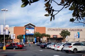
-Stonestown Galleria is the city’s only shopping mall that is not downtown, includes grocery stores (Target & Trader Joe’s), restaurants, and large retail chains. Its parking lot is shared with/surrounds banks, churches, and a movie theater.
These establishments draw people from all over the city as a source for a range of commercial needs. Anyone who doesn’t want to trek downtown would prefer to come here for its convenience and accessibility.
–Lakeshore Elementary School, Lowell High School, & San Francisco State University.
These establishments draw families to move into the area for the convenience of schools of all levels.
–San Francisco Zoo
The SF Zoo is also nearby within walking distance, providing a special place to go for families with children.


Force 2: Transportation/Traffic/Parking
–Parking Lots/Structures
The parking lots of the mentioned establishments are shared/adjacent and thus blurring the boundaries of each establishment, creating a sense of community. There is an abundance of parking unlike the rest of the city, making it the easier choice for anyone with a car. (SF is notorious for difficult parking and downtown traffic.)
–M-Line (MUNI) Stop
The M-Line is one of the main bus lines stretching over the city, making it a convenient stop for non-car owners as well.
–Daly City BART Stop
For others, there is a BART stop within walking distance. BART is the fastest public transportation system in SF, often faster than driving if stations are nearby.
–19th Avenue
This avenue is one of the largest streets in the city, stretching from the North Bay, through the Golden Gate Bridge, and down and turning into the 280 highway (the only other highway through SF other than the highly congested 101).

Force 3: Venues
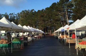
–Stonestown Farmers’ Market
A section of the parking lot is converted into one of SF’s largest farmers’ market every sunday, where many people come to buy weekly groceries.
–Stern Grove Park is a venue for free concerts throughout the year.


Force 4: Groups
-San Francisco State University is the city’s only 4-year public university. This university brings diverse people from all over who want to live in SF after high school to pursue a college education.
–Sunset District Locals
The Sunset neighborhoods are mainly occupied by families large. It has a more suburban vibe compared to the rest of the city. A large part of population who
frequents stonestown comes from Inner/Outer Sunset.


Force 5: Recreation
-Lake Merced Park
This area is lined on one side by 19th Ave and on the other by side by Lake Merced Park where people can golf, exercise, and relax.
–Fort Funston
Farther west of Lake Merced Park is Fort Funston Park (a dog-friendly park) which lines the beach. Many dog owners in the city bring their dogs here to have fun off the leash in a city with limited space for dogs to run free.
For my synthetic map of these 5 forces:

Exercise 3.1.1 Comment:
For context, I haven’t even read where your map is showing, much less any of the forces shown.
Based on the final map, there appears to be a correlation between where groups establish themselves, and things to do. Organizations are a large and somewhat dense gathering of groups, while Venues get smaller groups, but they are very dense, either fitting more people into less space, or maybe how they relate to each other, maybe people are closer friends at venue’s rather than inside of organizations. Interestingly, there doesn’t seem to be any impact on transit stations due to venue locations, and instead access to organizations is prioritized by the city. Also based on this map, groups never access the recreation areas.
I’ll leave a reply to this comment with some feedback after reading what the forces actually are and what you’re attempting to portray.
Ok, after reading through your post and actually learning what your forces are, Here’s some feedback for each individual map as well as for the final combo map.
Establishments: Since your map does not indicate buildings, you’ve got selected areas which i can only assume surround the selected establishments, but due to the fact that you have it set up this way, I cant tell what is what. What box is the zoo you mentioned? Which box is the elementary school? Middle School? University? I cant even tell which box is the Mall. I had assumed it was the biggest one, but then I realized a university would probably be bigger, so that must be the big box instead.
While those can be tough to indicate without blatantly sticking labels on them, maybe consider more accurate tracing of the boundaries, so that you can easily tell the size of the various establishments, which should help to translate to a more simple understanding of each individual unit. Also calling malls, schools and zoos “Organizations” on your final map is not an ideal term, I suggest Lifestyle or something along those lines, since they all deal with living everyday life rather than a particular event like a convention center or a baseball stadium would. Or just stick with establishments.
Transportation/Traffic/Parking
So you’ve established transit spots, and you’ve got your major and most traffic’d roads, but you have no indication of parking. Consider drawing in parking lots, especially if they overlap your chosen boundaries, since various places share lots.
Venues
Accuracy of scale, I have trouble believing that a farmers market can take up a quarter mile on one side, and be about .2 on the other. Unless this place has over 1000 vendors, its probably closer to .1 miles (500 feet or so, just a little bigger than a football field) on each side. Get that a little closer to what it should be. I’d imagine the outline is actually of the parking lot, which we can refer back to the previous point about indicating parking.
Groups
There is no distinction between your two selected groups. It actually does translate well on your final map because of the slashed line going over the big red wine color dot, but not so much on your initial force map. Also if you use separate colors, you can more obviously indicate a blending of visitors to the farmers market, with maybe one group being more represented than the other, which is what it looks like you’re attempting to show with all one color.
Recreation
I actually think you nailed this one. if you feel the need for changes at all, consider using a less dense pattern so that the underlying roads and paths of the park shine through. Also on your final map, if you’re using illustrator, use the offset path for your road line and just change the color of the resulting stroke so that your 2 lines aren’t overlapping, and its easier to see the final outline. Learn how here:
https://helpx.adobe.com/illustrator/using/duplicating-objects.html
So back to the discussion for the sort of hidden meaning on your map. I think if you had used different color for the 2 selected groups, of locals and college students, you can more easily show their blending all across your chosen site, not necessarily just inside the farmers market, that might actually be kind of interesting. You can find my 5 minute attempt at this over your traffic map here: https://sites.uci.edu/in4matx282f18/files/2018/11/Christina-Map-Suggestion-1.jpg
(I thought I had replied to this but I guess it never posted. So I’ll see if I can get to everything again.)
Thanks for the feedback! So I think what I should have done (after looking at your post) was actually keep the older versions of the forces maps instead of swapping them out as I update them. That way there’s a visual for the evolution/changes. Cause I had originally done them as individual maps, labeled all the names, etc. so they were probably much clearer as individual maps then. But after receiving the comments and thinking ahead to the synthetic map, I revised them with the final map in mind. In that case, I figured that it was much less important to know what the individual elements of the forces were, but rather more important to see the forces as groups of elements so you can read the forces in the final map more easily. So I took out names, switched up the colors/filling per force, and made them act more like layers on the same plane. This now seems like a mistake…So I will go back and add the labels back in, so thanks for reminding me that new audiences will still need the clarification!
On the note of naming the organizations establishments instead. I actually couldn’t decide between the two, but now that you’ve pointed out establishments works better, then I’ll go ahead and use that term instead.
As for venues, I actually have no way of telling the size/shape of them because they aren’t fixed to any boundaries and just sprawl out as needed. So I kind of highlighted a shape that I felt represented it. I also avoided outlining parking because it may decrease legibility given that there are parking structures as well as flat parking areas. But I will find a way to reconcile that and show it as best as I can.
Thanks for all the tips/advice though! I appreciate it!
Hey Christina, I don’t know the bay area too well but it looks like you covered a wide area for your forces. I’m impressed! I think you’ve made the right choice by adding names to your maps. I wonder if you might want to consider representing your forces with different colors or designs. That may help better distinguish your forces in the final composition.
Hi Christina! I think you’ve done a good job of picking out your forces, but I think you might be able to find some clearer ways of portraying them in the maps, perhaps (rhyme intended). For example, in your transportation map, it is not entirely clear to me what the brown lines are. I am assuming it represents a roadway, or possibly the BART tracks? If you were able to add a little clarity, I think that would greatly improve the usability of this map! I love that you chose “groups” as a force, it is something I never even considered for my location! I also think it’s really interesting that you chose two school groups and then a residential area – do you think these groups have a large presence in the area?
Can’t wait to see the end result!
Hey Christina!
I think you put an exemplary amount of work into deciding on and explaining your forces. The deep, detailed descriptions of all the mechanisms encompassing each force was excellent, and shows me you thought this out extremely well. This is especially prominent in your Establishments and Transportation sections, in which you clearly outline everything that makes up those forces.
On the design side, I think your maps show a great start! I would definitely suggest trying vector drawing in Illustrator so you can keep a fairly large image size without the file being too large in memory. Also, I’d urge you to somehow differentiate the forces in color or texture, so when we put them all together, it’s clear which force is which. Right now, all of them combined will show a single, monochromatic shape that makes one force indistinguishable from the others. You have an excellent start for your maps – I look forward to seeing where you take them from here!
Hello Christina. Good posting. For some reason your pictures are not clickable. I couldn’t maximize them so I can’t see very well your map representations. i would love to give you feedback, see if you can update the post with images that can be enlarged 🙂