Climate Lab’s Projections of the World Future Temperature Maps
We present their graphs of the World future temperature maps for the average of June/July/August, under the “business as usual” or no climate mitigation scenario. This is called RCP 8.5, where in 2100, the average climate forcing of greenhouse gases and other anthropogenic causes is 8.5 W/m^2 above pre-industrial times. Currently, we are about 2 for this year. The previous projections which we presented were for an estimate of obeying the present initial Paris Agreement emissions, which would give us RCP 4.5 in 2100. These projections are from the Climate Impact Lab at impactlab.org
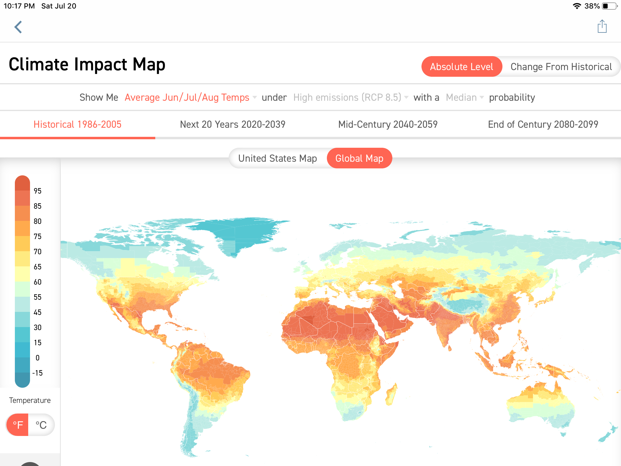
First, we have the past 20 year average of World temperatures from 1986 to 2005. The equator runs through the Western bulge of South America.
We next have the 20 year average projection from 2020 to 2039.

The mid-century projection of World temperature averages runs from 2040-2059.

Finally, the end of century projection is the twenty year average from 2080-2099.
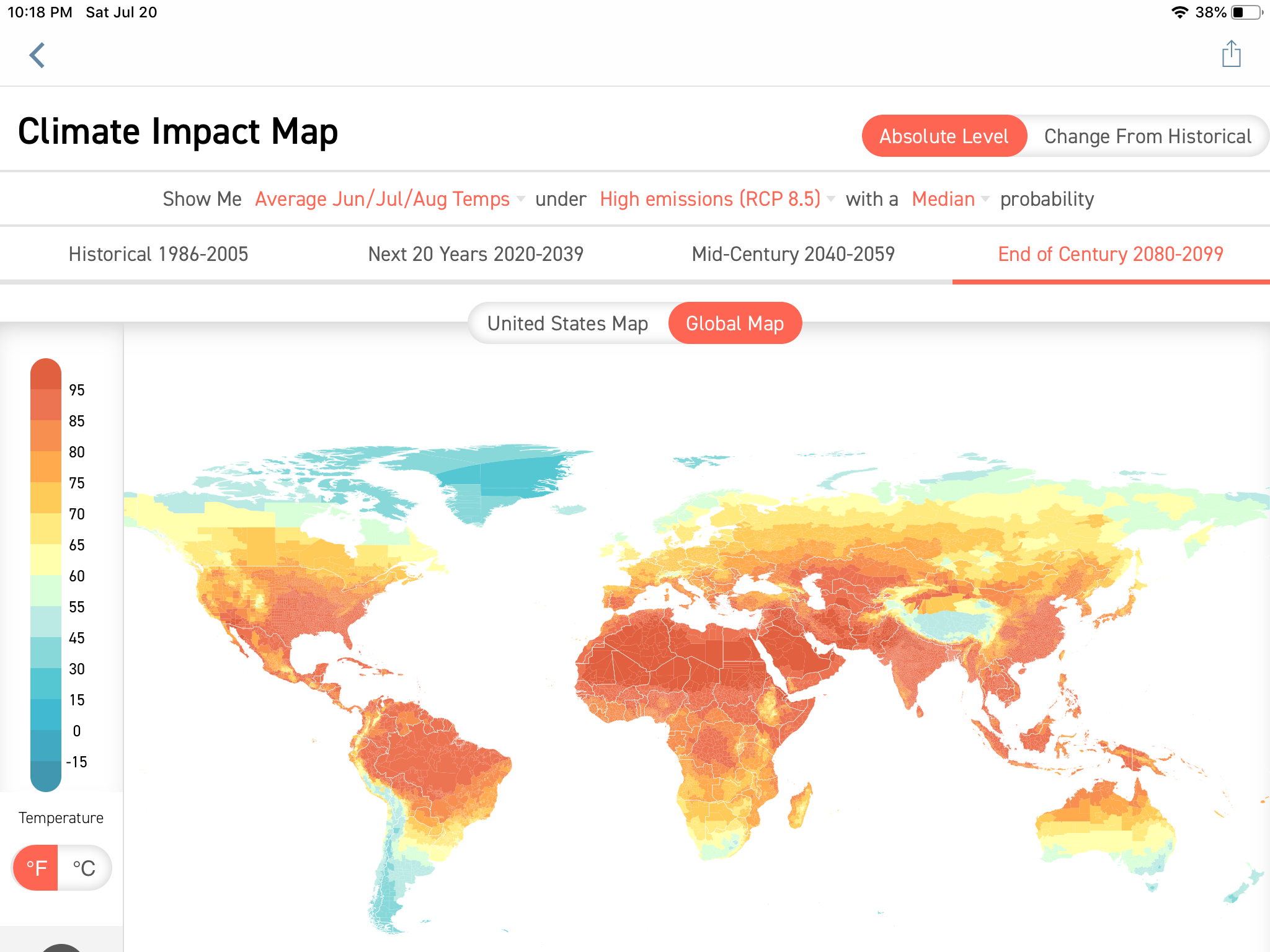
We see that compared to the top map, the historical record, that the bluish areas in Southern South America, Canada, and Siberia are turning warmer. The initial orange parts of North America, Equatorial South America, Africa, and India will turn redder. The bluish areas in South America are the Andes, and in Asia are the Himalayas.