The tragedy of Canadian wildfires due to an early summer heat wave, and Southward air currents, has brought dangerously high particulate air pollution to the Northeast US. The acreage of Canadian wildfires is now 15 times greater than the past average per year. We compile some relevant graphs which have appeared or which we have generated as of 4:30 PM EST on June 7, 20203.
We start with the hazard scale of PM2.5, which is Particulate Matter of 2.5 microns or less in diameter, which can make it to the smallest parts of the lungs, where they can cause lung damage and inflammation. Avoid outdoor exercise, and stay indoors if possible. First we present the color code for the hazard levels of this air pollution.
We now zoom in on the Northeast, heading into NY City. PurpleAir.com sells home air pollution monitors and shows their realtime results. It also has the PurpleAir app that directly shows the map. The results inside of circle outlines are those that are indoors.
The iPhone weather app has 327 for NY City. The PM2.5 from the first map above goes up to 492.
In order of Causality, we first show the unusual May warming over Canada, in degrees C above average. To convert the differences to Fahrenheit, multiply by 1.8, or nearly double.
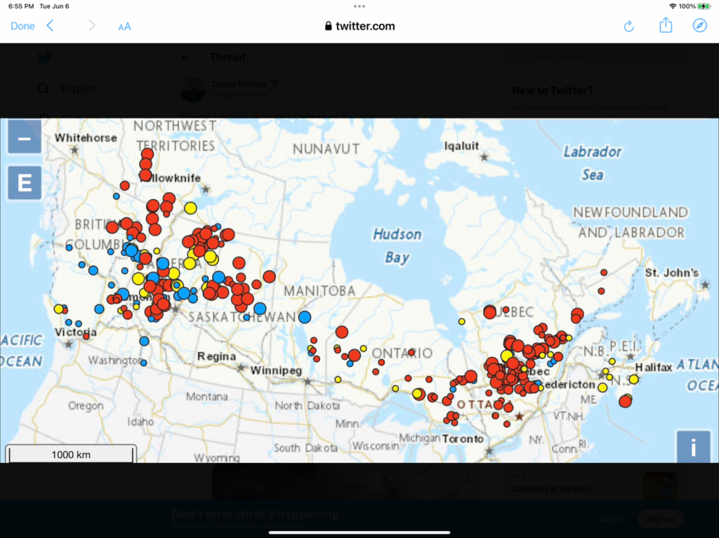
Next, we show where the Canadian wildfires are. Red is Out of Control, yellow is Being Held, and blue is Under Control, from @daynavettese on twitter.com:
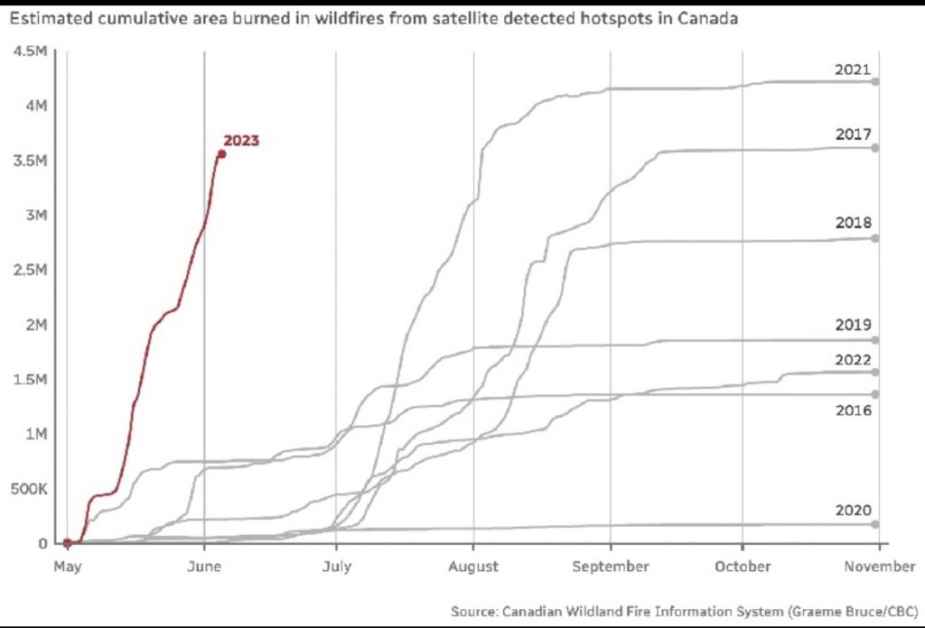
We see that the acreage burned are already almost at the worst season total of 2021, but much earlier (3.5 Million hectares times 2.5 gives 8.7 Million acres,:
Finally, we have the wind pattern, from earth.nullschool.net.
From Airnow.gov we have smoother air pollution maps of the Northeast and then New York:
From the iQAir.com we have the hourly and daily air pollution forecasts for New York City:
But, there are worse locations:
Kilauea livestream at: https://www.youtube.com/live/Q5M-5XFplo0?feature=share


