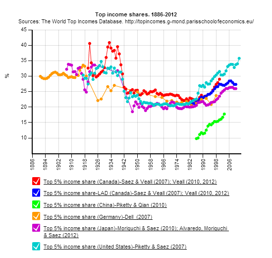
From the Piketty et al. site http://topincomes.g-mond.parisschoolofeconomics.eu/ we have constructed a graph of top 5% income distributions for top US trade partners. We see a dip for Germany (orange) after World War I. We also see a dip for everybody after World War II, and a rise since 1986.
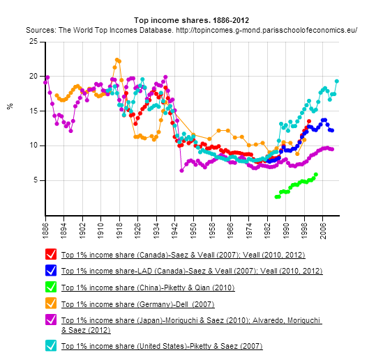
We have also constructed a top 1% graph from their database and graphics module. Again, we see Germany’s dip (orange) after World War I, and everybody’s dip after World War II. However, since after 1986, the US (light blue) has had a rapid increase in income of the top 1% up to 19% of total US income. It’s too bad that China’s data stops in 2003, a decade ago, and that our trading partner Mexico is not yet included.