Florida Politics Still in Climate Change Denial

Florida Politics Still in Climate Change Denial

Florida Governor DeSantis is already writing the Hurricane Ian disaster off as a one in 500 year event, implying that there won’t be any climate change effects for 500 years.  This is of course in defense of rapidly expanding Florida real estate, and the Republican’s national backing by the fossil fuel industry. Yes, I know that I shouldn’t be political after a disaster, but I am not starting this, and I am being scientific, not political.

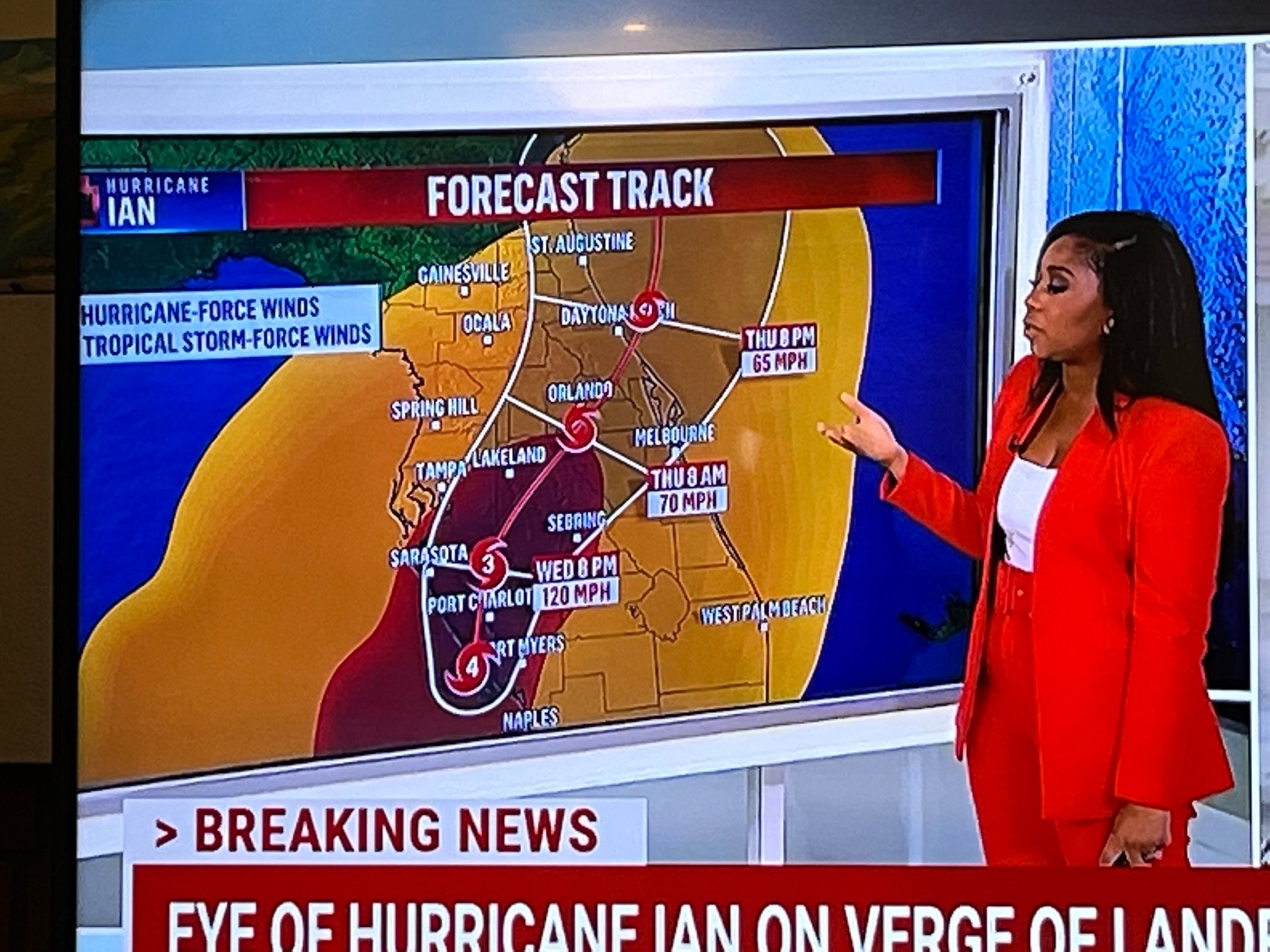
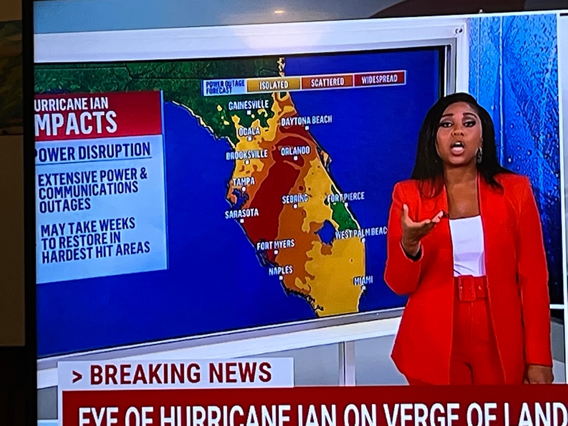
What the one in five hundred years means is that any chosen city would only get hit once in 500 years by another hurricane of category 5 or greater.  But the Governor of Florida has to respond and aid Floridians for many years in dozens of cities, counties, and areas.  The last extreme storm in Florida was category 5 Hurricane Andrew only 30 years ago.  Punta Gorda, near Fort Myers, was devastated by Hurricane Charley in 2004, less than 20 years ago.  But even more importantly, super, almost category 5 Hurricane Ian carved a long coastal swath including Naples, then crossed Florida with high rains and winds, struck Orlando, then repowered to a Catagory 1 over the Atlantic, and then came ashore again at Charleston, South Carolina.  Also, Florida can be attacked by both East and West, and has the gigantic 1,350 miles of coastline, only exceeded by Alaska.

But wait, the intensity of storms is also increasing rapidly with the warming of Gulf and Atlantic Ocean temperature.  Yet still another wait, by the year 2100, less than 100 years from now, the sea level will rise another 3 feet, at least.  Yet finally, the settlement of scenic and recreational ocean, harbor, and river apartments, condos, and homes is also rapidly increasing. 

We will back up these statements using the MSNBC presentation and other sources.

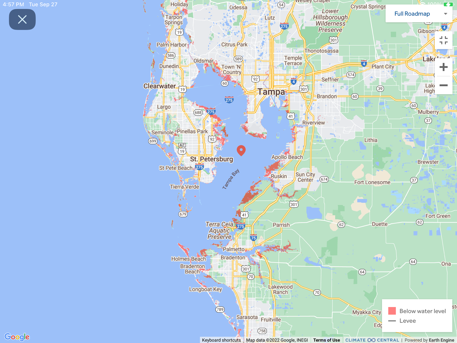
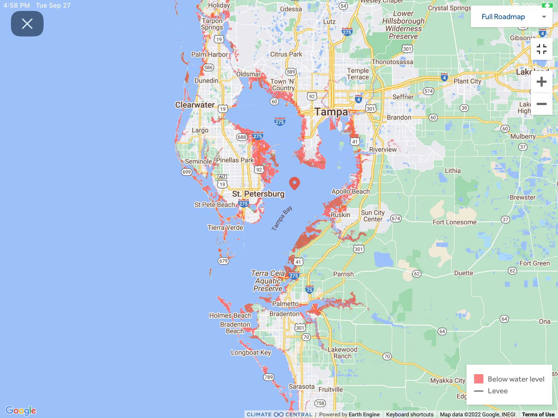
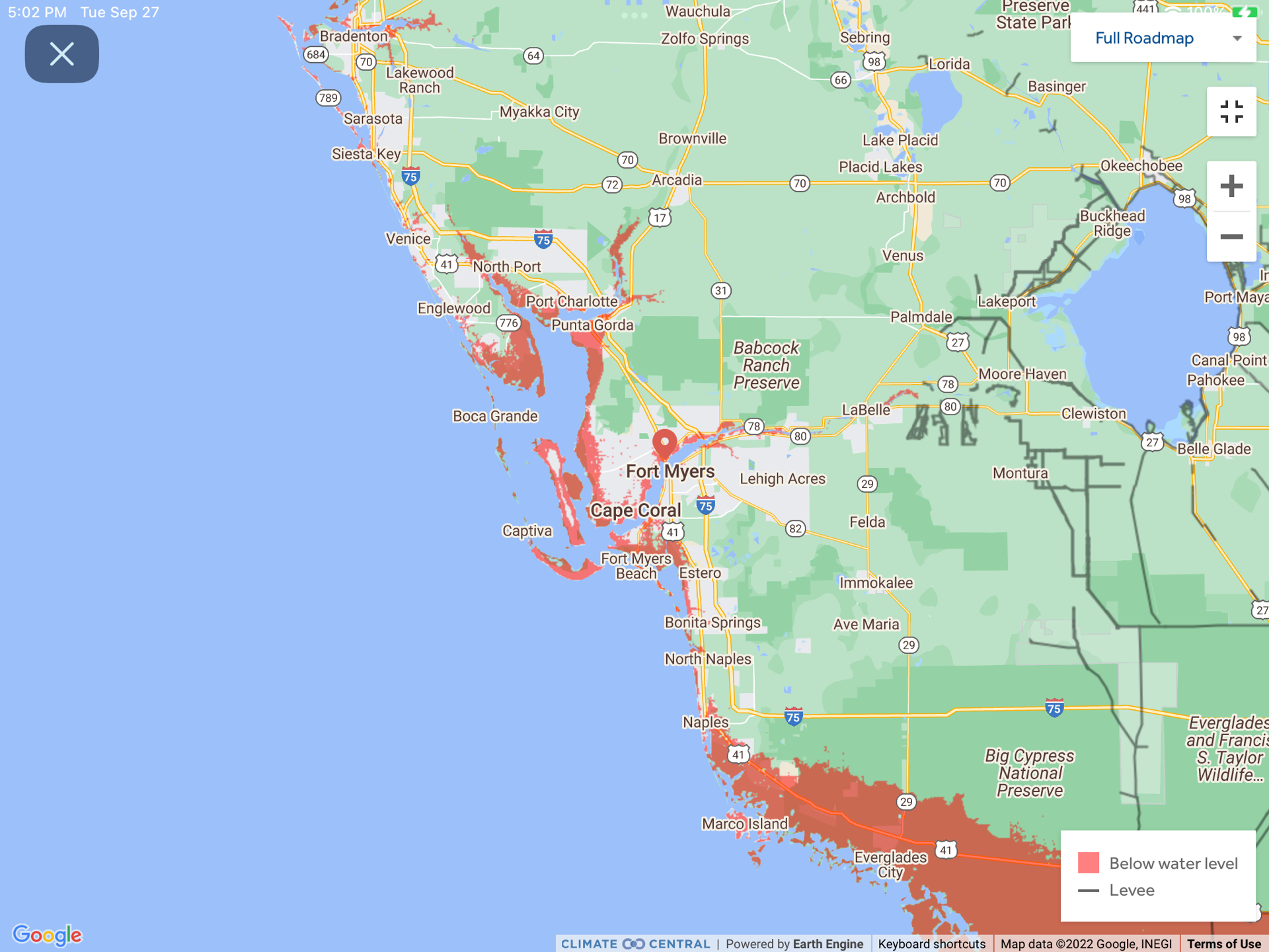
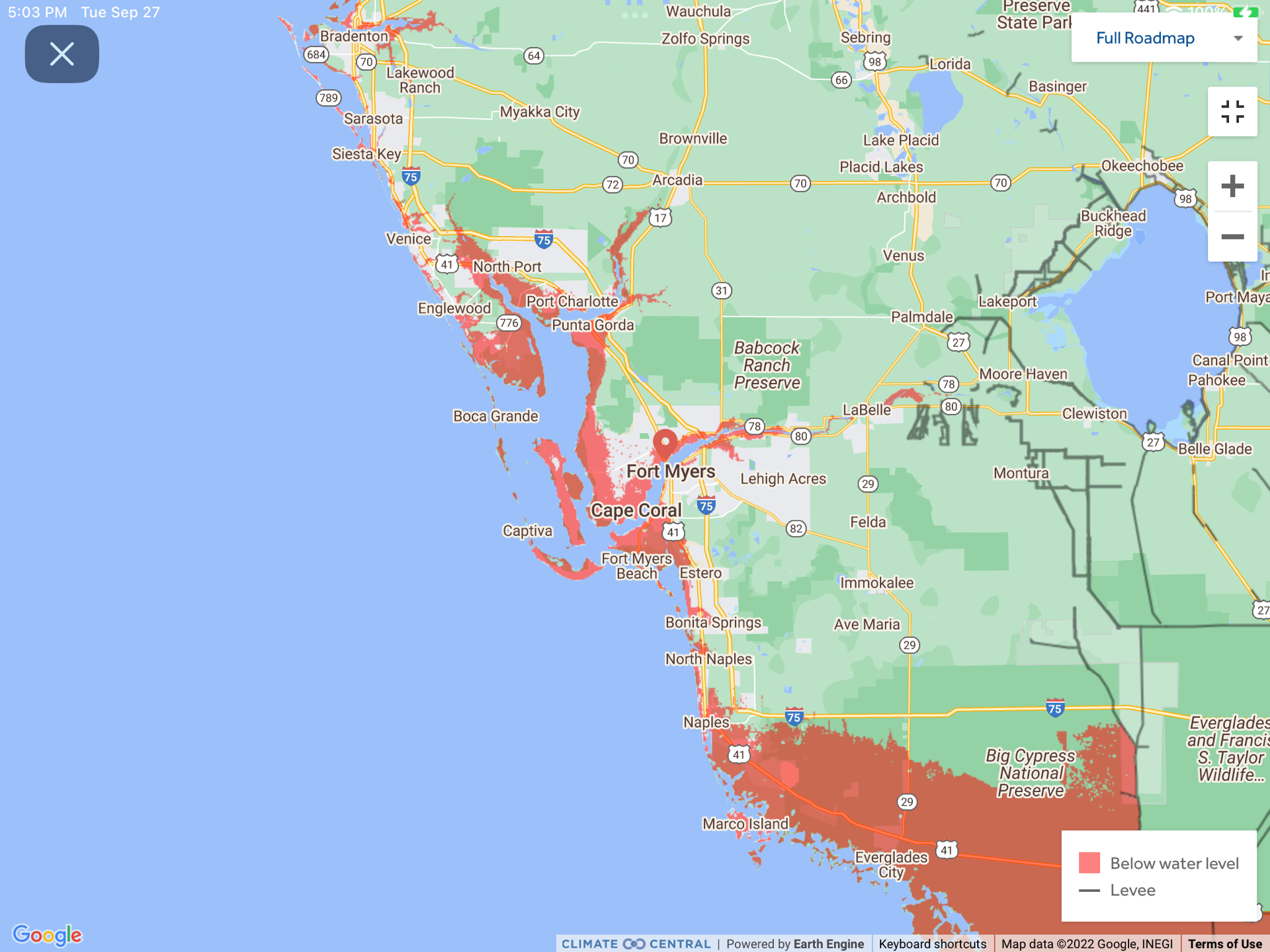
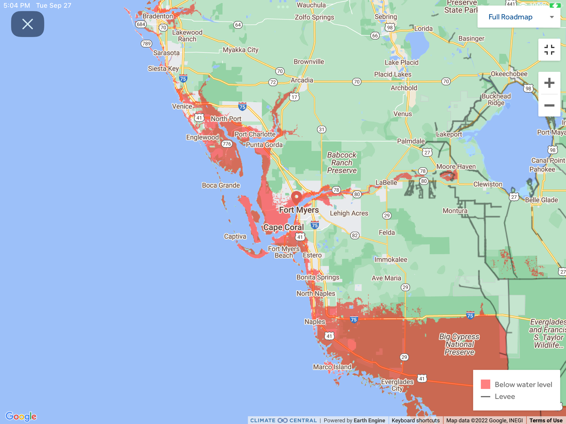
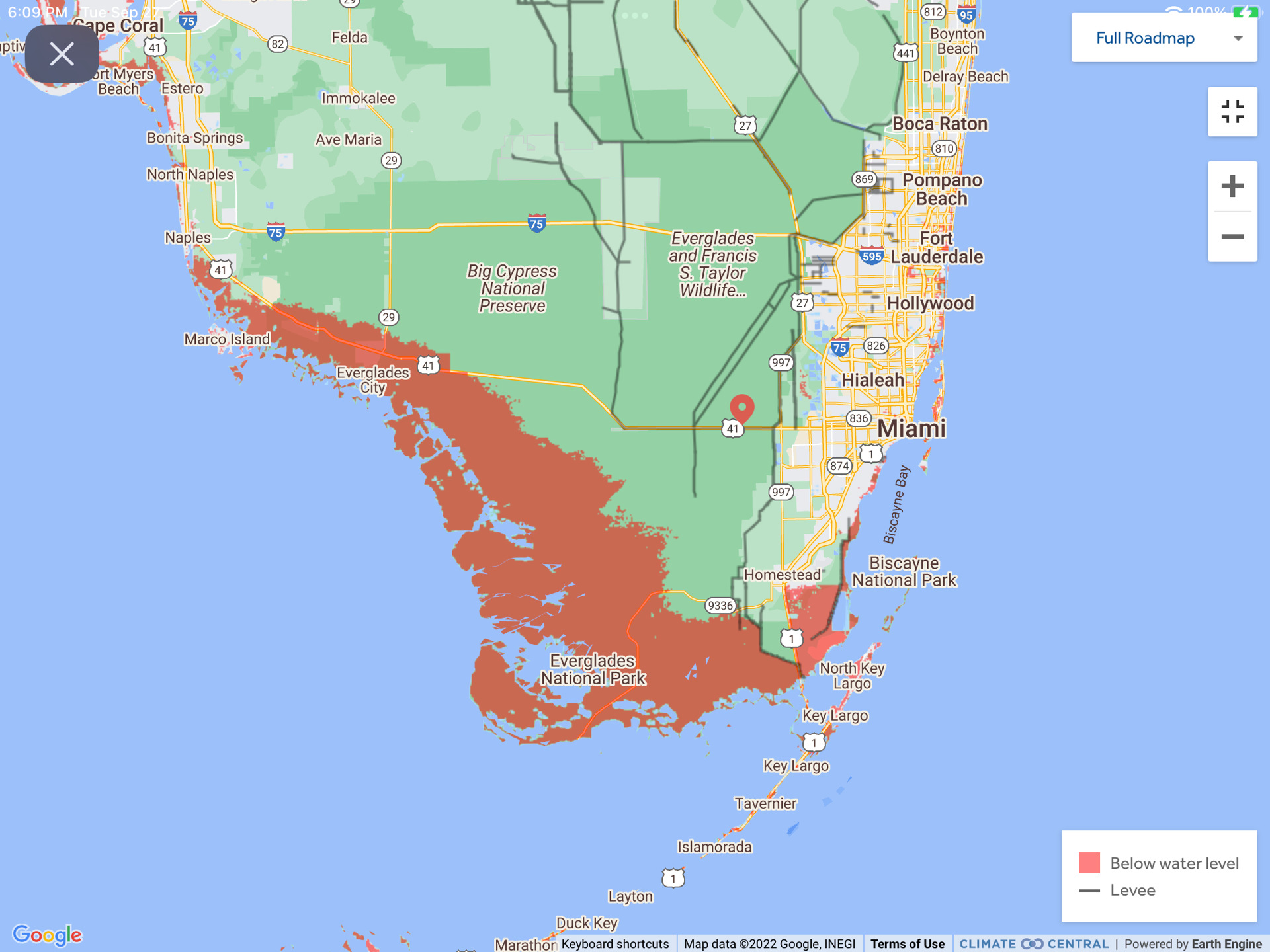
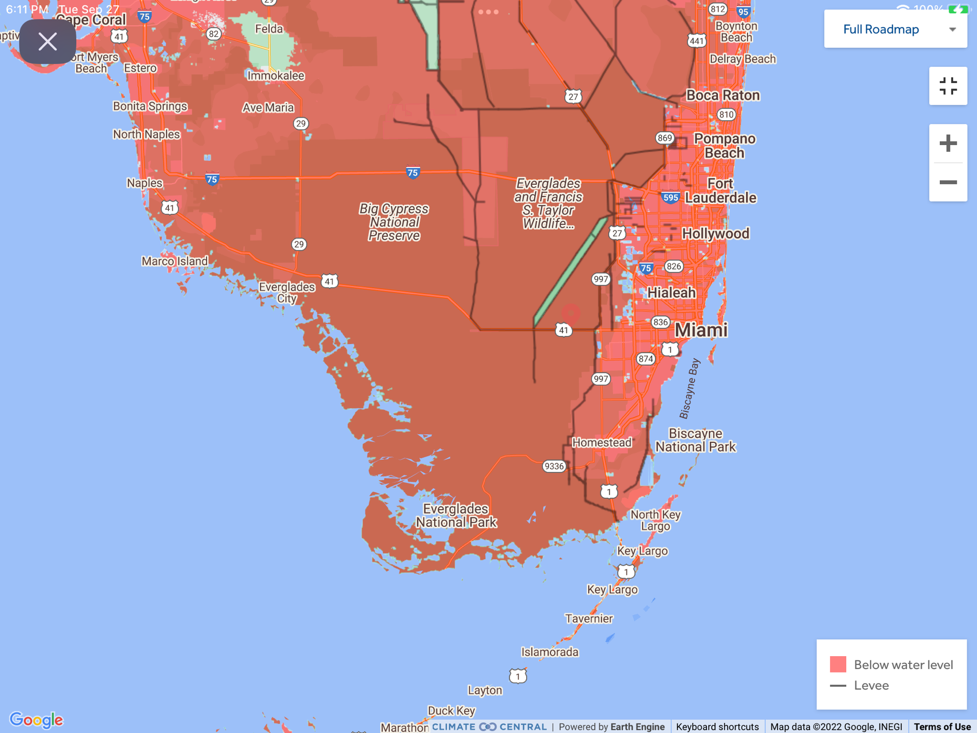
When driving across mountainous terrain, you always find the altitude at the peak of your passage.  Crossing the Everglades, the peak sign we found listed 3.5 feet above sea level.  Two articles ago, you can see that a flood map at 6 feet covers all of the Everglades South of highway 41.  That also means that  maybe 100,000 of the 1.5 million Florida alligators will be finding new homes in the neighborhood. 

Lee County, which contains Fort Myers Beach, Sanibel island and Fort Myers which took the brunt of the incoming eyewall, increase in population from 1970 of 100,000 to over 700,000.  It is one of the hottest increasing national housing areas.

One study says that the Hurricane contained 10% more rain because of climate change.  Forty years of satellite data showed that the probability of a tropical cyclone becoming a Category 3 or higher hurricane increased by 8% per decade due to global warming.  Warmer sea surfaces also slow down storms to allow for more torrential rain, flooding and storm surge.  Finally, the warmer sea surface allow the hurricanes to maintain their strength longer after making landfall.

The following study shows the correlation between the Atlantic water temperature and the energy contained within the tropical storms.

Above are about a dozen factors that increase the total damage to be considered by all Americans, over DeSantis’s minimizing dismissal of the true and scientific susceptibility of Americans to climate change and “natural” disasters.  Oh, and DeSantis is preparing to run for President of these United States, after he get reelected Governor.

Below is the yearly cost of disaster events of more than a billion dollars each.  The yearly costs are now often above $100 billion a year, and increasing in frequency.

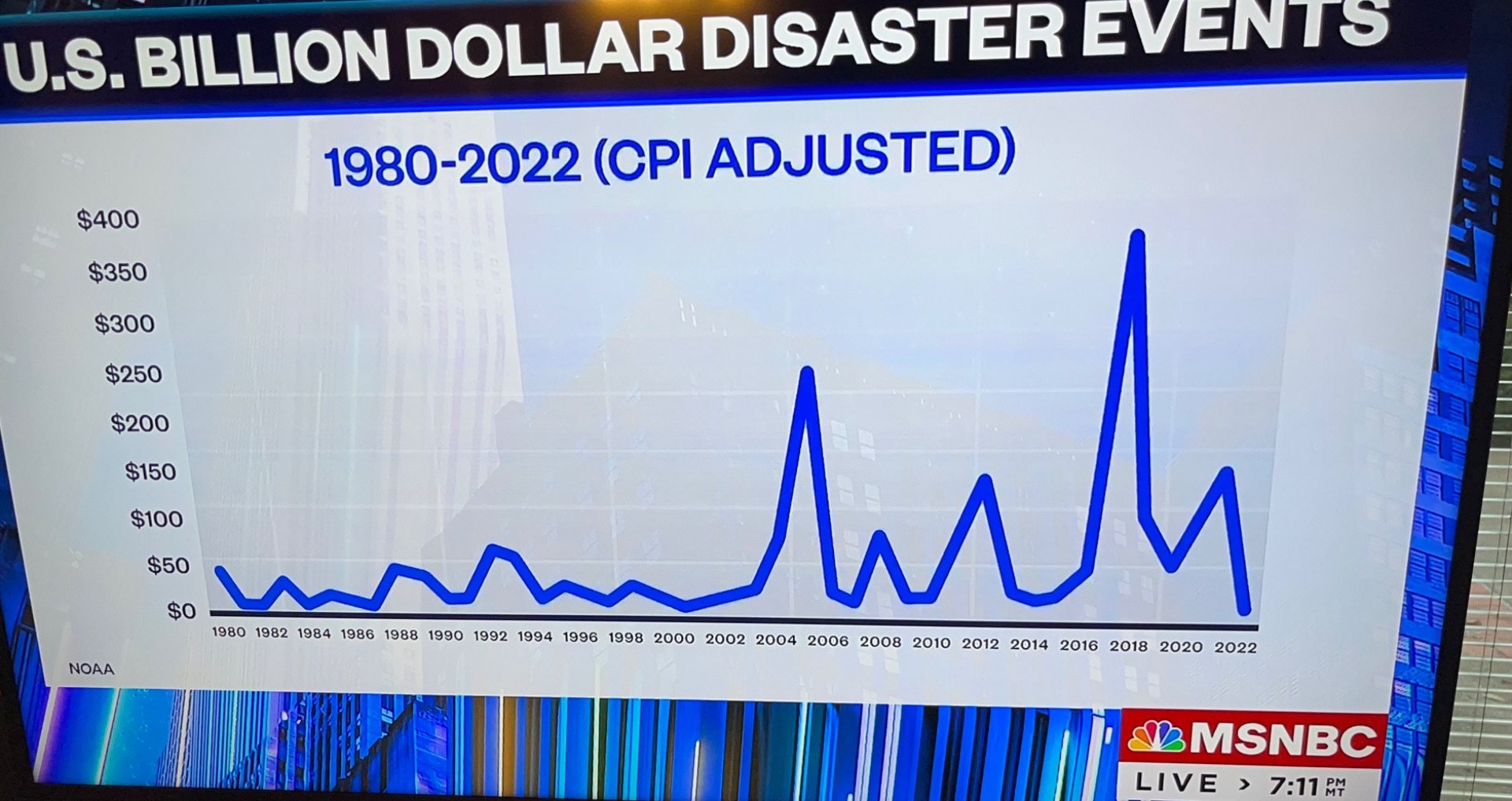
The chart below shows the type of disaster events and their costs and total costs per year.  For 2021, the second highest year, the total of 20 events was $152.6 billion.  The Total Costs for the last five complete years was $788.4 billion.  This is from NOAA’s National Center for Environmental Information and shown on MSNBC.

So far in 2022 we are at $200 billion.  Hurricane Ian’s cost is now estimated at over $100 billion, where only $63 billion is covered by private insurance.  A little over that total estimate by the end of the year would place 2022 as the fifth most expensive year.

The five most costly Hurricanes and their dates show that they are all in the last 17 years, proving that the once in 500 year description can be very misleading.

The Biden Inflation Reduction Act contains the largest appropriation yet for mitigating climate change of $369 billion.  This is not even half of the destruction over the last five years of $788 billion, showing that recognition of climate change and working on its prevention is far less costly and disruptive over both the short and long run.

Misrepresenting risk can have serious consequences.  Only 15.4% of households in Florida have flood insurance.  Even people in upper story condos can have their car drowned in underground or ground level parking.  Also, roofs can be removed.  In Orlando, only 2% have flood insurance.  In Lee County of Fort Myers, 28% are covered, and in Naples’ Collins County, 41% are covered.  Misrepresentation can also affect resident from following storm news, from stocking up on food, water, and necessities, and from evacuating when advised or ordered.

While Florida has had a 15 year old legislation to build renewable electrical energy, nothing was done on it.  Florida has only 20% clean energy, and only 7.4% of its energy is renewable.  While Governor DeSantis has become known as the “don’t say gay” governor, the past two term Governor and now Florida Senator Rick Scott was known as the “don’t say climate change” Governor.  Senator Scott is now Chairman of the National Republican Senatorial fund raising Committee.

Posted in Uncategorized | Leave a comment

Savannah and Charleston Possible Flood Height Maps With Hurricane Ian

We use US flood maps from Climate Central at coastal.climatecentral.org.

Here are the predicted range of flood heights along the shores of Georgia, and South and North Carolinas.

With a predicted storm surge of from 4-7 feet, here are the 3, 5, and 7 foot level flood height inundation maps around Charleston, South Carolina.  Fortunately, hurricane Ian warnings are up to 7 AM on Friday, September 30, and there is a low tide of only 0.5 feet at 5:20 AM.  The next high tide will be at 6.3 feet at 11:41 AM after the low.  A lot of the flooded parts by the ocean are already unoccupied tidal lands.

With a predicted storm surge of 4-6 feet for Savannah, Georgia, here are the 3, 5, and 7 foot flood levels for Savannah.  The latest Hurricane Ian track now points further north than Savannah towards Charleston.  The next low tide is at 6:25 AM on September 30 of only 0.6 feet.  The high tide after that is 9.2 feet at 12:22 PM.  A large part of the flooded area are tidal flats.


Posted in Savanna and Charleston Flood Maps for Hurricane Ian | Leave a comment

Florida Flood Height Maps Which May Be Reached with Hurricane Ian

Flood Height Maps Which May Be Reached with Hurricane Ian

Updated Surge Threat below Thursday 3 PM EST.

Here is the projection for storm surge heights from hurricane Ian on Tuesday, September 27th, 2022.  We use the flood maps from coastal.climatecentral.org.  Maps are generated for 3, 6, 9 12, and 15 feet where relevant in the projections.  There are also high tides of about 2 feet.


Here are the 3, 6, and 9 foot flood levels for the Tampa and St. Petersburg Florida area, although the latest NOAA shows only 4-6 feet for this area., but there is a 2.5 foot high tide as well about 2pm Wednesday.

For the Charlotte Harbor, Boca Grande, Fort Myers area, for the 12-18 foot prediction, we show flood levels at 3, 6, 9, 12, and 15 feet.  On Wednesday, at Punta Gouda, the high tide is at 5:57 pm at 1.7 feet.  On Thursday morning, it is at 4:51 AM at 2.2 feet.

Fortunately, or historically, much of the flooded areas are already nature preserves.

Here is a close-up of Fort Myers if it gets to 15 feet.


The southern Everglades are listed as 4-6 feet.  We give the flood maps for 3, 6, and 9 feet. The black lines are levees that protect East Florida from the Everglades.

Here are more Ian storm projections as of 3 PM EST Wednesday.


Posted in Hurricane Ian, US Flood Maps, Wind Energy | Leave a comment

IHME Global Projected Daily Covid Infections at a Minimum, to More Than Double by January 1

IHME Global Projected Daily Covid Infections at a Minimum, to More Than Double by January 1.

Today, September 21, Global Daily Covid Infections are modeled at about 18 million a day.  This will rise to 45 million per day by January 1, but be leveling off there, at 2.5 times as many as now.

The model uses 24% masking, 64% fully vaccinated, and mobility at 22% above pre-pandemic.  Already, 65% of Global population is immune to Omicron through infection or vaccination. 

Here is a map of the percent fully vaccinated around the world, from IHME.


Global Hospitalizations are at 200,000, and will double to 410,000 by January 1.  ICU are at 28,000, or 14%, and will double to around 55,000 on January 1.

Global Total Daily Deaths are around 3,500 a day now, while reported ones are at only half of this.  Total Daily deaths will more than double to 8,000 a day by January 1.

Global Total Deaths from Covid are at about 17.6 million, while Reported Deaths are about 7.1 million, or 40% of Total.  Total Deaths from today to January 1 are projected to increase about 450,000.  With 80% masking, this could be cut in half.

Here is the IHME map of Total Deaths per 100,000.


Posted in Coronavirus, COVID-19, Health Care, IHME Projections, Omicron Variant, Vaccine Distributions, Variants of Covid-19 | Leave a comment

IHME Projects Four Million Infections a Day in China by New Year’s

IHME Projects Four Million Infections a Day in China by New Year’s

We use the IHME model run on September 9.  For China, today, September 19th, there are projected to be about 320,000 infections a day.  However, the infections per day are going to accelerate, and by New Year’s Day, there will be about 4.3 million infections per day, out of a population of 1.4 billion people.  Only about 4% of infections are taken as detected.  If China were to advance from 59% masking to 80% masking, that would reduce to 2.6 million infections per day, or 59%.

For China, the IHME uses 59% masking, 92% full vaccinations, 18% now immune from the Omicron variant, and a mobility gain of 6% rising to 11% by January 1.  Northern China is about 30%-40% infected with Omicron.

With the infections, Hospitalizations will increase from about 5,400 beds today and 500 ICUs (9%) to about 80,000 beds and 7,000 ICUs on January 1.

Total Daily Deaths are about 200 per day now.  They will grow to about 3,500 per day on January 1.  This could be reduced to about 2,800 per day with antivirals, and 2,000 per day with 80% masking, or 57% of that with present masking.

Total Deaths in China on September 19 are estimated at 22,640.  On January 1, they are projected at 155,164, or about 133,000 more to go by then.  With antivirals, new deaths are about 107,000.  With 80% masking, they are reduced to about 98,000, or 63% of those with present masking.

The January 1 total death rate from COVID is projected to be 0.25 per 100,000, which can be reduced to 0.15 per 100,000 with 80% masking.  The Reported Deaths are about 80% of the total deaths.

Posted in Coronavirus, COVID-19, Health Care, IHME Projections, Omicron Variant, Vaccine Distributions, Variants of Covid-19 | Leave a comment

IHME Projects Rapid Drop in US COVID, Then Resurgence Over the Holidays

IHME Projects Rapid Drop in US COVID, Then Resurgence Over the Holidays

Updates, September 23.  In The Atlantic article by Sarah Zhang quoting virologist Trevor Bedford, so far in September, 88% of US COVID deaths have been in people over 65, since seniors have weaker immune responses.  He projects a continuing 100,000 deaths a year by COVID, which is three times that of a typical flu year.  It will continue to infect 50% of Americans a year, in contrast to the flu which infects 10%-20%.

Update:  An LA Times article says that for California this summer, half of COVID deaths have been from people aged 80 or over.  Nearly one-third have been from those 65-79 years old.  The 65 and over then make up 5/6 of deaths, or 83% in California.

Update:  A commission has estimated that for the US, “unfounded anti-vaccine sentiment has led to as many as 200,000 preventable deaths.”  California full vaccination rates by race are:  Asian, 90%; White 65%; Latino, 56%; and Black, 55%.  By age, for California, those 50 and over are about 85% fully vaccinated.  Those 18-49 are 78% vaccinated.  Even 12-17 is 67% fully vaccinated, and 5-11 is 36% fully vaccinated.

The IHME has made new projections on September 9th.  For the US, there is projected a rapid drop from the current about 600 Total Deaths a day, to a low of around 150 a day near the start of November.  After that, there will be a rise back to about 400 Total Deaths a day by January 1st, where the projection ends.

The background is that masking is currently at 14% and will stay at less than 10%.  For CA, NY, and HI, it is in the range of 10%-20%.  Mobility is only reduced by 7% compared to pre-COVID.

Between September 14 and January 1, modeled Total COVID deaths would increase from 1,322,021 to 1,361,986, or almost 40,000 more to go.  If the US would switch to 80% masking, that could reduced to about 22,250.

From graphs:  CA masking is 26% and mobility reduced by 19%; TX masking is 16% and mobility -6%; FL masking is 16% and mobility -6%; and NY state masking is 21% and mobility -13%.

The US infection fatality rate is less than 0.2%, that is the percent of deaths among those who have been infected.

CA is estimated to be 77% fully vaccinated by January 2023, with 98% immune to the Delta variant, and 78% immune to the Omicron variant.

CA hospitalizations at around 4,400 will drop to around 1,600 in November, and then rise again to around 5,000 by January.

CA daily estimated infections are currently about 140,000 a day.  They will drop to about 70,000 a day by the end of October, and then rise to about 320,000 a day by January 1.

CA Total Deaths by January 1 will be 135,000, which is 7,000 more since August 29th.

It is estimated that 94% of Californians had been infected by August 29th, and the infection detection rate has only been 5%.

While IHME does not directly cite modeling for the new Omicron dual vaccine, they model Other mRNA vaccines effectiveness against Omicron as 67% against severe disease, and 46% against infection.

A PNAS article has modeled that if the US had Universal Health Care, 1 in 4 COVIID deaths could have been prevented.  That is 340,000 as of March 2022 using the IHME model of 1,237,000 Total COVID deaths by then.  That means that while the US has 4% of the World’s population, we have had 16% of the World’s deaths.  On March 15 in IHME, the ratio of Total US Deaths to Reported was 1.27.

From the Los Angeles Times we show the percent fully vaccinated on the vertical axis, for all of the US states.

Full vaccination rates and deaths per 100,000 for the four largest states are shown in the table.

State Full Vaccinations Deaths per 100k
CA 71.0% 242
TX 59.0% 325
FL 63.7% 391
NY 74.6 364


We hope that many people get the new BA5 vaccine, and trust that Seniors will, as they have the other vaccines, often at the 92% level.   One problem is that Congress has to step up and appropriate more money to make COVID coverage free.  The cost of vaccinations, antivirals, and hospital treatments is so small compared to that of COVID deaths, severe illness and Long COVID.  At the current death rate of about 500 a day, that is about 180,000 deaths a year, which is triple the worst flu seasons.  So far, only about 2/3 of the US has received the first booster shot, and of those, only a third has received the second booster shot.

Posted in Coronavirus, COVID-19, Health Care, IHME Projections, Omicron Variant, Vaccine Distributions, Variants of Covid-19 | Leave a comment

Quinnipiac Polls on Student Loan Reduction, Climate Change, and Abortion Rights

Student Loan Reduction

Overall, Americans approve of President Biden’s cancellation of some student loan debt by 53% to 43%.  The Quinnipiac polling was from August 25-29, with a 2.5% error.

Democrats approve of it 88% to 9%; Independents approve of it 53% to 43%; and only 14% of Republicans approve of it while 81% are against it.

By  voting Age groups we show approval and disapproval.

Age Percent Approve Percent Disapprove
18-34 69 26
35-49 58 39
50-64 44 54
65+ 41 54

The age shift after 50 is not as steep as the approval margin before 50.

Blacks and Hispanics adults strongly approve of the limited loan cancellation, while Whites slightly disagree with it.

Race Percent Approve Percent Disagree
Black 81 13
Hispanic 63 30
White 45 52

Climate Change

Americans think that the lives of future generations will be harmed by climate change by an overwhelming 69% to 27%.  The only subgroup which disagrees are Republicans, by 57% in denial, to 39% who agree.  I’m watching UCLA playing Bowling Green in Pasadena, where the temperature is 100 degrees.  What about the present generations?

Is the US doing enough for climate change got only 15%, too much got only 21%, but More to Be Done got the majority 58%.

Is Climate Change an Emergency got 58%, while denial only go 39%.

Is Extreme Weather due to climate change got 61% Yes to 34% No.

Democracy

Is Democracy in Danger got a surprising 67% Yes to 29% No, and roughly the same across all political, age, gender and religion categories.

Health Care and Abortion Rights

The approval rating of Dr. Fauci is 39%, negative is 37%, and not sure, 22%.  For Whites with four years of college, this is raised to 59% approve, 33% disapprove, and 7% not sure.

That abortion should be legal has a majority approval except for Republicans at 34% approval, and White Evangelicals at 33% approval.

Agreement with the Supreme Court Dobbs decision denying a Constitutional right to abortion is only 34%.  Only approval is among Republicans at 68%, White Evangelicals at 65%, and Protestants at a narrow 50%.

Posted in 2022 Election, Abortions, California Water, Clean Energy, Climate Change, Climate Education, Climate Science, Conservation, Constitution, Coronavirus, COVID-19, Democracy, Electric Power, Fire Risks, Fossil Fuel Energy, Health Care, Impeachment, Inflation, Joe Biden, Paris Climate Agreement, Politics, Religion, Supreme Court, Trump on Climate Change, Western Wildfires | Leave a comment

The Healthy Democracy, Healthy People Initiative and California, Texas, Florida, and New York Ratings

We present key graphs of the index showing the correlation between voting rights in the Healthy Democracy and Health Care in the Healthy People Initiative for all states, and then the health care rankings breakdown for the four most populous states.  CA, TX, FL, and NY also figure heavily in supplying Presidential candidates.  As the initiative emphasizes, there is a strong correlation between voting rights and ease, and strong health care.  There is also a strong correlation between poor voting access, and poor health care.  The two feed into each other.

We have often seen examples of states with restrictions on abortions, possibly resulting from extreme gerrymandering, and poor maternity and maternal health care before and after a child is born.  These detailed ratings establish where all states lie in these Democracy and Health categories.

Here are the categories evaluated in the Health Care Index:

Here are the factors in the Democracy and voting index:


Here are where the individual states rank in the four main voting categories, and in the Health Care index.  The purple highlighted states satisfy the given category.  Categories Inclusive, Home, and Rights are positive, Restrictions is negative.

Here is a repeat of the Inclusive Registration category, but showing the states at the bottom left:

What is amazing to me is that California (CA) and New York (NY) are only about a third up on Better Health than Massachusetts at the top.  They are both positive in More Voting Access.

Even though Texas sells itself as high tech and attractive to industry, and Florida is supposedly a great retirement state, Texas is negative on Health, and Florida is just zero.

Even worse, Texas is the absolutely worst state on Voter Access.  We had a separate article on how greatly Texas has gerrymandered out its Hispanic-American population, which should have equal state representation as its White population.  Florida is half-way to the worst on Voter Access.

The highly male dominated Texas legislature has an almost complete ban on abortions.  They invented rewarding citizens who sued abortion providers, which the Supreme Court has not limited.  A poll  from June says that 60% of Texas voters want abortion to be available in all or most cases.  Only 11% favor the total ban on abortions.

Abortion in Florida is now only allowed through the fifteenth week.  Roe v. Wade allowed it up to the 24th week.  In a poll there, 56% want abortion to be available in all or most cases.  Governor DeSantis has said he will get more strict on abortion, but he is now running for re-election.  He has taken away the rights of ex-felons to vote, despite the public passing such a right.

In the Less Voting Access and Worse Healthcare quadrant, we have to notice the abundance of Southern States which are also Republican.  The lowest in Healthcare are MS and LA.  Far down in both axes is KY of Senate Minority Leader Mitch McConnell.  Also there are the Southern TX, GA, MO, TN, AR, AL, OK, SC.  There is also IN and the WV of Senator Joe Manchin, who is a Democrat in a strongly Republican state.

Here are the credits to the people who created this work:

Here are the ratings for California, with 39 million population:

Here are the ratings for Texas, with 28.6 million population:

Here are the categories for Florida, with population 21.3 million:

Here are the ratings for New York with a population of 19.5 million:

The Poverty category for the above four states is:  CA, 11.4; TX 13.1; FL, 12.3, and NY, 13.3.

The Overall Health index is:  CA, 0.196; TX, -0.201; FL, -0.101; and NY, 0.181.  The high is NH at 0.723, and Massachusetts at 0.712.  The lowest is -0.969 for Louisiana.

The Physicians per 100,000 is:  CA, 279.6; TX, 224.8; FL, 265.2; and NY the dominant winner, at 375.1.

The Gini income inequality indexes, where lower is better or more equal, are:  CA, 0.487; TX, 0.475; FL, 0.481; and NY, 0.516.  The US Gini index is 0.411.  Zero would be totally equal, and 1 would be one person owned all.

We’ll just add that the 2019 per capita Real GDP in chained 2012 US dollars is:  California, $70,662; Texas, $61,682; Florida, $44,267; New York, $75,131; and the US, $58,107.


Posted in 2022 Election, Abortions, Democracy, Democracy Ratings, Economies, Equality of Opportunity Project, GDP per Capita by States, Health Care, Income, Politics, Voting Rights, Wealth | Leave a comment

Student Loan Data Across States and for California, Texas, Florida, and New York

We present Student Loan Debt by State from Melanie Hanson at ElectionData.org on April 3, 2022.  We start with state maps and include delinquency and default data and how much they have been helped by the pandemic repayment moratorium, which has been extended by President Biden until January, 2023.  We then show details for the four largest population states, which together account for a third of the US population.  They also are home to at least seven future Presidential candidates.

We first note that the average debt per student in the different states is still pretty much in the same range, of $30,000 to $40,000 per student, spread across all states.

From the Federal Reserve Bank of New York Liberty Street Economics, we have the delinquency rates and how much they have been reduced by the pandemic moratorium on collections.  That will now be extended until January, 2023.

They report that of the ten states with the largest median debt balance, seven are in the Southern Census Region, and are Georgia, Maryland, Virginia, N. Carolina, S. Carolina, Alabama, and Tennessee.  The South also had the highest borrower delinquency rates in 10 of the top 12.  At the end of 2021, the highest borrower delinquency rates nearly halved. 38 million benefited from the pandemic forbearance pause.  Also, Senator Joe Manchin’s West Virginia and Senator Kirsten Sinema’s Arizona also strongly benefitted.

We now present the details of the four largest states of approximate populations:  California, 39 million; Texas, 29 million; Florida, 21 million; and New York, 19 million.


We make a table of these four States with their Total Amount Borrowed,  Number of Student Borrowers, and Percent of the State Population.  Then we add their Totals, and compare it to the US current Total of $1,750 Billion in borrowing by 43 million affected by the relief program.

State Amount Student Borrowers Percent of Population
CA $142 Billion 3,824,000 9.7%
TX $120 Billion 3,695,000 12.5%
FL $101 Billion 2,624,000 12.2%
NY $93  Billion 2,460,000 12.2%
Total $456 Billion 15,012,000 13.9%
US $1,750 Billion 43,000,000 13.0%


In terms of the national importance of justifying student aid, we add the observations of the Association of Governing Boards of Universities and Colleges (AGB.org) in 2019.  Higher education institutions are the largest employers in ten states, and in two-thirds of America’s 100 largest cities.  Higher education employs 4 million people, or 2.5% of the US population.

In the twenty years from 1996 to 2015, there were university tech transfer of 380,000 new inventions.  Universities added $591 billion to the GDP, and supported 4.3 million jobs.

When college grads increased by 1% in a region, wages of high school grads increased by 1.6% in that region.

This is the California page of costs from educationdata.org.  Unfortunately, they are now three years old.

The University of California system has exceptional student aid in the Blue and Gold Plan, where students from families with less than an $80,000 yearly income have their University system tuition and fees completely covered. UC Admissions states that over 70% of our California undergrads get an average of $18,000 in grants and scholarships to help with costs, including UC tuition, food and housing, transportation, books and supplies.

The Federal Pell Grants for an average university cost cover about $6,000, if your family income is less than $60,000 a year.

These are an example of the current costs of a UC undergraduate, which varies by campus.


Posted in Student Loan Debt Relief | Leave a comment

Economic Data of the Student Load Debt Relief Program

Economic Data of the Student Loan Debt Relief Program

I will present economic data from several news sources on the amounts in the Student Debt Relief Program.  The Department of Education site for this is studentaid.gov.  In this article, I will stay out of the political arguments.  As an educator though, I have to cite that college educated employees contribute many times over to more jobs and the economic benefit of their communities.  Also the training, research, and addition to their communities of post graduate education builds modern industries and advanced health care.  Currently, 44% of online job listings require a college education.  Two thirds of Americans support debt cancellation.  From the comprehensive educationdata.org site, we learn that the average college degree represents a 14% return on investment.  That is for the lowest cost schools.  Investopedia.com has the median annualized ROI as 6% for public schools, and 4% for private schools.  That, of course, get compounded over the years.  Compounding the 6% for 20 years gives 321%, the same as the S&P 500 has increased over that period.  Women with bachelors earn and average of $506,430 more over a lifetime than women without one.  Forty percent of Americans aged 25-34 have a bachelors degree or higher.

For the value of a college and beyond education, the 2021 data of the Bureau of Labor Statistics at age 25 or over has the median weekly earnings of high school Diplomas at $809 a week ($42,068 a year), a Bachelors degree at $1,334 a week ($69,368 a year), and a Professional degree at $1,924 a week ($100,048 a year).  The ratio of Bachelors income to High School income is 1.65.  The ratio of Professional to Bachelors is 1.44, and the ratio of Professional to High School is 2.38.  The yearly difference of Bachelors over High School is $27,300 a year, and of Professional over Bachelors is $30,680 a year.

I have seen two figures used for the amount of the loan repayments of $230 billion, and $300 billion.  I will use the official $1.75 trillion for the total amount of student debt.  For the two values of loan repayment on $1.75 trillion of student debt, the share is only 13.1% or 17.1%, an eighth to a sixth, hardly a complete repayment.

As far as inflationary pressure, even though some debt is cancelled, the yearly effect on the economy is only the drop in yearly debt payments on the loans, which amount to $24  billion a year.  We now have a $25 trillion a year economy.  The addition is one part in a thousand or 0.1%.  Compare this to the Trump tax cut of $1.8 trillion over 10 years, with $180 billion a year still injected into the pockets of the wealthy.  There was also the American Rescue Plan which injected $1.9 trillion in one year into small businesses loans and extended unemployment insurance during the pandemic, with total loan forgiveness.  This and other data is partly from the August 26th column by Paul Krugman.

The debt relief is bounded to people earning less than $125,000 a year, which is 95% of debtors, but 90% of the relief dollars will go to people earning less than $75,000 a year.  43 million borrowers are eligible for relief.  Roughly 20 million borrowers, or 45%, will have their debt completely cancelled.  One half of Latino borrowers will have all of their debt erased, while one quarter of Black borrowers will.

The average student loan interest rate is 5.8%.  Undergraduate students are paying 4.9% on average, and graduate students pay 6.1% on average.  The average student loan debt is $37,667.  In one year, 31.8% of students borrow money to pay for college.  The average student borrows $30,000 to attend school.

The debt relief program is covered while the deficit will also be reduced $1.7 trillion this year.

When the effect on inflation is discussed, we have to start with the fact that tuition costs have inflated almost a factor of five over the last 40 years.  Average tuition fees at public colleges over the past 30 years, even after adjusting for inflation, have increased by a factor of 2.6, from $4,160 a year to $10,740 a year.  Those for private colleges have doubled, from an average of $19,360 a year to $38,070 a year.

The debt repayment plan is already limited to 10% of one’s family’s discretionary income per year.  It is proposed to reduce that to 5% of discretionary income a year, with a limit of no debt after 20 years, or 10 years for community college debt.  Teachers or public servants need only make loan repayments for 10 years.

One in five student load debtors, or 8 million, had already defaulted on their student loans, even before the pandemic.

Pell Grant recipients had family income below $60,000 a year when they received the loans, and the majority of those families made less than $30,000 a year.  They will be allowed debt forgiveness of up to $20,000.  That constitutes 27 million borrowers.  That leaves 16 million bounded by relief of $10,000.  The 27 out of 43 is 63% with Pell grants.  Recipients of Pell grants owe on average $4,500 more than other college graduates.  Pell grants used to cover 80% of a public college education, and now only cover 32%.  President Biden will fight to double Pell grants.

42% of those who go to college pay back their loans over 5 years.

A third of borrowers have debt, but no degree.  However, they have the years and grades achieved in college for their job application forms.

The following two paragraphs quote data from Washington Post graphics.  Breakdown of Student Loans by Amount Brackets, and by amounts left to pay:  The less than $10K debt bracket covers 33% of borrowers, which in total owe only 5% of total debt; $10-20K, 20%, owing 8% of the total ; $20-40K, 21%, owing 17% of the total; $40-100K, 18%, owing 32% of the total; and Greater than $100K, 8%, owing 38% of the total.  The total cost of professional degrees now is about $100,000, and medical degrees now exceed $200,000.

 Student debt by ages:  Age 18-24, 24% have student debt; 25-34, 33%; 35-49, 23%; 50-61, 12%; and 62 and over, 4%.  For comparison, the average age of members of the House is 58.4 years, and of the Senate, 64.3 years.  The costs of their college and advanced education was relatively much cheaper when they went to school.  They may also be out of touch with those struggling to pay for a college and advanced education today.

The percent of undergraduate students of given races who have student loans are:  Black 90%; Latino 72%; White 66%; and Asian-American 51%.  The percent of loans which go to students of various races are:  Black 23%; White 17%; Asian-American 10%; Hispanic 12%; and Other 10%.  I know it doesn’t add up to 100%.  Rechecking that.

Information on the Public Service Loan Forgiveness program is on the pslf.gov website.

There are payback discounts for those who become teachers, and those who go into public or government service.  We note that compared to other college graduates, in 2020, All teachers earn 23.5% less, Women teachers earn 17.1% less, and Men teachers earn 35.2% less.  For the four most populous states:  in California, it is 17.6% less; Texas, 21.5% less; Florida, 19.6% less; and New York, 13.2% less.  A long time ago, teachers earned as much or more than other graduates.

A new poll by Emerson College on the $10,000 debt forgiveness, showed that for those with High School or Less, 69.6% thought that it was Not Enough or the Right amount, which we will call positive.  Of those with Some College 66.0% thought that was positive.  College Grads were 60.6% positive, and of those with Postgraduate School or an Advanced Degree, 58.6% were positive.  In total, 64.3% were positive.

Posted in Student Loan Debt Relief | Leave a comment